First, here is the Euro ETF.
The Ascending Wedge (bearish) showed all kinds of problems, other then the wedge itself. My MACD (which is a long setting so don't look for it to match up to the standard settings) showed and continues to show the weakness in the trend. The white line in the pattern implied target. These wedges are the patterns I've seen the most of lately, at least the most succesful pattern.
This is the 3C chart (Daily) -note the negative divergence near the apex.
Here's a screen you've probably seen more then once, I use it for confirming m.a. trades to eliminate most of the false signals. You may remember that 3 things have to happen, the moving averages need to cross in the price window, the middle window has a custom indicator in yellow that must cross its moving average and RSI needs to cross the 50 level. I usually use a longer RSI as well-typically 22, depending on the type of security and type of trade. You can see the successful crossover that lead to the upside and the successful crossover to the downside. Usually after a move, depending on how much momentum there is, the first pullback is to the 10 day moving average in yellow as you can see happened in mid November, the second pullback is almost always deeper, the 22 day is most often the target of the second pullback-(blue), you can see the FXE is between the two now so it may have more upside on this chart.
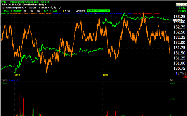
FXE 1 minute is showing signs of a loss of momentum.
The Euro has good support at 1.30, a break of $1.30 wouldn't be good for the Euro. Note the 1 day accumulation on 11/30 as the Euro hit $1.30 for a bounce. The 10 min chart just today started showing some signs of weakness as it stopped making higher highs. It's a light divergence, but may be a precursor.
The 15 min chart also shows the same 1 day accumulation at support. As smart money usually does, they accumulated at lows and sell into highs. The volume surge is a mini version of stage 2 mark up. Note this chart is also showing a loss of 3C momentum.
UUP-Proxy for the Dollar
UUP in a Descending wedge (bullish and the opposite of the ascending wedge above). You can also see 3C daily accumulation in the dollar at the lows and before it broke out of the wedge to the upside in a reversal.
Here's the same screen as above, in purple is a false crossover, in white is a real crossover. The first red square is the pullback to the 10-day moving average as typical, the second red square is where UUP is now, as I said, most often the second pullback is near or at the 22 day moving average, sometimes a little less, sometimes a little more, but it appears this is a pullback and the uptrend us still intact.
5 min 3C showing strengthThe 15 min showing the opposite of what was seen in FXE, a negative divergence at the top, where the dollar was pretty extended, under these circumstances, a pullback can not be said to be bearish, just normal. Note the strength in the 15 min 3C chart.


No comments:
Post a Comment