Tuesday, February 1, 2011

TZA/EDZ Chart Requests

Here's a look at TZA, this is a small cap leveraged 3x bear ETF. It does appear to be going through a change in character which is worth noting.

First lets look at momentum. TZA started down in August when the market started heading up-a move we had predicted about 5 days before it started.

 Note the 22 day moving average and how it has flattened out to the point where price is now criss-crossing above and below it. The volume is also interesting to note. MACD, a perfect indicator for momentum has shown a clear trend and very clean transition from negative to positive.

 My crossover screen can be quite early sometimes as a base is built before real upside momentum takes off, but 2 of the 3 components have triggered and the third, the crossover in the middle window is almost there. Not until the white square on RSI did RSI ever once cross above 50.

 The Volume at price indicator is interesting at the bottom where I put the white arrow. It looks like the sell side volume occurred in the red box around price, the buy side volume which is bigger seems to have happened more recently. also note the volatility in the Bollinger Bands has narrowed considerably. This often happens before a directional move. They may very well tighten up some more. I like the looks of the transition in price and volume at price.

 ADX crossed 40 and turned down which is said by Wilder to be the sign of the end of the trend, which was obviously the downtrend. The Vortex indicator is very close to a bullish crossover.


 Here on the 30 min chart we can see 2 main positive 3C divergences both at the lows.

 On the 5 minute chart we see the distribution on Friday afternoon which is the exact opposite of the accumulation we saw in bullish plays like the SPY, so it makes total sense as this is an inverse ETF. Today we also saw a pretty positive divergence and some interesting volume action again.

 The 1 minute also shows a leading positive divergence. 3C is at the same price level equal to $15.40 while price is at $14.45-this is a leading positive divergence. If we compare this to it's closest inverse  ETF, the IWM, we see something interesting and probably not coincidental.

A leading negative divergence in TWM the ETF for the small cap heavy Russell 2000.

I'm not saying we'll see a huge upside move tomorrow, accumulation can take time, but the conditions for accumulation are there, the price trend has gone from down to lateral, there is a definite change in character that is much more bullish.

EDZ

 EDZ's transition is relatively easy to see, from a bullish descending wedge to a lateral basing type pattern. This has been the case with most wedges, instead of just reversing as they use to, they tend to build bases or tops depending on the disposition. MACD has gone into a favorable stance and recent volume has been off the scale.

 My crossover screen shows EDZ was not ready to go north after coming out of the wedge, it had to build a base, note that the crossover signal in red was only 1 of 3-so there was no long signal there. Now again, for the first time RSI has crossed 50, the custom indicator is just crossing and the price moving averages have crossed, it's very early in the signal.

 This chart has a few interesting things. In purple, rarely do I see a definable divergence in MoneyStream, here we can see an obvious one and positive at that. Volume has been on the rise recently into the breakout day. It pulled back, but I do not think that has anything to do with emerging markets and more to do with the market in general as this is an inverse ETF. ADX crossed down from 40 ending the downtrend and recently has crossed up around 20 where the start of a new trend begins.. The Vortex indicator has a positive crossover as well.

 Looking at the last 2 days pullback, note that support was found at the Swing Pivot and there's also gap support just below which in my opinion is the strongest, most dependable support/resistance.

 I'm sure you've seen the daily divergences that are quite positive. They do not lead like this to this extent without something serious going on behind the scenes.

 The hourly positive divergences are also probably familiar, note they were accumulated right at support/the price lows. Also note 3C's current position near new highs.


Here's the 1 min chart showing a couple of rounds of positive divergences today. All in all, this is a large chart pattern, very reminiscent of the 2009-wedge in the dollar that ran through 2010 and not only fulfilled the target, but surpassed it. with wedges, the rule of thumb is they retrace their base so EDZ' base sits around $65, although n argument could be made for an even larger wedge.

These are longer term patterns and they are leveraged making them difficult emotionally to trade. A swing is amplified by 2-3 x and they take some patience as they develop. It's best to have a wide stop and take on fewer shares. As always make sure your risk management is within your zone of comfortability so you can sit out any market volatility that takes place. All in all, I think both have great looking long term charts with very good reward profiles.

SOL

Take a look at this Solar Stock. (SOL)

 Nice base there with rounding volume, the 50-day average obviously means something to those trading this one as it gapped right through it and we have a nice little consolidation with volume looking the way it should.

 My crossover screen with my custom indicator in the middle to help prevent whipsaws is giving a long signal.

While there are numerous stops you can choose, especially depending on what kind of entry you may choose, the trend channel has held the up and down trends very well. Right now it's a bit too close to the even number of $10 so I'd adjust away from that or you may just want to consider the trend channel if it breaks out and moves on a leg up for a trailing stop.

PM-PUT IT ON YOUR RADAR

This is a bear-flag type pattern and it's poked it's head above the 50-day moving average. There's a lot of Black Box manipulation of these patterns, but if this were to fall out of the flag (red arrow) this would seem to be a decent short. Remember -YOU PAY THE DIVIDEND!

CURRENCY TRADERS

You might take a look at this one. I don't think this is a false breakout, but it's pretty close to several possible stops, it may be worth a shot.

 A bull flag breakout in FXC-Canadian Dollar Trust

 This Trend Channel Stop has held the long term uptrend.

 3C 10 min looks solid on the breakout

FXC 5 min shows the accumulation right before the breakout in the flag.

Another View

As always, we need price confirmation, but the accumulation on Friday seems to be about right for a bounce of 2 days. It's possible with new highs being made in several of the averages, longs are getting set up in a bull trap-like scenario.

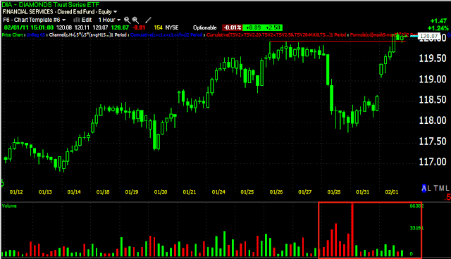
 DIA 60 min. Note the volume!

 IWM 60 min.

SPY 60 min.

SPY 15 min Heiken Ashi chart. Note the indecision candles and price backing off the top Bollinger Band at the new high area.

Market Update

We may be looking at the last day of Friday's bounce cycle, I don't want to get ahead of myself, but the 5 min charts are getting crushed. The SPY, DIA and IWM 5 min charts are all in leading negative divergences. There appears to be distribution from earlier in the day, we may actually be seeing some short selling activity as well.

 DIA 5

 IWM 5

 QQQQ 1

SPY 5

NEM to Bounce too?

 NEM breakdown from a top?

 3C daily seems to support that view. What I'm beginning to wonder is whether there's been a change of thought on Wall Street with recent events around the world and recent evidence of inflation.

 15 min chart in a lateral area-this is typical price action under accumulation and 3C the last couple of days has gone pretty positive.

Here's a small triangle, watch it for a breakout, the real important level will be $57, but if you want to get in early on a bounce, maybe a swing up, then you may want to look at this area.

UUP

Analyzing the US dollar is becoming very difficult without taking into consideration some of the fundamental aspects. Lets take a look at the charts first.

 Much like in 2009, the dollar as represented by UUP (for 3C analysis purposes) is showing a very bullish chart pattern (Big picture). The descending wedge is just like what we saw in 2009 when the dollar last rallied into 2010. The developments in Europe don't seem to bode well for the Euro long term although it's on a nice bounce (I believe to be corrective as the fear cycle is not currently focussed on European contagion). Today UUP broke a support level, this could be a false breakdown as is often the case (this is one of the worst trading markets I've seen since late 2008 /early 2009 and the common denominator is the Fed.

 looking at the short term 3C on UUP (1 minute) it appears this may in fact be a false breakdown meant to knock out longs, draw in shorts, create volume (the bid/ask spread-volume rebates/ setting bull-bear traps). We'll have to see if the dollar recovers in the next day or so.

 Looking at the Euro through the ETF FXE, we see a triangle and a breakout, volume hasn't followed up since the breakout and it's kin of rounding over.

The 3C chart is not showing confirmation on the 1 minute either, it is showing confirmation on longer charts, but the Euro has been rallying and the first place we have to look for a change n character is the 1 min chart. Unfortunately it is also the least reliable.

It seems to me, from the bigger picture that much like 2009 when there seemed to be no apparent reason for the dollar to go up, someone knows something. From the inflation reports we are seeing in releases like today's ISM, there seems to be a disconnect between Fed policy and what may be happening under the surface. Zero Hedge just published this article, it's worth a read. If in fact that is where we are heading, the dollar looking bullish would indeed make sense, but the Fed has given no sign, in fact the opposite, they feel inflation is below their mandate. This could turn out to be a bigger situation then you think, forget about food riots and governments crumbling, if the Fed had to take a surprise shift in course and raise rates to combat inflation, the Stock Market would see a sell-off to say the least. 

For now, lets see f this breakout in the Euro and breakdown in the Dollar is a false move. All of you who have been here for awhile know that we see our share of them as it's nearly the new business model on Wall street.

SLV Request

 Here's SLV in a huge ascending triangle. An ascending triangle is a bullish continuation pattern, but it's much smaller. Whenever we see large triangles of any variety we have to consider the probability that they are a top of either intermediate or primary importance. In this case, SLV found at least an intermediate top. Again, recently the 50-day moving average has been conspicuous, there was some support and then a clear gap down through that average on 1/20. If you've been here awhile you know that I have not been bullish on gold or silver-of many obviously overcrowded trades, these were two of the most. The longer term chart doesn't look good, MACD (and I use a long setting) looks bad. Volume recently at the 50-day has dried up the last couple of days and we have (right now) what appears to be a hanging man candlestick although that could change by the close.

 Here's the trend Chanel setting that has held SLV's uptrend, the cover stop is around $28.75. A move above that level would also destroy the downtrend's lower highs/lower lows.

 It gets complicated here, 3C 15 minute is showing a pretty formidable area of accumulation which I would think would support more then 3 days bounce. Of course a bounce can be interrupted momentarily and continue or turn into a swing up. There are some signs of distribution, I think having more to do with the 50-day moving average that price is at.


 The 5 min chart doesn't look all that bad, it's actually in confirmation of the price trend right now.

The 1 min chart has a small negative divergence, but I'm not sure it's all that relative right now.

If the 50 day average is broken to the upside, then I'd expect another shakeout move that could potentially approach the $30+ level. If we get a reversal down from the 50-day, I'd keep a tight stop initially until we see that it's not a one day rest.

Update- GDX

I'm going to update SLV, NEM and UUP but I saw something here in GDX and wanted to get it out to you.

 Here's GDX with a simple 50-day moving average, you can see it has interacted with price frequently and at some important areas. Note the current position of the 50-day moving average, this "Could" be an upside target on a big corrective move.

 If we draw one more trendline to look at this as a potentially larger top as there are volume indications that this may be the case, then GDX just hit a major support level, the volume at that support level may be confirming it is in fact an important level of support. While the longer term picture still looks like a top, this may form another right shoulder of a complex top. If so, the $58 level would be my guess by looking at this chart, it also is where that 50-day moving average is.

 60 min 3C shows quite a bit of positive divergences right at support and perhaps a false breakdown below support which would contribute to the volume as stops are hit. The red trendline with the two arrows is the price level you want to watch for a breakout, around $55.40 or so. If price fails below support, then we take another look, but right now, this seems to be the more immediate probability.

Again the 30 minute chart is showing positive 3C divergences like the 60 min did. At this point, I'd say the probability is an attempt at the 50 day moving average. At that point it may be worth a look for a short sale to at least support or perhaps even a break of it.

Unbelievable Melt-UP

I guess headlines are all that people scan, anyway, here's the SPY 1/5 min charts now.

 There are so few pullbacks in today's trade, it looks a lot like program trade.