Tuesday, June 26, 2012

GLD Update

GLD didn't do much today, but in the afternoon it did put in an intraday positive divergence that looks like it may try to fill today's gap. I likely won't take any action on the current put position, however it may offer an opportunity for those interested in GLD short to enter at a better price point with less risk (so long as the signals stay high probability as I expect they would).

 2 min intraday positive this afternoon and the gap area at the red trendline. The reason I believe this is likely a gap fill and no more is the next chart...

 The next timeframe, 3 mins which is still an intraday timeframe saw no migration from the 2 min chart, that caps the positive divergence to the 2 min chart.


The 15 min chart still shows the path of least resistance to be down and for shorter term trades in GLD (which the market is dictating right now), trading form the short side makes the most sense as far as aligning trades with the divergence timeframes.

As mentioned, the daily chart does show some changes in GLD toward a more bullish stance, but these charts still have to develop on the 1-60 min charts before they are worth considering.


The longer term daily chart changes in character in GLD, from bearish to mixed and now moving toward a more bullish stance as our initial assessment that GLD would enter at least a an intermediate downtrend has already been fulfilled.


Stop for UNG

In case you are considering trading around UNG rather than just holding it as a long term trend position, here's the updated stop. I'd prefer to use the stop on a closing basis.

 The resistance line above is basically what separate UNG from a stage 1 base and stage 2 mark up. It is not uncommon in situations like this for price to approach resistance, back off and gather some strength and then make an attempt at resistance. You can see clearly by volume that the initial momentum is fading off as we approach a very important level for UNG.

 This is a rather tight stop and it is by design for those who want to try to trade around a probable pullback. For those who are more apt to just hold UNG as it is one of the few long positions I do like as a primary trade, this stop would be meaningless. Currently it is around $18.50, if UNG moves up more tomorrow, the stop will also move up to lock in further gains. The equities mp long in UNG is up over 13%.


This 15 min 3C chart shows the area of resistance at the last negative divergence in May, we have a current 15 min negative which appears to be signaling the probability of a pullback as mentioned last night. I'll likely follow the stop and just keep n eye on UNG's behavior. Honestly if I was too buy and missed the stop I wouldn't be too concerned with holding UNG.

Germany-Contagion

Not that it should matter as the EU is moving to make rating agencies irrelevant in actual law, but I'm sure this is not going to be well received in Germany where this week Merkel has made numerous statements that basically sound like, "We're sick of taking care of you" to the other EU countries.

I suppose if there was a time to foster that sentiment, now would be it and Egan Jones is the mechanism by which German's can see the effects of "contagion", something I would think most Germans never thought would reach their borders.
favorite 


This afternoon, my favorite rating agancy by far (they aren't scared to be first through the door), Egan Jones, downgraded Germany from AA- to A+.

To rub salt in the wound, just check out EJ's reasoning, I'm sure the PIIGS and France are dancing a jig right now.


6/26/2012: Federal Republic Of Germany: EJR lowered AA- to A+ (Neg.) (S&P: AAA) (3413Z GR)
Synopsis: German chancellor Angela Merkel continues to create tension with EU member states by resisting calls for EU bonds (shared liabs.), money printing calls and for her pushing for fiscal controls and the seniority of bailout funding. Germay is likely to be outvoted by other ECB members and therefore will have greater prospective exposure. Watch for the EFSF and the ESM morphing into banks (thereby depressing eventual recoveries) and a rise in the number of euros. The fallout from a likely Greek exit needs to be monitored. We are cutting to " A+ "

Of my,not only a cut, but a slap-down on the Euro-bond issue as well! 

As for the Euro, the response was muted.

Currencies

Although most of us don't trade currencies and it's pretty doubtful you'll find analysis of the EUR/USD in a technical analysis book, the bottom line is the movement of the $USD (which is easiest to analyze by using the Euro as a proxy as the Euro makes up 50% of the Dollar index -by far the heaviest weighting) explains a lot of the market's movements. When the $USD is strong, the Euro is generally weak and stocks, oil and most other assets tend to fall in price with a strong $USD. When the $USD is weak, the Euro is generally strong and asset prices in everything from stocks to commodities typically rises via the legacy arbitrage correlation.

You cannot have a meaningful understanding of the market without understanding at least what the EUR/USD are doing, even better, if we can pick out the most likely path of the $USD (or EUR/$USD) we have an important piece of the puzzle in our overall market analysis.

As such, here's an update of the FX pair and what appears to be the most likely course. You can think of the market and the Euro as moving together and the market and the $USD as having a mirror opposite (inverse relationship), so if 3C looks like the Euro will move up and the $USD down, this is a bullish finding for the market.

First where the EUR/USD is...

 This is long term resistance, the Euro broke above the resistance level in similar fashion as the SPX broke above its resistance, in fact look how closely they move together (as a trick for you tool box, often divergences between the Euro and SPX at turning points like an extended pullback in the SPX with the Euro turning up while the SPX is still heading down-are often excellent early warning signals of a change of trend in the market/SPX).

The SPC in gren and Euro in red, both broke above their respective resistance levels at the same time and broke back below them at the same time. Note on the 4th of June the SPX is still trending down, but the Euro is reversing to the upside, shortly thereafter the SPX followed.

 Here's where we opened this weel's FX trade Sunday night in relation to the major resistance level-keep in mind there's still a huge short presence in the Euro so a short squeeze is a definite possibility, which would have similar effect on the market.

 Here's the last day or so, trade has been choppy, but has a lateral overall trend.

 We are looking at the ETF for the Euro, I'm trying to avoid the significant noise in some of the near term short charts and uncover the trend, the 3 min chart seems to indicate a fairly healthy positive divergence in the Euro this week, there's certainly a change in character in the price trend.

 The 15 min Euro from accumulation before it broke above resistance, to confirmation of the move up to a negative divergence once the Euro crossed above resistance and a current positive divergence in the Euro.

 The 30 min chart shows the same thing. Honestly the 30-60 min charts of the Euro do not look as strong as they did when we were making new lows in the market on 6/4, but there's still something to work with there.

 $USD 1 min trend was in line as price moved lower, however as the $USD popped this week on Euro weakness, 3C failed to confirm and left the $USD in a leading negative divergence; most of the damage has been done the last 2 days, which is also where we see the SPX making a sort of rounding bottom on positive 15 min divergences.

 The $USD 15 min from a negative divergence at the May top to in line with the downtrend to a pop up in the Dollar that saw another 3C negative divergence

The 30 min $USD/3C chart is pretty plain and simple, a positive divergence and a negative divergence as price starts to round over. Should the $USD complete that rounding over and head down, this will be a market positive, however just out of experience, never expect a nice clean move, expect some volatility and chop or some surprise. Wall Street never makes it easy and when it does look easy, you better take a step back and look for the trap.

USO Update

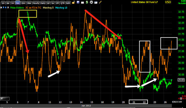
USO I find to be an interesting chart, we have oil inventories tomorrow at 10:30 a.m.  so we could see a potential trade there. There was a string of EIA reports for a while that looked very much like they were leaked and although oil would initially move on Wednesday according to whether there was a build or a draw, we often found good trading opportunities as it appeared that the EIA petroleum report was one of the most leaked reports out there. We'll be watching for similar opportunities tomorrow and Thursday we have Natural gas inventories, so we'll take a look at UNG as well.

 Thursday/Friday of last week USO was definitely looking a lot better as a long trade with a clear positive divergence. Look how 3C's character as well as the price of oil changed as Monday rolled around. What was the cause? I think it's pretty simple, China has always been very opaque in their economic reports, the HSBC Chinese Flash PMI vs the Chinese official version were totally opposites the last 3 of 4 months with HSBC's showing contraction and Chinese manufacturing falling off a cliff, which is what we suspected in 2011 based on commodity price action. The Chinese version painted a much rosier picture until the last official PMI, which "Suddenly" deteriorated horribly to pretty much come close oto in line with HSBC's 3 months of declines. That alone was odd, that the Chinese version was so upbeat and saw such a dramatic shift in one month.

In any case, the Chinese can hide a lot, but as the NYT article this weekend pointed out, the power consumption in their manufacturing areas had dropped off badly, there can only be 1 reason for that and I believe that's the same reason that oil which is not only used as fuel but in the making of many things such as plastics, etc, had such a dramatic change in character as the new week opened. Traders can chose to go along and drink the Chinese Kool-aide, but when presented with hard facts, the market adjusted quickly.
 The 3 min chart which was improving last week has not deteriorated much, but isn't where I would have expected it as of last week and before the NYT article came out.

 The 5 min chart shows some progress today

When in doubt, reduce the noise and uncover the trend with longer charts like this 15 min, this is still in leading positive position, some of that my be from last week, but I have to deal with what is there now and what is there now shows a positive change in character overall. I'll stick with my USO longs and look for any leaks of the EIA report due out tomorrow a.m.


Market Update

Not to get too excited, yet, but thus far things are working out as originally envisioned BEFORE the F_O_M_C and before the pullback even began.

I suspected there would not be positive divergences right away as one of the points in accumulation is to do so at better prices, that thus far happened, I was looking for positive divergences in to lower prices, that has happened and the overall price pattern looks constructive. Also the migration through the 3C timeframes looks more like what I hoped to see, yesterday we were starting to see that, but we were missing a few pieces, today there's improvement in that area as well.

I have maintained the long (leveraged) hedging ETFs in the equities portfolio that also has the core short positions.

 As I posted yesterday with regard to different head fake areas and the psychological effect, the move down from above support would certainly be viewed by bears as confirmation of a failed test and give them confidence to enter the market, shorts are needed to get a short squeeze really moving. Today's daily candle also looks much better and as if the pullback is coming to an end, although we need to remain vigilant.

 Intraday I didn't expect positive divergences on the initial pullback, but this "U" shaped area is a typical basing pattern. The next resistance is at the gap created on yesterday's open, look for congestion in that area as shorts will be looking to short that resistance area as well and as usual the market may throw them a bone to get them to commit.

 The 3 min chart is leading spectacularly.

Now we have a distinct positive 15 min divergence and this is an important timeframe. Next I want to see the 30-60 min charts start to see bleed through from this 15 min chart.


FB Update

While everyone was focussed on hating FB, we saw something apparently few others (judging by the Twitter Stream) saw and made some decent money long FB, many members are still making VERY good money long FB. Don't get me wrong, I DON'T like FB and think it is overvalued, but when the market offers an opportunity, it's best to leave personal opinions out of hard analytical fact. Many shorts have been taken to the cleaners on FB while we've made money, the only thing that separates us is our view of FB as it is on the charts vs their perception of the stock.

 I closed a call position in anticipation of a pullback, I haven't seen the pullback that I would like to see to re-enter a new position. In my opinion a position must offer high probabilities, low risk and an excellent entry, just to say, "it is moving up" is not enough-that's chasing a trade, there has to be an edge to a new entry and thus far I haven't seen that edge and I'm starting to wonder if we will see that edge before FB perhaps takes a turn for the worse.

As for the charts...

 Since FB first started trading, it has retraced about 50% of its losses.

 Here's the area in which we first noticed something was changing in the underlying 3C trade.

 Here's an example of the change on a 60 min chart, a leading positive divergence that just kept growing. For a 60 min divergence to lead so quickly, there must have been huge and very fast institutional accumulation at those low price levels. I speculated way back then that MS/GS, the underwriters of FB's IPO had lost significant money trying to defend the stock on the first day of trade and this was likely their position to make the money back by sending FB on a steady march higher through a forest of short sellers.


 The 15 min chart shows a negative divergence, this is one of the reasons I closed Call positions at a decent profit, but nothing like some of our members have made who continue to hold.

 As for a pullback, sometimes negative divergences simply lead to consolidation, FB saw a consolidation and although I was tempted to start a new long position, I just wasn't comfortable with the underlying trade activity. Yesterday we saw a small pullback, but again, it seems to me that the divergences are more negative than just a 1-day, 3% pullback.

 Here's a look at the 15 min chart, this has me a bit nervous about FB's future on this upward march, it can still jump back in line or it can deteriorate more form here. I would say one thing is fairly certain, the initial accumulation around $26 and below, has likely been distributed at this point, meaning it is likely GS/MS were behind this position and likely they have recovered a significant amount of their initial losses from the first day or two of trading in trying to defend FB's price at various levels (the last was $38).

 The 1 min chart's trend is not inspiring a lot of confidence as it goes from in line to a negative divergence. This is also probably the area in which smart money has been taking profits. After the stage 1 base and stage 2 mark up seen at the green arrow, the red arrow looks like stage 3 distribution as smart money almost always sells in to higher prices.

 The 5 min chart is seeing that bleed through from the 1 min chart as well, from positive divergence, to trend confirmation to a negative divergence; it is also seemingly starting to bleed through to the 15 min chart.

If I was still long FB, with these negative divergences migrating through the timeframes and just reaching the 15 min chart, I would consider the stock to be under distribution which can include short selling and I would CERTAINLY have a trailing stop. I personally would also be taking some profits, many of you have a large enough profit that you could take your original investment off the table and let the profits run with a trailing stop and have a guaranteed profitable trade. I still hope that we will get another chance to enter a new trade in FB, I don't really care if it is long or short, just as long as we get an excellent signal like we first did.

 As for a trailing stop, I have used the hourly trend channel (which I have said I think it may be a little too tight, but there's not enough trade data to construct a daily trend channel). This channel has held FB long since it was under $26, yesterday it saw a technical stop out of the channel so there may be some changes in character, watch for extreme volatility or a spike move up, that may be a signal to take profits.

 The 60 min 3C chart has gone from confirmation in a leading positive divergence to a mall negative divergence and pretty close to confirmation, but that in and of itself is a change in character.

One other stop you may want to consider is a 40 bar exponential moving average on a 60 min chart, it held yesterday's pullback. I would think a break of this m.a. would signal some real changes in character that should not be taken lightly if you have a large profit here.


Follow Up on Yesterday's GLD Puts

Yesterday I decided to re-open a put position in GLD, right now it's already at a decent gain for such a small move and amount of time. For now, I intend on sticking with the position.

 The position is at a nearly 14% gain since yesterday using July 155 puts.

 Intraday today, the 1 min in GLD saw a small intraday positive divergence, however it seems to be fading.

 This is the move up yesterday and the negative divergence in to that move which caused me to re-open the put position which was closed Friday in anticipation of a bounce. The 2 min chart shows the same intraday positive and is currently in line intraday, I expect the 1 min negative divergence will soon effect the 2 min chart and hopefully keep migrating through the longer timeframes.

 The 5 min chart showing the negative divergence in to yesterday's afternoon run up.

 The trend of the 5 min chart, since going negative around the F_O_M_C, you can see yesterday's negative divergence in to an intraday run higher and the current 5 min chart position is leading negative.

The 15 min chart shows the first put position entered in the white box, in the green box when the last half of that position was closed on anticipation of a little bounce, the second white box is yesterday's new put position and the red box is the 15 min chart in leading negative position.

There's still a lot of damage to the 30-60 min charts so I feel pretty comfortable trading GLD from the short side until we start to see the 15 min chart improve.

As mentioned, there may be a longer term trending long setting up in GLD, but I do believe it needs to pulllback at least to the $148.50 area before we can make any assessments as to how the longer term trend is developing.


Market Update

Sorry for the delay, it took some time for StockFinder to update intraday data.

In any case, you may recall there were signs of a pullback in 3C before the F_O_M_C meeting, we've seen that pullback develop since. What I am looking for in a pullback is 3C to give positive divergences, suggesting it is a pullback and not something more bearish. Today thus far I see improvement as we are now seeing 15 min divergences develop more clearly.

 The overall DIA 1 min trend in leading positive position.

 The 1 min on the open today saw an intraday negative divergence and around 11 a.m. an intraday positive divergence.

 The overall trend of the 2 min-I want to see the positive divergences migrate through the longer timeframes as we see here.

 The DIA 5 min in leading positive position.

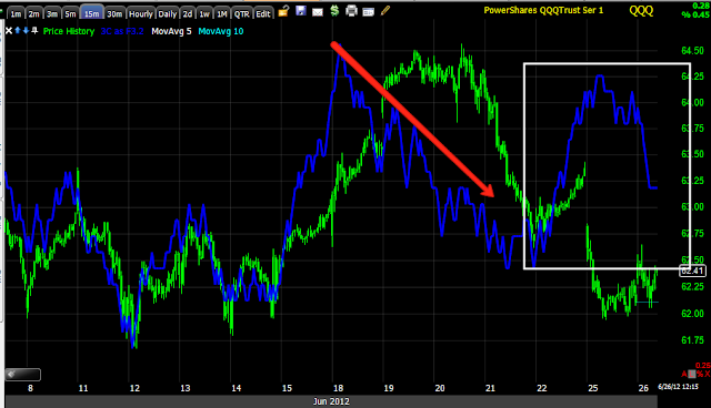
 The 15 min with a pullback signal and a leading positive divergence as we chop around in this flat trading range.

 QQQ 2 min looks great, leading positive in the trend

 That has migrated to the 5 min chart which also looks great.

 And the 15 min chart in leading positive position.

 SPY 1 min overall trend in leading positive position

 A closer view of the 2 min chart adding to yesterday's positive divergence

 The 3 min chart adding to the positive divergence in a leading positive position.

 The 5 min in leading positive position.

And the 15 min chart is finally seeing the migration as it is now leading positive.

We are close to an area in which I will be looking for an end to the pullback as well as opportunities to take advantage of the pullback.