Today was certainly a strange day, but this entire week has been a bit strange.
We tend to get very good signals on Friday which leads to our "
The Week Ahead" forecast. Why do we get some of the best signals of the week on Friday? Friday Option Expiration Max Pain pin seems to generally open around the area the market closed on Friday and tends to hand around that area until the pin starts to wear off around 2 p.m. as I suppose most contracts are cleaned up by then. For whatever reason, the market can pull any kind of antics it wants the last two hours, but the 3C data those last 2 hours
(whether a weekly options expiration or a monthly or Quad Witching) is pretty amazing both very short term, for example last Friday's late day )3:37 [.m.) trade idea,
Trade Idea-EXCEPTIONALLY SPECULATIVE...VXX Short Term Calls which was based on the forecast that we see early weakness in the market this week. I didn't close the VXX Calls until Tuesday morning at 10:18 a.m. which was near the best prices we were going to get before the intraday trade turned up off the a.m. lows of what turns out to be the week thus far with a decent +57% gain for little more than a day of exposure.
Oddly, although it's not at all the way I expected...
The forecast called for early weakness in the week followed by a bounce and here we are green on the week in everything but Transports.
I mentioned numerous times late last week and through all of this week that I would welcome the opportunity to trade the market for the anticipated bounce, but not based on guesses, but feeling or even probabilities,
based on high probability, low risk entries. As I posted today, the market didn't do the work that would give me the confidence that a move such as today's would hold. The high probability signals were not there.
See this afternoon's Important Market Update to see some very odd changes in correlations today.
There were a number of correlations presented as recently as this Tuesday's
Daily Wrap. The charts below are $USDX correlations captured Tuesday that have been in effect recently...
*The $USDX is represented as a purple line, the comparison symbol is represented by red/green candlesticks*
The $USDX vs. 30 year Treasury Futures.
This is an odd correlation that suggests a $USD funded carry trade is being unwound as the symptoms include :Falling Bond prices, falling $USD, falling Equity prices and inflation in commodities (rising commodity prices).
Above we have falling $USD and Treasury prices. Remember last year Treasuries outperformed the equity market on the year. We saw some odd 3C signals in long term charts like the 60 min that had confirmed the Treasury rally through 2014, suddenly they went negative and no longer confirmed. As you are probably well aware, Treasuries have just seen a large initial break of their primary trend, one we are trying to exploit with this trade idea from
Trade Idea: Long Bonds / TLT . The charts in this post are more than enough to get the gist of the idea.
Also from this Tuesday's Daily Wrap, the $USD NASDAQ Futures correlation.
Again this is an odd correlation. Under "Normal" circumstances, the Legacy Arbitrage correlations apply:
$USD up= stocks down, oil down, gold/silver down, most commodities down.
$USD down=stocks up, oil up, gold/silver up. most commodities up.
It pretty much applies to any $US dollar denominated asset,
but this chart above of the NASDA 100 futures and $USD moving/selling off in tandem is much more indicative of a carry trade unwind and is a very unusual sight, but one that has been increasingly more frequent since the $USD broke its primary uptrend.
Amazingly,
even gold futures had a close correlation with the $USD with the $USD leading moves in gold slightly.
This was another capture from Tuesday showing the $USD ETF UUP (green) vs. USO/oil in white.
This is a very strange sight.
Also from Tuesday, 20+ year Treasuries (TLT) in blue vs the SP-500 as equities and Treasuries had a correlation with the $USD.
There's a reason for that, it's not an anomaly in my opinion and I'll show you further proof as to why I believe it is not.
This is from today...
A near term 3 min chart of $USD in purple vs. CL/Brent Crude Futures with a close, not perfect, correlation.
And this is a capture from tonight, 5 year Treasury Futures (not yields) vs the $USDX in purple and then a swift and polar opposite reversal of the correlation today.
Again, to see some of the drastic changes, especially today since Tuesday's charts above, see this afternoon's post,
Important Market Update.
Remember when we used yields as a Leading Indicator not so long ago (maybe a month)?
However they were no longer useful as a leading indicator as there was no more rotation from equities (risk on) to Treasuries (risk off) and instead, both were moving together which we already know is one of the signs of a carry trade unwind.
Yet today that inverse (recent) relationship between yields (30 year) and the SPX popped right back to the old correlation we had used for well over a year, that happened today specifically.
If I invert the 30 year yield (red), keeping in mind yields move opposite Treasury prices
(thus we are essentially looking at a proxy for a 30 year treasury) and compare to the SPX, you can see the recent correlation between bonds/treasuries and the market (SPX),
it's a near perfect correlation, that is until today. Again, this is a throw back to the old correlation we used for a long time as a leading indicator, but why such a sudden change on a day in which the market saw a short squeeze on low volume with no positive divergence in front of the move as we'd almost always see for even the smallest of moves?
Last Thursday, April 7th I posted a trend I had been noticing,
Market Update: DIVERGENCE BETWEEN THE AVERAGES AND INDEX FUTURES. The first half of the post I showed the charts that I believed were the start to a market bounce that we'd see finish up the base for on this week's early weakness. I posted numerous charts that supported the bounce idea, but then noted something I had been seeing a lot of...
"So far everything seems to make sense, yet I have had this gut feeling to keep Long risk minimal. As I showed last night, the one thing we were looking for to tell us that the April cycle had transitioned into a much more bearish market condition were the 7, 10 and 15 minute charts which were positive at the beginning of April when we made our forecast and have since turned negative as we were expecting and watching for during the April cycle.
I showed these charts last night, all of them negative."
After showing numerous Index futures charts, the conclusion at the end of the post was,
"The one thing I keep thinking about is the fact that few retail traders are trading E-mini contracts. In other words my suspicion is the pros are not taking on any long risk but are more than willing to sell into it which has been the exact same position I have taken. Maybe I am projecting my personal feelings regarding long risk, but I can't argue with the charts above."
Today someone mentioned to me, "Why not a short squeeze?". If you noticed, most of the work to keep the averages in the "Loitering" range has been done in the low volume overnight session. The effect is producing a clear area of resistance as mentioned earlier today when talking about 2 possibilities- an op-ex pin or a head fake move, again in this afternoon's,
Important Market Update,
So if I am correct that there's little to no institutional sponsorship of the expected bounce or as even shown today, not a single divergence before any of the moves, perhaps using stops/limits and a short squeeze with some minimal investment in the overnight session is what has been going on.
That doesn't give me any confidence in trying to play a market bounce.
Returning to the charts...
Remember one of the symptoms of a Carry Unwind is inflation in commodities. This is commodities in brown vs. the SPX in green.
You've seen the macro data for 2015, it's at the worst levels in 6 years. Manufacturing is missing left and right.
I have to mention that the F_E_D has made clear that a strong $USD is problematic for a rate hike as tightening policy would only strengthen the $USD and hurt exports of multi-nationals. The F_E_D is looking for $USD weakness. One thing I find interesting given USO doesn't look ready for a stage 2 breakout yet with a couple of example charts...
This 60 min chart of $USO shows perfect 3C confirmation of the price trend until the breakout above the base's resistance which we had suggested would need to happen as a head fake move before USO could turn down, get its charts together and make a real run at resistance that doesn't stall, but slices through as I believe USO/Oil will do.
This 15 min chart, which is more detailed and shows divergences that weren't large enough to show up on the 60 min chart is also largely near perfectly in line with price action with the exception of showing a few divergences that moved price and the most recent as price broke above resistance with a very strong leading negative signal (3C distribution).
The thing that the commodity chart above and the USO charts have in common are the date March 18th, that's when USO started its run.
It's also interesting on a daily chart of both the $USD and the Japanese Yen...
After making a new high, this daily chart of the $USD puts in a large, nasty downside candle on March 18th and after that never makes a higher high again, but rather a lower low on both an intraday and cling basis with a deep leading negative divergence.
The daily chart of Yen futures has transitioned from a downtrend to a lateral trend reminiscent of not only a base, but the kind of demand one might expect if a USD/JPY based carry trade was being unwound. Again, on March 18th we see a huge move up in the Yen and the 3C positive divergence has continued to improve since. Note the 3C leading positive divergence in to the dip just before the 18th, it's huge. This doesn't look coincidental at all.
Leading Indicators...
They were much more sloppy today than yesterday, here are a few...
Our Pro Sentiment Indicators were only willing to play along for so long before heading the other direction intraday.
The second one we use for confirmation was much the same after having been close to inline with price earlier in the week.
High Yield Corporate Credit wasn't as fond of following along either where it has recently been pretty closely following the SPX very near term as it is often the first lever they'll employ when trying to manipulate the market short term.
I showed an even bigger picture of HYG vs the SPX last night and it is in a primary downtrend, this is a little closer view, but nonetheless it has been falling out of bed. The larger view is incredibly different and shows just how dislocated HY credit is from the market which is important as HY Credit is essentially institutional money's risk asset like a stock like NFLX or AAPL would be retail's.
The point being, institutional investors are leaving the table and have been, but we already know that from the charts and their SEC disclosures.
VXX, which I considered for a trade yesterday and glad I didn't, showed a noticeable lack of relative performance vs the SPX. Note
VXX didn't make a lower low (as it should normally trade inverse the market/SPX) until after 2 p.m.. Normally the correlation would have caused this to happen with the SPX's first higher high around noon. Also in to the close, VXX should be at the low of the day, yet again it shows relative strength vs the SPX and fails to make a lower low or a new low on the day.
I mentioned earlier that VXX had been seeing positive divergences intraday building all day and it already has a large one in place that is fitting as confirmation of the IWM's leading negative.
If you're looking for rotation among deep pockets, this VXX (which trades opposite the market) 15 min divergence is enormous. It seems someone has been busy accumulating a large VXX position.
Meanwhile the reason and all the rotation you could want seems to be right in front of us on the IWM chart of the exact same timeframe...
IWM 15 min.
As shown above already, 30 year yields/Treasuries pulled a strange maneuver today, moving more like they use to when we used them as a leading indication, but those days are gone with bonds selling off and doing little more than that.
Here's what bonds would look like as I inverted the 30 year yield as yields move opposite bond prices.
Note the very tight correlation to the left with the SPX until today.
Meanwhile High Yield Credit (not specifically Corp.) also fell intraday vs the SPX. These are two risk assets, one pro, one equity. How many retail traders do you know who trade HY Credit? In any case, under "Normal" circumstances in a risk on move, HY Credit as a risk asset would move WITH the SPX, not against it. Another chart that looks very much like deep pockets were selling in to price gains which is EXACTLY what we are looking to do as is posted in the first couple of paragraphs of the "Week Ahead" when it comes to "after the bounce" and what comes next.
Internals
The closest thing to a Dominant Price/Volume Relationship was the Dow with 19 of 30 stocks at Close Up/Volume Down, the most bearish of the 4 relationships. However it was the only average of the 4 majors to have a Dominant Relationship.
The S&P sectors weren't luke-warm like yesterday, they saw 8 of 9 sectors close green with Tech leading at +1.61% and Energy lagging, just barely red at -0.04%. This is about as close as you get to a 1-day overbought condition in the S&P sectors.
The 238 Morningstar sectors saw an extremely overwhelming 215 of 238 close green, again it's counter-intuitive as this is about as close as you get to a 1-day overbought condition with the market closing lower the next day. The one thing missing is the Dominant P/V relationship which only the Dow showed and is in line with the sectors.
The 3C concept we have seen very often of charts/divergences picking up where they left off the next day in the cash market (even over a 3-day weekend), would suggest we are in for some ugliness tomorrow, however I suspect the Monthly Options max-pain pin will be the most influential variable as we most often see the pin right around Thursday's close. However, I'm very interested to see how this plays out as a concept on a monthly options expiration with divergences this big and consistent.
SPY 1 min with today to the far right,
I didn't think I needed to point out the divergence.
QQQ 1 min, again, I didn't think I needed to write on the chart and in fact thought it would take away from the chart.
IWM 1 min.
What I find interesting is how similar they all are, even in the day or so leading up to today, but especially today.
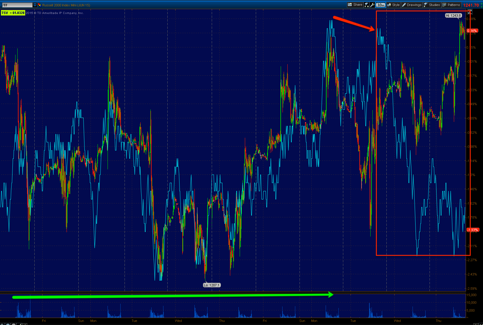
The intraday 1 min ES and TF charts look remarkably similar to the charts of the averages above...
ES with the regular cash market hours highlighted in green.
TF 1 min.
This is far from the only curiosity... We almost always see a positive divergence before moves that are 1/10th today's. At the areas I've marked with a yellow box, we should have seen a positive divergence if there was institutional accumulation to back the move, I don;'t mean the kind of accumulation that means they are bullish, just market makers/HFTs stocking up so they have supply for the move and can make an extra buck in their trading accounts, it's not there.
I'm going to take a closer look at futures and market breadth indications, I may post another update tonight. Otherwise, have a great night!