Monday, August 20, 2012

The $AUD

The Australian Dollar is probably my favorite leading indicator among the currencies. One of the main reasons is that the $AUD is a carry trade currency, when it's being bought the carry trade is on and you can expect a market rally, when it is being old, the carry trade is being closed and you can expect an ugly market. Here's an example of how the $AUD was one of the tools we used is setting up shorts at the March through May 1 highs.

 You probably recall the rally in the SPX that carried over in to the new year, at the March highs just looking at price alone would have you believing that the up trend was still in effect, this is where we started selling short and had a number of successful shorter swing trades on the volatility of this topping pattern. Add the $AUD (Orange) and you can see the carry trade was being closed out, thus the rally was near its end, you wouldn't have gained anything by staying long after the $AUD diverged in March, only lost or had months of opportunity cost to get out close to the same level as months earlier. We used this time to set up shorts, but as you can see, the $AUD clearly called this top.

The $AUD works on a number of timeframes and trends.

Recently the $AUD diverged from the SPX pretty badly after having stuck very close to it since the June 4 lows.


 Here's the $AUD/SPX divergence, while I wouldn't use any one indicator alone to make a call (you need as many pieces of the puzzle as possible), this is still a key indicator.

So I decided to take a closer look at the $AUD, if there was confirmation or even worse, positive divergences, then I'd be nervous about my market positioning, if the $AUD looks like it's being sold and is going to roll over more, then I feel more comfortable with my market positioning (bearish).

 The cleanest chart here is the 4 hour showing a price surge in October that 3C did not confirm and price went up parabolically and came back down in the same fashion, otherwise, the uptrend was confirmed until it went negative around February. Next the downtrend was confirmed by 3C as was the reversal and new uptrend from the early June lows, it is now leading negative again at this turning point.

Now I want to confirm this chart and see if there are more details...


 The hourly chart shows a positive divergence in to the June bottom, it's not on the 4 hour chart because the divergence wasn't big/strong enough to make it that far, there's confirmation and then it goes negative at this recent top like the 4 hour chart. The faster charts will show more detail and stronger divergences as well as more of them.

 The 15 min chart is key because it is a strong timeframe and it moves quickly to show divergences that are serious in nature quickly, we have a new leading negative low in the $AUD here after a positive divergence at the June lows.

The 5 min chart shows the same nasty leading negative divergence, anything shorter than 5 mins is too spotty, you can see the 5 min chart getting gappy. In any case, I feel comfortable the $AUD will continue to sell off, that's not good news for the market at all.

I liked BIDU a Lot

That was before I saw this DAILY chart, now I nearly love it.

This also shows you very clearly with 3C exactly how institutional money is involved in the 4 stages of a cycle.

Stage 1 we see accumulation or what we might otherwise call a base, it doesn't look that big, but it is 3 months of nearly pure accumulation as divergences on daily charts are not that frequent and not usually this strong.

Stage 2 is Mark-Up, this is where they create a buzz around the stock, lift the price well above their accumulated average price.

Stage 3/A I'm braking this down in to 2 parts because it is 2 parts. Stage 3 is "Distribution and a Top", first there's distribution selling smaller amounts in to higher prices/demand. Wall Street positions are huge and to sell them in to higher prices they need to be fed out a little at  time so they don't drive price down by offering too much supply. As the top forms distribution should be nearly complete, they can sell short here as they know there's no more institutional support to drive prices higher.

Stage 3/B Top This is pretty self explanatory, the easy money has been made, while you might be able to pull a few more percent out, this very volatile chop is rarely worth trying to stay in the trade unless you are trading much more nimble.

Next is...

Stage 4 or better known as decline.

BIDU looks like a fantastic short here.

ES Still Going

At this rate, we may have a big surprise by the open.

The leading negative here just keeps digging deeper and deeper in an almost parabolic fashion as price is range bound.

Financials

I had an email asking what Financials looked like, it' easier to show you than explain.

 Financials put in one of those bearish ascending wedges that we've seen get manipulated so many times. According to Technical Traders, when price reaches the apex, price should break to the downside and retrace the base around $11.50, instead they run a head fake move to the upside, this is important because not only do they knock out the shorts, Technical Analysis teaches when you have a price pattern like this fail, change your position and go the other way, LONG! As you can see, the longs who chased the breakout would be stopped out too and XLF goes on to build a larger top, with bullish descending wedges, we see the exact opposite and they go on to build a base. Eventually the patterns seem to make good, so XLF should at least retrace down to the base at $11.50, but it doesn't have to stop there. The yellow are a confirmed head fake or false breakout and the one now is very likely to be the exact same thing.

 The important support/resistance trend  line from the daily chart above is drawn in here, remember the point of a false breakout or head fake move is to get bulls to buy on a strong price move and then to trap bulls. Look at the 1 min trend as price moves above the breakout level, this is exactly how we confirm head fake/false breakouts. What is very interesting is how the floor just fell out at the close today. I've mentioned several times today how steep and extreme many of the divergences have been today, something not seen often and maybe not ever like on a scale as was present today.

 Here's a closer look at what happened at about 1:30. The idea is to sell/short in to price strength with smart money if the signal is there, but usually it is more of a process, this looks like an event or a last ditch move.

 The 2 min chart shows nearly the exact same thing as the 1 min trend, the leading negative divergence gets much more extreme as price passes the resistance level. If this were a healthy trend, it would look like the FB charts posted and 3C would make higher highs with price.

 The 3 min chart shows the same concept, note Aug 2nd accumulation seen market wide, THIS WAS NOT COINCIDENCE. The breakout occurs just after that accumulation and almost immediately there looks to be selling in to higher prices as the 3C trend gets worse as price moves higher.

 The 5 min chart with several neg./pos. divergences, note Aug 2nd again, then a leading negative divergence on the breakout.

 The longer charts will show less detail, but a cleaner trend, the 15 min shows Aug. 2nd accumulation at price lows, they buy at lows the same way they sell/short at highs, the trend in 3C is pretty clear and worsening. Now that multiple timeframes are aligning and we have the head fake move, the break could be any minute.

 The 30 min trend from confirmation of the move in green to a negative relative divergence to a leading negative divergence.

This 4 hour chart is the cleanest, the green arrows are just 3C/price confirmation of the trend at the time, note the negative divergence in March, the positive at June 4th and before as we saw the bearish triangle set up and break lower in to accumulation, and the size and depth of the leading negative divergence now and especially at the break above resistance.

This appears to be a very clean head fake move/breakout confirmed on multiple timeframes and in multiple markets. These head fake moves are almost always the last thing to happen before a reversal. The bulls getting caught as price moves lower provides stop selling which adds more supply and pushes price down faster, hitting more stops, shorts step in. The head fake move creates the snow ball concept, "From failed moves come fast moves in the opposite direction".

Something up with ES

Earlier today around 1 p.m. I showed you this leading negative divergence in ES (S&P E-mini Futures) and said it looked like it would make another deeper new leading negative low.

Here's ES now, I included the first chart for scale so you can see the new leading negative divergence and how much deeper it is right here.


Financials coming next, they were interesting in to the close too

Flight To Safety-TLT

It looks like TLT is getting ready to explode to the upside in a flight to safety trade.

I've already shown the longer term charts in which TLT actually improves on the break below resistance, which is confirmation of the exact opposite seen in the market as TLT trades opposite the market.

Here's the near term stuff.

 3 min leading positive -very steep incline/momentum

 5 min leading positive as it consolidates

 15 min leading positive

And the 30 min is leading positive, this chart rarely moves up this high, this fast, it's almost a straight line.

FB Update

I'm glad I added to FB today, not because it is up 5.2% today, but because unlike almost everything else in the market, it is a confirmed move, a heathy move and that is one thing interesting about FB, it seems to be immune to general market action.

 Even very short term where you'd think some profit taking would occur, there's good confirmation on the 1 min.

 The same with the 2 min, excellent price/3C confirmation.

 The 3 min also looks good, maybe a slight pullback, but good.

The 15 min chart is the star, I'll look to add the last 1/3rd of the FB full long position (equity) on a pullback.

BIDU Update

Looking at BIDU, it has done exactly what we expected it to do since it reversed from the bottom, a strong counter trend move, I would have no problem being short BIDU right here. I prefer a little wider stop on initial positions, but I think this looks like one of the best set ups out there right now. Actually I did fill out the BIDU core equity short position.


 BIDU made the head fake move above resistance, the 30 min chart is VERY sharp in its leading negative divergence

The 60 min shows the first short position or core short in yellow, you can see the counter trend rally, the 60 min chart just fell to new lows, the purpose of a counter trend rally. I really like BIDU short here.

DIA Momentum

I just found the large increase in leading negative momentum interesting, especially as it starts to fill out al timeframes.

 This bearish wedge pattern is looking very obvious, normally I'd expect a head fake move on this pattern as we have seen them so many times before, but they always led to a topping pattern in this case or a bottom in a descending wedge. It doesn't look like there's time for such a pattern.

 60 min is not only rolling over locally after the positive June 4th divergence on a head fake bear trap, but it is massively divergence relative to price in the same area in Q1.

 The same with the 30 min chart, these are the long term charts that tend to be the most reliable and hold the most importance as far as giving us an idea how bad a divergence is. This would be very bad.

 And the intermediary timeframe between the longer underlying trends and intraday actions, the 5 min is seeing increased downside momentum.

 Apparently that 5 min momentum is flowing from the migration of even worse downside momentum like this 3 min chart

Intraday today, there's a very steep leading negative divergence right here.
And this is just the DIA.

More on AAPL

The VIX for those of you who are not aware of it, is often called the "Fear Index", it's a way to measure investor/trader sentiment, when we are near market bottoms there is a lot of fear and the VIX is typically very high, when we are near tops, there's a lot of complacency in the market and the VIX ix often near lows. Last week we saw the VIX post a closing low that hasn't been seen in 5 YEARS, since 2007!

Here's what the inverse relationship of the VIX compared to the SP-500 looks like.

Here the SPX is red and the VIX is green, note when the SPX is near tops (orange) the VIX shows a lot of complacency being near its lows, when the market is at its lows (white) the VIX spikes on Fear. We recently hit a new 5 year low in complacency as mentioned.

The VIX and volatility more broadly are part of the formula for pricing options, when volatility is low, options prices are lower, when volatility rises (the market drops), options prices become more expensive.

As for AAPL's options, they are breaking records for all new levels of complacency, the same as the VIX being very low. Complacency is near the highest levels since 2009, meaning traders are VERY confident that there's no downside risk in AAPL. The crowd is usually almost always wrong and the last 3 times this happened with AAPL, it saw a sell-off each time, some larger than others, some more dramatic then others in terms of how fast tit moved down. Complacency is almost always turned on its head.


Glad I found this chart-AAPL

When talking about some of the fundamental issues surrounding AAPL, from the death of Steve Jobs to battery technology placing a limit on smaller devices, to a range of other issues, the one that I mention most is the dividend AAPL declared, I often make reference to MSFT and how it was a strong growth stock like AAPL until it declared a dividend.

This chart shows you AAPL with MSFT overlaid, see what happens to MSFT after the dividend was declared.

This is MSFT in red going in to 2000 and at the top and AAPL presently, I bet you can guess where the dividend was declared, any way, MSFT never became a growth stock again after that.

Risk Asset Update

 Yields really coming undone as op-ex passed.

 Long term I didn't realize how dislocated yields are from the SPX, as you can see on the last divergence, Yields act like a magnet for the SPX and they tend to revert to the mean like we saw at the June low.

 The $AUD is out of sync intraday, but more importantly,

 It's really dislocated , this was almost perfectly in sync several weeks ago.

 The Euro also dislocated, long term it's much worse than even the Yields dislocation.

 HYG in yellow never made a higher high, it's hard to see the scaling because both have to fit on the same chart, but at the start of the red trendline, HYG Credit should have made higher highs with the SPX, it didn't and even went the opposite direction.

 This Histogram shows the dislocation/scaling a bit better, you can see credit positive at the June lows and then falling off in to the move up until it is severely dislocated again.

 High Yield Junk Credit also didn't make a higher high with the SPX.


 Again the Histogram shows the worsening dislocation or negative divergence between credit that should rally with the market and the SPX.

 Intraday Energy isn't keeping momentum with the SPX, it's not even close to the opening highs.

 Financials have seen downside momentum at each pass of strength intraday in the SPX, that should give you a hint about what the underlying action is in Financials.


 And Tech which was strong earlier is giving up momentum, unable to follow the SPX to former intraday highs

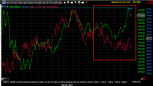
Sector rotation this afternoon is changing subtlety, but surely. Risk on sectors such as Financials, Energy, Industrials, Tech and Discretionary are all rotating out, only Basic Materials is hanging in there. The Defensive flight to safety sectors of Healthcare, Utilities and Staples are rotating in.