Monday, May 5, 2014

URRE Update

URRE has been a long time favorite on the watchlist as many of you know, there are some fundamental reasons such as legislation passed that makes it virtually impossible for any new power plants using even clean coal technology to be built, leaving a nice space for companies like URRE.


I think there are two things going on generally speaking in URRE, first as the chart below shows, there's a larger base that has made URRE such an interesting long term play or idea.

You can see a clear transition from a stage 4 decline to a stage 1 base and a clear change in character not only in price, but volume as well.

The second thing is closer to home so to speak, that's the chart below depicting a Descending Triangle, which is interesting because technical traders see the price formation and a descending triangle is a bearish consolidation with the continuation moving lower as URRE has done, even the volume on the chart is exactly how it should look according to all of the Technical Analysis textbooks.

 This pattern is too clear, clean and obvious to be organic, it looks to me to be clearly engineered, so a break below it is not surprising at all as that is exactly what technical traders are expecting and looking for to enter short trades, puts, etc.

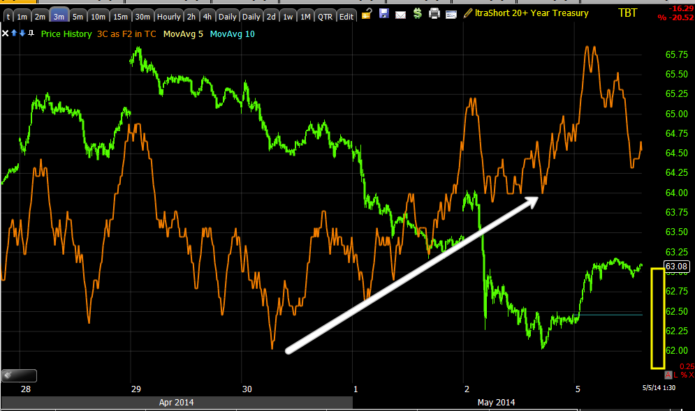
We can even see the stop levels hit as URRE moved lower through support and different stop levels.
Note the volume as different support levels are taken out, to the far right at the white arrow the candle and volume look like a short term capitulation event which may mark a minor bottom.

This 3 min chart shows some moderate accumulation since the day of the first break below support, 4/28, however this is not enough in my opinion to be a completed reversal process, in fact I'm not even sure it's starting a reversal process, I just know the longer term charts look great, and this triangle looks definitely purposeful.

When I see something like this I expect this kind of a move and I suspect there's a very clear reason it was put there and executed in the first place. 

The base is large, this is not something that is a set up, it looks to be a clear stage 1 accumulation area, so activity inside it is meant to accumulate. What better way is there to accumulate if you are a large firm that trades positions that are millions of shares in size? 

You create a scenario in which you not only get the asset at a lower price, but you have automatic supply available that allows you to accumulate without raising any suspicions, allows you to accumulate in the kind of size you need to without moving price against your position and allows you to trap bears and create momentum on an eventual upside reversal as the bears are caught in a trap and eventually forced to cover creating a short squeeze. The short squeeze creates the kind of upside momentum that causes other traders to step in and become buyers at higher prices, typically as price moves back above the descending triangle as it is then seen as a failed move. This additional demand/buying is putting you at a profit and keeping the momentum going without having to expend any resources, all the while no one is hip to anything you've done. The set up is there.

From here we know exactly what to look for, the evidence of a head fake move which would be accumulation showing up on 3C intraday charts and strengthening. We are also looking for a reversal process of the actual head fake move below the descending triangle's support ( accumulation and the reversal process are one in the same). Here's today's close.
You might recognize the daily closing candle as a bullish Hammer (reversal candle) and we have increasing volume, it doesn't need to be huge, but when it's larger than the previous day, these candles tend to be more important and more effective.


So I think URRE is a very interesting position and has moved in to a potentially very interesting position. There are numerous ways to play it, perhaps to wait for the initial momentum of the short squeeze and eventual longs coming in and take gains there before the breakout from stage 1 as there will be resistance and some fooling around near resistance of the larger stage 1 base or  you can look at this on a much larger time horizon as a long term trend trade or what many would view as an investment, but either way, I think it's just a matter of patience, letting this process play out. We know what to look for in price and 3C, as we see it, the trade has come to us on our terms at much better prices and much lower risk with the best timing we can ask for.

I have little doubt this will be a long term long position, take a look at the 3C accumulation on the daily chart, one of the strongest underlying signals we have and the highest trend probability...
This daily URRE chart shows 3C (orange) in a leading positive divegrence on a very strong timeframe marking a very powerful underlying trend. This base is so large right now that it can easily support a primary bull market trend for URRE and it's not even done forming yet.

Of course we have to watch the charts and see what is happening as we move forward; many of our concepts are fractal in nature so the large stage 1 base may see a head fake move below the base (around the $2.20 area) before the move to stage 2 begins, but we let the market tell us that, we just know that the larger head fake is a probability when we have defined support/resistance levels and a stage 1 base this size.

If we don't see increasing, definitive accumulation on the short term charts from 1-10 mins over the next few days, then the probability of a head fake move on the entire stage 1 base becomes very high probability, but there are two sides to that coin, the head fake move of a stage 1 base this large would mean URRE is getting ready to move to stage 2 rather than a swing trade within the stage 1 base. For now I would remain patient and probably not enter here until we see which way this is most likely to go.

I REALLY think this is one that is worth waiting for.

Futures Update

I suspect a lot of the blah-ish market action today as well as the several signals or timeframes in numerous assets that were not quite there, may have had something to do with AAPL taking out $600, I certainly think the VIX action today was a slam down to help AAPL and the Q's.

In any case, now that the orders there have been hit, it seems there's a bit different tone that started developing just before the close as posted Market Starting to Reveal More About Intraday Trade

 This version of 3C was first created to use for after hours trade, this is AAPL after hours to the far right in the light shaded area, it seems to be seeing some distribution in AH as we saw earlier in some very early timeframes (early in the process for those timeframes, but not for the asset in general as the 10-60 min and 1-day are already quite bad).

Since AAPL took out the $600 level just before the close there was a definitive change in character in the 3C signals as posted above, here are what the futures are looking like right now.


 ES with a VERY tight range and a leading negative divegrence

 NQ or NASDAQ 100 futures, also seeing a leading negative 1 min chart, I'll be interested to see what this looks like later tonight.

And Tf/Russell 2000 futures with the exact same type of divergence, I doubt that's an anomaly.

AAPL Update and the power of CENTENNIAL NUMBERS (and whole numbers)...

It's little wonder that the Q's weren't on the same page at the EOD as the SPY and IWM in today's afternoon post, Market Starting to Reveal More About Intraday Trade which was a follow up to an earlier market trade in which all of the averages were in a transitional moment (which happens) where they could have pivoted down and locked in a negative intraday divergence or moved up and confirmed intraday price action.

"The last update things were blah for afternoon signals, they are starting to reveal more character now...The IWM has revealed what the earlier non-descript signal was going to turn in to as it was transitory. The Q's haven't had the same reveal" 

With APPL's diminished, yet still heaviest weighted stock in the NASDAQ 100 by a mile, it's not surprising given trade in AAPL today.

We've had a couple of AAPL updates, it's on the radar, although not an open trade, yet... However it is one that I think we should keep on the radar and look for the entry opportunity to line up.

Some recent posts about AAPL...

AAPL Interesting Friday April 11th...

"There are several charts for AAPL (long) that look interesting, I would not enter more than a partial equity position at the moment as there's a bearish triangle that could be used for a stop-run/head fake move and that's where I'd really want to enter or enter options/calls."

Here are some charts and their commentary from the post linked above...

"Here's that triangle I mentioned, a perfect head fake set up with a downside break, creating a bear trap."

 " The 1 min chart during the triangle gives us good reason to believe any downside break would be a head fake move."

"I think I'll enter a 1/2 size trading position (equity LONG) and wait on the other half or possible option/calls."

So we had a bearish triangle in the right place (proceeding a move down) with a positive divergence (several actually) which told us a few things, 1) Technical Traders would see the triangle as a bearish triangle and short a break of price below the triangle 2) We have a positive divergence at the site of the triangle meaning someone was accumulating it which finally leads to 3) The expected move below the triangle (according to Technical Analysis principles) would likely set up a head fake/false move which would create a bear trap and this is where I'd want to enter in size, although there was enough at that point already to enter a partial position, "I think I'll enter a 1/2 size trading position (equity LONG) and wait on the other half or possible option/calls." 

Here's what happened next...
White=The bearish consolidation/continuation symmetrical triangle which had a positive divergence, telling us the probabilities were for a false move or "head fake".

Yellow=A move below the triangle begins, this is exactly what technical traders expect to happen as this is a common price pattern that most Technical traders notice immediately and believe that it will break down and start the next leg lower, continuing the preceding trend which was a move lower, thus the reason they are called "Consolidation/Continuation" price patterns; they are expected to consolidate (the triangle) and then continue the preceding trend. However we know that technical analysis is used against traders every day because they have not adapted and still follow nearly 100 year old principles of technical trading, Wall St. knows this better than anyone.

Green= The head fake move playing out, creating a bear trap which forces a short squeeze once price moves above the apex of the triangle as that's where most technical traders place their stops, some will place them above the highest point of the triangle.

Eventually price moves higher on a beat in earnings AH April 23rd...
April 23rd After Hours AAPL beats on Revenue and EPS.

 Retail looks at earnings as, "A beat is a buy", this is fine with Wall Street no matter if Wall St. firms are long, if they want to sell their long in to demand and higher prices or whether they want to short in to higher prices. However Wall St. looks at earnings very differently. Wall Street looks at earnings and asks? "Do they do better next quarter?" If not, AAPL is a sell, if so, AAPL is a buy or hold, it's not what you've done, it's what perceptions are about what you will do next.

In that light, AAPL may have several problems that were apparent in their earnings:
I-Phone sales were exclusively responsible for the beat as they came in at 43.7 mn units vs 37,7 mn consensus, but I-Pad sales fell short at 16.4 million units vs. consensus of 19.7 million units.

Perhaps more disturbing is the rend in sales, Dec 2013 earnings revealed 51 mn I-Phones sold, March 2014 saw 43.7 mn and the Q2 estimate is for 37.7 million units and that's their main staple.

I Pad sales: Dec 2013 26 mn units, March 2014 16.4 min units and Q2 estimates  19.7 mn, that's exactly (19.4 mn) what was expected for Q1 and came in at a miss at 16.4mn.

Mac Sales: Dec 2013 4.5mn units, March 2014 4.1 mn units and expectations for Q2 4 million units.

We all know AAPL has had a long history of guiding low and then beating guidance, but the trends here don't look great, nor does the I-Pad misses and furthermore, AAPL burnt through cash at $8.2bn for the first time since Lehman, this of course is due to corp. dividends and stock buyback which was recently increased by 50% from $60 billion to $90 billion.

All we have to really go by are the charts and underlying trade. Unlike some members who cashed in big on the head fake entry and holding through earnings, I saw a few things that made me a bit worried about AAPL and closed the long position for a small gain before earnings.

Additional recent posts...


EOD Thoughts Wednesday April 30th

"I'll let you know if I see anything that is screaming, I do like the AAPL short that I posted, but I haven't taken that"

AAPL looking VERY interesting (short) Wednesday April 30th...

"I've been watching this one waiting for charts to align, take a quick look...

So what do the charts show now? For one, they show how powerful whole numbers and Centennial numbers are when it comes to the human psyche, we've known this for a while and often point out, "That's why you always see things on sale for $9.99 rather than $10". 

AAPL and $600 just like NFLX and $300 (moved to $299.50 before its reversal up-enough to hit stops at $300) are very powerful magnets for orders to line up at and although I'd never want to show Wall Street my cards in a poker game, many traders place their limit and stop orders on the books where Wall St. and many others can see exactly where the important levels are and today it was exactly where you'd expect (this may be part of what I was seeing late Friday when I said, "There are a lot of charts that look great for an entry, but are missing a couple of timeframes").

This is today's AAPL 1 min chart and at 3:56 p.m. as the VIX was getting hammered to push the market higher (I wonder why?), AAPL hit a high of $600 even on the 1 min chart and look at all of the orders that were triggered, all lined up right at $600.

This is interesting and creates an opportunity that seems to have been brewing since earnings came out (I think we have Wall Street's perception of AAPL's Q2 earnings), actually there were some signs before earnings, but certainly at them.

Here are the current charts for AAPL (and I think it's clear now why the Q's were the only one of the major averages that didn't have the same clarity of signal later in the day as per this post, Market Starting to Reveal More About Intraday Trade especially considering AAPL's weight on the NDX...)

 The AAPL earnings beat which you already saw, volume was saved today by the break of $600.

This is the chart of the exact 1 minute bar that had its high of $600 and the huge swell of orders triggered as evidenced by volume at that 1 minute candle/bar.

 Here we can see a positive divergence on a 10 min chart which also formed another very popular technical price pattern, an Inverse Head and Shoulders Bottom. Remember, our set up was posted (the expected triangle head fake break down and using that as a long entry) on April 11th, the same day we had posted a market wide warning of a move higher as well as the target levels which have largely been hit, but the actual move didn't start until 4/15.


*Note the 10 min chart is leading negative, but this really didn't take hold until AFTER earnings were reported.

The 30 min AAPL chart shows another positive divergence at the 4/11-4/15 area which led to the upside through the H&S bottom formation, one traders would expect to break to the upside.

Again we have a leading negative divergence, but on a stronger 30 min time frame.

 And a 60 min leading positive divergence followed by a leading negative divergence after earnings were reported, compare the relative divergence between points "A" and "B". This leading negative didn't start until AFTER earnings were reported so I think we have a pretty good idea of what Wall St. thinks about Q2 earnings and thus that sets AAPL up as a potential, solid trade.

The only thing missing is the mature reversal process, perhaps a head fake which should all occur over $600 and 1-5 min divergences to fall in line with the 10-60 min negatives.

 The daily chart is also in a leading negative divergence so at this point, the highest probabilities for AAPL moving forward look to be solidly in the downside camp,  not to mention that gap is calling and furthermore, as the F_E_D withdraws QE3, they are taking away the punch bowl or the nearly risk free POMO money that Wall St. investment banks (the ones who move the market) have been living on since 2009.

We have evidence of this in April's Window Dressing (not even a quarterly Window Dressing season). The F_E_D's 1-day Fixed Rate Reverse Repo Operation for April 29th was an astounding $183.3 Billion dollars and by April 30th (moth's end) was $208 Billion or the second highest ever? 

Why? Because banks needed the capital to plug holes and dress windows to keep regulators and investors thinking the banks are in much better financial condition than they really are, remember these are 1-day reverse repos and it was month's end , April 30th, I can almost guarantee nearly all of that money was sent back to the F_E_D May 1st. So beyond deciding where to pull liquidity from (perhaps stock holdings that are expected to under perform or perhaps miss their next earnings) and besides the condition of the market, AAPL on its own is already showing some very eye raising signals.

What we need from here for a set up...
 While I wouldn't consider it "immediately actionable", it seems the 1 min intraday chart is showing us distribution in to higher prices and especially where the demand has been (or volume), at and above $600.


The 5 min charts shows the accumulation at the inverse H&S, the 1-5 min charts are at different levels of divergence, but when they all look like the 10 min chart posted above and we have a reversal process in place (and perhaps a head fake move), it might be quite profitable to use any potential head fake move as a short AAPL entry or a AAPL Put entry.

WE'LL WATCH FOR THE SET UP, AS FOR THE INITIAL TARGET
Depending on how long an entry takes to form (and I'm guessing it will be above $601), I'd say the initial downside target will be $520-$530 or at the 200-day moving average which has been a magnet for AAPL, breaks below the 200-day carry a lot of downside momentum as we saw during 2012/2013 when AAPL lost 45% of its value in 8 months.

Keep this one on your radar.


Quite a few Updates coming...stay tuned

I'm working on several updates, including AAPL, URRE, and a couple more I'd like to cover.

Market Starting to Reveal More About Intraday Trade

The last update things were blah for afternoon signals, they are starting to reveal more character now, for example...

 SPY 5 min is a good signal and Financials which the SPX is heavy with don't look good, I'll post them.

The IWM has revealed what the earlier non-descript signal was going to turn in to as it was transitionary.

The Q's haven't had the same reveal, but they are on a cliff on the important charts.

URRE update coming as well, I would not personally enter it yet, but there are interesting things happening there.

Market Update

Today is really surprisingly "Blah". On Friday when I posted that I had looked at a number of charts and they all were pointing to the same trend which was, good negative divergences in a number of timeframes, almost a good short entry, but each had a couple of charts that needed to get in line with the rest of the signals to make them really choice entries and it's really more about the timing than anything right now, this chop in the market is just a portfolio killer to try to trade without being right on top of every minute of the market, not an ideal situation at all.

In any case, here's a look at some Index Futures and the averages, for the charts that I mentioned on Friday to deteriorate (these were market ETFs, Industry groups, individual stocks, etc), there would need to be distribution on those couple of charts that weren't yet in line with the rest of the charts and for distribution, you generally need some move to the upside as Wall Street almost NEVER sells in to a market moving down, they sell in to higher prices which they have to just as a function of their sizable orders crashing price against them. Much in the same way, Wall Street accumulates in to price weakness, they don't chase prices higher, the size of their positions would create such a supply/demand imbalance, by the time their sizable order was filled they would have driven price several percent higher  and against their own position.

The other environment they'll accumulate or distribute in to is a flat trading range, a market that "seems" quiet and boring, but that's often where the most underlying institutional action appears to be, that's why I said last week that, "If I'm running scans looking for 3C divergences, I don't use 3C as my scan, I look for flat price ranges, that's where the 3C action is to be found".

Hopefully these charts aren't out of date as the market intraday moves pretty quick.

This is my Custom NYSE TICK Indicator, vs the SPY, you can see where breadth intraday fell off and where it picked back up.


Es intraday itself looks fairly negative, but it's not screaming or jumping off the chart, it is a bit more interesting than some of the averages intraday.

 NQ is the same, also note the very low volume, I said earlier this was something likely to cause increased volatility as there are several countries on vacation today.

TF is "roughly" the same intraday, a little more boring than the other two.

 The SPY signals to the left and up until early this morning were clear and they worked fine, right now there's really not a signal, it will show up soon I'm sure, but it's pretty blah, this is one of the reasons a few posts ago I said I wouldn't risk my capital in this environment, it's just not a choice environment (choppy) until we have those charts mentioned on Friday lined up, then it's time to deploy capital.

SPY 2 min, the current signal could really turn in to anything at this point, it could move to confirmation, it could pivot down to a negative divergence, etc, it's kind of in transition

 The 3 min signals is a bit more positive leaning and that's essentially what we'd need to get the distribution that was lacking on almost all of the charts I looked at on at least 1 of their multiple timeframes, some 2 or 3, but a clear trend among numerous stocks and Industry groups.

QQQ 1 min also has a slight positive bias, but again could turn in to several different signals where it currently is.

 QQQ 2 min, this is why I chose SQQQ Friday as a long position, to me it looked the worst of the averages as you probably saw the follow up charts.

 QQQ 3 min

 IWM 1 min is very blaf since the early morning signals.

The same is true of the 2 min.

At 5 min there's a slightly more positive bias, but again, it seems we are kind of transitionary.

I'm going to check on Leading Indicators.

Treasuries Update & TLT / TBT Trade Update

OK, here are the charts mentioned, I included the Treasury Futures for 5, 10 and 30 years as well so you can see it's a trend through the Treasury complex, but the shorter term 5 year and the benchmark 10 year look a tiny bit different than the 30 year.

Also the TLT charts which is a position I'm still interested in as a long term, Trend long position and the chart below will show you why. I'm interested in the position around the $102 level, for leverage I may try to do something like short TBT to get what would effectively be a 2x long TLT position. The chart below will also show you why $102-ish is the level I'm interested in and that there's still a good probability that we can get in to that position, the allure of which is that it looks to have a large enough base to be a long term or primary trend, trending trade, MY FAVORITE KIND!
 This is TLT's 4 hour chart, a VERY strong underlying trend and it's clear where the base was organized, at the $102 level. The most recent signal is a negative, but not a horrible leading negative and for the size of the base, it could support more upside. This $102 level pullback is something I've been interested i a looking for for sometime now, it's not anything new.

As for an even longer, stronger trend...
TLT's daily chart shows a lot of "in line" or confirmation of the price trend, I suppose this had something to do with the F_E_D interference in the T market, but interestingly the base from late 2013 is the largest base on the chart and this with QE on its way out and/or at a time when the market knew QE's days were numbered (that was clear by the summer 0f 2013 F_O_M_C meetings).

The daily chart shows NO negative divegrence even for a rather decent size pullback if the $102 level were to be visited again.

Of course I'll monitor the developments, it's high on the watchlist, but I'm not married to the idea and if anything changes then I'll revise my outlook. 

30 Year Treasury Futures...
 This is the 5 min chart, despite intraday action mentioned earlier in which it looks like TLT will gain a bit and TBT drop a bitt, the 5 min chart which is stronger than the intraday action suggests a bigger pullback is going to be the dominant theme in the very near future.

The stronger 15 min chart agrees.

The 30 min chart which has had excellent signals also shows a fairly important negative divegrence for 30 year Treasury futures (the equivalent in equities would be TLT-20+ year)

 And even the 60 min chart has a negative divegrence after being largely in line with a smaller negative causing a pullback and a smaller positive after that sending TLT to highs.


10 year (benchmark) Treasury Futures...
 I don't have to capture many charts because they are all the same as TLT except there's some difference in the look of the 30 min and then the 60 min, the end result though is the 30 min is still in a negative divergence.

It's the 60 min chart that for this leg anyway, is still in line and not showing =a current negative divegrence like the 30 year above, however there is a large relative negative divegrence you can see by comparing where price and 3C were at point "A" vs point "B", lower at point "B" , but this isn't a smoking gun as far as negative signals go.


5 Year Treasury Futures
 Again I don't have to capture many charts because they look the same as TLT until once again you reach the 30 and 60 min. The 30 min's end result is still a negative, but a relative negative so it's not as strong as the 30 year's divergence in the same timeframe.

The 60 min 5 year T. Futures are almost exactly the same as the 10 year, they don't have a noticeable negative divegrence right now on the current leg, but they do have a relative negative divegrence, both the 5 and 10 year's 60 min charts are weaker divergences than the 30 year (or TLT's equivalent).

TLT- 20 + year Treasury Bond Fund
 This is the intraday 1 min that I mentioned in thinking we'd see some upside intraday, there's been a little pullback forming what looks like a small "W", I'm waiting to see how that resolves, it did not destroy this divegrence above, but it weakened it a little, however a pullback often strengthens them as the target accumulation area is reached.

 The TLT 2 min intraday leading positive, the same I said about about the 1 min divegrence applies to this one as well.

The 3 min TLT looked a bit negative, but now is starting to look like that the "W" base or slightly larger intraday base (on the pullback) is a probability, here's the updated 3 min chart I am recapturing to update it's position.

This is a very different signal than the previous or earlier capture above, this suggests the intraday base that looked like it would send TLT higher intraday and TBT lower is actually widening its footprint which would allow for a larger move and a better entry / add to for the TBT long trading position.

 The 10 min chart is a different trend entirely, not intraday and it has a leading negative right now after what has been fairly in line trend confirmation.

I didn't capture the 15 min chart because there was nothing of interest, but it is now starting to form the same type on leading negative divegrence as we see above.

And the 30 min TLT chart with a large relative negative divegrence, although it's the weaker form of divegrence, those dates below are days, not hours so its size is what is impressive.

And I didn't think I needed to draw on the 60 min chart to illustrate the 60 min leading negative divegrence, so these are now connecting up with the 4 hour chart's negative I showed earlier, it was there and waiting for these other timeframes to join it which it looks like they are doing.

 TBT, UltraShort 20+ year Treasuries...2x leverage) 
 This is the long I have established at half size as a trading position now, the 60 min chart's positive divegrence confirms TLT's 60 min chart negative divegrence as these two move inversely or opposite each other.

From my perspective the idea is TLT pulls back possibly offering the $102 long term (long) entry I'd like to have, but in the course of doing so, TBT should make money as it moves up as TLT moves down. 

Sorry to skip around, but the 10 min chart has the yellow trendline where a probable stop run occurred, the divergence here looks like any stops hit (which become supply on the cheap) have been under accumulation. Furthermore, as a long position the head fake is usually a very good timing signal for a reversal to the upside (in this case) as the head fake move is one of the last things to occur before a change in trend for several reasons, not the least of which is the momentum it generates on the reversal as we saw a smaller example of today on the GDX/NUGT charts.

 Intraday the 1 min chart confirms with the TLT intraday charts as well as Futures intraday charts. The double top intraday (the opposite of the double bottom in TLT I showed) is showing a deeper negative intraday divegrence so I think it is legitimate.

 However ay a mere 3 mins we still have a leading positive (still there) and I gave a "rough" guestimate of the pullback range, although a move below the recent lows would not be surprising either, this is where I want to add to the TBT long or open new positions, of course as always we'd confirm positive divergences on the pullback to make sure.

And the 5 min with the trend line for a head fake or stop run move and the positive divegrence or accumulation of the supply generated by hitting those stops.

So far so good, if you are interested in a TBT long position I'd set price alerts for a pullback to the $62.50, $62.25, and under $62.