Tuesday, July 21, 2015

Daily Wrap

The overnight session was relatively tame/flat as the cash session started out in like manner until the USD/JPY dumped just as we had forecasted in a very timely manner in yesterday's FX-Market Correlation / Divergence. This is where I fear a lot of technical traders miss the boat and the big picture. It's not like we've had some deficit of signals, in fact they've been great, but there's always more to learn just as we showed last week one of the main drivers of the market was the USD/JPY carry trade as well as other levers such as HYG and VIX-Slams which we have seen reverse in recent days with the individual FX futures telling us to expect a move down in the USD/JPY and a move up in the EUR/USD, the exact opposite of both FX pairs' trends cueing the bounce. Today we saw a preview of what the USD/JPY carry trade looked like when it slipped earlier today and took the market with it.

this was not short term analysis of the FX pairs, this was big picture and the charts and signals that we saw yesterday remain just as relevant if not more so today as we saw in today's Futures Update SO THIS WAS NO ONE HIT WONDER, ACTUALLY IT WAS A WARNING SHOT OVER THE BOW IF ANYTHING CONSIDERING THE DEPTH AND STRENGTH AS WELL AS CONSISTENCY OF THE CHARTS/DIVERGENCES.

I call these indications the shadows, they may not be the charts of the averages themselves (although those are not lacking in quality signals), but they are no less real. I think one of the main drawbacks of Technical Analysis is that technical traders have always tended to be lazy and look for the "Holy Grail" of indicators rather than just do the work and make the discoveries that no Technical Analysis book I've ever read has pointed out. If I can make the connection between the $USD/JPY and Es/SPX futures and then break down the currency futures to determine what the most probable course is, then how much more so do you think the traders who specialize in these markets and I believe it's because of this that we see such strong confirmation signals. The pros aren't reacting to one indicator or asset, but noting changes that are like a shadow of something very real that's just out of sight.

For at least a good week now I've been pointing out the strange relative weakness in the Dow as it is usually one of the last to give out and one of the best to hold up in a bear market, but compare the Dow to the NASDAQ since this bounce around 7/10 and as of the close the Dow has gained +.91%, lost .99% today alone as UTX and IBM accounted for nearly half the losses and compare that to the NDX which had a solid head fake move set up and has gained +5.75% over the same period down -.12% today. That's quite a difference in relative performance and we have been talking about the Dow's relative weakness in the charts for nearly a week now. The Russell 2000 which should lead a risk on move is only at a +.19% gain for the same bounce period. There's something obviously wrong in the major averages' relative performance alone without digging deep.

There has been ZERO improvement in market breadth, NASDAQ being the worst.

The earnings juggernaut of after hours has been one UGLY affair and this may change the very near term forecast for a bounce as I'm not seeing much on the earnings radar that is helpful. That includes GPRO, CMG, YHOO and MSFT and I just saw this in AAPL, note the 3C divergence...
Who knows though, by tomorrow morning some market makers and specialists may goose things to get out of inventory at higher levels.

Leading Indicators are worse than yesterday and yesterday was worse than the day/week before.


 High Yield Corp. Credit which is a lever of market (short term) manipulation made a new low today after having led the bounce in the early part of it. This puts HYG just at the area where it was first tapped to support the bounce on 7/8, a break lower and we are heading to the December lower low.


 Pro Sentiment made another lower low after having put in the first positive divergence at the bounce base since the May head fake when it went negative and has led lower ever since.

 And 30 year yields which I suspect may sop acting as a leading indicator as thin liquidity seems to be hampering the Treasury market continues, but for now, Yields are acting like the typical leading indicator magnet for the SPX and should drag it lower.

And one of my favorites because of the lack of manipulation, High Yield Credit, which has hit another lower low today. Pro traders are in RISK OFF mode as you can see by the risk assets they made.

As I had said numerous times before the bounce even began, it would be a "Risk Off Bounce" , meaning smart money would be selling hot and heavy in to it and nothing we have seen contradicts that.

Speaking of which, we get another update from BofA/ML on market action by client type which we posted June, just about a month ago when there was $4.1 bn in institutional/hedge fund net sales in a single week, the largest amount on record according to BofA/ML's data tracking which looked like this at the time...

 Again, for the week in June, the largest outflow or selling among institutional investors on BAC's data base.

BAC just released their latest update today and guess what, we were right, it was a RISK OFF bounce...

According to Bank of America/Merrill Lynch,
"Last week, the S&P 500 rallied 2.4%... as the situations in Greece and China turned seemingly less dire and 2Q earnings began to come in better than expected. Amid the rally, BofAML clients were small net buyers of $32mn in US stocks, led by private clients. (Private clients’ flows in recent weeks have suggested uncertainty over market direction, as they’ve alternated between buying and selling most weeks since May.) Institutional clients and hedge fund clients were both net sellers for the second consecutive week last week. "

Year to date according to BAC, Institutional clients remain net sellers YTD and guess who's holding the bag?
 Institutional and hedge fund clients are big net sellers while retail are the net buyers YTD 2015! As if this were news to us...

What I didn't know or at least had not confirmed was the biggest net buyers of stocks, corporations through buybacks are now starting to fall off. Again from BofA/ML,

"Buybacks by corporate clients were smaller than in the previous week, and the four-week average is now the lowest since January. Buybacks by our corporate clients have totaled $21bn YTD, which on an annualized basis would be slightly below last year’s record $45bn level (chart below). Given that valuations are more elevated vs. a year ago and investors have been agitating for companies to spend on growth, more selectivity in buybacks makes sense to us."

So it would seem that all of those easily swayed retail traders who will chase anything that moves, may just have been left holding the biggest bag of them all, oh would I hate to have been a buyer of the NDX at recent highs rather than adding to the put position yesterday. As I always say, "Price is deceiving". 

While it's probably too early to gather much from futures after the earnings rock slide in after hours, I'll be checking in on them later tonight, but we didn't have any really strong indications for a bounce other than a few scattered charts like the Euro, and an excellent AAPL head fake set up which is now completely questionable.

I think I'm going to call it an early one tonight, be glad we got positions in place before the weekend and added some more yesterday. If we can get some additional positions, and I don't see any reason why not, I'll be on the hunt for them, but remember the market always is looking to make the greatest number of traders wrong at any one time, it would seem the momentum chasers of the last week are now remembering that, but despite all of the horrible charts, one day can make a lot of difference so no victory laps, just continue to do what we do.

Have a great night! You may hear back from me in a bit if futures get interesting. Until then, remember the NDX 5 min futures chart posted today in Futures Update and subsequently updated.. This is the reason I want the 5 min timing charts in the direction of any new trades...
NQ 5 min 3C chart, thus yesterday's TRADE IDEA: Adding to QQQ 8/21 $112 PUTS

See ya soon!

Quick Market Update

Whether APL earnings or rally the head fake set up, or the Currency analysis, I think some price strength in to tomorrow is looking like an excellent set up, as several add-to positions were yesterday.

I'll post some charts of the averages right after the close, but they are in line with my short term theory. Again, "I" wouldn't try to chase a bounce here with as much damage as there is to the underlying structure of the market, I'd want to short in to it or sell in to it.

I think when you see the charts, you'll see the findings from the AAPL ?Futures theory for tomorrow look pretty accurate, after that I suspect it's game back on and some more serious downside.

FB Update

FB is in a similar pattern as AAPL as far as 3C charts go, not so much the same kind of head fake move, but a very parabolic move with a rounding top and would benefit as a short entry from the same kind of move I would like to see in AAPL as the negative divergence in FB continues to migrate, it is pretty clear though that this was one of the chosen, the 4 Horseman or whatever Cramer calls them, I certainly wouldn't want to be a buyer here with the hype and the way the charts are going. As for timing, there's not much different here than the AAPL post or the last "Futures" post.

FB got a good shot in the arm to support it, that's clear in a 60 min chart.

 FB 60 min chart/positive divergence , confirmation and now a relative negative divergence  I'd take on a FB short before this 60 min chart goes further south, but I'd want to see a little something extra whether migration of the negative divergence or a churning event which I'm wondering if that's not what we've seen this week.

 This is where all new divergences start, the 1 min chart and FB also have that typical Igloo/Rounding top so a head fake or Chimney with good signals would be very appealing and I'll be setting price alerts for any such move as to not miss it.

 FB 3 min migration of the newest divergence leading negative

 FB 5 min also showing a relative and then stronger leading negative divergence in the same area of the rounding/Igloo price pattern.

And the FB 10 min chart. That to me looks like distribution on a parabolic move which has been this market's M/O during this bounce, thus I would take on the trade before the 60 min chart reacts as it may be too late for best positioning by the time it does.

Futures Update

Just as I suspected. There's still a chance for an IM bounce, maybe AAPL earnings that pop the market and especially AAPL along the lines of today's earlier update 9head fake), however all of that looks like an excellent opportunity.

As for the currencies, there are some VERY short term over-bought/oversold signals in the big moves in EUD/USD and USD/JPY today, that fits with the Index futures above maybe seeing a little bounce or a break tomorrow and that being a great opportunity to add to short market positions, although if you really don't want to be bothered with the "threading the needle", I think it's fairly safe to enter a position (market short) with a stop that can absorb some very near term volatility and you'll be fine with such a position.

Here are some examples and the main theme throughout the futures is market down hard with EXCELLENT signals.

As for Currencies...

The $USD moving down is a big part of the EUR/USD upside reversal and the USD/JPY downside reversal-the pair that has been supporting the market and in this case, moving with the market including the downside as you have seen today.

The $USD is the key asset in both the FX pairs so we'll take a look at some EXAMPLE charts, this aren't the only charts, but I look at 9 timeframes for each one so I don't think you want to se that many.

I don't have any sort term $USDX signals for a pullback or rather a bounce after today's killer move down, I can see it in other places, but nothing very strong so whatever may come of this as far as a bounce in USD/JPY or a pullback in EUR/USD, it should be very short lived and give us an even better opportunity to once again hit these assets in to some price strength with huge underlying weakness. The $USDX...
 $USDX 5 min has seen no bounce damage during today's decline so given this chart alone, I'd say more downside in the USD/JPY is very likely near term which means more market downside, however as I said, I see some VERY short term divergences that would suggest a consolidation or slight correction which may give the market some breathing room. Perhaps it's tied to AAPL earnings tonight.

 This is a much stronger $USD 30 min chart with a VERY deep leading negative divergence that confirms that last week's bounce WAS USED to close out the carry trade as well as support the market. As I ALWAYS say, price is deceiving and a lot of traders will have been suckered in to this sucker's bounce/rally which as I have said for years, is the entire point of the exercise.


 The 1 min Euro Futures is the only chart that shows an intraday negative divergence in to its biggest move in 6 weeks to the upside (EUR/USD up), so this looks like an overnight/maybe tomorrow correction in the EUR/USD, it makes sense to assume the same for USD/JPY which again sets the market up for some excellent positioning in to some price strength ,  but severe underlying damage.

This is a 7 min chart of the Euro futures leading positive, absolutely no damage done to the divergence today and is pointing toward more price action in the EUR/USD such as we saw today.

 Even stronger, the Euro futures 60 min chart with a MONSTER positive divgerence. Remember the Euro has trended down during the market bounce so a reversal in the Euro up and $USD down, should equate with the broad market down, although unlike USD/JPY, EUR/USD has an inverse correlation with the market.

 And this is the 5 min Yen Futures, I don't see anything suggesting a near term correction or pullback other than price's parabolic move today, but a pullback short term would only strengthen this and weaken the USD/JPY which the market has been following like a puppy. I have to go with the 1 min euro chart and price action itself. Otherwise, the Yen looks set for more upside.

Nearly 2 years ago I wrote that "When the market breaks down, expect to see the Yen rally".

And this is a much more important Yen futures timeframe of 30 minwhith an exceptional positive divergence. so today''s USD/JPY decline which pulled the market lower looks to be the VERY TIP of the iceberg.

As to Index Futures, Again there's very little that would hold up on anything much more than some short term (day maybe) chart noise, but it may give us another, excellent opportunity to add additional or new positions in to somewhat better prices rather than chase them lower, with severe underlying damage.

The best I can find to support a market bounce or at least a break from a big downside move immediately would be...
1 min charts like ES which have been in line with earlier downside and now have a slight positive divergence. This isn't anything surprising given I have expected a bounce in the IWM.

However there's nothing of any credibility after that other than some 5 min charts NOT in position yet. That statement is not entirely accurate...
 This 5 min ES chart is actually negative, but not to the extent of the NQ 5 min chart below. Remember, this is the timeframe I rely on the most for position timing.

Compared to the NQ/NASDAQ futures 5 min leading negative divergence above, ES could do a little more work and a slight corrective bounce in the market could allow it to do that.

As for the charts that matter, the strong underlying trend, here's several examples in multiple timeframes just to save space, but they are overwhelmingly negative for the market.
 NQ 7 min, I trust  I don't need to point out the divergence and tel you that a shorter term timeframe means a closer move.

 TF/Russell 2000 15 min

 ES 30 min

YM/Dow futures 60 min

And just so you know this is a very strong negative signal and a very close one, not some week long bounce and then a short opportunity... Here are VIX futures...
 We rarely see VIX futures post divergences out this far at a 60 min chart and positive, remember they move opposite the market so this is market negative.

And as for timing, this is VX 5 min which means any kind of possible bounce/consolidation we might get that would be more ideal for entries than today, would be very short lived as VX is ready to go on the 5 min timing chart.

Just as we saw yesterday that started playing out today, we really haven't come close to touching the very negative signals on the longer timeframes, but we are moving in that direction and I would say we have likely already transitioned from stage 3 top of the bounce to stage 4 decline.


The Bigger Picture

Once again , as we did at the SPX's tag of the 150 day moving average, we forecast a bounce at the 200-day moving average, incidentally we forecast all of this to happen on April 2nd with a head fake higher first which occurred, that head fake failing (SPX) which occurred in May and on the way down, speed bumps at the major moving averages such as the 200-day that would create speed bumps/bounces, but nothing that would change the ultimate forecast of the October 2014 lows being breached, a new lower low being put in and the market transitioning from a stage 3 top to stage 4 decline which in primary trend terms is known a a bear market even though 1/3rd of all professional traders on Wall St. have never seen one! This would be my third bear market and as a student of the market going back hundreds of years to different asset bubbles and back to the 29320's, the 1929 crash and great depression, it has been my opinion in comparing charts from then and now, that this is much worse and if you are on the right side of the trade, the best and biggest opportunity of multiple generations.

While that's the bigger picture analysis, we have to take the market as it comes and the opportunities with it so we also keep an eye on the near term. Yesterday I posted what was noe something I could no longer just say, "This looks bad", the USD/JPY charts and component currency charts as well as the EUR/USD. The USD/JPY as seen yesterday and today is moving up or has been moving up as a carry trade supporting the bounce off the SPX 200, the EUR//USD has been moving down. Yesterday's FX-Market Correlation / Divergence were a sampling of the charts that would no longer be ignored and the charts I could no longer just tell you, "It looks bad". 


The USD/JPY was anticipated to move lower and the EUR/USD was anticipated to move higher as of the post above yesterday.

AS OF TODAY, THE $USD IN BOTH FX PAIRS IS AT THE BIGGEST DECLINE IN 7 WEEKS, THE EURO WHICH IS UP 1.3% IS AT THE BIGGEST GAIN IN 7 WEEKS, SO YESTERDAY'S POST WAS NOT ONLY CORRECT, BUT INCREDIBLY TIMELY.

And why does it matter what FX trades are going to do for equity traders? As I said yesterday, it's like knowing there's something around the corner by seeing the shadow, the FX pairs effect the market which was updated as well in, Index Futures yesterday just to round it all out.

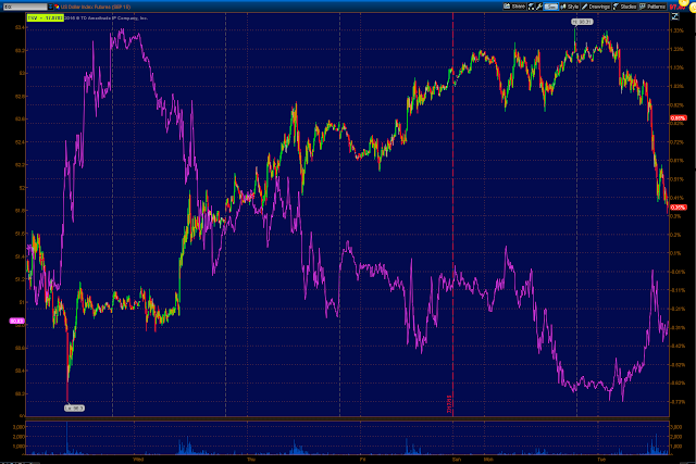
Today's move in the USD/JPY (beyond the 1% loss or biggest loss on 7 weeks for the $USD) has had this effect on the Index futures (ES/SPX futures), again the shadow telling us there's something around the corner.

Yesterday the posting of the exact same chart, USD/JPY vs ES has the exact same near perfect correlation, the only different is today the USD/JPY's decline forecast last week, and especially yesterday has taken place and as expected, pulled SPX futures down with it.

As for the EUR/USD which I also saw as reversing trend, but to the  upside looks more like this...
EUR/USD downtrend sees a big reversal to the upside today, in both cases of USD/JPY decline and EUR/USD advance, the $USD has made the biggest move down in 7 weeks (the Euro the biggest move up in 6 weeks).

S it only seems reasonable to take a look at the short term charts of the FX pairs and see what we might have in store very near term. However that's only for positioning of new trade ideas and trade management, I think the big picture is pretty well in hand as the market has moved almost exactly as forecasted on April 2nd; that's a lot of advance notice.

Before I update too many more individual assets, I want to get a better feel for the major market near term as it will have the most effect on individual assets and the best timing for their entries. This won't be a large post like yesterday, but I think a smart one to take note of for near term trade and positioning.


AAPL Chart Update

Welcome to the complicated AAPL chart. Over the last year there have been some big fund managers completely cashing out of AAPL positions and I do like AAPL as a longer term core short which is over a period of a year or more within a trend we really haven't quite entered convincingly anyway, the SPX break of its 200-day moving average would be a big boost to the transition to a stage 4 primary trend and everything seems to point in that direction. However as you may have noticed I haven't put out any recent AAPL trade ideas.

I'll show you what I like about AAPL and what makes me a bit nervous as AAPL reports tonight, but first a little rant that applies to everyone, AAPL trader or not.

I don't really care whether AAPL beats or misses, I don't think the market (or at least the pros) do either. The fact of the matter is that if the broad market averages are down, about 66% of stocks-you pick em, are going to be down. It doesn't really matter if it's a great company or a turd with a ticker. When the die comes in it lifts all boats and EVERYONE is a market genius, although that's not really true (market genius), it's just the simple truth of a rising tide lifts all boats and an ebb tide does the opposite. Remember all of those Mutual Fund/401ks back in the day and people would make a boat load of money in these mostly long only funds until a bear market came and erased all the gains and people would panic and sell at the bottom and then brag about how much money they lost at a cocktail party. That's just the truth of the market. If the major averages are moving in one direction, the majority of stocks are doing the same and it has almost nothing to do with the individual stock in most cases.

AAPL has already been COMPLETELY sold by some very large funds, COMPLETELY. So do earnings really matter to me that much beyond a very near term trade or position? No, and I don't think they'll matter to the market either in the bigger picture.

Now as to what I like and what I don't like and at the end you can se if you can guess what my trade plan is beyond a longer term core short AAPL position that we've had for a while, but absolutely NO recent AAPL calls.

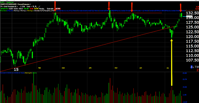
 This daily chart of AAPL transitioning from a stage 2 uptrend to a stage 3 top is a chart I like. Note how the former uptrend has transitioned lateral to make a large ascending triangle. Triangles this large are not consolidation / continuation patterns, but that doesn't stop lazy technical traders from believing that and Wall St. knows it. Most often these are tops or bottoms depending on the preceding trend, in this case it would be a top.


 This Daily chart of AAPL, which is the same as above, just a closer look at the most recent trade is a chart I do NOT like. Can you tell why? Think about the NDX charts from earlier today as to why the NDX outperformed the other averages even though it had some of the worst breadth with only a handful of stocks leading it higher due to its odd proprietary weighting schedule. You can pay $10k a year for a NASDAQ subscription and get the weighting schedule, but in the past, when AAPL was the big component in the NDX, it was worth approx. 20% of the average's weight meaning that it was worth about the same by itself as the bottom 50 weighted NASDAQ stocks combined. If you took those bottom 50 NDX 100 weighted stocks and threw in AAPL and all 50 of the stocks were down 2% cumulatively on the day and AAPL was up 2.5% on the day, the NDX 51 would close up +.50% even though 50 of 51 stocks closed down 2%.

Also note the head fake below the triangle at the yellow row with large volume as stops were taken out. Once again, head fake moves tend to be some of the best price-based timing indications we have and this one was purposeful in hitting stops under the obvious tringle and the psych level of $125.

In a channel buster or Crazy Ivan situation which is what this looks like, what is the most probable outcome with AAPL having broken below the support level and moved back above?

If you said a Crazy Ivan breakout/head fake ABOVE the very clear resistance area, you'd be right. Thus, near term, I'm not crazy about this AAPL chart and an AAPL (new) short position ...YET

 I do like this 1 day 3C chart of AAPL showing the 4 stages of a cycle from stage 1 accumulation on a double bottom to stage 2 mark-up and stage 3 top/distribution. However, in a stage 3 top such as the one in yellow, what is the most likely price-based timing indication telling us AAPL is ready to make a serious move lower? If you said a head fake above the resistance area just like we saw in the NDX over the last week, you'd be exactly right.

 The AAPL 60 min chart which is not as strong as the daily chart above, but more detailed and more immediate in its signals. Note the distribution with AAPL coming down and that move down was the one that broke BELOW the triangle or set up the stop run head fake pointed out above, giving AAPL short squeeze momentum, then long chasers momentum. Note the accumulation of the stops at the head fake which can be seen more clearly on the daily chart above. In addition the 60 min chart is still in line since this move.

 Coming back around to the shortest timeframes and working out as all new divergence start on the earliest timeframe and we are looking for a reversal of the 60 min chart, the 1 min chart shows a small head fake yesterday and leading negative today, but this is only a 1 min chart, the weakest underlying trade there is.

 I like the 3 min chart, it looks pretty clear that tAAPL has been sold in to higher prices and later I'll give you some proof of that, beyond our charts.

However at the 30 min chart which shows the head fake below the triangle in yellow with accumulation of the stopped out shares, we have a relative negative divergence. This needs to be stronger and then it will migrate to the 60 min chart and take care of that troublesome chart, but in the meantime, until then, I suspect whether earnings are great or stick the joint out, they are going to try to lift AAPL above the daily chart's range as that's where there will be demand and the best AAPL exit for remaining long shares in large institutional accounts.

So, how would you play AAPL knowing what you see above?

My thought is, "I might miss the trade with the market getting as ugly as it is, but I think the highest probability for AAPL is a break above that very obvious resistance zone just like the NASDAQ-almost a carbon copy and that's where we'll get the best signals and head fake with the best entry and lowest risk.

That's where I think the highest probabilities are and that's what I'll look for unless something changes between now and then. By the way, failed breakouts see some of the fastest/sharpest reversals to the downside so an entry on a head fake move is not only well timed and excellent positioning, but leas to a failed move produces a fast reversal.


USO Update

I'll get to some of the more anticipated updates, I just want to give them a much time as I can to get the most information I can, especially with those reporting like AAPL after the bell.

As for USO, long term members probably know what the gist of expectations are, newer members probably don't so I'm going to just briefly touch on them, let you see the most current charts and what I'm looking for as there's a partial/Speculative USO 8/21 $17n cal trade idea out there that I would add to if I saw the right mix of scenarios come together.

 This is a base-like structure (stage 1) that appeared after the downtrend from last summer's H&S top/distribution and downtrend in oil, then it turned sideways indicative of a base. Speaking of head fake moves, March 18th saw a stop run below support which immediately led to the bounce above the range which we expected to come back down in to the range allowing crude to be accumulated at lower prices and the base to strengthen. Crude finally did come down as we expected with a break of the range(chop) around $19 about 2 weeks ago. I've ultimately been looking for a move down toward the $16.00-$16.50 area for the base or signs the base is finishing up, which should create a primary trend reversal to the upside in oil, but as with any asset, we want strong confirmation of our expectations before entering positions.

 Locally and near term it looks like Crude has been consolidating in this area for a bounce/gap full kind of move and that's what the USO call position is all about.

Remember those head fake moves which would be below support and tag stops, that;'s what looks like happened at the yellow arrow and the day before as volume increased as intraday trade hit stops.

 The short term intraday 1 min chart has a decent positive divergence in the area where our head fake would have occurred.

 This 5 min USO chart also looks to be more positive in the same area,

At a 30 min chart, there's no such divergence and this is much more in keeping with the move eventually to the lower end of the large range.

 The 60 min USO chart confirms. These are the charts we want to see go positive near the lower end of the range and that will set up a possible long term , primary trend long position.

Generally speaking there's a legacy $USD arbitrage correlation between the $USD and $USD denominated assets such as oil.

If you saw yesterday's FX-Market Correlation / Divergence then you know I'm expecting even more downside in the $USD in coming days, which means...
 This rough inverse correlation between the $USDX (candlesticks) and Crude futures (purple) on a 60 min chart or...

A closer look on a 5 min chart, "should " see the $USD make a move lower and as such crude higher. Of course there are extraneous events such as the recent Iran talks/deal, oil inventories of which we have one tonight after the bell (API) and another tomorrow morning at 10:30 a.m. (DOE/EIA Oil Inventories). However for the most part, I'd say the probabilities favor a bounce in crude.

I don't want to add to the USO call trade idea which is half size/speculative until I see some stronger charts that really stand out which means we could miss the trade in waiting for that stronger confirmation, but we still have a partial position and this really isn't a large trade, more of a gap fill/./bounce.

I think it's worth waiting for, if the charts really start to pop, it's probably worth taking a look at the extra risk (add-to), if not, then I'm content to let the current scenario play out, however once again, you saw the posts yesterday, I do expect the $USD to move lower and that is a big influence on the price of oil which moves opposite the $USD for the most part as seen above.


Market Update: IWM Can Still Bounce

When I say the IWM can still bounce, personally this is not a trade I would try to be catching (bounce), it sets up the trade I would try to be catching, (SRTY dd to/IWM short in to some price strength).

The last bout of selling with the USD//JPY taking a nose dive (I wish I had some graphics to put on the USD/JPY chart of lemmings going over the cliff as that's what my twisted mind saw looking at the chart-little animated lemmings happily marching over the cliff-like sell off).

The charts since that dump look like this so the IWM can still bounce, although a few more of those and the bounce will be a lot lower.

 SPY 1 min intraday with some 3C support, it's not a big divergence, not much of anything to look at right now.

However there was some pretty hefty damage done as you can see on a simplee 2 min chart as it is fast enough to catch the market action more immediately.

As for the SPY 5 min chart, well it speaks for itself, that is ugly and whether we bounce or chop around a bit, there's very likely no coming back from that. It seems the bounce we expected and the failure of that bounce is pretty well in cement, it's just the particulars which I'm less interested in than being ready for the trend which for the most part, I'd say we were as of last Friday.

 QQQ 1 min similar to the SPY intraday

 And similar to the SPY as far as damage.

 The IWM is more in line, this can do damage to the chart that can support a bounce and has done a little, but it can still support a bounce, the issue is where/when as the IWM can certainly bounce from a lower level than here.

 IWM 5 min bounce/positive relative divgerence still in place.

As for the market, breadth pretty much shows you what's happening slightly in advance.
 The NYSE intraday TICK breaking the downtrend channel. Note the sell off looks pretty extreme in ES, but it didn't hit any extreme TICK levels , I would say the reason is because the selling has been occurring all last week in to higher prices.

And the TICK trend which is negative as seen earlier this morning, but has a slight reprieve currently.

Again, choppiness, bounces, etc... I'd say we've cleared stage 3 and are in to stage 4 decline.