Monday, June 4, 2012

After about a 3 week large positive divergence (almost a month if you count the positives from May 7th to the 15th or so) and after 2 days of improving leading indicators and solid 3C signals, it looks like we are finally on the verge of what could/should be a stunning upside move.

Here's where we stand tonight...

 ES is moving higher, 3C doesn't look bad.

 Since the close the Euro has moved higher with good momentum, making this 2+ days of upside.

 Here is the opening of FX the previous Sunday and yesterday, the trendline is the area I posted earlier today where a Euro short squeeze would likely take effect, we are very close and at this pace could hit it tomorrow.

The SPY bear flag/pennant, we knew there would be a head fake move, we got at least 1 and I suspect the break of the 200 ma yesterday was the second. The size of the positive divergence often is correlated to the size of a head fake move, remember a head fake move is used as a primer to get the market moving initially on short covering. Today's price action did not fall apart as most traders thought once the 200 was broken, instead we saw a bullish hammer (reversal/support ) candle form today. With the leading indicators gaining momentum, the 3C divergences being positive in to the head fake move (exactly what I had hoped to see with a downside move last Thursday that never materialized), this is exactly the confirmation I wanted to see, I couldn't ask for better.

News is pretty quiet except right around the close, Egan Jones downgraded the UK from AA to AA-, yet the Euro held up very well, no so on Egan Jones last sovereign downgrade last week, can you guess what the difference is now? Two hints... 3C and leading indicators.

OK, I'll come right out and say it and my long term members know this is true, Wall Street controls the near term cycles, they plan them and execute them.


I'll update again if anything interesting happens.

Merkel/Barrosso Press Conference

Here are the highlights...


  • MERKEL SAYS WE NEED MORE EUROPE, NOT LESS IN EURO-ZONE (sounds familiar)
  • MERKEL SAYS WILL DISCUSS EUROPEAN SUPERVISIONS OF BANKS AT EU SUMMIT, BANKING SUPERVISION IS A MID-TERM GOAL
  • BARROSO SAYS WILL PUSH FOR BANKING UNION AT THE COMING SUMMIT
  • MERKEL SAYS EU NEEDS ANSWERS SOON ON POLITICAL UNION
  • MERKEL SAYS DISCUSSING EU BANKING SUPERVISION WITH BARROSO
  • BARROSO SAYS EU SHOULD DISCUSS ELEMENTS OF 'BANKING UNION' -> we agree to hold another conference at a future time
Meanwhile, even though we had strong signals around the May 15th area, I had NO IDEA how the Euro/USD might reverse, I'm still not sure what is causing the initial stages of a reversal beyond the evidence we have that Wall St. or Institutional money in general has been active in underlying trade which can't be seen via price alone (until this last Friday). I suspect that whatever the "Catalyst" is, it will have little to do with the real reason which is smart money's manipulation of the market which they can do on a sub-intermediate and even intermediate trend, for example the October rally off the lows had been accumulated since August of 2011, that along with dishonest or misleading at best, economic data was pretty much enough to keep the market moving higher since the October low-just to give you some idea of what they can influence, although their operation are usually much smaller (days-weeks), but they can effect longer trends than one would think.

The Euro'd record short interest has to have the Euro shorts a little panicky right about now, not because of anything in Europe actually getting fixed beyond press conferences, statement s and some policy action that always seems to fall short, way short; but rather they know that record short interest is a juicy set up that Wall Street most likely won't ignore as there's a lot of money to be made shaking them out of the trade.

As for the currency pair...

 The Euro didn't seem to react to the press conference, but it is still acting well.


 Friday the Euro was up, the dollar down, I suspected the NFP, but now I suspect the NFP may just have been cover. The green arrow is the FX market open last night and the Euro has moved higher since.

 Here are some local levels of resistance, probably why the Euro is a bit flat right now as it would need to fuel up before challenging them.

 Here's the daily chart, look how close we are to the start of a strong Euro short squeeze with lots of upside momentum the last few days.

 Euro 1 min leading very positive today, the negative divergence at May 21 saw a head fake move at the yellow arrow just above resistance, remember that head fake moves almost always precede a reversal. Note the change in character in 3C last week.

 The 3 min chart with the head fake move in yellow, a clear change in 3C character and price has begun to respond.

 The 30 min, with a leading positive divergence in th Euro.

 The USD 2 min-note the deep leading negative divergence just before May 15th as discussed in last night's post, then a small accumulation patch that ran out of steam quickly as distribution set in to a wicked leading negative divergence. This is what I mean about having a longer term divergence in place and then coming back to the short term charts for better timing.

USD 50 min leading negative around the 15th of May , accumulation before that near lows and the $USD has not been able to recover, still leading negative.

A Euro short squeeze and $USD sell-off look like they are right around the corner.

The last move up had good breadth

 This is the NYSE TICK Index, typically a strong move is around +1250, that one was +1661 (the Tick Index is all of the NYSE stocks that are advancing per Tick less those that are declining), essentially the move wasn't a few heavily weighted stocks in the average, but rather a lot of stocks moving at once, this is a positive indication as market breadth tells us if the move was hollow or supported, this was supported.

This was the last time the TICK hit a level like that, essentially it was the strongest broad market move in the last 850 or so Ticks.

Follow up on the market update/3C lesson

Note how the QQQ really responded to that last positive divergence around the 1:30 p.m. lows in which the divergence was strongest. Also note the flat area of trade and rounding shape intraday in prices, this is a typical accumulation price pattern. This is why I'm always a little nervous of quiet markets, that tends to be when institutional money is up to something, unlike what Technical Analysis teaches, which is primarily...

that this spike in volume is smart money buying, they are not that dumb as to let the world and especially the predatory High Frequency Trading programs (which try t front run large institutional orders, forcing smart money to pay higher prices for shares) know when and where they bought. In fact if we look at that volume spike...

 The volume spike was on a small 1 min churning event, you can tell by the candle with the volume as it has a long upper wick which is higher prices being rejected. I don't think it is material to our analysis other than an intraday curiosity.

There was no negative divergence at that area and price/3C are in line right now, even though 3C is much more bullish than where price currently is. They may run a test of support at Friday's close, a dip below it, whatever it is, it is most probably some manipulation scheme. We'll likely find out soon enough.

Market Update

We have a lot of members using 3C and trying to understand the indicator, so in this update as it's a little quiet in the market I'm going to try to show you some concepts that will help you. Because of what I learned in reading probably 70 Technical Analysis books, attending multiple conventions, etc, it took me quite a long time to understand 3C. I started with daily divergences and those are very strong, the longer the timeframe the stronger the divergence, but when I moved to intraday, there was a lot of de-programming I had to do and that was only possible because I had seen years of 3C working and how it works. What Technical Analysis teaches about market accumulation and distribution is very limited and often wrong, this is why there was such a steep learning curve. The real powerful signals are often found on intraday charts, but every market trend acts differently so you have to put in the hours to understand as you go through different market environments. Understand that 3C's numerical value is totally useless, it is a divergence indicator, 3C's level compared to price is also unimportant unless you anchor it by comparing to a relative price level in the past. Whether 3C is above or below price isn't what is important unless it is in the context of a relative comparison of 2 (or more) points in time including the present. Leading divergences are always stronger than relative divergences unless the relative divergence is just absolutely huge. Finally don't try to squeeze signals out of 3C, institutional money is not always active or especially active which is where we find our edge. If it doesn't jump off the chart, ignore it. The premise is 3C is comparing how much money flow there is at several relative points. If price is significantly lower than a month ago and 3C is significantly higher, it is telling you there is a lot more money flow in the stock currently and that is a valuable signal. If price is higher now than a point in the past, but 3C is significantly lower than you know money has been flowing out of the stock, smart money has sold in to strength or shorted.

The size of the divergence also plays a role, during the March-May top a quick 5 or 15 min divergence could turn prices, but in the current situation when 3C has been positive for a long period of time, this means there's something much bigger going on and once a positive divergence is established on a long chart like 15, 30 or 60 mins, you often have to come back to the short charts 1, 2, 3, 5 min to look for strong divergences that give you a hint that a move is about to start.

You also have to have a general understanding of how Wall Street manipulated Technical patterns as technical traders started really using TA around 2000, Wall St. knows what they are looking for, often gives it to them (getting their confidence up) and then traps them. An understanding of what Technical traders look for is also an essential part of putting together the pieces and that is what 3C is all about, putting together the pieces. The name 3C stands for something that jumped out at me in one of Don Worden's books, I believe, "Street Smart Charting", 3C= "Compare, Compare, Compare". If you have used TA all of your trading career, what Don says in that book will stun you, you won't like it, but he'd been on Wall Street for 50 some odd years designing their indicators and systems, he understands how the market works, we have taken it a step further as the market has changed since he published those books about 10 years ago. Each timeframe has a different look back period so they won't look exactly the same, but it is the trend of 3C that is important in confirming through timeframes.

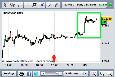
I forgot to add the DIA to the update, but it is leading positive today on the 1, 2, 3, and 5 min timeframes so it looks good.

 IWM 2 min longer view. What is important on this longer view is that price has made lower lows, but 3C has not, it has made higher lows, there's more money in the stock now than there was at the 31st. There's also a leading positive divergence today which is another important signal that should be looked at intraday (closer).

 The same chart zoomed to today, as prices touched the intraday lows, 3C which hasn't made a lower low all day went very positive at the last low and is now leading positive as it is higher than the open when prices were near the intraday highs, this would suggest lower prices have been accumulated all day, but especially at the last dip. I find these leading positive divergences, especially quickly formed and on longer timeframes are usually worth trading, GLD was an excellent example last week as a 30 min chart was leading positive at the lows of the day, GLD made the biggest 1 day jump since Jan. of 2009 Friday. Those are signals I don't ignore and often will trade.

 IWM 3 min longer term trend, I didn't mark every small divergence, the important information is 3C much higher than the 23rd when prices were much higher than present, this i a large relative divergence because we are comparing between 2 relative points (both price and 3C).

 The 3 min chart is leading positive at the same place as the 2 min chart before-confirmation and a new high for the day, thus leading positive, which shows increased institutional activity. Although the timeframes are close-only 1 min between them, they are comparing totally different look back periods, so there is a trend in place in underlying 3C activity.


 IWM 5 min is trying to hit a leading positive divergence by making a new high on the day as price is near the bottom of the range. Strong signals on shorter charts eventually bleed to longer term charts, giving you an all around stronger signal.


 QQQ 1 min long term view shows the trend, the distribution at the May 29th head fake/false breakout of the pennant, which is what TA traders wanted to see (a failure of a test of resistance, they are taught to short these failures). The trend since is clear and that is the most important aspect here.

 Close up (intraday) 1 min chart shows 3C has made no new lows with price and the same area seen in the IWM as leading positive is the same in the QQQ, these are two completely different averages , yet they have the same signal at the same time, this gives you stronger confirmation.

 QQQ 2 min shows a positive relative divergence at the first long arrow, then increased strength in the divergence at the second arrow at what appears to be some intraday support, the last touch of the same area sees a stronger leading positive divergence, again more confirmation at the same time. Normally the 1 min chart would look stronger, but the look back period catches different moments of their activity, plus you have to consider the 1 min chart's trend which is very strong.

 QQQ 3 in confirms at the same area, no new lows in 3C, instead higher lows in to a leading positive divergence, also note the flat area in price, often where smart money operates as traders lose interest and aren't paying attention to a dull market.

 QQQ 5 min is making a new leading positive for the day as it passes the levels at which price was at the intraday highs, the shorter charts have passed on strength to the longer chart.

 SPY 15 min overall trend, you can see distribution during MArch, especially strong at the 2nd, then even stronger as 3C is much lower at May 1 which also shows a relative negative divergence at the red arrow, there's the positive divergence mentioned last night starting May 7th which is seen in all of the averages and many industry groups/stocks. The overall 3C position at the pennant is higher than it was when prices were near the top's high, a leading positive divergence in the longer term trend, compare the two relative points at the yellow trend line.

 SPY 1 min trend-keep in mind this positive trend is at a likely head fake move below the 200 ma and the bear pennant, this tells us it is a likely bear trap.

 SPY 1 min intraday making the same new leading positive highs at the same time as the other averages.

 The 2 min chart intraday shows the same activity in the afternoon and is now leading positive, increased institutional activity. Think about supply and demand and ask yourself why there would be increased positive activity here?

 The 3 min trend in the bear pennant, the important signal is today's stronger leading positive, again compare two relative points at the white boxes on price.

 SPY 3 min is making it's way to a stronger leading positive divergence, note the strength of the relative divergence at the large white arrow and compare to the other averages at the same time showing the same strength.

Finally the SPY 5 min trend is leading positive, again as the afternoon wears on the divergences in all of the averages become stronger.


FB Calls

I just double checked the original FB position, it was very speculative so I have some room to add the July calls, I'll be adding some July $25 Calls.

Market Update coming up next...

FB Update

On 5/31 I entered some June $27 calls, I really don't know why I went with June, I'd much prefer July, but I still like FB here and it looks like something is still brewing. I may add a small July call position and when/if the June calls are in the money, roll them over to July. If I had no FB position right now (keeping in mind any long other than UNG in my view is to be considered speculative), I'd be looking at adding one right now and still may add a few July Calls, I'll let you know if I do, before I do.

Here's the FB charts.

 FB forming a bearish consolidation/continuation pattern-"A descending triangle", which is in the right place so traders will be looking at this as an opportunity to short FB before the next leg down which is implied by the price pattern, the only problem is these price patterns are more often than not, traps. They may not be obvious at first, but when you look back after several days or a week or so, you see these are traps more often than not. If there weren't strong 3C signals that have already worked very well in FB, I probably would have no interest in FB as it is a new issue, but that's not the case.

 The bearish consolidation triangle, note volume picked up as traders likely placed short limit orders on a break of support.

 The 1 min FB chart shows deep negative divergences o the 25th and 29th (approx.) and the positive on the 31st, which is when I entered the June calls, which were up 36% in 30 mins by the close, I didn't get in as early as I would have liked to, but that's when I noticed it. Since then the triangle has continued to mature and the divergence has as well.

 A closer view of the 1 min chart, what is interesting is the negative divergence on the 31st is VERY small, much smaller than previous negative divergences that have taken FB lower. Also 3C never made a new low and as we reach the area in price where I would have preferred to enter, the positive divergence is even stronger.

 The 2 min also shows negative divergences that were quite large and took FB lower, compared to the negative on the 31st, they are much larger, the 31st negative is barely noticeable, Of course the stronger positive since Friday is also attractive.

 The 3 min chart needs to commentary.

 Nor does the 5 min

The 30 min doesn't show the previous negative divergences, they weren't strong enough to make it to the 30 min chart, instead 3C shows confirmation of the downtrend, however the positive divergence does show up clearly, really starting on the 31st.

I do like FB here for a quick long trade, whether leveraged or not. I'll have to look at how much risk I have in the June Calls and see if there's room to start a July position which is what I should have done from the start.

AAPL Follow Up

 AAPL may test intraday support, but volume is rolling off which is where we often see accumulatio, especially in a flat-ish environment.

 AAPL 2 min from confirmation to a leading positive today

 The leading negative 3 min AAPL divergence on 5/31, a reason I closed the AAPL June calls to preserve those profits of 131% and as you may recall, I was looking for a pullback to roll over that position to July. The chart went from a leading negative on 5/31 to in line with the pullback to a positive divergence building in.

 The 5 min AAPL negative at 5/31, then in line on the pullback and a positive divergence building in. I think most of the AAPL accumulation would have already taken place over the last several week so I don't expect to see a huge positive divergence on the pullback.

The 10 min chart is now seeing the shorter timeframes bleed through, I like the upside confirmation, the negative on 5/31 and a large relative positive currently.

I could have been a bit more patient, but I do believe we'll have the Merkel/Barrosso press conference in the next hour or so.

Going to Add AAPL July $550 Calls

Risk Asset Update, I like what I see so far...

Friday I saw a few hints which were small, but like they say, to make money you have to see what the crowd missed and with the crowd focussed on the SPX 200 day moving average, there's a lot they are missing. The signals from Friday that were encouraging are continuing today in the Risk Asset Layout.

 We discussed several different ways a head fak move could play out around the bear pennant seen here with the SPY, one thing traders would be looking for (bearish retail) is a test of resistance that fails, we saw that on May 29th at the upside breakout of the pennant, as most traders chase price as they don't have the tools to anticipate (beyond the implications of the bear flag itself), a move below the pennant was one option we also discussed, the move on 5/31 simply wasn't very strong, it didn't close below the pennant bringing in those retail traders who come home, look at the market and place an order before heading out to work the next day. Friday's break was a perfect set up for a head fake move, especially as it broke the 200 day m.a. and when we look for head fake moves we always look for the most obvious area traders will be watching, for most traders price above or below the 200 day is what determines a bear or bull market, so that break was perfect. The sell side orders came in this morning as expected last night, but thus far it hasn't moved the market much.


CONTEXT for ES is finally improving, after the model being negative most of last week, out risk asset layout shows why it's improving, which started Friday in places few were looking.

 Commodities are starting to outperform the SPX, that's not surprising given their FX correlation and the moves in EUR and $USD, it's not because of GLD as it seems the QE sentiment has tamed a bit for now.

 Here's the same chart except I added the Euro in Blue. Remember last night I showed the record level of shorts in the Euro and mentioned that the Greek election polls went dark Saturday, this is going to cause some of those shorts to close their position as it is predicated on a Syriza win and they are now blind to those indications. On May 15th we saw some unusual activity in the Euro/$USD, I just couldn't imagine what would turn them, well it may be too early to claim they have been turned, but the last two days have seen a turn in both.

 High Yield Credit is not a conservative play, it's a risk on asset and now it has 2 days thus far of trending up vs the SPX, credit usually leads as it is a much bigger market that is almost exclusively traded by smart money, not retail. We have picked many downside reversals on bearish credit divergences with the PX, now we have a bullish one.


 Yields are another leading indicator that have served us well, as I showed you in last night's post, Yields were starting to bullishly diverge , today they have really made a move.

 The $AUD is also an excellent leading indicator among the currencies, I showed you the ROC of $AUD as it uncovers trends that aren't very visible without ROC, but ROC often shows very early changes in momentum, today those early changes are turning in to very visible bullish divergences vs. the SPX.

 $AUD the last 2 days (Friday/today).

 The Euro has finally seen some real upside momentum, I speculated this was in part due to the NFP print and dollar weakness, but that could just be a cover. The news out of Europe really isn't that bullish when you look back at their track record, but I don't think it's the news that is moving the Euro, I think the news is just a cover so financial media can tell you why the market did this or that, the real reason is Wall St. manipulation of the market. As mentioned many times before, trading is a Zero sum activity, for someone to win, someone must lose and there's too many people on the bearish side of the boat, a good shakeout would mix things up and the divergences we have seen suggest such a shakeout in upon us. This doesn't change the big picture bearish nature of the market and that's why I posted the bearish nature before I put out last night's post, but there can be several trends existing at the same time, depending on the timeframe you are looking at.

 Euro today vs. SPX.

 High Yield Corp. Credit was also shown with ROC and the slight changes there, remember once again, credit typically leads and equities follow so divergences in credit are very important. It was the big picture negative divergence in Credit that gave us good timing to start shorting the March-May top.

 HYC Credit's trend, above it may not seem like much of a divergence, but remember, it's what the crowd missed that makes you money, not the obvious that everyone is trading off like the 200 day ma break.

 I wanted to see Tech relative momentum vs the SPX stay strong in considering adding the new AAPL July Calls (I already have several, this is the June position that I closed last week for a 131% gain being rolled over to July). So far so good.


 Tech today vs the SPX shows decent relative momentum, I'm leaning more and more toward opening the AAPL July Calls on a speculative basis (meaning lower risk than usual as this is counter to the primary trend).

In sector rotation the defensive sectors are obvious and there's nothing interesting there. Financials look like they may be trying to get a foot hold to come back in to rotation, Tech though is the one I was most interested in. Since the notion of 1 final very strong shakeout bounce, I have been of the opinion that AAPL and Tech would lead it, so I like the look of Tech rotation.