Friday, December 28, 2012

Early Closing Take

Well I'd much rather have the NASDAQ call position than a NASDAQ put position going in to Monday.

So far some interesting things, HYG-High Yield Corporate Credit doesn't show this as well on a chart, but watching it real time in to the close, it was moving up off the lows on some very heavy volume. High Yield Credit  made its ONLY upside move of the day from 2:30 through the close and that includes moving up from 3:15 to 4 p.m.

FCT which has been more on the bearish side intraday this week closed off its lows and ended relatively well vs the SPX.

The Euro and EUR/USD stayed almost perfectly flat the whole day, including the last 30 minutes, the $USD made no move connected to the last 30 minutes of trade at all. The Aussie ($AUD) held up very well, it's coming off lows from Wednesday and didn't skip a beat vs the SPX. The $AUD is in what I would call a bullish short term pattern, at least on a relative basis, longer term (and not even that much longer) it's in a very obvious negative divergence with the SPX so that still fits well.

I don't know what Yields would have done, they were closed before the closing dump. Commodities also held up well, they seemed to be much more interested in the currency correlation than any Fiscal Cliff concerns.

Here are a few of the charts, I still haven't had time to take a thorough look around, but as it says above, "Early Take".

 Commodities over the last 6.5 days are definitely showing more risk appetite than the SPX, a rare positive divergence in commods, usually they are negative vs the SPX. To the far right you can see how commodities held up as the market went south on the news Obama wasn't bringing anything new to the table.


 The longer term leading negative position in the $AUD, a bounce in the SPX with the $AUD staying put would really highlight the divergence.


 The $AUD intraday today held its ground.


 The EUR/USD seemed like it was holding steady waiting for Fiscal Cliff news, but when Fiscal Cliff news came, it barely budged.

 High Yield Corp. seeing large volume as it bounced back off the lows in the afternoon, it was more impressive to watch live.

 The same HY Credit as above, except on a 60 min chart with 3C shows the longer term negative divergence sending it lower, but...

Look at the intraday chart for the same, it was leading positive and continued so right through the close. This doesn't make sense.

 High Yield Credit saw a move up in to the close, you'd think the move would be down and in to investment grade, so again something isn't sitting right here.


 Even as the TICK finally saw some extreme readings, it stuck me that it wasn't a straight down trend, there were upside readings during the sell-off that were +1000 and not over a 1 second period, there were other positive readings in the +750 range which is odd on a move like that.

Here's the same TICK chart with the SPY in red overlaid. Notice even earlier when there was barely any range, still Tick followed the SPY, but at the EOD, it didn't.

I find it strange that so many risk assets, in fact any risk asset at all, acted so well during this period, it's almost as if stocks alone were selling off while the riskier assets like Credit (because of the leverage) either held up well or even advanced!

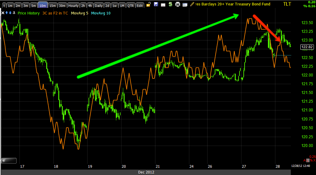
As for the averages, these are the same 3 that were the only 3 that held up all day today.

 DIA 1 min , note the negative divergence yesterday worked perfectly with this morning's gap down, yet in to today's close it's nearly the mirror opposite. Yesterday the market is moving up and we see an EOD neg. divergence that tells us it's likely the market gaps down today which it does and today as the market sells off it is in a leading positive divergence, take that with what we see above and something doesn't sit right with this afternoon sell-off.

 The NASDAQ futures that held up all day today and especially in to the close.

 And the QQQ 1 min which held a leading positive position in to the close.


As well as the QQQ 2 min which I show a longer trend, but you can see today's action as well.

More as I dig it up, Enjoy your weekend!


Continued to be surprised by the NASDAQ

Even in to closing trade, the underlying trade in the QQQ as well as NASDAQ futures are holding up amazingly well.

Quick Market Update

The same averages that have been leading all day are the same ones holding up now, the QQQ 1 and 2 min have barely budged from their positive position, the DIA 1 is holding up and the NASDAQ Futures 1 min 3C chart is holding up.

Also holding up was the latest positive divergence in EUR/USD. TLT hasn't bettered its 3C position since the volatility on the downside which is strange, glad to have closed the UVXY short yesterday, those are in line.

I'll let you know if I see anything else interesting or standing out.

Tick Data

TICK finally went nuts after nothing most of the day, right at 3:15, I'm guessing as the news Geithner would be there, TICK hit +1250, when CNBC said Obama has no new proposal, but is looking for a counter-proposal, then we saw some -1250, it's mellowing out now.


No new Offer from Obama, wants to see if they have a counter offer

Volatility on

Decided on Jan QQQ $65

This has to be a pretty small position, it's obviously for a quick trade (hopefully 1 day) and is speculative to start with, but if it were beyond the smaller size it is it would mess up the hedge and put too much emphasis on the long side.

On the SPY Calls

Everyone's portfolio is different so not every trade or position size is appropriate. I can't possible run a portfolio the way I want to and post on WOWS as well as answer emails, but I do try to keep good habits and I'm pretty good at guestimating position sizes for risk management and portfolio balance according to the way I see the probabilities and the trends unfolding, as well a hedges that often are also meant to not only hedge, but provide two profitable trades (the actual hedge and the trade it was hedging).

In light of all of that, I wish that I had opened a QQQ call position rather than the second SPY, so I'm going to look at adding a little QQQ call position if it can be done without disturbing the hedge balance between the short term trend expectation and the longer term shorts set up.

I just like the way the Q's are acting.

Leading Indicators-Initial Signals

Again this isn't a long enough move to call these signals solid or high probability, but they are something.

High Yield Credit, both HY and Corp. are reacting better than the SPX, the Euro is holding up better than the SPX, FCT and commodities are both holding up better, and FCT is actually giving a semi-impressive signal to the upside.


NASDAQ and EUR/USD Futures going more positive


What we get today is probably not very important, it's what we get Monday.

Quick Market Update

We can only do a quick update because the move hasn't been very long, but there are some positive signals which is how every positive divergence starts.

 DIA 1 m.

 IWM 1 m.

 QQQ 1 m.

 QQQ 2 m.

 SPY 1 m.

 TLT 1m.

NASDAQ Futures 1m.

TICK is Just as Blah - Volatility Isn't

There really hasn't been any underlying movement today, I suspect volatility is up as hedges are being put on, any large fund with significant long exposure saw the volatility yesterday and probably thought,

 "There's no way we can move 100k shares without crashing this position"

So the next option (no pun intended) as we have seen the VIX moving higher  is to hedge the long position with options, 2012 hedges are being rolled in to 2013 and many institutional traders who'd rather be flat or have less exposure right now are simply hedging that exposure, although this is nothing new, it's been going on the last several weeks, probably a month.


 This is the daily VIX with 20/20 Bollinger Bands applied, whenever a market average or other asset (but especially market averages) walk the upper band of Bollinger bands on a daily chart it shows extreme strength, the same goes for walking the lower band, extreme weakness. This is a reflection of big money trying to hedge their event risk (assuming no one actually nows the outcome of the meeting between the President and Congressional leaders).


 The 3C daily chart shows a strong positive divergence right at the pullback area in the VIx around November, this is when protection became cheaper to buy.

Here's the NYSE TICK chart for today up until the market started moving several minutes ago. As you can see, the range is mostly between -500 and +500 with a lot of time spent near Zero, there are very few extremes, this is a good measure of intraday market breadth and tells us the buyers/sellers are either evenly matched or more likely just not there and siting on the sidelines.

Some Movement Finally-QQQ and Volatility

OK, about an hour before Obama and the top chiefs from the House and Senate are scheduled to meet, the market is making some moves which is great, it's better than nothing and it gives us something to watch and see how the underlying tone behaves. As far as intraday trade, we still have an eternity right now, especially considering how fast and volatile the market proved to us it can be in the last week.

So volatility...
 You can see how much clearer yesterday's short term signals were vs. today's, the negative divergence in UVXY that kept our short trade not only alive, but in the money by $2.00 a share, were quite obvious.

Today the green arrows mean that 3C is moving with price, there are no divergences and thus the market is in a holding pattern with no large transactions either way taking place. However very recently we have a 1 min small leading positive divergence and it's moving the market and UVXY the way it should.


 At 2 mins, again yesterday very clear signals, today UVXY is giving no signals and is actually a bit negative recently so the 1 min chart as of now isn't very strong.

 QQQ 1 min has been leading positive for a good portion of the day, it finally leapt to the 2 min chart below.

And we have a bit of a leading positive divergence there too, so now hopefully we get some good movement and some good signals out of this.

Another AAPL Update

Being there have been intraday (1 min) continuing positive divergences in the QQQ that have also moved to the 2 min chart as well and positive divergences in the NASDAQ futures not only on the 1 min chart, but the 5 and 15 min charts too (Futures charts seem to be more influential when comparing  the same timeframe in a similar market average like the NASDAQ 100).

 I figured I'd take another look at AAPL and see if it was part of the equation in what's going on in the NASDAQ today. Short term (and that's where we are hung up) the answer seems to be a resounding "NO".

 The short term intraday AAPL chart from yesterday afternoon and including all of today. I could find a divergence or two in there, but this IS NOT the kind of divergence that we look for to give us an edge, there are a lot of charts that look like this and most of them are going no where.

However there was an interesting finding...

 Take a look at the AAPL 15 min chart, this is a significant timeframe just on a single divergence, look at what that negative divergence did to AAPL, sending it from $594 to $501 in just about 2 weeks.

However even more influential is the trend of a 15 min chart (or any timeframe really) and there as I showed earlier today, we have a leading positive divergence. I suspect this is preparation for the 3rd trend, I showed it to you in the market as well and it dovetails nicely with the first and second trends.

 If we look at AAPL's 15 min chart and focus on TODAY ONLY, look at what we see, a leading positive divergence on a pretty long timeframe that doesn't typically move this fast in a single day.

 Remember the bearish "Bear Pennant" and our expectation that we'd see a head fake break below it in AAPL, we saw the break below, thus far it is a head fake because AAPL should have started a whole new leg down on the break below the price pattern, instead it's lingering around support.

 Yes, support as seen on this daily chart. This is VERY obvious support so what typically happens before any move to the upside, that's right, all of the orders and stops that are piled up just below support are hit and taken out (as you saw and will see in my continued Head Fake article, there are more reasons than just that).

For traders watching AAPL and it is one of the most watched stocks if not the most watched, there's one other price pattern suggesting those stops get hit and we have a head fake move to the downside to start the third trend, which just so happens to fit perfectly with market expectations! This is what I meant when I said the different trends dovetail in to each other and give the next trend a jump start.

This is the other pattern traders are watching, a bearish descending triangle which is a consolidation/continuation pattern which is expected to continue the previous trend which was down, so traders have another reason to fall for a head fake move below support, all of which can be used by us to buy AAPL at great prices, low risk and very high probability chart indications.

In any case, the point was the sharp 1-day leading move up in AAPL on a 15 min chart today.


AMZN UPDATE

I've been trying to get to this one all week, might as well post it now.

 Looking at a 5 day chart, the change in character is obvious, as volume dropped over the last 4 years, volatility has increased, increasing volatility is one of the last things that you see before a top and decline.

 On a daily chart, through 2012 we have a double top of sorts, I have addressed these patterns numerous times, Technical Analysis teaches that the second top should fall short of the first and then drop, but Technical Analysis has been being used against traders for a good 10 years and more and more every year. The most common outlook for a double top is something like we have right now and then a breakout above the top's resistance range which creates a bull trap as bulls see this as a new breakout high and we usually see 3C dropping fast as smart money sells and sells short to retail. Often we can see this in advance of the breakout, many of our core short Q1 2012 trades were set up this exact way.

 The daily chart is hitting a new leading negative low below the accumulation of the 2009 lows, this gives us a pretty good clue as to what would happen if AMZN saw an upside breakout.

Although I plan to go in to detail in part 2 of "Understanding the Head Fake Move", essentially this traps retail longs, gives smart money shorts the best entry possible and when price drops the longs who are trapped at a loss begin to sell adding more supply to the market which in turn sends the stock down even faster, which brings in more shorts and provides more supply, etc. It's a cycle, it's a snowball effect.

I prefer to have a partial short in AMZN now in case we get a black swan event, but in my risk management BEFORE I ever enter the trade, I leave enough room to add to the position at the breakout highs, that is ultimately the best price, the lowest risk and as long as 3C looks the way it does now, the highest probability trade you can enter. If you are more patient you don't have to enter a partial position now, you can just wait for the set up, if it comes you have an incredible entry, if it doesn't, you didn't lose anything except some potential.

 The 60 min chart shows AMZN negative in the area.

 I didn't draw on this chart because it doesn't need it, this is a 15 min very long trend of 3C, note where 3C is now vs the last high of 2012, that should tell you something about what has been happening in AMZN this year.

 At 10 min AMZN has basically reached an in line status so we want to look at AMZN from the fastest charts now. We look at the longer charts for the strategic view and the shorter charts for the tactical entry, it's kind of like the longer charts are a decision to declare war on Iran and the shorter term charts are the war plan.

I now that's a weird analogy, I just saw Iran flash across the screen.

 The 2 min chart has a leading positive divergence, I didn't have to draw it in, it should be pretty obvious.

So does the 5 min chart and you know the 10 min is at reversion to the mean. You might have noticed this is very similar to the market charts and 90% of the time stocks move with the market.

In fact, the market has the most gravitational pull on any particular stock you might want to trade, the second most powerful influence is the Industry Group as they rotate in and out of favor. It may seem hard to believe, but the actual stock has the least influence, sure there are days when news or earnings are all that count, but we are speaking in terms of generalities.

So when looking for a trade, you are best off starting with the market, maybe doing a little Industry group analysis and then look for the specific stock that fits your market outlook. At that point work from long term charts to short term charts to analyze the stock and from short term charts to longer term charts to set up the entry.

EUR/USD

Currencies are also flat, in many cases it's a "Chicken or the egg" situation. "Are currencies flat because of a market event or is the market flat because of a currency event.

I would say it's probably safe to assume this is caution ahead of any potential Fiscal Cliff statements, however the one thing I've learned over and over again is, "When the market is dull, it's dangerous". You always hear me talk about this with the analogy, "It's like the kids are too quiet in the room next door".

While the media is spoon feeding us reasons why the market made every move (or no move) , we've often found that during periods like this the market is up to something, it's just we can often see it and right now, other than the few indications I already mentioned, there isn't much.

However I do find this EUR/USD chart interesting. Remember when this pair moves up it gives the market a boost, when the pair move down it weighs on the market.

It's not just the market that's flat intraday...
 The market open this morning and the EUR/USD ever since.

However when looking at the 3C chart of the pair, you see the negative divergence sending it lower, the positive sending it higher off the lows and right now a leading positive divergence. Interesting.


Treasuries

Treasuries seem to have a little short term information in them, but also this is ANOTHER example of the multiple trends playing out at once.

I don't know if Smart Money has an idea of what is going to happen, we know that some of the best traders in the world are Congressional Staffers so that would imply that while the TV tells us everything is in the air, these guys have an idea on what is really going to happen and I'd expect some of that to filter to Wall Street.

Here are Treasuries/TLT which are considered the "Flight to Safety Trade", so these should move more or less opposite the market, when traders are afraid they take money out of stocks and put it in Treasuries, when they are feeling confident about the market moving up they take money out of treasuries and put it to work in stocks. So the price action in treasuries should be roughly the opposite of the market, but more importantly for our purposes, the underlying 3C signals should help us (at least act as another piece of evidence or piece of the puzzle) to determine the outlook.

 Starting form the short term intraday 1 min we see the negative divergence in the afternoon, this is the exact opposite of the market's positive divergence in the afternoon, the market moved up and Treasuries moved down. Remember at the close on the 1 min charts the market averages had negative divergences suggesting early weakness today, TLT had a positive divergence suggesting early strength today and it gapped up just as the market gapped down.

Currently the 1 min chart is exactly in line with price and this is the frustration I'm dealing with in most assets in this timeframe at this moment.


 Look at the 2 min timeframe though, this is still intraday, it's still a signal that could easily play out today or just get worse and create an expectation for an even larger move just as futures did overnight.

We see a negative divergence yesterday afternoon which panned out and a leading negative divergence right now which is even worse.

 The 5 min chart is also showing a leading negative divergence. If I had confirmation in a lot of places, the way I would interpret this chart is that the pop to the upside (the SPY Jan. Call trade) would last more than a day and would be quite strong, probably even stronger than I'm currently imagining and the market tends to exceed your expectations even when you are exactly right.


 Now at the 10 min chart, this is where we have some transition and I believe separation between the two trends, this isn't that negative so I wouldn't expect this to reflect any of the market upside, it's more of a transition point for the second trend, the downside move which is expected to be longer and larger.

I showed you virtually the same thing yesterday in Financials using FAZ.

The 15 min chart is leading positive, this means the longer term players are positioned for a defensive play, expecting market downside and Treasuries to benefit from the flight to safety that causes.