Thursday, April 9, 2015

Daily Wrap

Well what can I say, we are headed in the direction we should be, but running in to an options expiration Friday tomorrow which generally means that the market will open right about where it closed, stay within a range close to that until 2 p.m. and then do as it pleases and we get some of the best 3C data of the week allowing us to put out the Week Ahead forecast, although next week is the bigger monthly op-ex max-pain pin.

Yesterday numerous indications pointed to a move higher today, we have known about the badly lagging 3C signals in the IWM so today's weak relative performance shouldn't be a surprise.

Intraday, we had a great example of why volume is important as I said the following in this morning's Market Update-IWM intraday upside reversal:

"be on the lookout for a large volume spike and a bullish candle on one of the intraday timeframes like 5, 10 or 15 min for example, I suspect it's too early in the day for the IWM to hold these losses without so much as an intraday bounce."

Before I could even finish the post, exactly what I warned to look for as a downside intraday flame-out or capitulation (selling event) took place.

From the same post....

" This is the kind of intraday candle and volume I was talking about that just occurred on the 15 min chart, it's essentially an intraday flameout and we should get a bounce from this level."

Remember what I said earlier, last night and over the last several months about the lost art of volume analysis and how it will be more and more important as we move forward as shown in the Broad AAPL Update ? ALL OF THESE EXAMPLES ARE FRACTAL IN NATURE MEANING YOU CAN USE THE CONCEPTS ON ANY ASSET AND IN ANY TIMEFRAME WHETHER INTRADAY LIKE TODAY OR ON MONTHLY CHARTS LIKE AAPL.

 These are the major averages today, note the Russell 2000 (yellow) and the flameout from this morning. The R2K was the ONLY average to show such extreme volume, the others did show the bullish candles, although the volume makes the candlestick reversals about 3 times more effective.

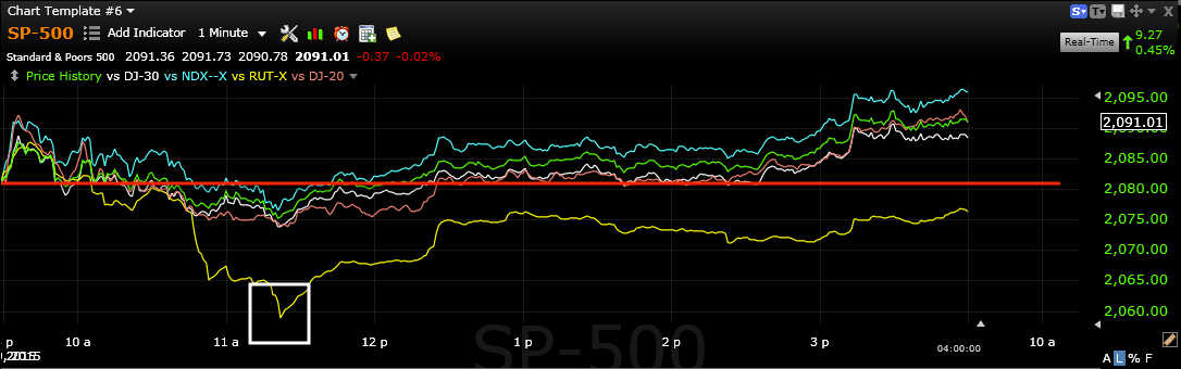
Despite all of this, the Russell 2000 which was the only of the major average not to have a 15 min positive divergence last week when our forecast was for a Triangle/Volatility-pinched breakout to occur this week, ended the day in the red.

As for sector performance intraday, most of the sectors were together huddled around mediocre performance, while Energy led at +1.60% and Utilities lagged at -.43%.

As for the averages since last Thursday's close when the forecast for this week was posted, nearly all of the averages are higher with the R2K being the laggard.

I have tried to be very clear about our expectations for the week, Triangle-based breakouts and increases in volatility. Our market proxy example, AAPL which I posted quite a bit on today, saw what looked like a successful test of former resistance (mentioned yesterday) which has become support at the apex of AAPL's triangle, although the move wasn't all that impressive at +0.76%, it does keep the market on the upside of the triangle which is what's important for now as most technical traders will recognize the triangle as well as the breakout (in some cases we are still waiting) and the test of former resistance/now support, which should give them the confidence to buy.

However as you know, we have been seeing distribution since the first price gains on Monday, as expected in last week's forecast, this won't end pretty, but I don't think we're at the end yet.

As I said, I've tried to be clear about what I'm looking for including signs of distribution in the averages which we have very strong evidence for. The conditions and expectations, example charts and where we are with the other indications I'm watching for are all clearly laid out in today's Status Report post.

As for the Index futures, as shown in this morning's A.M. Update,  we are already seeing signs of the 7-15 min Index futures starting to turn which will turn much faster than the averages that are already so deep in to negative divergences that if I was going only by those, I'd likely be calling out pivot , core/trend position entries now.

While we are NOT there yet, here are some examples of how things changed in a day and are bringing us closer with each move to the upside like today's as clearly expected as of yesterday...

 Nq/NASDAQ 100 Index futures are already negative on the 5 min chart, it's not that much of a jump to the 7 min then 10/15 min charts.


In fact the ES 10 min is already showing signs of going negative.

NQ 10 min also negative.

This after yesterday morning we confirmed that the highest probability outcome which we already knew as of last week's forecast, has already developed on the 30 and 60 minute Index future charts, making the 7-15 min charts just a matter of timing.

ES/SPX Futures 30 min leading negative, the higher probability chart for this move's ultimate resolution...

And the Index futures are negative on the 60 min chart, obviously the Tf/Russell 2000 futures look the worst which was evident in relative performance between the major averages today.

We are also looking at a second chance short (swing trade) opportunity in USO, we didn't quite get enough of a move to make it worthwhile today in USO, but I believe as posted earlier, Quick USO Update, that we will get that opportunity before oil heads back down to the base it has been working on since January for a longer term long position, perhaps even a primary trend reversal.

Also as we first saw yesterday and posted, it looks like the GLD pullback/swing trade short will also give us an opportunity for any second chance positions anyone may be interested in as posted again today in an update, GLD Follow Up

From a Gold Futures (/YG) perspective...
The 15 min chart turned negative giving us the swing short to the downside expected and after 2 days of near straight line decline, the chart has posted a small positive for a bounce that allows us excellent positioning and the ability to re-confirm the trade...

The 5 min YG / gold futures shows the probability of the bounce we have been tracking today as speculated yesterday.

I have posted on what I believe are building divergences in the $USDX, Yen and Euro with the probability of a EUR/USD bounce and a USD/JPY decline/Dollar decline.

The Currency Futures seem to continue to confirm that developing  probability.
 $USDX 5 min negative divergence in to higher prices...

And the $USDX 7 min leading negative divergence in to higher prices.

At the same time...
 The Euro 7 min futures are putting in a leading positive divegrence suggesting a move higher in EUR/USD which would have pass-on effects to USD/JPY...

As the 10 min Yen futures lead positive as well in to lower prices.

This is to say nothing of the larger daily trend in the Yen with a base and positive divegrence as well as the $USDX with a topping / triangle pattern and negative divegrence, an important sign for the market via the global carry trade that has $9 trillion in $USD liquidity which would have a strong effect on bonds and stocks with 100-300 times leverage, as mentioned last night, if we see what the charts are suggesting, the carry trade will collapse in  snowball-like fashion and won't leave any risk asset unmolested with that much carry out there in $USD alone. See yesterday's Daily Wrap for the charts of the longer term USD/Yen charts.

As for the close in the major averages, they were right along the lines of intraday in line and 2 min or longer showing distribution just as posted here late in the day, Market Update.

This doesn't mean that we are done with this move, it just means the move is as we expected thus far, it would be useful to us if we could get a little more upside out of it and a pick up in volatility.

Our target was for the break of the pinched volatility of the triangles, although poorly shaped, they are visible to the naked eye and it's not the price pattern's textbook look that matters, but what the psychology of the price pattern is, thus one of the reasons I used AAPL as a proxy for the market in last week's IMPORTANT: AAPL Set-up & Market Movement forecast that lays everything out.

 Although the last 2-days before today were ranging, the Doji star yesterday and the hammer-like candle today, both holding at and above the triangle's apex is a recipe for further upside which makes sense as the 7-15 min Index Futures are moving in the right direction, but not there yet. The averages are showing all the right signals, but I still think it's early without the other 2 sets of signals . Finally leading Indications should have a strong signal, thus I still would be calling for patience in setting up the trade on our turf, under our conditions and at the time of our choosing.

AAPL as a market proxy should see a clean, clear move to the upside on increased volatility, although I don't think the market will have long after that, thus the reason I've spent so much time going through my watchlists today and setting alerts for the best looking trade set-ups.

 The SPY is far from a perfect triangle (descending vs AAPL's symmetrical) , but the breakout that is occurring is pretty clear and I think will be much more clear before this is over and our entries are ready.

The Q's have a bit more to go.

As does the DIA.

Remember to see this afternoon's Market Update to see how underlying trade is continuing to respond to any hint of higher or even stable prices above last Thursday's close.

Among leading indicators, yesterday I posted a positive signal in our custom SPX:RUT ration, today it made good on that signal (as well as several other near term leading indicators).
 Yesterday's leading signal in our custom indicator while the market was ranging and flat,  while today we have non-confirmation and a negative signal which may pass on to tomorrow, but this Leading Indicator does need to break from the SPX and lead more than just a single day for the kind of signal and set up for a true break lower.

This is the same indicator since last week as part of what created the forecast as it led (white) to the upside and has generally been leading negative since which is EXACTLY one of the 3 conditions we need to see.

As for HYG which was covered in great detail in last night's Daily Wrap added today...
 While it's the price divergence between HY Credit (blue) and the SPX (green) that counts as a leading indicator as we saw at the end of the day as the market pushed higher...

The real early warning signal is in HYG's 3C divergences which precede the actual price move, thus this leading 10 min divergence is VERY telling and exactly where we should be at this stage of the move.

Spot VIX was near perfectly in line with the SPX today (SPX prices in green are inverted to show relative performance). while VIX looks like it was whack-a-moled to push the market up in to the close, the tight triangle right under the 50-day in daily spot VIX looks like it's setting up a perfect Crazy Ivan shakeout before making a highly directional move ...

VIX (spot) daily triangle just below its 50-day breaking under the triangle's apex on what I suspect is a Crazy Ivan shakeout, which should see a move to the upside and above the 50 as the market's move finally fails. This may lead to a very interesting VXX/UVXY long or call option trade in VIX derivative ETFs which are high on my list of trades.

Our Professional Sentiment indicator was also not buying this afternoon's exuberance in to the close as you may recall, there was no positive divegrence to push the market higher, there was the VIX smack-down and an earlier a.m. divergence, but this just looks like the playing out of the move we saw set up last week in our forecast linked above and here... IMPORTANT: AAPL Set-up & Market Movement

 Leading Indicators: Yields
Yields were also supportive of the market today/intraday as you can see this 30 year leading at the a.m. lows in which the IWM put in that volume spike and the 10 min hammer I posted about earlier today (linked above) as well as leading the market at 1 p.m. as the market pulled up to yields as is normally the case as they act like a magnet and the two reverted to the mean by the close.

On a longer term as a Leading Indicator, yields (5 year) are already negatively displaced and leading as they should be, the SPX's triangle should breakout a bit more to the upside making the divergence all the worse as there's already a clear trend lower,  the market will revert down to yields.

 Commodities as a Leading Indicator (that is working once again now that QE is over) were in line intraday in the morning, near perfectly with the SPX and then refused to move higher in to the afternoon.

On pour triangle breakout basis, commodities are doing as we expect from leading indicators as 1 of 3 things we are looking for. Commodities are negatively dislocated from the SPX after having been supportive in to last week's forecast, doing exactly what we suspected last Thursday before we even had the first tick to the upside (started Monday).

As for Internals today...

We did get some pretty good intraday volatility which has been sorely lacking the previous 2-days...

 We finally saw some movement greater or less than +/- 1250. At the red arrow is this morning's RUT capitulation event on volume and then a couple of moves above 1250, but as you can see from my custom TICK indicator below, the later day rally had weaker breadth...
 This shows this morning's flame-out on the downside in RUT/IWM in yellow and then a stronger internal move right after, while the afternoon move was still respectable, it was weaker than the mid-afternoon bounce off intraday lows, which is what we want to see, weakness in to upside moves and distribution.

The Dominant Price/Volume Relationship...

We had another perfect Dominant relationship today, very close to yesterday's of which I said the following...

"The dominance today was strong, 15 Dow stocks, 55 NDX100 stocks, 817 Russell 2000 stocks and 204 SPX 500 (of the 4 possible relationships). All were Close Up / Volume Down. THIS IS THE MOST BEARISH RELATIONSHIP OF THE 4. Often this will lead to the end of a move and a move lower the next day, it's the market's upside running out of steam (via volume) and bearish any way you cut it, even if the averages are up 2% each tomorrow, this is EXACTLY what we want to see in the process of a bounce out of the triangle volatility pinch."

Ironically today's Dominant Relationship was nearly exactly the same, 15 of the Dow 30, 58 of the NASDAQ 100, and 206 of the SPX 500 (of the 4 possible relationships), almost exactly like yesterday and the relationship, Close Up/Volume Down, again the most bearish of the 4 relationships.

The Russell 2000 did have a dominant relationship at 713 stocks, but it was close down / volume down, the least influential of the 4 relationships and the one I have nick-named as "Carry on" as in keep doing what you were doing as we saw Tuesday night which had the same relationship with virtually no movement Wednesday, at least not far out of Tuesday's daily range.

In any case, again a very bearish set of internals.

As for the S&P sectors, AGAIN, 8 of 9 closing green approaching an overbought condition on weak internals. Yesterday I had this to say about a similar relationship in the sectors,

"Seven of nine closed green, approaching an overbought condition which would fit nicely with the Dominant Price/Volume Relationship, it's really exactly where I'd like to see it if we only had a little more upside in the actual price trend given the 3C charts in the averages, the developments in Index Futures starting on 30/60 min charts and some of the Leading Indicators starting to move."

And the Morningstar groups came in at a weaker 143 of 238 green, not as close to overbought as I'd like to see at this point, but everything else looks to be exactly on track which is why I'm spending most of my day sorting through assets/watchlists for the best looking positions as we approach the pivot point.

Finally as to Index Futures right now,  again they are nearly EXACTLY the same as last night with an intraday leading negative divegrence, see the bottom of last night's Daily Wrap to see what last night's 3C charts of Index futures looked like, then look at the result in this morning's, A.M. Update... an incredible bit of forward looking indications which someone could have done very well with as an overnight Index Futures trader.

Once again, leading negative going in to the overnight session.

 ES 1 min overnight leading negative

NQ/NASDAQ 100 futures leading negative

TF-Russell 2000 futures leading negative.

Also the USD/JPY is leading negative going in to the overnight session.
USD/JPY

That will do it for tonight, we are still perfectly on track with last week's forecast and our strategy to use it to let trades come to us.

As usual, I'll check the futures before turning in, but I suspect we may see something similar to the overnight session last night.

Have a great night!


GLD Follow Up

I've been expecting a pullback in gold on a swing trade-like basis for about a week, we have seen that begin over the last couple of days, but on a very near term intraday basis as posted yesterday and last night, I expect a bounce from gold/GLD, similar to near term oil expectations (actually their longer term expectations are virtually the same as well)...

As for the dominant trend or swing trade trend...

 You can see the GLD 15 min chart's (good timeframe for swing trade signals) positive divegrence sending it higher, and a rather quick negative divergence set in which is the swing pullback trade. The last 2-days GLD has been on a near vertical downtrend, this is where I expect a small bounce which should offer the opportunity of a second chance entry in to the swing short trade, the longer term is a different scenario entirely.

On an intraday 1 min chart 3C has been confirming price's downside action since the decline from Monday's open. As you know from both yesterday and last night's updates, I suspect we see a n intraday or very short term pop slightly higher, which offers a second chance opportunity for the trade at better prices and lower risk. Note today's intraday positive divergence as well as the price trend moving from a clean diagonal downtrend to a flat lateral trend, often seen at areas of accumulation or distribution although this is a very short term bounce I'm looking for which I believe is best used as a short (swing) entry in GLD and miners.

Market Update

Well there it is, the move we've been expecting today with obvious lagging in the IWM for obvious reasons.

The initial move thus far, which may be a bit too early to tell, is mostly in line on a 1 min intraday chart as it should be, but so far we are still seeing distribution signals on 2 min+ charts. As I said, it may be a little too soon for 2 min charts to register, but this is exactly what we were expecting for today and moving forward until the 7-15 min Index Futures fail which they have not yet and of course Leading Indicators, otherwise we are right on track as far as yesterday's forecast for today goes and back on track for the week's forecast.

All of the averages look alike other than the lagging IWM which we know why, so this example of SPY 1 and 2 min charts is representative of all of the averages. Index futures are in line intraday 1 min like the SPY 1 min.

 SPY 1 min intraday. At #1 we saw this morning's early flame-out in IWM downside as volume increased as we were looking for on a bullish hammer 10-min candle, an intraday flame-out or reversal signal, At 2 we have a negative divergence intraday sending the market lower around 1 p.m. and no positive on this move up, just what we already expected, but at #3 and the green arrow, the intraday chart is in line.

As you know the 1 min charts are intraday steering divergences. The stronger 2 min chart thus far is showing distribution in to the move higher which has been the case all week, it was what was forecasted for the week last Thursday and thus is not a surprise.

2 min SPY distribution signal in to price strength intraday.

All of the averages look this way. I suspect the 2 min chart is accurate.

Lets hope we get a bit more strength.

Quick USO Update

I didn't forget about USO or miss the entry I am looking for, we haven't really seen that great of a move intraday yet and still have a nice intraday positive divegrence still suggesting we get something closer to a gap fill...

USO's negative divergence as posted this Tuesday and yesterday's 5+% gap down. Today as suspected yesterday and last night, we have a decent intraday positive divergence suggesting something along the lines of a gap fill, certainly more than what we have seen intraday so far.

I'll continue to monitor USO for either a long sale or short entry on a swing basis (or both).

Broad AAPL Update

I am going to go in to some different timeframes and long term/short term aspects of AAPL, I would like to go in to the MSFT growth story vs. the AAPL, believe it or not, MSFT's was much stronger until certain events took place including the declaring of a dividend, then MSFT became a blue chip, mostly range-bound dividend stock, but the growth story had long ended. If you take the time to look at the MSFT template, you'll see AAPL is following in the exact same footsteps, but that's analysis beyond the scope of this post and best done by yourself to see and learn the lessons and hallmarks of this kind of transition from growth to blue chip. AAPL being recently included in the DOW Industrials should not be overlooked within the purview of the preceding comments.

As for AAPL and some longer term fractal concepts that can be applied to any asset, any timeframe...
 This weekly chart of AAPL shows 2 trendlines, the first a lower degree of incline, at the yellow arrow price peeled away from the trend which is a warning, however we must consider the timeframe/trend we are dealing with and this is a large weekly trend (each candle represents a week). At the second, steeper trendline, price once again peels away to the upside, ironically right in the area of our current lateral triangle, another warning to AAPL's long term trend. I show these just as introduction to the concept that often leads to channel busters and the like in various tiumeframes, but the overall increase in parabolic activity makes AAPL's price trend less and less stable, we'll see evidence of that below.

 This weekly trendline shows the first time AAPL peeled away from the trendline which resulted in a -45% retracement over 8 months or nearly half of AAPL's value at the time when AAPL was trading in the 700+ range, it lost 390 points in 8 months (remember this is arithmetic scaling rather than log).

 This long term 8-day chart's trend shows the importance of volume as it should ALWAYS rise WITH price as it did from when it added roughly 2900% from 2003 to 2008. Since the highs of 2007/2008 AAPL has added about 340% since. Even from the 2009 lows to present, AAPL has added about 1/3rd of the gains from the 2003-2007/8 period,  so you can see the arithmetic scaling distorts the actual percentage gains and the volume decreasing on the uptrend form the 2009 lows to the present, is a problem that was held at bay only by the F_E_D's QE. Remember times have changed, don't assume that the F_E_D based trend since 2009 was driven by a set of circumstances (F_E_D HIGHLY accommodative policy) that have changed and continue to change. It is a mistake to believe , "This time it's different".

I hope you consider this as part of volume analysis for your tool kit, I suspect you'll find it increasingly helpful as we move forward.


 The current triangle and the Technical concept of resistance being broken and tested as support as Monday's breakout from the triangle has returned to the triangle's apex to "Test" former resistance/now considered technical support.

This is a long term 9-day 3C chart showing accumulation of a stage 1 base. It may not look very large from this perspective, but that base is 2.5+ years long. At the green arrow we have 3C confirmation of the trend or stage 2 MArk-up. At the 2007/2008 area we have a clear negative divegrence and an AAPL pullback of roughly -60%.

There's a clear and exceptionally strong leading negative divegrence currently, remember this is a 9-day chart.

Just as a form of independent confirmation by one of the most well respected creators of Technical money flow indicators, actually creating the first one, "TICK VOLUME" which rather than get historical credit for, he sold to Wall St. firms to use, Don Worden and his flag-ship creation MoneyStream below...

 This indicator is vastly different from 3C and would not share the same signals if there wasn't a true divegrence of distribution in the long term flow of funds in AAPL.

I have labeled two Primary trend cycles with stages 1-4 and a Secular trend cycle in Green from stages 1 (base) to 3 (Distribution/Top).

I think this divergence is very clear, probably quite a bit sharper to the naked eye than even the 3C divergence. Something dramatic has changed in the AAPL growth story as it goes from a stock that EVERY fund must have to a stock that some of the most well respected funds are selling in totality.

This is the same chart without my drawing on it.

As to the near term or tactical view considering the above charts as long term strategic trend, remember the current triangle posted above.

I still believe AAPL will breakout as anticipated last week and likely act as a proxy for the market in some sense although the market generally has lost much of the support available as of last week on a shorter term basis.

As to AAPL specifically...
 4 hour distribution at the triangle in AAPL,  this chart tells us what the highest probability outcome of any shorter term signals will be. For example, short term charts with positive divergences and breakout signals can and will still breakout, this just tells us that it is highly probable that those breakouts will fail and not be able to hold their ground.

Thus strategically we would want to consider AAPL a short set up in to price strength if other signals suggested a breakout attempt. While the larger strategic trade plan would be to short that price strength and maybe even ride it up on a short term piggy back trade (long), we always want to confirm that the original shorter term charts that projected a breakout confirm what the longer term strategic 4 hour chart is telling us by showing us the proof of distribution in to a breakout/higher prices, this is how we have the highest probability trade at the best price, the least risk and the best timing.

THIS SORT OF STRATEGY REQUIRES PATIENCE WHICH MOST TRADERS DO NOT HAVE (as they try to make back losses quickly and often recklessly or try to force a trade when the market is telling them to stand aside) , HOWEVER IT IS NO DIFFERENT THAN AN AMBUSH. 

WOULD YOU RATHER BE THE ONE AMBUSHED OR THE ONE SETTING UP AND EXECUTING THE AMBUSH FROM A PROBABILITIES PERSPECTIVE?

 The long term 60 min chart with the AAPL price triangle (at the yellow arrow) is an enticing long entry even for a short term swing trade that we know is highly probable to fail, but that's why it's called a piggy back trade, we ride it until the charts tell us it's time to get off and change positions. You can't be in love with a stock and show the kind of discipline necessary to execute trades like this. It's easy to be caught in the lure of a successful trade initially and forget about what the probabilities are telling you especially because most traders have an inherent bias toward trading from the long side.

I personally can see why some might take this long trade, I myself would not and rather be patient and wait for the larger set up to unfold, this is because I don't see the kind of support in the market I would want to see being the broad market is responsible for about 2/3rds of the directional influence on any given stock. As I showed last week, you start with market probabilities and work your way to sectors and then to specific stocks or ETFs, most traders look for stocks first and hope the market cooperates, this is like looking at and trading from a 1 minute chart with no knowledge of the bigger picture, it's backwards, but it is the dominant theme among technical traders which is based in pure and simple laziness.


 The 30 min AAPL chart. The first positive divegrence is part of forming the triangle (to the left), it is the two to the right that have been part of our most recent forecast from last week using AAPL as a market proxy. The yellow area is Monday's breakout of the triangle.

 This 15 min AAPL chart (yellow represents the price triangle) shows the first divegrence at #1 which is part of forming the triangle and the second at #2 which is a "W" base and the divergence the breakout is based on or was.

 10 min showing the positive divergence, the actual accumulation is not through the entire length of the white arrow, but specifically at the white box where the "W" base is. The orange arrow up is the breakout attempt NMonday and the horizontal orange arrow is a near negative divergence, not quite as 3C does make a higher high, but not by much.

It's the most current pullback leading positive to the far right that still suggests AAPL moves higher from it's breakout Monday and pullback to the triangle's apex since.

 This 3 min chart shows the accumulation of the "W" base at #1, the negative intraday divegrence at the breakout from Monday resulting in a pullback since and the current positive as seen above on the 10 min chart.

The 5 min chart shows again the first accumulation and then distribution to the left forming the triangle. As I said last week, "THESE TRIANGLES ARE NOT COINCIDENTAL, THEY WERE SPECIFICALLY AND PURPOSEFULLY FORMED".

The "W" base for the breakout is obvious as is the shorter term distribution on 3 and 5 min charts sending the breakout on a pullback, although distribution was not so strong as to show up on a 10 minute chart, although close.

This would suggest that we still should expect a breakout. This is the highest near term probability, however there is a difference between a probability based trade and a HIGH  Probability, LOW Risk trade. I don't like to trade based on probabilities alone, but rather excellent high probability entries with low risk, I don't see this as that kind of trade, although I wouldn't blame anyone for taking it as my risk tolerance for these kinds of trades has faded over the years as my patience has grown.

I WANT TO CONTROL AS MANY FACTORS AS I CAN AND ONLY STRIKE WHEN I SEE OVERWHELMINGLY STRONG PROBABILITIES FOR SUCCESS.

As for longer term Trend Channel based stops which will tell us when AAPL's character has truly changed...
 a 5-day weekly Trend Channel that has held the entire 2014 and 2015 uptrend without a single stop-out. The current stop level which "may" move higher is $118. Once $118 is broken, the trend change chances for AAPL increase significantly.

This Custom Trend Channel is the first indicator I received an award for and self adjusts to each particular stock's own character and most recent behavior unlike trendlines or different channels like envelope channels. The Trend Channel takes on the character of the stock and changes with it and only stoops out when there has been a change so drastic that the entire character has changed.

The Secular trend in AAPL represented by a quarterly chart (each bar represents 1 quarter or 3 months of trade) shows a bearish tall upper wick on the most recent candle and has held the entire AAPL uptrend with a current stop at $75, although the Trend Channel will continue to lock in gains so next week it will likely be higher than today, but once $75 is broken (as of the current stop), AAPL's growth story is over.

I'll continue to update you on both near and long term trends/trade set ups in AAPL.