Monday, December 22, 2014

TECH / QQQ

Here's a look at the NASDAQ Index futures, they look absolutely horrible. I have a general rule though, for a trade, the 5 min Index future has to be divergent. Depending on whether it's a new divegrence or one that's maturing, the 5 min will either represent the strengthening of a new divegrence to the point that it's trustworthy for a trade or in a mature divegrence it represents the timing timeframes as all of the longer charts are in line together, the 5 min is what is needed for a full house. The first trade would be along the lines of a swing trade or a shorter term trade, the second would be along the lines of a core position whether long or short, that depends on the divegrence.

You saw what the Q's looked like in this update, MARKET UPDATE AND GLD P/L, they look bad and pretty darn close to a core short full house (multiple timeframes all consistent in signal).

Even though we saw this move coming, (some of you decided to trade it and did very well), for me, even though I consider myself to have a high tolerance for risk, I would not trade this and rather decided to just be patient; the reason being is such a sharp "V" shape reversal can't be trusted in my view. These types of sharp bases can give spectacular gains one day and wipe you out the next, if you think about it,  it's not very different from the market on a macro theme in which the Dow saw it's worst weekly performance in 3 years/the SPX worst weekly performance in 2.5 years the week ended December12th, that carried through the next Monday and Tuesday to some extent and then we get the best 3-day move in 3 years and I expect shortly we are about to get another headline move to add to this string of them as the 5 min charts turn negative.

I don't know how many of you recall the first half of the year in which the averages crept up to make all time new highs on +0.10% moves, there wasn't a single 1% move for months, a very low volatility melt-up. Contrast the change in character now vs. then in volatility alone. As I mentioned earlier and we have seen with many recent examples, volatility tends to be high between stages such as between stage 1 base and stage 2 break-out. The entire Channel Buster concept is a change in volatility between stage 2 mark-up and stage 3 top and probably more than anywhere except for capitulation at the end of stage 4, volatility is extremely high between stage 3 top and stage 4 decline.

In any case, this is about the NASDAQ/NQ and Tech.

 This is the NQ/ NASDAQ Index Futures 7 min chart. This last move up that we forecast Friday December 12th, about 2.5 trading days ahead of time, mainly reached the 7 min chart, meaning it was a tradable divergence from my standard of needing the 5 min chart or higher in divergence, but again it was the base I didn't and still don't trust.

While it's easy to say, "I'l just trade this for a couple of days and then get out", people have a funny way of falling in love with assets which are the last thing you want to fall in love with which is why you see so many people who made so much money in a bull market lose it all in a bear market, AAPL was another good example or Gold until 2011, people had made so much money there, they couldn't believe it could be anything different than what they knew in the past and end up losing everything. I've read a lot on the psychology of bear markets and this subject and it's fascinating, but point made hopefully.

This 7 min chart is the worst looking of the Index futures.

 Even on a 15 min chart you can see the leading positive divegrence before the F_O_M_C, it's not as clear as the 5 or 7 min charts were, especially as it was happening, but in retrospect it's clear and more so is the negative divegrence.

If you are wondering why the negative divegrence would be so much bigger and larger than the positive divegrence, the simple answer is it is being sold in to strength, whether short selling or selling of long positions. This is why, when I refer to this move, I say that the Crazy Ivan head fake BELOW the range that set the bear trap that led to the strongest small cap short squeezes in 3 years and pushed the IWM above the range around $118 was a means to an end, the distribution is the end, unfortunately for many that will only be clear in retrospect when it's too late to have used this set up to position yourself.

 Here a 30 min leading negative divegrence in NQ as well as the positive divegrence is clear. While this looks like a longer positive divergence it started last Friday, the same time this move was set out as a theory with later confirmation Sunday, Monday and Tuesday. Again the negative divegrence is multiples stronger in leading position vs a relative positive divergence (the weaker form of the two divergence types).


This is NQ's 60 min chart. I want you to get use to seeing divergences because they are the best signal you will get no matter what indicator you use: MACD, RSI, Stochastics, simple Rate of Change in price, breadth readings, etc.

Divergence analysis is by far the strongest signal which Dr. Alexander Elder, Author of "Come Into My Trading Room", makes a great case for in MACD divergences, however few people have understood divergence analysis beyond what they have read or been taught with regard to a single indicator, you can use it on just about any indicator.

So the positive is smaller here as it should be on a stronger underlying flow chart, but it should be visible vs. price and yet the leading negative jumps off the chart with little need to look very hard.

We can go even further, but then we are getting in to MACRO analysis rather than the specific analysis tied to this specific move.

As you can see, EVERY timeframe from 7 to 60 minutes are all in line with the same divergences, this is very powerful confirmation and a very strong edge that you should always look for in positions and analysis.

This is also a core-type position because our 4 hour and daily charts are also leading negative which suggests that any move up is bound to be sold in to and resolve to the downside as the main flow of the largest force of the underlying flow is in one direction.

From here I'd have absolutely no problem with entering or holding core short positions, but I endeavor to give you the best timing possible as there are many different types of traders here from long term managers to short term day traders, thus what I consider an excellent overall entry right here and now, for someone day trading or using options needs the best timing possible which is not always easy, but it is what I try to provide.

Do not let the charts above escape your attention, they are showing overwhelming confirmation.

The one chart I'm still waiting for...
 This 5 min chart of NQ is still not giving the leading negative divegrence that would give us one of the most sweeping full house of divergences we've had in Index futures (so far 7, 15, 30, 60 4 hour, daily, weekly and monthly all negative. If I were a money manager I'd be finished now with all of my short positions unless I had some cash laying around for playing options to juice returns, I'd be done considering these divergences. Personally in my own account,  I am done. I am in position, as you know, even expecting this move I decided not to risk missing the downside where the real story is and gladly held my shorts knowing this would be a sharp move as my minimum target was $IWM $118, which means I knew (as did you) in advance what kind of sharp move this would be, but that doesn't dissuade me from keeping my positions aligned with the strongest probabilities. Had the base been different perhaps I would have traded it.

I have suspected the 5 min charts were not yet divergent because this IWM breakout was not as strong as I imagined (imagine two candles just like the first one moving up after the head fake shakeout below the range). I expected something more along the lines of 2 or 3 very strong candles slicing through the range's top, rather than these small stars sputtering through, but again, the percentage change in 3 days may be more than enough to create the psychological reaction that leads to the taking of action and creating the bull trap, that will be sorted out any moment. From here, the 5 min charts could go negative by midnight,
IWM Daily range, Crazy Ivan (dual shakeout on both sides of the range). Note the last 3-days small candles and diminishing volume, these are not what I expected for a move above $118, I was looking for something solid like what a 2-day chart might look like.

However as I have said, see the QQQ charts, don't let the NQ (NASDAQ 100 futures) charts above escape your memory, they are in rare formation with the kind of edge that we find only once in a great while.

As for Technology which the NASDAQ is heavy with...

 XLK-Technology Sector...

This is a 1 min chart of XLK, I like these charts that show rough confirmation or the divergence to the far left with a clear positive standing out before the F_O_M_C and the leading negative, it's like they are calibrated and back-tested, the former signals were all good, I have no reason to doubt the current signals.

The 5 min XLKshows November highs divergent as well as early December, both lead to the forecasted downside and then the positive divegrence pre-F_O_M_C and a sharp leading negative divegrence since that is larger than anything since.

The stronger 10 min chart and the same findings. Multiple timeframe confirmation is not only strong because of numerous charts agreeing on the same events, but the signals they produce are stronger as there are numerous timeframes often reaching very long term.strong underlying flow, which makes these a very sharp edge to trade.

 Here I didn't mark anything on the 30 min chart, but the early December divergence leading to downside should be very obvious, is you look close the positive of last week should be visible, although it looks smaller here because it was not as strong as the current divergences and the failure to confirm and leading negative current position should be apparent.

On a long term 2 hour macro trend chart the leading negative at the rally off the October lows is exactly what we forecast at least a week before the October lows were in and the upside rally started, this was the rally I said would be a face ripping move and to book mark the post.

Look at what has happened during that time, the exact thing we forecast to happen before the move up even started, distribution through a strong move in price.

I'm not a huge fan of TECS because of its liquidity, but if I were looking for a broad technology short with leverage and without the constraints and drawbacks of options, I'd consider TECS long (3x short Technology ETF).

As for broader coverage in the QQQ, I personally hold SQQQ long, it is a 3x leveraged inverse or 3x short QQQ.
 The 1 min chart is leading, but looks a bit damages today. If  we look at intraday trade of the 1 min chart, it's really not much damage.

1 min intraday today, it is largely in line with a slight negative bias, no major damage though at all.

2 min is leading positive, I suspect the 1 min charts are stalling so larger transactions can be wrapped up at these price levels because I'm consistently seeing charts beyond intraday steering (1 min), leading negative like this telling me they are pinning price in place and supporting it as you saw earlier with assets like short term intraday HYG support, to continue to sell/short sell into.

 What I find interesting about this 5 min chart, as leveraged ETFs often give the earliest and cleanest signals, I suppose because of their leverage, is the fact it remains in leading positive position. It seems there are some large size traders who decided to do the same thing I did and simply leave the SQQQ long position open, waiting for the market to conclude this bounce.

The 10 and 15 min charts looks the same as well.

We have multiple timeframe confirmation that fits with NQ/NASDAQ futures as well as QQQ, now for another asset and more timeframes, TQQQ or the 3x leveraged long QQQ ETF which should show negative divergences for confirmation.
 While I find certain assets in line on 1 min charts, assets that are leveraged long like TQQQ are not in line, there's apparently no reason to wait around any longer while the underlying QQQ must be pinned in place to allow exists from assets like 3x leveraged longs,  this is what I suspect is going on today as TQQQ's 1 min chart looks very different.

 The mid-term 15 min chart shows former divergence and price move as forecast as well as the positive we saw market wide with the price move as forecast and now a leading negative15 min.

I have no reason to believe, especially in light of leading indicators, credit, bonds/yields that this divegrence is any less real than the others. In fact it's more in line with the longer term macro trends than any.

Speaking of which, this TQQQ 60 min chart is a pretty serious macro trend, I trust I don't need to draw any notations on the chart.

Speaking of confirmation, here's the same chart in SQQQ, 3x short QQQ.
Again, they should give nearly directly opposite 3C signals and they should not be hard to see. 

I'm going to give the market another couple of hours before concluding the Wrap as there are some movements on 5 min charts starting and I'd like to see where they go.

i'll also be updating UNG which has been slammed since the EIA Natural Gas inventories on Thursday morning 10:30, why they were slammed, and what the silver lining is that has been "seemingly" overlooked, although if I had a chance to accumulate an asset at much lower prices with a certain bit of knowledge that changes the game, I'd take it as low as I could get it too, "Buy low, sell high".

I'll be back with you shortly.


QQQ/Tech Looks To be The Worst

I'm going to get some charts up, but as I go through different averages, their ETF's, leveraged and inverse ETFs, sectors, etc. TECH looks to be the worst, I'd lump QQQ in there, but Tech as in XLK, maybe TECS or SQQQ.

I'll get those charts up, but there's essentiality 1 timeframe I'd wait for before calling this out as a position at the exact time, that's the 5 min chart. You'll see with all of the other charts, this one is destroyed and I suspect it will be one of the first to fall the hardest.

MARKET UPDATE AND GLD P/L

I'll try to get GLD charts up ASAP, but I think right now, the market is more important, this is really getting to look ugly and right in line with our head fake /Crazy Ivan shakeout expectations. The bull trap is sufficiently set.


The GLD position covered never made much progress, but rather than have it sit there as dead money being at full size, I decided to close it on some strange looking GLD activity that I no longer feel I have a STRONG edge with, I'll come back to it.

As for the market, HYG was called on intraday, presumably to halt a premature slide in equities as the European market closed.
 HYG 1 min intraday, this is still a small divegrence for intraday steering only.

The effect, SPY is in green and HYG in red, you can see HYG lent the market support.

However HYG's distribution trend is still solidly intact and I would not doubt this.

Meanwhile I wondered if TLT was seeing any distribution to try to help the market (support) and none, it just keeps moving higher. ZB (30 year treasury futures also have the same positive chart as well.

Here's the result, TLT in red moving up with SPY just like the last two F_O_M_C meetings after their knee jerk reaction up and at almost the exact same time.

 Meanwhile the strength in the "Flight to Safety" Bond trade is sending our leading indicator, Yields (30 year) lower, dislocating with the market even more- this is what happened at the last two F_O_M_C meetings 2-3 days after that killed the knee jerk and sent the market lower, in the first case as mentioned, to the October lows so quite a way and this is already much more dislocated on a longer term basis suggesting an even worse move which is my forecast and has been.


SPY 2 min is seeing some distribution so the HYG move is only mildly supportive, I don't think it's there for any other reason than to temporarily halt a free fall decline, whether that be because positions are still being moved around or something else, but I don't think we have long now, possibly even overnight. There are only a few VERY short term charts I'd like to see move like the in line or close to it 1 min.


SPY 5 min accumulation before the F_O_M_C and distribution after.

That odd trade from last week in SPY for $200 million in the last 4 seconds of trade (something like 1134 trades in a single second), skews the SPY chart's scaling making it difficult to show divergences on shorter term charts where that spike is present.

Being as such, I'll use the QQQ
 The 1 min chart with late Friday's weakness that was carried over this morning and pretty much in line most of the day on a 1 min chart, there's a slight positive divegrence now, but that may be an anomaly on the chart and fade- it's of no concern to me.

 The 2 min chart, beyond simple intraday steering is showing a clearer trend of negative divergences reaching deeper in leading negative position as well as the pre-F_O_M_C accumulation.

 This QQQ 5 min trend chart should be MORE THAN CLEAR, THERE IS TROUBLE HERE AND NOW.

The 10 min chart carries on the multiple timeframe migration near perfectly, there's trouble here.


 THE 15 MIN CHART JUST MAKES THAT MORE CLEAR, ESPECIALLY BEING A STRONGER 15 MIN CHART.

 And this move was never meant to hold, the highest probability 60 min chart has been leading negative in a large stage 3 top, no head fake move is going to repair this damage, as I said, it was never meant to hold.

As for the IWM, all the important timeframes are moving along like the Q's.
 Intraday the 1 min continues better relative strength, but it's just a steering chart of no real consequence beyond intraday reversals., etc.

 5 min leading negative

10 min seeing the migration from shorter charts and leading negative.

Remember we called this from the start as being the average that would show the best relative performance.

I won't say we are right there, but I think we are darn sure close enough that I would not be trying to thread the needle.

Taking GLD Short Off the Table


On today's run down with some heavier volume and some positive divergences, something doesn't look right here and I think the assets are better used somewhere else for now being I don't see the same edge.

I'll put out some charts shortly. I am not replacing this with a GLD long position.

USO Update

I saw USO futures last night and this morning, there didn't seem to be much to say immediately as they looked like a near term pullback at the cash open as well as what they saw this morning pre-market.

However, so far there appears to be growing strength and the accumulation zone is getting higher and higher which makes me think they are getting ready to let USO rip to the upside.

 Last week's stronger "W" base rather than a "V" base which is what the market took off on last week, not a strong base to hold gains or an extended move, but this is.

However note that the former accumulation area at the bottom of the "W" lows around $20.50 is now seeing leading (stronger) positive divergences at higher levels, even though it looks like they gave it a little tap to knock it lower to pick up shares at the best price available, This higher range of accumulation suggests to me they are taking whatever they can get and likely looking to a move to the upside very soon.

 Brent Crude futures show the same thing this morning.

 The 2 min USO chart is leading positive to an even greater extent.

 The 3 min trend change in 3C and price should be evident.

As with charts out to 15 mins.

Again, I do NOT see this s a major trend change, but likely a major short squeeze.

Important Market Update

I think our forecast from December 12th has been covered and beaten to death, I don't think I need to go in to that much further except to say that officially it has done what we were looking for, a move ABOVE IWM $118 which was the rough breakout level for the range. I've said that I imagined and had hoped for a cleaner, stronger looking breakout, but as I also mentioned that the percentage change in the last 3 days may be just as valuable psychologically because that's all this move really is, a bit of psychological warfare used to turn price action on traders who are chasing it (in its simplest form- there are a number of other tactical and logistical reasons, all covered in our "Understanding the Head Fake Move" posts that are always linked at the members site near the top right).

I was especially keen to see what the levers were going to do today as well as some very important leading indicators and of course the 3C charts for the averages as well as Index futures, not everything was quite on board Friday which is why I didn't put out a short call, at least not a specific one, but broadly speaking, I think this is a fantastic area and time.

Lets get right in to it as there are a lot of charts, but I want you to see the evidence with your own eyes the same way you saw it when such a strong move was forecast on the day in which we ended the week with the worst weekly performance in 3 years. Hopefully these concepts will be a part of your trading tool box.

VIX Futures

T
 This is an intraday chart of actual VIX futures, clear improvement can be seen on the chart, protection is being bid, however the VIX lever, although used, didn't move as far from protection as you might think.

Looking at a longer scale 1 min chart of VXX, short term VIX futures, note how it shows 3C almost perfectly in line with price movement, but on the dip in VIX futures after the F_O_M_C, 3C's fastest chart, the one most capable of confirming the downside move... DOES NOT, rather it stays in a leading positive position suggesting some level of accumulation during the move down which would make sense if the move up in the market were expected to be a short lasting knee jerk move with something ugly following.

There's also confirmation in multiple assets through the leveraged long VIX short term futures, UVXY as well as multiple timeframe confirmation as they look exactly the same after the F_O_M_C push lower of VIX futures.

On a 3rd timeframe (longer 3 min), we have more confirmation using the inverse ETF, XIV which moves opposite VXX and with the market. The chart here shows XIV did NOT confirm the upside move, but rather saw distribution in to it. 

UVXY 5 min shows the warnings I was posting before the move that gave us the objective evidence to confirm the Mass Psychology theory put forward for the market forecast of a move above a 6 week range in the IWM, however in addition, almost as soon as the F_O_M_C passed there was near immediate accumulation on this 5 min chart which is the demarcation between intraday charts showing intraday moves in the market and a chart long enough and strong enough to show institutional activity intraday.

That's 4 different timeframes, 4 different assets all confirming the same thing. Why such a rush for VIX protection right after the F_O_M_C, in some cases we can see it immediately after the 2 p.m. policy statement last Wednesday.

Even using relative performance, you can see the same thing. I have inverted the prices of the SPX (green) so you can see what the normal correlation between VXX and the SPX is and as you see to the left, they normally move exactly opposite of each other, however right after the F_O_M_C at the red "F", note the relative out-performance of VXX.

Not only does 3C show positive divergences in 4 assets related to VIX futures , but in at least 4 different timeframes with a strong enough bid that the relative performance of VXX price vs the SPX was effected.

The same is true of spot VIX, note the correlation with the inverted SPX prices (green) and the change in relative performance for the better for VIX as of the F_O_M_C.

Treasuries/Bonds

*This is key- The last 2 meetings in September and October the market saw an upside knee jerk reaction after the F_O_M_C, within that 2 to 3 day period, bonds decoupled with stocks and almost immediately after that happened, the F_O_M_C gains were completely erased and in the September meeting's case, a lot more than just the knee jerk as we headed to lower lows at the October lows. 

Bonds and yields are key. We witnessed both 30 year Treasury futures and TLT giving ample warning of a head fake move to the upside, I say head fake because even back then the longer charts stayed very positive suggesting any short term divergence would eventually turn back toward the longer term/highest probability chart which they are doing now.


This is the TLT distribution on a 1 min chart I had posted so many times last week as evidence that Bonds/Yields would be used as one of the 4 main levers (Bonds/Yields/TLT, HYG, VIX and USD/JPY).

Here you can clearly see almost immediately after the F_O_M_C on the 17th, we have TLT accumulation that has already led to a move higher in the 20+ year bond fund,  thus bonds have already come unglued from equities just like the last two F_O_M_C meetings, IN WHICH BOTH CASES, THE DOWNSIDE SPX REVERSAL TOOK BETWEEN 2 AND 3 DAYS, WE ARE ON THE 3RD DAY NOW.

TLT 2 min also showing the same exact thing, distribution to send TLT lower in to the F_O_M_C (with a small head fake move in yellow as these appear on virtually every reversal in every time frame and every asset). Again the very next day we have TLT accumulation and a move higher with bonds dislocating form equities again. This is one of the key things I was looking for to not only verify our forecast was correct, but the timing of the reversal.

Here the stronger TLT 5 min chart has a much smaller negative divegrence because the distribution to send TLT wasn't strong enough to make it to this chart, in other words they only did enough to ensure TLT would act as a lever as they needed it to until the short squeeze could take over, but apparently they are not willing to part with too much of their safe haven assets in Treasuries which is interesting because at the same time I was pointing out this distribution and thinking something was up well over a week ago, we had just had a scorching 30 year auction with some of the best internals seen in a long time, yet there was distribution in TLT. At the time I thought it's either a shakeout to take those shares from weak hands as there was certainly overwhelming demand for the 30 year auction or something else was going on in which TLT was being used as a lever for a possible market bounce as we had been thinking of a market bounce that week ( the week of the worst weekly performance in 3 years) because of signals like this.

As for the long term or the highest probability directional move , I may revise treasuries at some point, I'm still gathering some new data, but for now, the 60 min chart is confirming the uptrend very well despite some minor divergences here or there that caused pullbacks and rallies.

Here I have once again inverted SPX prices (green) so you can see the "normal" correlation between bonds and the market, they typically move exactly opposite each other, but note how TLT has broken away right after the F_O_M_C (red "F") and is doing the EXACT same thing that led to the failure of the last two F_O_M_C knee jerk rallies.

Here's a closer look showing exactly where the F_O_M_C Wednesday ends at 4 p.m. and where bonds start diverging away from the SPX like last time.

As for actual 30 year Treasury Bond Futures, today as I was hoping to see, they are under accumulation, again, dislocating from their normal relationship with equities.

If we look at one of my favorite Leading Indicators, Yields which move opposite bond prices and thus have a tendency to lead the market and pull market prices toward yields, we get an even clearer picture.

10 year yields in red vs SPX in green
(normal prices-not inverted)
 Note how the SPX and 10 year move together, often Yields will lead the market before a new move. Right after the F_O_M_C (white "F") note the failure in yields, this typically acts like a magnet and pulls equity prices toward yields, meaning down.


 Over a longer period you can see what happened the last time the 10 year yield and SPX diverged, we saw the worst weekly performance in the Dow in 3 years and 2.5 years in the SPX. Now note the same dislocation of the 10 year (red).

30 year.. I find the 30 year more important in this regard...
 You can see that the 30 year yield not only moved with the SPX off the October lows rally, but even led at the lows, making a higher high and low before the SPX had made its low.

 Yet again, look what happened at the last divergence between yields and the SPX, the worst weekly performance in 3 years and now  look to the far right and see how massively the 30 year yield has dislocated from the SPX and THIS ON TOP OF AN ALREADY HUGE NEGATIVE SIGNAL.

THE OVERALL 30 YEAR VS THE SPX SINCE THE OCTOBER RALLY!

Thus I think you might see how I view this as a piece of the puzzle confirming the move last week was indeed a head fake move intended to set up downside momentum and a lower market low (below October).

HYG-High Yield Corp. Credit, one of the 4 levers most often used. HYG is so often used , as soon as I see a 3C divergence in HYG I know something is up.

So I'm glad to see last week's late distribution in HYG and this morning's continued trend.

The 2 min HYG trend showing 3C migration through longer charts and leading negative. Thus the positive divegrence I saw the week of the 12th and last Monday and Tuesday in which I said, "There's only 1 reason to accumulate HYG", that reason is being put to bed and HYG should continue to lead the market to a lower low as it is severely dislocated and calling for a massive move down in the market.

HYG was in line (green) with it's downtrend until accumulation which on this chart is seen Monday and Tuesday before Wednesday's F_O_M_C.

So again, I ask was it the F_E_D that really moved the market or as we see everywhere and forecasted almost a week before, was the knee jerk reaction just cover for this move, which has a psychological effect of its own. Not only do traders believe the Santa Claus rally is starting, but that the F_O_M_C was dovish, which it was not. The F_E_D just painted themselves in to a tighter corner that is going to cause a more severe market disruption when they are forced what they know they must do.

However the main point is the institutional 5 min timeframe is showing a strong leading negative divegrence right now,

As for the trend and highest probabilities, HYG has been in a confirmed downtrend and as you can see on this 4 hour chart, there's nothing remotely close to positive here.

HYG's (blue) relative performance vs the SPX (green). Note HYG's leading price move at #1 as it makes a higher low and is moving up as the SPX is finding its bottom. As usual, "Credit leads, stocks follow" At #2, you can see HYG has failed to make a higher high like the SPX between the two relative points of the start and end of the trendline. No longer is HYG acting as a market ramping lever, but instead being abandoned as traders don't want to be caught long HYG when the music stops.


Here, even PIMCO's High Yield fund is showing HY credit was not as exuberant as equity and failed to follow it higher leaving it at a deep negative dislocation, although not nearly as deep as HYG's longer term chart.

FX /USD/JPY the 4th ramping lever...
This is the USD/JPY carry pair in red/green candlesticks and the SPX futures (ES) in purple, note this morning and overnight the two were inseparable as algos followed the USD/JPY's lead with ES, however that all changed on  the cash open this morning with ES lagging behind USD/JPY intraday .

Furthermore, I believe in addition to the longer term dislocation of SPX above USD/JPY's correlation, we will soon see USD/JPY pull back and all support for the market will fall away, making it impossible to hold even at these rather flat gains today.

Not even considering the macro trends as this post is not about that, you can see $USDX 3C accumulation JUST BEFORE the F_O_M_C. A LEAK Perhaps? We have caught 3 leaks that were blatantly obvious in the past, the F_E_D was caught leaking the F_O_M_C minutes to 154 Institutional and Private Equity firms by email a day in advance of their release (why would the F_E_D email these even if it were an accident when the fastest dissemination of the information is at the actual release?). The F_E_D was caught red-handed helping the banks and out of the 154 firms that received the information, guess how many came out and said, "Excuse me, I think you may have made a mistake in sending us this early?" NONE! AND JUST HOW DOES ONE GET ON THE F_E_D'S MAILING LIST OF THE MINUTES WHEN ALL INFORMATION IS SUPPOSE TO BE RELEASED TO EVERYONE INCLUDING YOU AT THE SAME TIME?

In any case, of the 3 leaks we caught in the past  I doubt this is one as it would have been well before the policy meeting even started and there were 3 dissents so things were not in the bag for Yellen.As for leaks, you have to remember the Financial media already have the policy statement hours in advance on embargo so they can write their articles or talk intelligently as soon as the minutes or policy statement are released.  How else do you think Jon Hilsenrath of the WSJ writes a 500 word op-ed released 3 minutes after the F_O_M_C minutes or policy statement? The point being, there are plenty of potential leaks out there and I'm sure a Goldman would pay handsomely for the information, but it seems from recent events they don't even have to do that as one of their employees, a former F_E_D employee , routinely received inside information from the NY F_E_D, just out over the last couple of weeks in addition to over 40 some odd hours of tape from a F_E_D employee/whistle blower, but I don't think this was one.

The Yen macro trend looks to be up , but nearby the 5 min chart remains positive as it was lat week.

As is the 7 min chart which was conveniently trashed just before the F_O_M_C leading USD/JPY and index futures higher, The Yen moving up does the opposite, thus recent accumulation after the F_O_M_C increasing in strength suggests the 4th lever, USD/JPY will also fail soon.

As for Index Futures...
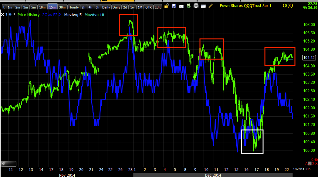
This is NQ/NASDAQ 100 futures this morning on an intraday 1 min chart, clearly negative picking up where 3C left off at the cash close Friday and SPY / QQQ certainly underperformed the IWM in early trade as 3C forecast Friday.


ES/SPX futures looked the same, but...

Note how TF/Russell 2000 futures were at least in line, a better  or more positive chart than either NQ or ES as 3C's closing divergences suggested.

While the 7 min charts are already moving and they are the extent to which the Index futures went positive before the F_O_M_C, we still did not have migration from the 1 min chart to the 5 min chart, even last night, but today as you can see in TF/ R2K futures, we are leading negative so the bridge of migration from the 1-5 min charts is going to link up with the 7 min chart soon.

And the 7 min chat, from a clear leading positive divegrence before the F_O_M_C, another part of our evidence supporting our forecast, the divegrence is negative now and deconstructed.

I believe we are very close to seeing a downside move of special significance as both the Santa Rally and the F_O_M_C knee jerk would be effected and send the market lower on their own, but the head fake move is the real momentum behind any move lower.

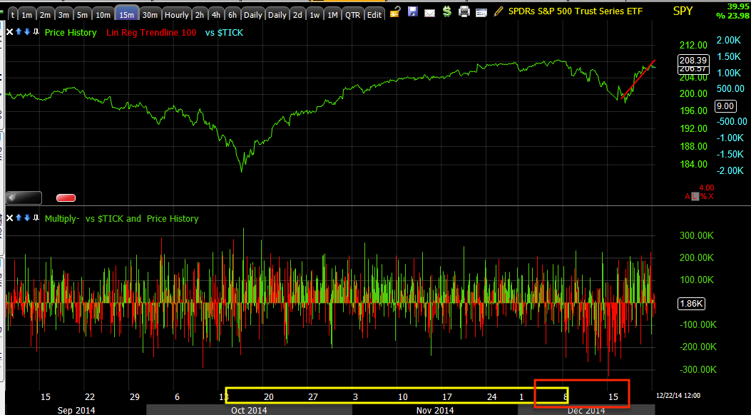
Intraday breadth is also fading.
 On my custom NYSE TICK indicator, note the fall off of breadth as the October rally advances until the deep red with the former week's worst performance in 3 years, then a head fake move, or the Igloo with Chimney and that is now...

Also fading since the F_O_M_C as you can see on a 1 min chart.

Everything is as I would hope to see it if not better.