As mentioned, this is a little longer than I prefer, but where we are in the market at this time, I think it is absolutely necessary information for you to have so you can do your strategic and tactical planning as both are rapidly approaching to meet at virtually the same time.
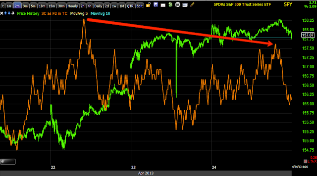
First of all, our expectation (partly based on VIX / Market expectations from several weeks ago) for market movement both short term (positive) and longer term negative are confirmed in these charts with the short term (positive) trend starting to lose some juice, but just as with a wounded animal, this can often be when the market is the most volatile and surprising. Still, longer term planning and tactical execution is very near, the increased volatility as a primary trend reversal draws near makes this market increasingly more volatile and less predictable.
For those that recall AAPL around the $550 area, it looked like we were going to have a nice trade set up and then the unpredictability and volatility of fear and nothing but sellers changed everything, most markets get to that point in which they can collapse beneath you in very sudden moments, this is why I waned many times and even showed you how months of gains on the upside can be erased in a day or two (we just saw 6.5 weeks of longs taken out in a few days).
Leading Indicators...
The CONTEXT model for ES (SPX E-mini Futures) is showing a negative 25 point differential, the last time it was this high it went to -43 points and ES fell about 45 points, so it's pretty accurate in those situations, more than anything though it is telling us that there's a flight away from risk assets except in the stock market where market averages are very easy to manipulate on low volume and because of the way the averages are weighted.
For instance, the NASDAQ 100 doesn't give each stock 1% of the average's weight, in fact AAPL carries about 20%, more than any other component stock and about the same as the bottom 50 weighted NASDAQ 100 stocks COMBINED!
Commodities are underperforming the SPX (always the comparison symbol in green unless otherwise noted), but today we are seeing much better recent performance from commodities, adding some support to the market.
Longer term, commodities were on par as far as relative performance with the SPX until the 2013 rally, they fell out badly and they shouldn't have in a healthy rally and a recovering economy.
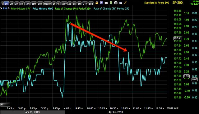
Yields tend to be like a magnet for stocks, today Yields are more supportive than they were yesterday, this is partly why the SPY Arbitrage model is improving as yield performance relative to the SPX improves as the day wears on.
Longer Term Yields dislocated badly with the SPX, in a healthy market they should move roughly together, note most of this is during the 2013 rally, but especially in the area where the SPX broke my custom indicator, the Trend Channel. Typically stocks will revert to yields, however yields longer term are much lower than they appear here.
The fact that yields are so low alone tells you that there has been a massive flight to safety, of course some is due to F_E_D monetizing Treasuries, but when you look at where things happened, it can't all be attributed to F_E_D buying.
This is a 5 min (nearly month long) chart of the Treasury ETF, TLT vs the SPX, these should move mirror opposite each other for the most part as they do to the left in green, but the fact that the market has rallied since the lows of the 18th and TLT has not dropped, just goes to show the flight to safety trade is seeing so much demand that it is literally holding TLT up as if this were a REAL MARKET with prices determined by supply/demand dynamics.
TLT's 5 min (shorter term) 3C chart has been showing short term distribution or profit taking, it is my opinion this is short term money moving from safety to risk assets for this move up we have started, it's not large scale distribution in TLT, but more like our short term long trades, while the bulk of core positions are short or are being built short, the core or bulk of TLT positions are long, this is a flight to safety and it has taken place largely since the 2013 rally.
If you need proof that money has been coming out of stocks and in to safe haven assets, just look at the percentage of ALL NYSE stocks trading above their 40-day moving average, that fell from 80+% to less than half of that from January until now, that tells you the majority of stocks are actually falling below their 40-day moving averages as the rally has proceeded, that only happens because of large scale selling, however the market averages with their odd weighting schedules easily mask that.
Perhaps as a hint of what we can expect from the market short term, I do believe TLT will fall due to this negative short term divergence, the market would need to rally for that to happen so we may indeed have more time left than the charts appear to suggest right now.
Currencies
The short term 1 min chart of FXE (Euro ETF) vs the SPX shows the Euro not giving the market any support here, while the market can ignore this for a while, I doubt too much longer.
In similar fashion, the $USD above typically forces the market to move opposite its direction, so once again short term the market is moving against the natural correlation, this can only hold so long especially as the $USD is about to make a primary trend change to the upside.
*When we have global currency intervention to devalue currencies (a form of trade war), the $USD tends to be the currency that gets bought believe it or not. I believe the $USD's trend is reflecting expectations of the F_E_D to end accommodative policy much sooner than most think, as such the $USD is discounting that information by moving higher as interest rates will have to rise when the F_E_D does start to normalize policy.
This shows the right side of a large "W" base in the $USD, recently it has pulled back, allowing the SPX to make all-time new highs, but as I wrote about 2 weekends ago, I believe this $USD pullback is about to end, this will put long term and significant downside pressure on the market.
In that same series of articles from the weekend of April 13th/14th,
"Currency Crisis", I also wrote about how changes in the Japanese Yen will also pressure the market as the BOJ went too far with their latest QE in an attempt to halt 2 decades of deflation, it was immediately apparent the BOJ lost control within a day and the Yen will reflect that moving forward in my view as I wrote about in 2 articles that took me 10 hours to write (they'll take significantly less time to read).
High Yield Corporate Credit is 1 of 3 assets used to manipulate the SPY and are the 3 assets used in the SPY arbitrage model, the other two are TLT (Treasuries) and VXX (VIX Futures). Here we see HYG in a more or less supportive intraday position, however the real support for a longer lasting move is seen below.
If you want to understand manipulation of the market by using credit like HYG, just look at the SPX (green) former highs and where HYG was (they should move together in risk on moves) and look how much higher HYG is now even though the SPX is still significantly off those same highs.
I believe that before the market makes a serious move down, HYG will negatively diverge with the SPX.
High Yield Junk Credit is performing much like HYG, actually even a bit better.
Remember the "Flight to safety"? VXX represents short term VIX futures, it moves opposite the SPX, note the COMPARATIVE RELATIVE PERFORMANCE BETWEEN THE LEFT AND RIGHT SIDE OF THE TRENDLINES FOR BOTH THE SPX AND VXX, VXX SHOULD BE LOWER RIGHT NOW, HOWEVER LIKE TLT'S FLIGHT TO SAFETY, VIX FUTURES ARE SEEING PROTECTION BID WHICH IS SUPPORTING VXX RATHER THAN LETTING IT MAKE LOWER LOWS.
3C 5 min on VXX also shows a positive divergence, this is the reason the UVXY (2x leveraged version of VXX) short was covered yesterday.
Near term Relative Sector Performance from the last day and a half, note today is seeing more "Risk" sectors performing better today such as Industrials, the high beta/momentum stocks of the Basic Materials group, Energy (1 of the 3 "Market Pillars"-the other two are Tech and Financials) and Financials. Only Discretionary and Tech are underperforming as of the time of this capture. The "Flight to Safety" groups of Healthcare and Staples are seeing weaker relative performance, while the "Flight to Safety" group, Utilities is seeing better relative performance;
it is my opinion Utilities are showing better relative performance as traders/investors look for dividend yields and in a safe haven industry group like Utilities.
If we look at the same chart, but go back to just before the November Rally, we see over time (throughout 2013) in most risk asset industries such as Tech, Basic Materials and Energy, we have poor relative performance, Financials being the exception (I believe I know why, but that is another post). The "Flight to Safety" groups such as Utilities, Staples and Healthcare have seen a rising tide of relative performance.
What does this tell you about the prospects for the market longer term or even perhaps after this current move up?
*
This is why I would take strategic planning and tactical execution during this "gift" rally VERY SERIOUSLY.
Market Breadth, Leading Indicators, 3C, Currencies, EU Contagion and Central Bank "Failed/Failing" policies are all coming together for the perfect storm.


