Wednesday, October 10, 2012

Now I know ES isn't getting hit as hard

Since the last Spain update the Euro ha made another leg lower, which makes it easy to compare.

 EUR/USD

 Here's a close up with the second leg down since I last posted.

The second leg down didn't move ES below the rough support level it created.

Spain Downgrade

For as long as there has been the acronym, "PIIGS" for: Portugal, Ireland, Italy, Greece and Spain, we have all known that Spain was the one infectious sovereign that could not be allowed to fail, thus it becomes the last domino even with the ESM activated this week, there just won't be enough money to save Spain especially as Italy follows it.

If you've been watching after hours trade you may have seen some unusual action that is stemming from the Euro actually, but that comes from a S&P downgrade of Spain to BBB(-) with a negative outlook. You may remember a couple of weeks ago the only legitimate rating agency in my view, Egan Jones, cut Spain to junk at CC.

The S&P cut isn't big, but it's the threat of further cuts, the actual cut was only from BBB+ to BBB-, however if Spain fails to keep debt to GDP below 100 through 2014 or if political support for austerity actions falls, then the S&P will follow through with a deeper cut.

And the reaction...

 Here's the EUR/USD or basically the Euro on the ratings action.

 Here's a closer look...

 ES didn't seem to get hit as hard as the Euro did, although direct comparisons are difficult because the Euro was already trending up by the US close and actually well before and ES hadn't started a similar move. However the purple is the EUR/USD vs ES above it and below in red is the Euro to ES correlation, a correlation of 1 means that the two are moving together in perfect sync, during the day we see several times where the correlation falls below zero to negative, which just means they are trading in opposite directions. As the news came out, the correlation saw the biggest non-correlation of the day with several areas trading well below zero which would indicate while the Euro was moving down ES was either moving up that bar or sideways.

Here's today's divergence between the Euro and the SPX, this is what I meant in that the Euro was already outperforming the SPX based on the historical currency/legacy arbitrage correlation. There are a few areas I highlighted where they trade in different directions, this is where correlation on the chart above falls.


Trading China - FXI / FXP

I don't like the prospects for China, it's been brewing for a while I'm sure someone said before me, I don't recall it being an issue until after we said it here, "Commodity weakness tells us there are troubles brewing in China".

Two weeks later the PMI manufacturing and services both confirmed what we saw in commodities.

Something recent is going on in China or at least the FXI (Ultra FTSE China 25) and FXP (UltraShort FTSE China 25).

I'll show you the FXI first and then a quick look at the FXP and a very recent change in character that may make China worthy of your consideration and tell you a bit more about the market in general if China is looking bad.

 I wish I could tell you some fancy name for the 5-day trend in the China long, FXI ETF, there is none, it's simply deterioration since 2011 which is when we noticed commodity weakness. I suppose there is a sort of large bear-flag / pennant in place which may be one reason why these ETFs look very close to making a larger move as the pennant squeezes like a coiled spring, ready to break one way or the other.

Which way? The first rule  would be to follow the trend.

 On a daily chart there's a recent range from June, the downside halted, but China didn't rally much off the June lows like the US markets. That relative weakness makes me also think that in a global equity downturn, China's downside relative performance will be better.

 Still looking at the long or Bull China ETF, FXI, the 2 day 3C chart shows clear problems in 2007, it shows a large positive divergence/accumulation going in to the 2009 lows, then distribution in 2010/2011 which grew worse through 2012.

 The 60 min chart tracks several large negative divergences in the trend as it switches from down to flat.

 A closer look shows some tops and some head fake / false breakout moves that have failed as they saw distribution on the attempt, this has only grown worse recently.

 The 15 min chart showing the August-present trend with some small accumulation to get it moving and distribution in to higher prices, particularly at false breakouts because that's when traders will chase the stock and give Smart Money demand to sell in to or short., again recently the divergence is worse.

 Now FXP, the Ultrashort ETF (opposite of everything we saw above). I only need 3 charts.

The first is the 2 day 3C chart showing confirmation on the downtrend, a large positive divergence around 2010 when the bull ETF was going negative, an area in red that represents that positive divergence and a 100% run to the upside in 6 months, finally the recent improvement in this ETF that you buy and it gives you short exposure to China.


  The second chart shows that since that 100% run in 2011, this is the first time the 60 min chart has really started to see heavy institutional interest with a leading positive divergence, something is getting ready to happen as smart money positions itself.

It's difficult to see where or when to enter based on divergences alone, although if we do get some market strength, it will be much easier. I can say for the long ETF, FXI below, any move above $35.40 seems to make sense as these are where the failed breakouts move above.

Since you are more likely to trade FXP long for short exposure, the level is a move below $24.10.

However if we do get some broad market strength, then picking a negative divergence/top area will be much easier.

While the recent returns haven't been much, just look at how the charts are coming to a head and deteriorating rapidly as they do, I suspect the profit potential is growing each day.

FB Charts

 FB base area

 Recent pullback, note constructive volume as well. If you had to guess where the pullback was going, would you have said above support or just below?

5 min leading positive divergence on the pullback.

10 min trend in FB, now leading positive, should add to that divergence as well.

FB looks good here for an add to or initial position (long)

As you know we have been following a base in FB that is still ongoing, the recent pullback looks to be ended, so in light of that, I do like FB right here as a new long position in which
I would phase in to FB in about 2-3 separate positions or for others already in, this looks like a good add to area.

Charts coming.

Futures

If you recall earlier today in a Futures update, there wasn't much of an overnight range and there weren't many decent 3C signals, in fact nearly zero.

Now take a look at ES.

 From last night to the open this morning, very choppy, no good signals here on the 1 min which has been very reliable.

 Take a look at the ES 1 min now, the negative divergence at mid-morning isn't that hard to make out, but you have to look, the leading positive divergence now jumps off the chart as a good divergence should.


Even the 30 min ES has added to its leading positive divergence and so have the NASDAQ futures.

USO / UCO / Oil Long

This is a tough call, for those who are comfortable with leverage and can move quickly, there's probably a nice opportunity here for a quick buck, I'll leave it to you.

This is UCO (3x leveraged long oil which I closed today near the intraday top for a nice 2 day gain) and USO which is the underlying asset UCO is based on.


 UCO 2 min went negative this morning, that's why I got out, the 2 min this afternoon is going positive.

 The same with USO, except the positive is very impressive.

 UCO 5 min has been in line on the way up, there's only a slight leading negative divergence.

This is USO's 5 min chart.

However, beyond this at 10 or 15 min charts, the negative divergences are clear. If I were going to trade this, I'd use options, maybe even the weeklies for a very fast trade to the upside and then get out.


Movement in Currencies

It's important to remember that the Euro has a positive correlation with the market, that's why today's positive divergence between the Euro and SPX was one of the deciding factors to go ahead and fill out the leveraged long position started today.

The $USD has an inverse relationship with the market, specifically stocks, Energy/oil and it use to be precious metals but those are more tied to inflation expectations now.

So again, the short term vs bigger picture is confirmed again in currencies, the Euro and the $USD.

 Short term the Euro shows an intraday 3 min positive divergence over nearly the last 3 days, you can see a positive divergence on the 3rd that gapped the Euro up and a negative on the 5th that sent it lower, these are shorter term trade signals, so near term Euro strength=near term market strength.

 Euro 5 min positive divergences, this last one is the largest, I don't doubt accumulation has been under way the last 3 days and that the move will surpass the average accumulated level-call it the median somewhere around $129 in the FXE or EUR/USD (1.29)

 The 10 min Euro divergence as they usually are seen, first a weaker relative positive (arrow) leading to a stronger leading positive (box).

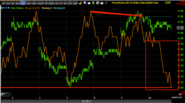
 UUP, the $USD confirms the Euro's short term strength with a leading negative 3 min chart that has been negative this entire weak, so the underlying action is short term institutional selling in to dollar strength, most importantly though is confirmation of the Euro signals.

 The 5 min trend in the $USD also recently leading negative

 And the 10 min in a clear leading negative divergence, that's good confirmation among two different ETF's in multiple timeframes.

Now the big picture and why I want to short price strength...

 USD confirming the downtrend and moving to a leading positive divergence on the 4 hour chart, which matches other 4 hour market average charts we have seen,


The Euro 4 hour confirming the uptrend (as it does the opposite of the USD) and a leading negative divergence now, again confirmation for the bigger picture as well and it's not good for the market averages, maybe short term, but we are approaching the end game, I feel more confident about adding shorts in bulk on price strength for the first time since last May.

Financials / FAS / FAZ

The story is pretty much the same, for short term (as in days which leveraged ETFs are perfect tools for), the trade looks to be to the upside and thus FAS (3x Long Financials) would be my choice as XLF on its own doesn't offer enough profit potential. Bigger picture which is coming together very quickly (i.e.-AAPL) I want to be using short term price strength to get in to short positions at better entries (almost all of the core shorts were entered at swings to new market highs before they fell much lower) with lower risk.

 Financials showing numerous bearish candles with higher than normal volume acting as downside reversals and bullish reversal candles with higher than normal volume acting as upside reversal candles. This daily candle today which is a doji, is a nice bullish reversal candle, although the volume could be higher, Financials have shown better relative strength today than the broad market.

 On a 5 day chart, this shows several concepts, first the ascending (or descending) wedges and how they don't work anymore like they are suppose to according to Technical Analysis, instead of this wedge breaking to the downside and retracing the base as it reached the apex, it did what all wedges have done the last year+, it formed a lateral top (bullish wedges form lateral bases), then they tend to break in the direction they are supposed to.

Using the candlestick reversal concept on a 5 day chart works well too, here you see the October 2011 lows that we rallied from with a signal and a recent pair of shooting star bearish reversals on volume.

I'll have more to say about companies hoarding cash, Financials and QE3 later.

 The 10 min intraday chart of FAS (3x long Financials), is positive, but didn't really inspire me as a choice until later today.

 The 3 min chart is leading positive, when a longer term (like the 10 min) divergence is already in place and then the intraday short term charts fire off like this, it is usually the market makers/specialists who have been filling orders over the last few days and who know which way smart money is going based on those orders they filled. Therefore, right before a move, the middle men tend to stock up and we see this divergence scenario.

 FAZ which is the 3X Bear/short Financials) on a 60 min long term chart is very positive, which is very bad for financials, I wouldn't really expect to see that in something like FAZ, but XLF confirms it, which means the bigger picture looks very bearish.

XLF on a 4 hour chart with (left to right) upside confirmation then a negative divergence early 2012 where we entered core shorts followed by downside confirmation and then the June lows positive divergence which was large and what I suspected all the while was those shares that were accumulated, being sold in to price strength as well as shorted toward the end as the 4 hour is at the worst leading negative of the year, in fact the worst I can see in 5000 bars of history going at least back to Oct 2011.

I like MCP long right here

MCP is a longer term basing long we have been interested in lately. There was a decent pullback today finishing a price pattern bottom on a very positive divergence making MCP an attractive long position or add to here.

 If you haven't sen the trade idea before, you might want to go back before considering it and look at the more comprehensive posts on MCP as a longer term long position. The area of pullback recently is in white.


 Here's an inverse H&S base pattern on a 15 min chart with the final shoulder made today and its still just off its lows so the risk is still low here.

 Here's a close up of that final shoulder today and volume rounding over with price.

 The intraday positive divergences on this last shoulder - 1min

 2 min leading positive -these are huge divergences.

And the longer term 30 min base divergences.

Bottom line, if MCP is a trade I've been building a position in or want to start one, right here looks like a nice area as it has come to you on higher probabilities and lower risk.

TQQQ Add area


This was nearly the perfect place to add TQQQ.
 This very strong leading positive divergence is only part of the story, it's where it falls.

After a move down, this descending triangle is a consolidation/continuation pattern for Technical Traders, note the volume surge as well as many traders run volume surge scans, it would have pulled their attention right to this bearish (according to TA) price pattern, they expected it to break to the downside. This breakout to the upside is what you call a head fake move, that's why the leading positive divergence during the hour the price pattern formed is more meaningful.

Adding Second Half TQQQ Here

The position is now complete.

Risk Asset Update

In reference to the last post, I'll say, "Just as I thought".

As soon as I finish this post, I'll be looking for the rest of the TQQQ entry.

 Commodity relative momentum vs the SPX is much better, this is a positive divergence in one of our leading indicators, it took 2.5 days to build, but reversals are a process not an event, the bigger the divergence the bigger the move which makes me wonder considering how small the negative divergence to the left was.

 HY Credit intraday is positive.

 HY credit longer term is also positive over a week

 The best leading indicator among the currencies, the $AUD is positive

 Now even the Euro which is more of a confirmation indication, is also positive, just on arbitrage alone the market should move up.

 As for the 3 major groups, Energy's relative momentum has faded, this is why we closed UCO/USO earlier today, but...

 Financials are showing a positive divergence vs the SPX and are barely down on the day, the XLF daily chart looks like what I'm looking for in the average's close today.

Tech's relative momentum is also positive, I can't see how the market doesn't rally in to the close and give us a daily reversal candle.