Thursday, September 2, 2010

A Question of When?

So far we've been right on with the bounce and the intention apparently. i said the next thing to look for would be negative divergences, we have those. So they are selling any longs accumulated for the bounce into higher prices and going short. When retail Joe steps into the market to buy, the smarties sell, they effectively take the other side of the trade in other words, they are short.

Now, they need a catalyst. It seems to me that everything on Wall Street is planned in advance, they aren't called smart money for nothing. It seems everything is leaked to them and knowing in advance what the unemployment rate will be allows them allows them to make these plans in advance.

Tomorrow a.m. at 8:30 we have non-farm payrolls and the unemployment rate, those will be the biggies. Watch for the "U6" number for unemployment, I'm sure I'll post it, it's a broader and more accurate measure of unemployment and is nearly twice as high, that is really what is important to our economy.

So I'm going to share with you some breadth charts, these are like taking the market's vital signs. One that you hear often is the dominant  Price/Volume relationship. Today on a decent follow through day, the dominant relationship for NYSE stocks was Price Up/Volume down. Even though price advanced, this is considered to be the most bearish of the 4 possible configurations. And... IT WAS DOMINANT. PU/VD came in at 3055 vs Price Up/ Volume Up (the most bullish) at 1386. Other averages with Price Up Volume down dominance included the Dow Jones 30 with 22 stocks vs. 2 that closed up on higher volume. The NASDAQ 100 was 74 vs 16. The Russell 2000 (one of the best barometers of market vitality) came in at  948 on lighter volume vs 313 on higher volume. The S&P 500 345 vs 84.

You get the picture, clearly the most dominant relationship, which was super dominant today, was the most bearish.

Here's more Breadth information

The NASDAQ 100 15 min Advance / Decline Ratio. In a healthy market, the A/D ratio should move up with price. This is showing the market advancing higher on fewer and fewer stocks-it's called a thin market and we see this often before a collapse.

Another breadth indicator, New highs, New Lows on a 5 min chart and it counts new highs over a 250 bar period-not days, but bars (in this case 5 minute bars). Again, you want to see this climb with price in a healthy market. Clearly this is a negative divergence as price advances and the New Highs decline.

As I said, the Russell 2000 is a good barometer of the market and economy as it has so many stocks in it. This is another way to look at an Advance/Decline line. the green is the AD line and the red is the Russell 2000. Clearly the Russell is advancing on fewer stocks-this is a daily chart. It really became a problem recently.

This is the same as above, but for the Russell 3000, the same situation exists here and the Russell has been outperforming the other averages recently.

Here's today's 1 min Tick index vs. the NYSE composite. The white arrow shows positive tick divergence and the red shows negative tick divergence. We had a strong price rally into the close, the Tick index should have followed price higher, instead it headed lower creating a negative divergence.

All of these taken together shows a market that is advancing on bad breadth. It's not a robust or health bounce, but we never expected it to be, we expected selling and shorting into it, that was the entire point of the bounce, so it is not the start of a healthy move, it is what we expected.

The TRIN yesterday came in very low suggesting a close lower, it's not a perfect indicator, just a piece of the puzzle of probabilities. Today we had another reading of .52 which is extremely low and suggests probabilities of a close lower. I think today the market was clearly being manipulated higher and the reason may be that the unemployment numbers are leaked and if you want to break the market, it's best to have a good reason for people to attach to and create negative sentiment. We'll see at 8:30 tomorrow what we get. If we do get a bad number that causes sentiment to sour, then it would in my mind really be a perfect set up for taking this market down.

As for 3C readings, I took some different readings across different timeframes, here's what I came up with...

Again today we saw the hourly 3C give ground, it's in a negative divergence that is borderline leading. Even when we were waiting for the bounce and the market was going lower, 3C 60 min held a positive posture, now that price is gaining ground it's going negative, this is clearly institutional selling/short selling.

5 min. 3C of the Russell 2000, as prices rallied into that friendly environment I mentioned in an earlier post, behind the scenes the smarties were doing the same as above, selling hard into higher prices. Really from their perspective, the higher they can sell/sell short the better. The same goes for us.

The QQQQ on a 1 minute 3C chart, again the same thing but this is more market makers getting out of their long inventory and shifting into shorts. One advantage of being a market maker is the ability to go "naked short" meaning they don't have to borrow the shares to initiate the short like we do. Remember I said Scottrade was closing down members profitable shorts,  it's supposed to happen when they can no longer borrow the shares, but if you short a company like AAPL or GOOG

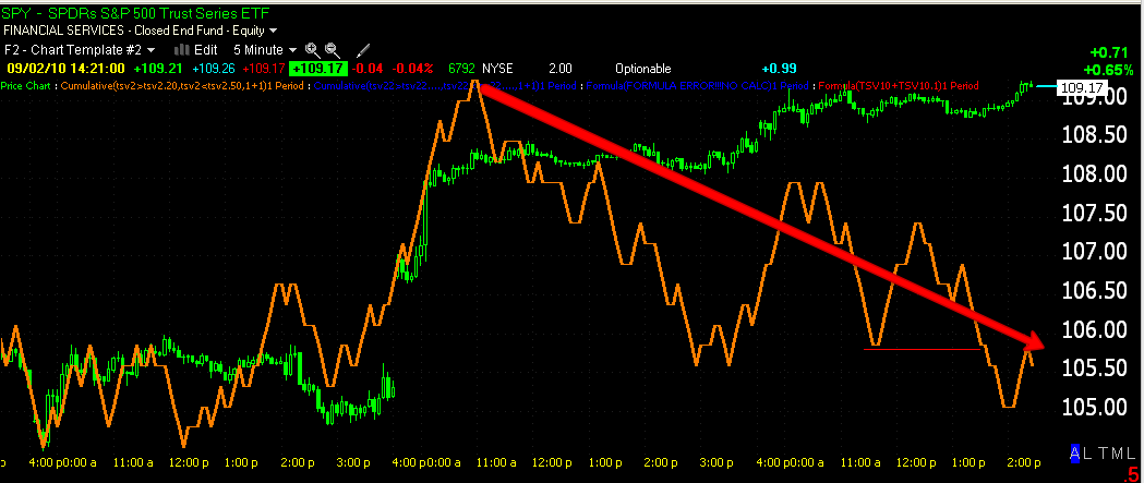
The SPY 5 min 3C shows a lot of recent distribution into the price highs, it is a leading divergence which is serious, so they are doing what we were watching for. A reversal should be close.

If you look at the price of the SPY (red) at a comparable level, you can see (white arrows) that the VIX has moved lower, which is complacency, which is what is needed to get a god sell-off rolling. This is a good sign for our longer term short strategy.

As for a few trades I want to show you...

DBRN is on the short list twice, the first time I used a more appropriate stop. This is a head and shoulders top, and a big one. The downside target is at least $14. We have a break of support and a rally back up to it which makes for a low risk, high probability trade.

Here's an effective Trend Channel stop for DBRN and it is on the close only, not intraday prices. Note that it has already captured the entire downtrend thus far from the top of the head of the H&S pattern.

Here's a proxy for gold, it's a 60 minute 3C chart in a major leading divergence, as I've stated, the metal is in big bubble trouble. It's a trade you may want short exposure to.

Another version of 3C 1 hour and we see a major leading negative divergence. Gold has been very popular and they are trying hard to keep up that perception, but behind the scenes, it's being sold off hard.

Here we have a 15 min chart of gold with a leading positive divergence suggesting it may bounce, that would be an ideal time to initiate a short or to add to one.

One of my favorite shorts, MSPD is a great looking short. It has rallied, but in a bear flag, a downside break of the flag would make for a safer entry, but I'd take it here with appropriate risk management, stops and position sizing. the target is at least $4, maybe lower.

Again, using my Trend channel (which won an award) you can see it was able to keep you in the long trade for well over a year and now it's suggesting a stop at $7.85. If you ever get TeleChart or StockFinder (there's links at the top of the site about them), email me for this indicator, it is a must for trade management.

Last, 3C 15 minute is showing apparent accumulation in a former long trade, RINO. If you are interested email me for updates. You can have long trades that work even in a bear market, this could be one.

Tomorrow morning will be important, we'll see if the Judo concept takes hold tomorrow or if we have to wait, I have a gut feeling that tomorrow is an ideal day to sell the market off and based on a few charts, it looks like that may be the plan, so if it is, they obviously have the leaked report already. The way they rallied into the close on horrible breadth and distribution really suggests they were trying to quickly get the most bang out of this setup. That's my gut feel but we need to see the numbers to back it up. If that comes to pass, don't be slow about getting your feet wet on the short side, whether using equities or inverse ETFs.

Again, thank you all for all your kind emails and support for my wife and I. Today meant the world to us.

Another Tidbit for the File

Yesterday at 1:12 I posted an Update on USO you can read it by clicking the link, but the gist was this, we had a triangle and the point I was trying to make is this is exactly what most traders look for and based on what they've been taught through nearly a century of books specifically covering this price pattern, they have an expectation. Here's the chart and part of what I wrote...


"This is typically considered a continuation pattern so the expectation is for a breakout to the upside, again, it's an obvious pattern on the chart which gives Wall Street an incentive to fool around with it being they know everyone in the trade is watching it and being that the pattern is expected to breakout to the upside. So watch for a false breakout, I'd guess if it occurred below the triangle that would be good news, above the triangle, bad news, unless they don't manipulate it at all."


Here's an update of that chart...


The first triangle did what I mentioned it might, it broke down-that's the opposite of what traders have been taught so it would have taken some short term traders out, then it ran a bit higher and formed a bigger triangle. Being that it is considered a continuation pattern and the preceding trend was up, again the conventional wisdom says that it should break out to the upside. However, the conventional wisdom is exactly what Wall Street uses to take advantage of traders, take their shares on the cheap and trigger stops and other orders, all of which they make money on through the spread between the bid and the ask. So this bigger triangle that we closed on yesterday did the exact same thing again, this time it probably hit longer term traders as it gapped down this a.m. and then went on to do what it is expected to do, it moved higher. 


This is an example of why technical analysis, at least conventional technical analysis can actually do more harm then good. People read all these trading books that teach them, "this is what is supposed to happen" and they place their orders and on a day like today with the gap down, the longs expecting an upside breakout got thrown out of their trades, Wall Street picked up shares cheap, the market makers made their money and the trade went higher. I know we've all been there before, it's frustrating to be stopped out of a position to only see it go the way you thought it should. These are the games Wall Street plays, especially when it is a very obvious pattern like a triangle that every technical trader sees. 


What can you do about it? First of all, understand this is the way Wall Street operates. Like I warned yesterday, 


"This is typically considered a continuation pattern so the expectation is for a breakout to the upside, again, it's an obvious pattern on the chart which gives Wall Street an incentive to fool around with it being they know everyone in the trade is watching it and being that the pattern is expected to breakout to the upside. So watch for a false breakout, I'd guess if it occurred below the triangle that would be good news, above the triangle, bad news, unless they don't manipulate it at all."


So you can 1) use your risk management and give the trade a wide stop, this means to maintain your 1-2% risk per position or however you determine your position risk,  you take on less shares. when the trade moves in your favor, you can raise and tighten the stop and add to the position.


The second thing you can do is wait... Waiting is the ONE advantage you have over Wall Street, you can choose to not trade. So you wait for the trade to do what it is supposed to do and that is breakout to the upside. You place a limit order just above the breakout level and you take the trade only after it shows you that it will do what you expect-unless you have other confirming information, last Wednesday we bought the lows of the USO/oil sell off because of a strong positive divergence in 3C. 


By waiting you will lose a small percentage of the trade, but you have a higher probability trade with less risk.


It wasn't that long ago that these patterns were successful on a pretty regular basis, but just like overwhelming sentiment that Wall Street takes the other side of, Technical Analysis has become very popular and Wall Street know what every technical trader is looking at. You have to think outside of the box. If you are a technical trader, put down the books, look at these charts and figure out strategies that will allow you to profit from the behavior that you know Wall Street will engage in.


A third and final way you can deal with it is to buy the suspected false breakout as it just turns up in a reversal. This allows you to buy it cheap like Wall Street is doing. You put your stop just below the low of the false breakout (remember you are entering the trade only after the false breakout begins to reverse and usually that will still be less expensive then the breakout point or even the point inside the triangle.


So keep this in mind-it happened twice in a day.

AAPL Follow Up

OK, I'm definitely bearish on AAPL, I mentioned it yesterday, but I do want to show you something. You may recall that I said "watch the leaders... AAPL, GOOG, etc"

I posted this chart of AAPL at 3:45 yesterday

I said,


"Despite even the late day positive 1 min divergence, the position of 3C at that point is very negative. Look at the red arrow on the top chart, the distribution taking place while it ran for the highs of the day!"


I also said, 


" I would hold this through even a bounce above the triangle-I'd add there too, but just to illustrate the amount of trouble this stock appears to be in-and it's a market leader."


In the white box (Tuesday) we see an end of day positive divergence, but it too was pretty low comparatively. I guess the point I'm getting at is I think AAPL is a decent short, but at the end of the day we do see the market maker stocking up on AAPL, that's what a 1 minute positive divergence basically represents. So, considering AAPL is a market leader, looking back we have to ask ourselves, "Why was the market maker buying this stock for his/her inventory at the end of the day?" The answer would seem pretty obvious; their expecting to sell those shares at higher prices in the near future.


Just so you know.. the divergence on the 1 minute chart of AAPL today was negative, however above we see two days in which the market maker was stocking up at the end of the day and both times AAPL moved higher. These are the hundreds of little pieces of the puzzle that helps us put together a composite picture of what we can expect to be the highest probability. Another little lesson to throw into the experience file.

A Friendly Environment-

The market today looked very much like a textbook of technical analysis. We know that the market uses technical analysis (at least the conventional kind) against its own practitioners, but today the market seemed to be saying to the longs, "Come in, the water is warm and the party is just getting started"

Look....

Here we have a perfect symmetrical triangle, this is an upside consolidation/continuation pattern. In the last few weeks and even months, I've showed you numerous triangles that were manipulated by false breakouts, this is the way Wall Street operates now. They know every technical trader is watching that triangle for an upside breakout, it's what they've learned for nearly 100 years. Wall Street did not play any games with this triangle, volume even rose on the breakout and the pullback we see in the Technical Analysis books was picture perfect, no false moves, it pulled back on lighter volume to a reasonable area of support. Next prices advanced into rising volume-in a T.A. textbook you always look for rising volume into rising prices. If you look at the 2003 rally, that's exactly what you will see. If you look at the bear market rally of 2009, you will see the opposite which was a dead give away that this was not a new bull market, just an extraordinary bear market rally. So everything traders saw on this chart invited them to join the party, it was everything they have seen and learned in T.A. textbooks. We know Wall Street doesn't operate this way anymore, so this looks to me like they were luring in the longs with a familiar and friendly trading environment.


Look at the advancing volume and prices, exactly what the typical technical trader wants to see.


But pull the curtain back.... and Wall Street is doing what they do best. If all of this was legitimate, then this minute chart of 3C would show 3C rising with prices. Obviously 3C, nor the long term 3C below followed prices, they showed indications of market makers/specialists selling into the rally. They could be trading their own accounts, they could be filling institutional orders and the selling could wither be of long positions acquired at lower prices or it could be short selling-we just know it was selling so Wall Street created a friendly environment and sold into it. Remember I said this would be a "malicious bounce" and a "Scary bounce" for shorts. I also said we need to be on the lookout for distribution into rising prices, we obviously have that on this chart. Both versions of 3C are coded differently so they give independent confirmation, both look the same at and after the triangle.


The 5 minute 3C chart which (version 2 in 5 minute works extremely well for the SPY) is the earliest timeframe where institutional activity can be seen (1-minute charts are almost exclusively market makers/specialists). Remember I showed you the institutional accumulation into the afternoon lows of 8/31 and this was one reason we believed there would be a bounce the next day, well look now. Prices are rising and 3C is making consecutively lower highs, this is a strong negative divergence suggesting institutional selling into the rally.

Given the job reports due out at 8:30 Friday morning, it's not surprising to see some trepidation, traders don't want to get heavily long in front of a report like that, but the rise in price taken with the negative divergence shows institutional money getting out of the way. We know and have seen the evidence of leaked reports. Either the report is going to be bad and they're closing bounce longs and going short or they are just starting to wrap up the bounce trade. I wouldn't be surprised to see the report come in worse then expected, remember my initial opinion was that the bounce would end this week, although we got a late start because of the Mexican Stock Market bomb scare.

The trading activity today was "pleasant" and familiar for most technical traders, I'd call it inviting for longs. This is all part of what we expected to see, a scare bounce that forced shorts to cover, longs enter the market and when the bounce is done, it reverses, longs are now at a loss and become sellers, shorts dive in, the supply demand equation is shifted toward supply which causes the market to fall fast and hard. That would be the purpose of a malicious bounce as we have discussed. The only unknown is how high, but again tomorrow we have the potential catalyst to start the snowball effect. I can not see going long this market in a position trade with GDP like we've seen. The short term reports today that the media says, "reflect an improving economy, albeit slowly" are soon to be forgotten, they are small time. The big picture is GDP falling from 5% to 1.6% in 3 quarters and the fact that neither the Fed that made some cryptic allusion to something akin to a "super weapon" that can be deployed, in my mind was rubbish. If you have a fall in GDP like that after everything they threw at supporting this economy and it didn't stick, why would you wait for it to get worse then 5% to 1.6%? If you had the "super weapon" you'd be out in front of this mess now trying to reverse that trend which, by the calculations, is on track for a double dip unless something amazing were to happen.

There's something in the timing of all this too that doesn't sit right with me, right before a 3 day weekend when most traders will be back from vacation and active in the market. Certainly a big sell-off on Friday would give those returning traders something to think about over the long weekend. I'd think a sell-off tomorrow would inflict maximum damage, but I can only speculate, however the underlying truth of the market is there for you to see in 3C.

Lastly you know that I have a bearish opinion of gold. Checkout these charts.

This is a stark contrast in what is textbook above and what is reality. The triangle, first any good breakout from a triangle never or rarely comes at the absolute apex (point of the triangle). A strong triangle will breakout about 2/3 of the way complete, usually with about 5 points of contact between support and resistance. This one broke at the absolute apex, it broke out to the upside on a thus far, false breakout. The red box shows the false upside breakout on price and the red arrow, below on volume. Note that volume increased on the red box breakout; this makes traders think it's a real move. Then in yellow we have strong price momentum down as exhibited by the large bodied filled in (green) bearish candles-there little to no wick, they start at the top of the candle and each 5 minutes they end at the bottom, no attempt to rally any of them. Now look at the yellow arrow, volume is picked way up on the sell-side. This is a small version of the Judo concept. The false breakout brings in the longs and then the fall causes them to sell their positions at a loss. This is a micro illustration of what I believe we are seeing in the market, we just have not entered the end/down phase yet.


This is a rarely used "ultra fast" version of 3C. It's meant really to pick up on very short term moves and is not very useful for anything other then that. The negative divergence at the breakout is already clear, the ending position has started a leading negative divergence. This "may" be a short term or long term top for gold. I would expect to see volatility moves to shake the tree, but ultimately the timing is just about right and considering the gap up today that formed the hanging man-reversal candle, it all fits nicely. My recent Gold analysis has suggested this was coming and this is why I have not recommended gold as a long despite the gains, you see a sick equity, you just don't know for sure when it's going to keel over.

As you know, I'm very open about my life, maybe too much so, but I think it's important for my subscribers to get a feel for who I am. There are a lot of self-proclaimed gurus that are great marketing people, but don't always have the insight to back up their claims. I AM NO GURU and I have nothing in my life I can't share because I have nothing I'm ashamed of that I haven't already made amends. I'm going to give you a personal example of why, when I see a chart like gold, despite the fact I know there are probably more gains to be had, I won't enter a sick trade.

My father died several years ago. It may be morose and I apologize if this touches anyone the wrong way, but I remember to this day one of the most surprising things to me was how much the human body can take before it gives in. For years he looked so bad that I thought it would be any day, but it went on for years.

The point being, gold is a sickly chart. If I told you to buy gold because I knew that despite it's sickness there were possible gains left, at some point you would most likely be caught in a trap, this chart may be the start of that trap. I can't and won't for any member of WOWS, set an example that would cause you to develop poor trading habits. I don't care how much gold gained after I saw the problems in it, I don't care if it gains more, it could and did already go on for a long time. The point is there are thousands of equities to trade. You only trade those that have the highest probabilities. It's hard enough to make money in the market, so even if you like the trade for whatever reason, when you see the red flag, move on. If you entered the Gold trade a month ago, you may feel justified by the gains, but what happens when it drops 5% in a day or something worse?

Perhaps a better analogy would have been this. Imagine a captain in the army leading his troops and they come up upon a mine field. The captain after thinking about it for a moment, decides the best course of action is to close his eyes and walk right through. Amazingly he makes it the other side. Has that captain now learned a lesson that will serve him well? The idea that every time he encounters a mine field the best course of action is to simply close your eyes and walk across?

I know it's a bit ridiculous, but imagine you knew gold was sick and bought it and made great money. Did you learn a lesson that will serve you well as you continue your trading career? This is one of the biggest reasons people do not take the time to understand risk management and apply it, they figure, "I've survived this long without it". Remember that genius young oil trader who made billions before he caught one final trade that took down his entire company. It's amazing to me they let him trade billions with no risk management oversight, but they did and as good as he was, in the end, he took down the whole company with one bad trade.

Finally, my wife Anna would like to say a few words....

Thank you for all of your prayers, all of the wishes of happiness and success and today all of the great emails welcoming me to this country. I feel really good about the members of the Wolf on Wall Street because Brandt works so much, I share him with you and I'm happy because you all are such nice people. I see all the congratulations and personal experiences and your life stories that you share with us. It seems like a big happy trading family. It's good to know that behind the computers, I can feel like I know some of you and I like that.

I share Brandt with you and in return you share your life and our life together and I really appreciate that because I feel like I have friends and people that care about us all over the world and that share my husbands passion and like his work.  I think it would be a good idea to have a cruise ship seminar one day where we can all meet. Thank you for all of your support.

Sincerely,

Anna (Panni) -from Hungary :)

Volume is Huge since 3 pm

3C is just not following this advance on a 1 min or 5 minute chart, this looks like the kind of move you want to fade. I'm really wondering what's going to be in that unemployment report in the a.m.

This may be it for GLD

Not looking healthy

I would be OK

With starting to short in this area, I would not over commit, but I would also look to take or start taking profits on longs, enough to guarantee a profitable trade.

EDZ

Looking attractive at these levels, the last few days it seems to be under accumulation

Update

The short term 1 min charts all show a negative divergence still in place as prices rise. This IS the SCARE BOUNCE we have been talking about and waiting for. As I said yesterday, they have accomplished the tactical idea, we just do not know if they are still shorting or still trying to run shorts out or suck longs in. With the data at 8:30 and the long weekend, a huge sell-off would be ideal, but we'll have to wait and see. Wall Street almost always swings way further then you expect both ways like a pendulum.

Alive, But.....

Here's the charts...
The hourly negative divergence continues

Here's the SPY 5 min -obviously they are still selling into higher prices

The SPY 1 min. confirms this

Note the reversal star in the Dow-30 as of now, also volume is falling off-buyers are not aggressive about chasing prices

The DIA hourly is also continuing its negative divergence

Distribution is evident on the 10 min chart very clearly

Even the 1 min chart is making lower highs in 3C

The Q's hourly are in a relative negative divergence

Q's 15 min shows distribution 

as does this chart of the Q's 1 min.

The Tick index confirms distribution at the highs at this point (when screen captured)

USO's hourly is lagging but and in a relative negative divergence, but this chart is not conclusive with 3C pointing up

USO 1 min 3C has been in line with prices, the longer term 3C at the bottom is showing distribution

AAPL is showing the same loss of momentum seen in the broader market with buyers unwilling to aggressively bid up price as volume is low

AAPL 1 hour in a relative negative divergence

AAPL 5 min=distribution

AAPL 1 min chart is showing clear distribution

Gold's hourly divergence is negative

GOLD on a 10min looking as if it wants to bounce

as does the 1 min chart

It seems like the bounce is sputtering out, the last hour will be important. We have some important reports tomorrow a.m. at 8:30, this could be a downside trigger, especially heading into a long weekend.

My Apologies

As many of you know, my wife and I had our interview for her permanent resident status with immigration today. I really thank you for all of the encouragement, well-wishes and prayers, plus you patience and understanding, it was a big deal for us.

Good news, my wife is now an American resident! We can put all of the long nights of organizing documents behind us finally and I can concentrate and devote my time to my second love, right here at WOWS. So I'm going to go over the charts and get an update out for you quickly.

I think I answered everyone's emails, but if I missed anything please don't hesitate to contact me.

Thanks again.