Thursday, May 7, 2015

Daily Wrap

As an interesting tidbit, the Dow has set a 100+ year record. The Dow has spent 38 consecutive days without making more than a 1 month low or high and this in a tight range of only 1.58%.
The change in trend is a message of the market in its own right as we are no longer moving up, but sideways typical of tops, but remember the volatility we are looking for before we get a serious move to the downside that holds? At a 100 year record tight over the last month, we are certainly primed for it. The next longest streak was 45 days in 1910!

US Macro Data hit ANOTHER new 6 year low today, in fact the pace of decline is so fast that only the Lehman era was slightly faster in the pace of decline, but the F_E_D sees no core deterioration. That's because, as I have made the objective argument, the F_E_D has set-up a subjective set of guiding data points that can all be trumped by the word, "Feel" as in "We feel that inflation will move toward 2%" when they hike rates, even if inflation at the time is moving toward deflation!

Not much has changed otherwise, I still think we have an oversold bounce and more to go than just today. In fact, I suspect we make a bit wider base and here's a quick look at why...
 SPY 1 min intraday ended on a slight negative divergence suggesting we pick up where we left off, perhaps some weakness early in the morning, but more than anything, I suspect a small "W" base here.

The 5 min charts like QQQ above are still holding their divergence...

 And the 10 min charts like IWM above saw rapid accumulation, although not the widest area, it seems like they want to get this off before a certain date and are hurried now.

You can see on our custom SPY/TICK histogram the short term capitulation yesterday and improvement today in intraday breadth which gives the 10 min chart above some credibility.

The averages...
 Look like they are making good use of stop runs and just from a personal perspective, the outperformance in Transports (salmon) is great as I'd love to put out a third trade entry signal as a core short position. The Russell has been in second place and everything else has been pretty close to each other.

Over the last month, you can see the lack of movement in the Dow (White), small caps have lagged badly (yellow) and everything else has been holding together.

Today's BABA trade/gains went very well, I don't know whether or not there was some earning's leak, I just know that the charts before earnings this morning, gave me no reason to close the position. Luckily we were able to close it pretty early, not as early as I would have liked, but still managed a +127% gain since May 4th.

VXX puts look great to me for a shorter term trade as does USO short/Puts and I'll show you why below.

Tomorrow is Friday and that means an op-ex pin, even the weeklies. Generally speaking we see the market open pretty close to Thursday's close and an op-ex max pain pin until about 2 pm around the same range. After that, we see the market do whatever it wants and we get some of the best 3C data of the week those last 2 hours. I suspect we get a little wider base as mentioned above already, it doesn't have to be a "W", but those seem to be popular lately on smaller bases.

I think the $USD strength today is very interesting and in a way pulls together all of our positions and expectations both near term and big picture...
 1 min $USDX strength today as forecasted yesterday with EUR/USD weakness and USD/JPY strength,  also as forecasted.

The more important signal is the 3C 30 min $USDX suggesting a counter trend bounce...

This is important to all of our current positions and forecasts as you'll see why below...
 Our April 2nd $USDX forecast called for a bounce (green) followed by a much larger downtrend (red arrows), the yellow areas are counter trend bounces as I am expecting here.

The $USDX daily chart...
From a longer term perspective, $USD weakness is what the F_E_D wants to see before hiking rates, thus my comments last week about the F_E_D being willing to sacrifice the market as Yellen seemed to make clear yesterday.

The clean uptrend is the carry trade in $USD, otherwise it would normally send the market lower. The yellow trendiness show lower highs and lower lows, the trend is changing and this will have a snow-ball effect on carry trade losses which will have a snowball effect on the $USD and I believe bonds and equities as well as they were financed with Carry trade proceeds. This is why the $USD has been looking so weak on long term 3C charts and the Yen so much stronger.

Note the daily candle in the $USD today, a bullish one, ripe for a counter trend bounce as we expect and this matters why?

 This is the $USDX in purple as a comparison vs ES/SPX futures (candlesticks. Note the near PERFECT correlation between the $USD and ES recently. This has obvious implications for our near term bounce forecast, as well as our longer term big picture as you'll see below. However I think this tight correlation is telling us more than anything that assets that were financed with carry trade proceeds are being closed out to close out the carry trade (sell the $USD and buy back the borrowed Yen).


This is $USDX (purple) vs. CL (Brent Oil Futures) or our USO trade, note the inverse relationship, meaning a $USD bounce as we are expecting would, as I have been saying, send oil and our USO short lower.

Do you think it's coincidence that the $USD has its best day since the end of January today and USO not only had its worst day in a month, but proved our theory of the move above base resistance was a head fake move as price slipped back below the trendily, opening USO up to a FAST REVERSAL (down)?
USO Daily with the last 2 days showing churning on volume and heavy distribution as price slipped back below the trendily, creating a bull trap.

 This is $USDX (purple) vs VIX futures, note the inverse relationship so a $USD bounce should send our VXX short/Put positions lower with nice gains. Remember that VIX typically trades almost exactly opposite the market!

 And here we have the $USDX (purple) vs. 30 year Treasury futures, again another position we opened today, Trade Idea: Long Bonds / TLT with not only good 3C charts as well as a strong conceptual reason for the trade, but apparently another strong $USD correlation. Again, remember that Carry Trade proceeds typically end up in bonds first (last year bonds outperformed equities on the year!).

 I posted the Trade Idea: Long Bonds / TLT idea today with the caveat that it would be  a half size position and I'd likely add to it on a pullback which I think is high probability to form a stronger base, almost identical to the market averages.

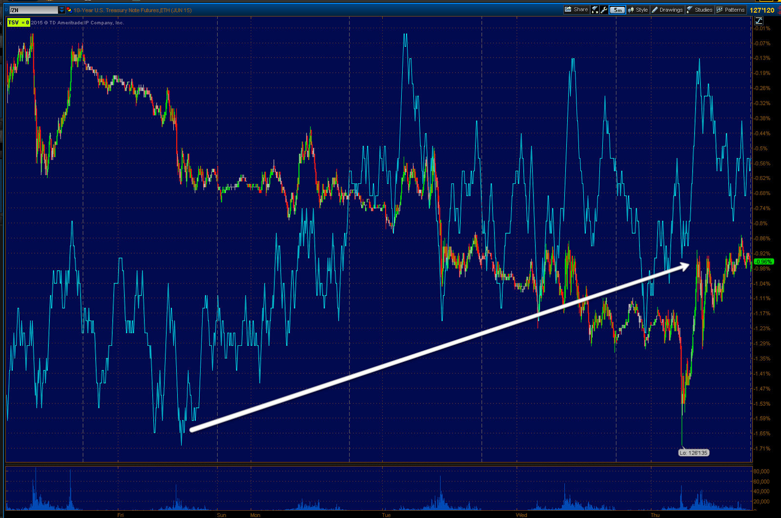
The 5 min chart of 30 year Treasury futures above shows a positive divergence in that base area, while the 1 min chart below...

Suggests a near term (likely tomorrow) pullback to strengthen the base just like equities/the market.

That's solid correlation and additional evidence to back up 3 trades that were all entered on other merits that just so happen to have additional probabilities via the $USD (VXX Puts, USO short & Puts and TLT long & Calls).

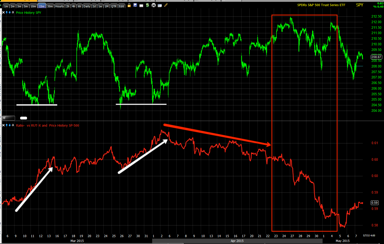
However as our longer term or big picture positions go which I posted in last night's Daily Wrap at the bottom, should do very well considering we are expecting a "Counter trend bounce" in the $USD, the trend should continue to make lower lows and when we look at the long term 60 min chart of $USD vs. ES/SPX futures....

You can probably see the leading correlation on your own, but just in case, note the $USD's (purple) leading correlation that has called all of the market pivot highs and continues to move lower as the market puts in a new low on this 60 min chart.

In other words, even our big picture core shorts are in the right place! We'll be looking to add to those on near term price strength in the market in assets such as transports, IWM, NFLX, etc.

I took a quick look at leading indicators today and they are in line with both near term and big picture expectations...
 The near term SPX:RUT Ratio which has been quite effective on both a short term intraday (day to day) basis as well as longer term.

The near term shows support for the market at the shite arrow yesterday as we hit all of those stops that were accumulated, today it remained in line with the SPX.

However on a big picture basis, this is exactly what I said I'd be looking for just after the April 2nd forecast came out so you would know in advance what expectations are. I'll ALWAYS try to anchor expectations in advance.
 The last two base/bounce areas in the SPX (white trendiness) both saw support from a rising SPX:RUT Ratio, however in to the advance we saw deterioration, but as I said many times in April, "I want to see the chart's divergence jumping off the screen".

I'd say the chart's/indicator's divergence vs the SPX in green is jumping off the screen with particular deterioration right at last week's head fake move or Igloo w/ a Chimney price pattern/top.

High Yield Corporate Credit, "Credit leads, stocks follow" has been leading to the downside and offered a little support today before failing at the end of the day in line with intraday 3C charts for a pullback/broader "W" base.

However, I suspect the reason we aren't seeing the same divergences in Index futures (as mostly pros trade index futures while retail trades equities) is because they don't want to take on long risk, but rather let the trade come to them and sell in to it or short in to it, the exact same thing we are looking to do.

That being said, since HY Credit is an asset that is almost exclusively traded by smart money...
I expect any bounce in the market (green) to be met with a deeper divergence in HY Credit as it continues to sell off. Again, exactly the signals we were looking for since our forecast on April 2nd and we saw that in to the topping area from the April run (red box to the right).

I don't think there's much more to say, we have pretty much maintained the same view with minor tweaks as the data comes in. I think our near term positioning and the requirements for any additional positions are quite clear as is our trade plan to let price strength on a counter trend $USDX-based bounce, bring the trade to us at the time of our choosing as well as the confirmation of underlying conditions. We aren't obligated to any risk, that's a good position to be in when l;getting the trade come to you. We are picking our battles and the time and place of them. 

Patience is the key. For nearly y a month we had very few trade ideas, but we didn't get caught in the meat grinder. When conditions were right, we started opening trades that have all been winners like the quick NFLX Calls closed May 5th at a gain, USO puts and equity short which is already at a gain, VXX puts with the $23 puts already green,  UVXY gains closed down April 30th which we did well with and our additional positions.

Patience and waiting for high probability signals were key in each of those positions.

Wrapping it up, the Dominant Price/Volume Relationship was the same in the Dow, SPX and NDX with no relationship at all in the Russell 2000. There were 18 Dow stocks, 57 NDX and 221 SPX in the Dominant relationship (of 4 possibilities) of Close Up/Volume Down. This is the most bearish of the 4 relationships and fits well with a minor pullback as seen on the 1-2 min intraday charts to widen out a "W" base.

Unlike yesterday, in which internals suggested that the averages close green , which all of them did, today's Sector performance shows 8 of 9 S&P sectors closing green with a short term weak 1-day overbought condition, again pointing to the probability of a minor pullback as drawn on the charts above to create a "W" base.

Tech led today at +.74 (it was the laggard yesterday) and the laggard today was energy at -1.05%. 

DOES ANYONE REMEMBER THE DIVERGENCE IN RELATIVE PERFORMANCE I POSTED 2 DAYS AGO BETWEEN ENERGY AND OIL SUGGESTING BOTH COME DOWN?

170 of the 238 Morningstar groups were green as well sticking with the internals themes above.

FINALLY, Futures tonight...

Most of the Index futures are in line and I wouldn't think much of them, however the NASDAQ 100 futures have an obvious negative divergence, again in line with VERY short term (tomorrow) expectations...
 NQ/NASDAQ 100 futures 1 min negative divergence.

If there's overnight weakness on this divergence, I suspect it will be because of a short term move in EUR/USD...
 1 min EUR/USD positive divergence. The $USD itself doesn't look weak on this timeframe, but a rising Euro pushes the $USD lower and the pair above suggests that as well as the Euro futures below...
Euro 1 min positive.

This would push the $USDX lower and , well you saw all the correlations.

Index futures would likely see some weakness. I'm expecting a small bounce in oil overnight and Treasury futures would be likely to see some short term weakness overnight which is all fine as it is what we are projecting for VERY near term trade (as in tomorrow).

Otherwise, the event of the day will be the Non-Farm Payrolls at 8:30 a.m. Last month's which came out on Good Friday as the market was closed, were horrendous, something like 127k on consensus of about 246k if I remember with a whisper number going around of a missed print around 150k, it came in even lower than that.

If there's another very weak print and there's some evidence to suggest it, then I'd expect equity strength, treasury strength, gold to sell off, $USD strength, etc. However that's just conjecture until we see the print, we were massively surprised last month, perhaps it surprises in a surprising way.

I hope you had a profitable day today as I know many of you have and of course moving forward both near term and the more important big picture.

Have a great night, I'm off to spend some time with the wonderful Andrea who has dinner on the table (well it has been for the last 30 minutes).
Without her, we'd never get our new website!

Bond Rally / Swing

*For some reason I wasn't able to get the tracking portfolio to recognize TLT Calls or any TLT options so I went with the best thing I could do at the time which was short TBT (TBT is the inverse of TLT with 2x leverage so in shorting it, I essentially created a fairly liquid 2x long TLT position).

There has been a lot going on in the bond space, especially German Bunds which nearly moved out of reach of the ECB's QE, the volatility has been staggering.

However even the most cursory examination of a bond chart tells you something significant has changed. The popular thinking is QE is over and rate hikes, but remember that bonds are the object of carry trade proceed purchases so when a carry trade unwinds, guess which asset class falls?

Either way, for now we have a short term oversold condition and a head fake move about to be pulled on traders that are entering on the most predictable basics of Technical analysis, a long term trendily break. This brings the shorts in nice and thick, a perfect time to run a volatility shakeout. For more on the concept, see this article about the 3 places I WILL short a H&S top and the 1 place I WON'T, it might surprise you as it is essentially the opposite of what Technical Analysis has taught for more than 5 decades (making technical traders' actions very predictable and easy to use against them).

THIS IS AN EXCERPT ABOUT THE CONCEPT OF VOLATILITY SHAKEOUTS APPLIED TO ONE OF OUR CORE SHORT POSITION, HLF (HerbaLife). If you are already familiar with our concept, just skip down below the next chart to get to the TLT/Bonds charts.

"This is the H&S top in HLF and the 3 places I'll short it, 1) at the top of the head which is difficult, 2) at the top of the right shoulder. I will NOT short a H&S on the initial break of the neckline as TA teaches, but rather wait for the volatility shakeout of new shorts who just entered at area #3 back above the neckline and this is an example of the increased volatility we see as a top transitions to a downtrend. We entered HLF on the biggest day up in its history, over a +25% gain on the day, but not just because of the gain, but because the charts told us to even before the move up started, that was just a bonus, although an emotionally difficult one to short in to."

TLT-Treasuries
This is the daily chart of TLT as posted in Trade Idea: Long Bonds / TLT.

Note the clean trend through most of 2014 and as usual, the "seemingly" bullish increased ROC above the trend line. This is almost always a red flag telling you the trend is about to change whether it occurs on a daily chart like this or a 30 minute chart. One of the finer examples of this concept can be found on a gold chart (GLD) around September of 2011. You can draw a simple trendline from November 2008 or you can use a 150 day moving average. Either way you'll see Gold peel away from its long-term trend.

Many of you who were with me back then may recall a certain hedge fund manager with a blog site who asked for my Gold analysis and for all intents and purposes essentially laughed in my face as he was a diehard goldbug. My analysis was that gold was topping and would enter either an intermediate or primary downtrend as it did. The first warning sign what is the increased upside rate of change in price peeling away from the long-term trend just as you see in TLT above.

Late last year we also saw negative divergences that no longer confirmed the uptrend which had been confirming for almost a year. Since then we have seen Bonds make a lower high in the lower low which is the definition of a downtrend. Note the increased volume as TLT breaks below it's long term trendline.


This is a closer view at the daily chart of TLT. Once again you can see short-term capitulation or a selling event at the march lows and more recently on the break of the long-term trend line. The price and volume action alone are good cause for suspecting a countertrend bounce.

The long term one day 3C chart shows a strong positive divergence at a four month, Stage one base. Just before the move to stage 2 mark up, if you look closely you will see a head fake/ stop run at the yellow arrow. Once again this concept works with any asset, in any time frame, with any trading style. This is one of the best price-based timing indications of a trend change.

#2 shows stage to mark up with 3C confirmation making higher highs with price at the green arrow. Stage III was seen on hourly and multi hour charts as the long term, stronger daily chart is slower to give signals. I've also noted the increased rate of change to the upside just before the lateral top formed.

This is our custom DeMark inspired buy/ sell indicator giving it's first buy signal in green at the right side of the chart.

Our customX-Over screen shows all three indications giving a long signal at the white boxes with trend confirmation at the green arrow and a recent sell/ sell short Signal at the three red boxes. This system avoids the whipsaws and false signals that plague moving average crossover systems. There's also an entire trade management strategy that goes with the screen.

Our custom Trend Channel held the entire trend with a close call at Q3 2014, but it did not close below the channel. Both breaks above the channel are the same concept as the peeling away from the long-term trend and are red flags that a training change is near. There is a confirmed stop at the red arrow. You will never catch the top using this system, But you will catch the meat of the trend.

The 60 minute chart shows one of the lower lower lows and lour highs and 3C confirmation of the trend. Let me be clear, I believe treasuries have entered a new phase or trend and I would expect to see them make it lower low, however the trade we are looking at is a shorter term swing trade, typically with a strong volatility as shorts need to be emotionally squeezed into covering which makes this a strong Long swing trade.

On the 30 minute chart you can see the beginning of a positive divergence.

The five minute chart, much like our market averages has a strong leading positive divergence. Unlike the normal inverse correlation between bonds and equities, they have been trading together as of recent which I believe it is a symptom of the closing of the carry trade.

An unusual correlation between Bonds (green) and the SPY (red) moving together rather than their normal inverse correlation.

I do find it interesting that we have signals for a market bounce at the same time we are getting signals for a bounce in treasuries, considering the recent correlation on the chart above.

Futures
This is the 30 year treasury future showing a negative divergence and trend lower with 3C confirmation, which has recently turned into a positive divergence. I do believe there is a strong possibility that Bonds pullback toward the recent lows and form a stronger "W" base. If this is the case, I would likely add to the bond long, swing trade.

This one minute chart of 30 year bond futures shows a negative divergence intraday much like the market today, suggesting the near term pull back mentioned above which would create an excellent trade entry at better prices and lower risk.

This is the 15 minute chart of 10 year treasury futures. I don't believe a bounce is limited to Long end Bonds such as those represented by TLT. I believe we will see a general bounce across the entire treasury complex.

I will be setting price alerts for a move toward recent lows so we can take a look at price action on a potential pullback for an add-to or new Long position.

Trade Idea: Long Bonds / TLT

I'll have charts out momentarily, but I believe we are on the verge of a significant counter trend bounce or what many of you know as a "Volatility Shakeout". For those of you familiar with the concept, this daily chart of TLT will show you exactly what I mean and when I post the charts next, you'll see additional information backing up the trade idea.


After bonds outperformed equities last year on a steady uptrend that had 3C confirmation all the way through, late last year I posted numerous notes that TLT/Bonds no longer had the long term 60 min 3C chart uptrend confirmation and they had gone negative. Since then, TLT has made lower highs and lower lows and recently broken a very obvious trend line. This is where technical shorts will enter on confirmation of the break of the trend line as it is obvious,  just like our H&S volatility shake-out of new shorts once the neckline breaks and that being the reason we NEVER short a H&S at the break of the neckline, but on the shakeout rally to force new shorts to cover just after.

I'm expecting the exact same here.

I'm going with a half size position in TLT (20+ year Treasury Bond Fund) June 19th (monthly) CALLS with a strike of $122. If TLT pulls back a little, I'll add the second half of the position.


Market Update: DIVERGENCE BETWEEN THE AVERAGES AND INDEX FUTURES

In my last market update,  Market Bounce Update I said,

"TICK data a slight intraday pullback or consolidation. I'll be taking a look around to see if there's anything that is worth the risk Beyond the positions that are already open."

 This is the TICK Channel I was looking at when I made those comments around 12 and as you can see things have turned down sINCE.

 The intraday two-minute SPY with a small negative divergence along the lines of a pullback or consolidation as mentioned in the 12 PM update.

 The intraday one minute IWM confirms the same

 And VXX (short termVIX futures) which trades opposite of the market, is giving an intraday positive which confirms the two charts above.

This looks like a normal intraday divergence, It doesn't look like anything that will affect our bounce scenario.

In fact...
 The SPY five minute chart is still positive as is the 10 minute chart showing earlier

 The IWM 10 minute chart still has a sharp leading positive divergence.

 And the five minute VXX has a negative divergence that confirms the two charts above and our bounce scenario.

 As far as the downside risk and the highest outcome probability (the big picture)...

 SPY 30 min

 Nothing has changed, IWM 15 minutes leading negative at the April Head fake move

VXX 15 minute leading positive confirming the charts above.

So far everything seems to make sense, yet I have had this gut feeling to keep Long risk minimal.

As I showed last night, the one thing we were looking for to tell us that the April cycle had transitioned into a much more bearish market condition were the 7, 10 and 15 minute charts which were positive at the beginning of April when we made our forecast and have since turned negative as we were expecting and watching for during the April cycle.

I showed these charts last night, all of them negative.
 The one minute ES chart is in line with the intraday charts above with a slight negative divergence intraday which does not raise any questions. However...


When looking at the SPX E-mini futures, I am surprised we don't see some slight positive divergence in line with D5 and 10 minute market averages. This is the ES five minute chart which is in-line with the downtrend.

The ES seven minute chart shows the same condition.

 As does the ES 10 minute chart


 And the ES 15 minute chart.


 And the ES 30 minute chart is exactly where it should be considering our near-term trend expectations and what comes after.

I find it strange that the 5-10 min charts don't have even the slightest positive divergence like the market averages we have seen today.

Perhaps this changes, perhaps it doesn't. The one thing I keep thinking about is the fact that few retail traders are trading E-mini contracts. In other words my suspicion is the pros are not taking on any long risk but are more than willing to sell into it which has been the exact same position I have taken. Maybe I am projecting my personal feelings regarding long risk, but I can't argue with the charts above.

I'm going to check leading indicators and see if anything there gives any additional information. Remember though, I am only expecting an oversold bounce. Perhaps I am correct in assuming professional traders are not taking on long risk as is so far evidenced by the index futures.

Food for thought