Friday, November 30, 2012

No Support, but AAPL is interesting

This is what I meant when I said the end of day ramp had no support, even on an HFT flash crash or ramp, they generally take 30-60 minutes to accumulate the shares they'll run in 1-5 minutes and sell, here there was nothing like that, no warning, no signs of accumulation before the move on the fastest timeframes and nothing before hand that would support that move. I don't have a clue why it was run, maybe like I said to lock in longs with some confidence and they would likely have trouble getting out that fast, they likely couldn't even make up their mind as to what was happening that fast. Maybe it was op-ex related, I did note the very suspicious close of SPY $142.05- $.05 is enough to cause a bunch of contracts to expire worthless and leave them unexerciseable; S&P $1416.06 (6 cents actually can make a difference with options);  the DIA $130.10 (10 cents); IWM $82.11 (11 cents) and the most suspicious, AAPL at  $584.98 which trades options in $5.00 increments, so in that case 2 CENTS!!!

Whatever it is, this is another fine example of why the market needs to be reformed. These kinds of moves have nothing to do with value, price discovery, or anything remotely close to the reason we have a stock market, it's a playground for whoever has the fastest machine and is located closest to the exchange (which exchanges charge money for-can you believe that?).

 DIA with earlier positives that made very small moves, nothing at the 3 p.m. low. 1 min.

 DIA 2 min leading negative, nothing in the area.

 DIA 3 min, nothing in the area.


 QQQ 1 min leading negative

 2 min exactly in line.

 3 min in line

 SPY 1 min nothing in the area

 2 min leading negative

 I don't think it was a stop run because the candle with the yellow arrow is the high.


3 min leading negative in the area.

Strangely though AAPL's 3 min does have something that stands out. Remember I said you might get a little higher price in to the closing trade?

Right in the area, the right time to lift it.

Go figure?

Ouch

This is a time compressed version of why we don't chase stocks and a move that was not supported.

 Ooh, that hurt, remember in the last post, algos start it until retail comes in which is a bit later and a bit higher, then everyone (I wonder why-maybe a big ask was flashed for 50k shares and scared everyone-who knows) for whatever reason wanted out at the same time. That's an instantaneous loss, it also probably hit some stops and knocked some players in decent positions out of the game.  This is an  emotional appeal to "GREED".

 ES which had been in a stinking 6 point range all day was just as painful, especially with the cost of one of those contracts.

Remember the mention earlier that late trade can get volatile after the pin is pretty much complete? This was a perfect example of that timing.

Even with that, still the TICK barely budged above +1000 for a few minutes , spending the rest of the day in an eery range.

The Ramp

Unless I missed some late day news, that ramp wasn't supported by anything, but it does leave a sentiment after taste in your mouth over a long weekend and makes you feel better bout holding long positions over a long weekend when you'd otherwise have closed them out.

What happens if Sunday night or Monday a.m. we gap down big, remember the ramp.

I'm going to see if there was any news, I don't think so, other than that, I'll show you why there wasn't any support, just algo's taking out the ask at every level until retail joins the party-they always chase.

AAPL Charts

5With 3C, it's all about the probabilities and when you have strong divergences on important timeframes, you have good probabilities, when they are on multiple timeframes with excellent confirmation, you have excellent probabilities, I don't walk away from these divergences, even when at first they don't seem to work (AMZN and RIMM earnings-both down and then came roaring to a profit as we stayed long because of the signals).

 The last 5 days are a range, nothing has happened in AAPL, ranges are GREAT for distribution and accumulation, I'll let the charts do the rest of the talking.


 60 min

 30 min

 15 min

 10 min


5 min

I can't ignore those signals, even if I'm dead wrong, these are the kind you search for

AAPL-

I REALLY know I shouldn't and it's probably not a good example for risk management, but the AAPL Put position size is "manageable" and the loss is about -25% which can turn around in a flash.

I'm thinking AAP $580 Puts, I'd much rather go with AAPL shares short, but it's just too big of n investment for the return.

December monthly $580 puts it is... charts to follow, you may get a little better entry on them

Do Pay Attention To the Close

I'm really starting to dislike op-ex Fridays, however the last several I've noticed that we tend to break free from the monotony of the pin and I assume that's because most option contracts have been settled, I don't know bout you, but I'd get a call about 2:30 from my broker wanting to know what I was going to do with a contract, if I said I'd wait it out, I'd get a few more calls. The point being, I think late in the day enough contracts have been settled that they can move away from the pin, if I recall correctly that was what was behind that AAPL Friday call that cashed out the next Monday at 100 and 115%.

FX Clues

I told you I'd dig, these are the futures for the Euro and the USD, although they tend to move opposite each other as the Euro by far has the most influence on the U.S. Dollar Index, accounting for half of it's weight, the $USD doesn't have to move exactly opposite the Euro. The Euro makes a good proxy, but the $USD is the ultimate source of stock movement as well as other risk assets and safe haven assets.

I looked extensively in to the Euro since Euro is what the entire market is obsessed with, there are some expectations there that match up with the expectations we have been tracking through signals in the market.

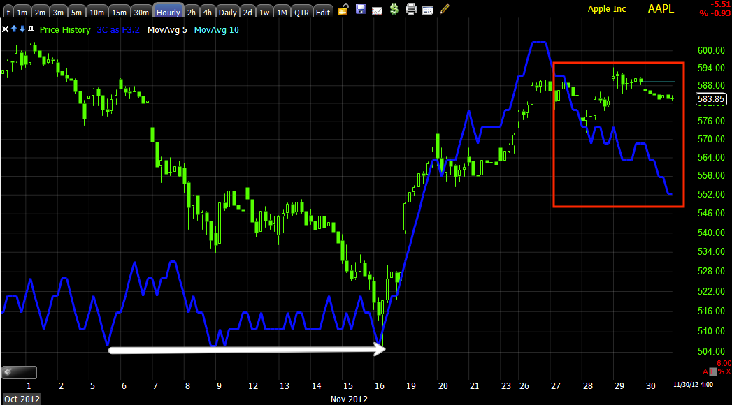
Just understand 3C is not like MACD or RSI where a divergence is an immediate signal, we are talking about large sums of money, huge positions and they take time to move so a divergence alone isn't a signal things are reversing, it's a signal that things aren't what they appear and be ready for a reversal.

So if you are working in the FX department of Goldman Sachs and are bearish the Euro next week, of course that information is going to be shared with the futures trading desk as well as the equities and fixed income. This is why we can find confirmation signals in wildly different assets.

So tracking the Euro through different timeframes, here's what we come up with (which are the same as the EUR/USD charts I posted). Just remember how the correlations work and you'll see a lot of themes that are exactly the same, not just in this post, but in posts from this week and even from mid September when we expected the next large cycle to begin accumulating (the same one that started 11/16).

Correlations: EUR/USD up means the Euro is up, the USD is down and this is bullish for stocks. The Euro is up on it's own absent the USD being down, not as bullish for stocks, the USD is what really counts, but the news flow is centered on Europe (a strange dichotomy, but not far from the correlations). No matter what the Euro does, generally the USD up, the market and commodities down and the opposite.


 Euro Futures ONLY-no EUR/USD! 1 min chart, the Euro saw a small positive divergence just in time to send it higher before the US open at 9:30, since then no strong signals, mostly in line or confirmation.

 Euro 5 min chart is where more institutional money flows are found, this week an initial backing off the $1.30 level on distribution, the green arrows are price confirmation and in to the end of the week, specifically today, a NASTY leading negative divergence, this suggests money is moving out of the Euro anticipating a move down either late today or sometime early next week I'm guessing.

 Euro Futures 15 min chart (this shows stronger institutional money flows), price/trend confirmation at the green arrow, distribution at the red ones, recently the last 2 days very strong leading negative divergence.

 Euro 30 min-even stronger institutional flow-also leading negative especially the last 2 days. This is the clearest trend of expectations in the Euro, generally speaking, not good for the market.

 The USD Futures 1 min today saw accumulation in to the move down, as that reversed and moved up the contracts were sold in to higher prices, the rest of the day just in line for the most part.

 The Dollar 30 min chart shows the exact opposite of the Euro which is confirmation, there's a leading positive divergence the last 2 days which means the dollar is expected to rise-a market negative and the Euro should fall.

The 60 min Dollar chart is the cleanest trend, distribution at Dollar highs on the 16th allowed the market to pop up strong on the 16th as the Dollar moved down, in closer term trade, the positive divergence that covers this entire week is bearish for the Euro and the market/commodities (I like SCO even more now.)


This may make sense

Especially if there is a weekly options pin, I'm still really surprised the TICK hasn't even sent one spike to the +1000/-1000 level, it's been as boring and flat as it gets in the same range all day at -750/+750 which is flat.

Ok, so we know there's an arbitrage correlation (positive) between the Euro and the overall market, if the Euro was going to fall apart here and there was an attempt to pin weekly options like the SPY/AAPL, etc, then they'd need to kick in some extra support to hold back the weakness that would naturally flow from a dropping Euro/rising USD.

Here's the relationship
 SPY (green) vs Euro (red) on a 5 min chart, note they move together for the most part.

The Euro is in a bit of a dangerous spot...
Here's the triangle in the EUR/USD I mentioned earlier right above the $1.30 mark which is the important level, this isn't a big break, but it is a break below $1.30, at the same time the market sees a positive divergence, it very well could be to support the market as the Euro would be putting downward pressure on it with a break below $1.30.


 The 1 min EUR/USD shows divergences intraday that form a triangle, it is as if the divergences (buying/selling) were done specifically to create that triangle (I wouldn't doubt it if that were the truth), but recently there's a worsening leading negative divergence and soon after a break of $1.30.


 The longer term 5 min chart also shows distribution after the initial pump of the Euro overnight and in to the flag, a perfect spot to sell as the prices would be very steady.

The 15 min chart for the same also shows a trend toward distribution in to higher prices in the FX pair for now any way, this has an effect on the market, a falling Euro pressures the market lower.


Here's the SPY and Euro again today, note when the Euro broke $1.30, that's when the market received some extra support and kept it from following the Euro as it normally does, at least for now.

This all makes a lot of sense if they are specifically trying to protect a weekly options pin that would cause the most number of options buyers to experience a total loss as the writers, (smart money) get to keep the premium.

Example Chart

Here's an example of the "W" bottom intraday where the first divergence was joined by a second making a more powerful intraday divergence than the original.

ES 1 min.

The SPY, DIA, QQQ (to a lesser degree) and now the IWM  have built a stronger positive divergence hitting the 2-3 min charts which are still  intraday timeframes.

5 min timeframes haven't been moved and they would need huge divergences to move them out of the leading negative positions they are in.

Strangely the $TICK STILL remains locked between the VERY moderate readings of -750 to +750, it's almost as if there's NO movement in the market, which smells and feels a LOT like an options expiration pin on the weeklies.

Maybe some interesting candidates will pop up, since there's not much else to do right now other than watch the market hover around unchanged, I'll be looking at those as well as do some deeper digging.

Market Update

There's another positive divergence, this one a bit stronger than the last as the market pulled back from the last one and made a small "W" intraday, that's where the positive divergence is. With so little movement in weekly optionable stocks, today's lack of movement along with yesterday's feels like a pin of options.

Market Update Charts

This really isn't that strong of an intraday signal, therefore it's the kind I would use to enter a position that I like, there's the overall strategic view (the asset you like) and the tactical view (How and when you are going to enter that asset), both are equally important; if you are correct on the stock, but chase it and get caught at the top, you may have to endure 2 weeks of drawdown and perhaps enough drawdown that it forces a margin call and you have to exit the position with a loss, only to see it do as you expected a day or two later.

We also have a lot of members using 3C and this will help you to understand the indicator, concepts and hopefully how different Wall Street really is from what you hear on T.V. or read in Technical Analysis books which are probably a traders greatest weakness, their inability to think and learn for themselves, rather they are lazy and just look for the newest indicator, the simple explanation to a highly interconnected and complex market.

The charts...(the market may have changed by the time I post this)

*I just uploaded all the charts and the market is changing, this is still a good education and I promise I'll give you the same update I planned before the market started changing.

 I'm not sure what happened with this as I haven't looked since capturing it, but this i a bullish consolidation/continuation triangle, it' the perfect pattern to manipulate because it is so popular. Technical traders expect it to breakout and the trend to continue up, instead we often see an initial breakout, traders buy it and then it reverses trapping the buyers at a loss. This is an important area too because this is the EUR/USD and right above the important $1.30 level.

 You already know the trends of the 1 min charts are leading negative, you already know that the important reversal timeframes like 5, 10 and 15 min are negative, so this is a closer view of the DIA 1 min showing an intraday positive divergence, remember INTRADAY.

 If this were strong, it would show up on the 2 min chart as well, there's no positive divergence on the 2 min chart telling us the intraday move is likely going to be weak.

 ES-S&P futures 1 min leading positive divergence, but...

 The next timeframe the 5 min is leading negative in a big way, again the intraday move can't compete with this and I wouldn't expect much strength from it.

 The IWM is an ETF/Average (Russell 2k) that should lead rallies, here there's no positive divergence at all on a 1 min chart.

 NASDAQ futures 1 min are showing no divergence either.


 The 5 min is very ugly, this is where the probabilities are, down.

 QQQ 1 min with an intraday positive.

 The 2 min has a smaller version, nothing on the 3 min.

 SPY 1 min intraday positive


Only a VERY slight 2 min positive, all in all, a weak intraday positive divergence, not what I would expect to make any significant upside difference.

Market Update

As you might imagine, AAPL is not the only asset showing an intraday positive divergence, all of the averages are as well (they all tend to move together-AAPL, the averages, most stocks, etc).

It's still intraday, it's still early.

Full AAPL Update

I always get a lot of email questions about AAPL so it's easier just to post it, this update will be a bit different as it will address multiple trends in AAPL, the way I would play them and plan on playing them (allowing you to plan and act in advance-so long as nothing significant changes in underlying trade), you may recall the article from earlier in the week about multiple timeframes and the trends they represent?

 Short term 1 min zoomed out shows a leading negative divergence.

 The same chart zoomed in close (for intraday trade) shows a relative positive divergence, even though that is there and is positive intraday from this point, the bias is still negative as the longer trend is leading negative. Think about how that works, the trend has declined because more and more short term money has flowed out, but on an intraday trading basis, someone is buying here to send AAPL up a bit intraday, perhaps they sell in to the price strength-WE never know why when we see the signals, we just see what they are doing which is a lot more than just watching price.


 The next meaningful chart is at 5 or 10 or even 15 minutes with this leading negative divergence suggesting quite  strong move down in AAPL, is this a reversal back to a resumption of the primary downtrend that has begun even since mid-September, right after QE3 was announced? I don't think so.

 Oh, there's that 25 min chart I mentioned above, that's a bad negative divergence, but still on the swing timeframe trend, maybe worse.

 Here's a 30 min chart, it shows the mid September negative divergence, I had been warning about AAPL long before that, but those who bought at $700 didn't take the warnings seriously, oh well, you can lead a horse to water, but you can't make him drink.

Note the positive change in character on this longer chart, a leading positive divergence, this is why I think a ugly pullback in AAPL will be a pullback and not a downside reversal.

The main trend or primary that really tells us something about AAPL a year from now or more is leading negative.

So how do you put all of these trends together in to a comprehensive trading plan? Remember, this is a plan, like they say, "Every boxer has a plan until the first punch is thrown", so if we have to adjust to changes or events that's what we'll do, but we can only make decisions bases on what we know right now.

So very short term -a week or so, maybe more I like AAPL short, it's a smaller speculative position, I want to watch for accumulation in to the pullback and when it gets strong, cover all shorts and start buying AAPL for a bigger trend up (resuming the trend up) and that may be a full size long position. When that starts to see distribution, I want a full size short (this may be many months down the road), but that's how to interpret the different timeframe/signals and if yo know how smart money uses shakeouts to move a stock without having to expend  lot of energy, then ll of these trends will make perfect sense.