Friday, November 14, 2014

The Plunge Protection and Market Correction Team

For many years traders have talked about the Plunge Protection Team with half certainty, as if they may be entering conspiratorial waters and perhaps placing a tin foil hat on their heads, but the PPT (for short) is a real entity, created by executive order 12631 on March 18, 1988 by President Ronald Reagan in response to events of October 19th, 1987. Although often called the "Plunge Protection Team" or PPT for short, the official name is the "President's Working Group on Financial Markets".

The PPT consists "officially" of The Secretary of the Treasury, or his/her designee (as Chairperson of the Working Group); The Chairperson of the Board of Governors of the Federal Reserve System, or his/her designee; The Chairperson of the Securities and Exchange Commission, or his/her designee; and the Chairperson of the Commodity Futures Trading Commission, or his/her designee.

While many would say the actual execution of actions of the PPT are nothing more than traders based out of the 9th floor of the New York Federal Reserve at 33 Liberty street, otherwise known as the "Open Market Operations Team", this however grew out of a much earlier iteration from the F_E_D itself just after WWI as then chairman, Benjamin Strong  first presented findings of the power of Open Market Operations to the committee during the December 19th, 1923 meeting. Hoping to show that these open market operations could support the expansion of multiple deposits and credits in the monetary system. Out of these operations at the N.Y. F_E_D, the "Open Market Investment Committee" was formed in early 1923, one of the prequels of Quantitative easing and many other F_E_D policy tools.

Strong was more influential than most realize, quote on quote, "In 1922, Strong unofficially scrapped the gold standard and instead began aggressively pursuing open market operations as a means of stabilizing domestic prices and thus internal economic stability. Thus, he began the Federal Reserve’s practice of buying and selling government securities as monetary policy. John Maynard Keynes, a prominent British economist who had previously not questioned the gold standard, used Strong's activities as an example of how a central bank could manage a nation's economy without the gold standard in his book "A Tract on Monetary Reform" (1923). To quote one authority, "It was Strong more than anyone else who invented the modern central banker. His policy of maintaining price levels during the 1920s through open market operation and his willingness to maintain the liquidity of banks during panics have been praised by monetarists and harshly criticized by Austrian economists.

However, Strong dies in 1928 before seeing what his monetary experiment that led to the "Roaring 20's turned out, just about a year later, the Crash of 1929 and the Great Depression. 

I think by now it's fairly clear that Central banker over-tinkering has never been an effective method of growing the economy in a sustainable way, if it was, Bernanke, an avid student of Strong's policies probably would not have had to reach much beyond QE1. 

While this is just my opinion, I think the real unemployment rate in the economy is indicative of the failure QE has actually been. From a Forbes August 20th , 2014 article,

"Despite the significant decrease in the official U.S. Bureau of Labor Statistics (BLS) unemployment rate, the real unemployment rate is over double that at 12.6%. This number reflects the government’s “U-6” report, which accounts for the full unemployment picture including those “marginally attached to the labor force,” plus those “employed part time for economic reasons.”

The U2 Rate is the headline unemployment rate, however it is not indicative of the real unemployment rate; U6, while not a complete measure is a better measure of those who would like to work or work more, but can't who are unaccounted for in the headline unemployment rate; not to mention the magic of lowering the employment rate by slashing the workforce pool/size which is simply a matter of one's status in the unemployment benefit system.

None of this is really the point though, the point is simply it is my belief that QE has been nothing more than a stealth bailout of the US and to an extent, the global banking system. You may remember the early days of bailouts in 2008 such as AIG and GM and you probably recall how deeply unpopular they were with the voting public. Thus QE, which saw investment banks report earnings that showed an entire quarters without a single day of trading losses was a perfect mechanism that few could understand to transfer risk from bank's balance sheets to the F_E_D's and to put substantial cash in the system in which the banks would make fortunes off of, thus a "Stealth Bailout" that was "officially" for the economy's benefit as far as mainstream Americans understood. Although it had little effect for the near $4 trillion in balance sheet expansion since 2008, I'd say it certainly provided plenty of liquidity and profits for banks, just like Strong did in the early 1920's.

Until recently, the F_E_D's actions or the Plunge Protection Team's actions have always been assumed to be to ramp the market higher, yet that doesn't explain multiple bear markets such as the Tech bubble or the Sub-prime housing bubble. I suspect bear markets are simply part of the wealth transmission mechanism known as the business cycle, therefore it would not be such a stretch to imagine that the PPT does more than just ramp the market higher.

Interestingly, 2014 has given us many examples of F_E_D speakers coming out with contradictory and sometimes outright ridiculous statements that either lifted or suppressed the market or certain assets like the $USD, but none has been more apparent than the recent comments by one James Bullard, CEO of the St. Louis Federal Reserve.

If a picture is worth a thousand words, than maybe this chart will save me several hundred...Bullard's comments and the recent effect on the Dow Industrials...
As volatility has swelled since September, look at the words of Bullard who was hawkish at the September highs sending the market lower to one of the most bearish sentiment lows we have seen at the October lows when he suddenly turns VERY Dovish October 14th before the F_O_M_C meeting saying that delaying the end of QE is logical. The very same day, San Francisco F_E_D president John Williams said he would even be open to another round of asset purchases or QE 4 under the right circumstances in an interview with none other than Reuters. 

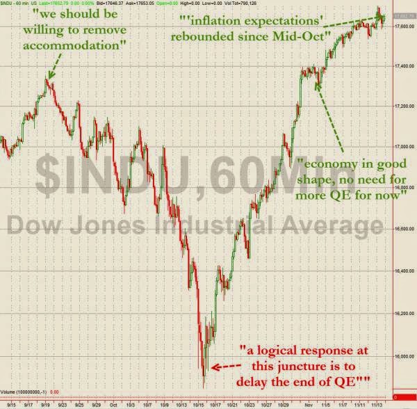
After a significant rally, on November 4th only 3 weeks later Bullard changes tune again saying the economy is in good shape and there's no need for more QE. Did the economy really change that much in 3 weeks?

Today Bullard is back at it seeing the last two times he came out he was market moving, but his last jawbone attempt failed to move the market lower so he doubled down today saying, inflation expectations have rebounded since mid October and rates are to be raised in 2015, of course "Data dependent".

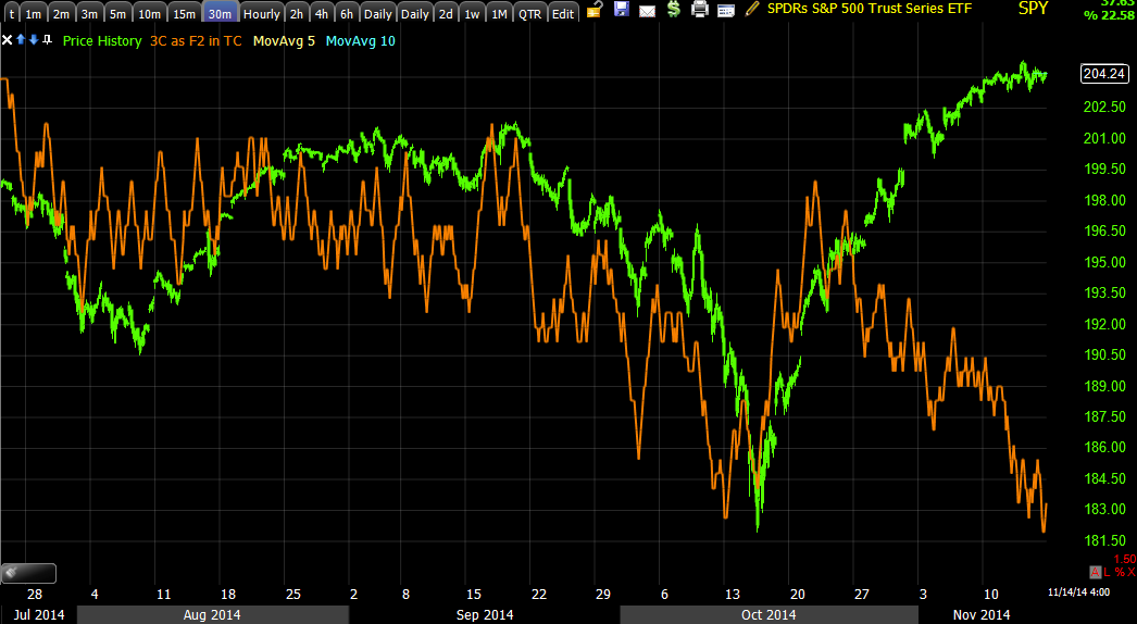
Have inflation expectations rebounded? You be the judge...
It sure doesn't look like there have been ANY changes in inflation expectations, not the positive ones Bullard alludes to today, "Since mid -October".

However, what we do know, is that Institutional money, investment banks and such that have clearly had balance sheet issues (recall the record use of the F_E_D's 1-day reverse repo facility on the last day of Q3 window dressing on Sept. 30th and the second highest use ever at the end of April window dressing - April 30th). Apparently banks are still in trouble.

We know professional traders don't just buy long, they go short, that's essentially the definition or main  difference between a mutual fund and a hedge fund.

These are just a few charts ALL published here from October 13th, the day before Bullard's comments,  as we were making the case for a strong rally ahead...
 A Russell 2000 Buy Signal at the October lows


Our Vix Term Structure inversion (red) buy signal on October 13th just before the October 14th market lows and Bullard's dovish comments.

Our SPX/RUT Ratio Indicator leading the market to the upside on October 13th suggesting a strong rally...

 HYG Under Accumulation, you may recall my comments, "There's only one reason to accumulate HYG"... obviously to support a rally.


High Yield Credit leading the SPX in a positive divergence, another telling leading indicator making the case for a strong upside rally to come shortly on October 13th.

3C charts with strong positive divergences and on and on...All on October 13th not to mention the 50 or so additional posts in the timeframe all supporting our analysis of a much stronger move higher just before the market put in its lows October 14th when Bullard and Williams both spoke in an attempt to apparently ramp the market higher, but smart money was already set for this move.


It's hard not to think that Bullard's comments, once smart money was already in place, weren't a momentum boost to get the rally going along with William's on the same day.

 And now...

After all of the leading indicators you've seen and divergences such as this...
with smart money in place for a move to the downside and Bullard's comments...
Our custom indicator with a buy signal at the October/Bullard lows and a current sell signal as Bullard switches his tune only weeks later.

There are dozens upon dozens of these charts now supporting a move down along with Bullard's comments just as there were dozens upon dozens of charts before the October lows and days before Bullard's market ramping comments.

It's hard not to think that while QE may be gone, the F_E_D is still out there making sure institutional money is on the right side of the trade, the stealth bank bailout continues via the F_E_D.


The Week Ahead

I've been looking at numerous assets like TLT, VIX, BABA, Transports, etc and while I don't find this to be as true in the major averages, I find myself saying, "Wait" before you enter a full position, it looks like a head fake move Monday, BABA is a perfect example or TLT from the last post.

Using Transports... First the larger picture, it's ugly...
A Broadening top that has already broke once with the lesson for the buy the dip crowd who weren't buying that dip, no matter how sharp of a "correction", but it, that has been the lesson of the October rally, like I said, a means to an end as the BTD crowd now knows a -10% loss is to be bought, not feared, that's the kind of psychology that locks them in for the long ride down. This also happens to be exactly what I suspected when we knew a rally was coming, but BEFORE the rally started.

5, 10 , 15 and 30 min charts have just fallen off the face of the chart this week, major damage as can be seen in breadth and the lack of any gains there.
 10, 15 and 30 min charts falling hard this week...

 a more detailed 3 min chart in transports shows the detail of that happening through almost the entire week with the exception of Monday.

However for the positions I'm interested in, I see a lot of rounding intraday bottoms with 1 and 2 min positive divegrences,  even if it's not a head fake move, I think I can get better positioning early in the week, if it is a head fake move, it's a great timing signal for stage 4 and a great entry. I don't see how another day's patience can hurt in this situation in any way.


Trade Idea (Swing+) TLT long via TBT Short

If you have been reading this week you probably know I suspect a strong 30 year bond rally, if you saw the last post, Leading Indicators- The Week's Biggest Developments then you know that I think bond action is one of the biggest developments of the week, more to the point, perhaps since shortly after the October rally got under way along with VIX futures which I'm a little more gun shy about trading them long unless I have an excellent entry.

In any case, if you didn't get through the last post yet, here's a recap, 30 year Treasury bond Futures... Remember, rate/yields move opposite bond prices and yields tend to pull market prices toward them like a magnet, thus higher bond prices means lower yields and lower yields tend to pressure the market lower.

 60 min chart of 30 year Treasury Futures...

TLT is the closest asset that's liquid, however doesn't have a great leveraged product, thus the TBT (2x inverse/short TLT) makes for an interesting way to leverage T:LT by shorting TBT, you essentially create a 2x long TLT (20+ year Treasury Bond Fund).

 TLT's 60 min chart

TLT's 10 min chart with the negative divegrence at the far left and green arrow being the October market lows in which the market rallied from. You can see TLT's inverse correlation to the market.

 TBT is the inverse of TLT, this 30 min chart shows the October lows at the green arrow and some small accumulation in TBT at those lows, it moves with the market, thus the leading negative divergence this week should be clear and confirms what we see in TLT.

 This too is TBT with a 10 min divegrence and a range, an area we most often see divergences as price action seems dull, but this is where underlying price action tends to be heaviest, which is why I always warn not to get caught flat-footed in a dull market.

I'm going to put in an order on the tracking portfolio for a half size of full position short TBT. The range bothers me and I would expect a head fake move above the range in TBT, below in TLT, I'll set price alerts and if that happens, I'll enter the rest of the order for a full size position at the head fake move to give me a better average entry and lower risk, but this is a planned phased in trade from the start, not averaging down a losing trade.


 TLT 3 min looks ready to go, but even shorter term...

The 2 min chart looks like a pullback in TLT, which could be the head fake move I'm thinking about around/below the range, could take place.

TBT's 2 min chart has a positive suggesting it's a chance if not probability, if I get the chance, I'll use it to my advantage, if not, I'll still have a decent trading size position.

Leading Indicators- The Week's Biggest Developments

Here's a  look at Leading Indicators and the biggest developments of the week. If I have time, I'm going to try to explain why the saying "Credit markets lead, stocks follow" in a subsequent post, but as you probably know, the last two hours of op-ex Friday often gives me some of the best data of the week so I'll do my best, but I will cover it because HY is screaming and stocks will follow.

In my opinion the biggest developments of the week other than the re-introduction of volatility the last day or so (not today) as I remarked earlier in the week, "Volatility tends to slowly die down, but from low levels it explodes". If we look at volatility in its most common measure, the VIX, high volatility is a high VIX which trades opposite the market, meaning high volatility often is the result of a sharp market decline.

The real developments though have been accumulation in VIX futures well above and beyond any divergences I can recall this year including the negatives at the October lows before the rally started.

The other interesting indication is Treasury bonds accumulation, if VIX futures are the "Flight to protection", Treasuries are the "Flight to Safety", as I have hinted at this week and specifically last night, I think we are on the cusp of a major treasury rally, again they tend to trade opposite the market implying a sharp market move down which is something I have expected since we first got wind of accumulation for the October rally nearly 2 weeks ahead of the actual rally's start.

Take a look...

THIS IS ONE OF THE MOST SIGNIFICANT MOVES IN ASSETS THIS WEEK, THE CRUSHING OF THE MARKET RAMPING LEVER HYG, (High Yield CORPORATE Credit), which just sold off sharply over the last 3 days.

 Looking at Pimco's High Income (Credit) Fund in green vs the SPX in red, note the absolute carnage in HY Credit.

I'll try to cover this in greater detail so the mechanics are more clear.

And Pimco's fund in green vs the SPX over the course of the October rally which started at the green arrow. Anything look familiar? Almost every Leading Indicator looks similar to the dislocation or divergence between Pimco's High Income Fund and the SPX, meaning all have deteriorated at about the same time ( a VERY LEARGE dislocation) and all very sharply, much stronger then the leading indicators at the October lows which caused us to try to anchor expectations by saying this was going to be a face ripping rally that will have you scared even though you have advance notice days before it started", followed by the challenge to "Book mark this post and come back" as you'll see, the rally will be that strong you'll feel fear to short in to it, which is something no one at the time was thinking as sentiment was as bearish as it could get. No one could imagine even a bounce, much less this kind of move, so what does that tell you about the size of the current leading indicator dislocations?


 HYG's 2 hour 3C chart and long term distribution, it is especially sharp right now at a new leading negative low.

 HYG 30 min from in line with 3C confirmation of the uptrend at the green arrow to a leading negative divegrence in June and a worse one now.

Just looking back at past posts...

July 25ths Daily Wrap post, this is right at the SPX top before sharp decline in to the end of July and about 15 days before the August rally started...

"High Yield ETFs and funds have seen huge outflows the last month, THIS WEEK SAW THE LARGEST OUTFLOW FROM HIGH YIELD FUNDS  IN MORE THAN A YEAR! Much of the flow has gone to low yielding, defensive Investment Grade Credit."

August 14th's Daily Wrap just as the August rally was starting the next day or two...

"Lastly, as we moved toward a base/bounce I noticed some inflow (small) in to HY credit which I figured was for a bounce "


And this chart and commentary from August 18th's Daily Wrap... just as the rally got started for August...

"Here's the massive outflow. The market cannot stay up with HY credit falling, thus the saying, "Credit leads, stocks follow". You can see the tiny inflow last week for the bounce."

And from our Sept 12th Important Market Update which was going in to the August cycle's head fake move and change from stage 3 top to stage 4 decline with an SPX decline in to the October lows of more than 8% and a Russell 2000 decline of more than 11%...


"According to Lipper Data, for the week ended Sept. 10 US High Yield bond funds saw an outflow of $765.8m , which is the second consecutive week of outflows as the previous week saw an outflow of  $198.1m. I think it's pretty clear to see that HY fund flow (much more coming out than what went in in late July/early August, is leading the market and pretty well synced with assets like High Yield Corporate Credit (HYG)."

It's obvious that while the trend is hugely toward outflows from HY credit, we see small inflows for bounces or market lever support such as HYG just before a rally starts.


HYG's 15 min chart in to the October rally with a sharp leading negative 3C divergence with the sharpest 3C decline the last day (yesterday) at the red arrow.

The longer term HYG/SPX correlation with HYG supporting the SPX through most of 2013 and as of June when huge outflows from HY Credit began, look at HYG's leading negative dislocation from the SPX, they are literally moving in opposite directions with the SPX making new highs and credit making new lows with large divergences at each SPX pivot high. Credit markets are much bigger and more sophisticated than Equity markets, they are telling you two different things, which do you trust?

And this week we have seen VIX and VIX short term futures outperform the SPX almost every day. Here's VSXX, short term VIX futures vs the SPX just today, I have inverted the SPX prices (green) so you can see the natural inverse correlation and differences in relative performance.

 At the green arrow VXX is moving as the correlation would suggest, in line with SPX, but today for a 4th consecutive day, VXX outperforms the SPX as VIX futures are bid.

 The spot VIX has also been outperforming the SPX all week, again SPX prices (green) are inverted. Note the SPX trend is nearly flat through the week while the VIX's trend has been up, this is because protection has a solid bid under it, demand = higher prices.

Not only is there a Flight to Safety, but a Flight to Protection". Why do you think large caps outperformed small caps yesterday so massively?

 And the chart of the week, the 60 min VIX Futures, this is not hedging, this is a HUGE leading positive divegrence/accumulation of VIX futures. Someone with very deep pockets has been accumulating VIX in size that is at least 15 times larger than the distribution at the October lows before this strong rally.

 VXX short term VIX futures 2 hour large picture chart and highest probability resolution for price leading positive at the move up (in VIX-down in equities) that led to the October low in SPX (at the top of this move) and the current leading positive divegrence, even higher and stronger.

Note the head fake move at the yellow arrow just before the upside reversal.


 UVXY 2x long VIX short term futures 60 min chart with an impressive divegrence now, again note the stop run/head fake move at the yellow arrow just before the last reversal to the upside.

I suspect some of the market action seen this week including AAPL is such a head fake move, you know the concept.

XIV, inverse short VIX futures, this moves with the market unlike VIX, yet look at the distribution at pivot highs and the lower lows in price vs the SPX as well as the sharp leading negative divegrence this week.

VXX short term VIX futures 30 min, again the head fake move before the last rally (yellow) and the current positive, much like actual VIX futures above.


XIV-the opposite of VXX above, again at 10 mins showing strong distribution this week.


Note the head fake move just before the downside reversal, this is the same time as the head fake move in the SPX in September as the August cycle transitioned to stage 4 decline.

XIV 5 min leading negative especially strong this week.

VXX short term action looks like a near term pullback before it launches higher, perhaps a head fake move/stop run?

And of course one of the other big developments of the week, the VIX buy signal on our custom buy sell indicator, only the second signal of the year. 
 VIX sell signal at the SPX's October lows and a current buy signal, more interesting, look how VIX has performed since the buy signal...

It has been trending up this week with the buy signal marking the week's lows on Monday.

30 year rates...
 As shown earlier, they not only called a top in yesterday's intraday SPX move in the morning (red trendline), but are leading negative today.

 Rates move opposite treasury bondx, this is the 60 min 30 year Treasury bond futures with another leading divegrence similar to VIX futures.

 And the 20+ year Treasury bond fund, TLT with a 60 min leading positive divegrence.

The 2x inverse TLT, TBT with a matching negative divegrence as confirmation, the green arrow being the October lows and small accumulation there.

TLT 10 min with October lows at the green arrow and small distribution compared to the positive divegrence now.

And the inverse TBT with a confirming opposite leading negative divegrence, with notable weakness this week.

TLT 3 min looks like it's about ready to fire...


10 year yields also leading SPX price (green) lower today

While the 10 year treasury Futures lead positive.


And 5 year yields leading the SPX lower (green), while...

5 year T-bond Futures show a leading positive divegrence. Remember bonds and yields move opposite each other and yields tend to pull equity prices toward them like a magnet.

As for professional sentiment...

 Again we are seeing it sell off vs the SPX in green and the trend...

This is since the July decline and the October lows and rally, there's a very clear professional sentiment divegrence.