Tuesday, August 28, 2012

Life-long Student

So many of you know that I taught Technical Analysis for the Palm Beach County School System's Adult Education program. My classes were always booked to capacity (didn't have a large enough class room) and we always had to turn people away. Out of probably 80 different courses offered, it was either my class or the ESOL (English-something or another) class that had the highest attendance. I enjoyed teaching because it made me really think about my positions, it challenged me with questions I hadn't thought of before, etc.

I will never call myself or try to pass myself off as a guru, I'm much prouder to call myself a lifelong student of the market.

With 3C, it took quite a few years to really learn how to use the indicator and I'm still learning how to make it more effective as part of the learning curve and as markets change in their complexion, but the biggest adjustment for me in learning the indicator was learning everything I thought I already knew, for the first time. For instance, many technical traders believe that large volume spikes are smart money buying, I have found time after time that smart money is buying and/or selling when you least expect it, they aren't buying new breakout highs, they are selling them, they aren't selling new breakdown lows, they are buying them.

A lot of the differences can be understood by thinking about the size you and I trade vs, the size they trade. Where we might have 100 share blocks, they are placing 10k share blocks, where we might have a 500 share position, they may have a 5 million share position. For us, selling a 100 shares or even 500 is routine, it doesn't tend to move most stocks much, however they cannot do the same, they have to break up orders in to smaller pieces and the lat thing they want is for anyone to know what they are doing, it literally costs them tons of money if an HFT picks up on their positioning.

This is what gives rise to head fake moves, breaks above a resistance level that will create retail buying so they can sell in to that or hitting stops on the downside and triggering a lot of retail stops so they can accumulate. These are just some of the things that you notice when you watch the market all day every day or you literally don't eat if you don't make money that week. Instead of thinking you know what the market is doing, you learn to let the market tell you what it is doing. Instead of planning a trend trade, you let the market tell you how much it might give and you plan your trade accordingly.

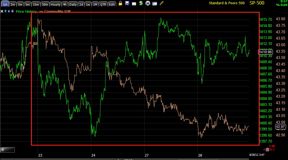
I've shown you several charts like AAPL, BIDU and GLD that demonstrate some of these principles, some you've seen, some you will see.

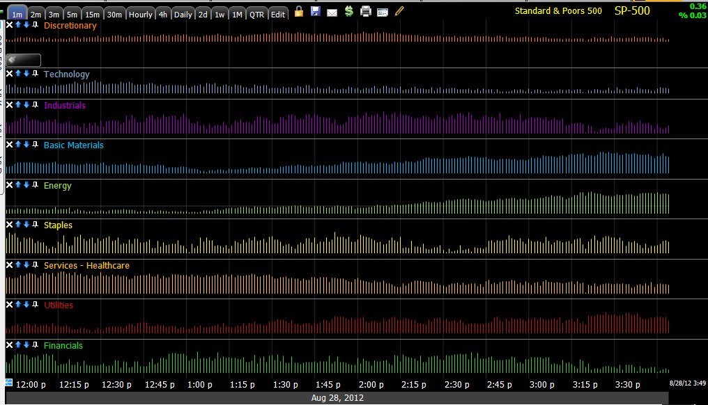
I just ran through several industry groups and I am going to tell you that I have never seen anything like this before. I looked at 3C, where the divergences really changed and guess what, I could guess at a level that had some technical significance that would get retail to buy, then I checked the level on a daily chart and they were right on. I'm going to post some of these charts so you can see for yourself, but I've never seen such clear market activity from smart money on such a scale and in a way that not only confirms what we have thought about how head fakes work and why, but a move in the market that takes this concept to a whole new level, one that makes me wonder if we are actually going to see something in the market that we maybe never saw before in terms of severity.

I'm going to have dinner, relax for a bit, clear my mind and try to present this neatly for you, but I'm sure when you see these charts, how many there are, how consistent they are, you'll be able to identify these concepts for yourself (which is always the best way to learn) and some of you old timers that have seen a lot of these charts might even grasp the depth of what is happening right now. It's actually kind of exciting and I can't wait until we can look back on this and see what else we can learn.

On another note, I'm actually considering breaking a few rules that I have regarding risk management although this isn't something I want to encourage (I thought about just taking the positions and not saying anything about it as it kind of sets a bad example), but there's no point in taking the positions without sharing them with you as that's the whole point of all of it to start with. It just happens to be something so big, so consistent with our concepts and so much larger than anything I've seen before, I get the feeling this is not going to just be another reversal.

Charts

First Risk Asset charts...
 Commodities are a risk asset, they should move with the SPX, at least generally, the dislocation here is one of the many signs that probabilities (which is all we base opinions on-lacking the crystal ball and all) are skewed toward this being a double top and not a breakout move.

 The last decent move down we had was where we established the core short positions, even with a move up in the market, most of these are still at a profit, PCLN for example at +22%, CAT @+ 20%, BEAV @ +13% and these were at even bigger gains at the June 4th low, it would seem that money was lost by not closing the shorts then, but I decided to hedge them instead with an equal amount of Ultra or 3x long ETFs, those all made money on the move up making up for any draw down in the short positions and then some, while still maintaining a short presence in case we had a Black Swan moment.

The point here being this was one of the indications back in March and April that told us we should be selling the market short while most traders only saw a higher high in the market at March. If you look back at that time in the archives, we entered almost every one of those shorts on the choppy moves to the highs in the market (ie. in the first red box there were 3 new highs), so we in fact not only shorted at the top at what most technical traders thought was a new high, but specifically we shorted in to the strongest moments of that top.

That dislocation between commodities and the SPX is the same concept as the dislocation between the two now seen above at the first chart.

 Yields I explain as being, "Like a magnet for stock prices", so when these go negative vs the SPX, that's another signal something isn't right in the market.

 Here's a larger view of the dislocation now, it keeps adding lower lows in a sharp way. I won't get too far in to it, but the sharpness of the dislocation is similar to the theme of hedge funds and others needing to close positions/short positions while their window of opportunity is still open, it's more of a desperate situation now then at March/April when the rally was running out of steam as the macro-economic data moved out of the seasonal adjustment period to disappoint.


 Still, look at the size of the dislocation now vs the March/April timeframe. Again, I won't get too far in to it, but I have mentioned there are many indications that make this rally from the June 4th lows look a lot more like a bear market counter trend rally that what price actually shows to be the trend.

 The carry trade currency and China/Japan barometer currency, the $AUD has also dislocated as it did in March/April as well, today's action in the $AUD was sharply negative.

 As mentioned this morning and one of the reasons I thought we'd actually get the short term price strength this morning is due to the EUR/USD, the Euro here in orange vs the SPX is supportive of short term risk, the market formed a triangle which is similar to a Bollinger Band Squeeze, a highly directional move will come out of this pattern, RIGHT NOW the Euro is supportive of higher prices in the market, but taking a closer look at the Euro itself as well as the dollar (which is down today which is also supportive of higher prices in risk assets from stocks to oil to gold), it also appears to be fairly clear that the window for short term price movement is closing.

The following charts are clear migration of a negative divergence in the Euro and a positive in the $USD, this is not a good sign for the market, when these reverse the window closes.
 Euro 1 min deteriorating all day as the Euro remains locked in a range, unable to add to its gains.

 The migration of that divergence to the next longest timeframe (remember a late day short term positive divergence was building late yesterday in the Euro, now the opposite is happening.)

 Euro 3 min chart very sharp negative leading divergence.

 Euro 5 min leading negative divergence.

In watching many of these divergences in FX ETFs, they almost always will wait for the next day rather than play out overnight. So it is conceivable that early strength is present in the market on the open as this window continues to shut.

 This is UUP/$USD's price, not 3C, the softness in the $USD today is positive for the market, the market didn't capitalize off that today, but the market wasn't asleep at the wheel either, it was forming the most recognizable price pattern in Technical Analysis, a symmetrical triangle. I don't quite understand how that fits in to the end game, but I think by the time this is all over, it will be clear that today wasn't the wasted day that the percentage change would imply.

 $USD/UUP 2 min positive, not only confirming the above UUP/$USD chart, but as the other ha;f of the EUR/USD pair, also confirming the Euro charts above.

 5 min chart already in a large positive divergence which was added to today

It's probably not coincidental that the $USD formed a bear flag with a bearish descending triangle right below major support, traders will interpret this as... Bearish, but there's more to price than just price patterns, that's what allows Wall Street to use technical analysis against technical traders so often.

Because of the spotty/gappy nature of UUP, it's easier to see with a line chart, note the descending triangle and below major support while a positive divergence builds in UUP, also recall that late yesterday there was a small negative divergence in UUP/$USD and here it is down today. The positive already in place is much larger than yesterday's negative and at a key area with a key price formation.

 UUP/USD 30 min positive in leading position t the bearish price formation, the leading positive divergence was added to today which is always an accomplishment on such a long timeframe in a single day.

 The $AUD chart intraday today led aggressively lower.


 It also looks like credit was making a move out of sync with the market, this is pretty late in the day to draw conclusions from, but at least it wasn't leading price.

For whatever it is worth, and I'll look closer at the industry groups, late day rotation was out of Financials, out of Industrials, out of Tech and Discretionary, Energy saw flows in as did basic materials, and the defensive Utilities.

More as I uncover it.

Quick Update

This looks like the start of the move I talked about earlier, it appears to be range bound, but it's just shaking out traders, it will get more directional, it's a lot more volatile than it appears.

From a Risk Asset view there are some good things happening, but they aren't complete in my estimation.

You need to be thinking about how you want to be positioned and where because it seems like our chance is going to come and go very quickly.

From Risk Assets' point of view...

Actually, stick with that, I'll put the charts up in the next post.

Quick ES Update

I always warn that a dull market is a dangerous market, it's like the kids being too quiet in the next room. I have a lot to look at, but just looking quickly at ES, I don't see any reaspn why the initial thoughts from last week, yesterday and this morning shouldn't hold. However, even though I have a lot to look at very quickly, one thing I do notice is the triangle meaning a directional move is coming-the strength we have been looking for short term with the internals falling apart? I believe so.

One of the most notorious areas of accumulation or distribution is in to flat prices, they are pretty much right at VWAP which is where execution of orders is considered a suceess, bearing that in mind, here's ES

 ES at weekly VWAP all day

 3C 1 min

3C 5 min

I'm just guessing, but I have a feeling we'll have to make some very quick choices in an environment that psychologically will not be easy, but none of the great trades have been easy to enter.

I have a lot of work to do, I'll get to emails as soon as I can.

The market is doing nothing-or is it?

We haven't sen our short term strength yet, All of those days I showed you yesterday in the SPY trend, about 1 day of moving the trend for every 4 of doing nothing for the trend, however the market on even a day like today when everything is flat or at a slight loss, something is actually happening. Take a look.

 SPY

 DIA

 QQQ

AAPL

Patience

GLD charts

This is why I put the two previous posts out without charts, time...
 The breakout, look at the volume also on the breakout. Technicians have it all wrong with volume and smart money movements and most of you have seen it enough that you know it's true. Technical traders run volume scans looking for surges in real time all day thinking that a surge in volume is smart money buying, WRONG! Smart money was in long before the stock ever moved, long before volume ever moved, if anything, in this situation, they use that volume/demand to sell in to.


 Now if I can't make this resistance zone breakout and the change in 3C from neutral / positive or in line to a horrible negative divergence clear, then I need to go back to the drawing boards and figure out how to show you this stuff so it's obvious to your own eyes. There are so many charts in so many timeframes doing the same thing at the exact same place, it's pretty hard to say this is just chance. Note the change in character on the 1 min chart's trend as price breaks out above resistance which is a zone to about $158.

 Intraday 1 min 3C and price did what they should have, but...

 The 2 min chart shows a clear positive divergence intraday, it's not huge, but maybe enough to break above recent resistance where I would consider adding to GLD short/put positions.

 The 2 min trend does the same thing on the breakout, this should tell you how that surge in volume was being used by smart money.

 The 3 min chart does not show an intraday positive divergence, my guess is that it just isn't that strong. 2 min is enough to move GLD, once it crosses resistance, retail buyers take care of the rest, but this doesn't look like smart money is getting long GLD at all, maybe just setting it up for a final bull trap (there appears to be one on the daily, but a reversal starts on an intraday chart and we see the head fakes on those timeframes as well.)

 The 5 min chart with a positive divergence at resistance, a break above resistance and what happens to 3C again, the 4th chart in a row now, every timeframe thus far.

 The 15 min chart seems to be showing increased activity, these leading divergences are the strongest and this is an important timeframe where it illustrates big movement, we see these toward the end, so it looks like there's increased activity, maybe a little panic to move out before the window of opportunity shuts.

The same on a 30 min chart, the same thing at resistance (keep in mind these are not as fast so there's some lag).

 Look at the longer trend of the 30 min chart, at a new high for the chart, nearly at a new low for 3C.

The 60 min chart gave us an awesome long signal in a day on 5/31 and the next day lmost a 6% move up in GLD to the far left, that was sold in to, GLD fell, another smaller positive, but look at price now and then and look at the relative position, this suggests much less money in GLD now.

I'll still be looking for that price concession.

GLD may give us the chance

As I put together the charts, there are short term signs GLD may give the price concession I'm looking for, as I realized this GLD started moving up. Stay tuned for the charts..

Today's US 2 Year T- Auction comes in weak

So weak in fact that PD's had to take down over 50% of the offering. Credit Suisse has an opinion with regard to the weak auction, it could be summed up as this, "You, whose eye's are starry and account is long with the thoughts of fond memories of Jackson Hole, prepare to be disappointed".

Now I'm no Treasury specialist, I'm not an economist, but it seems very clear to me that the F_E_D with each passing month is having a harder and harder time justifying QE, whether it's macro data coming in better than expected, whether it's food and gas inflation or the question of the independence of the F_E_D in an election year, everywhere you look, it seems to be increasingly evident that any QE will have to wait until 2013.

Whatever Rick Santelli believes about GLD, the most reliable correlation I've seen is gold acting as a QE sentiment indicator, if QE looks probable, then GLD rises, if not, it falls.

With that in mind, with what reversals look like fresh in your mind...
 Every major reversal in BIDU was preceded by a head fake move, I keep coming back to BIDU because it's a beautiful example, but we see this at least 80% of the time and we see it on EVERY timeframe from an intraday 1 min chart to a monthly chart.

I've drawn just about every chart formation one could imagine in GLD from a big bear flag, to a diamond to a triangle and they all have this one feature sticking out. I can't prove it, but long term members know that we have called F-O_M_C policy before the announcement on strange divergences which suggests either the relationship between Bernie and Jamie Dimon is a lot closer than the law would provide for (remember all of these big bank CEO's have helped bail Bernie's butt out of the fire at one point or another) or there's some one in the media who make a nice living releasing embargoed F_O_M_C policy at the news stations (although in this case, this seems to be a longer term realization of the QE reality).

If Jackson Hole disappoints, GLD goes down and that is Friday, I've already mentioned how on a yearly or multi-year basis, GLD has been one of the largest top 5 hedge fund holdings and many have significant profits in GLD, it is another potential sell candidate to meet HF redemptions.

So with an auction today coming in ugly, with the common sense of the QE argument, and with the hedge fund situation and finally GLD having broken above every technical pattern I can draw at the moment, it seems very likely that GLD will not be in this same area next week, maybe not even in the next few days.

There is a clear area of resistance from the last 4 days, this has been the standard I'd like to see broken to enter additional GLD short/Put positions as I already have enough, I want the concession to take additional risk that is above and beyond what my normal position sizing rules are.

However you may be in a different boat and may be interested in diversifying your positions, so GLD charts are coming up next.

BIDU Update

BIDU has been, as you know from last night' post, a core short position since March/April of this year, the position is at a 19+% gain even with the counter trend move, which I used to add to the BIDU equity short as the position was about 2/3rds the size I intended.

If I was looking to start an equity short, I'd consider phasing in to BIDU here, maybe in 1/4 or 1/3 positions, however in my particular circumstance, I am full on that position so I'm looking for a Put position as I closed the Put opened on the 8/16 breakout on Wednesday and Thursday of last week, the first position making 102%, the second making 89+%even though the second half saw BIDU significantly lower, the volatility in the market and the time decay made the position worth less, this is why I have little tolerance for consolidations/pullbacks with option positions.

 For my purposes of a BIDU put, I'd like to see higher prices, even though I think BIDU is in a full Primary downtrend.

 BIDU is a great example of "From failed moves (head fakes) come fast moves". I suspect each break of resistance that saw an uptick in volume as stops were taken out also saw significant Market Maker accumulation, not by choice, but by law as any market order they can't match, they must provide a bid/ask for, they are the buyers and sellers of last resort. It may not be the case, but it does make sense to me that market makers were stuck with significant long BIDU inventory they may not have otherwise wanted. To rid themselves of that inventory they have to create demand to sell in to and it's out there, I have seen many talking about BIDU being in a trading range so buyers are out there.

 Here's where BIDU is currently hung up at some resistance, a break above that may create some demand, but making a higher high and changing the short term trend classification from down would also be helpful (yellow line).

 The 1 min chart is reflecting resistance in the area.

 The 2 min chart seems to indicate it's not that big of a deal yet and BIDU should be able to overcome it. I enter trades on signals, this is not a signal yet to enter BIDU, if I miss the trade so be it, but I'm not betting on BIDU, I'm using hard data to make choices.

 The 3 min trend in my opinion shows a positive divergence which BIDU has rallied from, that is on par with the supply the market makers would have absorbed.

 The 15 min chart is in line, the positive divergence is rather small here, meaning I don't think there's anything bullish going on in BIDU other than market makers trying to lighten their long inventory, remember though, they don't need to bring price up to where they were forced to take on the inventory, as a market maker they can go naked short and make the rest of the money up on a downside move, still the 3C chart should show that and thus for a options position I remain patient, for an equity short I wouldn't be opposed to dipping my toes in the water here. The yellow area is of course the head fake move sending BIDU down well over 14% in several days.

 At the hourly chart it becomes clear to me that BIDU is in a primary downtrend, having just seen a bear market rally. After the 1929 crash, the Dow went on to lose 86% over the next 2 years, but the first bear market rally gained well over 40% and another 4 followed that one, these are some of the most powerful rallies you will see in any market, they need to be to accomplish the reason they are there in the first place. Hindsight is always 20/20 but at the right edge of the chart, after years of a spectacular rally in the Dow, many don't want to believe it is over.

Very long term daily BIDU shows the 2009 accumulation, if you look carefully, BIDU hasn't even broken it's primary top yet, this has a lot of downside in my opinion, but it's not ready for a put position right here.

AAPL at a consolidation?

It looks that way thus far as first resistance tends to be the previous close.

ES / VWAP Update

So far, so good for the early stages of today, we had pretty broad indications and thus far they are playing out, if the other half of the indications play out just as well (and longer signals are more reliable), then we should have a great game plan. This is the difference between reading headlines that were long ago discounted by Wall Street and following price from moment to moment and reacting to situations in which you don't have any idea and having an idea, laying out a trading plan and trading your plan. Or to sum it up more succinctly, "Letting the trade come to you rather than chasing it", take that a step further to portfolio positioning and management and it's quite an edge.

Here's ES which is like a mini market update, except looking at what big players are doing, thus far there's no contradiction in the analysis...

 ES / 3C 1min is seeing some price movement a we expected to see early on, it's also seeing a lack to any 3C confirmation, also along the lines of expectations.

 Here's the ES 5 min chart, this is where we have an important dividing line with the market averages, the move straight down in 3C on this chart this morning is encouraging, it seems to confirm the entire thesis of the idea put together last week, yesterday and this morning, price strength is being used to dump by bigger investors.

 The daily ES VWAP...

The Weekly ES VWAP, I'm betting on a move toward the upper 2nd standard deviation of VWAP.