Tuesday, October 2, 2012

One Chart and a Few Thoughts on Stagflation

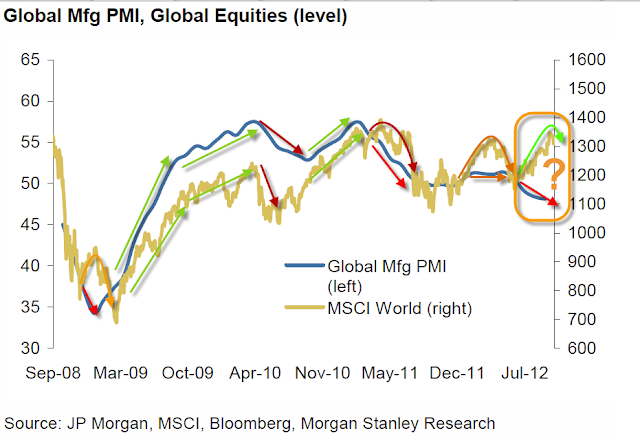
I found this chart pretty interesting, in blue we have the Global Manufacturing PMI composite vs the MSCI World Stock Composite.

Note that when manufacturing turns down, the market isn't far behind. In 2010 the market turned down about the same time, but QE1 was ending with no follow on program announced, also in 2010 the market turned up before manufacturing, but again, Bernie had announced the QE2 intent at Jackson Hole sending the market higher. In 2011 the end of QE2 was known in advance, manufacturing seems to have led the market lower here as we saw that 20% decline in late July 2011, manufacturing is again turning down and divergent with the market.

This is where I do have some thoughts that have been mentioned before...

First of all, "QE-3 is there to help employment" in my view is political cover and not very good at that; QE has never been shown to lower the unemployment rate, if it had we'd have heard about it non-stop from Bernie and we wouldn't be engaged in QE3. The fact is, weeks after QE3 was announced, as I suspected, a bunch of bad economic news came out, manufacturing was worse, Q2 GDP was revised even lower, Q3 GDP has been revised lower by GS 2 times in 2 days in the last week.

I can't even say that I believe QE3 is there to help manufacturing, think about it...

All of the manufacturing reports except the last one that was way out of left field and completely contradicted not only nearly a year's worth of data, but even a report released a day earlier, all have the same themes around the world:

Inventories are up because they aren't shipping as much (see the transports), new orders are in contraction, exports are in contraction, employment is down because capacity utilization is down and the one that stands out the most... Input costs are rising= inflation or to be more specific, STAGFLATION!

Before producers hire employees, they have to burn through current high inventories, they have to start using the spare capacity that is sitting idle and push it to the max until they can't push it anymore without more employees.

For that to happen, consumers need to consume and with the latest Consumer Spending rising due to one thing and one thing only, higher gasoline costs combined with higher food inflation, consumers are feeling the pinch as well.

The one thing we know QE does for sure is debases the value of the dollar or causes price inflation, so with consumers paying even more, savings worth even less and manufacturers input costs rising even more, where exactly is this demand going to come from that will spur new hiring?

Lets be honest, there's only a few places that really benefit from virtually free money by the tens of billions and that's the banks. It is my opinion that the first round of QE was a way to give the banks money without having to directly bail them out which was politically very unpopular, during QE2 the banks were raking in the money.

If there is a bigger problem that we are not aware of that caused Bernie to, as ex-F_E_D governor Kevin Warsh described QE3, "Panic when the economy isn't in a panic", then the next surprise may very well come from the financial sector. Remember how quickly Bear Stearns and Lehman happened, or MF Global for that matter.

In any case, manufacturing is more of an economic outlook indicator than even transports and both right now are not looking very good at all. I just wonder how the Financial sector that feeds off the economy is really doing because I believe that's the reason QE3 popped up.

AAPL Still Has It...

You might find this post interesting, specially if you are not use to seeing how much the market is manipulated or you don't understand just how much AAPL effects the market.

Going back through posts from yesterday and today, first there was the AAPL Symmetry Post yesterday, although this could be a lot of things including a Broadening top (all H&S tops start as Broadening tops first). Whether AAPL really needs to finish out a symmetrical top or not I don't know, I can tell you that since the day after QE3 was announced the market has pretty much just trended down; if AAPL were allowed to fail today below the neckline its nearly 20% weighting on the NASDAQ 100 would have done some serious damage to the market.

Here's what the AAPL H&S top thus far has looked like using 3C.

This is a 5 min chart so it's a bit difficult to see the shoulder's and the head, but I labeled them above, you can see the accumulation for the second shoulder to the left of the head and then the stronger accumulation to form the larger move that is our head so far. You can also see quite heavy distribution coming out of the head and again reasonable size accumulation on the first shoulder after the head and what I suspect will be the second shoulder starting today, but we were also below the neckline, as I said, a failure in AAPL here would have consequences for the entire market.

Speaking of which, here's AAPL's longer term trend.

The leading negative divergence to the far right on this 4 hour chart is where the H&S top would be now.

Around 1:55 p.m. today I was having trouble finding clean/clear intraday divergences in the market averages. So I took a look at some other indications like Credit intraday, Yields and the Euro; while nothing was screaming, there was just enough of a neutral environment and slightly positive that I could envision a move higher. Thirteen minutes later at 2:35 I posted I was closing the AAPL short "for now, most of my reasons were based on market behavior and the manipulation of technical traders, but there was a positive divergence on intraday short term charts, I was about 25 minute off from the intraday bottom after AAPL had been moving lower all day.

I can tell you this...
 The $USD (green) and the SPX (red) have an inverse relationship as you can see above, a strong dollar generally means a weak market, but...

As you can see to the right in the orange box, the market lifted with the $USD, this isn't normal, the market falling on $USD strength like the white box to the left is normal. So there's a lack of clear signals, AAPL is in a dangerous area and despite a neautral environment at best, AAPL is lifted and the market with it.

CONTEXT didn't even support this move...
This is the ES (S&P E-mini futures) in red vs the CONTEXT model in green (basically whether other risk assets support the market moving higher or not), to the far right, the CONTEXT model DID NOT support ES moving higher which seems to be a direct result of the move up in AAPL.

Another take on today's AAPL action from ZH is this...

AAPL's Drop-and-Pop... as the stock fell, volume was sporadic with some big blocks going through (lower pane volume, middle pane - average trade size for that minute). Once we hit the 50DMA, average trade size suddenly dropped and became much more stable (i.e. small-lots used to auction the market up) and volume picked up - surging as we passed VWAP and those institutional orders could be filled at or above VWAP... fascinating day


I'm not sure I totally agree with the above, but more or less what they are saying is as AAPL was falling, average trade size was mixed, meaning some institutional sell orders or short orders were going through, at the 50-day m.a. where AAPL would naturally have found some support from technical traders any way (I do agree with that), smaller lot size was used (typically associated with a High Frequency Trading program trying to manipulate price up to a specific area) to get AAPL back up to its VWAP (Volume Weighted Average Price). VWAP is where market makers will try to fill orders for institutional clients, as their analysis goes, once VWAP was crossed, trade size picked up as Institutional orders were filled at VWAP, in this case they wouldn't be buying there, they'd be selling there.

In any case, I'm not quite sure I buy that explanation as it leaves VERY LITTLE room and time for Institutional orders to be filled (about 30 minutes).

Beyond that, our own 3C 5 min chart has done a great job with AAPL and it would indicate accumulation for a move higher started earlier.

 This is just a sampling of every significant turn AAPL has made on a 5 min 3C chart since coming off the top of the head on the 21st, 3C called every one in which AAPL reversed course.

This would be a closer look at the last couple of days and today's move.

Either way, you can see that AAPL still has a lot of influence over the market. I would also say that the outlook we currently have for AAPL seems to be the most logical based on the charts which should give us an opportunity to short or add to shorts in AAPL (as I closed the AAPL short, I'd be looking for a new position and probably at the top of the next shoulder that we seem to be starting now). I'd also say that based on the size of the divergence we have thus far and looking at the ones for the entire price pattern (H&S- first chart in this post), this isn't the kind of accumulation you'd expect to see if a big move to the upside was coming, this is about the same as what we have seen that formed the small rallies that formed the left shoulders.

AAPL Follow Up

Other than yesterday's AAPL "Symmetry" post, or the positive divergence on the break of important support,  the market using Technical Analysis against Technical traders, and initial breaks of support commonly being shaken out, we have one more concept found in AAPL's daily data that tends to work very well.

While there are often reversal candle formations on a chart that lead nowhere, add increasing volume to that candle signal and they tend to be VERY reliable. As long as it's the right reversal candle after the right trend (a true reversal candle has to follow the trend it's reversing), if the increasing volume is there, these are just as useful as any reliable signal in the market.

The only caveat is a reversal can't be quantified or qualified, whichever way you want to describe it, you can pretty much count on a reversal the next day, but you can't predict by this method alone how long it will last.

Today we have a "Hammer", remember by the saying, "Hammering out a bottom" and increasing volume and AAPL ends the day just in the green after having broken an important support trendline and moving down most of the day.


ERX Going Just As Planned

This morning at 10:30 I showed you ERX (Energy Bull 3X) which is a long equity position that is currently down -4.5%, I also showed you what I didn't like about the position going forward a bit longer term which also fits well with this post from the weekend on the COT of commercials as well as how I planned on getting out of the position at a profit.

So far, so good.

ERX as of the close-you might want to look at this morning's post as well.

 On the daily chart what I didn't like was the upside breakout of the channel as well as the COT data, but that doesn't mean take the loss when there's an opportunity to make a gain.

 The intraday price action of ERX was perfect for a positive divergence and that's what was there earlier and what continued throughout the day.

 The 1 min chart leading toward the close.

 What is most important is the 30 min chart positive and leading here. You might look at that chart and wonder why I am looking to exit the trade...

That is answered here on the 4 hour chart with a deep leading negative divergence. This is what understanding the different timeframes is all about, the shorter term timeframes tell me I can probably exit the position at a gain, the longer term chart tells me that's probably the best idea although I want to always watch as the position develops for any changes, but strip away the noise and the 4 hour chart which is short on detail, long on trend tends to agree with the COT data of what's been going on in the oil/energy sector.

By the way, I always try to confirm, this chart may look very similar, but it's a totally different ETF with totally different volume (supply/demand).
XLE/Energy looks almost identical.

Any RIMM longs might want to lock in some profits

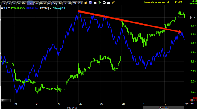
In a perfect example of the bifurcated market I've been talking about, 2 tech companies, RIMM and AAPL are headed in opposite directions on the day and in the afternoon. If you went long RIMM when it was first mentioned you might want to lock in some profit, if you are looking for an entry in to RIMM you may see it soon, but what a great example of the split in the market.


 1 min

 2 min

 3 min

 5 min

15 min, I'd like to see that gap for a long entry.

AAPL- Market Behavior

It almost never fails, whenever Technical Analysis set ups like the one in AAPL today (break below support/neck-line) show up, the obvious trade according to Technical Analysis is obviously wrong as they (Technical traders) have technical analysis turned against them.

 The Complex H&S top posted yesterday, which could also be a broadening top, it depends on how the signals play out. Today we have a break below the neck line.

 The AAPL 5 min chart has a relative positive divergence, but I think that is more coincidental, and a positive divergence today on the break of the neckline. As shorts (as few as they may be as all love AAPL) sell, it makes it easy for the pros to accumulate those shares or supply.


And this is why I don't like the obvious short set ups from the T.A textbooks, too many people all doing the same thing for way too long.

MArket Update

Looks like an intraday reversal and probably what we have been talking about right here.

I didn't have time to capture them all and some like theSPY, have very poor signals, but here's the DIA.

 DIA 5 min positive

DIA 10 min positive

MCP-Too many charts, not enough time

I'll be opening a small long equity MCP position here. There are too many charts to post with the time left in the day, but this is the gist of it (remember to see yesterday's MCP update).

 Yesterday's update explains the different things that have been happening in this area, basically positive and it's held the support level.

 The slight break of support this morning triggered stops and MCP has been lateral most of the day which is where we often see accumulation in a scenario like this.

There are a lot of positive charts, but I have limited time, the 5 min shows the positive divergence at the break of support this morning and a leading positive divergence since in the range.


GOOG getting slammed....

GOOG is getting slammed after failing on the breakout from the "bullish" triangle.

I'd really like to add to the GOOG short position, but I'll wait as this isn't much different than the initial break that everyone shorts and then sees a volatility shakeout. I'd rather try to add on a shakeout with less risk, if I miss it, I still have coverage.

The 3C charts still look just as bad as they did, but price is getting very thin on this move down.

MCP (long) Looks interesting here

I'll get some charts up shortly.

AAPL Update

Yesterday I posted this on what looks like a complex H&S top in AAPL. If we still consider AAPL a bellwether for the market, than the short and longer term thoughts about AAPL and the market are pretty close.

Here are the charts, but make sure to see yesterday's post if you don't recall it.

 This price pattern was what yesterday's post was pretty much all about and the reaction from it. The price pattern looks like a complex Head and Shoulders top, meaning instead of 1 head and 2 shoulders, it appears to have at least 2 if not 3 left shoulders and given the pattern's affinity for symmetry, probabilities are for at least 1 more right shoulder, maybe 2 so that would likely put AAPL somewhere around the $680 level as the H&S pattern is slanting upward. A 3rd shoulder would likely be lower.

Today AAPL broke below the neck line which is where Technical Analysis says you should short a stock like AAPL, so why did I just close it? As we have seen time and time again, the technical retail traders who jump in short on such an obvious set up seem to be run out of their positions probably 85% of the time on a volatility shakeout, this is absolutely my least favorite place to short, but it often leads to excellent areas to short on a volatility shakeout. If I shorted AAPL at $700 which I would have done had the position not already been filled out, then I'd probably only close half and ride out the rest and re-establish the other half at better prices if available.

 Like the market averages, AAPL's 4 hour chart is leading negative and this after the 13th.

 The 60 min chart is leading negative a well and this after the 13th.

 30 min chart is leading negative, but within that there is an inline component at the lows for AAPL.

 The 5 min chart shows a relative positive divergence after AAPL broke below the neckline today.

 While I wouldn't go buying AAPL long based on this 1 min chart, it is positive as AAPL moves lower under the H&S neckline.

Here's a closer view of the break down, as you can see the longer term charts are pretty clear, the shorter term charts aren't as positive as I'd think they might be, but this break is new. I'm making most of the determinations on short term trade based mostly on market behavior and how it is used against technical traders.

All of that being said, AAPL still has a lot of weight on the NASDAQ 100 so it's still probably a decent model bellwether for the market.


Closing AAPL short for now

Remember yesterday's post, AAPL Symmetry ?

Mostly based on that post, I'm going to temporarily close the AAPL short in the equity model portfolio.

I'm going to post on AAPL next.

The AAPL position is at  -7% loss, which would be about 1% of portfolio, but note the size of the position which would be about 15% so you can have decent sized positions and still follow the 2% rule,in this case 1%.

AAPL coming up next

Other Indications

As I said I'd bring them to you as I dug them up, on the Risk Layout chart there were some interesting indications, still along the same lines of local support (which doesn't mean bullish, it often is just shakeout volatility, but we aren't making a final determination on that, we are letting the market tell us and looking at longs and shorts that seem to make sense) and longer term deterioration.

Here's what I mean (and just putting it out there... a crack below the area of support I showed you in the last post for the QQQ and just about every other average, would be a very dramatic event).

 This is High Yield Corporate Credit (very liquid) vs the SPX in blue on a 1 min chart, as for an intraday signal, this isn't screaming, but it is worth noting, Credit dipped below its close yesterday and moved back above it while the SPX (green) is still below its close yesterday, credit generally leads even though this is a very minor signal.

 Longer term, before QE3was announced HY Corp Credit had been doing well, after the announcement it started underperforming and broke below the announcement date of the 13th (red trend line) long before the SPX did (orange).  In addition, Credit is much more negative than equities and in almost every circumstance credit leads equities. So that's a longer term view which is similar to the longer term 3C charts of the last post, but short term Credit also failed to make a lower low here, so that is another sign that a bounce from this support area is likely.

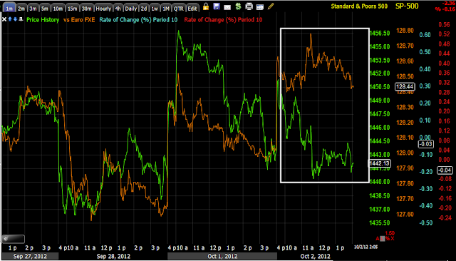
 The Euro intraday is performing better than the SPX, I would expect this to be a leading signal intraday for the SPX to move toward the Euro.

 Longer term they have been pretty much in lock step, however we've had more than 2 weeks of trending down without any significant correction and both have a support area below them.

Remember in my Energy 3x long, I'm looking for some upside to dump that position.

 Yields also lead the market, they are leading the SPX lower, but short term also have a support level here.

Longer term, this is probably the biggest negative divergence in yields vs the SPX I have seen since we started using them, again, much like the long term 3C charts.


Market Update

This update will be a bit more complex I think. As has been mentioned many times, since QE3 was announced there's been bifurcation in the market signals and in individual stocks as well.

The intraday trade seems rather "blah" or at least the signals do. Take a look at ES 1 min intraday.

The green arrow is the 3 a.m. EDT European opening, 3C 1 min is negative pre-market and as we move in to the NY open, there's a small relative positive divergence now.

Not all of what I see though is based on 3C.

While I'm using the QQQ 60 min chart, most of the averages are in the same position, they are at an area in which there hasn't been a lower low, an area around the QE3 announcement and otherwise just an area in which you'd expect some support if for no other reason than just volatility's sake.

It's also an area in which there's a lot of in line signals and some are even building, take a look at the DIA 5 min.
DIA 5 min

The ES 5 minhas a small positive divergence as well. I'd expect some volatility bounce from here, actually yesterday I mentioned I was expecting something along those lines today.

It would also be nice to see what the market does with it as we have plenty of information on the downside.

Still when you move out to the longer term timeframes where there's less noise, they for the most part don't look good.

 Even if I ignore pre-F_O_M_C data, the post F_O_M_C data in most if not all cases looks worse. The DIA 60 min leading negative divergence.

 SPY 4 hr. leading negative divergence

 QQQ 4 hr leading negative divergence

IWM 60 min leading negative divergence-all of those post F_O_M_C.

Still that doesn't mean there can't be a bounce at a support area like this and based on everything we've seen with price patterns like this, that ends to be what happens, a lot of the time after a break below support first.

I'm going to look at some other assets, but think about how and where you could use any potential upside a far as setting up shorts you might like, phasing in to longs we have been looking at. A break straight down below this area would be quite uncommon, but who knows, it could happen.

There are more stocks now than I can remember seeing maybe ever, in which there are positive looking ones like BIDU, UNG, RIMM, etc and negative looking ones, GOOG, AAPL, IBM, etc.

A lot of intermediate term 3C signals aren't formed yet because of this recent chop at support, they need to catch up, but we have other tools as well.

I'll let you know what I find.