Wednesday, March 4, 2015

Daily Wrap

The headline today is the Dow has the worst day since January, a far cry from just 3 days ago.

Of particular interest to me was how the market would react today to the unexpected, surprise easing actions taken by 3 central banks overnight and before the cash open. While the Polish central bank meeting was expected, the rate cut was unexpected, at least twice consensus as well as China's PBoC easing further by making more money available to financial institutions and India's central bank making its second rate cut in 2 months. I recall in 2011 we had something like 3 central bank actions in one day and the market ripped higher, yet today it gets the headline of worst Dow performance since January (which was far from a banner month).

Additionally, on the week, every major index is in the red after early week (Monday) strength except the NASDAQ which is still holding green on the week and the SPX is the laggard on the week.

Intraday it was difficult to post much of anything as I have no desire to spam your inbox with information that hardly has an edge. Indeed, I spent a good portion of today (this afternoon) going through the averages and their derivative ETFs in just about every timeframe looking for a clue as the intraday action was completely on hold. I said it looks like the market is waiting for something, I think it's a pretty safe bet to say that would be the ECB's meeting tomorrow. Still, at any other time over the last 6 years, 3 unexpected central bank easing actions would have produced a pop through the roof so to speak, rather today everything closed red.

So I looked for signs on near term accumulation on today's market which was a near carbon copy of yesterday with initial weakness, a "V" shaped recovery around 10 a.m. and after the European close, it was "Watching paint dry".

Some might say that weaker than expected European PMIs and some weak US macro data was the reason, but honestly the market looks to be waiting on Draghi which is interesting because over the past years the market's reaction to Draghi has seen an unabated decline in the reactionary half-life to anything he says or does (meaning the market use to react for a couple of days to Draghi then a day, then a few hours, then an hour).

There was EUR/USD weakness in front of tomorrow's ECB meeting sending the pair to a low of $1.1075, the lowest level since 2003 (likely to reach parity in the not too distant future).

As for the averages, here's a run down of multiple timeframes in multiple averages...
 QQQ 1 min gave virtually no hint as to what the underlying action in the market was except perhaps to say, none.

The QQQ 2 min has deteriorated as we have seen and there was some more of that today, likely just not enough action in underlying trade to justify prices off the earlier a.m. lows.

SPY 3 min shows some early action at the a.m. lows, but that's about it and the divergence goes flat by turning negative in to the close.

The SPY 5 min shows last week's weakness and how that has effected this week's prices so far, which on a closing basis has pretty much taken out the last 10-days of closes. On an intraday basis, if any longs got panicked early, about 12 days of longs would have been at a loss.

This is what I mean when I say that the market can rip away a month or two of longs in a single gap down creating an extremely effective bear trap. To me,  the +1% SPX gain since mid-February that was underwater on this morning's price action simply is not a risk worth taking from a risk:reward perspective.

 QQQ 15 min showing the overall trend since the start of the year which should be clear from left to right and individual divergences marked in red and white. The current move which targeted the 2015/January  range as it was exceptionally obvious and thus predictable in how traders would react (see the gap at the orange arrow above the range) has seen exactly the divergence I expected to see once we identified the base from Jan 29th to Feb. 2nd and identified the obvious range that would be the subject of the move.

While I'm very anxious to see downside gains on such an ugly divergence, I can be patient so long as I have a strong objective edge for the forecast.

The SPY 30 min looking as expected and really not much different than ES Futures (60 min) as you may recall.

And QQQ 60 min.

This has turned in to more of a review of multiple timeframes, but what I was really looking for today was any near term bias in the market or front running inside information, but couldn't find much of anything as seen above on the intraday charts.

 I checked HYG because even in its current decline which was screamingly obvious last week in its 3C charts, it can still be used intraday as we saw Monday to support a move, so I took a look there as well.
 Other than the divergence last Thursday and Friday (26th and 27th) which is a text book divergence, the kind that jumps off the chart without having to pour over every jiggle, I found NOTHING but downside confirmation.

 As for the HYG trend since it has turned to a primary downtrend, this most recent support move in HYG has seen one of the strongest divergences of the downtrend out on a strong 30 min chart.

So I also checked Index futures to see if there was any hint there...

 I think you can probably tell me, ES/SPX futures intraday 1 min

NQ/NDX futures intraday 1 min

TF/Russell 2000 futures intraday 1 min.

While I'd expect any new divergence to show up on the earliest/fastest timeframe first (intraday 1 min), I checked the 5 min charts too as sometimes divergences will slip by...
 Again, ES 5 min

NQ 5 min

And TF 5 min.

They all look like near perfect, textbook confirmation of the divergences and the price decline expected after brief strength early in the week.

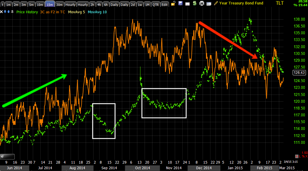
I did post TLT charts today which are important seeing that VXX/UVXY charts are already looking good and HYG is already in price divergence with the market, TLT/yields are the last real stand and I think you saw how that's turning out after our last two calls in the asset which were right on just about to the day.

Last Thursday's USO update gives a pretty good overview of some of the forward looking expectations for crude/USO and possible trade set ups, with a half size position already in place in the tracking portfolio.

Thus USO's moves today were a bit strange given the ISIS attack on oil pipelines was already out before the 10:30 EIA petroleum reserves report, which was totally at odds with yesterday's lower than expected API build data as the DOE's EIA report showed the 8th consecutive weekly build with the biggest weekly build in 14 years coming in at 10.30 mn barrels vs consensus of 3.95 mn. This is also the fastest inventory build on record.

The initial price action after EIA sent WTI below $50 after some strength on yesterday's API report, then suddenly something changed and USO rallied, like I said, the ISIS news was already out previously.
 This is USO intraday after inventories this morning and then what almost looked like an intraday counter trend move higher.

On the daily, as you know, we have a divergence well big enough to run a strong counter trend rally, in fact bigger which is why I'm starting to lean toward a base for a true trend reversal, this is why I chose a half size position until this all clears up, I can still add if we continue to form a base and I still have exposure on a counter trend rally which I can add to if it looks worthwhile.

 While the positive divergence may not look large, this is a 2 hour chart, it is large, more than enough for a counter trend rally and probably at least half or more than half of what would be required for a viable base and tend reversal.

It's charts like this 10 min that pulled USO back off a resistance area where they are apparently not willing to accumulate, that makes me think a base accumulated toward the lower end of the range is looking more and more probable. This chart still has not resolved so I still think it's probably the highest probability.

The 10 min chart is showing some 3C accumulation since the pullback from the resistance area around $20, not enough to resolve the 15 min chart as of yet.

Intraday, the 1 min chart shows the 3C accumulation after the EIA lows were in, thus it looks like a quick counter trend move on the EIA news or a contrarian trade as a lot of shares on the cheap would have been available for accumulation and a quick move on EIA headlines like that.

I'll update USO tomorrow when we get more data, but I'm still thinking we are going to see some more basing activity.

While Leading Indicators weren't jumping off the screen, there were a couple of slightly more positive readings and one more negative. Pro Sentiment indicators closed a bit stronger than usual or than the flat correlation and VXX closed a bit weaker, although not looking like a slam. Spot VIX was right on with the correlation and HYG was leading it lower.

 Yields were roughly in line with the SPX intraday, but you saw the TLT charts so I expect we'll be seeing yields putting pressure on stocks over the next several days as the TLT divergence builds and it moves.

Commodities which have been acting as a useful leading indicator this year (since QE ended) once again are definitely leading negative vs the SPX here.

Everything else mentioned above was on an intraday basis and there were numerous indicators telling me nothing at all like the averages above. As mentioned, the first place I'd look if I suspected a bounce would be HYG, but again nothing except it continuing to move lower.

Short term, I think we can chalk this up to the market in a holding pattern waiting on the ECB tomorrow. However beyond that, I think this chart chalks it up without words.
This is another textbook divergence, the kind you want to look for that jumps off the chart (SPX futures/ES 60 min). Note not only is the divergence in the right place and worsening, but price has begun to respond as well.

After looking at my usual internals after the close, I found little in the Dominant Price/Volume Relationship except the NDX at 62 stocks and the R2K at 718, both Close Down/Volume Down which is the least biased P/V relationship, the same as yesterday. I nicknamed the relationship, "Carry on" as in keep doing what you were doing (to the market) as the relationship has no bias that effects short term oversold/overbought bias. As mentioned, this is the same P/V relationship as last night.

On a slightly more aggressive 1-day bias, only 1 of 9 S&P sectors closed green, Healthcare at +.48% with the laggard being Industrials at 0-.78%.

Of the 238 Morningstar groups, only 41 closed green. These two data points taken together suggest a slightly 1-day oversold condition exists, although we're not seeing it in the component stocks' of the major averages (Dominant Price/Volume Relationship). It may simply be the market is turning down and seeing the negative tone you'd expect on a sell-off.

Other than that, some of you mentioned the Hammer formed in some of the averages. This isn't a true textbook hammer by a stretch as there has to be a decent preceding downtrend to reverse (as a hammer is a bullish reversal signal) and the volume wasn't increasing today which tends to be one of the most important factors as to whether a candlestick reversal pattern is effective or not.

So the bottom line all around is today looked and acted like a market treading water, although in the red. I have little doubt this is related to the ECB tomorrow, but I don't expect anything to come out of this that changes the position of the market in late stage 3 top/early stage 4 decline, even if there was a positive reaction to the ECB tomorrow, which as I said above, surprisingly there wasn't to 3 surprise easing actions taken overnight and before the open.

There's a slightly growing more negative tone to the intraday Index futures, which I'll check in on later, but as of now as a baseline, this is what it's looking like...


NQ 1 min deterioration.

I hope you have a relaxing night and I'll keep my eye on things and let you know if anything of interest pops up, otherwise as the Dominant P/V relationship suggests, I'd expect the market to keep doing what it is doing which is losing ground red on the week except for a single average.


Quick Update

I've been tearing through dozens of charts, every timeframe for the averages, for their 2x leveraged regular and inverse and 3x regular and inverse, today just looks like the market is in a standstill waiting for something.

Near term charts are pretty much looking like an op-ex pin day. The intermediate and long term are very negative.

I'll post examples in a minute, but as much as I have looked everywhere, it just looks like it is waiting for something very near term.

Treasuries/Yields Leading Indicator Update

Our call on TLT  ( 20+ year Treasuries) short/TBT (2x short 20+ year Treasuries) on Feb 24th, TLT / TBT Spec Position, was pretty much spot on and last night/yesterday I went in to some of the reasons why I think it was and how that influenced the market, that all changed yesterday with Taking TBT Long Off the Table and thus far I'm glad to have done it.

This however has larger implications as I showed last night, yields which move opposite bond prices are a great leading indicator pulling equities toward them as if they were a magnet and the examples I showed yesterday and in the Daily Wrap show movements in the SPX that are in sync almost exactly with yields.

I think there's more than 1 influence that's in effect at any one time, say for instance NASDAQ 5k or the Actavis Bond offering that closed yesterday. With Treasuries specifically assumptions or perceptions about the timing of rate hikes and the extent have a lot to do with their movement as well, so it's not very easy to break down a simple correlation like HYG (Nigh Yield Credit) diverging first in 3C last week and before and then in price this week, which has been a strong leading indication for us.

However, as I can't predict what market players / bond traders are thinking and likely they can't predict what many others in the same field are thinking, I have to break it down to what I see on the chart.

With HYG already divergent and in decline, and with the divergences in VXX and UVXY as per the Trade Idea: UVXY (VIX Short Term Futures) and charts, TLT is the 3rd of these 3 assets that have a lot of pull on the market (HYG lower, TLT higher and VXX higher= SPX lower). We already have HG moving lower in divergence with the SPX, as mentioned, you know I like VXX for a move to the upside as it has been doing and finally TLT moving up lowers yields which have this effect both short and long term.

 SPY in green vs 30 year YIELDS in red, the areas where SPY is marked with a box show a divergence, otherwise, the market and yields have moved together.


Even intraday the Leading Indicator is heloful, this is today on a 1 min chart, SPY in green vs 30 year yields in red, the areas marked on SOPY are positive, negative divergences and in green, in line or moving together as they typically do.

So a change in TLT/Treasuries is a change in yields which as you can see with HYG and VXX already showing strong signals, is more than likely a change in the market which is just additional clues to the evidence already collected.


 This is TLT on a daily chart and the 2/24 TLT short/TBT long post for a QUICK trade and yesterday's closing of that in yellow.

In the mean time, 30 year Treasury futures have started showing positive activity as seen on this 7 min chart, the positive activity starts this week which is one of the reasons for closing the TBT long/TLT short yesterday.

There's also migration of the divergence (meaning it is gathering strength) to longer timeframes like this 15 min chart, again already reflecting a positive divergence starting this week.

As for the TLT charts, they are more detailed...
 Bonds outperformed stocks last year, this is a 60 min chart of TLT and the confirmation of the uptrend throughout the last year, however I do have some question as to whether or not this trend will continue, but that's another post entirely, I'm looking for near term and intermediate term changes...

 This 15 min chart is one of the reasons I'm having longer term trend trade doubts about TLT, unlike last year.

However near term, the red box is the 24th when the TLT short idea was put out and shortly after it headed down on the short term scalp trade we anticipated which is why I preferred the 2x leveraged TBT (long)- inverse of TLT with 2x leverage.

Again, on this chart the first vestiges  of a positive divergence are showing up and like Treasury futures, they are starting this week.

The 3 min chart shows the same including our short idea on the 24th and yesterday's cover as well as the positive divegrence starting this week as the Rate Lock caused by the Actavis issue ends yesterday.

Again intraday 2 min charts are showing all of the same things in all of the same places.

Rising TLT means lower 30 yr yields which means the market which has been following yields like a puppy, follows them lower.

HYG, TLT and VXX have a special place together when moving as described above called the SPY Arbitrage, VIX up, TLT up and HYG down pressures the market down.

It looks like the 3rd piece of the trio is falling in to place.

While I'm not a huge fan of trading TLT because of the beta, there is the leveraged TBTR which in this case would have to be shorted, still the point is the influence on the broad market.

Intraday Update

The intraday signals are pointing lower from here. I'll have a more comprehensive update out shortly as I'm still gathering information.

 ES 1 min negative

NQ 1 min negative

TF  1 min negative (tis one looks to have the strongest 3C underlying chart right now), not to say strong, just on a relative basis.

Market Expectations and Volatilty

Yesterday, Market Update,  and in the past, I've talked about watching the market too closely and some of the expectations we have probably because many of us do nothing but watch the market all day long.

One of the little factoids I've often shared is that in a primary bear market, we typically have just about as many up days as down days, volatility. We have even more volatility at each of the transitions from one stage to another whether that cycle and its 4 stages be over a period of a month, a day, or a primary trend of 5 or 6 years.

The 4 stages we almost always see in a market cycle in any of these timeframes above are the base /accumulation which is stage 1, the breakout and move higher which is stage 2 called "Mark-up" or "Participation". Then stage 3 follows, which is generally speaking distribution/top (although distribution often starts late in stage 2 mark-up and finally stage 4 decline which follows the top.

I have mentioned volatility individually with each stage and I've covered it as a whole. We almost always have increased volatility at transition points between stages, that volatility may take on different forms, it may be an increase in the daily ATR (Average True Range) as is common early in stage 2, it may be in the form of strong head fake moves late in stage 1 on a head fake/stop run before the move to stage 2 mark-up. One of the more common changes in volatility we have seen often is at the end of stage 2 mark-up in which price's Rate of Change (ROC) increases in what I often have referred to as a "seemingly" bullish manner. This is generally seen when stage 2 follows a moving average and late stage 2 it suddenly peels away from that moving average to the upside, often causing Channel Busters and other events that lead to stage 3, that's why I say, "seemingly bullish" because most of the time if you were to buy the increased upside move, you'd be underwater not long after or in a dead, lateral choppy market often seen at stage 3 . 

Then there's an increase in volatility at stage 3 as it ends with a head fake or a common  Igloo with a Chimney head fake. This is often where volatility increases, but choppiness gets more intense until late stage 4 when volatility increases again with a more straight line drop towards the end and the highly volatile, capitulation event, again, all of these are at transition points between stages.

This is where you have to know what kind of trading you are engaging in for the environment and partly is the reasoning for holding UVXY, I would have to make a decision whether I was going to be short term trading and moving in and out in an increasingly volatile market which is fantastic for this type of trading, or whether I was looking at a more trend oriented position, in which case things like moving averages are helpful to smooth out the noise , but not understanding what type of trade you are pursuing and not understanding the nature of volatility and where it occurs causes mismatches between your anticipated trade plan and your reaction to volatility. As I think you've heard me say and I'm sure you've experienced in your own life, "Use the right tool for the job". I've talked about that a lot in the use of options from my perspective, I love them for tight places where I need more leverage and want to get in and out, but they are far from my first choice for a trend trade as everything about them is constructed to work against you with longer time periods.

I grabbed a couple of charts to illustrate what I mean. Somehow it's one thing to look back at a chart and everything looks reasonable and understandable and it's quite another when you're on the right edge of the chart, but this is why I'm so big on understanding the stages of a cycle, know where you are and you have a good idea of where you're going.

This is a macro example of the stages in a primary trend...
To the left is the top of the 2000 Tech Bubble (stage 3 TOP), followed by stage 4 DECLINE or a bear market. Just like we often see on intraday charts or swing cycles, there's a "W" BOTTOM or stage 1 ACCUMULATION. 

Note how stage 2 MARK-UP remains in a steady trend marked by a red trendline for 2+ years and recall that "Increased upside ROC in price" at the end of stage 2 that is "seemingly" bullish? At the yellow arrow and my note you can see price peel away from the former trendline, increased volatility which runs right into the 2007 stage 3 TOP.

It seems to me a lot of people expect declines to be straight line drops. If you look at the downtrend and start of stage 4, there's a large increase in volatility, but it's within a choppier zone than what people commonly expect, however if you follow my small orange hash marks on the chart, each one is a lower high and lower low, the very definition of a downtrend and in a primary trend sense, a bear market or stage 4 DECLINE. 

At the end of stage 4, again volatility picks up just like at the end of a stage 2 rally and that's where there's a near straight line drop, but this too is often a warning signal that the trend is about to change. This scenario of increased volatility at the end of stage 4 decline most often ends with a very volatile event that is called "Capitulation", which is like one big , massive selling event typically recognized by a large gap down on huge volume.

As a side note, this rarely is the actual bottom or the start of the cycle all over at a stage 1 base, typically price drifts lower after capitulation and drifts right in to a new stage 1 BASE as it did in the first quarter of 2009.

Almost all of the concepts above, we see on a daily, weekly or monthly basis, that's why I call concepts like this "fractal" and I didn't go looking for or cherry pick a chart, I just grabbed the last complete cycle, but for an even wilder ride, look at the start of the 1929 top and stage 4 decline. After the initial drop which was huge, there was a 5 month rally of +50% which is rarely noticed by people looking at the time period as it is dwarfed by the rest of the trend, but at the time it was huge for the Dow. I'd encourage you to go back to the 1929 top and slowly move your chart forward through time and see how you would have reacted emotionally yo each of the events because too many people look at the trend and think it's a no brainer short, but a 50% move against the initial drop shortly after it started after a decade of immense gains, you'd be awfully confused and I doubt many people would have had the wherewithal to sit tight.

I? think studying historical charts in this manner, putting yourself in the emotional moment (if possible) is one of the best ways to learn about mass psychology and market behavior because of it.


 This is a similar trend to the 2004-2006 bull market clinging to its trendline until that upside peel-away which probably caused a Channel Buster. This is also one of the more significant events on the market to this day, the first real break and lower low on a primary trend basis which has led to a large Broadening top price pattern (actually is part of it.

You may recall, at the time (both at the anticipated decline from the head fake move at the September highs which was stage 3 of the August cycle, I felt very strongly , despite my market outlook, that this wa not the top and when sentiment indicators hit record bearish levels at the October lows, again, I did not think this was the top and in fact had gone the other way and expected a "Face ripping " rally, even before we had the objective evidence of accumulation, there were simply too many people calling a top at the time, too many people on the same side of the boat.

Ironically we are at the exact opposite now with even CNBC posing the question, "Is it different this time?" just this week. I saw the word count of "Different" used in one night on CNBC within that context and it was over 40 times, that's the kind of sentiment tops occur in, just like the vivid memory of CNBC pumping the author of the book, "Dow 20,000" at the 2007 top that has stuck with me.

 I showed the chart above this one to show this one which is a faily look rather than weekly of the same top area and decline to October lows. This was called (by us) the August cycle as stage 1 happened in August, followed by stage 2, stage 3 and a head fake move we not only anticipated, but had evidence for at the yellow arrow. I'm not even going to get in to the Bullard connection then as now as the point is market behavior/volatility.

This stage 4 decline was very strong and more importantly very effective as mass psychology goes as it produced record high levels in several sentiment readings by 3rd part sources. From the head fake area (Igloo w/ Chimney) looks like a pretty clean downtrend, the kind of straight line move many expect, but take a closer look...

 From the Chimney/head fake in yellow, count the number of up days vs down days as the size of the candles (ATR or volatility) increases from the candles to the left. There are almost as many up days as down days; 6 up and 7 down before we reached the increase in volatility you see at the end or transition part of a cycle (stage 4 decline which moved in near straight line fashion the last several days or at least for 3 consecutive days).

Again, just like the increased ROC at the end of stage 2 Mark-Up, the increased ROC at the end of stage 4 is a warning sign that things are about to change and we had started calling for a bottom several days in advance while everyone was convinced this was the one that wasn't coming back.


 Our current daily chart of SPY shows a horrible start to the year, no January effect, a choppy range with a lot of volatility (look at the candle size or ATR), then stage 2 mark up off the 1/29-2/2 base area, note that volatility dies down and the candles are smaller until just before price starts moving laterally, there's an upside increase and then stage 3 as we have identified it.

I put the moving average there, just because I didn't have my pad out to draw the obvious roll over in the rounding top area. This is a transitional area and volatility is likely to pick up, whether that's increased ATR of the daily candles (the daily range) or whether it manifests in a more volatile move to the downside, history and mass psychology tell us it's more likely that we see an increase in volatility in a choppy downtrend until we reach that point of the straight line drop, but the straight line drop here is far from the norm.

This is exactly why I have had to make decisions about whether to leave UVXY in place for a trend move or whether to take a nearly 8% gain in less than 2 days, I think I posted my reasoning and in that, I understand the trade I'm looking for, thus the tool (type of trade) has to match the job.

Again, here are the charts for VXX/UVXY updated this morning and why I again decided not to take an even bigger gain today, VIX in the mix.

Remember the intraday charts mostly 1-3 minutes which are full of noise as intraday volatility has clearly picked up...
While the trend has been down, I'm sure you can see the difference in volatility from last week to this week, changes in character lead to changes in trends and volatility changes are CERTAINLY included in that concept.

Thus, while I have no argument with anyone wanting to trade shorter term among the increasing volatility and maybe taking gains like yesterday's 3 hour market exposure in UVXY of +6% or today's day and a half and nearly 8%...I've decided that I want to use this tool in a trend fashion, that means even though we can see it coming on short term intraday charts just like yesterday and today...
 VXX and UVXY intraday pullbacks off the best gains yesterday and today, both days in which decisions had to be made whether to take the gains and run, or stick to the initial plan and if I'm sticking to the original trend trade plan, I can't let short term charts that are essentially noise, throw me off.

This is the trend I'm looking for...
 VXX and UVXY charts from 5 mins through 60 min all leading positive in a huge way at a "W" type bottom area.

Much in the same way, while we identified the 1/29 -2/2 base and I could have easily closed shorts and went with longs for the move, I'm looking for a bigger trend and I expected to see underlying trade behave in a certain way on an advance...

This 60 min ES chart is confirming what I was looking to find. 

I'm not saying anything even remotely close to "Don't piggy back trade" or swing trade here, there's opportunity that was identified in advance, I just choose to take the larger perspective.

Remember working on AAPL for months and being practically laughed off StockTwits as I had said AAPL is seeing distribution and is going to move significantly lower in 2012 when AAPL was hitting new highs everyday and AAPL could do no wrong. AAPL longs were WORSE than the goldbugs of 2010-2011.

The point is as you may recall (I definitely recall as it was a hard lesson), I had a short position in place only a few percent off the top and decided when I saw a small positive divergence that I would close the short and wait for the little bounce the positive divergence was suggesting and then re-enter AAPL short at a slightly better entry with slightly less risk,  then the Dan Loeb news hit and AAPL never turned back, never gave me that counter trend move to get in. A trade I had nailed and been in place for worth 45% (or more if it had been pyramided up as you can do with equity shorts- non ETF) all because I treated my trend position like a swing trade and lost out.

I suppose Jesse Livermore stated it more succinctly in saying, 

“It was never my thinking that made the big money for me, it always was sitting.”

“Money is made by sitting, not trading.”

“Men who can both be right and sit tight are uncommon.”

While I disagree and many of you have proven that the above quotes are not the final word on trading, in the AAPL situation, the above applied and I took a tool meant for one thing and used it for another, the failure to align my trade plan with the trade management cost me a fantastic gain. In other words, I had AAPL right,  but didn't sit tight or you might say planned my trade , but didn't trade my plan.

I hope this of some help as we are obviously entering volatility.


More Broken Markets

While some people think these market breaks, the latest occurring at 10:12 a.m. this morning when BATS declared self-help against NYSE ARCA (meaning NYSE broke) are simply a way to slow the market's decline or ramp it higher, this is an issue we have been keeping tabs on for quite a while.

While I can see why some would suggest these are manipulative practices to slow a decline (I think the parabolic drop would have flamed out anyway at some point soon on an intraday basis), I've been paying attention to this situation that has been long in the making and I think there's a much bigger issue.

As you saw in the last post, despite spot VIX tagging $15.33 and closing up yesterday with new intraday highs today just a day after our custom indicator's VIX buy signal and ironically after record net longs  (as of the end of January)  were chased out of VIX and moved to net VIX shorts (as I mentioned when showing our custom buy/sell DeMark inspired indicator, VIX traders looke to be on the verge of 2-time losers as the market looks to make as many people wrong as possible in this zero sum game), the intraday VIX reversal was already underway as I just showed as well as the reason for not closing the approx. day and a half old UVXY long idea at an 8% gain.

This is the actual break in the market and timing and no it doesn't look good...
1 min SPY chart and this morning's gap down and then break of NYSE ARCA. I can see why some would think this is manipulative practice.

However this is an issue I have been paying attention to for some time. You may remember not so long ago the market was breaking on a near daily basis and on days when liquidity/volume were at extremely low levels,  but this occurred across numerous platforms and occurred in numerous market trends (up, down, even lateral/sideways).

I think the most important aspect here assuming it's not manipulation and my gut feeling based on watching these events in numerous market trends is that it's not,  is when the poo really hits the fan and liquidity, panic and HFT activity really increase, the structure of the markets (and I suspect it has a lot to do with HFT's clogging up the system) is so compromised that it risks potentially devastating consequences.

If a market is in sharp decline and suddenly a market breaks and people have no way of getting either the best routing or any routing, even more panic sets in. How would you feel if you needed to get out of a position and suddenly you couldn't either because a market was broken or other events relating to a broken market took place like huge bid ask spreads?

This isn't even a broken market, but it does show panic as all of the hedge funds are trying to squeeze out the same narrow exit at the same time...
This is AAPL on a weekly chart (each bar= 1 week) in 2012-2013 with a -45% decline over 8 months, you may recall because we had been calling a top and had a short position.

What caused this panic? The entire hedge fund herd (they have a heard mentality as no one wants to be the outlier who does worse than the crowd) found out that Dan Loeb from Third Point had sold AAPL as it no longer appeared on his top 5 holdings, 1 fund manager who isn't afraid to strike out on his own away from the herd panicked the entire herd in to a stampede.

Now imagine broken markets and the inevitable circuit breakers. I suspect the circuit breakers designed to give the market a "cooling off period", will only serve to cause people to panic further that they can't get out.

While the timing of the break this morning does not look good and does look like manipulative practice, in our last post on intraday VIX I think we had already clearly shown that the first trend change of the day was about to take place, nothing unusual about that and VIX was apparently at least one of the levers to halt the decline for the moment.

Before you ask, "Does that mean that every time there's a break in the market there's going to be an intraday bounce?", first I'll say that this has been normal market behavior for well over a century, nothing moves in a straight line very long.

Secondly I'd refer you to the VXX/UVXY 5 min charts and higher, someone is obviously betting against the VIX net shorts and with a steep market decline...

The huge leading positive divegrence in Short Term VIX futures (VXX) from 5 min to 60 min, the reason I'm much more interested in a UVXY trend than a 7+% 1.5 day gain.