Tuesday, November 27, 2012

Multiple TimeFrames/Multiple Trends

As you know, although we'd like to think the market moves in one direction without deviating to sharply from its course, this simply isn't true.

Even during one of the worst bear markets in US stock market history, there were significant trend and counter trend moves. I use to spend a lot of time when I taught Technical Analysis trying to get my students to not look at a price chart as a bunch of signals generated from numerous indicators or at resistance points or pivot points; I wanted my students to really understand what drives the market and what drives each of us to a very large degree- EMOTION.

In business school you might be taught how supply and demand effect prices and how the market is a representation of not only supply and demand, but of fair value, having discounted all knowable information in to a stock's price. The truth is the market moves on sentiment, it moves on EMOTIONS, the two biggest drivers of the market and our behavior are Fear and Greed, they are what cause supply and demand.

Most stocks' prices have very little to do with value, they have to do with what sentiment toward the economy is, what sentiment toward the market is and the particular stock. Have you ever seen a stock blow away estimates on earnings and still be sold off? That's because the market doesn't care much about what you did, it cares about what it thinks you can do moving forward, if they feel your best quarter may have indeed been your best quarter, they will sell the stock despite a beat.

In any case I'm getting off track, but if you really want to get the most out of a chart, learn to put yourself in the emotional moment of the chart you re looking at; how would you feel if you were long or short, if you had a profit or loss? It's difficult because you know what comes next, but that's an exercise worth working on.

As to multiple trends, lets take a look at that nasty bear market from the Crash of 1929.
 Here's the Dow-1929 Crash, when you get some time you might take a closer look and think about how you might have traded it. I suppose most people would say they'd have shorted this market and stayed short for a nice trending trade.

 Look at this  countertrend rally. If you didn't know that is was a part of the chart above, would your answer be different as to how you would trade this chart? Of course it would.

 This is the same section from above in the trend, it was a +52% move, worth trading as it took less than 4 months (bear market rallies are some of the sharpest rallies you'll see) to make that money, but ask yourself this, had you not known what came next, would you have had the fortitude to hold on to your short as more than 50% of the value declined in 3.5 months? Remember at the time you have no idea what comes next so if you could see this move coming in advance and had an opportunity to trade it from the long side and make extra money rather than sit through a very emotional draw down, would you have traded it? I would have.

There were at least 6 of these bear market rallies within the downtrend.

Here's a Fibonacci set, it just shows how your short would have suffered over 50% draw down. How many of you could actually keep that trade open?

Now along a similar line of thought, lets take a look at the market right now, some of you have asked me if I'm bearish this market as I have spent a lot of timing making a very bearish case. The answer depends on the opportunity available and the probabilities, I want to take whatever the market offers whether that's long or short. I do have different feelings about different trends and I'll show you why and what evidence I use to come up with these positions.

This will not be a comprehensive treatment of all of the reasons, it would take me weeks to post all of the information we have gathered over the last several years.

When we think of the market, think of the primary trends as the ocean's tide, a bull market is the tide coming in, a bear market is the tide going out, but unless it's a tidal wave, the tide doesn't come straight in when viewed from the beach. You have waves, early in the cycle and if you placed a stake in the sand where the wave came up to the beach and then stopped and went back, over some time you'd have to keep moving that stake in the sand further and further up the beach as the tide pushes the waves up higher. Conversely in a bear market as the tide goes out you still have counter trend waves that come up the beach, like rallies, each may fall a little short of the previous one, but they come and go and each can be an opportunity to make money.

 When looking at a weekly chart of the QQQ I can see a leading negative divergence at the top in early 2000, I can see a positive divergence at the 2002/2003 lows, I can see a negative divergence in to the 2007 highs and I can see one of the worst negative divergences this chart has ever seen right now. When the time is right, I want to load up short like I never have before, but the timing must be right because right now it feels like although the tide may be going out, we have a wave coming up the beach.

 Here's the SPY with the 2011 top before that we had confirmation of the trend, at the 2011 top we had a negative divergence so we might go from long to short, even though our main view is bearish, it doesn't prevent us from taking advantage of an opportunity to make money on the long side. As you can see, the recent top had a very bad negative divergence to it and many core shorts have done great, but you can also see a little reversal, I believe that's just the start of a bigger move to come.

 This 15 min chart of the QQQ shows a positive divergence from October to November, it's large and we've only seen a small move up so far from it. Ultimately there should be enough power to take this market higher from that accumulation zone which is fairly large.

 On a shorter term basis on a 5 min chart of the QQQ we have about 4-5 days of a negative divergence, this tells me it's likely the market pulls back before continuing higher from the chart above this one, so if I can make money trading this pullback, why not. I don't want this to be my main exposure, but a few positions here and there can produce extra profits. This negative divergence is no where near the size of the positive above this one so I think after a pullback we will see a continued move higher, but we always watch the market and look for its message.

If I had a large portfolio and I was very speedy, I could even trade this TICK chart from the long side, this isn't something I could do for a number of reasons, but the point is there are different trends and different opportunities. If you ask if I'm bullish or bearish it's not a simple question, it depends on the trend we are trading or preparing to trade.


Confirmation Assets

I always try to get as much confirmation as I can, so if I see a divergence and it looks strong enough to cause a change in the market, I not only verify whether other averages and timeframes are seeing a similar divergence, but I check other industry group, important stocks, currencies, volatility instruments, treasuries and more or less anything that has a correlation with the divergence I'm seeing or has an inverse correlation (meaning it should give the exact opposite signal).

As you know I checked Treasuries and was surprised by the size of the divergence and the urgency, but more impressive may have been the volatility instruments.  When short term volatility instruments start showing strong divergences and even start moving off those divergences, we are at the move in most cases because these short term volatility assets are meant to replicate a day only so they typically don't move much until it's actually time.

Here are several examples which you have seen in many posts, but most recently in this one today .

So this isn't too redundant , I'll provide one example from each of the 4 major averages, if you want to see more then simply check out the link above.

 The divergences were enough to signal a pullback as of Friday, since then they have added to th negative tone in a big way, I almost feel certain now that a test of the Nov. 16th lows is unavoidable which should be great for short positions taken up for this move and should provide an excellent opportunity to prepare for the next trend by buying low and with little risk before the next move which should be a larger move up.

I'll try to show you later tonight how and why we look at different trends from very short term to very long term, understanding that the market moves back and forth and not in a straight line and having some idea of what order those moves are coming in allows us to prepare and get some of the best prices, it's pretty much like knowing what the market will do before it does it except we can't predict how long or how far without watching the current action.

 The IWM 10 min shows a sharp negative leading divergence after coming off a strong positive divergence going in to the lows of 11/16.

 The QQQ shows nearly the exact same thing and we know AAPL has similar signals.

The SPY had been a laggard in a couple of ways, one it hasn't yet put in the same larger positive divergence (again this is part of understanding multiple trends in different timeframes) and second its signals weren't as strong, this is a strong, very clear signal in the SPY of distribution. You'll note in each case above, the leading negative divergence which is the strongest is in an area where price is more or less flat or range bound, this is the most common place to see institutional activity.

Now some confirming assets beyond what we have already seen...

 Sorry, I couldn't resist AAPL- the 10 min chart here shows the positive divergence at the lows of the 16th, the next day we had a 7.21% move up, we made 115% in a day on conservative calls and this doesn't even count the lows AAPL rallied from the day before, the 2 day move was large. Now the negative divergence is large, it make me think any longs that might have bought AAPL are going to go for a scary ride. In the end though, I think this is more about taking out the shorts before the next really serious primary trend down starts.

Treasuries are the "Flight to Safety" trade, when people are scared of what might happen in the market, they move to treasuries, but smart money also does the same. Long-Only Mutual funds can get killed on a move down, they need a safe harbor during those periods as they can't go short like we can so they move in to treasuries and I think this is why we see such strong confirming signals in treasuries before the move or reversal starts.

Since Treasuries move opposite the market (up when the market is at risk and moving down and down when they want to deploy that capital in higher yielding assets like stocks when the market rallies), the signals we see in TLT should be the opposite of the market averages-we should see positive divergences here to confirm the negative divergences in the averages and stocks like AAPL.

 TLT initially jumps this week which was strange as the market hadn't made a similar move down yet, there was some light selling in treasuries on that move the first day or so, then the positive divergence started and it looks like money was flowing out of stocks and in to treasuries.

 The 3 min Treasuries/TLT shows the initial positive divergence before popping up Monday, then a strong leading positive divergence in the later half of today to move to a new leading positive high.

 The TLT 10 min chart also shows a leading positive divergence before Monday's gap up, again today in the afternoon there was a strong positive divergence.

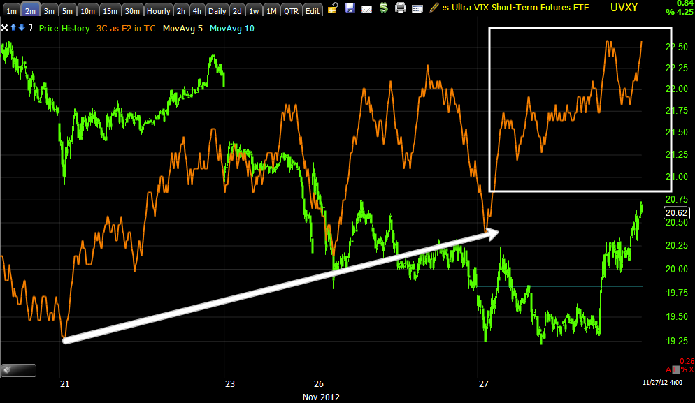
This is UVXY, it is a short term VIX futures leveraged ETF, it is meant to give similar performance to the VIX on an intraday basis, being the VIX trades opposite the market, we'd also expect to see confirmation signals in this asset to be positive.


 UVXY 2 min chart positive since last week when we first notices the probability of a pull back this week, today in particular there is a very strong move in a flat range, again it seems money moves in to these ETFs at the last minute right before a move so today's new leading positive high in the afternoon is impressive.

 On a 3 min chart look at the size of this leading positive divergence in UVXY!

 Even on a 5 min chart, the late afternoon move was so strong it was able to move the 5 min chart as if it were in real time to a new leading positive high.

 The 10 min chart is also leading positive and shows the entire area where we first notices something new in the market that suggested a pullback this week on Wednesday of last week and again on Friday.

 Even the 15 min chart is leading positive, which is a bit scary as this suggests some rather strong intensity to a pullback move.

The VXX is the same as UVXY above, except not leveraged. This is a totally different ETF, different price and volume so confirmation would be positive signals.

 On a 2 min chart, again strong afternoon momentum

 Even price responded (this is the Clear Method for Swing Trading-green is the uptrend, red the down and yellow are noise candles). This is a rather impressive move late in the day.


 VXX 3 min leading positive at a new high.

 5 min the same.

 10 min also leading positive

 And 15 min leading positive.

Here's the daily chart of the VIX with Bollinger Band buy/sell signals.

In the middle of the chart a daily candle closed above the upper Bollinger Band, then it closed within the band, this is a VIX sell signal and the VIX moved down, in fact it closed outside the lower Bollinger Band and then closed inside the bands creating a VIX long signal, keep in mind the VIX moves opposite the market so a buy signal in the Vix means the market would be expected to fall in the near term.


Holy Cow-T's and Volatility

You saw the keep it simple post, you know what the implications are. I just looked at Treasuries (flight to safety) and VXX/UVXY (volatility) both of which trade opposite the market, both of which have screaming positive divergences and are ready to go.

Charts coming

Keeping it simple

This is the way we did things a couple of years ago, it was a much simpler time, we weren't hitting opportunities that could be intraday or even day trading, but the outlines were perfect for understanding the situation in front of us.

Since I had to reboot a program I went back to the old school charts, simple, clean, effective.

Here's what we are going to end up with near the close, I'm actually considering lightening up on some of the leveraged long even though most were bought at pretty good prices, what started as a decent pullback last week is getting uglier.

 DIA 5 min-LEADING negative

 DIA 10 min LEADING negative

 DIA 15 min, leading negative.

 IWM 1 min leading negative

 IWM 5 min leading negative

 IWM 10 min, leading negative-badly

 IWM 15 min leading negative

 QQQ 5 min leading negative

 QQQ 10 min Leading negative

 QQQ 15 min relative negative

 SPY 5 min leading negative

 SPY 10 min leading negative

SPY 15 min leading negative

These 15 min charts weren't part of the deal late last week-Friday, this has me a bit concerned for leveraged long positions.

AAPL / TICK

The different components I watch to get a feel for a move are moving so fast now it's actually bogging down my machine, I may have to cut a couple of programs.

In any case, AAPL reached a 15 min chart's negative divergence, that's about as far as I'd like to see that go, it suggests a strong pullback, but much more damage than that and we start to lower probabilities on the next leg.

The TICK saw some pretty extreme readings and not just a few spikes, a nasty area. The odd thing is we haven't seen any move in the Euro or the Dollar that would cause this kind of volatility whether to the upside or downside.

 AAPL 1 min leading neg.

 AAPL 5 min-it's these longer charts that increase the probabilities of a strong pullback move.

 AAPL 15 min, there's very little noise, just trend and serious flows of underlying trade/money, this negative divergence is as far as I'd like to see that go in AAPL.

Price didn't even hit the same low as the 26th in the SPY, but look at the TICK, solidly at -1100 and then some for quite a while.

GOOG

I mentioned GOOG yesterday when volatility was lower as another possible "quick" options play on the pullback theme.

GOOG has great looking charts for a move higher after a pullback so you could also wait GOOG out and look at a larger position with even better probabilities. I'll get the GOOG charts out as soon as I have a chance, but even here, even as an equity short, it may be worthwhile for a quick trade. I mention an equity short because the volatility today may make it more difficult to make money on options.

SELL or HOLD ZNGA?

ZNGA is more like FB when it comes to its relationship with the market. The equity long position is up +13%.

I believe I'll leave it open, this is somewhat subjective and has more to do with the balance of positions than ZNGA directly, I would like to add to ZNGA to bring it up to a full position size which it is currently about 25% shy off.

For now, it's a hold for me as I have longer term plans for it.

AAPL as a market indicator

Earlier I said I didn't expect a "V" shaped fast reversal to the downside, but something that takes a bit more time to develop, well AAPL has developed along those lines and is looking pretty ripe for a reversal which is a market statement as well.

I'll put up charts of AAPL as well as anything else I find interesting, but we had a god amount of time to adjust positions today.

UNG Update

This is an answer to an email about UNG...

"I believe it was my last UNG update I noted price was above the resistance area, but I didn't think it was ready to go (move to a stage 2 breakout/mark up) so a pullback to gather some strength makes (made) perfect sense and I don't think it's anything more than that. I'd expect UNG to pick up some draft from the market when it decides to make that move higher. The 10-15 min charts in UNG look good, it is seeing accumulation (on the pullback), but the 1-3 min charts say it will go lower near term which is fine as it should pick up more accumulation which it will need to make a stage 2 breakout."

In essence UNG is another one of our longer term long plays that we like and have been in for a while. I don't see any threat to UNG right here or now, I see it doing exactly what I'd expect it to do. When it looks like it' nearly done with the pullback I'll update again in case any one wants to add or initiate a new long position. I absolutely prefer equities rather than options as UNG is still in a volatile base.


RIMM Update

I probably don't have to say it, except for new members, but RIMM is one of only a handful of stocks that shows promise beyond manipulated market cycles that have the power to send stocks higher (as they say, "A rising tide lifts all boats") and that's because (and many traders get the chronology of a trade 100% wrong) the market has the greatest gravitational force on any particular stock on any average day (obviously there are exceptions like earnings, news, etc). I'd guess the market accounts for 60% of what a stock will do that day, next believe it or not is the Industry group and whether that group is in rotation or not (rotation is starting to come back, but for several years the F_E_D's QE killed rotation as all risk assets appreciated). Lastly the individual stock, so if you want to analyze the market for high probability trades, start with the market first, figure out what it is likely to do, then look for the strongest groups or weakest and then finally the individual stock.

RIMM however I think has the power, like FB, to move against the market, although in this circumstance I suspect it will pullback with the market.

Any pullback in RIMM I view as an opportunity to add or initiate a new long position.

Here are the charts...
 We have been interested in RIMM and have traded it several times, at point "A" we have a stage 1 base, this is where smart money accumulates shares, to technical traders this often looks like a pause in the downtrend or an area that has no action and they largely ignore these areas until price and volume catch their attention. At point "B" we saw the triangle, usually we'd expect a head fake move, but since there was no probable reversal and because the charts looked excellent at the time, I said I thought it would not see a head fake move, it didn't. Point "C" is a nice move up of +36% since the triangle.

 A closer look as RIMM moves from a stage 1 base (accumulation) to stage 2 "Mark Up' (this is where the trends and easy money can be found). In white we have two potential reversal candles: a Star and a Doji t, both on increasing volume which is a VERY high probability reversal and it works in all timeframes so that's a concept to put in your tool box (Reversal candles on increasing volume are high probability reversals, there is no measuring implication of the reversal). Using the Clear Method Trending system (slightly adapted, Friday and Monday both contributed to the trend with higher highs and lows, today is a noise candle and that is also a high probability reversal candle and it also is confirmation of yesterday's Doji reversal.

RIMM absolutely should pull back, that=opportunity. The likely target is a gap fill, since HFT's the market has been ruthless about filling gaps.


 Look at the daily chart, a monster leading positive divergence, this is why RIMM stands out from other stocks.


 The 15 min chart is an important timeframe and it is for the most part in line/confirmation, but if you look at the two nearly equal highs in the red box, note there's less money in RIMM at the second as traders are taking short term profits.

This in no way endangers the trend.


 From an intraday standpoint, as soon as RIMM popped up it was seeing immediate profit taking, likely because of the size of the gap and traders knowing it would be filled more than likely.

The 3 min chart with accumulation before the pop higher and the same profit taking/distribution at the same area, again not a big deal, but RIMM should pullback.

We want to watch the pullback for a long entry or add to on existing positions. Put RIMM on your radar.