Monday, December 10, 2012

Closing View

The general trend pretty much continued today with the few notes I added, but for the most part the SPY and DIA saw negative divergences getting worse, the QQQ looks like it wants to move a bit higher, maybe AAPL and then there's the IWM which hasn't really nailed that area, but even with today's move it is seeing deterioration so the trend continues.


GLD Update

GLD was a recent long position that was mentioned, because of the choppiness in GLD I only assigned about 2/3rds a normal size position and it' a bit above this level at about a 1% loss so I still like GLD here. I think there's a chance it fills the gap and if it does, I would definitely want to take a look at GLD long, I may even consider it an add to depending on how it acts in a potential pullback. Other than a potential pullback as we want stocks to come to us and not chase, I like what I see here.

 GLD 1 min intraday has been negative, but that has pretty much only caused a lateral consolidation after the gap up this morning.

The 2 min chart is also negative, but that's where it stops. If the 3 min chart and 5 were negative too, I'd feel very strongly about a pullback, right now there's only the 2 charts suggesting such so I can't say it's VERY high probability. I still like GLD though even right here.

 The 5 min chart is leading positive.

 As is the 10 min in a big way.


The 15 minis also leading positive, there's a slight relative negative so this may also speak to a pullback/gap fill, but overall it's way more positive than negative.

And the 60 min chart, leading positive, you can't ask for a much better looking set of charts than that

FB Update

First I'm going to show you some of the long term charts for FB because FB has been considered a longer term trade since day 1 when we expected it to form a base. I'll also show you some of the closer action.

 Daily 3C chart in leading positive position, this is a really strong chart, I really love the look and like FB a lot as a longer term long position.

 Money Stream is confirming 3c's daily chart as well.

 FB made a nice break from this base, but it seems to be consolidating those gains. If this were a brand new position for me I would consider entering 50% of a full size position and add to it on a pullback. The probabilities are much stronger for a long term move up than a pullback, but there are strong probabilities for a pullback and both can happen.

 The 5 min chart looks as if FB wants to pullback or consolidate in the area more, I'd guess pullback.

 We also see this on other timeframes like this 10 min and more so I think there's a good chance of a pullback after that extended run, that's where I want to add the second half of the trade, at least entering half now I have exposure to FB which I love long term any way.

This hourly chart shows where FB is a little deficient and that chart should be seeing 3C up higher, it may take a pullback for that to happen.

If I already own FB, I hold here, you can trade around it if you like, but I like the idea of just giving it time and letting it do its thing.

Overall, I like this one a lot.

Market Update

On the 1 min charts it looks like a little intraday bounce is building, it's also on the 1 min futures charts, so this really is staying in character of the expectations of weakness in to price gains which sets up a nice short at some point in which partial positions are filled out.

AAPL Charts

Here they are...

 AAPL 1 min relative positive and leading positive divergence as AAPL held a range today.

 3 min leading positive divergence, the leading part today is the most interesting and bullish part for a short term trade.

 The 5 min with a relative positive divergence, nothing too special, but supportive.

 The 15 min chart showing how it appears AAPL's downside is done for the moment, it may be a short moment on a dead cat bounce, but for the moment.

Ultimately for the 15 min timeframe, there's no positive here, it went negative, AAPL fell, then it fell in to line with price, any positive here is VERY small so I don't see this as anything more than a speculative trade at this point, but could be worth a shot.

Spec Call for AAPL

I think I might look at a speculative position , a Call for December at $520 or $525.

The Stock long might work as well, I just don't think it has enough profit potential and again I think this will probably be a shorter term trade.

AAPL Update-Possible Trade

AAPL has held up pretty well through the afternoon, some of you are already in a dead cat bounce trade which I wasn't a big fan of Friday, but there are some charts that have really shaped up and with the NASDAQ showing better signals than the other averages, that's an added bonus as well as the NQ futures.

I would still consider this a bounce trade and speculative at that, but I like it a lot better than I did Friday. I'll get some charts up for you.

Market Update-Possible position considerations

I'd post the charts, but they are just moving too fast.

The IWM is showing intraday weakness, charts that were supportive or in line in the 3-5 min range are now falling apart.

The DIA is starting to fall apart pretty quickly, this is an area I might consider starting or adding to a Dow leveraged short like SDOW (3 x leveraged short DOW).


The SPY is also seeing deterioration on a stronger basis, I would also consider adding or initiating a partial short here  (personally I wouldn't want to go over 2/3rds my intended size, but I'd feel ok about bringing the position to that size here).

The QQQ is the only one that I have some question with as it looks better than the rest by quite a bit, but remember we saw that on the NQ 15 min chart. I wouldn't add to QQQ shorts here at this time.


Leading Indicators

Leading Indicators are telling a story just as the other updates and assets we look at and they are telling the same story, but in some cases it seems to be with more urgency, as if the probability of the downside move is much closer.

 Commodities vs the SPX (always green comparison symbol), they usually move together, commodities aren't buying something with this move in the SPX and I think a big part of it may be the Euro being able to hold up much longer.

 This is commodities again, but in this case, I replaced the SPX (green) with the Euro ETF/FXE, you can see commodities which are a risk asset and should move generally with the SPX are not.

 The $AUD began to give a divergent signal vs the SPX last week and the currency continues to remain divergent with the SPX, this is my favorite currency to use as a leading indicator.

 Here's the $AUD intraday, you can see it looks like the divergence with the $AUD weaker than the SPX at the a.m. highs brought the SPX down.

 This is the Euro ETF, this should move with the SPX (green), this is a significant negative divergence that does not support market health or strength on any move up.

 Here they are intraday, again they should track each other fairly closely, the Euro is much weaker than the SPX, which has to cause me to wonder how much true strength is left in the SPX from last Tuesday's divergences.

 Yields are like a magnet for the market and they are at a significant negative divergence, this divergence is more along the lines of what I expect in the market on the downside move.

CREDIT

 The all important credit, again High Yield Credit (a risk asset) is negatively divergence with the SPX again, credit seemingly doesn't trust this move up.

 High Yield Corporate Credit is also negatively divergent, it also doesn't want to follow the SPX higher.

Even Junk Credit is negatively divergent and unwilling to follow the market higher.

Futures

I really should have made this a 3 part analysis because all of the pieces are part of the same puzzle, they are all clues to the same answer.

In any case, there was 1 surprise in the futures and specifically in the NASDAQ futures, NQ. This caused me to look closer at the Technology Industry as the NASDAQ is Tech heavy with its components and to look at Financials as the S&P has the most exposure to financials and what I found made sense with what I saw in the ES (S&P) and NQ (NASDAQ) futures, rotation again as we saw last week. I will look at these more closely to see if there are some short term trades, I'm thinking specifically about a quick short in Financials, but I want to make sure it's worthwhile and maybe a quick long in Tech and obviously this would have some bearing on those who are in the AAPL long "bounce" trade.

 Part of the intraday trend and what comes after that (breaking above the IWM's resistance-so a mov a bit higher) is fairly well represented on the EUR/USD futures.

The 3rd part of the analysis really should include leading indicators and I will provide that for you.

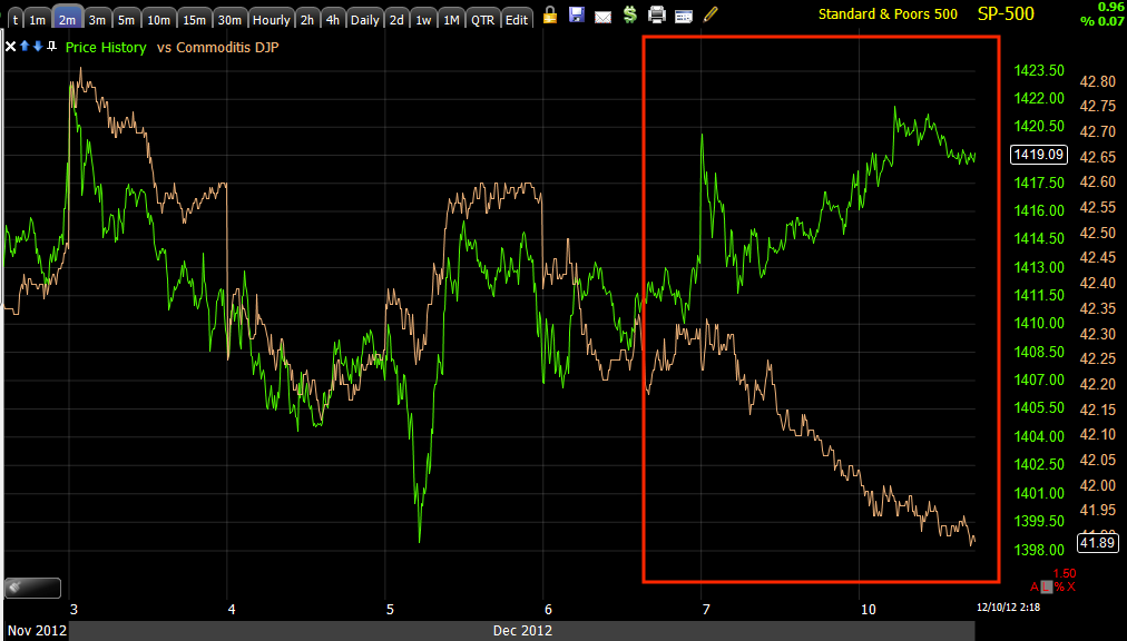
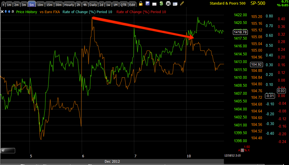
First here's the EUR/USD which is very influential in intraday and trend movement as I showed you in this morning's futures update, the EUR/USD gave away what ES was going to do.

 Intraday -1 min chart, there's a negative divergence in the FX pair, this surely has some connection to the intraday negative divergences in the market update just posted and the intraday pullback that is occurring as I type this.

 If we go to the 5 min chart of the EUR/USD though, we have an overall stronger positive divergence, so like the multiple trends that develop at the same time (that gets a bit confusing), this is showing us the same thing, 1) that short term the Euro has an intraday negative divergence and will (is) pullback, which has an effect on stocks as it pressures them and they pullback intraday as well.

The longer 5 min chart is more important, it represents a longer trend that just an intraday jiggle, this is positive so it is in line with the Euro/USD moving higher after the pullback is complete, which is in line with our market analysis of the last post which showed the same, short term intraday pullback, but we should see some more upside and one of the sign posts will almost certainly be a break above the IWM/Russell 2000's range on the upside.

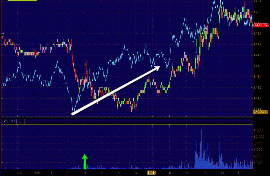
 The ES (S&P Futures) 1 min chart from the European open at the green arrow to present, there's some congestion in this area intraday, but it doesn't look that bad or as bad as the NASDAQ intraday.

 The 5 min chart of ES which I have been watching ever since it turned very strong late last Tuesday, continues to deteriorate, there is a "in line" or "Trend confirmation" move at the green arrow that supports the moves in ES, but the larger overall signal is the leading negative divergence so that is what I want to see.

 The 15 min chart shows the same, overall deterioration in to this move that became apparent late last Tuesday, it doesn't mean the move is over, just that it's not likely to change any of our of trend table expectations.

 Finally the 30 min ES chart that shows where the strength appeared last week very suddenly and how in to higher prices we have seen deterioration suggesting distribution in to higher prices and not endangering our trend table.

NASDAQ Futures
 The 1 min chart today looks a lot worse than the SPX/ES, it did see early accumulation this morning pre-market, but seems to be seeing distribution in to higher prices, this is on an intraday basis, so don't assign any more value to it than that.

 The 5 min chart shows basic continued deterioration or at least no new strengthening.

 The 15 min chart which I was watching to see if the positive leading divergence was going to deteriorate last week dis, however overnight there is a positive divergence that formed, it is harder to see on a 5 min chart because overnight volume is so much lower than regular hours, but on a 15 min chart each volume bar is bigger and this easier to make out a trend, so there's no concern about the 5 min vs the 15 min, the only concern is that we see deterioration of this too as we did last week, as mentioned above, I think it has to do with sector rotation from Financials to Tech.

The 30 min chart is in line with the trend and doesn't raise any concerns.


Market Update 1 of 2

I'd like to give you the update with the averages here and the futures in the next (part 2).

 DIA 3 min is a pretty good example of two things, 1) being the intraday negative divergence that is slowing the DIA down here, causing consolidation, etc and 2) the overall near term trend's general direction which is up, despite intraday jiggles and what not. This is what we saw forming last week, the IWM is a perfect example of why.

It is a bit confusing because there are 3 different trends that are all developing at once, just in different timeframes.  Before Tuesday of last week it was more simple, we expected a move down in the market and the longer term charts suggested that move down would be accumulated and lead to a larger move up which has been under construction since late October as a 30 min divergence. So while the move down certainly could be dramatic and shake things up, the larger trend that has been developing since October is for a move up. Tuesday the market shifted very quickly in the late afternoon and  at first we had a split where the NASDAQ immediately didn't look good for the next day, but the S&P did, the following day that shifted, we called both correctly, but it makes things a bit more confusing trend wise. I would try to think of this along the terms of August-October of 2011 when there was a lateral trend from August and we traded that, but also saw 2 things happening, a short term new low would come and that lateral period from August was under accumulation for a larger trend up. In October we saw the short term new low made and the market put in a bottom right there and rallied higher, this is similar to how we have several different trends at once now.


 The IWM as I have shown you has a VERY obvious range, stops and limit orders are bound to be piled up there so it is VERY likely that these are triggered with a move above that range (I believe that in part is what the changes on Tuesday were about, rather than let the market fall lower, some support was built it to take out this range in the IWM and perhaps some other areas in the other averages, whether resistance or moving averages, etc). As you can see since the changes from last Tuesday, the IWM has been creeping toward a move above the sideways range.

 Intraday on a 2 min chart we have a negative divergence, being what I believe the IWM is trying to accomplish, I think this will likely lead to a pause/consolidation. I believe the IWM is feeling a little pressure from other areas in the market that are causing it to pause a bit here, but I still think the most likely scenario is a break above the range before we finish with the move lower.


 The IWM 5 min chart is more representative of the slightly longer term in which we expect that move lower to commence before a solid move higher can take place, very much like the example I gave above of August-October of 2011, the short term trend suggested we see a new low, but the longer term charts showed the range from August to the October low was under accumulation for a larger move higher and that's how it played out.

 QQQ 2 min is showing a negative intraday divergence, but the accumulation (white arrow) is sufficient enough that I believe the QQQ is not in imminent danger of a plunge, once the IWM's resistance is broken, that plunge may become a reality VERY quickly.

 The 5 min chart showing the QQQ's leading negative divergence suggesting that move to the downside before a larger move up can be sustained. The QQQ 15 and 30 min charts are representative of the picture of what comes after this move is finished as that is the positive divergence I have mentioned that has been under construction since late October. The market just simply doesn't move in straight lines, so we follow these trends and try to use them to our advantage.

 SPY 1 min leading negative divergence, I think this will lead to an intraday downside correction, at this point again, like the QQQ, I don't see the imminent danger of a plunge  down hard, but I do think that will come and will likely show up quickly.-the IWM's positioning still being one of the keys in timing this.

 SPY 2 min migration of the negative divergence, however some longer timeframes such as 3 min and 5 min have not been negatively effected yet, part of the reason I don't see an imminent plunge.

Today the TICK chart has thus far been very positive with most downside limited to -250 and the upside at +1000. I do believe this is part of moving a lot of Russell 2000 stocks / IWM toward that point that is so obvious on the charts it makes for a perfect bull trap and there's a lot of order flow money to be made there by Wall St.

Futures and leading indicators will be coming up so we can continue to put the pieces together and give yo a clearer picture, as well as identify opportunities and specifically when.

MCP Follow up

Of a speculative position of 600 shares, I am going to close half as MCP is looking very parabolic, the 1 min divergence (negative) is making its way to the 2 min chart. All in all I would still try to stick to a trailing stop as discussed in the last update.

I just do NOT like these parabolic moves, I've seen to many fall just as fast as they fly up.

AAPL Follow Up

I've had a number of emails about AAPL as it seems quite a few of you took the "Dead Cat Bounce" trade. As I stated on Friday in the AAPL update, I do not have a specific price target in mind, there aren't any significant areas that stand out as a likely target, except maybe the gap in the $570 area.

As mentioned in that post and this morning's, I'm more relying on the flow of funds, the 3C signals to give me an idea of when it might be time to take profits on a dead cat bounce trade.

The 1 min chart, as you will see (this is a great example of what I have talked about many time with this timeframe) has created a negative divergence, but because it held there it makes the probability of a consolidation pretty high rather than a true negative signal suggesting distribution or an end to the move, this is why migration of a divergence (either happening or not) is so important.

The Charts...
 As you can see the 1 min chart (intraday) did go negative soon after AAPL made it above break-even or Friday's close. This, without confirmation of similar divergences in the next longest timeframe, should be taken as a likely consolidation (lateral trade or a correction in price) either through price or time.

 The 2 min chart followed price, but it is not negative, in fact it is still in a leading positive area so there's no migration as of right now to the next longest timeframe, 2 mins.

 The 3 min chart looks good so far today and even has added to the leading positive.

As has the 5 min.

So in my opinion, AAPL's 1 min negative divergence cannot be called anything more than an intraday consolidation at this point.

Of course there are always other circumstances that warrant out attention in this analysis such as the state of the industry group, the market and the QQQ specifically as they can add some color or additional information, but that's where e seem to be so far, an intraday consolidation.

I'll keep watching this one as charts in these fast timeframes can shift quickly.


MCP Update

MCP is a long that some of you are in, it has a very nice move today above resistance, I would absolutely have a trailing stop on this and perhaps even a couple (A tighter one to lock in profits and perhaps a bit wider one to allow for some consolidation and see if it can hold above this resistance area on the close).

 Daily chart's break above resistance on increased volume, it's important that it holds this break and does not close with a long upper wick.

 Intraday, volume as resistance is broken.

 So far this 5 min chart is in line with price so this is good.

 However divergences on a move like this always start on the shortest timeframes, the 1 min is not showing long term confirmation although it could later, more concerning is the slight deterioration specifically today, on a 1 min chart this can be profit taking in to the move, it can lead to a sideways consolidation or if it continues to worsen and move to the 2, 3, and 5 min chart, it will tell us this move is being sold in to and not likely to hold.

The 2 min chart doesn't have longer term confirmation as it should see 3C make a higher high here like the 1 min chart, but unlike the 1 min chart, so far there is no intraday weakness here, if that weakness develops more on the 1 min and moves to the 2 min, 3 min and especially 5 min charts, than I'd be much more concerned.

Again, feel free to email me for specific updates. Moving averages can work for trailing stops if you don't have my Trend Channel, for a tight stop right now a 50-bar 1 min average works, for a bit wider to allow for some consolidation, perhaps a 10-bar 15 min chart.

I am concerned a bit with the parabolic nature of the move, as you know they don't usually end well.