I've spent Friday since the close and well in to the night, almost all of Saturday in to the night, and other then breakfast from 1.5 hours with my family, all of Sunday looking at the market, correlations, tweaking new indicators , researching, running scans and capturing charts. If I haven't answered your email it's because I haven't had time to.
So a few things, first if you didn't read it already, I had a gut feeling about the market while it was in an accumulation stage before it even moved up on September 23rd at 1:50 p.m., I showed you a chart back then of what my gut feeling was and eerily it looks almost exactly the same as my gut feeling thus far.
Here's the post, reading it should help you understand the gist of my thoughts moving forward.
There are so many harts here, I can't label what each 3C signal means as normal, so here's a primer so you can understand them.
White arrow's are positive divergences, this is a sign of accumulation. You will see some that are more or less lateral instead of sloping up. If price stays the same throughout the period being marked, it' generally a relative positive divergence. You may see (and you'll have to pay attention closely to price) a lateral white arrow, if price is lower now then at the first point being compares in the pat-remember these are relative comparisons- that means 3C did not follow price lower and that is a relative positive divergence.
White boxes around 3C are leading positive divergences, these are the strongest type of divergence and indicate generally heavier accumulation. Of course the longer a divergence lasts, the more powerful the following move.
Red arrows are negative divergences or distribution (smart money selling), if price is higher, but 3C is lower for the time period being marked by the arrow, this is a negative divergence as there i less money flow in the equity even though prices are higher.
A red box around 3C indicates a leading negative divergence, again these are the strongest 3C signals.
A green box or green arrow indicate 3C is reading in line with price or confirming the trend. Remember that divergences start on the earliest timeframes and if they are strong enough they move to longer timeframes, even if the shorter divergence disappears or goes negative, the longer timeframe accrues the underlying action. The longer timeframe the divergence, the more important it is. 15 minute is a pretty good average timeframe to see market action, but if accumulation/distribution continues, then it will migrate the divergence to a 30-60 min or daily chart. Remember, the longer/stronger the divergence, the more we expect from the move the divergence is indicating.
Since this is a VERY long post and you may want to skim though it, I will try to put important things in bold lettering.
I have worn out my keyboard and I'm typing as fast as can, there will be spelling errors such as "harts" which is my sticky "C" key-what is meant is "charts".
I have so many charts to put up, they may not be organized as well as I would like.
Here we go. We'll start with the updated 3C charts for the market averages.
DIA 1 min, in general the DIA looks the worst of the averages, not to say it's horrible, just not as strong as the others
DIA 2 min
DIA 5 min since the decline on Tuesday
DIA 10 min, the question mark is looking at the positive leading divergence and suspecting that it has accrued in the DIA. You will see several of these.
DIA 15 min
DIA 30 min, even a relative positive divergence on a 30 min chart indicates some strength that has rarely been seen the last 7 weeks.
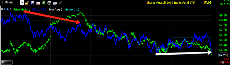
IWM 1 min
IWM 5 min and the 3C depth chart, the shallower the trough, the more accumulation we have seen since introducing this indicator. Also the longer the time period, the bigger the move we expect on the upside. My gut feeling as that the first positive divergence and the second sen to the right are acting as 1 accumulation area. Again the leading positive divergence I suspect has accrued in to the IWM. You will note the slope down on the current move down in the market on the depth indicator, it is different then past negative divergences and I question whether this is indicating that the accumulation zone on the current area to the right is actually bigger then what is marked, meaning I have considered shifting the time or length to the left.
IWM 5 min with another leading positive that I suspect has been accrued.
IWM 10 min-this is positive because price levels are lower then where the arrow starts, but 3C is higher, indicating more money flow. That is the nature of 3C-to look at underlying action and contradict price.
IWM 15 min and some very shallow recent troughs.I marked the two areas in yellow because this was the essence on my "gut feeling" that the two are actually part of 1 longer area, briefly interrupted by a move up.
IWM 30 min, this history goes back to the market top, note 3C is higher then the market top when pries were significantly higher.
QQQ 1 min, showing the leading positive divergence is as high as when the market topped on Tuesday even though pries are lower.
QQQ 2 min and the current depth indicator even more shallow then the last accumulation zone, which was already one of the shallowest we had seen.
QQQ 5 min 3C is at the same level of money flow as when pries were higher at the first red box, the red trendline is showing the QQQ at a recent new low.
QQQ 10 min, also showing 3C higher, even though pries are lower now.
QQQ 15 min, the depth chart is very shallow,
my gut feeling is there will be a little more accumulation lengthen the time of this current depth chart marking. This can happen in to lower pries or flat prices, usually it is both and in that order.
A closer look at the QQQ 15 min positive leading as the chart above doesn't do it justice.
QQQ 60 mn showing and extremely shallow reading, I believe the shallowest we have seen, which would indicate more strength, especially being on a 60 min chart.
SPY 1 min multiple 3C positive divergences, remember that smart money must accumulate in to supply to fill the large positions they put on, that is a key difference in most people's understanding of how the market works, people assume that Wall Street sells and buys like we do, but the size of their positions don't allow that, otherwise they would move the market against their position badly.
SPY 2 min
SPY 5 min from the start of this trend of consolidation, to the far left is the final low of the early August sell-off. Note the relative position of 3C for this entire period, it seems to suggest something bigger may be in the works.
A close up of the 5 min divergence above.
SPY 10 min and a rare instance of me using a long version of Worden's Money flow indicator, TSV, which is also in a positive divergence at the same time, even though the length of the setting often makes this indicator a little late, but more reliable.
SPY 15 min
A close up of the 15 min divergence, which is actually leading positive.
Breadth Indicators, starting with the NASDAQ 100 breadth. Breadth is the participation of the component stocks within a move, often breadth will contradict prices. An up or down move, if it is strong, should see confirmation of breadth, meaning a majority of the components should participate, breadth can contradict price action as well to reveal a weak move and possible reversal.
Usually, a small number of stocks making large gains characterizes a weakening bull market. This gives the perception that the overall market is healthy, but in reality it isn't, as rising prices are being driven by a small number of stocks. Conversely, when a bear market is still declining, but a smaller amount of stocks are declining, an end to the bear market may be near. Divergences are important. QQQ 5 min showing a stronger market then what prices depict.
QQQ 5 min Advance/Decline Ration, the number of advancing stocks minus decliners.
This chart depicts fewer NASDAQ 100 component stocks participating in the move down.
15 min QQQ A/D ratio, again, on a longer timeframe, there are fewer NASDAQ 100 stocks participating in the move lower, showing the trend down weakening, You can also see a negative divergence as the market was moving up, again showing the uptrend weakening before the reversal.
QQQ 60 min Advance/Decline line is rising throughout this 7 week period of consolidation, even as prices fell last week.
This seems to suggest that something bigger is going on, it may or may not have to do with the accumulation cycle underway now as this is a long term trend.
QQQ % stocks making new lows and new highs in a 5 min time period. The two areas in white are a comparison of my "Gut feeling that this move would resemble the previous move in which there was a small period of accumulation followed by move up and then a move down to accumulate more, making a slightly lower low. The following uptrend was longer because of this continued accumulation which I tend to view as 1 accumulation period, briefly interrupted by a mov higher and brought bak down in to the accumulation zone. The indicator featured here shows how little breadth was found in the interrupting move higher and how weak the move back down to the accumulation zone was.
The same indicator on a 15 min period, this timeframe includes the top before the August decline, you can see how much worse conditions were then, even though we are now at a lower low after the August sell-off. Again, this tends to hint that something bigger may be in play.
This is the same chart, jut looking at more recent history, which includes the situation that I had the gut feeling about, meaning that we would see something similar to the first period in the white box to the left.
This 30 min chart of the same indicator shows how little breadth participation is present in the current move down over the last week. The higher the green bars, the stronger the move up, the shallower the red bars, the weaker the trend down. The yellow arrows represent our current situation and how it resembles the time period in which I felt (my gut feeling) this current move would look similar to. So far they are quite similar.
15 min McClellan Oscillator described at the first hart of this breadth post. This is the entire consolidation period of about 6-7 weeks. Again I am comparing our current situation with the situation my "Gut feeling' told me I thought we might see. The negative divergences are at the interrupting uptrends that divided the accumulation periods and the white arrow shows a current positive divergence as the market moved lower last week.
The same chart comparing the second stage of accumulation of my gut feeling area and the proceeding uptrend. The second white arrow is the first area of accumulation followed by the interrupting move up and what breadth suggests as being the second stage of accumulation taking place now as the down trend shows weakness on this indicator.
QQQ Price Volume Trend, a sort of money flow indicator for all of the NASDAQ 100 components. This 1 min chart should be moving lower with price in a strong downtrend, you can see it is divergence, moving up.
The 2 min version of the same, at the red arrow it shows weakness in the uptrend and the following move down, here it is contradicting price and moving higher.
The 5 min version is doing the same.
A closer view of the market move lower and the contradicting in the Price Volume Trend.
A strong move down should see this indicator moving down with it.
QQQ Williams Accumulation/Distribution indicator 5 min. This period includes the market top before the August downtrend. Note how the indicator is stronger now then it was when prices took a 15% tumble. Again this seems to indicate something larger may be at work here as I have suspected for over a month.
The same indicator on a longer 15 min chart, showing a strong divergence and a strong move up, despite prices falling 15%
A 30 minute version shows the indicator even STRONGER then at the market top, again suggesting something bigger may be going on as 3C had alerted us to on the daily harts nearly a month ago.
More breadth charts, mostly the NYSE and all are daily, which is difficult to look at the micro trends we have been trading, but are still very interesting. These are Worden's T series indicators.
The indicators will be green, the comparison symbol, which is usually the NYSE unless otherwise noted, will be red.
NYSE Advance Decline line-remember these are daily charts. Un believably, the A/D line has barely budged with the NYSE composite's fall, this shows that there were a few stocks responsible for the majority of the losses, rather then broad NYSE component stock participation. This is a stunning chart.
The McClellan Summation Index, here we see negative divergences calling the top, but at our recent drop and consolidation we see a positive divergence, despite lower NYSE prices.
% of NYSE stocks above their 40 day moving average. This again shows a positive divergence with fewer stocks participating in the NYSE decline.
Bolton Tremblay Indicator-this is similar to an advance/decline line. Note The positive divergence in the indicator at the time QE2 was announced and look at the huge divergence now.
% of stocks 2 standard deviations above their 200 day moving average, This indicator clealy alled the top, it should be much lower in a weak market right now, instead it has scarcely moved down and is showing a positive divergence.
% of stocks 1 standard deviation above their 200 day moving average. Again the indicator called the deteriorating conditions in the market top, yet it is now in a positive divergence as the NYSE moves lower.
Absolute Breadth Index, This also showed the deteriorating conditions of the top, the first white box shows a positive divergence at the time QE2 was announced which sent the market higher. Right now it is much stronger then the market, another possible divergence suggesting something big may be under way.
The Zweig Breadth Thrust Indicator. A "Breadth Thrust" occurs when, during a 10-day period, the Breadth Thrust indicator rises from below 40% to above 61.5%. A "Thrust" indicates that the stock market has rapidly changed from an oversold condition to one of strength, but has not yet become overbought. According to Dr. Zweig, there have only been fourteen Breadth Thrusts since 1945. The average gain following these fourteen Thrusts was 24.6% in an average time-frame of eleven months. Dr. Zweig also points out that most bull markets begin with a Breadth Thrust. Right now we have a breadth thrust, you can see the conditions were met.
This was another breadth thrust at the March 2009 lows that started the rally we have seen since 2009.
This is the last breadth thrust that I am aware of, it occurred during the period QE2 was announced and sent the market higher for nearly another year. The current signal is yet another sign that something large may be in the making.
Daily McClellan Oscillator. The negative divergences here have called several tops, currently we have a fairly strong positive divergence, The last positive divergence of this magnitude was also around the period of the QE2 announcement, you can see what happened to the market after that.
A closer look at the current positive divergence as well as the negative divergence that sent the market lower.
% of stocks 2 standard deviation above their 40 day moving average. Instead of making new lows with the NYSE, the indicator has remained flat, this also happened at the period of the QE2 announcement.
% of stocks trading 2 standard deviations below their 40 day moving average. Early August nearly 80% of stock were trading 2 SD below their 40 day moving average, extreme weakness. Even as the NYSE has moved lower, that number has improved to only 33 %. Stocks are getting stronger as they relate to their moving averages while the market deteriorates.
Russell 1000 Advance /Decline vs the Russell 1000. Note how much stronger the A/D line is then the index, they usually trade nearly the same.
Russell 200 A/D line is in line with the R2k, however, it is not in worse shape which says something.
Cumulative 4 week new hi-lo. There was a positive divergence at the QE2 period in 2010 and there is a very strong positive divergence now.
These are all pieces of the puzzle, there are no guarantees in the market, but the more pieces that fit, the better your probabilities. Right now many of the pieces are suggesting some sort of event of some strength coming.
A look at some market bellwethers and one of my favorite longer term trades, URRE
AAPL 1 min Look at the 3 depth indicator!
AAPL 2 min
AAPL 5 min
AAPL 10 min
Longer view of AAPL 15 min with a current positive divergence of some magnitude. Remember, AAPL has a lot of weight on the NASDAQ 100/QQQ
CAT 1 min
CAT 2 min
CAT 5 min and the long term 3C depth chart since the market top.
Close up of CAT 5 min divergence
CAT 10 min
CAT 15 min
CAT 30 min
Financials, via FAS 1 min-lots of accumulation areas in the downtrend.
FAS 5 min long term, in a leading positive divergence, this may very well have larger implications.
FAS 5 min close up
FAS 15 min
FAS 60 min the yellow arrow may be in fact accumulation in to a rising trend, which is rare. The 3C depth chart is at a new low in the trough.
GOOG 1 min-this may be accumulation during the entire move down , note the difference between this move down on the depth chart and the last.
GOOG 2 min leading divergence
GOOG 5 min also leading.
A closer look at the 5 min
GOOG 15 min in a leading positive currently and a VERY low trough in the depth chart
Closer look at the 15 min chart
GOOG 30 min starting a 30 min positive
GOOG 60 min-possible accumulation in to the rally.
MSFT 1 min
MSFT 2 min
MSFT 10 min
MSFT 15 min-possible accumulation in to the rally
MSFT 60 min positive divergence!
URRE looks good-1 min
URRE 10 min
URRE 15 min
URRE 30 min
URRE 60 min!
Some charts of stocks, commodities and FX that tend to lead the market
FCX-Copper 1 min
FCX 5 min
FCX 10 min
FCX 15 min
FCX 60 min
FCX 30 min
FXA-The Australian Dollar 1 min
FXA 5 min
FXA 10 min
FXA 15 min
FXA 60 min
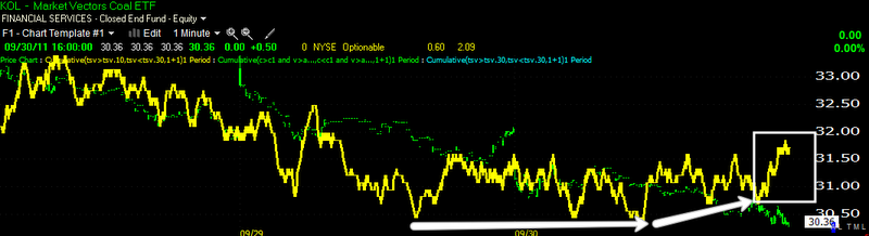
Coal- KOL 1 min
KOL 5 min
KOL 10 min
KOL 15 min
KOL 60 min
KOL daily
A look at some industry groups
XLI Industrials 1 min
XLI 10 min
XLI 15 min
XLI 30 min
XLK-Tech 1 min
XLK 2 min
XLK 5 min
XLK 10 min
XLK 15 min
XLK 30 min
XLK 60 min leading positive
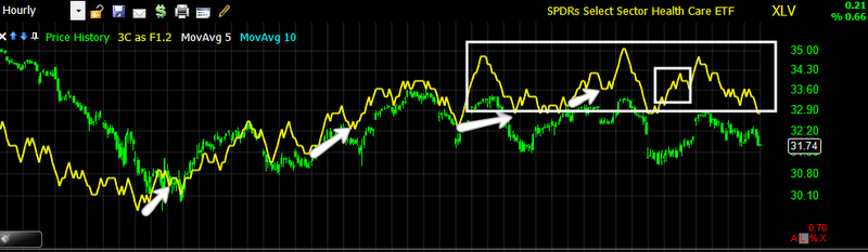
XLV Healthcare 1 min
XLV 30 min
XLV 60 min leading positive for awhile, again this may have larger implications.
XLY Consumer Discretionary 1 min
XLY 1 min
XLY 2 min good depth chart and very positive leading.
XLY 30 min-nice divergence
XLY 60 min
Worden's MoneyStream-it rarely gives signals so I don't use it much, but here are some rare signals, they are usually pretty reliable. It is read the same way as 3C, divergence analysis.
DIA 5 min
QQQ 5 min
SPY 5 min
IWM 5 min
QQQ 60 min
IWM 30 min
NASDAQ Composite 60 min
NASDAQ Composite 30 min
The charts above tend to hint at suspicions I've had that we actually saw some accumulation in to the move higher and continue to see it on the move lower.
UUP-Dollar index, a strong dollar makes for a weak market, here's an hourly negative divergence, again it appears something bigger may be brewing.
OK, this is the last of the charts. This is an indicator I've been working on, it is based on Demark Theory. This is not a lagging indicator, but a leading indicator. It i very reliable as you will see in the first chart which is an example. Of course the longer the signal persists and the longer timeframe it is on, the more significant. A long term signal that persists for a while usually moves at the end of the signal period.
The orange signals are sell signals, the green are buy, you will see on shorter harts, the implied move tends to be shorter, on longer harts it is more meaningful. This chart above just shows the correlation between the signals and a move in the market on a 1 min time frame, I chose this timeframe because there are a lot of signals and you can see how each caused a move in the market.
DIA 1 min
DIA 5 min
DIA 10 min
DIA 30 min
FXE-the Euro 1 min
FXE 5 min
FXE 10 min
FXE 15 min
FXE 30 min
FXE 60 min
FXE 1 day
FXE 2 day
FXE 3 day
GCC commodity index 10 min
GCC 15 min
GCC 30 min
GCC 60 min
GCC daily
GCC 2 day
GCC 3 day-these are some very serious signals for commodities... Remember what went nuts last time QE1 and 2 were in effect?
IWM 1 min
IWM 5 min
IWM 30 min
IWM daily!
QQQ 1 min
QQQ 5 min
QQQ 10 min
QQQ 15 min
QQQ 30 min
QQQ 60 min
SPY 5 min
SPY 10 min
SPY 15 min
SPY 30 min
UUP Dollar Index 1 min
UUP 5 min
UUP 10 min
UUP 15 min
UUP 30 min
UUP 60 min
UUP 2 day
UUP 3 day!
My expectation for early this week is that we will see more accumulation judging by the 3C depth charts, this may be lateral or in to a falling market or both the same day. It just seems to me that those charts are not done accumulating.
I'll update in the a.m. as to how things are looking, but there seem to be a lot of harts and signals that seem to confirm my original "gut feeling" posted above.
Sorry this took so long, I have probably 30 + hours in this post.