Friday, November 1, 2013

Wrap Up

Wel another one for the books, a market that defies any logic, reason and turns more and more unpredictable. Since QE is the thing keeping the market up and will continue to do so in the QE loving crowd's opinion, it's strange that with a $5bn open market operation on deck this week with no other news to interfere, the markets close down, maybe it's not as effective as it was as the F_E_D suggested (although they meant economically where we know it's not effective).

At the September F_O_M_C meeting the crowd was convinced a taper was coming wither then or October, the crowd was massively wrong. This week (and quite a while before) the crowd thought the F_E_D couldn't taper until 2014-2015 and even went so far as to say an extra $15 billion in bond buying would be announced, again they were dead wrong as the money is now on a December taper, how fickle the crowd is, how massively wrong. Even the once wonder-woman Meredith Whitney has lost her luster and predictive capabilities after being touted as the Nostradamus of the Financial markets, it's all "What have you done for me lately".

I suspect we have more surprises in store coming from China as they battle the QE/Hot Money bubbles from the world over, even though they had a solid manufacturing print and the official version agreed with the HSBC version, well close enough and seasonally this is even more impressive.

It's here in the US that macro-data is getting unpredictable with yesterday's strong Chicago PMI (As we know, all things Chicago are trustworthy- I'm not talking about the good people of course), then this morning comes the Markit manufacturing PMI absolutely contradicting yesterday's strong print (highest in 2.5 years)   vs Markit's "lowest in a year". The fun didn't stop there though, the Institute for Supply-Chain Management (ISM) came out with its highest print in 2.5 years confirming yesterday's data, disagreeing with Markits and that was also the 5th consecutive beat for ISM.

So...?

The NASDAQ's OMX options platform went light's out around 10:30 this morning (isn't that the second time this week for NASDAQ?) There has been an unsettling trend of market's just shutting down on otherwise slow days. Of course NASDAQ pretty much blamed it on HFT quote stuffing, shut the market and left it shut the rest of the day.

I have a serious question that should be considered. I'm guessing most of us know the role of a market maker (NASDAQ) and a specialist (NYSE), if you don't for certain privileges they receive for making a market (middle man) for a stock or stocks, they are the liquidity provider of last resort by law in exchange for their privileges and the nice spread they collect on every buy/sell.  We also know that HFTs now trading in micro-seconds are front running these middle men to become the default liquidity provider and essentially make that spread between the bid and ask, but HFT's that are responsible for roughly 70% of the market's liquidity are not bond by law to buy your stock at market price when the market is crashing 1987 style, the middle men are bound by law, the HFTs can just shut down.

How seriously has a middle man's ability to facilitate an orderly market actually been degraded by HFTs and why should we think HFTs wouldn't exacerbate the situation like the bear raids of old?

Next, if the markets are breaking almost (it seems) every week and declaring "Self Help" on a rather dull, low volume market, what happens when things heat up as they will? I know about the circuit breakers, but can you imagine the panic if the exchange breaks and you are stuck holding an asset while the market carries on and you have no recourse as the exchange is terminally broken?

If I kept on this line of reasoning I might site all of the major market players who have called the market a bubble in the last two weeks and I mean major, you don't get much bigger than these guys, as I said last night, I'd prefer they were saying the opposite, but it is what it is. 

If you look at F_E_D interest rate policy and tightening episodes, the markets have never reacted well to the "Business cycle" as it has been named,  but how in the world do you account for the effects of unwinding what will likely be a $trillion dollar balance sheet and raising rates in an economy this globally connected?

I think we saw our first glimpse of the downside of a globally connected economy after Lehman and I believe the effects went straight to the EU.

What happens with the next crash as many believe, we never finished the 2008 crash, the F_E_D artificially stopped it, but with a balance sheet that large, what tricks do they have left when the next crash that many believe will be much worse comes knocking? It could be as a direct result of their eventual tightening phase.

OK, I'm way off subject, but once you start thinking about some of these things it leads you to other areas and I barely scratched the surface, I probably did so just because of the overwhelming chorus line of major market players saying, "Watch-out below, this market is a bubble"

As to the market's the avera
ges themselves have been dispersed in an unusual way as of late, for example, today a n afternoon ramp (not uncommon after 2 pm on options expiration) brought most of the averages in to the green, but the Russell 2000 remained in the red and not by a tenth of a percent, but 0.45%, the same amount the Dow was up, the NDX was barely up at 0.07%.

If this market dispersion is strange, asset class performance since the F_O_M_C has been even stranger next to equities. Taper on, or what the market doesn't want results in higher $USD, lower gold, lower treasuries, the QE sensitive assets; you'd think stocks as well.

Since the F_O_M_C the $USD has been up (our expected $USD bounce), Treasuries have taken a beating (our TLT pullback) and gold has dropped (our expected gold pullback)...In fact, we had these expectations (TLT down, $USD up and a gold pullback BEFORE the F_O_M_C and they were all based on signals, I can't claim a leak, but how is it I wonder that 3C and smart money knew something about their reaction before the F_O_M_C?)

In short, QE sensitive assets are acting like the F_E_D burst the QE bubble, at least since  (or before) this week's F_O_M_C, take a look for yourself.

As for assets today

I decided I would show any leading indicators and related charts after the close since they have a tendency to change so why post them twice. There were a few surprises by the close...

 Commodities intraday as a leading indicator

 Commodities as a leading indicator on a larger timeframe.


Sentiment going south at the market top

Our second and original sentiment indicator giving very clear warning and continues to.

Yields up is usually bullish and short term it may be, but they are rising because of falling treasuries because of a "Taper On" view in treasuries, $USD and gold so in perspective, it may not be as bullish as it looks.

Yields long term warning of the cycle's bottom and top.

VXX a bit weaker today than yesterday vs inverted SPX in green...

However longer term no matter how many higher highs the SPX made since the 18th, the VXX hasn't made a single lower low, again big picture not good for the market.

Intraday HY Credit is down, generally not a good sign.

This is where it gets interesting as HYG is used to manipulate the market.

 Earlier today HYG was in line with the SPX and was showing a positive divegrence, then I looked and it underperformed at the afternoon ramp, went the opposite direction, I figured maybe 3C accumulation at cheaper prices, no 3C fell apart too from a short term positive divegrence.

And HYG credit warning severely as it is at 10/19 lows where we first noticed a problem with the market and in HYG first.


I might get in to some other things later, but even some of the short term positive signals for early next week turned ugly toward the close, HYG was the biggest surprise because it had short term "bounce" accumulation and that fell off as did price.

Have a great weekend, I may get a breadth post out if I have time, my mother is having back surgery next week so we're going through everything I need to do to take care of her animals and place.

Enjoy your weekend.

Special Market Update

Again, these updates are a bit more difficult for people to put in to context because it is multiple timeframe analysis. However I think it is the most effective; if you were to ask me if I'm bearish or bullish gold or oil, the answer would completely depend on the timeframe we are dealing with. I can't assume you are looking and trading the same charts as I am (say a swing trader using 15 min chart vs a position trader using 1-day or an investor using weekly), the answer depends on comparing apples to apples and in those answers, we can often discover what trend A, B and C will be moving forward and determine that "A" is a small short duration, "B" is an intermediate duration which we'd use different assets to trade and "C" is a long duration and that is managed totally differently.

I'll try to make this as simple as possible, from the charts already posted and Leading Indicators which I'll update on a closing basis, I think the market short term (Monday) moves up, but I still think this move up is within an intermediate or slightly longer duration "Chop zone", while the larger trend (and in this case I'm just talking about the cycle that started at the 10/9 lows and topped 10/29) is very much bearish.

As a result, I have no plans to change any core shorts, I don't even plan to change the leveraged ETF trading shorts. I think options for a short duration long trade in something like the SPY are about as far as I'd go and I'm not even willing to go there.

I learned my lesson by putting too much weight on the intraday charts and trying to trade around the larger trend with AAPL, it cost me a -45% gain that I had in place a day earlier.

I'll show these particular charts after market, HYG, although underperforming intraday, has seen the same kind of short term accumulation as the SPY just posted. VXX overall is underperforming enough that the SPY Arb could be used, it was used today from 11 a.m. to 1 p.m. to help the market off intraday lows. 

CONTEXT is positive 10 ES points, so everything seems to be in line with a move to the upside, again short duration and I think the highest probability is it is just the first or really second swing in a wider chop area which is a very dangerous place to try to navigate.

While I do update these intraday charts and likely short term moves, I strongly encourage you to put them in their respective context within multiple timeframe analysis.

I have very little doubt this market is toast and we will see a leg down below the 10/9 lows coming, in reality it already started with a trend of lower highs/ lows.

I don't see any specific assets as of yet that I think are worth the risk to try to trade this leg, but I'll keep looking.

Market Update: Clearing Op-EX

I'm just going to use the SPY for a market update, I mentioned before that three's dispersion between the averages, meaning the typical "one looks like all" is just not there- for instance the charts of the QQQ give a different impression, a more negative one, but I'm trying to average them together and I think the general idea as we start to come out of the Op-eX pin remains the same as what I suspected yesterday, "CHOP", dangerous, portfolio grinding chop.

Two things about chop, for the most part it's an area of the market I'd generally rather sit out and wait for it to clear unless I have a really good reason to do otherwise as it can create tactical opportunities.

The second thing is 3C has proven to be VERY effective in chop if it's tradable. I think the only time I ran a very specific trade model portfolio (rather than a tracking port. of all idea out there) was just after the nearly -20% loss in the market around the end of July/start of August of 2011.

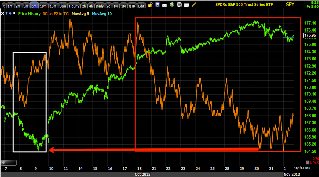
We had 3C signals 2 or so days before the end of that dump that it was going to stop, I think most traders were just scared and assumed it would keep going. From early August to early October, we hit EVERY SINGLE SWING UP and DOWN using 2 and 3x leveraged ETFs and had an overall portfolio gain of +75-78% for that narrow period.

Here's the drop, in white was where we killed it and even predicted the new Oct. low leading to a strong uptrend after.

I'm not at all suggesting we are in for anything like this, I can't even say we will see this for any more than a half day, we just have to let the market tell us as we go.

So far for the afternoon and these are the more important signals as they tend to pick up where they left off on the next trading day (Monday), even more so than price...
 As mentioned in a market update earlier, an intraday 1 min positive divegrence sending the market higher today. This could grow even more as we exit the op-ex pin in to the close, but I'll be keeping tabs on it.

 The 2 min chart, negative and today's positive, so again this looks conducive to the move up to create chop while the stronger negative charts are kind of a lid creating the move down and thus "Chop".

The 3 min chart negative with a small relative positive.


 This 5 min chart has a very clear negative with (so far) a much less impressive positive, but it's still a 5 min chart and is respectable.

However now let me put this in to some context.

 This is that same 5 min chart in context, it not only has shown dramatic distribution through higher prices as distribution normally does, it is leading negative well below where the move started at Oct 9 lows, so we have to keep short term charts in context with the bigger picture. 

Multiple timeframe analysis is one of the most difficult aspects of the market to grasp because people are use to "Buy, hold, sell" and the market can't be navigated that easily anymore if it ever could be beyond the kind of bull market long where anyone can be right or bear market short where anyone (who isn't afraid to short) can be right.

Thus far the SPY is in a downtrend, lower highs, lower lows= DOWNTREND.

When I say chop, I really can't qualify it until we see the signals which we are starting to see, but I imagined something like this.

i'm off to collect some more information and see if it looks safe enough to place any other new positions or manage existing ones.


Gold (GLD) / GDX / NUGT Update

I just updated these yesterday HERE , but I'm getting a lot of emails about them today.  I think most of you interested in any of these probably recall my macro view that gold has significant upside on a sub-intermediate, intermediate or maybe even primary trend, depending on where gold pullback to. Gold miners are showing good correlation with gold so I'd essentially lump them in the same category.

I have expected a pullback and we are seeing that pullback now. Yesterday I made a statement that may either be an opportunity or warning depending on how aggressive you are as a trader.

"Not too much has changed in the assessment for both, but there is a decent chance for some misleading activity and a decent chance for some trades if you are pretty aggressive."

My bottom line right now is I think if you are really nimble and willing to use leverage there are some trades (probably more in gold) on an intraday basis.

For my purposes and for the wider purpose of members, I DO NOT think the gold pullback is done or we might say that even if it was, I do not think there is a reversal process in place that is sufficient to support a reasonable long position. That's my feeling, 

Most all of you know that I do not believe in "V" reversals, I'll admit there are some here and there, but by and large a reversal is a process and beyond that I'm not at all convinced gold is done on the downside yet, even though intraday there look to be some opportunities. I'd still consider yesterday's statement above, a chance for some misleading activity.

USO Follow Up charts

I do have ERY (Leveraged Energy Bear) as a core position for now and you might think I'd close that, I decided not to because it is a long term position and it fits with the long term charts, in any case it is Energy Short, that's an entire sector, not one fuel. If I were trading my normal 6 position portfolio, I'd probably do something about that as it's a lot of commitment to a sector that is or has a correlation with the particular asset, not all the time, but sometimes.

I'm going to do this update with USO alone as I suppose most people would be trading USO over Brent Futures, but if you need charts for Brent over WTI, let me know, they actually do diverge from each other from time to time.

 A) is a large triangle formation after  several years of chop. B) is a channel we knew was going to fail, but expected a short shakeout sooner, unfortunately commodities are dictated by more than Goldman's trading desk. C) is a bearish descending triangle and it was this triangle I suspected we'd see a head fake move at, a failed break under, etc. D) is where we are today, just under some local support with some interesting things happening so it could easily qualify as a head fake move.

I'm a little hesitant to go with anything too long in duration so I chose Calls. The fact that China's manufacturing PMI ticked up in October over September (Oct. is usually slower) may be helpful for oil, shorter term I think the $USD may be helpful.

This is that local support I told you about, look at volume as the price pattern rounds over (remind you of any major markets like any of the major averages?) 

A break under that support on heavier volume with bullish hammer-like candlesticks looks very interesting taken with a few other charts. I find bullish or bearish candlestick patterns are probably twice as effective when they have a noticeable uptick in volume.


 The $USDX has been on a tear since the lows of the 24th, but price recently is getting too parabolic near resistance, that looks like an opening for dollar denominated assets like oil, perhaps PMs and historically stocks, but there have been all kinds of variations of legacy arbitrage the last 4 years with equities.

60 min USDX chart


This is the intraday 1 min $USDX and it does seem to be hitting head winds right now, interesting considering where USO is.

 The 15 min $USDX chart looks like the shorter intraday charts are on to something that could stick for a bit.

This 4 hour 3C chart of USO is why I don't want to close long term energy short core positions. A strong counter trend bounce is one of my favorite things to trade, a trend is my favorite thing to trade and the highest probability over the longer term as we see it here looks like ERY should remain open, I would prefer not to open a new ERY position right now, but we do have to make the distinction between crude oil and the Energy sector, HUGE DIFFERENCE.

 60 min USO has that positive I've been following and I'll show you where I have been expecting it to run to.

 The 30 min chart is more detailed and shows the distribution in the channel sending USO lower, but also the large positive divegrence so I do think a short shakeout is probable.

 Intraday 3 min is positive and we have that volume I like to see and more importantly big money likes to see.

The 5 min chart is in line too, so we have the strategic charts in place and it looks like the tactical are coming on line with the $USD probably providing a catalyst for a spark.


Opening a Spec (as usual) USO Dec. $35 Call

Charts to follow

Quick Market Update

As I said, it moves fast. We have some intraday positives in the SPY, QQQ and IWM so I'd expect an intraday upside move just about any minute.

Market Update

Honestly as far as looking forward for forecasting purposes, a positive divergence that tells us the market is going to be heading up, even while it's heading down or vice versa is much easier than a lateral market to forecast, I have to say and stick with the highest probabilities and the expectations of down, but I don't know if the choppy forecast was to close out October as best as they could and that would include the last week or so of market action on no volume and every trick in the book to hold the market up, I'm not sure if the chop is the best they can do to effect a market pin for op-ex today or if this will move along a little longer and act as a meat grinder taken to traders' portfolios.

Here's what I have this morning and I HAVE to give it to you as I get it because short term trade is moving around so fast. In the MCP post the market was doing one thing EXACTLY with EUR/JPY as I wrote it and then by the time I finished the post it was doing the exact opposite.

Lets start there.

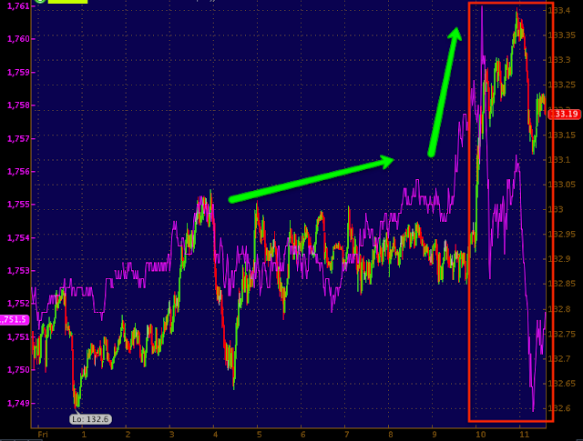
 In the early hours of the a.m. (times below are EDT from midnight Thursday to nearly 12 p.m. today), EUR/JPY is the green/red candlesticks, ES (S&P E-mini futures) are purple, you can see the correlation overnight and as I was starting the MCP post the FX pair and ES both took off to the upside, then ES failed, we saw this earlier in the week too, the chart I said "Was not normal". It's my opinion that ES failed to follow the FX pair because of op-ex Friday, that's the simple answer, I may revise that as I find more, but that's my guess so if that is so, then around 2:30 or so "if" the EUR/JPY is higher, Es should make a move to catch up, if not, then wherever EUR/JPY is should be the magnet.

Averages IWM
 Intraday 1 min is a weak relative positive, I think again this is just to steer the market on an op-ex pin.

IWM 3 min inrtraday has been in line

And this 30 min chart really stood out. First note the range, it seems like the market was moving up non-stop if you watch the market every minute all week, but that's a range and it's very similar to a very low VIX/VXX range indicating complacency, usually the mix in a situation like this is disaster for the market, but we'll look closer at VIX.

Second the ROC of 3C on the downside the last 2 days is extreme, looks like heavy distribution on top of what was already heavy, but the ROC has increased.

QQQ
 1 min QQQ relative positive like the IWM, again most likely intraday steering changes made by market makers/specialists for op-ex for now.

QQQ 2 min looks as if there's some element trying to slow down the near term downside, again I'd think because of the max pain pin level.

And the 5 min chart has maintained a strong ROC on 3C downside, again note the range, it is in these ranges we see some of the strongest accumulation / distribution.

SPY
 1 min intraday exactly the same,same reason I suppose.

The range in the SPY and the ROC of 3C downside is impressive and makes me think that unless something changes significantly later in the afternoon, the chop resolves to the downside in which case I'm still very happy yo have chosen 2-3x leveraged short ETFs rather than options as they'd be bleeding right now.

The Russell 3000 and my Most Shorted Index (red)
 For a long time the momentum monkeys played the Most Shorted stocks because the squeezes were giving them great momentum moves on the upside, but there's a reason I don't go long in a weak environment, it's because I've seen months worth of gains wiped out on an opening gap out of nowhere or at least it would appear.

The MSI is significantly underperforming the Russell 3000 Index, but the other side of that coin is at some point we either get an oversold bounce or we get the breaking dam. I can't imagine the momo monkeys who must expect these shorts to come back on no QE taper are hurting pretty bad. Hindsight on a chart is always 20/20, but living at the right edge is far different and people assume the momo monkeys are long gone, that's not the case from some of the comments I have seen, they got caught with the idea that what worked for the last several weeks/months would continue to work until they got buries too deep and now don't want to move/cover. That's the market working at its best.

NYSE TICK
 For the last couple of weeks it has been very mellow at +/- 750, we hit an extreme of -1750 this week, I haven't seen that since May as far as I recall, the 22nd.

Even today we are pretty extreme on the negative side around -1250.

My Custom TICK Indicator
 Again the cycle or trend off 10/9 lows shows the breadth of the market pretty well, just look at the histogram at the bottom, up early in the trend and then down.

VXX short term volatility
 This has been dull intraday the last couple of days, strangely, but it seems that protection is once again under accumulation/being bid on the 2 min

The trend has shown accumulation, remember the flat range in the averages, well look at the VXX, and recall what I said about flat ranges. The trend of positive divegrence is clear, now the increased 3C ROC is clear just as the chart above so it "seems" someone is making final preparations as it can't be said they haven;t been making them for a while now, in fact since that day I first saw everything go haywire, Friday 10/18.

 The larger intermediate 10 min trend

The there's HYG Credit which is a "Hail Mary" they go to for market support.

I think the 2 min trend above is accurate, but there is some effort to stabilize credit at least for today.

That is evident on the 1 min chart, this is a good example as well as to how much actual difference there is in underlying trade between a 1 and 2 min chart, on the 2 min it shows up as a much smaller area.

The 3 min shows distribution and overall in line, I suspect HYG continues lower, but it seems to also being used to steer the market for today, maybe a bit longer if there's plans to continue chop.

The hard part is answering the question, "What does SHORT TERM TRADE LOOK LIKE out of the chop?" I think the easier question is what does intermediate trade look like moving forward, thus the 2-3x leveraged shorts that can be left in place without all the work options would take to work around chop and just stay with probabilities.

MCP Follow Up

I'll get to the market in just a few minutes, but just like the sun comes up in the morning, look at EUR/JPY and look at ES, not much more has to be said about that which is why I thought it important last night to address the issue. 

It seems someone with a decent grasp on currencies has a fairly big edge over someone with MACD and Stochastics on their chart. Basically the EUR's downside ROC has slowed while the Yen's has increased, almost like a capitulation move down so it may end soon, we'll keep an eye on it, but if we get more/wider chop, I suspect a lot comes from this pair.


As for MCP, the last update was Monday 10/28 (this week) which came after our last trade there for  a +38 and +58% return, but as it says at the top of the post...

"MCP has been looking like a large, long term base, but on October 4th after looking for a pullback that we got,  I had written,

"I don't or didn't feel strong about the action in underlying trade when the pullback took place yesterday so I didn't open a new position... This is the 5 min MCP chart, this is what I wasn't too excited about yesterday, it just seemed like MCP needed some more time to gather strength so I skipped the trade...  So far intraday we don't have the kind of support MCP needs to sustain a move higher so I'll set some alerts for a shallow consolidation and look to see if this situation has improved which may offer that SCBO." 

You may also recall Goldman Sachs has a sell signal on MCP and you know what that most likely means, Goldman is buying every share of MCP they can get their hands on. 

So here's what MCP looks like today as I do like this as a trading stock either with or without leverage.
 This looks to be the longer term MCP base, a large ascending triangle, but not in the consolidation/continuation configuration, it's too big and trends are all wrong, in the "Bottom/base" configuration so a head fake move just before the completion to knock out weak hands followed by a Goldman Sell Signal looks to me to be very high probability signals of the signs of a base wrapping up and perhaps getting ready to make a move to stage 2 mark up which would be a amazing move in MCP.

The shakeout on its own is exciting at this stage, add GS and it's almost irresistible, almost... As always, there needs to be a high level of confirmation among multiple timeframes, I'll show you what we have.

This is the "Trend Version" of 3C, not much detail, but a clear trend and it's perfect, negative at the formation of the triangle's apex and price follows down and a positive divegrence just where you'd expect accumulation of stopped out shares and cheap prices.

60 min.

 This is the 30 min with more detail, note an increase right at the GS sell signal and break under support, exactly what we'd want to see in this case.

 The regular 3C version for MCP is on board too with a leading positive divergence (the strongest kind) right at the area where they, you or I would consider cheap and low risk, plus the volume on the break lower shook out weak hands so there where quite a few shares up for grabs, that's the size they need.

Why no one ever wonders about who took the other side of that kind of trade is beyond me, it's the fastest, easiest, cheapest way to accumulate in size without raising any suspicions, it's just common sense, what happened to using your head in reading a chart?


 The intraday timeframes are the key to unlocking the longer term (strategic & tactical, we need them both in line).

So this 5 min chart is good to see, but I think it will show an even more extreme (vertical-ish) positive before its ready to go.

 The intraday 2 min shows some movement and a little launch, this isn't enough for me to buy yet, at least not a full size position.

And the 1 min shows intraday distribution at the congestion highs of that move so I suspect it will come down a little more and really put together a strong positive before it's ready to go.

As far as how far along in the process it likely is...

I'm impatient, a lot of traders are, but that doesn't change the fact that 95% of reversals are a process, not an event (which is the difference between a "V" price pattern up and a "U" or "W"), most of the time the wider the base, the stronger the move.

I'm guessing we are about halfway through this process, the GS move could be considered a head fake, it did what they wanted, but typically that final "pre-lift-off" shakeout is more acute.

A couple of things you may want to watch: check out the 60 min Wilder's RSI 14 (w/ Wilder's smoothing), it is positively divergent and improving, I'd like to see it above 50, also a clear cross of the 10-bar 60 min m.a. over a 22 or 20 bar 60 min m.a. and if you're not good at eyeballing it, throw a ROC on price as well (Rate of Change). Sometimes a charting software program won't allow you to add it to price so put a 1-bar moving average on price, make it invisible and add ROC to the 1-bar m.a., it's exactly the same as price and watch for positive divergences.


Truth be told other than a head fake move that is more acute, I don't see any reason I'd be very nervous about starting a position here, phasing in and adding if we get a head fake move, but this is phasing in NOT DOLLAR COPST AVERAGING, the difference is one is planned, the other is throwing good money after bad so you MUST make that part of your risk management plan before you enter SHARE ONE.

I think MCP will make a move soon, it has showed its ability to run counter to the market which is somewhat rare.