Market tops are notoriously hard to trade, when teaching Technical Analysis, I told my students that most of the, especially if they weren't comfortable shorting stocks, should just put their money in some form of cash. The bottom 10-20% and the top 10-20% are the smallest scraps and the hardest to get. The 70-80% in the middle s the east money.
Throw in a bear market rally, (which exists for one thing only, to cause you to doubt the bear market and re-enter equities, thus they are VERY convincing) and a choppy trading range as well and you have one of the most difficult market areas to trade. To make matters worse, HFT trading causes distortions and the fundamental issues right now are something our generation has never seen or traded, in fact this is probably more complex then the Crash of 1929. Not only do you have to understand American economics, the "Feral Deserve", currencies, European politics and economics, terms like EFSF, Troika, Credit Default Swaps, Reserve Banking, Dark Pool markets, PrimeX and throw on top of that new level of market manipulation and inside knowledge/trading. Did I forget anything?
So it's not you, it's an unprecedented market, that is very complicated and very corrupt. It's no wonder that the week ending October 12th saw the 8th consecutive outflow of money from equity mutual funds in the form of $5.9 billion dollars and $99 billion so far this year.
Whether you are a bear or a bull, it's been exceptionally difficult this week with the open on Monday to the close on Friday gaining +1.6%. The week looked like this -2.34%, +2.35%, -1,18%, +.44%, +1.88%. Whether long or short, the day to day was quite an emotional roller coaster.
I have put together some charts to help you better understand where we are, possible reasons why, where we are likely heading and the condition of the market. Price and trend changes don't just happen one day because of "XYZ" news, there are warnings that if you look for, you'll know XYZ news wasn't the reason, it's just a catalyst or a cover.
First lets look at a way to identify where we are. My first few quarters teaching, I spent 2 of 8 lasses on Dow Theory or Trend classification. For most people it was a waste of time as the subject an be complicated for new traders, so modified it and taught there are 3-4 main trend, the 3 main trends are Primary as in bull or bear market, Intermediate and Short. The short term trend is easy enough to figure out so I look at Primary, Intermediate and Sub-Intermediate. I use moving averages to define the trends, not whether a stock is above or below the moving average, just simply which was the moving average is slanting (up for a bull market, down for a bear market and sideway for a lateral/transitional market.). I use the 200 day daily average (blue) to represent the Primary trend, a 50 day moving average (yellow) to represent the Intermediate trend and a 22 day moving average (red) to represent the Sub Intermediate trend. A short term trend can be defined by a 5 or 10 day moving average.


Here's my Trend Channel going back to 1995. A stop out would be a CLOSE below the highest point of the lower channel for a long and a close above the lowest point of the upper channel to end a bear market. Toy can see the 200 Tech Bubble Stopped out, but not 1 single stop out from 1995 to late 2000/early 2001. The Tech bear market was stopped out in 2003 leading to the last bull market, there wasn't even 1 false stop until the channel called the end of the bear market in early 2008. The decline from there was held perfectly in the channel and it was ended at the "FAD" intervention in early 2009. Even with the 2010, end of QE2 market pullback and 4 month consolidation, the channel did not stop out the long trend until just recently. Looking at the charts above, it is very hard for me to come to any other classification then, "We just entered a bear market".
That doesn't mean we won't see counter trend rallies that cause doubt as to whether this is truly primary bear market.


Finding an edge in the market isn't done by looking at one indicator or a series of indicators, it's not found in one index, finding an edge means looking at as many pieces of the puzzle as you can and seeing if a pattern emerges. This is where discipline really come in. Sometimes looking at harts can be as subjective as looking for animals in the clouds. We always want to approach our analysis with no bias and let the charts, if they speak to us, tell us hat the most probable outcome is. You will never find every chart you look at in agreement with the majority, but when you have a solid majority, you have high probabilities and can form a strategy and then use weakness or strength in the market as tactical opportunities to further your strategy.
So you have seen 3C charts every day. 3C is based on one of Don Worden's indicators and this is a man who could be considered the godfather of all moneyflow indicators. Everything from cumulative money flow to On Balance Volume was derived from his work in Tick Volume. So we'll take look at his MoneyStream indicator, one that gives excellent signals, but they are few and far between.


We can also get some clues by looking at currencies. First we'll start with the Australian dollar which in the past has led the market by either bottoming or topping before the market, so it acts as a leading indicator rather then a lagging indicator as most indicators are.


Now to the Euro


Now lets take a look at a few of the T-2000 indicators. The indicator is in green and the comparison symbol which is usually the S&P-500 unless otherwise specified, is in red.


Now some intraday breadth indicators


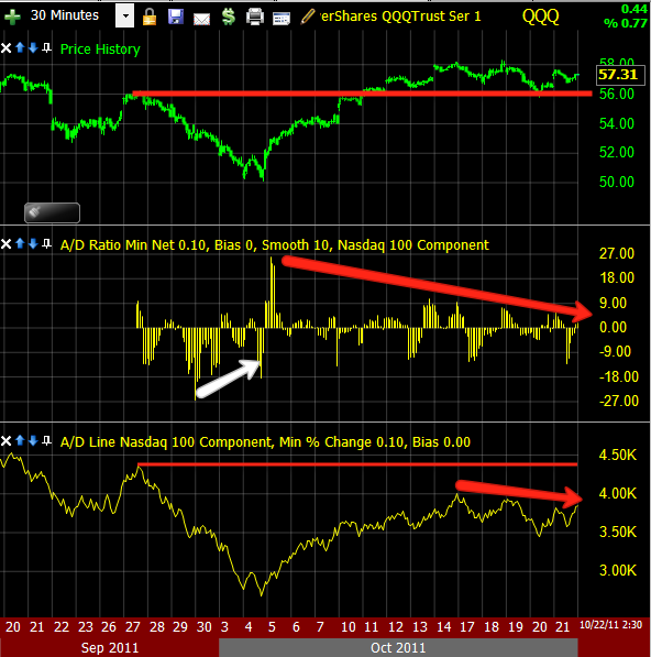
You can see both are not keeping up with the NASDAQ 100, so breadth is getting thin.

I'll probably send out a few more updates this weekend. After all, this is a big news weekend with the EU finance ministers meeting to hammer out some sort of deal to keep the EU from imploding.
Initial reports seem to indicate that the meeting is not so much productive as overwhelming.
Here are some quote from the meeting:
From the TeleGraph,
"It was grim. The worst mood I have ever seen, a complete mess," said one eurozone finance minister.
This one is harder to understand as it went through Google Translate, but seems to show surprise at the Greek situation and it being so bad that even in the best case scenario in which they privatize assets and carry out reforms, the EFSF is not big enough to cope with anything more then Greece, apparently shocked at what the inspectors found to be the real burden of debt. Good luck, let me know if you arrive at a different conclusion.
The numbers that the Troika on Friday evening on the debt situation in Greece is presented, have altered the agenda of the Euro-Finance completely. Really wanted the department heads to advise [if] they need to convince the country's private creditors to agree on a bigger discount on the bonds held by them, than the previously planned 21 percent.
But the "if" was suddenly a "how high?". Because the inspectors of the Greek lender describe in their "debt sustainability report," a scenario that far surpasses any fears. The country needs even under "normal" conditions, so if everything goes as planned with the reforming and saving, at least 252 billion euros , by 2020 to get back on its feet.
If the economy collapses further, state enterprises can not be privatized as hoped, nor do the reforms [produce the] € 444 billion needed to [please] the inspectors. So it is suddenly clear: the euro rescue fund EFSF is hardly sufficient for more countries to save, and his successor, the latest from 2013 operational ESM also not good.
The Swedish Finance Minister said,
"It is clear that a substantial cut in debt in necessary"
I can only assume they are talking about a Greek bond holder hair cut of more then 21% which should trigger a credit event and cause massive damage to banks who have been writing Credit Default Swaps.
Taling about Greece:
Jan Kees de Jager, the Dutch finance minister, told colleagues: "We've got to get real. People are talking about new defences but with one gulp the whole €440 billion could be gone, leaving the eurozone with no protection at all."
And from Schaeuble you get a feel for the tone and animosity, of course the German at this point nearly bear the brunt of the entire crisis, at least they have the biggest cross to bear here.
According to insiders, Wolfgang Schaeuble, Germany's finance minister, could not resist taking an "I told you so" approach - he had been, after all, the first to call for an "orderly" default for Greece 18 months ago, at a time when the cost of such a move was less than one third of the price today.
"Schaeuble is a man who does not mince his words, whose reputation for harshness and arrogance is well earned. He was, frankly, unbearable," said one diplomat.
More on the atmosphere:
Francois Baroin, the young and inexperienced French finance minister,
attempted to hit back, complaining that the IMF's default medicine would hit
France the hardest; the country's banks are highly exposed and could
threaten its "untouchable" AAA rating.
attempted to hit back, complaining that the IMF's default medicine would hit
France the hardest; the country's banks are highly exposed and could
threaten its "untouchable" AAA rating.
But Mrs Lagarde, who had held his post until taking up the IMF job this
summer, "shut him up" by brandishing the report and pointing to it
its detailed figures. "She really slapped him down - and in perfect
English too, a language he cannot speak," said a diplomat.
summer, "shut him up" by brandishing the report and pointing to it
its detailed figures. "She really slapped him down - and in perfect
English too, a language he cannot speak," said a diplomat.
"Their shouting could be heard down the corridor in the concert hall where an orchestra was about to play the EU's anthem, Ode to Joy," said an incredulous EU official.
And as to the French/ German alliance that was the Core until very recently when France became the target of bond vigilantes (the same way Greece, Ireland, Portugal, Spain and Italy started) here is what the English Chancellor had to say:
Finance ministers - including George Osborne, the Chancellor - expressed frustration on Saturday that their emergency meeting could take no decisions of substance until Mrs Merkel and Mr Sarkozy had buried the hatchet.
"This Ecofin meeting has been reduced to an academic seminar, an exercise with absolutely no purpose," complained one finance minister.


