Tuesday, August 6, 2013

MARKET UPDATE

This should cover at least the next day I'd think.

i'll use the SPY as a little more in depth example and then the others I'm showing you where there's some short term strength and where it ends and gets very negative, basically what little gas there should be and the roof on any move higher or bounce is more appropriate I think.

Essentially, this is a market gift IF IT CAN HOLD...

 SPY 1 min, there's no strength here at all, it's noisy and messy.

 Only once you get to a 3 or 5 min chart do you see some positive divergences clearly so that should provide for a bounce which can be used to short in to for those who are not totally prepared or may want a shot at an AMZN.

 The SPY 10 min, the next timeframe is negative and leading at that so this is the roof on the bounce, it can only go so far with so little accumulation.

The SPY 15 min represents where the trend really is going and this is why I'd use this time and any price strength as a way to enter positions for the bigger picture above.

IO'm not showing you the worst, I'm just showing you how much worse it gets just barely beyond these very short term positives.

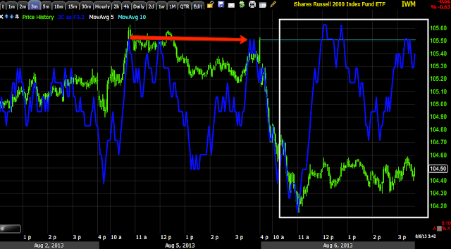
 IWM 3 min positive, 1 and 2 min are sloppy like the SPY.

15 min IWM, there's no question about what the highest probability trade is and why we should look at using ANY price strength for better entries like AMZN and maybe some quick longs.

 QQQ 1 min has no strength left

It's the 3 min like the others where the divegrence is.

At 5 min QQQ, you can see what happens so there's a roof on how far this can go and it looks pretty darn low.

MCP Charts

I'm thinking a target of $7.60-$7.75 would be the minimum move, but this is still a short term trade like AAPL, you get when the getting is good or you get got... Isn't that what they say? That's what happens when you work alone all day.

 MCP Daily chart with a great 3C stage 1 accumulation, BOP is even looking good here, this hasn't moved to stage 2 "Mark-up" yet and I don't think it will until it pulls back at least once more.

This 30 min chart shows the accumulation and the run we traded, then distribution which should ultimately send MCP down to the target area in the green box and there I think it will be a longer term trade, likely to move to stage 2 like our URRE long did.

 Short term though for our purposes. the 10 min has enough accumulation for a decent trade so long as you are somewhat nimble.

 The 3 min shows a longer trend, this still isn't going to be a swing trade, but it looks like it can add some nice gains.

And the 2 min is seeing a lot of recent strength as if Specialists and other short term traders (Pros) were picking it up in anticipation of a move to the upside.

MCP VERY Short Term Long / New Call Position

There are good signals for a bounce here and it's probably a worthwhile position even on a equity long basis, but I prefer some leverage in a position like this.

Again, I expect it to be a short term trade before MCP sets up for another longer term run like we just took profits on recently.

I'm using Aug 17th $7 calls here.

Charts out next.

Quick Market Update

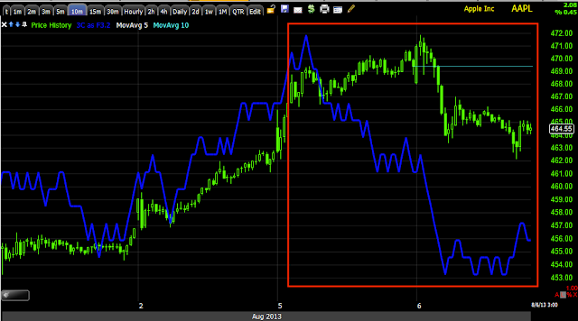
It looks like we will get a bounce, maybe a day or so, when I get the charts up soon you'll see, that may be a nice new entry for an AAPL short and there are a couple of longs that may be played for a quick trade, those are coming up.

Currency : AUD/USD

This is a request and I think it's tradable using FXA if you like, whether options or long.

 This is the AUD/USD pair ($AUD long/ $USD short), it's rare to get a signal on a pair past 1 min, but we have a 30 min positive here.

I checked the individual $AUD futures to make sure...

$AUD 30 min is VERY positive, I think this is part of a head fake move.

The $AUD 60 min shows the same strength and the reversal process is about the right size for an initial leg up.

This is a long term 4 hour $AUD chart, under the yellow line is where I think we have a head fake and strong accumulation so the AUD/USD could be bought or...

You might play the move just with the $AUD ETF, FXA long seen here on a 15 min chart and in the area of the head fake as well as a large leading positive divergence.

AAPL P/L Update

Here's the P/L on the AAPL weekly $470 put from yesterday.


37% gain for a day, if this were a longer dated put I'd probably stick around a bit longer, as it is now, I'd rather look for a new entry.

Here are the current charts and the reason for my exit.
 This is only a 1 min intraday chart, but it's enough with a weekly put to make me think about taking those quick gains.

 The 2 min chart is very much still negative, as I said, If my expiration were later, I'd hold the AAPL put.

The 5 min chart is still negative

And the 10 min.

This may turn in to a bigger, longer term trade, but for now I prefer keeping this one tight.

Going to Take Gains in the AAPL Weekly Put

Mostly because it's weekly.

Quick Market Update including Volatility

I'll have a lot more to look at like currencies and leading indicators, but just as we were able to predict the SPY Arbitrage based on action in HYG earlier this morning, we can start to see damage occurring to those assets that are creating a positive SPY Arb.

I showed yesterday that HYG, one of the main assets / Levers, was sold in to the close and helped as long as it could with an afternoon ramp, but someone wasn't willing to hold that risk overnight and I suspected the same thing would happen today.

 Right now as this is 30 mins delayed, there's a +$.70 SPY Arb, we've moved about $.61 off the morning lows when the Arb kicked in.

I suspect in an hour, this Arb chart will be headed negative.

 HYG for now on the 1 min chart has gone negative, price has started to follow, I want to make sure no reinforcements are added at lower prices in HYG to form a slightly larger base than just this morning's.

This is the VIX "Buy" signal from my Custom "DeMark-inspired" indicator, basically buy/sell or short/cover.

You can see the last two VIX buy signals, one was very recent.

The signals are definitely working, the first one took a bit longer, but there were some downside ones in the past that were between the next day and a week or so. The Bollinger Bands are starting to pinch as well.

Remember the actual VIX Futures? Here's the 30 min chart I have shown the last several days with not only a beautiful price-action reversal pattern, but a leading positive divergence.

 There's been no head fake move, here, but I don't think this is the kind of asset as susceptible to that, this is demand for protection sending the futures higher.

Here's the 5 min chart so you can see, the VIX Futures had the larger picture in place and the short term 5 min came in to place and it's starting to fire to the upside.

This will influence the VXX which IS an arb. asset.

 The 1 min VXX had an earlier small negative on the 1 min, but more like a pullback than distribution and now we just came off another positive.

The 2 min looks good here as well, this is where HYG was a dead giveaway yesterday that it wouldn't hold in to the close.

Treasuries have a 1 min negative, it's intraday, but it "could" send them lower and help the arb, if they head higher though, I'd suspect there's some element of a flight to safety or rotation.

The 2 min chart is fine.

Thus far it looks like the SPY Arb that started this morning, is starting to collapse and that's where any market strength at all has been coming from.


AMZN Follow Up

I posted a follow up on a core short position, AMZN in which I not only said I like the general area, but added...

"I may add to the AMZN short "if" I can get a little upside price concession to make it a better entry, but that's because I already have a largely filled out position in place."

Just as I said earlier, "Today is a gift", AMZN seems like it is prepared to make good on that gift I would be looking for to add to the equity short position.

Here's today's updated charts.
 Yesterday's post explains the macro fundamentals of the trade, "Above $300, etc.".

Here we have what technical traders will accept as a "Bull flag" and they are still bullish, still buying the dips.

This could also be taken as a Bullish candlestick  consolidation pattern called, "Rising 3 Methods".

All of the bodies are inside the one large candle so this qualifies and volume works for either set up so I'm guessing this is very visible to technical/retail traders.


 The big picture or "Why I'd want to be longer term short AMZN" is right here on the 2 hour chart and others and still perfectly intact.

The psychological price area of $300 is under the belt as well, it's just a matter of a tactical entry, the strategic view looks to be all sorted out already.

So if we are looking for a bounce to the upside, this 5 min AMZN chart seems like it has enough of a positive in place to do that.

My best guess is that AMZN may end up around the top of the channel around or nearby the $310 mark, but even at $310, we're only talking about a 3% difference.

If I were to use the 2% rule and say I had a portfolio of $30,000, then I'd have 2% risk per position (as long as I don't have 10 or 20 open positions at once), then my risk capital for the position would be $600.

***Keep in mind, this stop example is taking in to consideration I have some exposure to AMZN right here and I'm trying to add to it, it's far from a perfect example, but it may give you some ideas. Obviously if you can enter at a higher price, your stop can be lower and you have less risk which allows for more shares, but you don't want all of your eggs in one basket which is easy to do with the 2% rule and a tight stop.


Assuming I put a stop at $320 (not at exact whole numbers or anything else that is obvious), I'm looking at just above 6% risk on the position or about $19 risk per share which is not unreasonable at all for a new position.

So of that $600 in risk capital (I'm not including transaction costs because I'm assuming they are limited or slippage) with $19 risk per share, I can afford 31 shares, call it 30. That's about $9,000 which is 30% of my portfolio, that's about twice as large as I'd prefer (maximum single position no more than 15%), so it would be 15 shares until I can lower my risk.

This is a general example, the size of the portfolio, what you're willing to risk per position (this is because of gaps) and how wide you want your stop will all determine the real number, by the way, the new site will have a risk calculator for you to use quickly with your own data.

I have this one layout that determines a stock's maximum gap over the last year or two and sometimes I'll use that to determine my maximum risk as the overnight gap is the hardest to protect against.
 For AMZN the largest gap was $28.84 in May of 2012, that's a lot...

There's the gap in red, but the gaps to the left in white look like they're much higher probability so I check those out and get..

$17.60 which is VERY close to my initial $19 stop.

This isn't a perfect science, but perhaps these will give you some ideas to tweak your risk models.

The other way is to go with a much tighter stop, but you still run in to the "15% of portfolio" rule as a tighter stop will only allow for more shares to be bought.


Market Update As the Biggest POMO of August is Completing

The August F_E_D POMO (Permanent Open Market Operations) in which they monetize the debt by buying treasuries from Primary dealers (since the F_E_D is not allowed to "monetize the debt" and therefore cannot take part in the outright initial auctions, but must buy these assets on the secondary market) had the schedule released several days ago, it turns out that TODAY, is the biggest POMO operation of August...

At the top in red you see Tuesday August 6th with an expected $4.75-$5.75 bn in expected purchases.

Just to be clear for newer members who don't understand the process...

As I said, the F_E_D, like most central bancs, is prohibited from taking place (buying) at Treasury oferings of debt (Treasuries) so the F_E_D buys the treasuries (and MBS) from what are called "Primary Dealers", like Goldman Sachs and believe it or not the now defunct and "seemingly" criminally negligent MF Global  are and were a part of.

The PD's buy the Treasuries at the primary offering, in the past they have held certain offerings for less than a week before they were snatched up from the PD's by the F_E_D in these Open Market Operations.

The trick and why QE is stock market positive and has carried this market since QE1 started in late 2008 (but didn't take off until the MBS that were being bought were supplemented with Treasuries at the 2009 market lows) is because the Primary Dealers (big institutions like Goldman Sachs-I believe 42 in all) are paid rates higher than what they paid for the T's, essentially they hold them for a period (sometimes less then a week) and offload them to the F_E_D in POMO operations like today's for a large profit.

That money the Primary Dealers make is leveraged up (because money sitting idle is going to remain idle) by buying stocks and their very demand of several billion dollars sends the market higher, that has been the sole driving force of this market since the 2009 lows, not economic recovery, not better company fundamentals, pure cash pumped in to the market that benefits the banks, I suppose the F_E_D would rather give it to them than have to bailout these banks later (which they likely will any way).

Typically operations are over by 11 a.m. and the money starts filtering through the market, retail front runs QE days, buying in advance of the completion of the operation.

So it's a good time to do a market update and see what we have. First the SPY and the Arbitrage Assets so we know where, "What" is coming from, QE cash or simple "Lever Pulling".

*I'm not including Index Futures because they are almost all in line, there's nothing much to see, they are moving with the market as would be expected.

First the SPY and other assets that are arbitrage in nature, but could be used to make it look like POMO is pumping the market.

***I Know there are a lot of charts, but I'm trying to share a concept with you and show you how the market is truly working and engineered to give false indications of strength, if you want the quick and skinny:

Essentially we have short term positive divergences in the market averages intraday, it's very clear to see that these are engineered to either look like POMO money is entering the market or perhaps POMO money is really being used to pull the levers that need to be pulled to create a market positive arbitrage and the illusion of market strength, however I can say with a fairly high degree of confidence, any POMO monies entering the market today are manipulative only, they are not being used to buy risk assets by professionals or in this case the primary banks.

SPY
 1 min shows a positive divergence developing as early as 10:45 to 11 a.m. intraday and small here.

 If we look at HYG Above,  we can see that money entered HYG first and around 10 to 10:30, this gave HYG a positive arbitrage position as it moved up in price by 10:45 and price is what moves the arbitrage, they can't see 3C charts.

HYG IS being used to make the market look stronger as it was yesterday, remember it gave out at the EOD because they apparently didn't want to hold HYG long overnight for downside market risk.

HYG 10 mins shows clear distribution and EVERYTHING is in line so there's no sign of any real or strong accumulation in HYG, thus far it looks like arbitrage lever pulling for the HFTs.

The VXX is the second of the 3 arbitrage assets,  this 1 min VXX chart shows a slight intraday negative divergence, enough to turn it down and at 11 a.m.,  this helps build a more positive SPT Arbitrage and "appearance " of a stronger market.

 However, a quick look at VXX's 5 min chart reveals no such distribution and only a very strong leading positive divergence so, once again all of the indications thus far point to an intraday bounce.

THIS IS THE EXACT REASON I SAID THAT THIS BOUNCE IS A GIFT AS IT IS SHORT TERM AND WEAK, HIGHER PRICES CAN BE USED TO ENTER KNOWING THAT THE MORE IMPORTANT UNDERLYING TRADE IS NEGATIVE.


 TLT IS THE 3RD OF THE 3 "LEVERS OF MANIPULATION" OR HFT ALGO DRIVEN SPY ARBITRAGE.

Here we see a 1 min TLT chart, it has a positive divergence at the opening lows and remains fairly positive, TLT's price itself being lower than yesterday's close helps the arbitrage as it relies on price only, but we can see that even on the shortest timeframe, underlying trade is positive suggesting a flow toward or a flight to safety in underlying trade.

The SPY Arbitrage Model from Capital Context
 Look at the model and when the model went positive, right around 10:30 which is when HYG had already started moving t the upside, TLT was already down on the day from the open, the arbitrage as of this capture is positive about +$.30 SPY.

SPY 2 min shows no divergence at all as of the capture, just downside confirmation, thus not a strong divergence and VERY unlikely that POMO money is flowing in to risk assets.

SPY 10 min shows the damage of this week, it's already significant, that makes short term upside useful to enter longer term weakness via short positions.


DIA
 DIA has seen some ugly downside as did Industrial sectors, there's a decent intraday positive divergence this morning on a 2 min chart.

 Also out as far as 5 mins.

At 10 mins the DIA is negative as we'd expect from other signals.

The 30 min shows 6/21 when we called for an upside reversal 1 day before the ultimate bottom and distribution on a larger scale since.

IWM
 IWM 1 min has an intraday positive

the 2 min has one as well, less developed.

At 3 mins though, there's no migration at all, thus again we are seeing that there's not huge sums of POMO money flowing in to the market for any other reason, as it appears right now, other than to create an image of intraday market strength which they would probably do the same thing as I would and be a seller in to that strength or short seller.

 IWM 5 min confirms there's no strength beyond intraday timeframes.

 The 60 min is giving us the big picture and illustrating that fragility I mentioned yesterday apparent through July as 3C dives to lower leading negative readings.

QQQ
 QQQ 3 min is about as far as we go with any intraday positive and this  must be almost entirely based on asset arbitrage.

At 5 mins, the Q's show no strength at all, in fact quite the opposite.

And the 60 min chart, again with 6/21 highlighted as you can read the archives for that day, we called a bottom reversal and had been moving positions around for such an eventuality that took place off the lows of the very next day.

We know that HYG must be manipulated and some money MUST flow in to HYG TO do that, but what about other forms of credit THAT ARE NOT PART OF MARKET MANIPULATION AND THEREFORE HAVE NO REASON TO ACT IN A MANNER OTHER THAN WHAT IS TRULY HAPPENING ?

JUNK CREDIT (Remember, typically Junk credit trades almost identical to the High Yielding HYG as Junk is High Yield because of its rating).

We see very little on the 1 min JNK chart, nothing positive, in line at best so far today.

The Junk hourly chart makes clear this has been under distribution, some very recent and its prognosis is not "looking up" so to speak.

High Yield Credit 
 Thus far intraday HY Credit is in line with 3C moving down, kit's not leading the market.

If there were a risk on move by smart money, it wouldn't just be in HYG credit, it would be in Junk and high yield which it is not.

The longer term 60 min chart of High Yield Credit looks just like Junk, it has seen VERY recent and strong distribution.

SO, IT LOOKS LIKE THE MARKET IS GIVING US A GIFT HERE.