Friday, December 12, 2014

Planning Ahead

This week has been very tough as it progressed as charts went from very clear and right on target to murky the last 2-days. What is abundantly clear is that no Trade Signals were given other than (we expect to bounce tomorrow or vice versa), which means you avoided this...

A choppy range as represented by the largest Index by component stocks, the Russell 2000. We were able to call both upside move reversals to the downside so if you were day trading which is about the only profitable trading in a choppy range like this, then you still had your signals, but entering long or short this kind of range is just an emotional nightmare in which you think you are at a gain on the open and by mid-day you are ready to stop out only to find the closing trade in your favor after a possible stop out and then just to do it all over again. Sometimes staying out of the fray is the best thing you can do; there are 3 positions- long , short or neutral/cash and each has their advantage at the appropriate time.

I hope I've been exceedingly clear about core short positions, they have all been left open.

This is a few examples of one trend you not only don't want to mess with on the long side, but one you don't want to miss on the downside.

 Comparing the daily 3C charts of the QQQ/NDX at the 2000 bubble top and now I think you'll see something rather amazing that I think few people alive if any have had such opportunity tight in front of them if they only knew what side of the market to be on...

Above is the 3C negative divegrence at the Tech Bubble top in the QQQ

Below...
 Compare the same timeframe chart applied to the QQQ daily chart now.

Notice any differences between them? The increased ROC of 3C negative divergences through 2013 may seem "untimely", but I wonder what it will be viewed as 5 years from now? 

While you may ask yourself, "How can that be right if the market is still rising after?" This is where retail investors don't understand the size that institutional investors trade in and why the must sell differently over a longer period in sections rather than close an entire trade all at once.

For instance, from May 2013, as proof positive that distribution as represented by 3C was well under way, Leon Black, chairman and Chief Executive of Apollo Global Management which is a private equity giant said in May of 2013 at the Milken Institute's Global Conference, 

"It's almost biblical. There is a time to reap and there's a time to sow We are harvesting,

"We think it's a fabulous environment to be selling," he says, noting Apollo has sold about $13 billion in assets in the past 15 months. "We're selling everything that's not nailed down. And if we're not selling, we're refinancing."

The story can be found at Barron's,  

They obviously weren't the only ones using price strength and demand to sell in to as their size dictates selling in to strength over a longer period as to not crash their assets by putting out too much supply at once (basic supply and demand concepts).

 The recently acceleration of an already historic divergence as you can see and as we predicted in October before the rally. The forecast was there would be a rally that would scare even members who knew about it a week before it started and that there would be a decline after that was even stronger than the rally. Look at the 3C chart in to the October rally at a new leading negative low just as we expected and this is a 2 hour chart.

The last major negative divegrence was at the September highs at the yellow arrow, which were a head fake move of 3 days, leading right to stage 4 decline and a -1200 point drop in the Dow, lifting bearish sentiment to near historic highs, which was one of the reasons we expected a shakeout rally to change sentiment from all out bearish everywhere you looked, back to believing in buy the dip, no matter how deep it is. Psychologically, it is a masterful play, teaching the "Buy the dip" crowd who was bearish at the October lows, that even a -10% decline is a buying opportunity, a very dangerous lesson.


Even the QQQ 60 min chart shows one of the sharpest leading negative divergences (at new lows vs price's relative area near new highs).

THIS IS WHAT I MEAN WHEN I SAY, "DON'T TRADE AGAINST THIS TREND AND DON'T MISS THIS OPPORTUNITY".

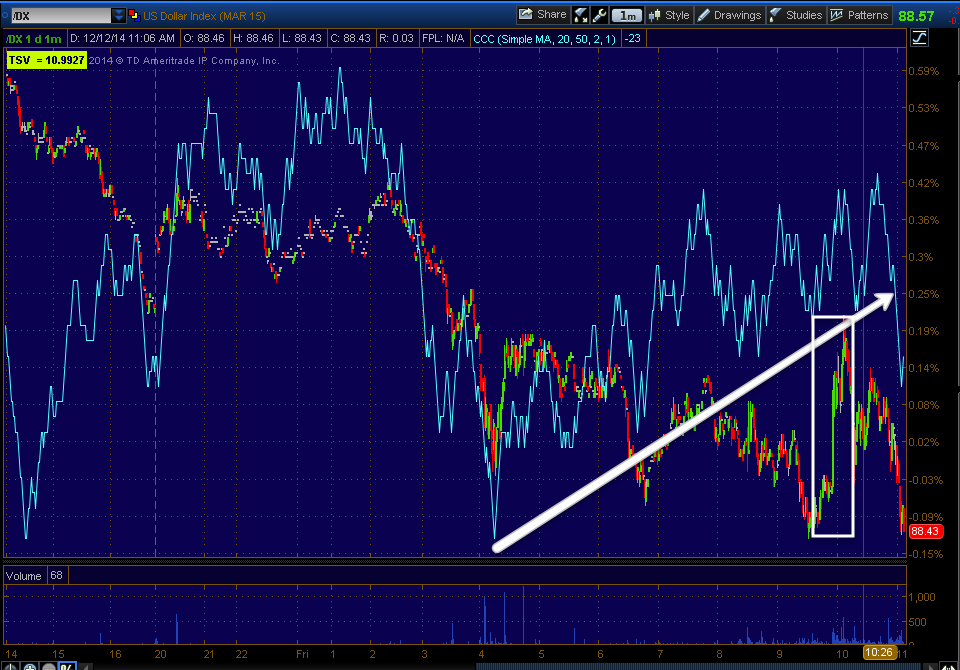
As for some of the other averages...
 SPY 2 hour also showing the last negative divegrence at the Sept. head fake highs (yellow) and the monstrous divergence all the way out to multi-hour charts in addition to daily. The 3C trend tells us that at these price levels in SPY, there's less money flow that at the October lows. It would seem the rally was used exactly for what we expected in October, distribution and changing dumb money's sentiment.

 Here's the Dow's 2 hour chart with a huge increase in the long term 3C leading negative divegrence at new leading negative lows-far less money supporting the market than ever before.

And the IWM's 2 hour chart during a large, choppy range lasting nearly a year, a definitive change in character, FLAT ON THE ENTIRE YEAR OF 2014- NO GAIN WHATSOEVER!

While the intraday trend of the IWM below (like the rest of the averages) looks horrible, something crept in this week when stepping back.
 IWM intraday confirmation of a negative trend on this chart, but beyond the 1 min chart...

Since Black Friday's extremely negative tone, there has been a positive IWM divegrence develop which would be in line with a break above the 6 week range of resistance or trading range that is extremely obvious. While some may not like the sound of the possibility of the IWM breaking above the trading range, it's one of the best conceptual signals we have for timing, just look at the September head fake highs on 9/18, which led to an IWM loss of over 10% starting the very next day.

It seems the SPX, NDX and Dow have already made head fake highs and I'd expect them to be relative under-performers in any such move.

While the closing charts suggest Monday pick up with negative activity in the morning as a move below this week's range in the Q's and IWM would be helpful to such a bounce, this could be negated by a relief move if the Senate passes their $1.1 trillion dollar spending bill to finance the government for the next year to avoid a looming shut down, they have until Sunday as the House already passed it. In fact I may be misunderstanding the divegrence and perhaps it is there reflecting an end to the issue by the start of trade Monday morning rather than a head fake move, after all, Congressional staffers are some of the most profitable traders- I wonder why?

Whatever the outcome, I'm not worried about potential drawdown at all, in fact it's the last thing on my mind at a time like this.

Whether a reflection of relative underperformance in the averages that have already made their head fake move, QQQ, Dow and SPY or whether just a cap on any upside bounce, it's pretty clear it can't get far.

 QQQ 2 min trend of the divegrence, not a strong timeframe, but a divergence nonetheless and...

The 10 min chart leading negative, capping any potential move as the divegrence isn't beyond a 2 min QQQ chart or 5 min IWM.

After the TLT post and expected pullback, this divergence in HYG was one of the signals that led me to believe probabilities are on the side of a bounce, one that seems has been trying all week to pull off, but has failed day after day.

Then in addition to the expected TLT pullback, HYG forms a positive divergence in all of this market chaos? That seems to wreak of a lever being planned to help the market early next week.

In fact, VXX is about the only of the three that wasn't''t onboard, leaving some uncertainty.

Another curious signal is in the index futures, again I don't like when we don;t have multiple asset confirmation, but the IWM is the only of the averages not to put in a head fake move so perhaps as speculated above, this is a difference in relative performance.

 While all of the averages are in line with the negative activity on the 1 and 5 min charts, the ES 7 min chart is also in line with the negative activity, but the Russell 2000 futures...

Again, the only average that hasn't put in a head fake move already, has a positive divegrence very different from SPX futures.

Either way, so long as we stay short , we either reap the rewards of more downside or get a chance to add a few more positions with all of the most meaningful charts showing the highest probabilities we have seen toward not just additional downside, but perhaps near historic downside.

I'll be on top of Sunday night futures, in the meantime, have a fantastic weekend!


Trading Plan In to Next Week

Bounce or no bounce in the market, the overwhelming chart signal probabilities are ultra negative, I'll show you later, but much more negative for say the QQQ now than even at the 2000 tech bubble top. More negative now for the Dow than at the 1929 crash top.

This is why I'll keep all short equity/core positions in place, if we bounce we have added positions we can enter at lower risk and better entries (more profitable), yet if the bounce is run over, our shorts are still working for us.

A head fake move right now for the IWM in particular would be a blessing just as the head fake move in the August cycle's stage 3 top at the September highs was a clear signal that the stage 4 decline was about to start.

I'll post later what I see that suggests a bounce and any number of events such as the Senate passing the $1.1 trillion dollar funding bill that is now extended to Sunday midnight as the House passed it with a continuing resolution to allow the senate some extra time, could be a potential "catalyst" for a quick bounce under the pretenses of a relief move.

Either way, I don't see how we can lose by staying short with or without a bounce.

So far the intraday charts that usually pick up where they left off on Monday don't look good, so that would suggest early weakness on Monday, although there's still a little time fro them to change before the close.

The QQQ and IWM specifically are right around a range so a move below that range ( a head fake move) would give them the momentum they need to make such a bounce, it's a failed move and a bear trap on a short term basis.

Any way you look at this, this market is going lower, thus I will stick with all shorts, add to if the bounce provides the opportunity, if for any reason it does not materialize, the shorts kkeep working for us until we can add again on the next correction.

More charts making the situation more clear are to come.

USO Charts

First let me be clear that I DO NOT see this as a trend change, USO/Oil would need a much larger base to accommodate such a thing and there's effectively no base. This would most likely be an exhaustion/oversold move that triggers a short squeeze, thus the potential for gains using options is enormous, even with a small, speculative position.

First let me show you some of the longer term charts, the heaviest underlying flow and the most likely probabilities for future trends,  thus another trade you might consider is on any potential bounce, selling it short and let the downtrend continue, this is a safer, less speculative approach, but you can also do both as I would intend.

 The daily Brent Crude Futures chart with 3C confirming the downside.

The long term 4 hour Brent Crude futures chart, again very negative with strong 3C confirmation of the trend.

I checked June/July and we had dozens upon dozens of USO posts, several short/Put positions as well.

This 2 hour USO chart is a thing of beauty. The divergences in the past at the green arrow are normal size divergences, but next to the divegrence at the red arrow, they look like simple "in line" readings. This is the kind of 3C divergence that I'd call "Screaming" or "Jumping off the chart"

Note however the recent change in trend after what looks like an exhaustion gap at the yellow arrow.

Here it is on a 2 min chart's trend.

The Crude Futures are also showing something similar...
 This is a positive divegrence on a 15 min chart and...

Another gaining strength on a 7 min chart.

This is well worth the speculative risk to me, although I would not go against this trend with a normal full size position.

Trade Idea: USO (Speculative Options) Jan $22 Calls

I'm seeing some things in USO that make a speculative call position, one I don't mind if it goes against me, look very attractive considering the potential gain.

Again, this is a speculative position, the trend in oil has been horrible, but I've been watching since a recent gap that is starting to look like an exhaustion gap.

I'll have charts up shortly.

Important (Brief) Update

This has been a pretty frustrating market this week , threatening to bounce several times, yet losing the momentum with the QQQ and IWM returning toward the lows of Tuesday while the SPX and Dow have made lower lows.

Choppy markets are often difficult markets and I haven't put out any new short ideas because the signals were not there. I have found in retrospect when the signals are not there (such as we might have expected to see for short entries at the intraday highs of the last 2 days), it's often for the best as you'd be caught in a choppy range which is a meat grinder and the real move is yet to appear, the one we really want to enter new shorts in to.

After looking around pretty throughly this morning, I feel there's a high probability of that bounce the market has been threatening all week. The charts in the major averages are just one of the pieces of evidence, but not what I consider the best.

The three charts that pushed me to this post , expecting this bounce to finally happen are TLT which I just posted, a pullback in TLT and 30 year Treasuries sends yields higher and the market tends to be drawn to yields like a magnet. The second is HYG, although it's in horrible shape and belies just how far this market has to fall in just the next leg down, I see near term accumulation there and there's only one reason HYG is accumulated these days, to act as a market lever and ramp the market because it does not have the strength to do it on its own and finally, what I talked about yesterday, the Russell 2000 (IWM) near 6 week trading range that is still at a small move of only-.38% from October 31st to yesterday's close, that's about as flat as you get , but also as obvious as you get. The more obvious a range/resistance level is and the more watched the asset, the higher the probability of a head fake move such as the September 16th-18th stage 3 head fake during a stage 3 rounding top, which almost immediately led to the next leg down and the October lows.

Nearly every asset in every timeframe has a 4 stage cycle that repeats over and over, some intraday, some over weeks or months and some over years, but they nearly all have them even if they haven't yet become evident.


 This is a chart of the SPY's August cycle which started with a warning (posted yesterday as an example) on July 31st of an impending base and bounce which started the first week of August (stage 1 base) followed by a rally through most of August (stage 2 mark-up) and then a rounding top (stage 3 distribution/top) which lasted from late August to mid September and the decline, stage 4 which went from the September highs to the October lows, erasing 1200 Dow points in weeks.

If you recall the period of time, then you know I have altered this chart to show how obvious a simple rounding top would have been for traders to follow. I'd estimate more than 80% of the time, in every asset and every timeframe, we see a head fake move just before the actual reversal begins, there's numerous reasons for this which you can read about here, * Understanding the Head-Fake Move Part 1 and here, * Understanding the Head-Fake Move Part 2

This is what the actual chart looked like with one of the most common themes for a top, which we call an "Igloo with a Chimney", the Igloo being the rounding top, the Chimney being the head fake move just before the downside reversal.
 To the left is the base of early August, then between the two yellow trendlines is stage 2 mark-up . The longer yellow trendline defines the highs/resistance of the rounding top and the small upside down "V" in red shows the head fake move which moved above the month long top with a 3-sday move, brining new longs in to the market as the last day broke out above the former highs (traders often buy breakout moves), however distribution through this area was already extremely well known so the resolution of the break out turning in to a failed move or a head fake was already a high probability and as such, a perfect area to short the SPY as it promptly reversed after the head fake and turned to stage 4 decline and the October lows.

The IWM has an even more clear 6 trading week range, which makes it a VERY high probability head fake move.

The move doesn't need to create a new high in IWM, it just needs to break above resistance of the range and trigger buy orders, part of which is to create fast reversal momentum as failed moves create fast reversals.

I'll post more charts that I believe back up this thesis and I'll post some assets I think are worth looking at as shorts in to price strength, we already have the clear underlying weakness just like we did at the September head fake highs, although this time much worse than before and in a more important place.

I am still leaving all core short positions open, this market is too weak to risk even a failed bounce attempt.

Treasuries & Position Management TLT (20+ year Treasury Bond Fund) / TBT

30 year treasuries had a very strong auction this week, it seems high quality collateral is in demand as well as perhaps the notion of offsetting longer term deflation expectations.

In any case, we have had at least two recent Trade Ideas long TLT that have served us well after the October pullback we saw coming several days before.

 In red is the pullback area we had seen several days before, anticipating a pullback that we'd be able to buy, we started seeing positive divergences in strong timeframes at the white box area, however on a short term basis, it looks like the probabilities of a near term TLT pullback are rising, although the position on the whole still looks very strong beyond a near term pullback which may offer opportunity for those interested.

This may also have some use in near term market analysis as well, although I'm not making that jump based on TLT alone.

 Since our first long entry on November 14th at the first white arrow from the left, in which we used TBT (the 2x inverse TLT ETF) as a short to effectively construct a 2x long TLT position as there aren't any 20+ year leveraged ETF's with any decent liquidity. This was the November 14th position/post, Trade Idea (Swing+) TLT long via TBT Short and again on December 3rd at the second white arrow, TLT Long Also Looking interesting here was posted.

Since the November position was opened, TBT short, effectively TLT 2x long is up almost +11%

I know some of you opted to use options (calls) for the additional leverage and while the near term potential of a pullback in TLT (20+ year Treasuries) isn't a pressing concern for a 2x leveraged equity position, it is more of a concern for option positions holding decent gains with time decay also a factor.

Let me reiterate, the TLT chart overall looks very strong and solid for more upside, what I'm really looking at right now is the probability of a near term pullback.

 This 2 hour chart of TLT shows its long term strength, I have little concern about that at this time.

The 60 min chart that showed the pullback area, accumulation at the pullback lows and now confirmation of higher prices is also showing significant long term strength. However...

While a small divergence (to the far right), there is a 300 min negative. It's not so much the divegrence on this chart, but the shorter term charts it migrated from that cause some more immediate concern toward a pullback, especially for those using the leverage of options with shorter expiration dates like December, although I prefer to take gains in options at the first site of a loss in momentum and look to re-enter a new position after the correction is complete rather than sit through it as options have a much different pullback/volatility rate than do equity positions for numerous reasons, not the least of which is time decay.

 The 10 min chart is much clearer about the negative divegrence and this is about where I see the threat and it being the nature of a pullback.

My initial gut instinct is the $122-$123 area would be targeted in a pullback, but the time decay may be  quite a bit.
 As far as the near term timing charts, this 3 min TLT is clearly negative as is the 2 min and...

This 1 min so I anticipate the probability of a near term TLT pullback to be rather high.

As for 30 year Treasury futures which are similar to TLT's 20+ year Treasuries...
 Again the longer 60 min chart is rock solid so I don't see this as a trend reversal and I anticipate TLT and 30 year bonds will see additional upside after a near term pullback which may be quite ordinary as pullbacks within a trend are not anything uncommon and often wring out excesses and shakeout weak hands, making them stronger in the long term.

 However, like TLT at the 30 year Treasury future's 30 min chart, a negative divegrence is obvious,


The 5 min chart also shows a negative divegrence suggesting it is close to a pullback area.

Just for additional confirmation, this is TBT, 2x short 20+ year Treasuries) or effectively 2x short TLT and its 60 min chart shows the exact opposite signal as it is confirming the downside, so again I think TLT's longer term is secure, but again like TLT and ZB (30 year Treasury futures) ...

After giving perfect confirmation to TBT's downtrend and showing distribution at the onlt real bounce attempt , the 15 min chart has a positive divegrence.

This is multiple timeframe/multiple asset confirmation.

Again, I would think we are close to such a pullback, it looks high probability, but the longer term is also looking very strong, thus a pullback in TLT may offer an excellent long entry if you are interested once it has completed. You might want to set price alerts around the $122-$123 area for TLT if you are interested.

Market Update

The USD/JPY opening support which served to close the QQQ/SPY almost the DIA and part of the IWM gaps down, was short lived, interesting that it was in effect long enough to close the gaps or thereabouts in most of the averages.

 USd/JPY opening gains quickly lost after the averages filled most or all of their gaps, however I would not write the pair completely off just yet (more on that in a moment).

As you can see, the SPX futures (ES) in purple are tied very tightly to the USD/JPY's movements (green/red candlesticks) on this 1 min chart from the overnight session to present.

Thus what happens in the Carry pair is of importance to the market.

From our perspective, this week has been about nothing more than managing short positions and letting them work, any upside price gains that are useful to enter new shorts have been pretty difficult to come by, thus just letting current shorts work is really all that I would do other than keep my eye on probabilities and outlier assets. Chasing assets or shorting weakness is ill advised unless you have a fairly wide stop and tolerance for risk as volatility in the area is likely to remain high until a more solid break to a new low, below this week's range occurs.

As for the Index futures, they are remarkably in line with 3C on the intraday charts, for instance...
 ES 1 min is perfectly in line with the downside with negative divergences at any attempt to move higher (distribution).

 TF / Russell 2000 futures look much the same as this morning's gap fill seen above saw distribution in to that minor intraday strength on the back of USD/JPY.

And NQ/NASDAQ 100 futures also saw a negative divegrence after the bell at the gap fill area.

The short term charts of the averages are reflecting the same...

 IWM with a positive divegrence and 3C perfectly in line with the trend since.

 IWM 2 min trend showing the major 3C divergences with IWM (distribution) in red and 1 positive divegrence earlier in the week.

 As the 3 min IWM chart shows the same, 3C at a new low with price.

The Q's have shown every attempt at higher prices met with selling.

As has the SPY.

However, you saw how tight the USD/JPY correlation is... The component currencies that make up the pair are still warning of another upside attempt or a larger building one.
 Although the $USD's help pushing USD/JPY higher after the bell to the gap fills was short lived, its positive divergences remains, offering the increasing probability of another USD/JPY move higher and a stronger one.

The other currency in the pair, the Yen...
Saw weakness on the gap fill sending USD/JPY higher after the open and has since found some strength, yet its negative divergence remains as well, both indicating that ?USD/JPY's upside may not be done, in fact it may not have even started in earnest yet.

I'll be keeping an eye on it, however once again, in my view ANY price strength in the market or individual assets you might have reason to sell short should be used for that purpose.