As I mentioned in my last post, there's fewer bullish looking charts right now then bearish (at least per my crossover scan-with very recent results) however, that is often a sign that the market may be overextended or oversold. We saw a very mixed market on Friday with the Dow performing the best at +.41%, the S&P at +.24% and the NASDAQ 100 which was the most dominant in terms of percentage change coming in at -.78% so the market may in fact be oversold and divergences between the 3 averages of this magnitude rarely last long.
So I'm presenting the analysis on a couple of possible long trades. I'm going through the short list as well and depending on the market, I may put a few out there as well.
LXP- This one is the exception as it is a short sale trade so we'll start with this.
LXP has trended right into a large triangle. Smaller triangles are usually consolidation patterns, but when they are large (and this is a weekly chart) they tend to function as tops or bottoms depending on where they're found, this would be in the top category. Volume looks right, including the recent negative spikes. MACD looks right as well showing a loss of momentum into the highs.
Here's the daily 3C. First a relative divergence in May of 2010 produced a two month sell-off, right now the divergence is even sharper and leading, things have gotten a lot worse since the last divergence.
I checked Don Worden's MoneyStream to confirm, it confirmed both divergences as well.
This price chart (price representation) is not candlestick, it's Heiken-Ashi which is a bit different from candlestick charting and typically easier and more reliable in spotting trends and changes of trend. We'll get to that later, more importantly is the Bollinger Bands around price as the volatility has narrowed dramatically, this almost always precedes a big directional move. Also note the indicator on the left side showing "Volume at Price". It's obvious there's been a lot more sell side volume in this triangle then buy, again another reason to believe this is a top and not a consolidation.
However, let me say this and this may work out for some of our options players. We've seen the high rate of initial pattern failure on easily recognizable technical patterns. You can get the programs that find them for free, Wall Street certainly has more sophisticated black box modeling. These patterns often give a false signal before following through on the ultimate direction. So in this case, I would not be surprised at all to see an upside breakout and that breakout turn out to be a failure. However, the upside breakout may be excellent positioning for a short side trade either via equities or options.
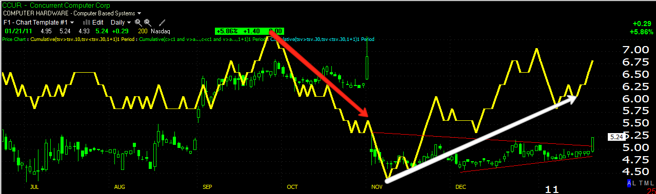
CCUR Long
Here's CCUR's daily 3C chart, there's a triangular consolidation, again it's large so it is probably a base. This is speculative as the volume is so low, it's also probably a solid pattern as the low volume makes it not worth it for the black boxes to try to manipulate it. Remember the volume makes this highly speculative. 3C showed excellent accumulation into the base on the daily.

Here in red we see the end of stage 4-decline with a capitulation event. It looks like at least a small stage 1 base is moving toward stage 2-markup.
The 30 minute chart also showed heavy accumulation into the making of that base, right into the breakout.
You can see, Bollinger bands have squeezed in the past right before a strong directional move.
This is the same Heikin-Ashi chart I mentioned earlier, it is read differently then candlesticks so ignore what you know about candlesticks. Basically a strong chart pattern will be big green candles with large upper wicks. Bearish candles are large with long lower wicks and indecision or reversal candles are similar to a candlestick doji star or small body candle with long upper and lower wicks. Note that the last run started with a candle almost exactly the same as the candle from Friday and gained strength from there. I like the idea of this trade, just beware of the speculative nature due to a lack of liquidity.If you get involved, managing this kind of trade is a bit different, so please keep in touch with me.
HEV
HEV daily 3C chart shows some heavy positive divergences in the lower part of that trading range which looks a lot like a type of inverse Head and Shoulders bottom.
This is a 15 min chart showing the pullback after the recent spike up, the divergence recently is very positive and leading. It looks like this one may be getting ready for another leg up, the base is large enough to support it.
The white area is where I'd have my order to buy and the red line is where I'd have a stop just a little below. The respective levels are around $4.45 and $4.17. I think the risk in this trade is fairly low and the upside is looking pretty good, therefore I like this trade a lot right here.
I'll be adding trades this week, all week starting tomorrow. You'll find these trades on the list as well as other recent trade ideas featured.
Have a great week.