I've talked quite a bit about out December 12th (Friday) forecast of IWM breaking above $118, or more specifically breaking above a trading range that only moved approximately -.10 to 0.38% depending on the day you start and end the range, but it was about 6 trading weeks long and didn't move above or below the range.
One of our strongest concepts is that of the head fake move, before any reversal whether up or down , in any timeframe where a reversal looks probable and in any asset, the chances of a head fake move, whether a failed breakout or a stop run, is about 80% and the more obvious the range or technical level and the more watched the asset, the higher the probability.
This is the actual article on December 12th, one of several where the idea of an IWM move above the range BEFORE it would make a turn to the downside, first started taking shape,
Important (Brief) Update. The forecast gained further shape over the weekend and Monday (the next trading day), with evidence of the theory showing up as soon as the next trading day, Monday the 15th.
While I said the IWM had to at least break above $118 where the resistance area of the range was, it could move higher and the higher the better for the downside reversal after the head fake move fails, but it was not so much about a target or a specific price level as it was about the psychological concept of traders chasing breakouts, thus the F_O_M_C acting as cover for the move which was posted 2 days before the F_O_M_C was the actual event that served as cover because the knee jerk reaction linked to a F_E_D event is a near certainty, just is the failure of that knee jerk reaction. This worked perfectly and the Santa Claus rally which traders just take for granted as being a done deal also played an important role as traders would go long expecting the Santa rally and January effect which converges in to the perfect storm or bull trap, essentially, the perfect head fake move.
I did expect the IWM breakout to look more convincing, something like this...
Imagine if this 3-day chart were what the daily chart's breakout looked like, it would have been more effective as a strong, clear, clean breakout, but we got this instead...
Not quite as strong., clean and clear, but the percentage move above the range is more than enough to do the job. Again, the price level didn't matter, it was the breakout above the 6 week range as limit orders would be placed there and the emotion of greed causes traders to chase price, which means most stops will be just below the breakout level or just below the $118 level, thus as price starts to fall below the level and trigger stops, you get the same kind of downside momentum as the first two days of break down below the range on the 15th and 16th created by luring in new shorts who were promptly squeezed for the strongest short squeeze in 3 years as price hit their stops when the levers of HYG, USD/JPY, VXX and TLT all helped with the initial move higher.
As I said in the December 12th post linked above,
"After looking around pretty thoroughly this morning, I feel there's a high probability of that bounce the market has been threatening all week. The charts in the major averages are just one of the pieces of evidence, but not what I consider the best.
The three charts that pushed me to this post , expecting this bounce to finally happen are TLT which I just posted, a pullback in TLT and 30 year Treasuries sends yields higher and the market tends to be drawn to yields like a magnet. The second is HYG, although it's in horrible shape and belies just how far this market has to fall in just the next leg down, I see near term accumulation there and there's only one reason HYG is accumulated these days, to act as a market lever and ramp the market because it does not have the strength to do it on its own and finally, what I talked about yesterday, the Russell 2000 (IWM) near 6 week trading range that is still at a small move of only-.38% from October 31st to yesterday's close, that's about as flat as you get , but also as obvious as you get. The more obvious a range/resistance level is and the more watched the asset, the higher the probability of a head fake move such as the September 16th-18th stage 3 head fake during a stage 3 rounding top, which almost immediately led to the next leg down and the October lows."
In any case, all of the expected moves have been made, all of the confirmation of head fake moves or false moves have shown up. With the levers now breaking down as I showed for USD/JPY specifically in the last post, USD/JPY Lever About to Give Way , I specifically pointed out the relationship in USD/JPY accumulation at the first head fake move below the range which set up the short squeeze once we moved in to the range, so just as USD/JPY was important in the evidence of our forecast then, it's just as important now as are the other 3 major levers, (VIX futures, Treasuries and High Yield Credit (HYG specifically).
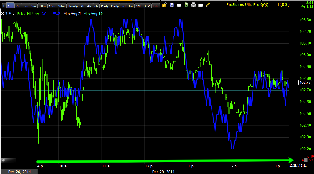
In fact, since the 4:39 post, here's what has happened in USD/JPY...
Since the post at 4:39 p.m. EDT (yellow) this is the movement in the carry pair.
On a larger scale chart, here's the same, while not in free-fall, the move looks to have started.
This is important because it's not only a lever up as we saw this morning...
At the 9:30 open, the correlation between USD/JPY (candlesticks) and ES/SPX futures (purple) tightened up significantly and the FX pair was used as an early lever to ramp the market combined with some opening or early lows that knocked out a couple of days of trade in several of the averages, creating a buy the dip mentality.
Much in the same way it can ramp the market, it can also lead it lower, so while the 1 min $USDX chart looked to be a dead giveaway as to timing, it's the 30/60 min charts of $USDX and Yen which aligned perfectly with the entire move since the December 12th forecast that are truly significant to broader market action and fulfilling the forecast which has been pretty spot on thus far.
I've pretty much covered the charts for the Index futures and the averages many times showing what I expected to see and what we ALWAYS look for to confirm a head fake move, but just as a quick review/reminder, as for Index Futures...
When short term charts are fuzzy, move out to the longer term charts where there's less detail, but a much clearer trend. This 60 min chart of ES/SPX E-mini futures shows a negative divergence leading to lower prices to the left, our forecast on December 12th and the initial Crazy Ivan head fake/shakeout below the IWM's range where accumulation occurred (white) and the move above the range with a leading negative divergence in to higher prices (distribution in to higher prices). The current divergence is far stronger than anything else on the chart.
As for the averages, they too have been showing what I'd hope to see, not only on a longer term basis, but specifically in to the start of the Santa Rally Friday and the end of Window Dressing the same day, however for the purposes of verifying whether a move has support and the ability to hold or whether it's the head fake move expected on 12/12, the longer term charts show the stronger underlying action.
While there are much stronger charts with negative divergences currently, there are none that show the positive divergence of the head fake move below the range on the 15th/16th, it simply wasn't a strong enough move to show up on those charts, but this does the job as a leading negative divergence in to the breakout above the range is the confirmation I'm looking for.
Put in to context of the IWM's range...
IWM range, with a Crazy Ivan shakeout (both sides of the range). After 6 weeks in the range, the first trading day after our forecast, the 15th and 16th shook out traders below the range and the anticipated move above the range lines up perfectly with the chart above this one.
I've already dealt with USD/JPY expectations, however we have several other levers and Leading Indicators that are important.
We saw HYG accumulation early, as I posted above from the December 12th post, "There's only 1 reason to accumulate HYG", that's to ramp the market.
HYG's longer term chart as High Yield Corporate Credit (as we often say, Credit leads, stocks follow), is in horrible condition, here's a 4 hour chart.
HYG with distribution in large size to the far left, then in line on a 4 hour chart at the green arrow and a leading negative divergence taking it lower with a series of lower highs and lower lows, a downtrend.
However this is the chart that is most important. Although we could see HYG accumulation in smaller size on shorter term charts earlier, this shows the exact area of the 15th/16th just like the averages or Index futures accumulating on the supply that would have been available as price crossed below the IWM's range , whether from stops or short sellers, this created supply that could be accumulated. As you'll see, HYG led the SPX off the lows from this period. The important thing now is the leading negative divergence, just like the IWM above or ES/SPX futures (same place, same time, virtually same divergence).
TLT may have been one of the earliest signals, as bond prices fall, yields rise and yields tend to pull prices toward them like a magnet, again as mentioned December 12th in the initial post, "The three charts that pushed me to this post , expecting this bounce to finally happen are TLT which I just posted, a pullback in TLT and 30 year Treasuries sends yields higher and the market tends to be drawn to yields like a magnet."
Now TLT is no longer pulling back and has confirmation on the upside move meaning yields are falling and as such, just as they led the market higher as we expected, they should lead the market lower.
30 year Treasury futures have been used throughout for confirmation...
(ZB-30 year Treasury futures) 30 min chart with distribution in to the 15/16th and recent positive divergences like TLT. Yields move opposite bonds and equities tend to move toward yields.
And VIX futures are the 4th lever, we saw distribution early in them suggesting they lead lower, but now they have a positive divergence, thus confirming every chart above and our head fake move in the broad market averages and specifically the Russell 2000/IWM.
VIX futures (VX) , not short term VIX futures or spot VIX, VIX futures negative at the 15/16th and leading positive since a recent rounding bottom.
I try to look at as many assets in as many timeframes as possible, this way I can either verify confirmation of signals like the one above or not in which the theory has to be scrapped until enough new evidence leads to a new one. Looking at short term VIX futures, VXX, I have near perfect confirmation of the signals not only leading to the ramp higher, but the confirmation of a head fake move as expected.
VXX with the 12th and 15/16th with distribution and a strong leading positive divergence since in the same area as VIX futures above.
As for Leading Indicators which include all of the assets above...
When viewing Leading Indicator charts, the comparison symbol will always be SPX in green unless otherwise noted vs the Leading Indicator.
This is VXX (short term VIX futures), I have inverted the SPX's prices (green) so you can see the normal correlation, since the move opposite each other, when SPX prices are inverted, they should move almost exactly together. Over the last couple of days you can see VXX is outperforming the SPX's price correlation as VIX looks to be bid, the same as VIX 3C futures or VXX 3C charts.
In fact, protection seems to be bid across the globe. Japan recently issued 2 year bonds at a negative yield for the first time ever and overnight German 2 year Bunds hit an all time new record low yield of minus 10 basis points, negative! This obviously has to do , to some degree, with the 3rd and final failed Greek Presidential election which will lead to snap elections and the anti-austerity party Syriza which will probably take a majority causing all kinds of havoc as the IMF today announced they are suspending any further bailout talks until a new government is in place which has some flow through to any possible ECB QE designs, a complicated issue, but not good for any one looking for more Central Bank liquidity to lift the market, which is just one of numerous problems with an ECB QE plan, such as the German Bundesbank opposing it, Germany opposing it and it being illegal and outside of the ECB's charter.
In much the same way, it appears VIX and short term VIX futures are also bid in a flight to safety or protection.
This is spot VIX vs the SPX (inverted), which also shows strong relative outperformance in VIX.
TLT (20+ year Bond Fund) going back to the 15th and 16th is perfectly in line with the inverted SPX prices, but note the areas of outperformance in white with a recent one and right now. Just as TLT gave us early signals to expect some move higher, it is giving 3C positive signals and positive relative performance which would indicate the opposite of what we observed the week of the 12th.
here's the TLT 3C chart...
Early warning showing distribution/negative divergences before the 12th and in line now with a move higher.
Now SPX prices are normal and we are looking at yields which move opposite bond prices, yields also tend to attract equity prices toward them like a magnet. The 5 year yield which was in line on the move up and supportive of the move higher has turned divergent and heading lower with a strong move lower today.
The longer term 30 year yield's longer term chart shows how dislocated it is from the SPX, leading lower by a significant degree, just compare its relative position at the SPX early December highs and now.
And it is in line as it should be at the 15/16th and in to the start of the move, this is the lever I was talking about starting the move until the short squeeze could take over.
However the recent move lower should be of concern to longs.
Interestingly after the last two F_O_M_C meetings before this last one, yields dislocated with the market after about 2-3 days, meaning both bonds , a flight to safety asset and stocks, a risk on asset, were both moving higher. Shortly after that, all F_O_M_C knee jerk gains were erased and in the September meeting's case, we moved to significant new lows, at the October lows. The same thing is happening now.
This is one of our Pro Sentiment indicators that was heading lower before the 15/16th and then confirming higher until it has shown they are nio longer willing to follow this market any higher.
The second version we use for confirmation below shows a longer timeframe and correlation.
Again recent intraday action/sentiment shows they are not only not willing to follow higher, but are moving the opposite direction, this indicator has been useful on a short term intraday basis or even a longer term basis.
Longer term as mentioned, it was heading down and leading the SPX, it even started higher for the first time in weeks before the SPX hit its lows and since has fallen off.
Again I'd encourage an "A" / "B" comparison between where the indicator was at recent or similar SPX price highs and where it is now, to me this indicates they were aware as we suspected on the 12th, this would be a head fake move setting up a reversal t the downside.
Here's the same indicator on a near term intraday basis with a significant move lower the last couple of days.
HY Credit...
Here's HYG's longer term trend, in line with the SPX at the green arrow as it should be as a risk asset like the SPX, but then making a series of lower highs and lower lows or a downtrend.
Again, HYG's 3C charts...
Longer term negative

Recent to this move...
This is HYG's recent intraday action dislocating with price, again, HYG is used to ramp the market, it looks like it is done.
Longer term HY Credit showing its divergence with the SPX and leading it lower and the recent move up and then failure to confirm.
Intraday it has just fell off the chart indicating to me, it looks like we are very close to the downside reversal this entire move was about.
More HY Credit and its relation with the SPX as well as leading at the lows and again, compare points "A" & "B".
And a pick up in intraday downside recently.
This is PIMCO's HY fund, it led at the bottom and again, other than the fall out from the move off the 15th's lows, note the relative position between "A" and "B". It seems everyone knew this move was a head fake move.
And the intraday action, really falling off the chart.
The last several days of closes have been week. Today we end with a +0.09% gain in the SPX, for any serious trader that's as flat as can be, I don't know too many professional traders that would risk money for a 0.09% move. The RUT led with a +0.32% gain, but the Dow lost (again minimal) -0.09% and the NDX- 0.03%, all in all FLAT, a definitive change in momentum with Leading indicators and 3C charts looking horrible.
Intraday breadth, despite some short squeeze action, was horrible.
TICK again was in a lateral trend with a very tight range of approx. +/- 750 through the day.
Of the 9 S&P sectors, 6 closed green with the Defensive Utilities leading at +1.15% and Tech lagging at -.50%.
Of the 238 Morningstar Industry groups, a bland 139 closed green. Neither seem to indicate a short term oversold/overbought condition, rather they seem to be in line with the near motionless close.
There was no Dominant Price/Volume Relationship. The Dow had 13 stocks dominant in Close Down/Volume Up, the NDX had 65 in the same, but the Russell 2000 had 836 in Close Up/Volume Up and the SPX had 273 in the same relationship. These two relationships among the 4 averages have completely opposite meanings as far as next day influence, thus there's no Dominant theme.
Most of the breadth indicators, actually just about all deteriorated today, but not by a large move. The Percentage of NYSE stocks trading Above their 200 day moving average is still less than half at 49.66% and the percentage above their 40-day, even after a move like this is barely more than half at 52.89%.
All in all, not good breadth.
Finally I wanted to mention Transports, they are one of the groups I'll be covering tomorrow and are looking good for a short entry. Here are several 3C charts.
The 2 min trend from accumulation at the 17th to a leading negative divegrence.
The 5 min trend with a positive divergence at the same area and a leading negative divergence, of course a stronger signal.
Again the 10 min chart looks like smart money was well aware that this was a head fake move, there's no accumulation showing at a 10 min chart and the leading negative in to the price gain leaves transports with the worst negative divergence/distribution on this chart.
And the longer term chart, 60 min since the "Face Ripping Rally" we forecast at the October lows, has turned very sour with a negative divergence it never recovered from and has just continued moving in to a deeper leading negative divergence, thus I suspect Transports (IYT) short are wroth a look as are many others I'll continue to cover.
I'll take a look at futures before I turn in, if anything is standing out, I'll let you know.