Wednesday, June 3, 2015

Daily Wrap

Rather than re-invent the wheel tonight, I'd point you to today's two posts, Message of the Market  and Market Update and Leading Indicator Update. I don't think there's much I can add with what we have beyond these posts which look at the market in a different way, kind of the way astronomers know that there's a planet orbiting a star even though they can't see it because of the gravitational fluctuations observed over long period of time. 
On a more visible wavelength, anyone noticing anything pattern-like in the averages' intraday trade this week? As in down in the morning, then up and peaking in the afternoon to head down in to the close? The close has always been the most important part of the day, it's just strange how every day this week has been a near carbon copy of the others. I'll say, the week has been torturously dull.
treasury Yields are getting a lot of attention as I showed earlier today in the Market Update and Leading Indicator Update today. However, I think the assumption about yields is very misguided, rather than reflecting something from the ECB, I believe they are showing Treasuries basing for the counter trend Treasury rally, which really starts to make sense if you put all of the pieces together from this afternoon's Market Update and Leading Indicator Update post which may be one of the most important of the day if not week.
30y
30 year yields moderating, but still pointing to some market upside as the 30 year Treasury is engaged in the reversal process.
Near term this accomplishes the Igloo/Chimney head fake price pattern so long as yields keep acting as a leading indicator and I explained why I think there's a good chance they do for a while longer (see linked post above). Then they are in perfect position to drag stocks lower as a counter trend treasury rally starts, again I don't see this as a reversal of trend, just a CT rally, but strong at that.
Since our reversal process in the $USD, it has made another significant daily lower low today, moving closer to resuming the downtrend in effect before its counter trend bounce.
dxDaily $USDX second day down after the reversal process (4-days).
So far so good for our crude short/Put position despite the falling $USD.
uso 1
While USO has aded some nice downside today since yesterday's add-to put position, now up +21%, this 15 min USO chart shows we still have significant downside room, thus the July expiration.However don't be surprised to see a little relief consolidation tomorrow. 
Among Leading Indicators both of our Pro sentiment indicators which looked as if they might remain neutral for a short period while we wait for a head fake/chimney move, decided to sell off at the end of the day and closed near the daily lows.
Worse still, HYG continued selling off today in to the close.
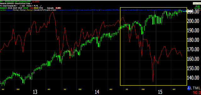
hyg 1HYG vs SPX. This can't be construed as positive for the market in any way and once again, my biggest fear is that the market comes down before we are able to establish good entries in longer term trend shorts such as NFLX, IYT, market averages, etc.
As for internals tonight,  there's no Dominant Price/Volume Relationship for the 3rd time this week. The S&P sectors show 6 of 9 in the green, while Morningstar groups show 188 of 238 green, a bit more toward the overbought condition than previous days this week, but not an extreme that would move the market.
I don't expect things will be much different until/unless we get a sharp head fake move, but I have to wonder at what point traders flee a sinking ship with Greece Friday looking set to default, causing untold side-effects.
Index futures charts look very congested and dull, I suppose we'll just have to look for the set-ups and whether or not the market cooperates will be an added bonus.
If anything changes in futures tonight, I'll put out an update.

NFLX Trade Set-Up

After watching NFLX every day for months now, it looks like we are finally moving toward a workable trade set-up. I try not to post information that isn't useful and in NFLX's case, for the most part there hasn't been too much useful recently as you'll see below, but I believe that's starting to change.

Remember that the market's direction is the greatest influence on any individual stock on any given day, in fact  about 2/3rds of the stocks in the market will move directionally with the market, This is why our broader market theory and movement is so essential to Trade Set-Ups and Trade Ideas.

NFLX vs. the NASDAQ 100
This is what I mean.

As for NFLX, there's already long term deterioration there because it looks to have been in the end stage of a top and a rather large one, the hard part is the timing unless you are very patient with wide stops (As I tend to be).


To know where you are going, you have to know where you are. Looking at the daily NFLX chart you can see a number of features that tell you where you are. From left to right, the red "C" is a "Capitulation" or selling event usually marking the end of a stage 4 decline. Note the gap down and high volume-selling event. After this prices tend to drift a while before any new stage 1 base is created which you can see at the white #1 and the rounding bottom (yellow arrows). Next is stage 2 mark-up or rally which holds a trendily pretty well and then the warning that the trend is about to change as price peels away from the trendily to the upside which starts a large lateral, choppy Broadening Top.

During stage 2 through 2013 there was a +300% gain on the year. After that during the LARGE stage 3 Broadening top, there was a 6% loss for 2014,  so the "Change in Character" warning was very useful.

Even with a large Broadening top (and they rarely look like they textbooks in real life), there's a head fake move above the top, this tells technical traders that it wasn't a top or it is nullified and they are free to resume chasing prices higher. Wall Street needs this demand to continue selling in to demand (including short selling). Notice how the head fake move above the top in yellow looks very strong although it's really not that much of a move. From the Broadening Top's upper trendily it's only about 8%. That's the kind of look needed to change psychology from thinking NFLX is topping to believing it is still in a bull market, the same reason counter trend rallies are so strong.

For those of you who have seen these tight , flat ranges with clear resistance areas, you know they are high probability head fake set-ups,  a last chance to leave some poor bag holders with shares of NFLX at the very high just before it moves to stage 4 decline.

A head fake move in any asset and any timeframe happens about 80% of the time, the more noticeable the resistance/support or other technical feature, the more probable there will be a head fake move. The more popular the asset, the more likely there will be a head fake move. This is what I've been looking for in NFLX and to get it in NFLX, it's very helpful for the market to do the same (see the NFLX vs NASDAQ comparison above) and this isn't anything unique to NFLX, it's any asset on our watch list as a potential trade.

Again the concept is simple, no one wants to risk buying NFLX with the market flat and NFLX flat, but give them a break above resistance and they'll chase that all day, giving smart money demand to sell or short in to. This is what I have been watching for every day in NFLX as well as many others.

This is a bit detailed, but my Custom DeMark inspired buy/sell indicator.

More importantly the NFLX daily 3C chart showing accumulation at the stage 1 base confirmation in to stage 2 mark up, distribution in to the stage 3 top that lost money through 2014 very much unlike stage 2 in 2013 and the move above the Broadening top with NO 3C confirmation; it didn't even make a slightly higher high,

Here's the same chart without all of the notation.

In other words, the big picture view of NFLX is one of a large top and lots of distribution.

As for the entry, the last time we had an earning's based pop we could see it would be a short set up, we waited nearly a month for that set up and entered at the exact high on 2/26, Trade Idea: NFLX Short

Since NFLX has put in another earnings gap up on bunk earnings, with all kinds of accounting gimmicks, Wall St. wasn't fooled. This 60 min chart failed to make a higher high and never recovered from the Feb 26th divergence.

Recently the tight range I showed you above has seen deterioration, Wall St. selling it and this has moved to stronger timing charts. The big picture daily, 60 min charts are already in place, it's the timing now.

15 min chart deteriorating which has been interesting, but not useful, just the right direction.

 However very recently, this week in fact, the timing charts' trends like this 3 min have been showing increased activity, this has grabbed my attention. The only thing I've been looking for now is the head fake move as Wall St. will use that to sell in to,  the entire point of Technical analysis is to follow what smarter money than us are doing.

It wasn't until today that an intraday 1 min chart started looking like NFLX is getting ready to make that head fake move and considering the market evidence near term, it seems well timed.

I'm setting alerts for a break above the $630 area and will look for intraday distribution on that break. We'll confirm distribution in to any such move and if so as I fully expect,  That's our entry. Let the trade come to you, get in at the best price (for a short) with the least risk and seeing that head fake moves are the last thing we tend t se just before a reversal, it also gives us the best timing.

Since I've already opened NFLX equity shorts meant for longer term trends, I'll likely be interested in put positions on the discount, however you can use the information any way you se fit.

This kind of chart is not unique to NFLX, I wouldn't be surprised to see quite a few go off around the same time.


Market Update and Leading Indicator Update

The market and analysis is getting more and more interesting, rather I should say challenging as it's a lot more like looking for clues in shadows or footprints rather than as normal, in the day light, but that has the ability to teach you new things to add to your tool kit. 

There are two very unique trends and they fit right in with our The Week Ahead scenario, filling in this area...
The area I'm talking about is where the white row is (Chimney/head fake )

 Taking a quick look at Leading Indicators, I think the The Week Ahead post from Friday and the subsequent refinement of that theory is as close as we get to a solid theory and one that works for us as well.

There are some very interesting things going on in Leading Indicators that again suggest not only our theory is correct, but our ability to use it to our advantage is strong and timely.

Starting first with the intraday market update of the averages, they have been somewhat frustrating as they not only diverge in relative performance, but on even the intraday charts.


 The intraday SPY has the best looking chart right now suggesting it will move back to the 4212.50 catalyst area that should get something going on the upside. However as you'll see below, I believe it is running out of time and that's not only from the Greek default perspective less than 48 hours away, it's from the charts' perspective.


The IWM intraday 1 min chart we'll be generous and call it "in line" although it's not, it's also not clearly negative as it was earlier today.

And the 1 min QQQ chart is in line which is interesting because there's such a disparity between the SPY and QQQ intraday with the IWM (3C charts) in the middle.

Since the May 6th/May 7th accumulation area, you can see what the underlying trend has been ...QQQ 5 min trend, so the Week Ahead theory actually fits quite nicely as it would require underlying weakness in to price strength, that's the entire idea behind letting the trade come to you.

As for the TICK data, it's not particularly enlightening, but it does give you a good bird's eye view of the mechanics of internals on an intraday basis.

These are the TICK trends today, you'll see how they line up with the market movements intraday, quite choppy really.

And my custom TICK indicator vs the SPY since yesterday with the lows and highs we called out for intraday moves. Note the SPY/market looks to be building up here for additional upside gains.

LEADING INDICATORS...
Right now there are only 3 that I'm very interested in, short term and what comes next.

Short term this is my custom SPX:RUT Ratio in red vs the SPX in green and it is pointing toward short term support for the market, the same as TICK and the SPY chart above.

This is 30 year YIELDS (red) vs the SPX (green). Remember yields were one of our BEST leading indicators acting like a magnet pulling equity prices toward them as yields move opposite treasuries. This indicator stopped working as Treasuries were sold off en masse, but recently it has started working again as you can see above, it has led the market both lower and higher with an additional leading dislocation higher, also in line with some of the charts above for near term trade.

This is where it gets interesting. I have wondered "How long can Yields work as a Leading Indicator" and as you might remember, I'm expecting TLT to lead a counter trend rally. Whether real or imagined (it doesn't matter as everything in the market is based on perception) any downside in stocks as I'm ultimately expecting soon and upside as I'm also expecting soon in Treasuries, will likely be viewed as the "Flight to Safety " trade is active again. This is the normal relationship between stocks and bonds, stocks see flow in a risk on mode, that flow moves to the safety of treasuries in a risk off environment.

Again, whether real or imagined, a strong move up in Treasuries as I have been expecting as a counter trend move and any weakness in stocks as the Igloo/Chimney top completes, WILL GIVE THE IMPRESSION (again real or imagined) THAT THE FLIGHT TO SAFETY TRADE IS WORKING AGAIN. 

This may ultimately fail in Treasuries with a lower low as it is failing in the $USD, in fact I expect it will, but for now, what happens when Treasuries rise? Yields fall and as our Yields leading indicator that IS working now sees yields fall, which way do stocks move? Remember , as a leading indicator, Yields pull equities toward them like a magnet so a rally in Treasuries/TLT sends yields lower and stocks are pulled toward them.

THIS IS WHAT I MEAN ABOUT FINDING THE ANSWERS IN THE FOOTPRINTS...

As for TLT and the reversal process of a couple of days as I have expected, I updated the initial start yesterday after closing the TLT put position for a near 40% gain. Today, TLT , despite it being down, continues to build its positive divergence and the one I ultimately expect leads to its counter trend rally (see last night's Daily Wrap for charts)...

 TLT 1 min at a new leading positive high

TLT 2 min migration also at a new leading positive high.

TLT 3 min also leading positive.

I'll check Treasury futures as well and update them later. I don't think the long trade is quite ready yet as the reversal process is still underway, which is also interesting because it tends to seem like it all lines up with the expected short term market move and failure which would be a perfect time for the "Flight to safety" trade to begin.

Finally, earlier I showed the HYG charts and their refusal to help lift the market, however there's something worse. HYG/HY Credit is one of our best leading indicators and one of the best signs of what institutional money is doing, this is why it is one of our top leading indicators. Take a look below...
HYG in blue in near lock step with the SPX in green at the green arrows as mentioned earlier, but look at what happens to the market when HYG diverges to the downside as it did Friday the 22nd upon the market re-opening Tuesday the 26th... Now look at the current leading negative divergence in HYG and this is just a near term one, don't forget the larger ones posted earlier here, Message of the Market (toward the bottom of the post).

It seems the major trouble that HYG has been promising is getting an ignition from the shorter term charts that are done supporting the market. As I said earlier and I apologize for the language,  but smart money is getting the hell out of Dodge.

To add to all of this, the protection against a downside move and one of the assets I'd like to open a long position in is VIX short term futures and while I wouldn't say that I'd open a time sensitive option position just yet, I would say that they have built an impressive divergence and I'd sure hate to miss that trade .

We'll scalp what we can in this choppy nonsense, but as I said earlier, my greatest fear is that the market comes down without having had the chance to get in to additional short positions, although we have built quite a few.


Message of the Market

There are certain watch list assets that look horrible on numerous timeframes, but for the sake of a better entry, less risk and not sitting in the asset as it moves sideways for 6 months as many have, a solid head fake move putting an acclamation mark at the end of a top is the best entry area.

One of these assets that has been on our radar with 2 previous trend entries at better levels as a core/trend short would be transports, they look horrible vs. the market which in and of itself is a message of the market. I recently posted the difference between Industrials and Transports (Dow theory confirmation/non-confirmation), it looked like this...
 The Dow Industrials are on top, the Transports in blue and the difference between them in red. You can see clearly with the custom indicator I created (red) that Transports have diverged significantly away from Industrials. Dow theory would say this is a screaming red flag for the market and I'm not so sure I'd disagree.

However even a dog asset must bounce. Look at the recent string of lower highs and lows in the $USD to be followed by the strongest 7-day move in near 8 years, but with yesterday's 2nd weakest 1-day move since March 2009, it isn't meant to last. These are the kinds of set-ups we can use and why it has been so important to me that we get one before the market comes apart, whether that be on Greece, the F_E_D or just of its own weight.

The daily chart of Transports looks like this...
 The best short areas are in the red box where we have had 2 previous entries. Two support lines have been broken and while looking weak just as the $USD did before it's counter trend rally, Transports have put in a divergence that is strong enough to give us a reasonable entry as a trend short, of course shorting it in to price strength as everything else is flashing major weakness.

This is that positive divergence in Transports that has had me hopeful we'll get a better price a bit higher and we can use that to open a new or additional longer term trend short. At any other time over the last few years a divergence this size on a 30 min chart would be good for 2 weeks of bounce before it even started to lose momentum, much less show signs of falling apart.

Something pesky keeps happening...

This is Transports on today's early strength on an intraday chart. All week any price strength in the market or numerous watch list assets has been met with immediate distribution just as you see above in Transports.

 It has now gotten to the point in which the 15 min chart (the timeframe just below the 30 min positive divergence that is sponsoring this bounce) has started to go negative which means it won't be long until the 30 min chart, or what we'd call, "The gas in the tank" runs dry and Transports slip lower.

Hopefully we can get a decent, low risk entry in Transports and numerous other assets before that happens.

The way this is playing out in the market is as follows...
As made clear last night, I view this flag and the SPY $212.50 level a catalyst for pushing these broken assets higher , at least high enough to make entries in them low risk/high probability, but once again like the last 3 days (this week)...

 Like yesterday and the day before, the intraday SPY chart has shown a negative divergence and price has followed it lower intraday.

The same with the QQQ

The same with IWM.

I have to admit, expecting a head fake move to the upside to fill out the chimney space, I suspected the invisible hand that moves the market (short term manipulation) would go to the first, #1 go-to asset when you need to push the market higher, but just don''t have the strength or a decent short squeeze and that is HYG- High Yield Corp. Credit.

I wrote just days ago that I suspected HYG would come down a bit making it less risky for them to accumulate enough to help the market along...I WAS WRONG.


 HYG IS FOLLOWING ITS LONGER TERM/STRONGER DIVERGENCE LOWER.

Below is the SPY in green vs. HYG in red. Remember HYG is almost always the first asset of choice for ramping the market higher and the market follows it in near lock step...
 HYG this week making lower lows, not helping on the upside.

 On a larger scale HYG making significantly lower lows.

And on a weekly chart, although I find the one above this most interesting for our immediate purposes. HYG is already in a downtrend vs the SPY/SPX.

The thing is HYG is not just a tool of short term manipulation, in fact the only reason it works for short term manipulation is because High Yield Credit is one of the largest institutional "Risk On" assets, you don't find many retail traders trading credit. When the market sees HY Credit moving up, it assumes institutional money is in a risk on posture and the computers buy, however if there's one thing HY Credit is telling us, one message of the market,  it is that institutional money is getting the hell out of Dodge.

EIA Petroleum Inventories Post 5th Consecutive Build

Yesterday before entering Trade Idea: Adding to USO July 17th $20 Put I posted that I thought there might be a leak in the API data from yesterday after the close showing a build or in the EIA data which we have seen what appear to be leaks in the past on numerous occasions.

The EIA (DOE) oil inventories came out at 10:30 showing the 5th consecutive draw (unlike API) at -1.95 mn bb on consensus of a +818k build. Hearing the data alone, one might think oil rocketed higher; point in fact it did , briefly. That was short lasted though as production levels were revealed to have hit a new cyclical high and as we expected yesterday upon adding to the USO put position, oil moved lower.

This morning's EIA inventories sent USO briefly higher and then to a new lower low since our additional put position entry yesterday.

I suspect someone knows something that is going to be beneficial for crude and that's why we have this base and while the put position is in place because I expect near term movement lower, the reason for oil moving lower I suspect has nothing at all to do with a bearish outlook for oil, quite opposite in fact.

One of the big mistakes of Technical traders is to assume higher prices and volume mean smart money is buying, the facts as we have observed them is they buy in to price weakness and sell in to price strength, thus the current decline we are riding with puts most likely has less to do with a bearish outlook for oil than it does a bullish one. 

This is the reason for price to fall back within the base and as it does, why we want to look for additional signs of accumulation of lower prices-that's smart money at work.

Interesting Market Move...

Ironically last night's Daily Wrap started with this very paragraph...

"Since Friday, we haven't had any divergences of significance in the averages, however the Rounding/Head Fake top price pattern or "Igloo with a chimney", seemed to be the most appropriate probability and since then as this small flag in the averages (especially SPY) has developed, it has become a catalyst for such a move. I still think it likely needs to be done before whatever happens on Friday in Greece actually happens."

A little further down the post the price pattern is expanding upon...

"This flag-like price pattern simply needs a breakout above SPY $212.50 and that should be the catalyst to fulfill the remaining top price pattern. I have little doubt that we'd see the necessary distribution to confirm a head fake move"

With Greece's D-Day almost here, amazingly this area identified as the catalyst to get this entire top ended, just broke above SPY $212.50...

From just a few minutes ago...

 SPY breaks above the $212.50 level from last night's post. This "should" get us on our way, not a moment too soon with Greece looking.

You may recall there were some divergences in Index futures as well that suggested the same, although very poorly formed, they can also be found as well as "what comes next" lower in the Daily Wrap.

 The intraday SPY 1 min chart looks pretty good, in line from this perspective, but the reason my biggest fear is that the market falls apart before we can get in to new or add-to positions such as the Transports trade I posted an update for yesterday is because when you look at this very same chart within context...

It doesn't look so good.

Ironically, that's exactly what you want to see in a head fake or false move, I just demonstrated it in the USO post on the USO breakout above its base's trend line, a very clear leading negative divergence as it did so.

So now I don't have to waste a lot of time going through hundreds of charts and can focus on the ones that are trade set ups. Hopefully this holds out a bit better than recent intraday attempts.

USO Follow Up

We entered an additional oil position yesterday (add to)  Trade Idea: Adding to USO July 17th $20 Put which is doing well so far. You probably aware we have several different timeframes we are looking at for two very different trades, one the current July 17th USO put on a pullback and eventually the finishing of the base for a longer term trend trade long USO. The pullback trade dovetails in to the larger base breakout trade.
 The down trend channel back in to USO's base area and the last week's bounce within that channel. I expect we'll be moving to the bottom of that channel and we should start to see a constructive pullback (accumulation of lower prices) to set up the next trade, USO long.

 This 15 min chart could be representative of the failed breakout in USO which was never meant as a breakout, but rather a bull trap/head fake. The leading negative divergence is sending USO lower, thus the trade has good probabilities.

 This would be the last week's bounce inside the daily chart's channel above, which failed sharply yesterday as seen above.

And thus far this morning, we have good intraday confirmation of USO's leading negative (near term) divergence or price/trend confirmation.