Monday, January 30, 2012

PEIX Still on the radar...

One thing I've noticed just before or at major market turns is the number of "Cats and Dogs" trades that pop. Cats and Dogs are low priced, often low volume stocks, they are not pink-sheets/OTC/etc.

I believe it also has to do with extremes in investor sentiment, which is most often a contrarian indicator, for example, when a high percentage of dumb money is bullish, it often marks a top in the market. As per last night' post, the bullish dumb money sentiment is very high and the bearish dumb money sentiment is very low. Human nature being what it is, a lot of traders will see a bullish market and feel like they missed it, so near the top, they tend to want to get involved, but do they buy quality stocks with high P/E ratios? Generally no, they look for a sale, something cheap as most investors think that the number of shares they can buy will increase their returns rather then focus on the percentage gain that can be achieved with a quality stock.

While PEIX may or may not be a stock that falls in to the above described category, it certainly is a C&D stock and these stocks can really move, albeit you are best off taking profits quick as they tend to evaporate just as quickly. That being said, I like PEIX's chances and a simple trade alert can offer a low risk trade with the chance of very high returns in a short period of time.

 This is the long term PEIX daily chart, I wanted to show this example because it features a bullish ascending wedge. Almost all technical analysis books will tell you that when the wedge reaches its apex, there should be a bullish break out and the wedge should retrace its base, that would be a target of about $7.00. However after observing hundreds of these wedges, both bearish and bullish, I've noticed that they are a lot more likely to form a lateral base or top then they are to breakout. Some will even stage a false breakout/breakdown. PEIX is such an example. Note the lateral base, this kind of price action (or in action) is often an accumulation area.  PEIX did make a run and has formed a bullish continuation triangle consolidation.

 To illustrate the gains in these C&D trades, I took the average price during the accumulation period (it's actually around $.31) and have shown the move of 440% on an intraday high and 338% on a closing high, the point is, they can really run.

 Here's that accumulation period.

 After initial confirmation (green), there was profit taking/distribution (red), since we have seen some accumulation within the consolidation (white).


 We saw a quick breakout (yellow box) and that saw distribution, so it was a head fake. Most amateur traders will give a trade one shot and if it doesn't work, they walk. Professional traders will give a good looking trade multiple shots as long as they keep their losses small, they can do this. This 5 min chart also shows some recent accumulation after the head fake move.

 The 1 min chart confirms everything seen on the above chart.

 A 3-day Trend Channel has held the major up and down trends, that would include a downtrend of -95% and an uptrend of up to 440%. The current Trend Channel stop would be $.93, which could be used, but a tighter stop can also work.

If we treat the entry as a swing trade entry, then Friday made the last lower low/lower high and is our pivot. The next candle (Today's) is the signal candle. The idea would be to go long on a breakout through the signal candle's highs ($1.06 is today's high, so a  move to $1.07). Then simply place your stop just below at either the pivot or signal candle's low ($1.02 and $1.01 respectively), but we want to stay away from whole number stops as they are WAY too obvious for a shakeout/stop fishing expedition. I would consider a stop of $.97 or so.

Being a speculative trade, I wouldn't invest more then 10% of my total portfolio value before margin and maybe less.

For risk management and position sizing, lets assume a portfolio of $10,000 and our investment of 10% of portfolio ($1,000). At $1.07, lets call it $1.09 just for slippage, we can buy 917 shares. I like to keep my loss on any one trade at 2% of portfolio and on spec. trades, sometimes less, but lets assume 2% ($200). With a stop at $.97 and we'll call it $.95 for slippage, we have risk of $.14 (entry @ $1.09 /stop at $.95=$.14 accounting for slippage). Multiply $.14 (risk) by 917 shares and our risk on the trade is $128.38 which is about 1.2% of portfolio.

Our potential upside based on the consolidation and not past gains, is around $2.15, from an entry of $1.09 that's $1.06 in profit. So our reward:risk factor (which should never be less then 3:1) is about 7.5:1 or double our minimum r:r factor. That makes PEIX an interesting trade.

Financials/ Energy/ Technology...

 When I look at today's intraday action, I get a feeling that is best described with a picture rather then a thousand words...


Financials...

 You know what usually happens when we get alignment between the 15, 30, and 60 min or daily charts. My gut feel is that the action from the new year and slightly before has been one big set up. XLF's 15 min hart leading negative, this is usually bad enough, but considering the length of the divergence since the accumulation area in white, we would expect it to bleed through to the longer even more important charts.

 XLF 30 min, not just negative, but leading negative with huge bullish investor sentiment (contrarian indicator)-remember the purpose of a bear market rally.

 XLF 60 min

 Just for some confirmation, FAZ, 3x leveraged financial short should look the exact opposite... FAZ leading positive 15 min.


 FAZ leading positive 30 min

 FAZ leading positive 60 min.

 And FAS? The 3x leveraged bull financial ETF should look like XLF and the opposite of FAZ above. 30 min leading negative.

FAS 15 min leading negative

Energy/XLE

 XLE 15 min leading negative

 30  min leading negative

 Daily  XLE negative

XLK-Tech
 15 min leading negative

 30 min leading negative

60 min leading negative.

Market Update

 The Euro has been range bound, not sure it will give much more upside.

 The Dow still hasn't filled the gap and is showing some distribution here, it may still fill it, but that seems to be all the averages want to do, it's not risk on.

 The R2 k is showing the same.

 The Q's filled the gap but have been content to do nothing since, up .05% on the day.

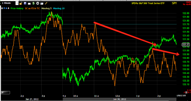
And the SPY is showing the same.

Everyone is so use to the market filling gaps diligently, it may be worth a shot to short one of the averages, maybe the SPY with some puts with the intention of taking profits on the gap down we likely will see in the a.m., but I said "intention", because I think it is likely with everyone conditioned to the market filling the gap, that a trailing stop would make sense for 2 reasons, 1) the unexpected gap that doesn't fill, which would be a very bearish breakaway gap and 2) what I mentioned earlier about taking advantage of extremely high bullish sentiment while they still have it, as I suggested, that would probably mean a sharp move down and that fits with the break away gap theory.

RES Trade Set up (short)

This looks to be a fat juicy short setting up, we want to catch them before, not chase. Here's the idea behind the trade...
 This is RES on a daily chart, I believe this could be an excellent trending trade, therefore it is worthwhile to be patient and let the trade come to you. It is also much easier to understand the trade when you remove the noise to reveal the trends by using a 5 day chart. I might even make my risk management, entry, trade management and exit plans based on a 5 day chart, we can't usually do that, but with a trending trade we can and it probably is the most effective way to view RES as to not get caught in emotional decisions.

 A look at a 5-day chart makes the top much more obvious, it also reveals the 4 trend stages and makes them more obvious. As you can see, RSI has gone negatively divergence in to the top (stage 3) and the recent volume spike has come on a break below the top's support level. What do we know about tops? We know that most traders believe that once a top loses support, it's time to short. Wall Street has used that century old idea against traders to shake them out, we know that after a serious break of support, we tend to get volatile shakeouts back above former support (now resistance) and it knocks traders out of their shorts. These are short term manipulations by Wall Street, but they can't change the larger picture of a stock that is clearly topped out and almost ready for stage 4 decline (where we are likely to find the trend and easy money).

 Stochastics is an oscillator so it is best used in a range bound market, you could call a top a range bound market, just extremely volatile, so once again on a 5-day chart, the negative divergence in stochastics becomes crystal clear.

 Using my X-over screen to prevent false crossover signals on a 5-day chart, we see a clear sell/short signal has developed. We also see that the volatility in the stock usually takes counter trend moves up to the 22 bar (each bar is 5 days) moving average, and that's where we see the long upper wicks on price candles (resistance and higher prices being rejected). So now you have some idea of where a stop would need to be placed.

 I created an ATR indicator and you can see it trends well during the uptrend, however (5-day chart) during the top, we see extreme volatility that we would expect to se during a top and in some cases a bottom.

 The 5-day Trend Channel also has held the downtrend thus far, it also confirms that a counter trend move should be halted around $20, the same as we saw on the X-over layout. This means this we can ease/phase in to the trade in smaller pieces, but near the Trend Channel is likely where the bulk of the position should be initiated. Whether it can make it there will largely depend on the overall market tone.

 The 2 day 3C chart confirms the uptrend as it should, but goes negative at the top and is now leading negative, so we know smart money is already on the short side of the trade.

 A look at the hourly chart confirms distribution into the top.

 A closer look at the same chart even shows a false breakout to a new all-time high on a negative divergence.

 The 30 min chart has been in confirmation largely, except for a few divergences like the positive at the October lows which are also support right now.

 Here the 5 min 3C chart does a great job, but also shows what we would expect to see after a break down, short term accumulation in white as they get ready to shake out shorts on a move up, this is what we want, to short in to strength.

 A closer look at 2-3 days of accumulation, so it appears the move is set, but it's nowhere near enough accumulation to worry about this changing trend to a bullish stance, just enough to shakeout longs on a move probably close to $20.00

 The 1 min chart shows the same.

So here's support at the white trendline from October. The first area of interest is at $18, you could consider starting to phase in a short position there, but I wouldn't go to more then 25% of the intended position. Near $20 is where we will probably want to add the bulk of the position, maybe 50% (to bring it to 75% of the intended position). I personally would add the last 25% on a break below the October and recent lows.

After that, RES should be ready for a better trending environment.

Risk Assets/ Credit vs the SPX

I haven't updated our R.A./Credit layout in a while, I meant to Friday as a move in credit was highly suggestive that the market would see some downside this week. Lets start with Sector Rotation first as it may make some of the following charts more useful.


 On a longer term basis, you can see Financials at the bottom in green coming in and going out of rotation, as noted over a week ago. Tech seems to be at a critical point as well where it may be maxing out in rotation, Energy has certainly struggled, and those are our 3 most important market industries.

Over the last 2 days, Financials have fallen off hard today, indicative of a more risk off environment. Utilities saw some early strength, also risk off as they are defensive, as well as health case and staples, all defensive. Energy is clearly under pressure from a declining Euro (especially from Friday's levels). Industrials have fallen off which makes sense given the Dow's performance, even as the most defensive of the 4 main averages. It should be noted that the Russell 2000 is today's biggest laggard and thereby the biggest indication of a risk off mood.

Of the 3 most important groups, Tech is the last holdout and why the NASDAQ 100 is the best performing of the averages today, largely being supported by AAPL.


 Intraday commodities are underperforming the SPX.

 As you can see in a risk on environment such as what we saw during 2010's QE2, commodities (brown vs the SPX green), a risk on asset, tracked the SPX very well, they also topped first in 2011and led the way to late July's plunge. We have seen major trouble since the fall of last year in commodities, which led us to believe there was a slow down brewing in China, a few weeks later, data confirmed manufacturing and services had entered contraction, making FXP an interesting play on Chinese weakness. There's more bad news out of China that I will cover later, we may have some individual names that are worth a look rather then the broad FXP. Right now there's a strong dislocation between equities and commodities, not a healthy market as you can see compared to the past.

FXP...
 A bullish wedge in FXP, the rule of thumb, "Wedges retrace their base". However we also may get a gap fill making FXP a decent quick swing trade if we can get a better risk profile entry.

FXP showing accumulation, so any pullback should have more then enough support to make an FXP swing trade (maybe longer) an attractive play.


 Above are rates (red) vs the SPX (green), rates act like a magnet for equities, as you can see on Friday rates hit multi-decade lows and the market soon followed, they are posting a new low today and diverging from the SPX intraday.

 A little longer view of rates vs the SPX, note they topped  in white followed by the SPX topping in yellow, however rates are still leading much lower.

 Long term, there's a severe dislocation between the two and one of the reasons  believe the market has been in an exceptionally dangerous position recently. Again, rates led the July market sell-off as well as the initial October rally top.

 The legacy arbitrage correlation between the Euro and the SPX is fairly clear here.

 In Green during the fall, they were correlated very well, that correlation has dislocated (I do not believe it is broken) over the same period in which the market has looked very dangerous, the correlation would suggest quite a bit of downside for the market. The Euro (orange) is also at a resistance level marked with a white trendline.

 Here is Friday's move in High Yield Corporate credit (credit leads, equities follow), it was selling off all day (much like the ES VWAP chart from last night's post), but especially in to the late day pop on Friday. The result...

 Here's today's drop.

Here you can see my custom financial momentum indicator in red and where financials really started to go out of rotation. With nearly 1/4 of the SPX weighted with financials, it can't go far without them.

As the sector rotation charts showed, Energy and Financials are starting to come unglued, it's just a matter of tech now. As I mentioned in last night's post, with investor sentiment so bullish, I would think Wall St. will want to take advantage of that before sentiment shifts, which in my view would require a pretty fast and nasty downside move.