After looking at some of your emails and stepping back and taking a breath, I see things a bit differently , the conclusions still lead to the same place, but I think you have to have an idea of where you are before you know where you are going.
It probably started early this week, I saw some things that I didn't expect to see and later this week I saw something I really didn't expect to see. Since then, a lot of charts and pieces of the puzzle have been falling in to place. Have you ever thought about buying a certain type of car and all of the sudden you start to notice that car everywhere you drive? For me, seeing these two things was much like deciding on the car to buy and after, the charts that came were like seeing that car all over on the road.
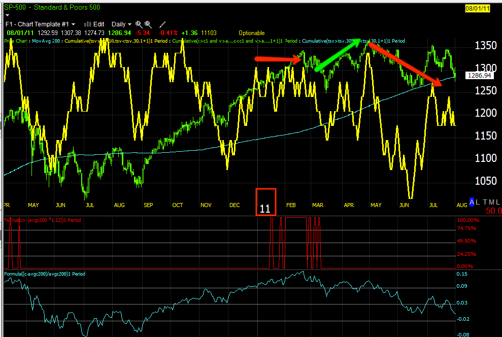
My expectations were for a pretty powerful move to the downside, but rather short in nature and that it would be followed by a VERY strong and convincing move to the upside to get retail wildly bullish which Stocktwits just saw the most bullish sentiment in their history this week after just 2 weeks ago having a solidly bearish sentiment.
You may recall, I said I thought the upside move would be so strong that many of us would be emotionally swayed by it and that new highs in the market were absolutely possible.
Most of this analysis was based on two very distinct trends, especially in the futures. Specifically the Index Futures all had 1, 5, and 15 min negative charts, the 30 min chart was like a dividing line where nothing was positive or negative, but perfectly in line with price. The 60 min and 2 hour charts were very strong, this implied to me that the accumulation for the second of the two moves, the bigger, stronger upside move, was already in place. The 1-15 min charts were already negative for what I expected to be a shorter downside move; this downside move in my view served only 1 purpose, to act as a booster for the upside move. For instance, retail would be bearish as they were and short, when the trend changed to the upside, they'd be the short squeeze that starts the initial move to the upside, the downside move would also see some accumulation, but that would be in the 1-15 min charts as the main portion on the 60 and 120 min charts was already there.
I thought maybe the downside move would start the week of July 4th, but because it was such a chopped up week, this week would be a strong probability as well. Then I started seeing something I didn't, the 30 min charts that were all in line started turning negative and blurring the line between the downside move that was solely a catalyst to propel a stronger upside move. Since then even 60 min charts have gone negative.
It seems to me, the initial downside move that I expected did in fact start to move toward that to be followed by an upside move, I've shown you examples the last 2-days in VXX and market average divergences. At the time the point I was making is where ever the first divergence appears, after a reversal, price tends to move far past that initial divergence. I know that's confusing, but without finding the exact posts I can show you some of the exact charts and I'm sure you'll recall as this was just yesterday and the day before. Only this time, there's an obvious trend among risk assets and it looks like a few things changed very quickly.
The IWM, at the first negative divergence in the new run, this is where I was expecting a move down before a final move up; divergences suggesting that was the plan were there.
Ever since the market has moved higher it has moved to the kind of extremes I talked about in the second expected move which was the very powerful move to the upside (what I expect to be the final move and the place to load up the shorts).
The leading negative divergences among the averages on this extended move is what I expected to see on the uptrend move to extreme highs and the IWM made all time new highs which is something I said was likely to happen, I said they needed to really convince people to be bullish, look at Stocktwits, they've done it.
Just instead of the way I expected, something changed on the 8th, it's as if the plan was there, but was suddenly shifted to do away with the downside move and just move to the second part, the strong upside move. There's what seems to be clear evidence for this, keep looking.
QQQ was in an area to reverse to the downside-this is a (like all) 15 min chart so it's a serious signal, it stuttered badly around the 8th as if it would move down and then price continued up and the 3C charts in deeper leading negative divegrences as expected on the eventual move up. You may even recall I posted several charts, the reversal process had started and was nearly mature,
again, then something changed. These charts are just things I've put together after, I haven't got to the sudden change.
This move up is everything I described weeks ago, the only difference is I expected a fast move down just before.
The SPY 15 min and the area it would have to pass to change sentiment, the apex of the triangle and resistance, look how leading negative 3C is, lowest on the chart.
The same SPY chart, "A" is accumulation, not a lot, enough for the size move that would reverse at the 8th, for the size, that seems very practical, "B" is the divergence expected to turn us down on the faster move down followed by a longer or stronger move up, "C" would be the head fake resistance and gap resistance that needed to be crossed and would have made for a perfect head fake for a reversal move down at "D".
Just a look at the SPY 15 min without all of the drawing so you can see the size of the negative divergence.
The point here is all of these different assets have the same divergence in to the 8th, similar action after and worse negatives as price moved up as we expected from the eventual move up that I described as likely so powerful, many of you would be scared by it even with what you know and that was 3 or 4 weeks or more ago?
Again the 8th
VXX which moves opposite the market fell as it should and
as expected and the 8th would have been the upside move (down for the market), the divergence is clear there and since then a stronger leading positive as was expected in to the final strong up trend.
A different managed ETF and leveraged , but moves the same as the VXX, UVXY, the same positive at the 8th suggesting the market downside move expected before a much stronger upside move and we expected to see a stronger leading positive hear in to that move as we see.
XIV is the inverse (opposite) of VXX and a different company runs it, yet on the same timeframe it gives the same signals, at the 8th it looks like down, ever since the divergence is worse -and this moves with the market.
XLK, the TECH sector has the same pattern, again right around the 8th.
Transports which are crucial to any change in the market have the same pattern.
What I've shown you so far is the "effect" and a lot of charts showing the same thing, "it looks like something may have happened". I haven't reached the smoking gun yet, but I'll bring you closer to it.
Treasuries "typically move opposite the market, but we've been seeing treasuries be used a lot (specifically TLT as it is 1 of 3 arbitrage assets that can be used to manipulate the SPY price) in intraday manipulation or "Pulling the lever", HYG too.
Look at the very sudden negative leading divergence in TLT and the huge drop just prior to the 8th, this would be a market positive or help the market on the upside. Again, not a smoking gun, but it does look like someone changed their thinking or schedule quickly and needed assets to help accomplish the new goal.
I believe that was to skip the downside move and move right to the upside move. The accumulation first gather at the start of this trend up was no where near enough for a trend this long, that is why other ways have been used to move the market higher. Look at TLT just before the drop down.
There was a pretty large accumulation area in TLT and TLT moving higher pressures the market lower, but suddenly and long before the positive divergence could play out to the upside, there was a fast leading negative divergence that led TLT down the next day on the chart seen above this one.
TLT lower is a positive arbitrage for the market, the market didn't have the initial accumulation needed to take it higher, another way had to be found for whatever reason this change of course was so suddenly decided on.
This is a smoking gun as far as the change and very rapid from the quick move down expected before the strong uptrend, the move seems to have been cancelled and very suddenly judging by this chart, furthermore, TLT is one of the main assets that would need to be utilized to send the market lower!
You probably recall me showing you this chart of the SPY this on July 9th in the
Daily Wrap
The first thing to note is the SPY was already completing the reversal process, the head fake move the next day in yellow is almost always the last thing we see before the actual (downside in this case) reversal, the next day in red was the 8th.
The more important thing to note is what I pointed out in several Daily Warps and market update posts this week, look at the gaps! The day time range is very small with all of these dojis and stars. All of the market's gains were made in the overnight, low volume session using the AUD/JPY to drive the market higher. There was no intraday strength so another method needed to drive the market higher after what seems like a very sudden change in plan.
In this post from July 11th, I referenced the above post and showed you exactly how the market was lifted using the AUD/JPY in the overnight session to lift the market on a gap,
The Carry Won't Carry Us.
After I posted last night this post was coming and encouraged you to look, one thing a member sent was another market analysis service arriving at the exact same conclusion in their video out today, I don't like using other people's research, but this is the same thing I pointed out early in the week, as they also said, the gaps or overnight session is where all the strength came from where volume is low and it's easier to manipulate higher. Also they noted the same thing, the doji's and starts or the open and close very close to each other meaning no regular hours strength.
The last thing they said, which is EXACTLY what I said the entire purpose of the strong move to the upside would be for, was to (in their words), "Set up the Mother of All Shorts This Week". This language is almost EXACTLY what I said about the move to the upside, the language I used about even our own member's being frightened by the move and to create a hugely bullish environment which at the time seemed almost impossible to imagine when I posted the trend expectations. This was the reason why and that this move would be the ultimate area we were looking for, even if you decided to stay in cash until we reached that area and all of this posted weeks ago.
One of the main and first smoking guns for me was the AUD/JPY itself.
This 60 min AUD/JPY chart shows the very sudden move down in the pair on the 8th, this is not typically bullish stocks,
remember it is this pair moving up overnight that has lifted the market to gaps in the a.m.
This is the $AUD as a proxy for the AUD/JPY as the signals are better here,
This was the first smoking gun.
There's a fairly strong accumulation area there, that would lift the AUD (AUD/JPY) and the market higher.
The accumulation was already done or at least a lot was put in to it and remember the currency markets are much larger than the stock market.
THERE WAS A VERY SUDDEN SHIFT AND THE $AUD (AUD/JPY) WAS SUDDENLY UNDER HEAVY DISTRIBUTION.
I DON'T KNOW WHAT HAPPENED, WHAT CHANGED MINDS, WHAT INFORMATION MAY HAVE BEEN LEAKED, BUT THIS IS A RARE THING TO SEE, A MARKET GO FROM ACCUMULATION TO ALMOST IMMEDIATE DISTRIBUTION WITHOUT HAVING MADE GAINS TO THE UPSIDE, THIS LOOKS LIKE A PANIC TO GET OUT.
This is an important chart
The $AUD 30 min. Remember all of those market average and industry group charts I showed above where it looks like the reversal to the downside we were expecting was almost complete and just about July 8th, all of the sudden everything changed; TLT dropped like a rock, the markets were gapped higher, the "Levers of SPY Arbitrage manipulation" were being pulled and used.
This chart shows accumulation right at 7/7 and a few days before, it helped the market move higher with the overnight gaps and suddenly there was fast distribution to get out of the $AUD or risk on driver for the market.

The 15 min $AUD also shows it, right around the 8th, just like TLT was dropped very quickly to help the market, the AUD was used as well, it's like something changed their mind about letting the market move down and then up and they just pulled all the levers to keep it moving up,
it sounds like they know something suggesting they didn't have time to run both trends.
Comparing the currency to the SPX, this is what this sudden dump looks like.
All of the sudden the risk asset (AUD/JPY) that was used when the market seemed to first change its mind about not having enough time to run the downtrend that had nearly completed the reversal process, suddenly has lost all support, but the distribution of $AUD started before the fall in price did as you can see on the $AUD 60 min charts above.
While the price fall was overnight, the decision to sell off an accumulated position happened a few days before as the 60 min chart shows which was extremely strange in the first place.
This is the AUD/JPY daily chart because it is important.
The primary trend since about May has been down, the Carry Trade ended, then at the white arrow it looks like the accumulation starting for our large upside move, this accumulation would not be inconsistent with a shorter downside move occurring first, but this accumulation WOULD be needed to move the pair higher to get the kind of extreme market upside move we expected and have been seeing.
Also remember that with this pair moving back down along the lines of the new trend, it puts significant pressure on the market. The currency pair turned down in May, the same time we had the 1-day key reversal day that the market had not been able to trade above until just very recently.
What is strange is how fast the move went in to distribution.
I'd say everything "time-wise" was compressed, from cutting out the downside move that all of the averages and other assets show was just about to start to cutting down the length of the upside move that AUD/JPY was being accumulated for as can be seen at the 60 min charts above or here again...
This move was distributed very hard and very fast, it never launched as it should have, THERE'S A REASON WHY ALL OF THESE CHANGES OCCURRED SO SUDDENLY AND THE AREA JUST BEFORE AND AROUND JULY 8TH SEEMS TO BE THE KEY.
Of course with a move as long as this one has been, there's no need to stick to the original plan, the effect has been achieved, all retail is bullish, the shorts that were screaming about buying puts on Twitter are all massive bulls as far as our sentiment update goes.
As I said, I don't know what would cause such a sudden shift in sentiment, all I know is all of the pieces showing such a sudden shift are scattered everywhere, this does not look like it is coincidental, it looks like "Everything changed" as far as the timeline goes. One of the largest signals that pops out (although there are so many at the same time and place, was the large accumulation in AUD (AUD/JPY) and then how suddenly it was distributed before they could even make any money on the move, that you don't see often. Once Wall St. sets up a cycle (like the accumulation), they very rarely abandon it, but here they clearly did, that's panic.
Do I think the market has more upside before it turns down? My general answer would be yes for a couple of reasons, but I would never get involved in it as I have seen months of uptrend taken out on a gap down.
First...
SPX- While I could come up with several reasons, this is the only one that really matters, the move triggered on a breakout here would be astoundingly bullish for retail, the volume huge and that's the reason for a head fake move and why they tend to be the last thing we see in about 80% of all reversals.
The Dow is at the same level as well.
The IWM as you know already made it so confirmation of all 4 averages would be taken as huge by technical traders who trade on stuff like that or chase it.
The Q's recently made it and that may be the reason I liked AAPL, but only for a quick trade of a couple of days.
What might be the key day this week?
Wednesday when the July VIX contracts expire, I think that's a huge catalyst, especially after what I've learned about the Put/Call $ weighted ratio in July (Thanks Mike).
Perhaps even more so, I think the F_E_D has a horrible PR week last week and something will have to be straightened out for a country that relies on "Faith and Credit", the F_E_D sounded Manic/Depressive last week and guess who has the soap box Wednesday and Thursday this week?
Bernie will testify before the House Financial Services Committee in Washington Wednesday and the Senate Banking Committee in Washington Thursday. Esther George also speaks 2:15 p.m. Tuesday, but Wednesday with VIX July option expiration seems to be an interesting moment in the week.
For me, that means about 3 days to get in to position, assuming the ongoing signs and signals continue to confirm, build and spread, I have little doubt they will. *I wish I could have posted all of the links to all of the information regarding our expectations, especially with regard to the last move to the upside, I just don't have the time to find so many.
In a subsequent post tonight I will clarify why I think the SPX's initial downside target before any substantial correction will be <$1525.
I'll also do my normal check of the futures.


