Monday, September 22, 2014

Daily Wrap

Lets back-up. Friday's Daily Wrap which was posted after our The Week Ahead forecast for this week, ended with this paragraph summing things up nicely and scary accurate...

"Finally, as I said in the week ahead forecast, I think early Monday we'll see some weakness, perhaps in to a bounce later in the day and maybe in to Tuesday, I expect HYG to decline from there as it has already started falling apart. If the 3C charts don't put together an intraday positive after Monday morning, the market will be in big trouble fast, however based on breadth like the S&P and Morningstar sectors, I'd expect at least 1 day of correction to allow them to try to work off some of that oversold tension, but oversold can quickly turn in to bear material, that's how this market will end.

Have a great weekend."

As I said this morning, I don't like it when a bunch of people are calling for a top at the same time, the market always finds a way to make the greatest number of people at any one moment, WRONG.

So we had 2 Hindenburg Omens Thursday and Friday, the clusters tend to be more effective. As I said this morning, the H.O. alone doesn't impress me, we've seen many come and go with nothing following, however they do tend to almost always precede a bear market or major decline, which would suggest they are not a forecast of a decline, but rather a pre-requisite that is present before most major declines.

I also mentioned Prechter of Elliot Wave notoriety saying they are short the 3 majors averages, this was Friday.

In addition, UBS's Art Cashin has noted how Sept 22nd, especially after new all time highs, tends to lead to market crashes. 

BofAML also came out ad noted the bearish seasonality of the week after triple/Quad Witching in September as being one of the worst weeks of the year (Quad Witching was Friday), with the SPX down 62% of the time over the last 32 years and down 10 of the last 12 years.

EVERYONE apparently knows about the Russell 2000's DEATH CROSS today,
The death cross is considered a bearish (although we've known that about the R2K for quite sometime, especially as this is the average that should lead risk on rallies) cross-over of the 50-day moving average below the 200-day moving average, we've been talking about it for about the last week, but now it's out there for everyone to see.

A long term member also pointed out that in the vicinity of out Igloo w/ Chimney top which was predicted over 3 weeks ago, are some interesting moving averages...
 60 min SPY with a 200 bar moving average right at the head fake move completion (Igloo's chimney from last week)...

60 min QQQ with a 200-bar moving average...

And the DIA on a 60 min chart with a 50-bar moving average sitting right there, all technical no-no's that can shift sentiment much more than it already is.

Keep in mind my last paragraph from Friday's Daily Wrap and specifically...

"If the 3C charts don't put together an intraday positive after Monday morning, the market will be in big trouble fast...

oversold can quickly turn in to bear material, that's how this market will end."

Keep these two sentences in mind throughout this post.

I digress... Compared to last week's F_O_M_C, Scotland's independence vote, the BABA IPO and AAPL's I-Phone 6 release, this week is pretty boring, although we do have some important macro economic data culminating with the 3rd revision of Q2 GDP on Friday, however, there's a distinctly different flavor and last week seems almost perfect in hindsight for the head fake chimney move we forecasted the previous Friday.

Trade was ugly from the overnight session as the "It's different this time" crowd quickly found out from the BOJ, the PBoC and the ECB that they'll not likely be substitutes for the F_E_D's lack of liquidity as QE ends and rate hikes start. The conspiracy theory that the F_E_D was passing the mantle off to these other central banks was blown to pieces over the weekend although Draghi did seem to try to walk back some of the weekend hawkishness from his comrades today during a speech, but what is clear and reflected in overnight trade as well as early trade,  the punchbowl is finally being taken away, NO IT'S NOT DIFFERENT THIS TIME, IT NEVER IS!

The averages looked like this today, kind of an inverse European close effect...
All closed lower, but that right turn we wanted to see earlier this afternoon/late morning based on our forecast....If the 3C charts don't put together an intraday positive after Monday morning, the market will be in big trouble fast... actually was there right on time, which is really just about allowing certain watchlist assets complete their process and offer us the best entry and lowest risk mostly on the short side. The green arrow is the European close.

I always warn about the F_E_D / F_O_M_C knee jerk effect, but here's the evidence of those warnings...
All major averages have lost all gains since the F_O_M_C knee-jerk reaction last week except the Dow, still hanging on to a minor gain. The Russell 2000 is down about 2% since the F_O_M_C (yellow). The R2K saw its biggest 2-day drop in 5 months in addition to its Death Cross. The R2K is now down -2.5% for the year to date and -6.8% from July highs.

Of the 9 S&P sectors since the F_O_M_C, the defensive Healthcare is the only one still holding gains.

The VIX, which I have posted numerous times as a picture perfect reversal process...
An inverted Igloo with Chimney reversal process and head fake move, saw its biggest move up in 2 months.

As we are watching Gold and GDX and to a lesser extent, Silver (because of the manipulation), Dr. Copper was down 1.52% on China growth issues...
Copper vs the SPX (green)...

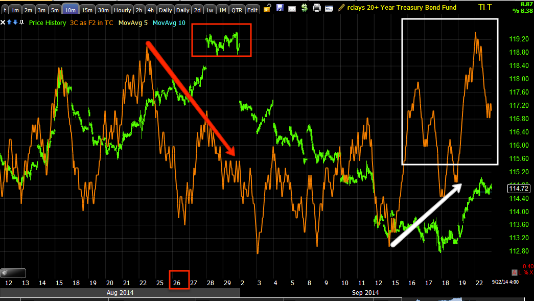
You saw today's important near term and longer term Leading indicators, an important post...Leading Indicators / TLT Update

Keep those in mind as you look over the next series of charts as well as what the two important sentences were from Friday's last paragraph of the Daily Wrap


"If the 3C charts don't put together an intraday positive after Monday morning, the market will be in big trouble fast...

oversold can quickly turn in to bear material, that's how this market will end."


On the divergences front we expected to see based on a very oversold breadth condition in the market that can quickly turn from simply oversold minor bounces to what I warned of in the same paragraph right above...

 SPY 3 min positive divergence today but...

 However, vs the strong 60 min chart, well you know what's coming, it's just a matter of how long we can get it to hold to finish positioning.

Along the lines of positioning, our HLF short was down -10.31% today, putting it at a -37.5% gain...
The 3 places in a H&S (HLF) I'll short and the one I won't, the red arrow is our last short entry.

Our SCTY position (short) is at a +15% gain, FXP just entered is at a +14% gain, NFLX is at a +7% gain, FSLR short is green as well, but there are still a lot of great looking set-ups, almost there.

 The QQQ negative divegrence last week as expected and the positive today, but on a 3 min chart so we are seeing what we expected for the early portion of this week thus far... however...

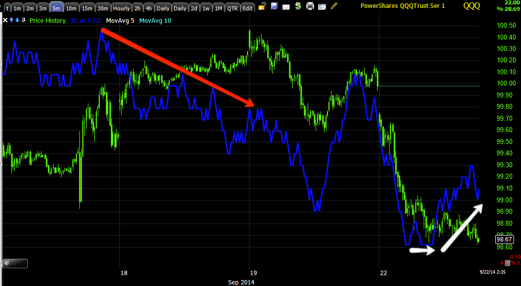
QQQ 30 min leading negative right at our head fake move...

The IWM put in a 5 min positive divegrence today as expected...

However, this powerful 2 hour chart shows you how long IWM has been under distribution and just why it's acting so bad with 40+ % of its component stocks already in a bear market.

Now, given the divegrence, keep this in mind.

Our Dominant Price Volume Relationship saw a STRONG Dominant relation in every average, 25 of the Dow 30, 89 of the NASDAQ 100 , 1506 of the Russell 2000 and 415 of the S&P-500, the relationship was Close Down/Volume Down or what I call, "Carry on". The volume was bound to be down vs. Friday's Quad witching, but the sheer number of component stocks down on the day (and that's just 1 of the 2 down relationships) is overwhelmingly bearish and 1-day oversold.

Of the 9 S&P Sectors, EVERY ONE closed red. Of the 239 Morningstar groups, 227 of 239 were red on the day. This is one of the worst 1-day oversold conditions we have ever seen.

However, t doesn't stop there, take a look at a few of the breadth charts, I added many more last Friday and Thursday...

 This is the August cycle with the head fake, the green is the indicator, the red is the SPX unless otherwise noted. The 4 week New High/New Low Ratio at new lows despite price being up, it's at the same level where our original oversold bounce started, this is bad.

 The same indicator on a 13 week new high/new low ratio...

The 26 week new high/new low ratio

Can you see the destruction in breadth  right at our head fake move?

The New High/ New Low Ratio...

And now...
 The Percentage of NYSE stocks 1 Standard Deviation Above their 200-day moving average...Now hitting new lows for the August cycle, compare to where prices are...

  The Percentage of NYSE stocks Above their 200-day moving average...again, another new low for the August cycle, comparing where price is, is essential...

  The Percentage of NYSE stocks 2 Standard Deviations Above their 40-day moving average...Another new low for the cycle and note the destruction in breadth since July 1, the end of Q2 Window dressing.

This is  The Percentage of NYSE stocks 2 Standard Deviations BELOW their 200-day moving average... HITTING NEW HIGHS FOR THE YEAR AND BEYOND!!!

THE YELLOW ARROW IS WHERE THIS INDICATOR OF DEEPLY OVERSOLD STOCKS WAS JUST 2 DAYS AGO.

Basically, the conversation I suggested you consider between the best entries and the big picture, as I said Friday, is pretty much no longer a dialogue, although we'll always try to get the best entries, it's a necessity now in my view, I'm prepared and very excited for an opportunity I think no one alive has seen.

However, one bridge at a time, the next thing is whether those divergences hold and what assets are giving the best entries and the lowest risk, you saw the Financials post today, FAZ Trade Follow Up/ Set-Up I think this is a great set-up, there are many more and if that bounce can hold and it should on a market this oversold, we hit the jackpot. If it doesn't hold as I mentioned in red from Friday, we still hit the jackpot. There's almost no downside, based on nothing but downside.

I suspect we get out early week bounce, HYG's chart seems to support that.


Quick MCP Update

MCP ended the day with the same 5 min leading positive divegrence it was putting in earlier in the day in a very flat range which is often where we see the most underlying action, although it seems very boring from a price perspective, I suspect it has a lot to do with filling an order at a specific price, this kind of flat intraday trend is not normal and the fact we often see large positive and negative divergences at these flat trends tells me they likely have to do with a VWAP/Large Order fill type concept.

Divergences at what look to be runs on stops. Note today's very flat 1 cent range all day

Leading Indicators / TLT Update

When it comes to Leading Indicators, the analysis is much the same as 3C, we look at these in multiple timeframes and multiple asset confirmation, divergences are almost always the signals of choice. In fact you can apply the very same concept to almost any market indicator and multiple timeframe analysis with higher timeframes representing the highest probability for the longer term resolution and shorter timeframes representing near term price action, using divergences, are almost always superior to how the indicators are put forth by TA. For example, a Stochastics oversold/overbought signal is no where near as useful as a Stochastics divergence and the longer timeframe represents the larger trend while the shorter timeframes represent the bumps in that trend. I can almost guarantee, whatever your favorite indicator is, its most powerful signals are divergences.  Take MACD for example, many people use either the two moving averages and will enter or exit a position on the cross over or for those using a histogram, the same can be said of a cross over below or above the middle / zero line, however 2-3 daily MACD divergences in a row are a far more powerful signal giving you crucial information about the trend. From there you can fine tune the actual timing with multiple timeframe analysis using a 60 min, 15 min chart, etc.

For any who aren't already familiar with these concepts as we use them every day, here's an example using TLT, which we originally put out a "Pullback" warning on August 26th, TLT / Treasuries. If you look at the post from 8/26, you'll see the longer term charts were all in good condition and only shorter term charts were negative suggesting a pullback. Once a pullback starts, it will almost always surpass the area in which we first identified the divegrence even if the divegrence wasn't mature, TLT pulled back further than our initial warning so even an early TLT short on the 26th would have made money. *This has some severe implications for the broad market.

While we expect a pullback and not a reversal of trend, we can only verify that as TLT pulls back and check for the accumulation that should accompany a pullback.

The first HINT of a positive divegrence in TLT came September 9th, TLT-20+ year Treasuries , Update although this was only telling us that the pullback was likely in fact a pullback, not giving us a strong reversal signal.

By September 11th, the divergences needed to suggest the pullback was ending were starting to form and TLT, although just recently turning up, has nearly surpassed that area where the first stronger "end of the pullback" divergences started.

Here are the charts and the concepts of multiple timeframe analysis using TLT, which was just posted in Friday's Daily Wrap and earlier in the Week Ahead (so this is timely for those interested in TLT long, 

From the "Week Ahead" as part of the week's Dominant Analysis...

"The daily TLT chart with out initial post calling for a TLT pullback on 8/26 , the pullback and recent posts calling for an upside reversal which we got today. This should send leading yields lower and the market is attracted to them like a magnet as we saw this week again." 

However for near term TLT analysis and it's effect on the market short term:

"recall our recent posts that TLT was about ready to end its pullback and move higher, well it did so today with a +1.27% move and that's with giving quite a bit back this afternoon as we forecasted earlier today for a short term correction allowing a long entry."

Today TLT closed up +0.10%, losing momentum and forming a reversal star candle, right in line with TLT's major trend and minor trend, which has market implications which are in line with both trends.

This is the initial longer term perspective calling for a TLT "Pullback" starting 8/26, as you can see, the pullback surpassed price from 8/26. However in to that pullback (and what we needed to see to confirm a pullback), we have a positive divegrence that sent TLT higher Friday, even though very near term we expect a small correction allowing for a better TLT entry. Remember that yields move opposite bonds (TLT =20+ year bond fund) and the market is drawn to yields like a magnet.

So far so good for the initial TLT pullback theory as the pullback from 8/26 looks to be over and verified as a pullback.


The shorter term 5 min TLT chart shows the accumulation of the pull back's base, this is what we want to see, without this accumulation (if 3C just follows price), the move down would more likely be a trend reversal than a pullback which is an excellent entry point.

Note the upside down Igloo with a Chimney (head fake move) in TLT's base and the positive divegrence throughout sending TLT higher least week. Also note the smaller, most recent negative divegrence along the lines of the short term correction we predicted Friday in TLT.

So far the longer term 5 and 10 min charts confirm a pullback that is complete and very short term correction as we suspected Friday making TLT a good looking long still as a slight pullback will allow us to enter at better prices without chasing the !.2+% gain from Friday. However this also has market consequences as a leading indicator as stock prices are attracted to yields which move opposite bonds/TLT.

So we go to shorter timeframes now that the bigger picture looks established.

 The 3 min chart shows a negative divegrence today that is about in line with the market averages' positive divegrence today which is great confirmation as a pullback in TLT will send yields higher and market prices are attracted to yields most of the time supporting the positive divergences seen today, even though they are very minor.


 And the 2 min chart confirms the same. It seems through multiple timeframe analysis as well as multiple asset as we already know what the averages did as far as their divegrence today, we have a high probability scenario which is in line with Friday's Week Ahead expectations of the major dominant theme being market weakness, but an early in the week bounce as the weaker theme.

Leading Indicators...


Today we expected a bump in the overall theme for the week which is stage 4 decline, some of which we are already clearly seeing in price action, but we have nearly a full day of positive divergences being worked out in the averages, mostly in the IWM which I suspected would try to break it's downtrend line on short term price strength or the minor theme...
The IWM made a lower low today which I'm not complaining about as my SRTY (3x short IWM/Russell 2000) is racking up gains every day, however, to get retail traders off the bearish side of the boat, breaking a technical price pattern usually will do the trick and the IWM's is one of the most visible.

The concept of the break above are still short term only, but when used with the longer strategic charts, they are excellent for tactical analysis in determining the most likely near term price moves and how you want to use those price moves.

Here's a quick look of what we already suspected to be the highest Dominant theme and short term probability with the argument for the longer term probability over the course of the week being made in Friday's, The Week Ahead, DOWN.


 One of our newest Leading Indicators is the following screen with the SPX on top (although the price trend of the Igloo top looks compressed), in the middle my SPX/RUT ratio indicator used for confirmation/non-confirmation of price moves and in the bottom, my VIX Inversion Indicator, the red bars that are also painted on price show high probability long entry areas just as we saw early August as the 8/1-8/8 base was being formed with 3C positive divergences.

Also note the SPX/RUT Ratio Indicator did not confirm a lower low in price, but rather supported the VIX Inversion signal suggesting a move to the upside was likely as well as 3C showing the same and an extremely oversold breadth condition.

The major trend in the SPX/RUT Ratio currently is non-confirmation of higher prices experienced in the "Chimney" or head fake area of last week, so again we have strong confirmation from multiple indicators and multiple assets.

For those newer to 3C, I originally names the indicator as I did as a very basic, but important reminder to "Compare, Compare, Compare". Now I might say, "Compare, Contrast and Confirm" are equally as appropriate, but that's what you find when you compare as many assets in as many timeframes as possible.

 This is a short term 1 min chart of the same 2 indicators above and what this shows us is first there's no strong VIX inversion signal, although VIX fear is rising, but not to the level in which it is a contrarian signal.  The SPX/RUT Indicator however, on a very short term, shows both the non-confirmation of last week and some very basic confirmation of today's lower low. There are several takeaways, first since this indicator didn't make a higher low as compared to last week's trend, any short term upside is limited a expected in Friday's week ahead post. Also the indicator intraday looks a lot like price so it is not sending a non-confirmation signal on a very short term basis along the lines of today's short term signals, but it is capping those by having ultimately made a lower low for the entirety of the chart, which speaks to the dominant trend for the week, DOWN.

 As for HYG which has been used to amazing effect through all of August and most of September so far, it is slightly leading on a VERY short term basis, offering the market VERY short term support.

When looking at the entire August Cycle which we are still in and the preceding sell-off that brought t us to the August lows, you can see clearly how HYG has led the SPX anywhere from 4 days to over a week and at this point the dominant trend is HYG is already in stage 4 decline, despite the last week and a half's breather which supported the head fake move in the market last week and perhaps the BABA IPO.

The Dominant trend take-away from multiple timeframe analysis is the market's probabilities are to follow HYG and move to stage 4 decline, which the SPX is only about 15 points away from, the Russell 2000 has already entered stage  4 decline, the NDX is about 52 points away from stage 4 decline.

Our near term Professional Sentiment is exactly in line with price, it is not leading, it is not divergent, thus it's not telling us much except it's not standing in the way of today's divegrence, but it's also not showing any leading qualities for a near term bounce off today's underlying price action.

As for the dominant theme in the cycle...

 Interestingly Professional sentiment is nearly perfectly in line with the SPX until the SPX goes to make the head fake move or "Chimney" on the rounded Igloo top, at that point, pros want nothing to do with a head fake move, they are busy selling. This supports our Dominant trend view of the market for the week.

 Yields short term show regression to the mean in green, today they show slight positive leadership which again is along the lines of the divergences we saw which we weak and the move we expected from Friday for the early part of this week, a weak move and the dominant move being DOWN.

HY Credit shows the same intraday, in line with price, not leading either way. However....

On a longer term view, again, like Pro Sentiment, HY Credit falls apart at the market's head fake move last week forming the Chimney.

More to come in the daily wrap.


FAZ Trade Follow Up/ Set-Up

Friday I put out a trade set-up for FAZ long (3x short Financials), Trade Set-up (Swing or Longer Term ) FAZ ,  the post was the following...

"I'll have some charts out in a few minutes, but FAZ long (3x short financials) looks pretty darn good in the area for either a new position or filling out a partial position. If intraday signals hold, you can probably pick it up for *12.50 (correction-$15.50) or less, but ultimately anywhere below $16 is a choice entry so you might want to set some price alerts."

That target was nearly hit, it still could be, but as the market has these short intraday positive divergences, it should cause a pullback in FAZ (long) which offers another opportunity to get in to a new position or fill out a partial position. Again, I think anywhere below $16 is a great entry, but why not use short term momentum to your advantage.

I like FAZ for a broad Financial short so it is what I've chosen to go with for the time being. After the initial break in the market and the first counter trend bounce, you can spot individual assets (non-ETFs) that are the laggards of the group, but initially I prefer broad sector coverage without the worries about individual company fundamental surprises such as news, etc.

Here's a quick review and the charts showing the probabilities for a better FAZ long (3x short Financials/XLF) entry.

 The last partial entry in FAZ long was during this range as it looked like it was about to break down below the range (red arrow in the red trendline range), there was a head fake move or false breakdown which I used to close half of the FAZ long as it was obvious in early August that the market would bounce and with it, Financials. I had been waiting to fill out the position above the range, but XLF didn't have the strength to break above the range without first creating a bear trap and then squeeze which got XLF above the range, the area I planned on filling out the FAZ position (long) which I did (red arrow).With the market's "Chimney" head fake, XLF gained a big and offered a nice looking FAZ pullback entry which has subsequently passed, but there looks to be a second chance on today's market divergence.

 XLF deteriorated badly in to the original range on this 60 min chart and after breaking above, saw a sharp leading negative divegrence making it a pretty safe entry to fill out FAZ long above the initial range.

 I often find that the leveraged ETFs give signals earlier than the underlying (XLF), so I'm using FAA, 3x long Financials which should give the same signals as XLF and opposite FAZ (3x short financials). Here on a 10 min chart we see a timely negative divegrence right at the chimney area in the broad market, an excellent entry area for FAZ long or XLF short. This is still the main theme, however on a shorter term basis, we may still be able to get slightly better FAZ entries.


FAS 5 min is still the theme of weakness in  the area, thus FAZ looks like a nice trade on the long side.

And the FAZ 15 min chart shows it was eworth the wait to add to it as the same range that XLF was showing is seen above, it was the break below for FAZ that I wanted to add back the shares I had taken off the table early August in anticipation of just such a move.

FAZ looks good here on a more important chart, 15 min, however very short term, specifically our divegrence in the market today is the tactical second chance for a long entry at a discount.


 The 5 min chart shows a break under $15.50, an ideal area to enter FAZ and then it has run up on today's market weakness, however...

The same positive divegrence in the IWM on 1-5 min charts is showing up as a negative on FAZ on this 3 min chart meaning a short term pullback on some short term, expected market upside, can and in my view, should be used to pick up FAZ, if interested, at a discounted price as the longer term charts all look good for some decent upside.


Trade Idea-Fade IWM $112 Sept. 26th expiration, $112 strike

I'd prefer to have gotten in a bit earlier, but I think it will be fine.

Quick Market Update

So far this is just about exactly what was described Friday in the week ahead for very early in the week price strength or a bounce back. The divegrence that has been developing since about the afternoon has seen price break the downtrend line and start moving sideways, the divergences are extremely weak, the best looking by far is the IWM, my SRTY (long) is continuing to just rack up the points on the portfolio's equity line which is why I wanted to keep that position even in the face of a near certain bounce in early August, although I did cut back other shorts like FAZ long which I recently added almost all of it back. I don't see anything on the upside coming from this current divegrence beyond what was published in Friday's Week Ahead, there's no sleeper divergence here.

 This is about the extent of the SPY positive today on a 3 min chart.

For comparison, the QQQ 5 min vs.

The IWM 5 min, so as we saw earlier, the IWM continues to look the best for a counter trend / Fade bounce position, although highly speculative.

HYG is really losing its ability to add any support, I thought this would happen going all the way back to the previous Friday's week ahead post in which I suspected HYG, as it has since Aug. 1, would break down first and lead the ,market, it looks like it will.

The intraday TICK at least has a trend. There was a +1000 poke above and then some nastier -1400 readings, for  an early heads up on a change in direction, draw the channel trendlines around the NYSE intraday TICK and look for a break above the channel.

The SPY custom TICK looks similar.

And this is the 5 min / 50-bar IWM, a cross above should send IWM higher. I may even look in to a weekly call option as a speculative fade trade only,  hit and run.