Monday, May 18, 2015

Daily Wrap

Friday the entire day in all of the major averages, it looked like 1 big options expiration pin. Typically this tends to end around 2 p.m., but Friday lasted all day and it may have been because it was a monthly expiration.

Other than Transports in salmon which have massively under-performed the major market averages, everything stuck together close to unchanged on Friday (seen on this 2-day intraday chart). It looks to be pretty clear that the entirety of Friday was an op-ex max-pain pin with the market only available to move today once options expirations was over. However there's more to this than just a move.

The question Friday was whether the best looking head fake scenario I've seen in some time would be hit or not, today it was hit and there was an accompanying short squeeze with it, but in my opinion, this was weak since before the event even occurred today. Normally we'd have fairly clear signals that a head fake move was coming, even if it was only to last the briefest of moments, but this time nothing. The only thing we had to guide us toward that probability was the concept itself and the high probabilities of the concept which were insanely high given the assets' popularity, the size of the trigger (resistance) area and the familiarity of the price pattern (triangles-both ascending and symmetrical.

From Friday's The Week Ahead

"I don't think the bounce is quite complete or its reversal process is not quite complete which means that my first assumption would be that the market would be rangebound and choppy in the area finishing the reversal process, but we also have some very easily recognizable resistance areas that are a hot bed for a head fake move, I have not doubt any head fake move or false breakout would be exactly that.

It's hard to say which scenario is more likely, but the Index futures have turned definitively and unambiguously negative."


These are two examples of two of the most clearly laid out head fake set ups we have seen in a long time...

 The daily SPX ascending triangle which is not only a popular index/asset, it's a large price pattern and a familiar one making the probabilities of a head fake move that much higher above the approximated 80% "normal" probability. Today's move is above resistance of the triangle so it would qualify as a head fake move or part of one. The qualifying condition is whether or not there's confirmation (in which case the move is confirmed and not a false move) or distribution (signaling the extraordinarily high probability of a false move/bull trap).

The same is true for the Dow, although a symmetrical triangle.

Also from Friday's The Week Ahead:

"As for early trade next week, we don't have any strong signals"

If you caught this morning's first post we didn't have much to go on, a bit later when it looked certain that we'd gap down, the Index futures on intraday 1 min charts firmed up suggesting the gap down wouldn't hold...
There were two positive divergences overnight/in the early hours in ES/SPX Index Futures. The first was right at the lows of the European operand the second came during pre-market trade as the averages were set to gap down. Noether divergence was particularly strong, but did what they should do on an intraday chart. 

The afternoon showed us clear deterioration in to the (I hesitate to call it a head fake move, but technically that's what it is, just without the extreme momentum that accompanies them to sway emotions) suspected move above the clear triangle's resistance.

I also said on Friday as well as today that the gas in the tank for any bounce was from the previous week and reached out to about 10 min charts, therefore,

"The same is true using QQQ as an example-the 10 min bounce chart needs to fall apart more before the next trend/DOWN"

While I can't say that the 10 min charts were taken out today, remember it's a process (also from Friday's "Week Ahead" post...)

"Looking at VXX it looks to be half way through (or more) its reversal process, but not completely there yet."

However, here is some of the deterioration today that needed a lot of help from a VIX smack down to HYG ramping attempts with TLT down...


 DIA's migration of its negative divergence (as all averages were in line for most of the morning with no divergences) reached out as far as 5 min charts clearly and beyond that and that's just on today's trade alone.


The other averages migrated out to about 3 min charts, but put in sharper leading negative divergences by the close like this IWM 3 min.

 Or the very sharp leading negative of this QQQ 3 min.

 Or the SPY 3 min.

The 10 min chart I was talking about on Friday in the post linked above that needed to show deterioration as it represented the bounce chart or "gas in the tank" is this 10 min QQQ chart which did see deterioration today; not as much as I think is necessary...YET.

Remember the VXX chart and my estimation Friday that the reversal process was about "Half over"...

However when dealing with a price pattern as large as the SPX's...
SPX daily chart and triangle...

It's probably much more appropriate to use a VIX chart of similar magnitude. This is XIV, the inverse of VXX which trades with the market...
Notice anything about the price pattern and/or the divergence with that price pattern? That would be the common head fake top/price pattern "Igloo with a chimney", the Igloo being a rounding top and the Chimney being a head fake move at the end of the reversal; process just before a downside move.

A smaler version of the same concept occurred in the SPY/market just before the October lows at the September head fake move which we called in advance as the rounding top was almost finished...
SPY daily just before the downside reversal to the October lows. 

The same concept works as a bottom as well. In the VXX it would look like this...
VXX 15m

These would be much more appropriate as far as scaling vs the SPX's triangle.

The weakness before today was in that there was no additional divergence other than the 10 min chart from the week before last week's, nothing was added to it. Then additionally the intraday deterioration today and 10 min deterioration to the "gas in the tank charts". Again, QQQ 10 min...

QQQ 10 min deterioration, it just needs to go a bit further as posted Friday.

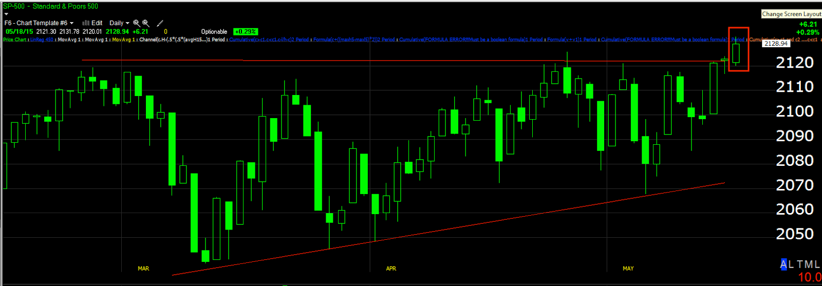
I don''t think there's any coincidence between Friday's op-ex pin price action and today's move above a triangle that has lasted nearly the entire year (2015) on the same day the $USD made the breakout from a "W" base that we had been expecting for a counter trend move to the upside (which should fail and make a new lower low). I'm also a little more than "suspicious" that it occurred just 2 days before the F_O_M_C minutes are released Wednesday.


 $USDX 30 min chart with a "W" bottom and leading positive divergence for a counter trend bounce.

Here's the trend...
$USD 60 min downtrend (red) with counter trend bounces (yellow). I do suspect this one will be larger than the previous ones, but that's nothing new as far as $USD analysis.

The correlations are what interest me the most both short term and after the bounce is done as I explained using Gold, Crude, Treasuries and the market as examples...

 This is a 30 min chart of the $USDX (purple) vs 30 year Treasury futures (think TLT long trade). The correlation isn't perfect and the TLT long position isn't based on the correlation, it's based on the merits of its own signals, but I have little doubt that there's a correlation even though today it was sharp;y off as it seems the counter trend treasury bounce trade is overcrowded as  was mentioned last week so a shakeout seemed appropriate, one of the reasons I waited before adding to the TLT position which was done today, Trade Idea: TLT Long


Here's a tighter view of $USD (purple) vs.  30 year Treasury futures )candlesticks) which are close enough to TLT. I believe the very recent non-correlation is the shakeout from Friday's +2% TLT gain.

Other correlations that should have some meaning to short term positions such as Gold puts, USO short and longer term trade set ups such as Gold long and USO long after a pullback...

 $USD (purple) vs 60 min Crude Futures, note the inverse relationship, thus $USD up, USO down.

Closer, on an intraday basis...
 This is a 1 min chart showing the $USD's strength today vs. Crude futures recent weakness.

In fact, the $USD put in the strongest daily performance in TWO months!

This is the $USD (purple) vs Gold futures on a 30 min chart, again note the inverse correlation, suggesting $USD up, gold down.

However I like both gold and oil for longer term trend trades so when the $USD counter trend move is over and it starts moving back down, USO and Gold should have pulled back and be in decent position for a long trade, although we will confirm accumulation of a pullback before entertaining with position.

As for the SPX futures... You have to remember a lot of correlations are new and I think that has everything to do with Carry unwind...

 The $USD in purple on a 30 min chart vs the SPX futures / ES. Note how they were in tight correlation to the left and Es  over away from the Dollar's decline since.

I suspect (from the underlying weakness in the averages today), that the $USD should bounce up a bit, the averages may or may not continue their bounce/head fake, although it looks like they are swimming against the tide, but this should bring them closer to reversion to the mean. I suspect the market wi=ill have its head fake move in or have tried and failed and by the time the $USD is ready to make a lower low, they'll be back in correlation and the $USD will have some catching down to do. This would fit with the fast and sharp reversals that are born of failed moves.

Intraday this is what the $USD looked like vs ES, however as you see above, they are greatly dislocated at the moment.

I suspect that Treasuries will also put in a counter trend bounce, but then will continue lower to a new low along with the $USD and I suspect the market, the carry unwind. I don't know how much more evidence we need, it seems plainly evident that the $USD carry unwind is well underway.

Intraday, here's the performance of the major averages... For a "breakout" day, the percentage gains ranging from +0.14% to +1.09% are not only all over the place, but there wasn't a solid breakout on volume in any of the averages, again suggesting a false move that will fail and from failed moves come fast reversals.

That's the Russell 2000 leading intraday with transports just behind (see our Trade Set-Up: Transports Follow Up) and then the NASDAQ 100 with the Dow laying at +0.14%

It looks pretty obvious the VXX/VIX futures were slammed hard (short term manipulation to lift the market)...
 VXX short term VIX futures in blue vs the SPX, I'm sure you can see the inverse relationship is skewed toward a steeper VXX decline.

Remember today they were trying to get the 2nd asset of the SPY arbitrage going as well, HYG and TLT was already down, which makes me wonder if the entire TLT 2% Friday gain wasn't a set-up for a SPY Arbitrage melt-up to break above resistance in the Dow/SPX? The $USD waited until today, the move in TLT on Friday was extreme for that asset and VXX was obviously knocked hard today not to mention the attempt to get HYG in the game (the 3 assets of the SPY Arbitrage scheme).
 The SPX (green) vs HYG which as I showed near the end of day in this post, Market is Struggling it looked like they were trying to save the close with HYG, not let the Dow go red.

However considering recent correlation between HYG and the SPX, it looks pretty plain for a breakout above the triangles that institutional money wanted nothing to do with a risk on scenario. HYG dislocated disproportionately from the SPX today and closing red. Again, see this post from near the close, Market is Struggling

Yields were obviously up on Treasuries pullback today, but not enough to be helpful if the former Leading indication of yields were still working...

30 year yields (red) vs SPX. Again it's impossible to prove, but the pin Friday and then TLT down today, VXX / VIX futures slammed hard and an effort to get HYG up and green on the same day the $USD breaks out of its base and the SPX/Dow above their triangles all seems a little too coincidental, its as if every condition the market could need or want to post a green close was there ad it still looked as if it was struggling.

In addition to an apparent aversion to risk on in institutional land via HYG, Pro sentiment was lagging again...
 Pro sentiment for the 3rd consecutive day moving down and...

High Yield Credit (not the same as High Yield Corp./HYG) was also down for a 3rd consecutive day. If that doesn't look like risk off among the pros...

As for internals, you saw TICK today, there was definitely a short squeeze again, but internals were very poor on the day.

The early morning gap down which we had seen an intraday positive divergence which would at least fill it earlier, Quick Update was about as good as it got this morning to just above +1000 which is nothing to even mention other than the fact it was so poor on the day. The rest of the day you can see the average was right around he ZERO line and this on light volume AGAIN! Not a good day internally speaking.

There was no Dominant Price / Volume Relationship today. There were 7 of 9 S&P sectors in the green and 176 of 238 Morningstar sectors in the green. I don't see any near term overbought or oversold tensions at the moment.

As for futures, the Index futures are pretty close to in line on 1 min charts as is the $USDX, but I suspect the $USD may see some overnight weakness as the Euro and Yen both look like they have small positive divergences. I don't think it's anything much beyond that as the $USD's base and positives are on such long and strong timeframes.

The gold divergences haven't changed since this morning, TLT/treasuries I think gave the best read on the TLT charts during the cash market.

HERE'S WHAT DOES STANDOUT, DAMAGE FROM TODAY IN ALL OF THE INDEX FUTURES ON TOP OF THE LONGER TERM CHART DAMAGE FROM FRIDAY/THIS MORNING... (and this timeframe with this damage continues to suggest that we are in a reversal process)...
 ES 3 min

 NQ 3 min particularly sharp near the close

 TF 3 min

This is on top of the charts posted earlier like ES 10 min which shows what we saw all last week, damage through the entire week and no positive divergence off Tuesday's lows to give the market an extra boost of gas.

I still think that it's a reversal process, we have a potential head fake move in there as well. As I said in my last sentence on Friday, I think patience and letting the signals develop, letting them jump off the chart and not jumping the gun here are going to lead to the best results with the least amount of risk.

Remember we have the F_O_M_C minutes and now according to the FT,  apparently there's even a chorus of Financial titans/executives from some of the biggest banks and Institutional investment firms petitioning central banks to get themselves in stable condition (hike rates) to be ready for the next financial crisis. I don't think they are saying this suddenly out of the blue as an opinion over a casual conversation. As I have believed for some time, the F_E_D is more afraid of not hiking rates and getting off ZIRP so they have some room to maneuver than they are of the damage rate hikes will do to an already weak economy (macro data at 6 year lows)...

And everything seems to be lining up for one last hurrah (bonds, possibly stocks  the $USD where itthe carry can be closed out at better prices).

I'm not going to pretend like I understand the end game at this moment and how the averages/correlation and potential continued head fake move will play out, but I have very little doubt as to how it ends, that was the third trend forecast of April 2nd after a small pullback (last Mon/Tues) followed by a larger bounce (now) and a decline that will make the bounce look as important as Monday/Tuesday's small decline (actual verbiage from the April 2nd forecast).

If anything pops up in futures I'll let you know, but I suspect the $USD counter trend bounce as well as the Treasury bounce will lay out, equities "should" conceptually, but they seemed to be climbing the proverbial "Wall of worry " in today's action. The IWM's close was impressive, the Dow's close and the fact it was so dislocated from the IWM, WAS NOT IMPRESSIVE.


Trade Set-Up: Transports Follow Up

Friday I posted a trade set up for transports (short), Transports Trade Set Up

All we had/have to do is let the trade come to us and enter on confirmation of multiple timeframe signals. 

The following excerpt below (including the chart) are directly from the post /Trade Idea linked above from Friday:


 "Very recently and VERY quickly there was a burst of accumulation, it is no where near a stable base or anything I'd personally consider as a long as it is too unstable and unpredictable, but nevertheless, we have a 15 min leading positive divergence which I confirmed in essentially a single day (just a tad longer)."

If you are use to seeing 3C charts and what the accumulation process looks like, then you know that this is exactly what I said above, "Unstable", but for a short that we want to enter on price strength, this instability and weakness in its structure are most helpful.

Today, I'd say Transports did about 3-days worth of work toward our goal of a trade set up that comes to us on our terms, our price, when and if we chose based on the evidence.

In other words, I'm surprised (despite the fast forming, weak base) how quickly transports deteriorates today and how close they are to what will be our 3rd entry area (all around the same price).

 This is a longer term trend version (weekly) of my custom X-Over screen. You can see the long signal with all 3 indications confirming, then the uninterrupted up-trend without a single whiplash stop out over the entire period and now very recent, very clear se;;/short signals on all 3 indications.

 On the daily chart, I wouldn't have entered Transports short today just because of the character of the asset, it always gives away tops with bearish candlestick reversals, today (as ugly as it was), did not meet the criteria (the bearish candlestick give-away transports always seem to offer).

If you look at the original idea from 1-day (market day) ago, Friday, you'll see what this chart is about; support levels at white rows and head fake moves at yellow arrows below their respective support areas before attempting to bounce/rally.. Last Thursday we had a stop-run head fake below support at the yellow candle to the far right. Although volume has been down the last 2-days as price is up (as we needed it to be as Transports are the worst performing of the large averages on the year) which is bearish, the closing candle today was not the give-away. However, a lot of damage was done a lot faster than I would have anticipated.

 While the daily candlestick chart is not giving away the short set up (to the day)  the 60 min chart is sure showing weakness as the candles  become smaller in to gap fill resistance.

 This is the 1 min trend chart it's clear there's nothing even remotely approaching confirmation of the last 2-days, a good start.


 The 2 min chart seeing migration (kind of like the DIA today, the worst relative performer with regard to underlying trade and actual price percent gain) after last week's positive divergence which is what led to Friday's Trade set up.

3 min Transports chart deteriorating significantly today. Again you can see why I was interested in transports as they have been a horrible performer so any price strength is welcomed to enter new or add to existing positions.

5 min accumulation for a bounce and deterioration already.

Different assets will be ready at slightly different times, but typically most will be ready at the same time as the broad market, like the saying goes, "A Rising tide lifts all boats", the opposite is true.

This is going to be a nice set up if you are interested, it's one of my longer term core position favorites.


UGLY

It appears from intraday action, HYG activation was likely to try to hold the close, this is some very ugly intraday action, lots of selling in to it.

The DIA is the first average close enough to taking out the "Gas in the tank" charts. The others are just deteriorating more, but not as much join the way of migration yet. You'll see below.

 SPY 2m

 SPY 3m

 IWM 1 min

 IWM 3 min

QQQ 1m

QQQ 3m

DIA looking the worst 1 min

 DIA 3 min

DIA 5 min

DIA 10 min

And TICK still can't get off its back!