Tuesday, October 18, 2011

Full Market Update

 DIA 1 min shows the positive divergence I mentioned in this post yesterday, in which I thought we weren't quite done with the upside. Today however has shown a leading negative divergence, which is the strongest kind of divergence.


 DIA 2 min here's yesterday's strength


 DIA 5 min again yesterday's divergence and in line trade


 DIA 10 min shows a relative negative divergence today


 DIA 15 min this important timeframe shows a continued nasty divergence, the longer/stronger, the more downside we expect.


 DIA 30 min longer term chart, showing a very important timeframe going leading negative.


 DIA 60 min this chart speaks for itself and is one of the nastiest long term negative divergences seen in a while.


 QQQ 1 min this also shows yesterday's strength from this post.


 QQQ 2 min negative into the closing highs


 QQQ 5 min yesterday's strength and inline trade


 QQQ 10 min a relative negative divergence


 QQQ 15 min the important 15 min chart is leading negative (the longer the timeframe, the more important, but at 15 mins, it gets pretty serious).


 QQQ 30 min an even worse divergence


 QQQ 60 min one again this hart speaks for itself, it includes the top in which we saw a very bad downside move from in late July/early August.


 SPY 1 min showing yesterday's end of day strength suggesting more upside.


  SPY 2 min close up a relative negative divergence as well as yesterday's EOD strength


  SPY 2 min expanded view showing the depth of the negative divergence


  SPY 5 min this is the entire short squeeze rally with initial distribution on the 7th, remember how much accumulation went in to this 15 min chart, basically the whole 10 week consolidation was used as an accumulation zone.


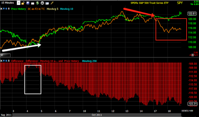
  SPY 15 min a leading negative divergence


  SPY 30 min this chart also speaks for itself, especially in this timeframe


  SPY 60 min the longer view of the 60 min, this is the worst 60 min divergence seen in several months


ES 1 min shows very early morning accumulation as was expected Monday, there's distribution in to the highs of the day and now it's leading negative in after market trade (ES trades 24 hours during the week)


 ES 5 min shows yesterday's signal for more strength, this is a relative negative divergence in to today's highs, there's a hint of a positive divergence tonight, we'll see if it dissipates or strengthens. Maybe Emma will wake me again for a very early morning update!

AAPL-A big surprise

With the new 3C depth charts, which is like a MACD histogram for 3C, showing areas of accumulation and distribution, we have an additional tool to look at long term trends and being the depth charts are a new addition, this is the first time I have really looked at AAPL, one of the largest institutional holdings out there and what I found, absolutely shocked me.

 The daily hart stretching back nearly 2 decades shows AAPL has been under slow and steady distribution for the last 5 years or so and is now at the deepest crest seen in decades. Buying/accumulation was very heavy between the early 1990's through 2004, since then, the VERY LARGE accumulated position has been slowly, but surely been sold in to demand and price strength, both of which are essential to move a position this large without causing price to collapse.

 Hourly chart shows accumulation in the summer of 2010, I'm too tired to see what product they were launching, but I'm sure there's a relationship for those who want to investigate it, I'd be interested in hearing what you dig up.

Distribution of that position has been steady and is leading negative as AAPL hits new highs.

 The 30 min chart shows the same with some moderate accumulation  during early summer 2011.

 The 5 min chart shows several smaller cycles.

 And the 1 min hart virtually collapsed during the most recent rally of the last 2 weeks. This will have an impact on the NASDAQ 100.

 5 min regular/extended trade shows the recent distribution in to price strength.

Last night there was short term 1 min accumulation sending prices higher today during regular hours, that position was distributed in to the highs of afternoon trade and right in to earnings. We'll have to see pre-market tomorrow morning, but it appears that there "may" be some accumulation in after-hours, perhaps to try to fill some of the gap we will surely see on the open.

I think the 1 day chart is fascinating, it seems to show the long term strategy of Wall Street and apparently their view that AAPL is perhaps reaching its zenith.

In Support of the SRS Trade

You may be surprised by just who in fact may be telegraphing the collapse of the Prime real estate market, none other then Fannie Mae. Don't take my word, do some research right from their site.

Among their projections: 10 year treasuries to plunge, New and Existing home sales to fall by 7.1-7.7% next year, Mortgage origination to decline by over 21% compared to the first 6 month of 2011 (Jack, thoughts?).

Of course words don't compare to actions and if you look up Markit and their PrimeX averages, you'll see the "money where your mouth is" trade, running, not walking, out of prime loans.

SRS-UltraShort Real Estate

If you are a long time member then you know SRS is and has been one of my favorite short plays, however, it has been a long time in the making and it has been curious why it hasn't taken off yet.

 This is one trade we have had to be REALLY patient with, however, even if you take this smaller version of the bullish descending wedge (there is a much larger version), the rough upside target is well over a double conservatively, if you take the bigger picture in to account, then SRS could be an easy 1000% gain. Note the bottom that has been forming for well over a year, making this a bottom that could support a huge move. Note the rounding volume, suggesting that this is ready to move from stage 1 accumulation to stage 2 markup, in fact, that may be starting already.

 A closer look at recent price volatility and volume.

And the amazing 3C daily chart in a huge leading positive divergence.

And the catalyst? What may make SRS a long candidate now?

The recent collapse in the PrimeX market is the answer. This may also be why SRS has based so long as PrimeX's 4 indices haven't crossed below $100 (par) pretty much since their creation, meaning the Prime Mortgage Baked Securities-not to be confused with the junk subprime which collapsed in 2007- including Fixed 1&2 and ARM 1&2 have crossed below par over the last few weeks as European banks and others have liquidated holdings in PrimeX. This is a new and rapid decline for prime loans and may offer the opportunity of a lifetime or at least one of the biggest opportunities since the sub-prime collapse.

I encourage you to look at SRS as a trading vehicle and to consider buying on the recent weakness. I have believed in this trade for over a year, it's just been a matter of a low risk/high probability entry and with PrimeX now collapsing and falling further each day (Prime Commercial Backed Mortgage Securities are yet to see the same decline), SRS may finally be offering an opportunity that may just be to good to pass up.


Here's Some News You Can Trust

Moody's Credit Rating Service, downgrades Spain by 2 levels to A1, 4 levels below Aaa. They also added a negative outlook.

Don't Believe Anything Out of Europe!

Around 2:35 today the Euro surged on news from the UK's Guardian that France and Germany reached a deal to leverage the EFSF bailout mechanism from $440 bb Euro to $2 Trillion!!!

The Euro responded like this...


After the market closed, the WSJ reports:

"European officials are still debating the size of the bailout fund for the euro zone and reports that an agreement has been reached to leverage it to EUR2 trillion are "totally wrong," an official familiar with the negotiations said."


Continues...


"Leveraging the EFSF is still being debated," a person with direct knowledge of the discussions said. "We may have a decision on the size by the summit or just a statement that firepower must be increased. But there no talk about an amount around EUR2 trillion. Such reports of an agreement between France and Germany are totally wrong."


These Europeans leaks, and I do believe they are deliberate, are ridiculous. The Finance Ministers and their spokespeople are worse then a sewing circle.


'Nuff said...

Extended Hours 3C charts do count

I am VERY grateful to a certain member who helped me bring 3C to ES trade and Extended Hours trading. As I said when I first introduced the charts a week or two ago, we are uncovering a whole new area of the market and it should give us a tremendous new tool-so thank you my friend!

I have to go to the Apple Store momentarily, but I couldn't resist looking at the complete AAPL trade with extended hours, I will bring the regular charts later.

Regular hours are in black and EX hours in the lighter shade.


 AAPL 1 min -look at the boost on a positive 1 min divergence to loft share price and the distribution right through to the close. I'm guessing AAPL does leak.

 The 5 min chart shows selling/distribution right into the highs and ever since.

 The 30 min chart, again distribution into the highs, leading negative since (the strongest divergence)


 4 hour-A new high in to distribution causing what we see before 85% of the reversals, a HEAD FAKE, and why? Because new highs /breakouts are almost always chased and they give WS a chance to distribute on strength.

The 1 day chart, 2 head fakes at the yellow arrows, the white trendline is resistance. 3C? Leading negative. What a scam!

Off to the AAPL store,  if they don't fix my Macbook Pro, I might have to rub it in on the earnings. Today has been SUPREMELY frustrating.


This post should have taken 5 mins, not 20!

After Hours

Here's the 5 min EUR/USD FX pair, note the knee jerk reaction through resistance on  the EFSF announcement and subsequent pullback-remember the correlation here is strong EUR=weak dollar=HFT algos buying-or just think of it this way, strong Euro-strong market.


A closer look at the pair reveals the  knee jerk through resistance and a pullback now at support. This chart should be watched over night along with ES indications.

As for AAPL-the impossible just happened, they missed! I'll bring you the AAPL charts soon as well as After hours trade in AAPL/ES.

It appears that AAPL raised guidance, most likely to offset the miss as everyone knows they ALWAYS shoot low on guidance so they can beat every quarter like clock work. AAPL is down 5.5% in AH. The Q's are down .60%, about double the market as AAPL is the most heavily weighted component in the NASDAQ 100.

Surreal.

AAPL Up to Bat Next

The SPY closing....
 This is what technician's expected to happen on a bearish ascending wedge and exactly why I said watch for the exact opposite at 2:45, although those tend to be short term head fakes and the pattern usually plays out. This is an important lesson for technical traders, all of these patterns that have been with us for over a century and worked well until T.A. became mainstream and the internet and low cost online brokers took Technical Analysis from a "voodoo" study to the "In thing" around the late 1990's, have now become easy money for Wall Street as Technical Traders keep doing the same thing they have been doing since the early 1900's-just look at the book, "Technical Analysis of the Stock Market". You'll see how well these patterns use to work in the 1940's, 1950's and so on. They have now become an albatross around the neck of any technical trader who still follows them and they get manipulated so often, I don't know why Technical traders keep falling for it. To make things worse, Technical Analysis says, "If the pattern fails (as it did above), trade in the opposite direction". This means technical traders went short seeing this bearish pattern, Wall Street does what it always does and manipulated the pattern short term to cause the maximum pain, traders reverse to a long position and then Wall Street takes the pattern down and TA traders lose 2x. It's evident right there in the volume. TA traders went short the bearish Ascending Wedge, it broke down a little bit to sucker in the rest of the traders that wait for confirmation and then took price up and triggered the short stops and the long buy orders. Look at the volume on the 2nd attempt or test of the high, it didn't make it and volume swelled on churning. You an guess what will happen next. This isn't just Ascending Wedges, but any obvious technical pattern, support/resistance area.

Here's the long term chart-15 min- from the start of accumulation for the rally to a leading negative divergence. Note the 3C/MACD/Depth chart as well, it keeps swelling at the crest.

XLF continued

Here are the other XLF/Financials charts  I wanted to bring you...
 The former high in white, today's attempt in red-note the very heavy volume-looks like churning, that is not bullish.

A closer look at the closing action intraday 1 min chart. 3C is negative as I would expect in a churning environment as well as RSI.

More charts to come, I'll have an update of everything I wanted to cover today but couldn't do to technical problems. I may have to hit the Apple store first as this is very frustrating.

Pretty Amazing

Yesterday at the close  I showed charts showing accumulation, we didn't see them materialize overnight so at first it was a seemingly useless signal, however today they have been fulfilled, which tells me that what we were seeing yesterday was the market acting on news that the rest of us would have to wait a full day to hear. That's the information curve and trading insider knowledge in a totally corrupt and rigged market.

Here are the ES indications EOD...

 ES 1 min in a relative negative divergence, although you can see two accumulation points, 1 a bit before the news about EFSF was released.

 Here's the 5 min ES 3C chart showing the positive divergence in to the EOD yesterday, as I noted VERY early this a.m., I was surprised ES hadn't moved as much as 3C indicated, it just took a bit longer.

And a close up of very early a.m. ES trade into the NY open and a current relative negative divergence.