Tuesday, October 16, 2012

AAPL Proves our concept right again

Many of you have heard me say that I wouldn't short the first break from a H&S top as Technical Analysis teaches, in fact an even better TA entry i a break and a bounce to the former support that fail and shorting it there, I still wouldn't do that. This popular price pattern, long considered to be among the most reliable is traded the same way over and over and Wall St. uses that against technical traders and that is why we have the concept of the "Volatility shakeout". If we weren't able to get short AAPL at the top of the head where risk is very low, then we re usually better off waiting for the volatility shakeout that is quickly becoming as common as the H&S top itself, still traders make the same mistakes every time.

AAPL's H&S top breaks at the yellow arrow, although many will enter a H&S top short on the price formation, most will wait for confirmation, the break below the neckline at the yellow arrow; this is what I call, "Chasing price".

AAPL put in a strong hammer on increasing volume and that held as support the entire time, not once were those lows violated. This is when we started planning for the volatility shakeout  and today price moved right to the neckline and closed just off the highs on increasing volume. What we want to see is a strong move above the neckline that scares shorts in to covering, sending AAPL up more, that's hen we want to start looking for a position on the short side, we'll let the market and AAPL tell us when, but so far, the concept has held and worked perfectly.

Market Charts

I realized there was no way to get that last post out before the close with these charts, so here they are.


The theme is largely the same as what you have seen in the last couple of updates and what you'll see in the DIA...

 The green arrows represent price movement, the 2 min negative divergence basicaly saw the negative divergence migrate through the longer intraday timeframes, from 1 min to 2 min, 2 min to 3 min, etc. as a divergence should, but as mentioned it didn't create a consolidation in price, but through time as price flattened out and travelled laterally; this type of consolidation is just as useful as a price pullback in terms of keeping the equity from becoming 1-day overbought and allowing it to continue it's path upward.

Toward the end of the day even on the 2 min chart you can see the DIa saw a positive divergence which would be a new divergence for the day and start on the 1 min chart, it migrated to the 2 min chart because it was strong enough.

Here's the DIA 1 min chart, again you can se the negative divergence simply too the market fro up to sideways, a consolidation through time rather than price. At the end of the day, the positive divergence developed, but note where, on a dip in DIA prices (buy weakness/ sell strength).


 FAS was one of the first I mentioned this behavior with, I'd rather have seen price stay put or fall and 3C continue to move higher, but the movement may cause some early panic tomorrow on the open among shorts so it's not all bad.

 The IWM 5 min chart shows how far the negative divergence migrated, but also how resilient the IWM was in not losing ground and consolidating laterally.

 The faster 1 min IWM shows the late afternoon positive divergence building in the IWM.

 The QQQ, as you might imagine, looked great today. The 1 min chart saw only a brief negative divergence to halt the upside and the positive divergence there lasted the rest of the afternoon, this can't be separated from AAPL's action and remember we have been expecting a shakeout move in AAPL to the upside to rid itself of some shorts that entered too soon on the initial break of the H&S as I warned of. I do think there will be a profitable AAPL short coming, we're not there yet.

 QQQ 2 min shows the migration of the positive divergence, this is a nice looking chart and no doubt because of AAPL's moves.


 AAPL 5 min saw a negative divergence migrate out to the 5 min, this is nothing like the 15 min positive divergences of yesterday which were incredibly strong.

 AAPL 1 min goes negative just enough to send price sideways and then we see the positive divergence, to see AAPL accumulated this late in the cycle (between stage 1 and 2) is impressive.

SPY 2 min doing the same, negative just enough to consolidate sideway and then add to the positive divergence, all in all this was a great start to the bounce we have been looking for.

Closing Market Update

We are seeing some upside here and there, I would have preferred not have seen price move and just let the 1 min 3C positive divergences build, but that's what we have.

The bottom line is that the faster charts are improving, I'd prefer price stayed flat, but improvement is better than no improvement.

I think we will see more upside tomorrow, but more importantly this move to the upside should last longer, I think we are just getting started, it may be along the lines of a swing trade.


Charts coming.


IBM Update

IBM is a longer term equity short position that is actually still in the green, I'd like to add to the position, but only on some price strength and 3C weakness.

Here's the update.

 This 5 day chart shows IBM as a likely double top. Technical traders expect the second top not to exceed the first top, but in reality, that second top making a higher high on a head fake move is more common than not in double tops and bottoms. That is where I'd like to add to IBM short.

 On a daily chart, between the two top areas IBM put in a bull flag at the red arrows and then a bullish ascending triangle at the yellow arrow, that triangle initially failed taking any premature longs down with it, but I do think it will see an upside breakout before IBM really heads down and that is where I want to short it provided the 3C charts still show weakness.

 Here's a closer view of the 2 price patterns, the yellow arrow is where I think IBM is going and where I'd consider adding to the open short position in place now.

 The 60 min chart looks horrible so I don't think IBM is a good long candidate by any means.

 The key 15 min chart is leading negative as well, but has shown a very recent relative positive divergence sending it higher  on this last leg up.

 The 10 min chart is showing a negative divergence in to this leg up as I'd like to see.

As is the 5 min chart, I just want to see these divergences keep up or worsen with IBM above the $212 area, then it's more likely than not that I would add enough to bring the current half position size to full size.

FAS Update

FAS is another position we just picked up yesterday, some of us Friday, it is the 3x long financial ETF and so far it has done what we expected and I still like the trade, I still think there's more upside in it and as for tomorrow, it has the same indications as TQQQ late in the day on the 1 min chart.

 This was the triangle FAS was in, the move below the triangle on Friday I suspected was a head fake move and yesterday we saw a bullish hammer reversal candle form on the close. Today we have an indecision Doji candle and right at the apex of the triangle, according to Technical Analysis, this is a high probability/low risk area to short, a second chance if you will and I believe that is why FAS is slowing down here, but I do think it has more upside and will leave the position open. Yesterday I said I think we will see 2 head fake moves in FAS, one already on the downside and the second on an upside move and then Financials may be ready to short for a bigger picture trade.

 The 2 min chart has a negative divergence that sent FAS laterally to consolidate through time as well like TQQQ, but any new divergence will show up on the 1 min chart first...

Like TQQQ, FAS has an end of day positive divergence forming, leading me to believe any shorts entering FAS today will likely be squeezed tomorrow.

For the time being, I'm keeping this long position open and I think it's still in a decent area to initiate  a new position if you missed it the last couple of days.

TQQQ Long Update

TQQQ is at a decent profit for the first day and I expect more, this could also in part be taken somewhat as a market update since this is a QQQ leveraged ETF.

 This is the most important chart for the bigger picture of this move as TQQQ is a 3x leveraged long of the QQQ, the 15 min positive divergence is of some size and suggests we still have plenty of upside, this shouldn't be a 1-hit wonder.

 The 5 min chart held up well today so I'm glad to see that and will continue to hold TQQQ, the only leveraged positions I'm more touchy about are October expiration options.

The intraday chart of TQQQ is interesting because the negative intraday divergence often causes a pullback, but sometimes a consolidation can take place through time rather than price and that is what seems to have happened here, the negative divergence created a lateral consolidation through time rather than price and as we near the end of the trading day, the 1 min is starting to gain some strength and this is where it shows up first. So I'll take another look before the close, but it is starting to look good for a follow through day tomorrow.

Not every day in a bounce is going to be up, but the general trend should move up.

More updates coming...

Risk Asset Market Update

The market is pulling back on the intraday negative divergences that I have been talking about and AAPL is there pulling back as well, but as mentioned earlier, I think this is a healthy pullback and nothing to be concerned with if you are long for the swing move up we have been preparing for.

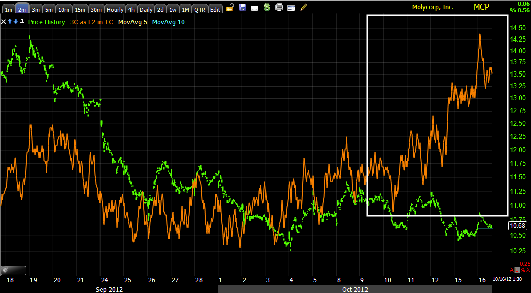
 AAPL 3 min intraday negative divergence for a pullback

 AAPL 10 min chart still looks great for more upside after the pullback is complete, it may be a day, it may be a half a day, we will just have to see how 3C reacts on the pullback.

The 1 min NASDAQ futures negative divergence...

As for the leading indicators of the Risk Asset Layout... (SPX is always green unless otherwise noted)
 High Yield Corp. Credit is in line with the SPX today, this is a good sign for a continued bounce, at some point it will diverge and we'll have to start looking for the long exits and the new short position entries, but not yet.

 On a longer basis, HY Corp. Credit locally is leading the SPX by a fair amount still, this is also good for the continuation of the move higher as we have expected, we'll want to watch for serious divergences here to warn us of a turn just as the positive divergence warned us of a bounce.

 JUNK HY credit looks the same as HYG which is also good for the bounce.

 Longer term Junk HY credit is still leading as well.

The long term charts are showing HYG and JNK negatively divergent with the market, but that is the bigger picture trend, for now we have a bounce and it looks good, but it should be moving in to a more negative area where we can expect a bigger move to the downside.


 The $AUD which is an excellent leading currency because of its connection with the carry trade was positive vs the SPX recently, this helped us determine near term probabilities were to the upside. $AUD is lagging intraday as you can see vs the SPX.

 Here on a larger chart, $AUD went positive and gave us a strong hint of the bounce to come, it i not keeping pace with the SPX on today's move, but it shouldn't, it was used ahead of time to finance a carry trade, even a small one, they aren't going to buy in to strength, they buy weakness and sell strength o $AUD not keeping pace is not a surprise and we'll be looking for signs of it being sold off and the carry trade being closed as a reversal signal of the move higher in the market.

 Long term, as I have noted, the bigger picture beyond the bounce/rally we are seeing now, is very negative, this is why I want to short strength when the time is right and the long term chart of $AUD shows us this very negative divergence. This is the importance of understanding the relationships in multiple timeframes, it allows us to plan in advance and have an idea of WHAT TO EXPECT and how to take advantage of that.


 The Euro is more of a confirmation currency or arbitrage, it's moving closer to the SPX, it is not a carry trade currency so the difference between the performance of the Euro and $AUD makes perfect sense.

 Longer term Euro/SPX, as you can see, there's a tight correlation, they move together and the Euro does not have the predictive power the $AUD has.

 Yields intraday are moving as they should and confirming the move up thus far short term.

Longer term they are still a bit more positive than the market so we should still see more upside.

Longer than this, rates are very negative and the long term picture doesn't look good.

FB Update

FB still looks fine to me as I mentioned in yesterday's update, it seems as if it is going through the "process" of a reversal, while also building a base. FB has always moved on its own away from market correlation so it not being up with the market today is not a concern for me.

 FB base area

 The recent consolidation in white, this is the lateral trade that divergences often pop up in.

 This is the 15 min FB chart, it looks very good where we are now.

And the 5 min FB chart.

I believe FB is in the process of creating a reversal.


AAPL/Market Update

AAPL and thus the market, look like they are ready for that pullback now which I don't view as a big deal, I'll show you why in AAPL as the market is definitely taking its lead from AAPL today as seen in the Q's vs other averages.


 AAPL 2 min negative divergence should pull AAPL back intraday, in fact it has already started to a degree.

 There's no damage at all on the 5 min chart so this looks like an average, normal pullback.

The 30 min chart shows the strength AAPL still has in reserve to push higher.

In any case, the market should follow along with AAPL.

MCP Update

MCP has been more of a patience position on the long side, not to the extreme of UNG or FB, but it does appear to be carving out a small base to move north from.

Here's the update, I still like what I see here.

 MCP's daily chart hasn't seen any damaging moves and has held up well recently in this tight triangle.

 Here's a dip below the triangle, but MCP pulls itself back up and seems to see accumulation in these areas.

The longer term 15 min chart in the base area

 The 3 min trend in the base area

 The 3 min chart showing positive divergences on dips below support.

And the 2 min chart turning up recently, taken with the pinching triangle, I wouldn't be surprised to see a move or breakout soon. There is clear support so a head fake move before a breakout is always possible, but I don't know that MCP is attracting that much attention.