Thursday, August 9, 2012

The Big 3

As you probably know, I consider any rally unsustainable without the participation of what I consider to be the most important 3 industry groups: Financials, Technology and Energy.

With 3C when we have negative divergences on 15, 30 or 60 min charts, these are some strong signals depicting underlying distribution in large scale. We then often look for 1 of/or 2 things: we look back to the short term charts for timing signals of when a reversal is near and we look for a head fake move above an obvious resistance level, price pattern, new high or anything else that will get longs active as I would conservatively estimate (between all the timeframes) that we see some sort of head fake move before 80% of the reversals we see whether they are up or down and whether they occur on short timeframes (even intraday) or whether they are on major trend change timeframes.

So I'm going to show you the 3C charts and some charts I consider to be key among the big 3 industry groups. The signals recently and especially since last Friday have been cleaner and clearer than we have seen in a while. My original expectation was for a pullback move that was more volatile and more intense than what we would normally associate with a pullback, but recently in positions I have opened, I have looked at this move as something stronger than we originally anticipated. Remember, fear is stronger than greed and markets fall faster and harder than they rise.
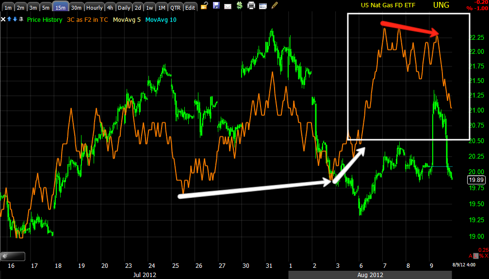

Energy 
 The 1 min chart in Energy today isn't a strong distribution timeframe for overall big picture stuff, but since Financials were the last to cross resistance (up to 7 days behind Tech and Energy), as of last Friday I said I believed the markets were waiting on Financials, that they were the only group still holding the market up. This move today on the 1 min chart in Financials is pretty intense, a leading negative divergence.

One reason I look to the short term charts for timing is because market makers/specialists who have been filling institutional orders and have some idea of what is coming often want to get prepared right before a move-whether stocking up or selling naked short their inventory as they are allowed to do, they also trade significant volume in the stocks they make a market for. I suspect HFTs play a similar role as a liquidity provider, but this would be a more recent development. The Specialist/Market maker stocking trend before a reversal is something I have witnessed many times in the past, HFTs have definitely effected their role, but I believe it's still common practice.

Also much of what has kept Energy up has been Middle East event risk. Energy markets are WAY out of sync with their legacy arbitrage FX correlations.

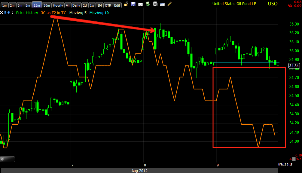
 Just because it is confirmation and so extreme, here's the 2 min chart, the yellow box is where the short position in USO was entered yesterday (this is not USO). The divergence is way out of recent character and it is very sharp, leading negative.

 The 5 min chart was included because it shows the interesting accumulation seen market wide for 1 day last Thursday, the same day Goldman told anyone who would listen to go long the Euro, today in a GS release it was once again confirmed that GS's trade rec'd go against (they trade against) their own clients, yet they are going to treat the average Joe (us) to better information? Sounds like GS had some Euro's or any risk asset that is correlated to the Euro (which is just about everything) to sell.

By the way, here's how that Goldman Euro trade rec'd is going...
Considering many probably got in on the spike after they announced it, most are probably at or near a loss and most of that happened overnight last night.

 Energy 15 min, note at the yellow box there is NO accumulation, as mentioned, energy has largely been up on fundamental  risk events. There's a sharp change in character on this chart from rough confirmation to a leading negative divergence. I'm still dumbfounded by how many "experienced" traders believe that when a stock's price is going down, they believe that is smart money selling; smart money sells in to price strength and demand and are already short by the time price goes down.

 Energy 30 min-this is part of the reason I now expect a worse move down than previously, note confirmation (generally) at the green arrow as 3C makes higher highs with price and the recent leading negative trend down, confirmed on many timeframes. This is a major change in character of the underlying trade.


Financials
 Again, the short term 2 min chart is included so you can see how sharp the negative leading divergence has been.

 The 3 min chart shows last Thursday's accumulation which was market wide and only 1 day. Th leading negative divergence here is touching the lows and over the course of only several days.

 Thursday's accumulation again in white and the leading negative divergence on a 5 min chart.

 15 min Financials going all the way back to the head fake low of June 6th when we opened hedging long positions at great prices while traders went short. The small red boxes show negative divergences at tops and the resulting moves down, the current negative divergence is leading and the worst on this chart.

 30 min Financials with a distinct change in character-remember it takes institutions time to sell millions or tens of millions of shares, it's not like us. However it appears they are done as the recent highs have hit an increasing leading negative divergence which was already at a new relative low.


Technology
 The 1 min chart with a sharp change in trend.

 The 5 min chart also now lower than where 3C was at the accumulation from last Thursday, it only took 2 days to get there.

 The 15 min chart of Tech, white is a positive divergence or accumulation, green is trend confirmation and red is a negative divergence/distribution. An arrow represents a relative divergence-relative between two points, a box represents a stronger leading divergence. Often we see relative divergences first as distribution starts in to higher prices, the relative divergences may get worse as distribution continues, leading divergences almost always follow relative divergences and represent a flurry of activity, stronger than the previous activity and usually faster, I like to think of it as final preparations or in some cases, very strong institutional activity, that's what we saw market wide last Thursday, the same day GS made their long Euro call and just before the major averages were pushed above local resistance (possible head fake area).

Tech 30 min, this shows the relative divergences getting worse and ending with a leading negative divergence which is almost as low as 3C when prices were at the late July lows.


UNG-What we learned

Really, not much new that we haven't realized a while ago. Just before 12:30 today I posted I was closing the UNG call position even though UNG is one of my favorite long term longs in the market, but when the 5/15 min charts look like this and market volatility and character look like this you simply CAN'T FORCE TRADES ON THE MARKET.

If you have been around WOWS for a while, you know I would much rather a trending trade and the UNG long position in the equities model portfolio is doing well,

 This is a position I barely look at and I think it is and will be a decent trending trade, but the chart looks like this...
That's a 4 hour (very long) chart with a major change of character. The point is, I think I chose the right tool (an equity long) for the job.

As for the Call/options position that is 3 days old, this isn't a bad gain...


However, I know how the market has been trading and I know that I/We have to adapt to the market and use the right tool for the job.

The above position was closed out at almost the exact high of the day, but knowing how the market acts and knowing the strengths and weaknesses of options, these were the correct charts/tools for this trade.

 When this 5 min chart didn't confirm that big move up I pretty much knew that the move was being sold in to, Wall Street ALMOST ALWAYS sells in to strength and demand and buys in to weakness.

Even though the longer term prospects on this UNG 15 min chart look good, the fact the divergence showed up here too told me it was more serious than just some intraday jiggle and it was time to close the trade at a decent profit.

This is one of the tougher markets if not the toughest market I've seen. People who bought, "Come Into My Trading Room" and use 1 method of trading are getting annihilated, just look at the financial blogs, the Stocktwits/twitter stream.

You have to use the right tool for the job, take what the market gives, be willing to change your opinion if the data supports it and fast and you HAVE TO let the trade come to you. We bought UNG calls on a pullback with a 3C positive divergence telling us it was a healthy pullback, our gain would have been almost nothing if we had chased UNG instead. Luckily we have a tool that gives us an idea of what to expect BEFORE it happens, it's not 100%, but if it was you would have never heard of it or me, however it's been reliable enough for us to make some great trades while everyone else is getting knocked out of the game. The key is what I have always said is our biggest advantage over Wall Street, "PATIENCE". We don't have to be in the market all of the time, we can pick and chose our battles and we can wait for the trade to come to us.

I hope the UNG trade made you some good money, but I hope this post give you some things to think about to further your success.

ES Update

As the 5 min market average charts started to deteriorate as per my last market update, look what was going on in ES...

Hitting the lows of the day session

PCLN- Why CORE shorts Stayed in place

PCLN is a good example...

 Entered at $761.79, now up 26+%

As I said back at the June lows, "I'd rather leave core shorts open and hedge them with longs", the market has too much volatility and event risk. The best case scenario is the long hedges make money, the core shorts go on to continue making money. Worst case, you're hedged. My only regret is PCLN could have been filled out a bit more, we just never got that decent counter-trend move to add.

The area PCLN was shorted in April and yesterday's break

Quick Market Update

We are finally getting some movement in those 5 min charts, I'll try to get some up, but they look like they are starting to give out.

GLD Put Position

I REALLY didn't want to go out to September for a quick trade, but the market is so volatile and August expiration is coming up next week, the time decay factor can be a killer so I went with September $160 puts in the options model portfolio.


GLD Update and possible position

We don't have any tier 1 US economic data tomorrow except Import/Export prices and it seems there's some disappointment of late with some better than expected data which means QE3 becomes less likely, which means GLD becomes less attractive in the near term. I'm thinking of a speculative, quick Put trade in GLD here.

 The 1 min went leading negative when GLD gained in price, this looks like near term selling in to strength based on the QE disappointing data.


 The 3 min overall as recent data has also been disappointing for a September QE3 announcement.

 The 5 min chart as well

And the 15.

That's enough for me for a short term options put position, I'll let you know what I decide on.

USO still in decent Risk:Reward position

Yesterday I posted 1 2 3 4 5 6 updates including starting a USO Equity model portfolio short position that is so far in the green and has room to add to, which while I'd like to see the market crack to the downside and get on with it, I'd also like to add to that USO position and fill it out on some price strength/underlying trade weakness.

Here's USO today...
 Intraday, as usual traders placed stops at intraday support and a penny or two below, they were stopped out (or there could be some short orders triggered, but I'd bet most of those are stops). This is why I harp on not putting stops at obvious places-you'd think traders would have learned by now! Also I prefer to keep stops mental rather than show the entire trading world where my "Uncle" point is, the bigger your position the more important this concept.

 1 min USO and one of the reasons for starting a short equity USO position yesterday.

 2 min has added to the leading negative today

 So has the 3 min

 As well as the 5 min at a local new low.

 I wouldn't have entered an equity short in USO based on the charts above alone without a 15 min chart like this.

 The 15 min adding to the leading negative today

And the hourly as part of the bigger picture, why I'd like to add to the short and fill it out...

For risk purposes, USO isn't in any different position today than it was yesterday.

Market Update

Still staring at the lines, as long as we don't get lost in them (meaning lose sight of the big picture).

While ES has been choppy...

For today's purposes and for any potential trades, there's pretty much only 1 timeframe I find to be interesting, it's the timeframe that will most likely give us a decent timing signal as to when this chop (at least today) ends and whether any positions/trades may be worthwhile today, that's the 5 min chart and here's a little micro (intraday) vs macro (big picture) presentation as to where we stand.

 DIA 5 min trend, leading negative, looks like there's been significant distribution in this flat range.

 DIA 5 min intraday is pretty much in line, a little more positive than in line intraday. Note the consolidation I mentioned would be likely and the continued move higher although not much as we are up six tenths of one percent in the DIA 0.06%

 QQQ intraday almost perfectly in line with price, for any position/trades, I want to see a big move here in 3C.

 QQQ 5 min macro trend, I don't think commentary is needed.

SPY was in line, a little negative now.

SPY 5 min trend.


More or less we are at what almost all indications point out to be a major strategic turning point, intraday we are just waiting for the tactical turning point.

Quick FB Update

 After FB made a capitulation move to the downside we saw some positive activity, some got long and made some quick money with options on this small run, but I suspected from the start that this was not a big enough base to accomplish much of anything and we'd likely be coming back down to likely form a bigger base in FB, thus  far it looks like we are on track for that.

 15 min leading positive

a 60 min leading positive at the second low.

I'm not thinking that we are about to see lift off, but I am thinking we will. I might consider starting to build an equity long in FB, I'll wait a bit more and see what comes of these long term positive divergences. I'd really like an options call, but I don't think we are there yet at least today.

High Yield, How About JNK?

Since High Yield Credit is a risk on asset, there's not much higher yield than junk or JNK.

Here's the correlation between JNK and the S&P-500

 SPX (green) vs JNK (red) 60 min chart

 SPX vs JNK daily chart-there's pretty good correlation there as they are both risk assets.

So what about the underlying trade in JNK?

 The 3 min chart, from confirmation to a negative divergence to a leading negative divergence.

 The 5 min, very much the same, there's a clear change of character in the underlying trade, just as in the averages.

The big picture-60 min