Better late than never... Sorry about not getting these out sooner, but I've had a little disturbance in the family force that needed my attention and these are more informational at this point, speaking of which, I'd also like to get a breadth update up soon.
These won't be in any particular order, these are just some of the many charts I looked at Friday, the point largely being the long term timeframes are already severely damaged, which indicates the underlying damage has been done, the support is removed from many of these issues. When this happens we often come back to the short term timeframes and look for head fake moves above obvious resistance levels showing negative divergences (selling/short selling in to price strength by smart money) as a timing indicator.
A while back we were expecting a quick sharp pullback followed by a much stronger move to the upside that would pull in longs, as the charts developed I said I was looking at the market downside as being more than just a corrective move and was going to be treating it more seriously (larger positions), the downside corrective move never materialized to any degree, but the move we expected right after, a strong move up that would likely hit new highs did, the final trend we expected was a big drop, specifically a primary trend down. In a way, it seems we skipped over the 1st trend anticipated and went to the second, the charts long term still look good for the final move, being a very serious move down, but if you recall, the move up trend we anticipated was going to have to be very strong to pull in new longs, a break out new high in most averages is along those lines and was a scenario mentioned many times since the trend assumptions started forming around late June.
Perhaps Draghi's words (but no action) short changed us of the smallest trend assumption which was the first, a pullback move followed by the strong move up. Fundamental shifts such as Draghi's 180 degree reversal on ECB policy are very hard to predict, even for Wall Street.
To the charts!
AAPL 30 min , the theme you will notice is once price moves above an important resistance level, the already divergent stocks, Industry groups, ETFs, etc, all see worsening 3C divergences, the simple implication is selling in to strength in price, or shorting, but you will see this theme in many of the charts as a clear resistance level is broken. Without going in to a lot of detail, this is the exact same thing we expect to see on a head fake move and lines up very well with a head fake move as well as the second trend we anticipated based on the charts which were bullish enough to hint at a powerful uptrend, but have now crumbled in to that move.
The short term charts are good for timing and the worse they look in to a strong price move, the more likely it is that we are near/at the reversal as I've consistently said, "80% of all important reversals are preceded by a head fake move" and that is on the conservative side.
BIDU 60 min chart from where we first shorted it, the head fake bear trap in yellow and the anticipated counter trend rally which now looks to be out of steam as the 60 min chart reaches new leading negative lows.
BIDU short term 3 min sees a worsening leading negative divergence in to a move above resistance, this is the opposite of what a healthy breakout should look like, but the breakout above obvious resistance brings in retail longs, which provides demand allowing smart money to sell/short in to that demand at better prices. These are the signals that I like to trade as I'm trying to trade with Smart money.
TLT/Treasuries broke below a very long term/important support level, but as they did, they saw accumulation of the stopped out shares as seen on the 3 min chart's trend, in fact a large move up in 3C on big price weakness.
TBT which is the Ultrashort of TLT sees the exact opposite with a deeper leading negative divergence in to higher highs, accumulation in Treasuries, suggests the flight to safety trade is on already, Treasuries tend to rise when the market falls as the flight to safety trade and TBT confirms TLT very well.
The long term TLT 30 min Treasury chart with the important support level broken, but no 3C downside confirmation at ALL, in fact, just the opposite, a leading positive position suggesting that a large move out of TLT on stops was accumulated as the timeframe represents stronger institutional activity.
The Ultrashort of TLT above, TBT on the same timeframe gives exactly the opposite signal, thereby confirming both charts, again note the worsening divergence on a strong timeframe as TBT breaks above a congestion/resistance level, again the reason which we have seen many times is the retail longs buying a confirmed price breakout provide demand that smart money can sell/short in to, thus the deteriorating 3C at that area of the breakout.
Short term volatility has been seeing very strong leading positive divergences, several can be seen to the left, but as VXX DID NOT make a new price low as its market correlation would suggest, it did make a new leading positive divergence.
VXX 3 min with VERY strong activity Friday in to the afternoon session in a flat environment (flat ranges are where we often see institutional activity as it i the last place technical traders expect it, they expect it at big price/volume moves, but Wall Street is as quiet as they can be when putting positions together or taking them off as there are specific High Frequency Trading programs that specifically look for "Icebergs" which are large institutional orders being broken up in to smaller pieces, the HFT then front runs the institutional firm, making money by making smart money pay a lot more for the order.
Just as Cramer says, as far as smart money, you never want to tell the truth, but rather create a new fiction.
VXX 5 min seeing the same level of heavy activity on the 5 min chart which is important as a timeframe, but also showing migration of the positive divergence in the lower timeframes, meaning it is spreading, becoming larger.
UVXY 15 min chart, this appears it is not just a recent event, in my experience, with most divergences if you were to buy UVXY at the first sign of a positive divergence around the $10 level, even though the accumulation continued in to lower prices, by the time UVXY was done running higher on the positive divergence, even the $10 position would have made a decent gain.
VXX 30 min, again suggesting this is not just recent behavior as volatility has been VERY cheap lately.
UVXY 30 min, look at the difference in size between the negative divergence sending UVXY down and the leading positive now, this would suggest quite a strong move will come off this divergence, the reversal down's divergence wasn't even leading.
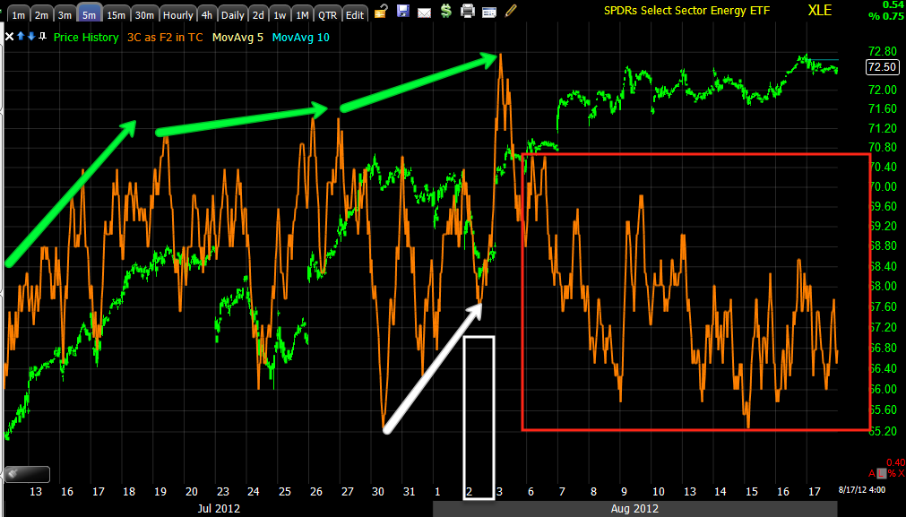
Energy 30 min with confirmation of the move up at green arrows and a worsening negative divergence
Energy 5 min with the Aug 2nd accumulation that was market wide, it was in almost every asset class we looked at, not too long after, the trading ranges that had been established were broke in to 3C worsening divergence again suggesting the longs stepping in on breakout moves were providing demand that could be used by smart money to sell in to or sell short in to, both actions come across the tape as a sale.
Energy 1 min with a generally nasty divergence on several breaks of resistance levels, but particularly in to the closing action Friday.
Here's a closer view, look at the divergence on Friday at the close, this is one of the finest examples of a true divergence and strong, clear signal.
Financials at the breakout level in yellow above the white trendline; note the worsening 30 min neg. divergence in to the wedge-like rise.
The June bottom in Financials with accumulation, this is where I decided to add longs to hedge out the core short positions I wanted to keep open because of their superior positioning, also note the breakout level at the red trendline and the 3C action in to that area.
On a faster 2 min timeframe in Financials, they make a break above a resistance zone late in the week as 3C makes new leading negative lows.
Technology 15 min and the Aug 2nd accumulation(clearly planned as it was market wide on price weakness and a GS trade rec'd the same day in the Euro-which is the same as saying go long all risk assets, allowing GS to trade against everyone as they do against their own clients), the divergence here at the breakout level is very sharp, this is what the internal underlying smart money action looks like as a bull trap is set up.
Tech. 5 min at a new breakout with the clearest divergence on this chart, suggesting the most institutional activity at this area, which makes sense as the volume and retail's actions open up the field for smart money to maneuver their larger orders.
XLK 2 min conforming the above chart at the same breakout area-note Aug 2nd accumulation , a general negative divergence though most of August and a very powerful one toward the later half of the week and at a new leading low.
The 3 min chart also shows the same, it even shows the small amount of accumulation at a dip in prices needed to get the breakout move going and then look how much worse the leading negative divergence is as price moves up. These are just some of the charts that gave me the confidence to enter positions Friday, I don't enter/exit on whim or guesses, but on hard data.
High Yield Credit and Junk Credit (also with high yields and as such a risk asset) with the close from Thursday drawn in a red trendline, Credit didn't share stock's enthusiasm. This has been the trend, but again, very specifically we see this Friday.
The same is true of JNK credit with a close below Thursday's, both of these have rallied with the market when the market had a decent trend, but when they fail to rally, they are telling us something. They have failed both on a very short term basis and on a longer term basis.
I'll try to get some more charts up for you in a bit.


 | Theme by Thur