Tuesday, July 6, 2010

Daily Wrap...

Yesterday the 1 min "negative divergence wasn't really all that negative, it was in line with price, slightly negative and no sign of a positive divergence. This is not the kind of edge that I'd really consider an edge. However, the 5 min 3C from yesterday suggested strength and by virtue of it's timeframe, it suggests strength that is building and is usually realized within a day in most cases. However, as I have said before, a divergence simply shows institutional money doing something that is opposing the trend, which indicates the probability that we will see a reversal. A one minute divergence helps us narrow down the activation of the reversal, but it is difficult to say when their accumulation or distribution ends. Still the timeframe in which the divergence is found gives us some indication of when to expect results.

Here are a few charts that are a little difficult to read, it takes time to understand divergences and more time to spot them, still even more time to gauge their relevancy. Follow the arrows, blue for accumulation or a positive divergence which will always be found in a relative negative trend and red arrows for negative divergences which will be found in a relative uptrend or at highs.

Here's the 1 minute which is the hardest to follow:

Looking at the higher red arrow, compare where price was at the start of the arrow and where it is at the end of the arrow, you'll note price is much higher. For 3C (white indicator here)  to confirm the trend, it too should make a higher hig. In this case the downward slope of the red arrow and 3c indicate distribution, that was also the high for the day and price reversed to the down side. The first blue arrow on the left shows price making a new low, however, 3C is near the top of the chart where the arrow begins, this shows positive accumulation or a positive divergence and price moved up rapidly from that point. The 1-min 3C chart I believe is showing the collective action of market makers accumulating or distributing a position right before the trend reversal so they have the inventory to fill the orders on the other side of the trade. For example, the first blue arrow on the left is showing market makers "stocking up" or accumulating the stock in anticipation of a reversal to the upside. They will sell that accumulated stock into the demand provided by the upside reversal. This morning as we gapped to today's high, there was a negative divergence, this is showing market makers going short or naked short (which they are allowed to do-you are not) in anticipation of a move down. This afternoon, you see a small blue arrow  (the second from the right) at this point market makers are buying to cover their short position from the early morning gap that led to a price reversal to the downside and they are accumulating shares to sell into the demand of the next move higher. The last blue arrow to the right shows a "leading positive divergence" which is the strongest of divergences and shows heavy accumulation by market makers. Why are they buying? Remember that their job is to take the other side of the trade, this means that they anticipate higher prices and that is why they are accumulating and why a positive divergence is a good indication for us of a continuation of the late day trend reversal to the upside. If you read my explanation a few times and you closely follow price and where the indicator is relative to two points on the chart, you will start to see the connection between divergences and trend reversals. Remember that a 1-minute chart is the least influential, it is not indicating a major trend change, but rather intraday changes in trend and is an excellent tool for day traders. I don't use it on the site because we are not devoted to day trading, but I can use 3C on tick charts (a tick =1 trade) and I can see very minute changes of trends.

Divergences are not just for 3C, but are some of the best ways to interpret almost any indicator.

The 5-min chart-
I believe the 5 min chart still shows market maker activity, but with an emphasis on a larger picture which could include filling orders for major institutional clients or more consequential changes in trend therefore they carry more weight then a 1 min chart and represent more
significant trends, which can last up to several days in some cases. When I see a 5 min divergence, I pay a lot of attention to the 1 min chart to try to determine when the 5 minute divergence will spark a reversal. alignment of the different timeframes leads to the most significant trends and results. Therefore it is possible, as we have now, to see a 1-day negative divergence and a 5-min positive divergence. the bigger, most significant trend is the one day, but within any move up or down, we get gyrations and trends within trends. Being able to understand which timeframes effect which size trend is essential in understanding divergences. The chart above is about 2.5 days worth of information. On Monday we see out first positive divergence (to the left in blue) at 1 p.m. Between 11:45 and 1 p.m price makes a lower low, however, 3C does not confirm the downtrend which would mean that we would expect the downtrend to continue, instead 3c (in white) makes a new high-leading price which is why it is a leading divergence or a heavy load of accumulation. It also happened to be the reversal point of the downtrend. As you saw in the chart above, by the time we got the gap up early this morning, 3C had made a lower low, it did not confirm the trend by making a higher high, thus we know that market makers again were selling into the gap up and going short (both actions represent selling and are considered distribution). If we look at today's 3C from 12 p.m. to the price low at 3 p..m. we see 3C making new highs, which indicates accumulation (buying). 3C carried higher, leading price (leading divergence and by 3 p.m. we saw a reversal and a late day move up. Between the 1 min chart at the top and the 5 min chart above, both are showing positive divergences (alignment of trends) which suggest that we will see more upside and early gains that will likely be sustained for most of the morning, perhaps longer.

Divergences can be seen in almost any indicator and despite the traditional use of many indicators, such as Stochastics using number levels to identify overbought/oversold levels, divergences in Stochastics are more powerful then the way most people use the indicator. This is the case for almost any indicator I can think of and not a lot of people use divergences  in reading their indicators. Learn how to spot them and you will have found a powerful new way if using traditional tools.

Today we did not see a big move up, but considering how the H&S top was broken, any slowdown of downside momentum is an important occurrence and to close higher as we did in the important averages, this was a good sign for our analysis.

You probably can get an idea of what we expect to see tomorrow from the above posted charts, but here are two more (the QQQQ 5 min and DIA 1 min) for you to confirm what you see in the SPY for tomorrow.

This one minute chart is fairly easy to spot the positive divergence just from a glance, most of the day price moves down, most of the day 3C (yellow) moves up.

Both are showing positive divergences although the Q's 5 minute is more pronounced as you can see if you focus on price and 3C between 2 p.m. and 3 p.m.  today. Prices lower, indicator higher = positive divergence.

Be sure to read my 11:09 update this am "Another Possibility" , this is what happened today and it appears tomorrow we will see part 2 of that scenario, a move back above the averages respective necklines which will put the shorts who instinctively believed the neckline was resistance anyway. the break below resistance signifies a failed rally attempt, this is where they would have gone short.

From the update this a.m.-
"The charts could break down below the neckline (Dow and Q's are the only ones above it right now) which would help to pull in the shorts. The idea would be later it moves back above the neckline and knocks out those shorts." 


As you can see, it looks like prices are ready to move back above the neckline which will cause a mini short squeeze (cause more demand) and help to move prices higher. These are the games the market makers play to move the market in their intended direction.


At 11:13 a.m. I added another post "Driving You Nuts Yet?"  "In all the averages there is a bull flag on the 1-min chart, it suggests the market is getting ready for the next push higher."
In that post I brought up the possibility of a bull flag forming. A bull flag is a consolidation/continuation pattern (bullish). It was very early to call out a bull flag as we didn't have anything really strongly resembling a bull flag, but some hints of it and in concert with the earlier analysis, the pattern would have made sense. Guess what we got today? A Bull Flag! Here it is. The components of a bull flag are a fairly vertical rise in price which forms the flag pole and it occurs on decent volume, then the flag which is a pullback that MUST ALWAYS consolidate against the preceding trend of the flagpole. So if the flag pole is a move up, the flag will be a parallelogram consolidating downward. Another feature of the bull flag is that volume falls off during the consolidation. If volume were heavy it would void the pattern. Volume should pick up when the flag is completed and that occurs when price moves up through the upper trendline (resistance) of the actual flag portion of the pattern and breaks out. This is further confirmation of what we see above in 3C and our analysis from Monday night. 


Finally at 2:17 "Update" I said,  "OK, we got what I thought we might see this am, there are still positive divergences in the SPY. I'm looking for EOD rally." EOD=End of day, again that is what we saw. So far I think we are on track, whether you are trading this bump up on the long side, waiting for an opportunity to short at higher levels or just waiting this bounce out. We appear to be in pretty good shape.


As for the shorts I mentioned this a.m., Dell has a very strong 1 min positive divergence, look for opportunities to short it as early as tomorrow.


FARO also has a strong positive divergence and volume picked up toward the end of the day. This one has a "Tweezer"candlestick bottom in place and looks set to hit our target.


EXPE didn't do much today, we'll have to see what tomorrow brings, but that tends to suggest it may be weaker than we realize.


BIDU has two 3C 1 minute charts that look very aggressive to the upside, several other charts have failed to show much. There was some volume at EOD, were it not for the aggressive nature of the 1 min charts I doubt I would have had much to say about this one. However, if it can make it to the target zone, It would make for a high probability, low risk, high reward trade so keep an eye on it. 


BID from a purely Price pattern point of view has formed the bull flag, it has not broken out to the upside, that needs to happen soon, however, volume increased dramatically toward the close. Keep an out for the breakout which (at this point) would occur around $22.75. As a possible alternative trade, it is close to forming a bear flag on the daily chart, a breakout of the intraday bull flag dovetails with the daily bear flag-they work together, but if this one doesn't breakout, it could be shorted on a limit order below the daily bear flag which is around (again, at this point-but stocks move) $21.95. However, it really needs that intraday bull flag breakout to be a decent looking daily bear flag short.


SLG got hammered today. There's a bit of a positive divergence at the EOD. I can can't see this one moving much higher than $54.15 if it can muster the strength to rally at all. There's a lot of overhead resistance in this one and any move up may be worth phasing into a short position a bit at a time, maybe in 1/3s. It has a decent target of about $40.


As for UNG, I've received a few emails and may have overlooked something that may be significant.  Support and resistance at moving averages, especially at the popular 50/200 day moving averages are self fulfilling events because so many traders use and watch them. I rarely use moving averages for a lot of reasons, but in these two charts you ill see that UNG has a long established relationship with the 50 day moving average in blue. If you are in the trade you may want to take this into consideration.
Acting as support and resistance


Here we see Support in January, when support is broken it becomes resistance which we see during February and at the end of April. The end of June we see the uptrend start on good volume as price breaks above the 50 m.a. and subsequent support recently.


MA looks like it could be a nice little trade on the upside for at least a day trade, it may take on more life from there, but there's a good divergence on the 1 minute chart. This is a trade posted on Trade Guild before WOWS as a short, it brought in over 20% already. Take a look at the chart, it may be worth a shot, especially for a day trader.


Finally BAC short
This is a good chart to learn a few things, click on it and read the annotations


The extended trading range shows a daily 4C negative divergence that turns into a leading negative divergence, shortly thereafter BAC breaks very significant support in the $14.40 area. The longer support stretches, the more times it is tested, the more significant the eventual break. We now have approximately 11 months of long positions underwater (Overhead Supply/Resistance).


A closer look at the break. First note that the break occured on a gap right through support, that is important. Secondly, as I often quote, "To make money in the market is to see that which others have missed". The increase in volume on the break of support is not visually impressive, most people would ignore it, however, it is small details such as this that our the things you should look for. With the hundreds, maybe thousands of indicators available today, most technicians have forgotten the art of volume analysis. Here are the two most two most important components of technical analysis: 1) Price  2) Volume PERIOD! Volume analysis is virtually a lost art.  Ignore volume at your own peril.


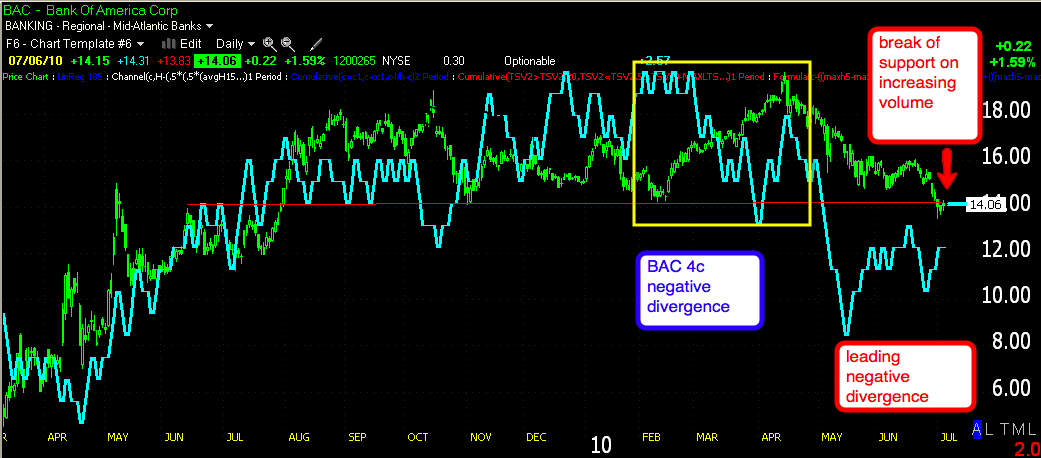
BAC is certainly worth keeping a close eye on, this break of an 11 month trading range is very significant. A pop back above the former support would present a very interesting opportunity on the short side. As a reminder, BAC does have a dividend, although small. Some dividends are not so small and if you are short when they go ex dividend, you will be responsible to pay the dividend. In this case, it's not really worth concerning yourself over.


Finally RISK MANAGEMENT! If you have questions or need help with a plan, please contact me immediately. If you don't have a risk management plan, I'd advise you to think about getting out of the market until you have one. IT only takes one trade to do major damage, no matter how good you are, your only as good as your risk management plan.

Update

OK, we got what I thought we might see this am, there are still positive divergences in the SPY. I'm looking for EOD rally.

Driving you nuts yet?

In all the averages there is a bull flag on the 1-min chart, it suggests the market is getting ready for the next push higher. You know what I think about the next day or few days, but there's a lot of ways to get there so I'm throwing out different scenarios for you to be prepared for.

Another Possibility

This one can get emotionally a little scary if you are plying the long bump, but here it is.

The charts could break down below the neckline (Dow and Q's are the only ones above it right now) which would help to pull in the shorts. The idea would be later it moves back above the neckline and knocks out those shorts. It's the waiting for the move back above the neckline that can be nerve-racking if you play the long side bump. If you are just waiting to short at higher levels this is really of no consequence to you, you either get them or you don't. In either case you should largely be in a short position by now.

Check out the shorts I just listed.

A Few Shorts

These will be added later tonight to the spreadsheet.

Dell anywhere around $12.50 or above.

FARO -watch this one on the size of your position, it's fairly low volume. You want to consider shorting it in the red triangle.


AMPL stands a decent chance of breaking out to the upside for a quick upside trade of a few days-this is a long trade.

EXPE short in the red rectangle -I doubt it moves above $21.82

BIDU-a typical triangle top and it could be a nice short

This is a long shot, but possible short -BID

SLG

There should be more short ideas to follow if this market continues up.

Unlike the inverse leveraged ETFs, these are pure shorts, you will need a margin account. Each (shorts/ETFs) have advantages and disadvantages. Ideally a decent blend between them would be great, just make sure that you choose positions that do not put too much money in any two positions that are closely correlated.

If you look at GLD's chart today, you can see why I've been hesitant to get involved with Gold, that trend doesn't look right.

Update

well we've skipped anything on the one min chart which wasn't strategically all that important and was the most ambiguous of all the charts. The 1 min was following prices or confirming, there was nothing suggesting a reversal in the 1-min, but it's not hard to turn and a weekend  can do a lot.

So we are now dealing with the 5 min positive divergence that I mentioned would hit it's first target at the neckline at $104.40 or so (SPY), for all practical purposes we have hit that and pretty fast. There could be some hold up in the area as I described last night, many traders will believe this to be the resistance level. If I'm right and we head higher into the gap, the market makers will allow some time in the are for those traders to take their short positions in the res before they move the market significantly higher and create  mini short squeeze.

Now is an important time to watch and it is a level I would feel comfortable adding a little to a new short position, not a lot, but a little. I know that's subjective, but everyone is different, for me, I'd have 25% in place as of Friday and maybe ad 10-15% here.

Right now prices are backing off that neckline level, watch for volume to increase slightly. I believe if/when prices move above the neckline, it won't be subtle, but fast and a significant move. If you are day trading, a position in UPRO now makes some sense, but don't get greedy, this is a precarious trade.

Correction

Thank you to the reader who pointed it out.


"You could use a 2x leveraged ETF like QID also." should read 


You could use a 2x leveraged ETF like QLD also.