Tuesday, February 14, 2012

SLV Chart Request...

Gold and Silver and probably 2 of my least favorites issues to analyze, gold is in a potential bubble and silver has been manipulated more then any one single issue I can think of and compared to gold (geologically-as in the ratio of gold vs silver in the ground) silver is way undervalued compared to gold.

First lets start by looking at the long term which is a good place to start when analyzing an issue, you have to know where you are in the trend first.

 This 5-day chart shows an RSI negative divergence at the top, which isn't very strong and a recent RSI positive divergence. The top was the COMEX manipulating silver with 5 consecutive margin hikes even after they killed silver, they kept going. If you click on the chart you should get a larger view, note the candlesticks on this 5 day chart, you probably wouldn't see them on a daily chart' they form a near perfect Doji Star reversal that is confirmed on exceptional volume, but that had a lot to do with the COMEX. Note the trend as well, lower highs and lower lows, but possibly SLV could break that and make a higher high. There would not be a trend in place until it also made a higher low and moved off that low. My best guess by looking at this chart alone is for a bounce and likely resumption of the downtrend.

Looking for correlations, you don't find much. Usually with gold there's either a market correlation depending on monetary policy (QE makes for a good market correlation) or there's a flight to safety inverse correlation. Silver is not as correlated to the $USD as you might think.

 This is the correlation to the Euro/$USD, in red it's useless because of the COMEX hikes, in white it's a bit better and there's a rough correlation to dollar weakness (again, QE produces dollar weakness so in a QE environment, the correlation is better and the PM's benefit).

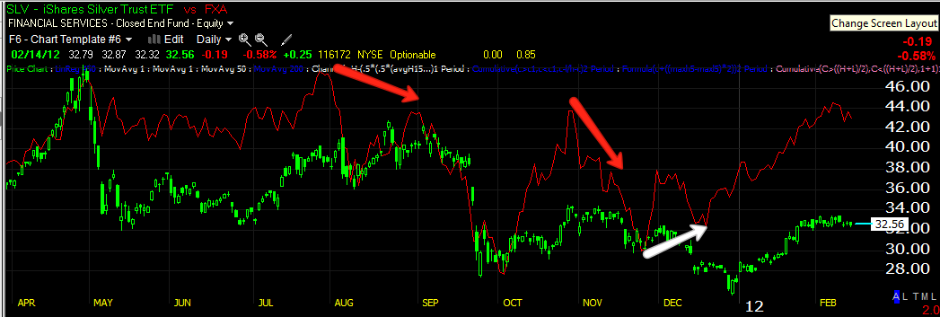
 As for market correlation, here's the SPX, virtually useless, but I did find one correlation that is predictive and that is valuable.

 Here's the Australian dollar or FXA, note the Aussie topped in August, SLV soon followed, it topped again in November, SLV soon followed, it made a higher low in early December, that sent SLV higher, unfortunately there's no divergence to tell us what comes next, but keep this in your bag of tricks for SLV and watch for a move in the Aussie, likely it will tell you where SLV is going next.

The next best thing we can do is look at the Australian dollar and see what 3C says...
 On an hourly chart, the FXA is in trouble, this would suggest that SLV will be in trouble, but there seems to be a 2 week lag between FXA's moves and SLV following.

 Very short term we have a positive 5 min divergence suggesting a FXA bounce, so this may very well bounce SLV a bit.

The 2 min chart shows the same. So based on what I see thus far, it looks like SLV could be in for a bounce and then potentially a dip.

Now to look at 3C/SLV short term and see if we have some confirmation...
 The 10 min chart is showing a positive divergence, it's several days long, that's in the bounce category.

 We have a positive divergence on the 5 min chart too, a couple of days long, so that hint at a bounce.

 And today it put in several positive divergences and some productive price movement, lifting off its intraday lows.

 This area around $34 is where I believe the new JPM line in the sand to be, although I have no idea if they still hold the SLV short and how big it may be.

 So far the Trend Channel has kept this move in the long trade, I would not short SLV until a break below the Trend Channel, just under $32 on a closing basis.

 Longer term on a 2 day chart there is a "possible" small positive divergence, it's hard to say definitively because some other timeframes don't support that view.

 Like this hourly chart, it's clearly negative, but so was the FXA chart in this timeframe.

 The 30 min chart went from confirmation to a negative stance, same as FXA.

The 15 min chart is the same, however, considering resistance at the $34 area, a bounce that breaks it on a head fake move seems reasonable. The move certainly could be traded from the long side, but we would need to check the breakout as I suspect it would be a head fake / shakeout move, but it makes sense with the long term and short term charts, a bounce that breaks $34 followed by a move down, so there are two potential trades, first long and then short.

 Using the swing trading system I have been working on, SLV is still considered a long as the Trend Channel confirms. Using this layout, there are two potential long stops, one at the Trend Channel at $32.22 on a closing basis and the other using the Swing pivot with a closing candle that has a high that is lower then $32.80.

If you wanted a tight stop, the volatility stop I have incorporated in to the swing layout is at $32.46.

My feeling is a bounce above $34 is probable, but it is also probable that it is a head fake move, which may give you good short positioning, trading it up and then down. If you just waited and there was no bounce, a close below the daily Trend Channel would be worth looking at a short trade.

I know there's a lot there, if you have questions, just email me.

The 5 min 50 bar average makes another appearance

Old habits die hard, note the 5 min 50 as resistance all day and the break of it brings the volume.

Market Update

There's very little accumulation on this move, just enough to keep up appearances.

By the way, the Finance Minster's meeting for tomorrow was cancelled, you know who they blamed it on

Junker Junks the Euro

Why Greek party leader, Samaras said what he said about re-negotiating the terms of the bailout after the April election, I can only assume was for political gain. Those words alone were exactly what the Troika fears the most about Greece, that they won't live up to their obligations.

I pointed out last night that tomorrow's meeting of the finance ministers can't possibly produce a bailout agreement because of all the votes in the Netherlands, Germany, etc. How can they summit of FMs produce a vote when the key individual players haven't produced the votes needed to do anything at a summit. As I said last night, all of the votes and timetables for them will make your head spin and to think that these group of clowns will be able to manage a disorderly default of a developed nation!

So the Euro keeps diving as expected..

Juncker's statement didn't help, but it was predictable as I pointed out last night and just summarized.

From the DJ newswire...

Juncker: I did not yet receive the required political assurances from" Greek coalition party leaders "on the implementation of the program


As far as I know, other then rumors of what the Troika may demand as proof, Greece hasn't been presented with specifics to give political assurances, but even if they did, the likely next PM of Greece, who unlike Papademo-ns (in his closet)formerly of Goldman Sachs, will be freely elected-Samaras, said everything the Troika feared when he voted for the austerity measures and the next day said they would be re-negotiated in April (presumably after his election).


So if it's not already clear, the end game is "Kick Greece out of the EU, they serve no purpose for German industrial production any more. All that is left are the details of how, when and how bad.

JPM Changes in Character

 It was just a few days ago I pointed out that JPM put in the first Bearish Engulfing candle since Dec. 6th 2010 a definitive change in character. This is what a normal wedge looks like these days, nothing like what you see in a technical analysis textbook. They head fake, they move laterally, they do everything except what T.A. books teach you as Wall St. uses Technical Analysis against you.

 The 30 min 3C chart of JPM-it' no coincidence that this looks so much like the SPY 30 min chart, even though they are two unrelated equities, heck, one is an ETF! Yet they look the same, that is why 3C stands for "Compare, compare, compare".

 The 5 min chart after the wedge breaks out, exactly what TA says it shouldn't do, which draws in buyers on what they believe is a failed pattern. The Bearish Engulfing candle trapped 4 days of longs itself, today's move traps something closer to 2 weeks of longs at a loss and this is why they run these head fakes.

 A negative divergence on the breakout and subsequent formation of a bearish engulfing candle in white and a leading negative divergence now.

The 2 min chart shows the same, that open that created the bearish engulfing pattern was under distribution since it started and was the highest move since last August.

Yes, I think JPM is a short candidate.

SPY/SPX Update

This is a longer term update with more charts so I have only completed it for the SPY/SPX because if I captured all of the same charts for the other 3 averages, you'd have 28 charts and I wouldn't be able to get it done before the close.

 The SPY 2 min chart today is in line or showing confirmation of the move down, this confirmation is something we have rarely seen on the moves up, which would indicate that the smart money has been using the rally to sell/sell short in to. Price is always deceiving and Wall Street is always working far in advance. The entirety of these charts are "part" of the reason I believe this is a bear market rally and they are dangerous. Again, if everyone knows it, it's not worth knowing, the price chart alone is something everyone knows and there's no edge to knowing what everyone else knows.

 SPY 2 min longer term has really ben negative since last Thursday and is now leading negative for at least the 7 days seen on this chart and likely many more.

 The 5 min chart shows confirmation up, confirmation down.

 The 10 min chart also went very negative last Thursday, it showed some accumulation (for the gap fill yesterday) late Friday, it has been negative ever since and it too is leading negative at a new low as far back as my history will show, 7 days.

 The 30 min chart is where the real trouble is and has been, this is why I have thought (along with other indications) that we are seeing a bear market rally that will end badly. When you see how negative this chart is, it may seem out of place or unbelievable, but consider the Credit/Risk charts that show equally as bad or worse dislocations between the market and the EUR/USD, commodities, rates, and Credit. When you put them altogether, this chart is much more believable as we have confirmation from wildly unrelated indicators.

Finally, a long term picture of the SPX showing the 2007/2008 top, 3C went positive before the market at the 2009 bottom and called accumulation. 3C stayed mostly in line until QE2 when averages were artificially manipulated higher, thus the deep negative divergence as once again, QE2 created an illusion of real strength, but in reality it was just manipulation of the market. Presently, the depth of the daily divergence is horrible, worse then most every single top I've studies over the last century, QE2 is mostly to thank for creating higher market prices with no underlying support or strength. In my opinion and as we saw with consecutive months of insider selling that was more lopsided then any other time in the history of the market, QE2 was a gift to Wall Street from the F_E_D, it did nothing for the economy except squeeze margins in every industry, arguably it did more harm then good, except for the bankers on Wall Street and the CEOs who were able to sell their stock at high prices, thus the F_E_D's gift to Wall Street as you cannot distinguish between politicians and Wall Street, look at how many former Goldman Sach's employees serve in the F_E_D and the White House. Look at Greece where a technocrat was NOT elected, but placed in power by the Troika to get Greece to go along, and where did he come from? Goldman Sachs.

New Indicator, new insights...

This is a custom cumulative indicator I just threw together real quick, the reason why? Because very rarely do we see "V" shaped reversals either up or down, however, I was thinking, what if the reversal period is actually building before our eyes and we don't recognize it?

So here's what I created, first I created a code that tells us what the price percent change is each day and since the moves have been so small lately, +.22% or something along that rather then what we use to see as an average move of 1%, I created the indicator to move up 1 notch if the close was greater then .25% and to move down if the gain was less then +.25%. A change of .25% up or down is almost meaningless, we have just seen a string of so many days of small gains that there's more of an illusion of strength then actual strength.

Here's what I came up with...
 The Dow-30

 The NASDQ 100

 Russell 2000-be sure to compare the indicator relative to where prices are now and where they were at similar levels in June/July of 2011

And the S&P-500

Next, I created the same indicator, except it will move up on any close above 0% (even .0001%) and move down on any close below 0%. Since we know that the market has been more interested in creating the illusion of strength by closing higher, but not as concerned with actual strength as we can see by the very low percentage gains, this indicator by itself would move nearly straight up, so I added one more indicator to our custom indicator and that is the Rate of Change. If the market is showing more strength, the white indicator will move up on a positive rate of change, if not, it will move down on the Rat of change decreasing. So as the rally unfolded, we can see the relative strength of it.

 The Dow 30 from a ROC uptrend to a recent downtrend.

 The NASDAQ is the clear winner among the averages, but even its rate of change has dropped off since the start of the uptrend, before it went flat in the middle of the trend.

 The Russell 2000had a positive ROC and then went flat from the early highs to just before the red arrow begins and the trend down.

And the S&P-500

The point of this exercise is not only to show the declining strength of the move up, but that there may not need to be a period of lateral or rounding over and a "V" shaped reversal is not only possible, but more probable (I didn't say highly probable, but more probable).

Credit/Risk Asset Update

I think this layout has been one of the best, most innovative set of indicators we've added to our tool box, furthermore, I think if you ignore the signals here, you are doing so at your own peril. This layout is flashing bright red flags, not the kind that suggest a correction, but the kind that suggest something very ugly is going on beneath the surface where few traders look. As always, what the crowd knows, isn't worth knowing.

 Commodities today seem to be in line with the SPX's performance (SPX is always in green).

 As you can see yesterday, they had no interest in taking part in the SPX's move and remained at the Friday drop lows. This is why we use these charts, they are forward looking, not lagging indicators. A risk on rally should see risk assets like commodities perform, when they don't you see what happens.

 Taking a very long view back to 2010, look how commodities were in a risk on mode with the market at the green arrow, then toward the 2011 top, commodities diverged, they warned that it was a top, they warned before the 16% late July plunge and right now they are at the worst divergence in years, they are warning of something that probably very few of us can appreciate. It may be of benefit to go back and read my Bear Market Rally post from Feb. 5th 2012, the archives are at the right side of the site about half way down.

 High Yield Credit is showing worse relative performance then the SPX today. It gave a warning late yesterday.

 Since the NFP on the 3rd, look at what has been going on in High Yield Credit. Again, this is a RED FLAG.

 Rates, "Equity's magnet" are in sync intraday with the market.

 Over the last few days, since last week through today, they are warning as well, they failed to confirm the market's move up yesterday.

 Longer term, rates warned of the 2011 top and it's break in late July. Right now, they are worse then ever.

 Since 2009, they called the bottom before the market bottomed, called the 2010 consolidation, the 2011 top and are making new lows in this area, in fact historic new lows.

 This is a conversation for another day, but I have mentioned that I believe we will see the first secular bear market in equities of our generation. Note the years on the time frame below.

 For those who still don't think the FX correlation is alive and well, the Euro/Dollar warned yesterday as the market was near its highs. Today the Euro is still underperforming the SPX, another warning.


 Over the last week or so, the Euro called a bottom before equities at the white arrow, again at the white box for yesterday's move and several declines as the market "appeared" strong.

 Longer term, the dislocation is huge, you can see the Euro/FX called the July drop, the October rally highs, and now it is more divergent then ever. This, along with everything else we have seen, strongly suggests this is indeed a bear market rally setting up the bulls for a major fall.


 This is High Yield Corporate Credit, on the 10th, High Yield Credit made the biggest 1-day drop since November. It hasn't added a higher high in weeks and is moving toward new lows.

 Financials are under-performing today, as they warned late yesterday.

 In the white box, financials led the market higher with out-performance, they warned last Thursday before Friday's decline, they warned again yesterday and are now moving to new Post NFP lows.

 Intraday, you can see financials are one of the worst performing industry groups.

If we look at all major groups today, again we see very defensive trade with Financials, Basic Materials, Technology notably, all lower, the only risk on sector performing is Energy. The defensive sectors are in rotation, Healthcare, Utilities, Staples and Industrials to some degree which I assume is a move toward blue chip names.

I borrowed this chart as I can't afford a Bloomberg terminal, but since we have been talking about it the last several days...
Here's the divergence between European Financial Credit and Equities (credit in orange). The Credit market is bigger, it's where smart money plays, not retail and Credit almost always leads equities as smart money is making moves there while equities look like they are just being set up.