Friday, April 5, 2013

More SupportFor the Larger AAPL Base Theory

I wasn't able to get the order through on time to expand the monthly calls, but that's fine, if this is as I suspect, even Monday should be fine.

When dealing with a base, the generally accepted wisdom (same for a top just in reverse), the larger it is, the more upside it can support and that's basically because there was more time for a larger position to be accumulated and stronger gains are needed to sell that larger position in to strength. I still suspect the move will be very fast and strong, it needs to convince traders that their current bearish sentiment is wrong, the good thing is it doesn't take much for traders to change their minds. 2 or 3 days of solid gains would probably do it.

Most AAPL recent positions were picked up on recent divergences, I didn't expect the larger 3C signals and base that has since formed to be for this move, it appears they are.

Here are additional signals I think are worth sharing...

 This is what I suspect to be the base and after that 200+ point decline, it's not surprising that AAPL would need some more time to put a base together, however I did not expect this base (which wasn't even formed to be a reasonable expectation for a near term move, I suspected something longer term was going on in AAPL and would take additional months to complete.

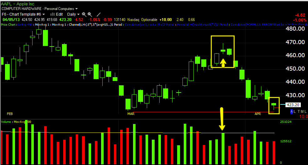
 On an hourly chart today's last candle (remember the market's behavior is fractal through different timeframes because human behavior is the same) is a bullish reversal candle called a hammer, it must appear after an extended downtrend, it should have a lower wick at least two times the size of the body and the close should be as close to the highs as possible (essentially the smaller the top wick or no upper wick, the better). From experience we know that increasing volume tends to double the chances/probabilities of a reversal candle. Basically everything that can possibly make this the strongest hammer it can be, was present.

 Additionally there was a stop out which appears to have been accumulated as volume increased on the break, but was highest at a capitulation-like low (again this is the same behavior seen on daily or multi-day charts on this 5 min chart.

 On a daily chart, as discussed last night, the top of the base has the exact same reversal candle stick pattern we talked about last night, a strong first candle of the set of 3, a star at the second candle representing a loss of momentum, heavier volume on that reversal candle (churning) and a confirmation candle that closes lower the next day after a higher opening, in this case the confirmation candle is also a bearish engulfing candle. Today's daily candle is a hammer (upside reversal ) on slightly heavier volume,

 As for the 50-bar 5 min which many traders watch and the Trend Channel, note the increase in volume as AAPL broke above the 50-bar average (yellow arrow) just confirming traders watching this timeframe and moving average combo. The move below the Trend Channel is a sort of "Channel Buster and again confirming traders are watching, note the heavier volume at the EOD (in the yellow box) as price moves above the 5 min/50 bar average.

 The 60 min momentum screen I use shows AAPL going positive, then negative and price reversing and then positive again. White arrows are positive divergences in the indicator, red are negative and green is trend confirmation. Recently Momentum, RSI and MACD all went positive.

 TSV 38 and 55 both have been in a positive divergence at the base.

 The DeMarketor buy/sell indicator ha some interesting signals, MACD os positive and the Bollinger bands are pinching for a highly directional move.

 Money Stream (60 min) is also in a positive divergence at the completion of the base.

Finally on a daily chart AAPL goes from confirmation and some smaller signals moving price to a large negative at the top and for the first time, something that looks positive in the area of our base.

I really can't argue with what I see in AAPL, the only thing that is surprising is price didn't make a lower low at the second low to run out the stops and set up a bear trap.

I'll be updating the market later, I have a lot to look at. So far none of my analysis has changed since Tuesday night's VIX / Market example, I still expect all the same, the charts have confirmed the same even in unlikely circumstances that make it difficult.


Going to try to add to April monthly $425 call

AAPL Equity Position

"IF" I had the room, I would strongly consider an AAPL equity long. The positive divergences of recent and price action make me think the base in AAPL is actually quite a bit bigger. I suspected this longer term divergence was for a move that was not ready yet and wouldn't be until AAPL made significant new lows, now I suspect it's all part of the same base and this suggests a strong move up which would be worthwhile even as an equity position.

AAPL 2 hour positive on a double bottom, this kind of base could support quite a move to the upside. I would still treat this as somewhat speculative though based on the longer term or bigger picture market indications.

As Expected during the last hour of op-ex days...

As I posted just a bit ago...

"I have also noticed on op-ex days we tend to see late day movement as most open positions are closed by the late afternoon so we often see some trade over the last hour or so that is significantly different than the rest of the day which tends to be dedicated toward an op-ex pin."

I haven't seen all risk assets yet, but there's a significant change in ES and TF as well as SPY, DIA, QQQ and IWM intraday charts as well as price action which is a bit surprising in front of a weekend as most seek to take risk off heading in to the weekend.

 ES

TF

Leading Indicators/Levers

The CONTEXT and SPY arbitrage are very interesting...
 I pointed out last night the dramatic change from CONTEXT being down around 8 points to moving towards parity and now around pre-market CONTEXT has gone positive at a +9 point differential, the exact opposite of yesterday's action.

SPY arbitrage looks like the averages' intraday charts, a series of small adjustments to facilitate the most effective op-ex pin.

HYG is leading the SPX, it is supportive. VXX is broadly in line with the SPX, but VIX futures are not seeing the same amount of volatility or a bid for protection that they have demonstrated in the recent past at SPX levels that weren't as low, in other words I'd expect the VXX to be higher than it is, so it looks to be supportive as well of the market. While FCT and HIO have seen a move towards risk off, it's no where near as big as you'd expect after the gap down and NFP.

The EUR/USD has been broadly supportive today. Yields hit a new low as would be expected, but not as volatile on the downside as would be expected, about half of yesterday's decline in yields and showing intraday movement that is making the daily candle look like an upside reversal candle.

High Yield Credit is also acting supportive of the market as are commodities.

All in all, all things considered, I am surprised by the broadly market supportive indications among leading indicators when judged by today's price action and NFP, when judged by 3C and what it has been saying, this is exactly what I'd expect.

Furthermore sector rotation is very interesting.

The Risk sectors' relative performance has been surprising today, Energy up, Basic Materials Up (which will help the averages as there are a lot of high beta and momentum stocks in the sector), Industrials up and FINANCIALS!

On the flight to safety side only Utilities have been in rotation, Healthcare and Staples have both been moving out of rotation, not what you'd expect on a day like this.

I'll be looking around for any area where there are still high probability trades.


One Other Op-Ex Thought

I have also noticed on op-ex days we tend to see late day movement as most open positions are closed by the late afternoon so we often see some trade over the last hour or so that is significantly different than the rest of the day which tends to be dedicated toward an op-ex pin.

Quick Market Update

Some of the variables to this positive divergence in the market concerning today was of course the NFP, but so far I think the market has made a pretty decent comeback all things considered (NFP sees biggest miss since 2009, Labor participation rate is at a 30-year low making the unemployment -U3 headline number sound a lot better than it actually is and this wasn't good, the real U.E rate considering the work force scam would be over 11%).

The second was the op-ex pin, this didn't use to be an event, only on the monthly expiration, but weeklies have become popular so every Friday seems to be an op-ex pin. In other words, the market, even if it is rearing to go, essentially can't until the Pin is completed and Wall St. makes their money on writing options and then pinning them so 90% of them expire worthless and Wall St. gets to keep all that premium.

As for the market right now, the SPY intraday looks like a pin, the charts in context of the market are VERY positive, much more than at any time this week and this hasn't been the typical 1-day options divergence that we have grown use to, this looks like a much stronger, faster move and the downside following it also looks much worse. The 10 and 15 (which wasn't even positive until today) look very strong.

The DIA intraday looks pretty strong in most cases and especially the most recent intraday divergences, the 1 min chart is flying. All in all the Dow is my least favorite of the averages, it's divergences are no where near as strong as the other averages, especially today's movement.

The QQQ 1 min intraday looks like a series of small corrections, this makes me think it's being pinned. Beyond the 1 min, the QQQ divergences to the upside are very strong in the timeframes they appear in and they seem to be migrating through longer timeframes so all in all, the Q's seem like they are gaining underlying strength.

Finally the IWM intraday charts look VERY much like a pin, I have noticed and pointed out that Thursday's tend to close close to Friday's pin and the IWM is less than half a percent from yesterday's close after being down significantly more earlier, again this seems like pinning behavior. The charts beyond intraday look pretty good, one of the biggest changes is in the 15 min chart that was showing no positive divergence before today, the movement there is a significant timeframe and thus flow of underlying trade and it has been quite spectacular, here's a chart.
From 15 min chart lows that haven't been seen since last summer 2012 to 10-day highs in less than a day (I guess there was a small positive forming yesterday), this is a VERY significant move on a very significant timeframe.

As for futures, ES and NQ both look like they are seeing minor adjustments to the intraday flow, again most probably to effect an options expiration pin, the R2K futures however are very strong, here's an example of the numerous small intraday ES adjustments.
 ES 1 min looks trend-less, this is the kind of intraday movement seen on option expiration as it seems market makers and specialists make a series of small adjustments to make the pin most effective.

However the 30 min chart shows several negative divergences, each one forming a top in ES trade and the last divergence being the worst and sending ES down the most, however today as ES hit lows for the week, we see the strongest positive divergence in nearly 2weeks of trade.


Intraday Charts

I'm going to use the QQQ 1 min chart as an example, but so it makes sense I'm going to back it up to different areas this morning so you can see it as it developed, which is harder to do just looking at a current chart and trying to understand what was happening at each point of the day.

 QQQ 1 min as of 10:50 this morning, in a positive position suggesting higher prices.

 QQQ at 12:50 this afternoon with an intraday 1 min negative, if the 2 min is not negative, most often this results in a consolidation as we see with price moving sideways.

 1:30 QQQ is starting to go positive again

 This is the 2 min chart at 1:30, leading positive which is the strongest divergence with an intraday relative negative which is the weakest divergence.

 SPY 3 min leading positive is the strongest signal here, but there's a relative negative intraday divergence. The chart suggests the SPY will see higher prices, but intraday a pullback is likely.

 The same 3 min chart zoomed to intraday readings makes the divergence clear. Thus far we are seeing a sort of consolidation, slight pullback.

 DIA2 min with a leading positive which is the most important signal suggesting the DIA moves higher, whether this completes today on an op-ex probable pin or moves in to next week is hard to say, but the probabilities near term are for higher prices.

 DIA 3 min leading positive with no intraday negatives, this suggests the intraday negative is very weak.
 IWM 1 min intraday negative

 3 min leading with an intraday negative

15 min leading-this is a very important timeframe and suggests there are very high probabilities for a significant move higher in coming days.

Intraday Pullback or consolidation likely

However that doesn't change the overall very strong tone. I'll follow up with some charts I'm capturing now to demonstrate this visually.

Precious Metals Follow Up- GLD

Yesterday I posted an update on Precious Metals, it wasn't just an update but a couple of leveraged ETF long positions that I liked...

"I think I'd prefer to buy these (the stocks) in a leveraged ETF like UGL or DGP(gold leveraged 2x) and silver AGQ- 2x leveraged."

Both positions are up today... GLD seems to have more initial 3C momentum, but I think Silver is going to catch up fast.

Here's the GLD updated charts. I think there's a little profit taking in to this last parabolic intraday run, but since these are equity positions, I'm not as concerned with consolidations or pullbacks as the longer term charts look like these are just getting started.

 GLD 3 min was very positive yesterday at the lows, it's up today and has good confirmation on the move on this chart.

 The 5 min chart either hasn't caught up (as it hasn't turned down confirming a small negative divergence) os is seeing some profit taking in to this last run higher.

 The 10 min chart is in excellent shape, it was very positive yesterday and is even more so today so even if there were an intraday pullback on profit taking, so long as charts like this hold up, it looks like GLD is just starting its move higher.

 The 15 min chart is another excellent example of a chart suggesting GLD is just getting started.

 As is the 30 min, this is a fast and sharp positive divergence on such a long timeframe.

 So far the intraday chart is in line with price so I'll have to wait and see if any signals confirm short term profit taking (from the 5 min chart), but either way, it wouldn't change my positioning long Gold and this is why I didn't want to use options, to allow for pullbacks and consolidations.

The 3 min chart is in line as well so I can't confirm short term profit taking, but again, it wouldn't change the long positioning as the longer, more important charts are extremely bullish.

I'll update SLV ASAP

IF I didn't already have good coverage...

This is a VERY tempting area to buy, whether equities or options, if I didn't already have good coverage in IWM, QQQ, AAPL, GOOG... I'd be buying in this area.

In fact as an opportunity, if we get a little downside I may look at a position here just because of the opportunity, but I'd like to see a move down that has the market thinking the market is heading lower (and believe me, I'll make the bearish case as well as anyone, it's just the market doesn't move in straight lines, especially around important reversal areas).

If I was looking to take advantage of the move by way of long equities in the averages or maybe some of the stocks like GOOG or AAPL, I'd have less problem buying them here than options as the dynamics are different in pricing, equity positions are at the cost they are at, options change do to volatility.

Just an FYI...

It's not just the SPY either...AAPL / GOOG

It's present in a lot of stocks, some that we have been watching that didn't even have divergences in longer timeframes or were negative, now they are positive.

AAPL and GOOG are two examples.

 AAPL 5 min is the kind of divergence I don't ignore.

 10 min

 15 min adding to the leading positive today

 30 min

 And now the 60 min is going positive? Yes.

 GOOG 1 min

 3 min

 10 min is insanely positive

 15 min

 30 min

And now 60 min

These are the kind of signals I have learned not to ignore.

SPY Example- Very Telling

Last night while the Yen was throwing fits (which I don't think are over) I said this about smart money in the last paragraph of the last post around 3 a.m.

"I'd just say when smart money invests money for a move, they generally see it through"

It's taken all morning to get the data feed running for SF, but now that it's up, I see what I expected. EVERY AVERAGE looks the same, I'm just using the SPY as an example to save time rather than captures of every average.

What you'll see below is timeframes hitting new highs, above the highs of the SPX new high earlier in the week, there's migration of the positive divergence through every timeframe and now on charts that weren't even close to positive like 10 and 15 min, in other words, the NFP was a setback, but it looks like smart money is throwing a lot of money in to not letting the market slip and completing the move they started setting up, which means they have even more invested now, I don't think they'll give up on this move higher.

Check the charts and know it's the same for every average.

 SPY 1 min

 2 min

 3 min

 5 min

 10 min

15 min