Friday, August 2, 2013

Leading Indicators...


 This is HYG, yesterday I showed you the charts that the USD/JPY which was leading the market was going to break down and I suggested they'd use HYG to take its place, look at HYG today vs the SPX in green, nearly tick for tick.

 This is unusual, TLT (Treasuries or the Flight to Safety Trade) moving up with the SPX in green today, the only reason I can think of that there would be a risk off and a risk on asset moving together is an op-ex pin, either than or smart money is doing something much different than retail, but I think the first scenario is more likely.

 Institutional sentiment is off from the SPX, especially as we near the close.

This was one of the examples I used to demonstrate how the market was being led by the USD/JPY yesterday (USD long./JPY short). Above is the USD, yesterday it was nearly perfectly in line with the SPX, or rather the SPX with it as the currency pair was the leader.

The Yen would have to move down, to make it easier to see I inverted the scale of the SPX in green, yesterday they moved perfectly, today as I said they would yesterday, the USD/JPY fell out and you can see that today, HYG replaced them as expected with VXX to make up for TLT's strength.

 Yields (red) are a magnet for equities (green), they ran together earlier this week, look at today, that's a magnet pulling on the SPX to the downside.

Also commodities as a risk asset were supportive of the SPX, what happened today?

It seems it's harder and harder to keep the market afloat, you look at today and think, "It's green", it should be up well over 1% on follow through of a breakout north of $1700.


Market Update 1 of 2

Before I switch over to the Leading Indicator Layout I wanted to get an update out, the next will be leading indicators.

Basically the same thing as I mentioned in the earlier update is still occurring, 1 min is steering or in line, longer term falling apart.

For example, say each "X" represents a 1 min. time period (and this is the reason the longer time periods are much more important in showing the trend of underlying trade).

3C will move up or down depending on whether there's more money flow at the present bar vs "X" bars ago, if it is more, it moves up, if less it moves down. This is how I was able to improve on Time Segmented Volume as they use a moving average of the raw data, whenever you average data, you lose data. My way doesn't drop any data which is important because a big institutional order can go through in milliseconds, to average it out is to miss out on important data.

So a 1 min 3C block/ bar would look like this "X"

5 min= "XXXXX"

15 min= "XXXXXXXXXXXXXXX" and so on.  For a 1 min bar to move up, there can only be so much accumulation or distribution due to the amount of volume during that period. However as we move to longer periods, the size of the underlying action can be significantly larger.

Today's action is a bit unique and I think because it is op-ex Friday, the 1 min charts are pretty much just steering, while the longer term charts are showing the underlying trade. However the longer term charts or the larger underlying action..
 DIA 5 min leading negative, but pay attention to where the divergence starts to get worse today.

IWM 15 min leading negative, there's strong underlying negative trade in the IWM today

QQQ 5 min

SPY 3 min, again pay attention to where it gets worse intraday.

Now the CONTEXT model vs. ES, this model is treasuries, credit swaps, credit, currencies, carry trades, precious metals, etc. In a perfect world or market, they's trade together because of the high degree of correlation.

The first thing that is notable about CONTEXT is the immediate drop as soon as the 8:30 NFP came out, institutional risk assets were sold hard.

The second thing is if you paid attention to how 3C got worse as the day went on (remember it is op-ex pin Friday), look at how CONTEXT has done the same in the red box.

The distribution signals in the market averages line up with the selling of institutional assets.


Volatility and Credit

This isn't a comprehensive post on either, just changes today, although I need to take a more comprehensive look at Leading Indicators, there have just been so many individual assets that I've been keeping my eye on or throwing out there.

 You know how I feel about TLT, this is chart based, evidence based. If I had to make an argument as to why I like TLT , I'd come up with the normal arguments that anyone with a little experience would make.

The fact is, some of my best, biggest trades made no sense to me at all. When I saw accumulation in the $USD and there was no comprehensible reason for it to rise, I took the signal seriously, it went higher and months later the Treasury and F_E_D talked about and made moves to create a strong dollar policy.

When I called the top of the massive BushII (W.) era oil run within a week while Cramer was telling everyone to buy, I didn't have a fundamental arguement why. I'm far from the smartest guy in the room, I'm not competing with Wall St. based on my brains, look at what happened to LTCM with two Nobel Prize Winners in economics and they went down the tubes in less than a year.

I'm following the signs of underlying money flows, by the time any of us understand why, all the money will have been made.

So TLT you've seen the charts, you know why.

As for the HYG bump today that was predicted yesterday, here's how that's going...

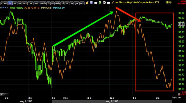
 HYG is seeing pretty stiff intraday negative diverences this afternoon.

 The last big 2 min leading negative led to the big gap down yesterday, it's getting a bit nasty today as well.

The same chart as above just zoomed in to intraday, it looks like HYG/Credit market support is being pulled.

HYG 3 min, the point being is the divergence is migrating through longer charts meaning it's getting stronger.

VIX Futures...
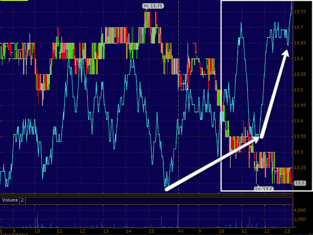
 This is the 5 min VIX Futures chart, not VXX, the futures, we already had an enormous positive divergence, today just added to the stronger leading positive in a flat range where we most often see this activity.

 VXX 5 min has added a ton on the upside leading positive today and in a flat range.

 The inverse of VXX which is managed by a totally different company is confirming with the exact opposite, leading negative signal.

I feel pretty good with today's VXX call position.

Update to GLD $126 Calls

This was the earlier post of GLD charts...

There's a subtle change, but an important one, it may be very favorable for those who may be in a 2-3x leveraged GOLD ETF.

 GLD 3 min, GLD didn't take right off after the call position was opened earlier today and I'm fine with that so long as 3C is adding to the positive divergence (within reason of course considering time decay on options).

 The 10 min chart also added to the divergence today so I'm fine with GLD calls.

Here's where we are seeing a little change, it doesn't look like much, but it takes a lot to move a timeframe this long on a slow day.

It's the fact that the 15 min timeframe is moving positive that is special about today. I wouldn't sell this chart on its own or earlier, but considering GLD's consolidation today, the fact that this improved tells me there seems to be a larger degree of activity than earlier thought which benefits the etfs.


GS Charts

I had to go ahead and open a new position in one of the option tracking portfolios, I set up the account so I couldn't add any more than my maximum percentage position size of portfolio which 1s no more than 15% for any one position, often less, but I'm also not a big believer in over-diversification.

Here are the GS charts and what looks to be a very proportionate rounding/reversal process just above recent resistance.

 GS 2 hour, to the left of the red box where the long term 3C chart is leading negative, you can see 3C moved higher with GS's price, this is confirmation and part of what kept us away from a GS long recently.

The 30 min chart has a deeper leading negative divergence at this second high above local resistance and if you zoom in closer, a sharp leading negative in to the last several days.

 The 15 min chart is an excellent timeframe with a good representation of underlying trade size and detail without too much noise.

That trend in 3C at that area in price is a killer, this is the kind of chart that I would say, "JUMPS OFF THE PAGE".

THE KIND I DON'T IGNORE..

And the 5 min shows the 4 stages of a cycle with accumulation to the left, mark up in price, distribution/top and the last stage is decline, these 4 stages play out in any time frame you look at.

GS Update

For many, many months I have been answering emails asking about shorting GS and my reply (unless very short term) has been the same, "Not yet".

As you know, recently I've seen some things in GS that are starting to change my mind.

I already have a GS core short equity position open, I'd like to add, but it would be really violating risk management rules, I may see if I can juggle some things around to add ot it any way.

I want to alert you to GS as I think it's in pretty darn good position, low risk with a stop above the recent highs, but not in an obvious place! Of course I like the way the charts have developed.

I wanted to give you a heads up to take a look while I put together my charts for the next post.

I like IYT Right here as a longer term equity short.

I think a put would probably work here as well, but for now I'm just going to go with an equity short, meant to be a longer term trending position. As I said, I think the risk:reward ratio is attractive, I think this is an excellent entry that did what we want to see it do up here.


Market Update

Now we have some movement. Interestingly the 1 min charts are largely in line, but they are the smallest unit of underlying trade and seem to have stayed in line as a steering current, almost like a market maker working the bid ask so they can distribute in to higher prices. The larger chunks are seen on the larger timeframes and that's where we're seeing some break down as the VIX Futures continues to accumulate.

 IWM 1 min in perfect line

IWM 2 min going negative

The 3 min chart is where larger chunks are found, this is why the long term charts are more important for underlying trade, here we see a much worse looking chart intraday.

QQQ 1 min was in line, now starting to go negative

QQQ 2 min is negative

QQQ 3 min, in larger size is more negative.

The SPY is virtually the same, 1 min

2 min

3 min.

I'd dare to say we're going to see some movement shortly.

Volatility Charts

OK, so the last position is meant to be a quick trade only, hopefully it gives more and that's fine.

This goes back to the post just before, "Market Update" and actually further back to yesterday.

There's a LOT of money wrapped up in options expiration, 90% expire worthless and who writes the options and collects the premium on that 90% that expire worthless? It typically isn't the average Joe.

Overnight Wednesday and through the wee hours of Thursday morning, the USD/JPY finally came alive after being very stagnant, but as I showed you from yesterday's charts (see the post linked above), I could already see that the USD was coming apart and the Yen was building strength so the USD/JPY pair that lifted the market (again see the previous post, they move nearly tick for tick) was not a short term manipulative asset that was going to hold the market much longer, this is why I suggested HYG might take over today by ,moving to the upside, it did too.

 HYG did move up today as suggested today, but this isn't because of a "Risk on" posture, it's what I suggested yesterday as HYG was falling to lower and lower lows, it would be a replacement for the USD/JPY as an engine to drive the market or at least hold it in place on an important day for cashing in, Options Expiration.

*Remember in the SPY arbitrage that algos use to buy or sell, there are 3 assets that are part of this arbitrage.

HYG represents risk on, algos see HYG moving up and they assume smart money is in a "Risk on" mood.

TLT (20+ year Treasuries) is a Flight to safety trade, algos see TLT move up and they assume that smart money is moving out of stocks and in to a safe harbor asset.

Finally VXX (or UVXY for 2x leverage) is seen like TLT, when VXX moves up it reflects the short term VIX Futures, you can't trade VIX itself, but you can trade the futures or the Short term VIX futures via VXX. When algos see VXX move up they assume smart money is reaching for protection as we saw yesterday and thus is worried about the market.

The thing is, these assets are fairly easy to manipulate intraday, that's why Capital Context keeps the SPY Arbitrage chart intraday.


 You may recall yesterday I added to the TLT long (core) position, but today it is up, TLT effectively cancels out any positive market arbitrage from HYG as it is a bigger move.

VXX typically moves opposite of the market/SPY so this mornings move down in VXX made no sense really, but it would be the only other asset left to shift the balance in the SPY arbitrage positive as HYG's positive is cancelled out by TLT's pop higher today, VXX is the tie breaker, but what I noticed when I checked was the actual VIX futures were NOT trading as badly as VXX, they are not an arbitrage asset either.

 Here's VXX in green today vs the SPX in red, they typically move almost exactly opposite, the move to the downside in VXX didn't make much sense at all (it's a little more complicated than that, but that's the gist of it).

Recently VXX has been trading in a range rather than down as it should be with the SPY moving up at the white arrow.

 This is the actual VIX Futures, they have a large positive divergence in them and did not see the same level of downside movement VXX saw.

 There was NO negative divergence at all on the VXX chart before it turned down which is strange, but there is a positive developing at the same area that VXX is acting better than it should.

 UVXY also has no negative divegrence before turning down, but it too has a positive divgerence in the flat range and acting better than it should in this recent area.

 XIV is the opposite of VXX and trades with the SPX, it had no positive divergence before moving up.

 And it is seeing a stronger distribution signal as well.


As for the SPY Arbitrage, since VXX started acting better than the correlation suggests it should, the SPY arbitrage has lost strength.

I think VXX was used intraday for op-ex Friday to hold things together as USD/JPY couldn't do it, HYG couldn't do it with TLT up, the only asset left was VXX.

Even right now as the market acts better (remember in the market Update I said there was a slight positive intraday bias so it's no surprise, but as it does, VXX is still holding its ground.


And the VIX FUTURES themselves continue to improve...

They look even better than a capture about 10 mins. earlier.


I'm thinking this is going to pay off as the typical Friday op-ex behavior starts to fade around 2-2:30 in the afternoon. I'll be watching for additional signs too, I can always close the position out here at a very small loss.


Short Term Trade---

I know you'll think I've lost my marbles, but VXX, Aug. $14 Calls.

I'll explain in the next post.

This is meant to be a short term trade, but if it last longer, I'll keep it open as long as it is giving.


Market Update

You may have noticed that today's market update has been conspicuously absent, that's because I'd literally be showing you nothing. The intraday charts today look like a textbook example of what I'd imagine an op-ex pin to look like so there's no point in posting charts that give you no information.

There's a very slightly more positive bias developing, but very slight and I believe a lot of it has to do with SPY Arbitrage...

In this post yesterday I showed you the charts/evidence that played out  today exactly like the charts showed yesterday, HERE'S THE POST WITH THE EVIDENCE.

The gist was there's very little market strength with professionals being net sellers and retail being net buyers and apparently tapped out. The tool or manipulation tool of choice overnight Wednesday/Thursday before the open was the USD/JPY, but I showed you in the post above how the $USD was starting to fall apart and the JPY was gaining strength and suggested to hold the market even in place, another suitable manipulative asset would have to be found, I suggested HYG.

Lets look...


 The SPY Arbitrage is growing more positive at +$.30 right now, this can at least hold the market in place intraday for the pin, but it needs the Arbitrage assets, one of which is HYG, another is VXX which is performing VERY much out of sync with the normal market correlation (perhaps as part of the arbitrage) because the actual VIX futures don't look anything like VXX does today, but they aren't the arbitrage asset, VXX is as is HYG.

This is the USD/JPY I mentioned yesterday (in red/green candlesticks) vs the S&P E-mini futures (ES) in purple, you can see how the currency pair was used to lift the market, if you check my post from yesterday linked above, you'll see why I thought this pair would fail and something new would need to be found on an op-ex pin Friday, I suggested HYG.

This is a closer 1 min look at the same chart although ES is holding a bit better than the USD/JPY.

And here's HYG as suggested as a replacement as USD/JPY was showing cracks yesterday. This isn't a big move in HYG, but with VXX, it doesn't need to be.

This is about right for the small intraday bullish bias, I mean small, most likely a pin adjustment.

In any case, for now, that's where the market update stands.

YESTERDAY THE CHARTS TOLD US EXACTLY WHAT WOULD HAPPEN WITH THE USD/JPY AND SUGGESTED HYG WOULD TAKE OVER, THAT'S THE EVIDENCE BASED ANALYSIS I LOOK FOR, NOT EMOTIONS OR GUESSES.