Wednesday, January 25, 2012

Daily Wrap

Peter Tchir of TF Market Advisors said something succinct regarding today's trading action,

"Not sure what to make of a market that traded relatively poorly on strong apple earnings but managed to rip higher on a relatively neutral fed statement."

 These are two points I made during the day today.

First on the after hours and intraday gains APPL gave up...

and then on AAPL's lack of relative performance...

On APPL's intraday trade...

As for the F_E_D...

Initial Thoughts... 


"No QE as I assumed. As was widely expected, they extended the ZIRP (Zero Interest Rate Policy) from 2013 through 2014 which anchors expectations.

Other then then that, I see few items of note, from a quick browse of the statement bullet points, other then ZIRP, it's relatively unchanged."


The bottom line is what Peter said after hours, I had mentioned 4 times today, both regarding AAPL which should have really ripped with the market , but didn't...
From 12:30 (policy statement) through the close, AAPL gained .006% ($446.32-$446.58). The S&P on the other hand gained 1% (.01% $1312.53-1325.81).

And the F_E_D statement that extended ZIRP through 2014 was a little vague and widely anticipated. Again, Peter commented, 

"Yet I thought the Fed was disappointing. 2014 seemed like a big concession, but low clearly means 1% or lower, not 0.25%.  Will change if economy changes anyways. No mention of new QE3."

This is pretty much what I had said, no hint of QE 3 and really no real changes that weren't already expected. However as I showed in the last post and warned about several days ago as well as yesterday and today, "Beware the F_O_M_C Knee-Jerk Reaction!"

Beyond AAPL, the 3 major industry groups, the "3 Pillars" as I call them (simply because any rally is hard to sustain without the support of Energy, Technology and Financials) were oddly off today, except for Energy, but I'll show you why that was a given.

 This is today's sector rotation, it measures the relative performance between the major industry groups and the SPX. At the top in grey, note Technology falling off throughout the day, starting precisely at 12:30 and on a day in which AAPL should have made Tech the fulcrum industry. In "pea green" Energy started very weak, but strengthened right at 12:30. At the bottom in green, Financials fell off badly again right at 12:30 when the policy statement was released.

 This is my custom industry group (Financials) momentum indicator and here again we see outperformance early and then sharp underperformance relative to the SPX. In fact Financials were only up +.21% on the day.

 Here Technology fell off at the open (see the early AAPL chart from this morning) then Tech was in line with the SPX and after 12:30 its relative performance fell off hard.

Here's Energy in red, the SPX in green and the obvious driver behind both Energy and the SPX, the Euro in light blue.

As for the VIX Signal (Market Sell Signal)  that was completed last night, I decided to construct the set of conditions that make up the signal and look at their reliability in the past as this is a rare signal.

 The chart uses the VIX signal, but I've made the indicators invisible as to make the signals on the SPX easier to see. During the 2007-2008 period there were 4 signals, the first was off by a month, the other 3 were right on or within a day or two. The area in white is the area I talked about last night that has many similarities to the current market since the start of August.

 Here's the same chart moved forward a bit with the same area in white as described above.

Here are the next 4 signals, the first did lead to a decent pullback, however note that the first 3 all fell within Quantitative Easing periods and if anyone remembers, there weren't many indicators, the least of all the VIX that could keep up with the F_E_D's relentless pumping of cash into the market, remember the motto of QE, "Just buy the dip!". So we have the first VIX signal to occur since 2008 that is not in a QE manipulated market.

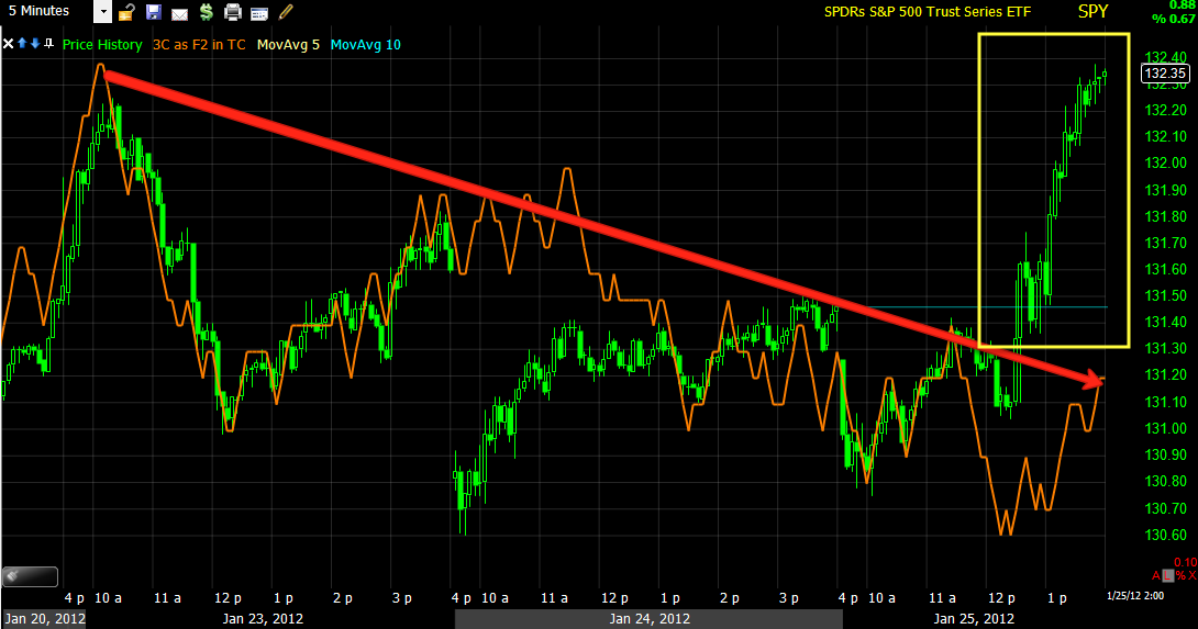
The S&P-500 is now at its long term downtrend resistance trend line.
And these are the two areas I mentioned last night that have striking similarities, again: they both started with sharp declines from a top formation. They both halted their decline on heavy volume (red), they both went on to make a new low that kicked off a strong rally and they both rallied on declining volume as well as declining internal breadth. Now, as of yesterday, they both have a VIX sell signal. 

As for the market today, as I posted numerous times, there's no disputing that today's gains were a direct result of FX legacy arbitrage (strong Euro/weak Dollar).

SPY vs the Euro (FXE).

Here's the Euro since the policy statement through the present...

It's interesting that such a parabolic vertical move ended right at the market close.

Here's the Euro on 3C through the NY close.
The 2 min negative divergence is enough to cause a consolidation and that is what the Euro has done since the close, traded laterally and slightly down.

The 2 and 5 min 3C charts are fast enough that they could easily confirm today's move up, but neither did.

 SPY 2 min

SPY 5 min

My guess is that HFT arbitrage algos were chasing momentum today, I doubt very much that smart money was chasing this move and 3C seems to agree.

As for some other charts we've been watching, one of the top performing ETF's over the last several days and is starting to get a lot of news coverage is our UNG.

UNG has gained about 18% over the last 4 days and put in a decent close today. I didn't listen to the Obama speech last night, but I did see this excerpt, which should probably tell you something about leaks and smart money:

"UNG added 7% today following President Obama's State of the Union address which emphasized the importance of natural gas as a clean energy source."

And we noticed the change in character as well as 3C positive divergences last week! I often say that 3C can tell us what smart money is doing, but it's not until later that we find out why", I think we just found out why.

URRE is another that has been shaping up, I've been thinking and posting that we'd see a healthy pullback  and that seems to be exactly what we are getting, which should set up a nice buy or add to with low risk and high probabilities.
We have the long signal, my forecast was for a pullback to the yellow rising 10-day moving average. This is one to keep on your watchlist. We "may" see a buying/add-to opportunity as soon as tomorrow, volume on the pullback has been beautiful.

What I really like about both is that they are trading on their own, they are not in lock-step with the market.

I'm going to have dinner and then pull out some scans like the Miners Trading System, back test it again, see what the results are and if see if there are any useful signals there, it's been a while.


The F_E_D Knee Jerk Effect

Long term members know I always warn of the F_O_M_C policy statement "knee jerk" effect. Wht do I mean by that? The market has an initial knee jerk to the policy statement and it is almost always wrong, whether it reverses the same day or usually at most within 2 days, it's been observed as happening so often you can almost count on it like clockwork, this is why I warned about it several times this week.

If I have time later I'll search for more policy knee jerks, but one date that I found through a quick search that was still within my intraday history looked like this.
This is the S&P-500 on August 9th, 2011, the policy statement came at 2:15. From 2:15 p.m. until 3 p.m. the S&P-500 dropped -3.2% in 45 minutes. From 3 p.m. through the close, it gained +6.3% and by the close the index was up 4.4% on the day. The next day, August 10th, the S&P opened at the previous day's highs and went on to lose -4.5%. 

The point is very simple, be careful with assumptions about initial knee jerk reactions from F_O_M_C policy statements and the market's initial reaction.

SLV Chart Request

SLV is one of my least favorite equities to try to get an edge over, mostly because we really don't know how big or how much of JPM's inherited short on silver (from the Bear Stearns takeover) is still floating around out there.

Last time Silver broke out and put Blythe Masters and JPM in danger, someone made a phone call to the COMEX and they hit silver with 5 consecutive margin hikes, this was the result...

Approximately a 30% decline in about a month and ultimately a bit more then 40% . Remember, the F_E_D kind of owed JPM for helping them out with Bear Stearns.

It may be partially because of that, that we see so few good signals in silver, it may be smart money isn't willing to go up against JPM. Whatever the case, Silver is undervalued on a geological basis (what's in the ground compared to gold).

 Here's the loose correlation with the Euro.

On a daily chart, here's the inverse correlation with the dollar index.

 Today intraday, the correlation with the Euro tightened up significantly, although volume fell off as the Euro looks set to decline overnight again.

 On a 60 min chart, SLV has been in almost perfect confirmation with 3C, except late today, but that is because the 60 min chart can't move as fast as silver ran up.

 On the 15 min chart we can see a positive divergence as silver was trending down slightly, it was under accumulation and that launched the current move we see, there was a slight negative divergence that started as confirmation and ended up causing SLV to go sideways until the next positive divergence (white arrow) kicked in and we have had confirmation since. Except again today but again, the 15 min chart may not have caught up to SLV's move.

 The 5 min chart would have caught up and went from god confirmation of the uptrend to what looks like some profit taking in to strength today.

 The 2 min chart shows more detail of smaller moves, the positive divergence of the 23/24 and confirmation with a slight negative in to today's highs. I would expect a falling Euro to have some downside effect on SLV, but until the 15 min chart catches up, how dramatic it is is unknown.


 The 1 min chart certainly is fast enough and shows the same thing, negative into today's highs.

 We did have a bullish crossover and if we saw a pullback, my guess is it will be to the yellow 10-day average.

 If I'm trading this as a position and willing to ride out a pullback, then I'd use the daily Trend Channel with a stop slightly above $30.00

 There also seems to be a resistance zone in place, this may be JPM's new line in the sand.

 Overall, any new positions I would wait for a pullback, otherwise current longs, I would use the wider trailing stop above.

NYSE TICK INDEX

The red line represents Zero, the NYSE TICK Index is calculated by all advancing NYSE issues per TICK, but in this case per minute, minus declining issues. At the red arrow (12:30) you can see the immediate change from vacillating above and below the zero line to moving above zero and into the +1500 area, just around 2 p,m, that changed and we saw some readings in the -1500 area, but the trend s clearly broken.

The market, like yesterday is cued in to the Euro...
SPY in green and the Euro in red, nearly tick for tick.

Which means the underlying action of the Euro/FXE is gooing to be most predictive.

Here's the Euro since making a rebound around 2:15
The 2 min chart clearly shows the 2:15 rebound looks to be under selling pressure in to higher prices.

We can confirm that correlation on the SPY with the same timeframe
And we have nearly identical readings.

On a zoomed in 5 min SPY chart we can confirm the chart above.
And add it altogether and it seems we have a good bit of distribution here.

Correction

I don't know how I mis-typed (more likely a brain malfunction) the options MP trade of SPY Feb $80 puts, the correction is Feb. $133.00

I'm sure you would have been scratching your head.

UNG follow up

 While I'm happy to see that UNG is trading out of correlation with the market ( note the 12:30 area), the volume at the intraday high was quite large on a doji star, possible churning there.

 As I thought earlier today, the volume is definitely on the high side, this is good IF the candle closes like the one with the white arrow, but if the daily price candle keeps that longer upper which, it will likely mean a reversal, especially if the wick becomes larger. If the close is near the top of today's range then it should be bullish, otherwise, I'd expect a reversal, but remember that doesn't have to mean down, it could consolidate sideways as well and a pullback isn't the worst thing in the world so long as it is moderate, it keeps the stock from reaching overbought tensions.

Since the resistance zone hasn't been obvious, I've been looking for what is causing it, the best I have come up with (as the 22 day moving average hasn't been touched yet) is the 60 min 200 bar average which has been resistance in the past. The volume on this chart quite clearly shows a transition from a probable capitulation event to a more bullish trend.

In the short term, whichever way we close today, I don't see this as a problem for the newly emerging trend, it's just a high volume day like this with a long wick on the daily candle will likely cause a deeper pullback or a longer consolidation.

Model Portfolio Trade

I bought February $80 SPY puts, lets see if this fade works

Fading the SPY

I wouldn't choose the Q's but maybe a quick intraday or 1 day PUT to fade the SPY, the trade is pretty close to a stop at the intraday highs so the risk isn't too bad.

Update

 Euro now starting to lead negative...

As expected the EUR/USD lost momentum first.

 ES did not confirm the move either and is negative.

 1 min 3C  SPY heading toward lows of the day

 2 min chart has had plenty of time to confirm and remains negative.

On the 5 min chart the parabolic move sticks out like a sore thumb, I already put it in a yellow box as I suspect that is where it will be in future charts.

NEar the top of the parabolic move?

I think we are close...

 As you can see the move in the market is not announcement based other then the kick in the Euro, on this chart the Euro and SPY are in lockstep, but SPY volume is dropping off fast.

 The Euro 3C chart is in a relative negative divergence now and no longer confirming the Euro's move.

The 3C on the actual EUR/USD futures has dropped nearly straight down.

Remember what I said about initial reactions. Watch for the Euro to fall out of sync first, the market shouldn't be far behind.

QQQ Reaction

Since the Q's are leading the market today and given the AAPL post, I thought I'd look at the Q's

 The Q's went negative right off the open which makes sense considering AAPL's open, there was a small positive divergence around 10:30 that lifted the Q's, but it quickly turned negative, since then the Q's advance has been on a leading negative divergence.

 The 2 min chart confirms the 1 min chart above.

The long term 5 min chart is still very ugly.

APPL's reaction has been interesting as well

Or perhaps lack thereof. If I were an AAPL long, I would be frothing at the mouth thinking AAPL would run far in front of the market, it hasn't even kept up with the Euro move...
AAPL vs the Euro and remember that AAPl is the heaviest weighted component in the NASDAQ 100