Tuesday, May 15, 2012

Euro / $USD

Just before the close I posted, "Someone Knows Something About the Euro". Recently the currency ETFs have not been giving great signals, to even see a signal is encouraging, to see a signal that fits with expectations and what is needed to fulfill those near term expectations is even more encouraging.

The correlation between the $USD and risk assets like stocks and commodities is pretty well established, however the $USD has an inverse relationship and for posting charts it is more difficult to pick out divergences because of the inverse correlation, I use the Euro as a proxy because it is correlated positively with risk assets and makes it easier to see divergences. Furthermore the EUR/USD FX pair make up 50% of the $US Dollar Index, so the correlation between the Euro and risk assets is reliable.

Here's are a few examples...

 SP-500 (green) vs FXE (ETF for the Euro). Directionally the correlation is pretty solid, no correlation is perfect and that is the reason arbitrage traders exist. You can use these failures of correlation to help in your analysis as they often result in corrective moves. At the red arrows the Euro (FXE) in white has failed to make a new high with the SPX and there's a nearby reversal shortly after, at the white arrows the Euro is stronger than the SPX and there's usually some upside in the SPX, in each of these cases the Euro didn't make a new low or lower low with the SPX, but generally the correlation is pretty solid.

Here's the SPX vs the Dollar (UUP), as you'll see there's an inverse correlation, so picking out these divergences is a little harder if you aren't use to divergence analysis.
Note how the $USD is nearly the mirror opposite of the SPX, when the $USD is strong it makes risk assets more expensive, when it is weak risk assets are perceived as cheap. A good example is oil which (except in a very few recent and rare cases) trades in $USD all over the world. Assuming all things are the same in oil as far as cost, supply, etc (in other words oil is stable), oil prices have to adjust to currency fluctuations. As oil is priced in $USD, if the dollar goes down, oil prices must rise to make up for the loss in the dollar. A strong dollar usually sees oil prices drop.

 Here's the USO / Euro (FXE) correlation, if we used the $USD if would look similar to the SPX chart above.

Here is Gold (GLD) vs the Euro, so as you can see, a weak Euro typically leads to a weak stock market and other risk assets like commodities. A strong Euro gives the market breathing room to move higher and typically follows that correlation, that is why today's signals in the Euro and $USD are interesting.

 Here's the Euro today via the Euro ETF (FXE). We see an early positive divergence off the 11 a.m. lows and then a leading positive divergence that gives up ground as the Euro refuses to move higher, toward the end of the day, the last 2+ hours we have one of the first clear positive divergences I've seen in a while in the Euro, it is actually leading positive and in a rather flat area of trade (this is a common area to see divergences form).

 The 2 min chart shows similar divergences at the same times, the end of day divergence is very strong and hitting a new leading positive high, even as the Euro is at the day's lows.

 Here's the longer term trend of the 2 min chart above, you can see a clear negative/leading negative divergence sending the Euro lower, but over the last 3 days we started with a relative positive divergence and built in to stronger relative positive divergences and ended with a leading positive divergence-this is a normal progression for divergences.

 While I welcome near term Euro / Market strength so we can pull off a few more trades on the short side in to market strength, I want to also show you the big picture in the market which is bearish. Here on a 30 min chart (a much more important long term trend) we see a very strong negative divergence with a head fake move above the resistance highs before the Euro collapsed. There are several other negative divergences, but the Green arrow showing trend confirmation is probably the most important as this suggests any near term Euro strength will be short lived.

 The 60 min chart shows the same a negative divergence at the top with a head fake move in price and down-side confirmation of the trend.

 Today the Euro saw some aggressive downside, but downside momentum has fallen off as the Euro starts to flatten out-Changes in character lead to changes in trends.

As for the $USD (which for confirmation of what we see in the Euro, we should see the opposite, negative short term divergences suggesting the dollar is being sold in the near term).

 The $USD (UUP as a proxy) on the 1 min chart shows several negative divergences over the last 2 days, these are also the two days that I suspect are a head fake move out of the bear flag, which would set up a bear trap and short squeeze in the market, that would give us the bounce I've been thinking we'll see before the market totally collapses. Note just like the Euro's afternoon leading positive divergence, the $USD saw an afternoon leading negative divergence, this is confirmation.

 The 2 min chart was showing confirmation at the green arrow, it quickly changed to a leading negative divergence even as the $USD moved to new highs.

 The 3 min chart confirms the above with a leading negative divergence. The longer the chart, the less detail and noise and more trend.

 The 5 min $USD/UUP chart went from confirmation to a leading negative divergence.

 Once again, here's the longer term perspective in which you can see numerous divergences moving the dollar, but most importantly for the big picture is the current leading positive divergence on this 60 min chart. This doesn't mean the dollar can't weaken and we get out bounce, but it does mean probabilities are very high that the big picture is dollar strength which equates to market weakness.

The daily chart of the actual Dollar Index shows several divergences that have moved it up and down, but again the main theme for the market's bigger picture is a developing leading positive divergence in the Dollar Index which is negative for the market.

In summary, it looks like there may be some catalyst to move the Euro higher/Dollar lower which may allow the market to get off a short squeeze bounce which I want to use to short in to strength, the longer term picture as we have seen in just about every analytical tool we use shows the market in a very dangerous position longer term.


ES Update

For those of you who may not be familiar with "ES", this is the ticker for the E-Mini S&P Futures. The reason we follow ES is #1 it tends to give great intraday signals unless the market is in a heavy distribution stage like at the top of a bounce that is near a downside reversal and #2 because ES is very influential regarding the S&P-500, for instance, ES trades overnight during the week session and opens early Sunday night. The movements in ES in large part determine or help us determine where the market will open.

In an earlier update today, "Quick Market Update"  at 3:43 p.m. I posted this chart of ES (which we track using 3C 1 min for intraday moves and developing trends) with the following comments...


" The ES chart is the only 1 min, as mentioned before I wanted to see a pullback and 3C build, the pullback came , 3C for ES held and didn't make a new low with price, it's moving up, I'd like to see it continue to move higher. The trend for the day looks good."


As you can see above this was the second time I mentioned my specific expectations for 3C/ES readings. While the lading positive divergence is good, it usually is only the first part of a divergence and to see if there's a stronger divergence building, we need a move to either the same relative Es price level as where the first divergence occurred or even better, a move lower in ES. If 3C stays positive, we are building a bigger positive divergence. 


The chart above shows 3C leading positive, making new highs for the day as price pulls back, this is the point of 3C, to contradict price and give us early warning that a price move is either confirmed or not what it seems, for instance a head fake move.


Here's the current ES chart, it will take a little explaining for those not use to spotting divergences. 
This chart starts at the 9:30 New York open to the far left. The first white arrow (white arrows always represent a positive divergence-green gets too lost in the price charts which are almost all green. Red denotes a negative divergence, a box denotes a more powerful leading divergence) is a relative positive divergence that was between two relative points, 1 pre-market and the second during market hours. As you can see, ES responded almost immediately to that positive divergence and moved higher, even though the EUR/USD correlation was not supportive of a move higher. ES topped on that move around noon time, it is important to note that it reversed (there is probably some other correlation that indicated the reversal, likely to be found on the Risk Asset Update), it is important to note there WAS NO 3C NEGATIVE DIVERGENCE turning ES down at this point or at any point during the day. 


The second positive divergence in't a "perfect divergence", but it is close enough. The next white arrow that spans approximately 11 a.m. to 1:45 p.m. as the second positive divergence, this at the point in which ES touched the red trendline for the second time. It's not a perfect divergence because that second point was not lower than the first time ES touched the red trendline, but the divergence is clear enough that it doesn't much matter. This is showing 3C's underlying trade (3C looks for accumulation and distribution via positive and negative divergences) is stronger at the second pullback to the red trend line than the first pullback. 


From that point ES turned up, but did NOT make a new high, however 3C did make a new high which is a leading positive divergence seen in the white box around 2:15 p.m. It is at this point I first mentioned what I would like to see happen in ES, either a pullback to the same relative price level or to a lower low so we can see how 3C responds. 


From the roughly 2:15 top of the run mentioned above, ES broke below the red trendline and headed to the lows of the day, this gives us a very good indication as to whether the 3C underlying trade is holding up or whether the divergence fails. 


At the low in ES roughly around 3:30 there are 2 white arrows stretching across the chart to the low, the shorter white arrow shows a positive divergence between the 1:45 pullback to the red trendline and the new ES low, 3C is higher at the new low than it is at the 1:45 pullback, this is a continued positive divergence. The longer arrow reaching to the ES low of the day compares the frist time ES pulled back to the red trendline and the low in ES and again, 3C is higher at the ES low of the day, another positive divergence or confirmation. When price is lower and 3C is higher, this is the positive divergent signals we look for to tell us there is likely underlying accumulation activity taking place. As volume increased on the move toward the low, there is more supply available in the market, whether from sellers or short sellers (both are selling) which allows smart money to accumulate a larger number of shares without arousing suspicions and driving price against their position. 


Finally from that low to after market 3C is again leading higher. Confirmation would be if 3C hung in the same area as price, a negative divergence would see 3C move below price to new lows. All day 3C put in a series of higher lows, even as ES moved to lows of the day.


Thus far the trend in 3C/Es for today looks very good. There were several positive signals as well in the Risk Asset Layout as well as the 2 day 15 min market averages.


Usually in a market that is not in this bad a shape, I would take profits in my short positions (Currently: BIDU +14.73%; CAT +13.92%; PCLN +13.06%; AAPL +9.52%; XOM +4.52%; and BEAV +2.07% -all straight equity shorts with no leverage/no options except an XOM July 85 Put at +32.31%) and try to reposition on a bounce higher. I am not trading around these short positions simply because I have spent over a month accumulating them and the market is in such bad shape I don't feel the benefit is worth the risk of not having the positions on a market break.


I'm positioned with several speculative trades that are much smaller (as they are speculative and run against my larger view market outlook) to try to take advantage of a bounce, those positions which are much smaller position sizes include equity longs in TYH and FAS and Calls in AAPL, BIDU and USO.


Next up is the signals in the Euro/FXE as the Euro is key to giving the market the breathing room it needs to move higher, trigger a short squeeze and a bounce. Keep in mind though, a move higher is only a tactical opportunity to add to short positions. Our larger view analysis is very bearish on the market.


Hang in there, lots of charts coming

That last move exposed some interesting signals, all is not what it appears...

Some one Knows something about the Euro

I'll post the charts soon, but positives in the Euro on the last move

As head fake moves go..

The stronger the move and the more obvious the support or resistance level that is taken out, the more effective a head fake move is in creating reversal momentum.

 The range from the last 2 days in the SPY is clear, everyone knows where support is, the earlier break below wasn't a very effective move, it didn't pull any volume, this last move below support did what a head fake move should do, it pulled volume, some would have been stops, but more would be limit orders or plain old short orders (limit or otherwise). This is the point of a head fake move, to trap traders and the more volume the better.

SPY 1 min since. I still would liked to have seen a bigger volume surge on a 1 min bar on the first break below the trendline.


Quick Market Update

I'll get to emails soon, I just need to keep an eye on what' going on here today.

What I'm most interested in right now are the 15 min chart over the last 2 days.


 DIA has a strong positive divergence on this last move down.

 The ES chart is the only 1 min, as mentioned before I wanted to see a pullback and 3C build, the pullback came , 3C for ES held and didn't make a new low with price, it's moving up, I'd like to see it continue to move higher. The trend for the day looks good.

 IWM 15 min

 QQQ 15 min

SPY 15 min

Risk Asset Layout

There are some interesting indications here, especially since we broke under the 60 min chart's bear flag in the market, the Risk Asset Layout is giving a better signal than it has in a while and it appear to be leaning toward the last 2 days being a head fake move under the bear flag.

 First ES intraday, as the last few updates have shown, there's a leading positive divergence in ES, the best signal would be Es pulling back some more and 3C to move up as I have drawn in with the white arrow, that would be a very good, bullish ES signal and where ES goes, the market pretty much follows.

 As mentioned before, for whatever reason, CONTEXT went from ES being WAY overvalued to pretty close to the model.

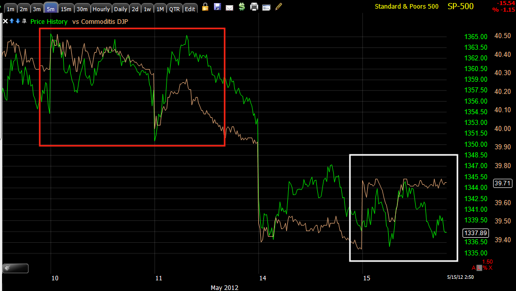
 Intraday commodities (as of this capture) are showing better relative performance/momentum than the SPX (SPX is always green unless specified otherwise).

 Longer term you can see where commodities failed first in the bear flag and the market soon followed, but over the last 2 days in a consolidation under the bear flag (potential head fake move) commodities are performing better, better today than yesterday and considering the legacy arbitrage between commods and the Euro or really more specifically the $USD, their performance today is much better than the FX correlation.

 As for the long term, commodities typically rally as a  risk asset in a healthy economic environment, their huge divergence with the SPX is bad news for the market when looking at the big picture and the reason I'm not letting go or trading around any of the short positions I've been building the last month+. This also speaks to problems in China which speak to problems with their #1 trading partner, Europe which will move through the global economy.

 Here's the Euro (as it's correlation with risk assets is easier to see and interpret than the inverse correlation of the $USD, o the Euro tends to be a decent proxy as the pair is 50% of the Dollar Index). Note in white some Euro strength lifting the SPX, in red the Euro isn't keeping pace, putting pressure on the SPX, currently in the near term they are pretty close to the mean.

 As far as the 3 major Industry groups (Tech, Energy and Financials), Tech as seen here is showing much better relative momentum vs. the SPX and especially over the last two days in which I suspect we are seeing a head fake move on the bear flag, also the consolidation of the last two days is encouraging with Tech showing good momentum as it has always been suspected that Tech would lead any last bounce.

 High Yield Credit has to be effected by JPM, but as it stands, it hasn't made a new low since the Market turned over on May 1st, that's at least somewhat supportive.

 High Yield Corp Credit intraday didn't keep pace to the left with the SPX and the SPX dropped at the orange arrow, the same happened later right after 12 p.m., right now HYC Credit looks a bit more supportive and considering the move in the market since 2:30, HYG is NOT following the market lower, so it looks even better than it does in this capture.

 A bit longer term in white HYC Credit (HYG) is supportive, in green it has reached near term regression to the mean, but intraday today something good is going on with this Credit.

 Long Term the downtrend in HYC Credit is not good news for the market, this is where the market started to top in lateral, choppy  movement. HYC Credit however may have found some support today at the upper trendline of the downtrend channel. Near term this may be supportive, long term this is another reason I'm holding my short positions.

 Yields are looking better today.they are more supportive than they were yesterday.

 Longer Term you can see how Yields are like a magnet for the market, in red they didn't confirm the market and led it lower, recently as in today, they are showing some support.

 The big picture though is very bleak here, remember regression to the mean when considering how far the SPX could fall and that is as of where Yields stand right now.

 The $AUD which is a good leading currency for the market shows a little intraday support, not a big deal though.

 Again you can see when $AUD fails to confirm the SPX in red the market heads lower, today they are near the short term mean.

 Longer term-big picture, $AUD as part of a carry trade has been unwound and you can see as it is unwound and heads lower the effect it had on the rally from earlier in the year.

 The Euro was roughly in line in green, at both white boxes the market got ahead of the EUR or specifically $USD correlation. However the market is showing some curious strength intraday on Euro weakness/dollar strength.

 Longer term in white the EUR/USD was supportive of higher prices, in red it failed to confirm at the top, it's mostly in line in the green box.

 Big picture, the House of cards built by Operation Twist has the correlation way off, think regression to the mean.

 As a Carry Trade currency, the Yen is acting as it should in the green box, however it is supportive of the market in the white box.

 Longer term the move up in the Yen which caused intervention by the BOJ (which was as usual, useless) shows the carry trade unwind and the market has acted as it should in such a situation, the recent move down in the Yen in the white box over the last 2 days is somewhat supportive of the SPX.

 Larger picture, in the red box the Yen is moving up as carry trades are closed out, note the market action as soon as this trend changed to up, it's not a good sign for the big picture for the market.

 Intraday sector rotation shows Financials seeing some relative momentum (as of this capture), the Defensive sectors are coming out of rotation a bit, Energy is weak because of the stronger $USD, but interestingly Industrials and Tech are rotating in.

Since yesterday, Financials are at least holding their own on a relative momentum basis vs the SPX, Utilities as a defensive sector have dropped, Energy has dropped because of the FX correlation, but again Industrials and Tech as well as Discretionary yo some degree seem to be rotating in. Tech rotating in is what I'd be looking for if the market can pull off a short squeeze.

Now to take a closer look at underlying trade since the market's afternoon fit.