Tuesday, April 22, 2014

EOD Update

As far as 3C signals, today they were as you'd expect for a head fake move which would just be a run above the rounding top that was already in place, the head fake move itself occurs about 80+% of the time before a reversal in any timeframe, whether you are looking at 15 min charts, 5 day charts or intraday 1 min charts. The head fake move is one of the better timing signals we have when we already know there's an underlying trend of distribution or accumulation.

I decided to just leave positions that have already been put in place such as: VXX calls, QQQ puts and an SRTY long, remain in place without subtracting from them and without adding to them. One reason is that the SPY and Dow did hit the second target from the April 11th post which would be to break the line of lower highs and lower lows by making a higher high that looks like this...
While the SPX and Dow did make that higher high AFTER they broke below support to stage 4 (thereby shaking out new "confirmation" shorts), the NASDAQ 100 and Russell 2000 failed to do so...

While downtrend channels were broken, the string of lower lows/lower highs were not as you can see above on this daily chart of the NASDAQ 100.

In a reasonable world the breaking of the downtrend channel would seemingly be enough, but the market is FAR from reasonable, in fact one of my greatest challenges is discounting the absurd factor in the market, meaning whatever seems like a REASONABLE TARGET OR TIMEFRAME OFTEN NEEDS TO BE DOUBLED OR TRIPLED AS THE MARKET OVERREACTS which I'm sure is to make certain that EVERYONE, no matter how great their risk tolerance, is taken in by the move, FOOLED.

It does look like a move to the downside is ready to break, however I'm not ready to load up the back of the truck until I see the same sort of 3C extremes in the broad market.

 I'll show you why using the SPY as a proxy for the broad market as the signals are similar whether between averages, S&P sectors, Index Futures or just plain thumbing through a watchlist of a hundred or so momo/favorite stocks

 Intraday I needed to see proof that the move to the upside today wasn't being confirmed and rather was seeing distribution, unlike yesterday's VERY LOW VOLUME market, today's market had much better natural migration of divergences. The 1 min intraday is clean, clear and negative.

 The 2 min chart looks as it should with migration of the divergence moving to longer timeframes (meaning the divergence is more serious and becoming stronger).

The 3 min chart is one that is long enough that it shows some more of the trend already, but it also added to the leading negative intraday.

The 5 min chart is usually the line in the sand for me between interesting and action, 5 min divergences are usually the minimum timeframe I need to see to enter a position and this is leading negative in a big way for such a short duration.

There's quite a difference between a 5 and 10 min chart and to see the 10 min chart leading negative like this, if I didn't already have positions open for a move to the downside, I'd have opened them today.

And the 15 min chart is where we get pretty serious signals of a swing+ nature, this is leading negative, but the positive divegrence and stage 1 base that led to this move was pretty substantial and before I add more downside trading exposure, I'd want to see this 15 min chart looking a whole lot worse.

The yellow trendline is where today's head fake move would be.

The 30 min chart still shows the positive divergence in what I was calling a head faked "W" base, but the negative divegrence isn't there yet, that doesn't mean the market can't or won't move lower from here, in fact it looks pretty likely that it does, but this is unresolved. Perhaps tomorrow this falls apart badly and then we'll decide how to react, but until then I'm weary that we may have a pullback that is a worthwhile trade, but not the one we are looking for.

Is the move down that we are looking for likely?
This 60 min chart says it's virtually a certainty, it's just we may have some near term scribble before the implications of this chart are realized and that's the market.

Quick Market Update

Today's "head fake" move looks to be pretty well confirmed as such, the reversal process is clean (no intraday head fake on that as of now) and both the averages and Index futures have gone negative, not raging negative, but enough to show distribution.

I'll leave the current VXX calls as well as SRTY long and QQQ puts in place for this particular move, if I add I'll probably need a little more to get me to move.

I'm going to check both FXP and NUGT for possible positions considering the HSBC China Flash PMI is due out overnight/tomorrow.


Closing MCP Long Trading Position For Now

I don't mind holding any core long MCP positions, but there's just not much confirmation on the parabolic move up today, thus I'm going to free up some space considering where the market is at and no real confirmation today.

Like I said, core/trend MCP longs will be left in place.

VXX / VIX Futures Update

I wanted to put these in a separate post as they are moving a bit faster than some other assets...

First since we were just talking about the April 11th bottom, here's the VIX Bollinger Band Sell Signal of April 11/12...
 Spot VIX Daily chart with 20/20 BB's and a sell signal at April 11th/12th bottom.

Since, yesterday nearly formed a bullish Tweezer Bottom reversal and today is forming a bullish Star  as the VIX typically moves opposite the market, suggesting the market is very near topping.

VXX / UVXY Short Term VIX Futures...
 1 min with a reversal process that is fairly mature.

 2 min from in line to leading positive...

3 min leading positive in a big way like only the VXX/UVXY can do.

5 min leading positive

10 min from in line to leading positive, also a large divergence formed up quickly.

and a 15 min leading positive.

VIX Futures...
 15 min leading positive...

30 min leading positive.

The 1 min is starting to break away on the positive side, when the 1 and 5 min are both positive we have a great timing signal, I may add to VXX May Calls

Revisiting Market Targets...

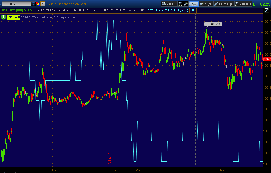
As of April 11th, we not only knew that we were going to see an upside move, but we were already looking at the potential targets. One of the great things about looking back at analysis like this is that it's not "in the moment", which means some of or all of the emotional bias is taken out of the analysis, kind of like a fighter's fight plan, "Psychologically...Everything changes once the first punch is thrown".

however, whenever I can, I like to try to "Anchor Expectations", this allows me to give you unbiased information ahead of time telling you what I think is probable, what to expect in the hopes that you will be able to take that information and use it to make unbiased, unemotional decisions because you know what to expect BEFORE the actual events begin, once the evnts begin, everything changes emotionally and that is what controls much of the market and most of our decision making process. However, sometimes even when we anchor expectations far in advance and are 100% accurate, the emotional component enters the decision making process which is NEVER good, so I try to anchor expectations as far in advance as I can, but sometimes there's just so much information that we need reminders, I got one from a member today that was very helpful leading to this post.

On April 11th in this Market Update it was obvious we were already near the bottom for an upside bounce and I tried to "guestimate" our upside targets because Wall Street doesn't do anything without a reason and when we can see them putting together cycles ands, bottoms or tops, there's a reason, there's some emotional or technical trip-wire they are trying to engage for their benefit.

This is what the market looked like the day of the April 11th post linked in the paragraph above...
On this daily chart of the SPX, you can see that 4/11 was not only the closing low  before the upside reversal we had been expecting (again you can review everything we were seeing and expecting at the time from the actual April 11th post linked here...Market Update.

Another important event that occurred April 11th for the Dow and the SP-500 was the move to stage 4 for both, which engages shorts as support is broken and subsequently engages our concept of the Volatility Shakeout as technical traders are just that predictable, they enter on confirmation of a break of major support and they place stops in pbvious areas just above former support, now resistance which makes them "easy pickings" for the market in which Wall St. can make money in so many different ways just by running the shakeout. As I have shown many times before, this concept is no different than the Volatility Shakeout of a H&S top.

Both the Q's and the IWM ran a shakeout of new shorts upon the break to the February cycle's stage 4.

 The QQQ 60 min chart's February cycle (accumulation was apparent in late January), note Stage 1, 2, 3, and then the break to stage 4 where technical traders have "confirmation" of the top's break, this is where they enter, but because they are so predictable and place their stops on the books where anyone can see them, it's easy to knock them out by imply running a VTSO ("Volatility Shakeout") above the former support/neckline, which is now considered resistance and thus a safe area to place a BTC stop just above, Wall St. knows it, they can see it and even if they couldn't, Technical Traders are just that predictable.

The Shakeout move is ran and the stops are hit, new shorts are shaken out giving smart money or large money the demand they need to sell in to or short in to as the shorts covering is demand. This is just a tactic, it doesn't change the problems that are present with the asset and as you see, after the shakeout stage 4 resumes, the Q's retraced all of the February cycle.


The same concept applied to the IWM, stage 2, 1, 3 and the break to stage 4 which technical traders see as confirmation of the break of a top and enter short on that break with stops placed just above or sometimes right at former support (now resistance) as technical traders have a big misconception in thinking support and resistance are exact levels rather than areas. As you see they were shake out and stage 4 resumes.

AS FOR THE TARGETS POSTED APRIL 11TH FOR AN UPSIDE MOVE EVEN THOUGH WE WERE AT A NEW LOW FOR THE FEBRUARY CYCLE...

In the post Market Update on 4/11 I posted these charts which were my "guestimate" of an upside target for both the QQQ and IWM...
 The target is actually a range in yellow, this is the target range on the upside for the IWM...


And this is the range for the QQQ.

If you go back and re-read the post from April 11th and the reason I picked these areas which we are now close to as it looks like a head fake move is being created...
 The IWM as of today on a daily chart with two target areas posted that stretch back to April 11th and..

The two targets for the QQQ also from April 11th as of today.

Why did I pick these two areas specifically? As I said earlier, Wall St. doesn't run ANY cycle that they constructed at considerable expense and time to them without a reason.  THE FIRST OR MINIMUM TARGET WAS TO BREAK THE DOWNTREND CHANNEL (yellow).

The second target area (White)  in this case as of April 11th we had a series of lower lows and lower highs in the NASDAQ 100, better known as a downtrend. THE SECOND TARGET WAS TO BREAK THE SERIES OF LOWER LOWS/LOWER HIGHS BY MAKING A HIGHER HIGH, THUS CHANGING THE TECHNICAL TREND CLASSIFICATION AND WITH THAT, TRADERS' SENTIMENT.

These were the targets posted nearly a week and a half (trading ) ago while we were at new lows for the move to the downside. Today we are in the area of these targets and it looks like a head fake move is forming in the area as well.

Both the Dow and SPX have broken to a higher high, thus their targets are pretty much fulfilled, anything from here is just cake. For the IWM and QQQ the significant target area left is a higher high, they are just a hair away from hitting that target and changing the trend classification even though many will change it based on the break above the downtrend channel.

In other words, we're in the area, some assets will be ready for shorting or buying at this point before others, that's what I'm looking at.


MCP (long) Position Follow Up...

I like MCP as both a long term trend long as well as a trading position, there's a very strong base that has a large footprint and can or will be able to support a very nice move to the upside, however I'm not sure yet if today's move is the start of mark-up or a transition form the stage 1 base to stage 2 mark up, I'd like it to be, but so far we have a parabolic move (granted there's nice volume) and very little in the way of intraday confirmation so far, that can change in a hurry.

For now I am keeping the MCP long open, but if I don't see some improvement or I see deterioration, I may close out the trading position on today's move of +5.68% thus far.

 Large triangles like this are rarely a consolidation pattern although many technical traders will view them as such, more often than not they are bases or tops depending on the preceding trend, MCP's base area is actually quite a bit larger than this, but this is about the size of the base in which I think Goldman Sachs is involved as buyers if you remember their little stunt to knock prices lower followed by strong accumulation which you'll see below.

A breakout of a triangle like this at its apex is a clear technical trading buy signal, what bothers me is there was no head fake/ stop run on a very obvious support level, first. Thus, if I feel this is going to end up being a false start, I'd likely try to book the gains, get out and wait for what would more likely than not, be a head fake move below support, that's where I'd want to re-enter, but lets give this a little time and see how things pan out.


 As you can see this isn't the first parabolic move which I rarely trust, they tend to have a high rate of failure, but at least this one has some volume behind it. We are approaching a resistance level and the tall candle wicks today look a little shaky.

 This is the 60 min chart's accumulation/leading positive divegrence which started right after Goldman's downgrade or sell (I can't remember what exactly they did, but it seemed obvious from events just after that Goldman is a likely buyer here).

The 5 min chart does show some accumulation getting ready for a breakout move, but there's no real strong 3C confirmation today. My other issue however is that we don't see more of this accumulation/preparation for a breakout in other timeframes, for example...

 The very next timeframe at 10 mins shows nothing, you can however, see where the last breakout or false breakout was showing clear distribution in to the move, we haven't had quite enough time for this chart to catch up, but where it sits now, it looks like a false move.

The intraday charts aren't that impressive either, the 3 min is probably the best looking of the intraday (1-3 min) , but it isn't leading or confirming as it should so I'll be watching this one closely as well.

Market Update

Today's volume is much better than yesterday's and the migration process looks much more natural today than yesterday (I suspected the low volume was the culprit).

Even a head fake move needs to A) be confirmed and B) put in its own reversal process (which is obviously smaller as they are proportional).

Here's where we are with the averages, I think I'll cover VIX futures in a separate post.
 SPY intraday 1 min with early confirmation slipping to a negative which is now migrating in early timeframes unlike yesterday.

SPY 2 min, also early confirmation this morning which is slipping to a leading negative divegrence intraday.

And the 3 min chart's trend so I can show the counter-trend bounce with the head fake or "Igloo with a chimney" price pattern that is seen so often in head fake moves on a topping pattern, these occur in ALL timeframes, the market is FRACTAL.

QQQ 1 min

QQQ 2 min deteriorating intraday which helps verify this to be a head fake move, but there's still more work to be done.

And migration of the QQQ negative divegrence is just making its way to the 3 min chart.

 IWM 1 min

IWM 2 min, I just recaptured this as it started moving faster with a leading negative divegrence.

And like the Q's, the 3 min chart is almost seeing the migration process move to it which is what we need to see to verify a head fake or false move.

However as I pointed out with the 3 min SPY chart above showing the entire counter trend bounce, this would be today's head fake move which would need to form (as it is) its own reversal process and because intraday traders will place limit and/or stop orders right above today's intraday highs, that makes for another smaller head fake target so you may have a similar look on this 1 min intraday chart as you do on the 3 min SPY chart of the last 4 days or so.

Carry Trade Update

Right now it's not the USD/JPY that the correlation algos are following, it's the AUD/JPY.

 This is a 1 min USD/JPY (red/green) vs ES chart. The longer term has seen USD/JPY as the dominant leader...


 This 15 min chart of USD/JPY v ES shows the correlation over a longer period has been a dominant one, however near term, it's the AUD/JPY...

This is a 1 min AUD/JPY (red/green bars) vs ES (purple), however even with the correlation ES has exceeded the relationship this morning which is common for a head fake move.

The 3C chart for AUD/JPY is similar to the USD/JPY...
 USD/JPY 5 min 3C chart still leading negative

As is the AUD/JPY which would seem to indicate that the market will lose this support as well (HYG is the other lever that went south yesterday).

Even intraday (1 min) there's a negative bias to the AUD/JPY.

For a closer look we need to look as the individual single currency futures, the AUD and JPY.
 Intraday it looks like the $AUD is losing 3C support which makes sense considering the price movement very recently today in AUD/JPY.

The 5 min chart is still in line, the probable concept here would be migration of the divergence, meaning the 1 min getting worse and infecting the 5 min chart.

As far as a roof on the AUD/, it looks like there's one at 15 min below..
There was a definite positive divegrence, likely as the AUD was getting ready to take the helm from USD/JPY, but that seems to be seeing strong distribution. We do have some Asian/Chinese data coming out this week, HSBC's Flash PMI I believe for China which would be a major influence on AUD/JPY.

As for the Yen, there's not that much near term movement of importance, the 1 and 5 min charts are basically in line with 3C, but the larger picture (as in the carry trades losing support and the market losing support) looks pretty bad.

 The 15 min Yen has gone from in line on the downtrend to lateral basing price movement with a leading positive 3C divergence.

The 30 min chart is also showing a leading positive divegrence in the same lateral basing area.

These charts have market implications for both the near term and for a larger (perhaps Primary) trend, that would likely be at least sub-intermeduiate to intermediate if not primary, meaning I'd be looking for a breach of the February lows which would be very significant for the SPX and Dow.

I'm keeping these on the radar today.