Friday, November 7, 2014

DAILY WRAP

I don't think it was a great week for bulls although they'd disagree as the AAI sentiment says they're at optimism not seen since December 2013, what short memories...And bearish sentiment is at lows not seen in NINE YEARS. What happened to all of those "Contrarian traders"?

My personal sources which I prefer are insanely bullish. In my view it wasn't such a great weekend a half as the F_E_D took away the punch bowl, the ECB didn't add anything and Draghi has a near mutiny on his hand while the 2 week old GPIF news that sent the market higher appears to have a caveat, the higher stock allocation (buying) may not be able to begin for a year while the laws governing the GPIF are changed, if they're changed and if the GPIF feels the same way about allocations a year from now.

However, that's just personal opinion, still along the lines of fundamentals and mass psychology, but not anything I'd trade on.

What I saw going in to the close just didn't look good moving forward for next week, Carry trades breaking, currencies getting volatile, things like VIX (protection) with huge divergences, safe haven buying in gold, seeing a huge bid today (as well as silver) and bonds, The NDX and RUT JUST barely closing the week green, the anti-goldilocks NFP print, not bad enough to have the F_E_D step in, not god enough to rally on an improving job market and the NDX, SPX and Dow all closing below the NFP print today.

Beyond this week's earlier USD/JPY/EUR analysis of forward looking forecasts for each currency and the pairs USD/JPY (which the SPX followed tick for tick Thursday) and EUR/USD plus this intercepted transmission, "Uh Kuroda... We have a problem"...

Not only with the USD/JPY via $USD and Yen analysis...
 As suggested earlier in the week, USD weakness is coming soon as this 60 min $USDX chart depicts and while the USD ended the week green, it closed today red, in line with the near term 15 min chart...

Which has clearly tuned on its divegrence.

However when talking currency pairs, it takes two to tango so the JPY/Yen...
 Earlier in the week analysis suggested the JPY would see some near term strength as this 60 min positive divegrence depicts in "/6J"

And like the $USD , it saw that strength start today (which was posted last night as short term intraday charts went divergent.

This may present a problem for the very volatile Nikkei 225...

 USD/JPY (candlesticks) and the Nikkei 225 futures (/NKD) already diverging.

If that were the only problem in the Nikkei...

This 60 min /NKD chart is also suggesting downside and as for the US Index futures which tracked USD/JPY perfectly yesterday...
 Es (purple) vs USD/JPY yesterday, nearly indistinguishable, but those pesky currency divergences sent US/JPY lower overnight today and this is what the exact same correlation looked like today as the market went for an op-ex pin...

ES in purple vs USD/JPY which was down most of the night as last night's Daily Wrap mentioned toward the end (current market status).

EUR/USD should see upside as well.

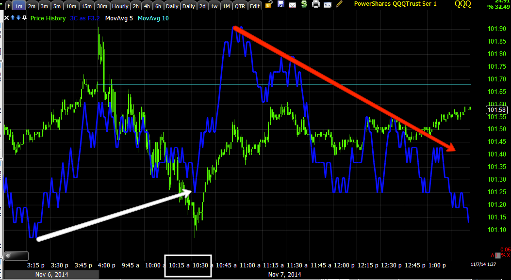
The other correlation supporting the market is of course the 30 year bond yields which I said Wednesday were the most important indication this week and I'd be putting out TLT and 30 year treasury futures analysis which I did, which both suggested higher 30 year bond prices and lower 30 year bond yields so the last LEading Indicator I was looking for this week which had looked like this Thursday vs the SPX...
 near perfect correlation between 30 year yields (red) and the SPX (green) with only a slight hint of what was to come with a negative dislocation in to the 3 pm bond market close...

All of the sudden saw this larger 60 min 30 year treasury bond futures with a huge positive divegrence and improving TLT positive divergences send Bonds higher off the Payrolls data, which means yields that the SPX tracked so well for the last week, now looked more like this today...
which might not be such a big concern if the inconvenient truth for the SPX was "Every time the SPX and 30 year rates disagree, 30 year rates prevail", just like our Yields indicator; as I often describe it, "A magnet for stock prices".

 Pont in case 30 year rates (blue) and SPX (green), doesn't matter, either way, up or down, rates lead.

PErhaps that wouldn't be such a concern as we all know 1-day does not a trend make, if it weren't for this chart below..

There's already a significant divergence between rates and the SPX, this is what I'd call an "Intensity" marker of what we can expect going forward.

I know many of you are use to our normal Leading Indicator 5 year yields, so just for kicks and giggles...

 Whoops, it seems they are just as dislocated and intraday...

Well like I always say, "Yields are like a magnet pulling prices toward them".

This is addition to already horrible leading negative divergences along the same macro size in Professional sentiment, High Yield Corporate Credit which was used as a lever today, but short term =, High Yield Credit itself, Financial credit, etc...

Some examples...
 Pro sentiment maybe wouldn't be such a serious indicator if it had not been so accurate like at #1 when the August cycle formed the Igloo with Chimney head fake and it went deeply negative at the head fake or right now, looking far worse than the divegrence that brought the market down last time to nearly 100% bearishness.


 And on the last few weeks, it looks like pros took early gains, used strength to sell in to the rest and are long ago out of Dodge City.

HYG may be a short term lever like today, but it's the larger implications I follow, take a look...
They led the August rally's lows, they led the August cycle's top, and they are leading the SPX right now, except far worse than the last negative dislocation that led to that sharp risk off move. Remember I said BEFORE any of these signals appeared, that I expected a lower low after this rally and that was before it started and before we had objective evidence pointing to a stronger move to the downside, that was based on Mass Psychology.

Or perhaps HY Credit's trend, in line for most of 2013 with a few small divergences that it led and a very strong and worsening leading negative at each of the 3 tops in this large SPX Broadening top.

We can go on and on, but you've seen most all of this already, it's just having the ability to get past emotions and use price strength to our advantage rather than chasing price half way through a move or further. As the market gets more volatile as it is, the broadening top is evidence of that, one morning you'll wake up to a gap that is essentially like the Coyote chasing the Roadrunner right over a cliff and weeks/months of gains are taken out in a single morning's gap, that's what increased volatility and unpredictability does.

Thumbing through tonight's breadth indicators, they have not moved an iota since Friday, you'd think ATH's would move stocks somewhat, but nothing, dead flat for a week.

I suspect this is about to change and as you already know, I suspect it changes this upcoming week as volatility has all but gone out the window, it's almost hard to remember how intense it was... "almost", I suspect we'll be reminded with a strong shot on the downside.

This move which was a theory during the last week of September during Window Dressing had some caveats, "If this happens then I think we'll get X move", those caveats came about, but from the start this move was never anything more than a VERY convincing shakeout off a -7% move.

Imagine the volatility back in 1929 after the initial crash and a REAL counter trend move or head fake that HAD to be convincing...

Dow-1929...
 Imagine that first bear market rally, nearly a 50% gain and nearly 6 months!

I know a lot has changed, but...
The concept is still the same, make them believe. This was a -10% move lower in the SPX in 2007 and a 11.26% rally to a new high, it had to be convincing, it was also the top, losing 5+ years of gains in 16 months, actually the entire previous bull market + -15%.

Similar to this ...

A -7.45 loss and a 9.06% gain,  the point is to MAKE THEM BELIEVE.

HAVE A GREAT WEEKEND


Trade IDea: Filling Out SPXU position (long)

SPXU is a 3x short SPY ETF, I have a partial position in the trading portfolio that I'll be bringing up to full size.

The Week Ahead

I have consistently said all of this week, "I have no problem being short here".

There's no way I can post every chart that makes this argument, but I believe today's option expiration, as the max-pain pin fades, if the pivot to the downside move we have expected to follow this "Face ripping rally". 

Since October 15th when I said I not only thought we'd see an exceptionally strong move and challenged members to bookmark the post, saying (paraphrased) "Even with the knowledge of what's to come and my 99% belief that after this strong move we will be making a new lower low, it will be so strong you'll be afraid to short the strength in price and underlying weakness which is a market gift" This is no short-coming of any member or trader, the move is designed to be convincing and not only to the bullish dupes, it's meant to squeeze every last short out as the boat was leaning too far to one side in mid-October with everyone bearish, the Fear and Greed Index pegging a record setting consecutive day reading of zero, the most bearish with current sentiment as discussed last night in  saying,

"the most recent investor-sentiment survey from The American Association of Individual Investors indicatesthat optimism is at its highest level since Dec. 26, 2013, while pessimism fell to a nine-year low."

As to what you have seen, the strongest Leading Indicator readings seen this year, that includes the Leading Indications that were just before this "Face Ripping Rally" as we called it on October 15th at the lows. I have posted these so many times they are probably seared into your memory.

Longer term breadth charts are as bad or worse than the 2007 top, posted this week in the Now and Then post.

Absolutely no repair to breadth despite the strongest rally of the year.

The very simple concept that I posted last night with a random example of the concept (HLF) from months ago, the same concept we have been following for years, which tells us the rally was a means to an end, not an end in itself, that concept has to do with the 3 places I'll short a top....
The break and head fake move to shakeout new shorts and the last place I'll short the top at #2, but NEVER at #1.

It doesn't matter if this concept is on a 1-day chart of a major average or a 1 min chart of a small cap, it's the same , the only thing that is different is emotional sentiment which is not what we want to use to make decisions.

The TLT/30 Year Treasury Futures have been key this week as they are already negative on a larger basis , the intensity of the move, but have fallen off badly intraday, the timing.

Our Currency analysis with $USD expected to weaken, Yen expected to strengthen and $Euro expected to strengthen which we have already seen overnight and today, this looks to continue so USD/JPY lower, EUR/USD higher.

The Index futures charts are negative in nearly EVERY key timeframe and badly so, including TF, ES and NQ.

Treasury futures are in leading positive divegrence meaning yields move lower as Treasuries have huge short presence, they are set for a short squeeze that leads stocks lower.
The VIX, as mentioned several times over the last week+ is leading positive at 60 min, someone with deep pockets expects lower prices.
VIX futures leading positive on a strong 60 min chart.

I can go on and on, but I fully expect volatility to increase and for us to see a sharp move lower next week, I believe we'll end up making new lower lows (maybe not all next week, but during this leg).

Remember markets fall between 2.5 and 4x faster than they rise.

Best of luck!


URRE +25%

URRE is similar to UNG in that we have been following it for quite some time as a potential secular bull market stock, I actually like UNG better, but since we have been following it so long, I can't ignore the +25-35.6% gain it has in place today.

The charts...
 Trend lines can be drawn a few different ways, as a rectangle with poor performance to the right side which makes sense with what happened next or as a descending triangle (bearish consolidation/continuation pattern), however a triangle this big should never be mistaken for a consolidation / continuation pattern which may last a month or so, but not this long, although most technical traders won't differentiate and will take this as a bearish triangle and thus short a break below its support trendline making for a slick bear trap.

The yellow arrow is the concept that I have covered 4 or 5 times this week in UNG, XLF and several others, the bear trap for upside momentum.

 Here's a closer look on a daily chart.
For new members, if you have not yet read the posts, "Understanding the Head Fake Move", I'd call them essential reading for understanding many of our concepts and how and why the market acts as it does. These posts are ALWAYS linked at the top right corner of the member's site, if you need links to them email me.

 On a daily chart candlestick analysis is helpful with a bullish Harami candlestick pair at the yellow box or what we call an "Inside Day" in the west. Remember,  candlestick reversals just tell us the trend is changing, they have no targets other than to say that if you look at a 5-day chart's signal, you should expect at least 1 bar of reversal which would be 5 days as it's a weekly chart.

The move today on volume "Appears" to have been helped by $USD weakness, although they reported today, added properties for new drilling in 2015 and appear to have benefitted from Japan re-opening nuclear power plants all in the same day.

 The longterm secular move is what has been of interest to me with URRE, not as a trading/sewing stock, thus I'd consider it as a long term investment and my risk management would reflect that and the fact it's likely in a large multi-year base (volatility in stage 1 can be extreme).

Like UNG a negative divergence sent this significantly lower before a change in character of price.

The 2009/20010 leading positive divegrence led to a move of over 800%. The leading positive divegrence since has been a multi-year one, much like homebuilders at least 2-3 years before homebuilders led the next bull market with 2500% gains.


As you know, there appears to have been a bear trap head fake move below support, this chart shows a failed upside move followed by accumulation for a second larger failed upside move. If these moves were legitimate, which I suspect they were, then they are no different than UNG's attempt to breakout of the range,  when it couldn't be done under the stock's own power plan "B" came in to being, the bear trap/momentum building short squeeze.

You se the last rally /breakout attempt fail before they seem to give up and let it fall, perhaps with a head fake move in mind ahead of time, you'd be surprised how far in advance Wall St. plans and works assets. From what I can prove from both charts and actual research documentation (internal), it's on a 6-12 month scale in average, often 1-2 years for larger primary trends.


 This 30 min chart shows what happened, a more detailed version of the chart above, for that reason I have labeled each divergence in order of occurrence and where they effected price.

 As far as head fake concepts go, I often say we see them 80% of the time regardless of the asset or timeframe, this is another example of a head fake move just before a reversal as they act as excellent timing indications.  

PRICE IS RARELY WHAT IT SEEMS AND WHILE PRICE PAYS, PRICE ALSO IS DECEPTIVE AND TAKES AWAY.

The one disturbing thing is the lack of short term confirmation which may be understandable as those who have losses seek to take gains quickly, but I'd like to see a pullback and how URRE handles it. For this reason I'd either be taking partial profits with a stop or one or the other until we have more solid information beyond a knee jerk move on all today's news.


The 60 min X-Over Screen has been pushed to a long signal, all 3 indicators are confirming and the pullback targets are the 10/22 price moving average on the chart.

The daily X-Over has nearly triggered a long signal as well, I suspect it will.

I would not chase, I'm not even sure I'd hold without a stop.

As for the daily Trend Channel, the stop would be just above $1.40, I would never place a stop at a whole number or even number, not even $1.40.

The more appropriate stop on a 60 min Trend Channel is at the $1.70 area and will continue to move higher, email me for the latest, but remember these are on a closing basis.


GOING INTO 2 P.M.

The reason I note 2 p.m. is because is past experience the Friday max-pain options expiration pin, meant to cause the most number (dollar amount) of options to expire worthless so the writers
(Wall St.) can keep all of the premium; tend to be lifted around 2 p.m. to 3 p.m. as most brokers badger their clients in to wrapping up positions well before the close.

I t has also been my experience that what the market does the last 2 hours is a wild card, but has next to no bearing on the Week Ahead (Monday), however, the data we collect the last 2 hours is some of the best of the week and often leads to the following week's forecast, thus the data and price can move together or opposite, but it's the data that really matters for the next trading day (Monday).

If it wasn't clear this morning that we were in an options expiration pin, it should be clear by now as the market has been approximately +/- .15% for most of the day (as I said yesterday, the max pain pin is usually right at Thursday's close.

Here are a few charts going in to the release of the pin...

First the USD/JPY which has been analyzed 3 times this week with the major finding seeing $USD weakness ahead, Yen strength and Euro strength.

As per that analysis and more specifically last night's 3C charts at the end of the Daily Wrap already showing $USD distribution, Yen accumulation and Euro accumulation,

The USD/JPY which lead the market like a puppy dog yesterday...
 USD/JPY (candlesticks) vs ES/SPX futures (purple) as of yesterday

The negative $USD divegrence and positive Yen divergence have kicked in...
The USD/JPY (candlesticks) today vs ES (purple) as the USD/JPY has lost ground all night and is making significant moves lower right now,  however the SPX and futures are in a thin band of options expiration pin.

Even TICK data is in a thin band with virtually nothing going on other than the pin.

TICK in a very narrow range with no extremes.

Even the EUR/USD is higher as per analysis for a stronger Euro/weaker dollar.

 The larger scale major dislocation of 30 year yields (red) vs the SPX (green), not to mention the horrid volume trend.

Short term which is what I was talking about so much yesterday as needing to be watched, TLT and 30 year Treasury future analysis has led right to what I was looking for in TLT and /ZB_F charts, the leading move lower, however the market is pinned for op-ex max pain.

The lever used today to accomplish this as the market is not only fighting Yields but the USD/JPY's losses, has been HYG, but remember this morning my warning that it only had a small 1 min divergence at this morning's lows. As you can see in red, HYG is now falling off as support for the market pin.

 This is a close up of HYG's positive divegrence this morning and where it's at now as that divegrence fades to a negative within a larger leading negative.

This is a wider view of that leading negative.

This is SPY intraday trying to maintain that near perfect pin.

However while it may not be moving much, the trend here on the SPY 5 has made a new leading lower move.

The IWM intraday looks similar trying to maintain the pin or actually doing so...

 And the QQQ with a steering positive divegrence this morning, however that's starting to fade intraday as well.

 My interest though is beyond intraday charts, it's in larger, stronger trends like this 30 min QQQ showing the original positive divegrence which I said back on October 15th was both long and fairly strong, it's no where near as long/strong as the current leading negative.

QQQ 30min

Add that to the horrible leading indicators, yields breaking down, which may be a trade worth investigating, and I'd say we are in for some increased volatility (notice how it has dies to a trickle this week?).

More to follow... The last 2 hours I'll be collecting a lot of data for the Week Ahead post.

Op-Ex Max Pain

As is usually the case on op-ex Fridays (which include the weeklies now), the market tends to open and linger near Thursday's close for the max-pain options expiration pin. Who writes most options and who buys them? you can probably easily answer that question and thus understand why the options expiration max pain pin is so profitable, ALL premiums are lost if they expire worthless which most do and the max-pain pin is a big part of making sure they do, a nice pay day on Friday.


There are numerous signs this is the case and even how the market is fighting the USD/JPY correlation and the much more extreme 30-year yield correlation.

 As our recent currency analysis has shown, the USD was expected to weaknen, the Yen to strengthen sending the USD/JPY lower , which has clearly happened overnight. This is the USD/JPY (candlesticks) vs the SPX E-mini futures (purple line).

Note the current dislocation from the correlation which we saw overnight as ES tried to move higher against the USD/JPY and quickly failed, the same thing is happening right now, as I said, I'm 80% sure this is because of the max-pain pin in which they have to keep the market at a certain level so the highest dollar amount, not open interest, of options expire worthless.

This is the chart I just showed of the SPY vs the 30 year rates (red) and how they have severely dislocated lower, the market has some catching DOWN to do after the max-pain options expiration pin expires.

As for the lever to hold the market at the max pain level, I'm sure you can guess with 3 guesses, HYG was probably one of them and that's the winner.

As shown and posted yesterday, there's no significant divegrence in HYG that supports the market like the one we saw in to the October lows. See last night's post Looking Back To Move Forward. in which the exact data from October 15th lows was posted, all from the October 15th post, Important Update.

HYG as a leading indicator is also flashing bright RED warning signs like other leading indicators, way stronger than what we saw at the October lows, which were part of the analysis that went in to the "Extremely strong move up" back then.

This is the HYG/SPX trend (SPX green) for this cycle alone, note HYG leading early on and turned to lagging, interestingly there was an early turn, much earlier than I'd have normally expected in HYG, but not just HYG, nearly every leading indicator went south around the same area which just boosts my theory that the next pivot or leg down will be even stronger than this leg up, which is what I expected as you can see from last night's post above as I wrote that on October 15th, I believe I even said I felt it was a 99% probability.

On a primary trend (in Dow theory this is what we consider bull/bear markets, trends of about 5 years)...
HYG is seeing very string dislocation right at the area of the SPX that is drawn as a broadening top, look at HYG's leading status at each of the SPX (green) tops and how HYG leads them lower and look at the current dislocation, considering where price is, it is by far the largest.

As for HYG 3C charts, pretty much as expected since yesterday's update and considering this morning's action (so long as the market doesn't move too fast before I get this post out)...
 Yesterday's leading negative and still in a leading negative position with a smaller relative positive at this morning's open, HYG is the lever to counteract USD/JPY and 30 year rates, but as the charts show, it only has that small divegrence on a 1 min chart this morning which can't take it far.

 2 min

5 min

60 min showing the October lows at the white arrow as well as HYG's leading negative divegrence that caused a leading indicator decline in the August cycle's top.

A quick look around shows all other Leading Indicators are still on track and trend moving lower as they have been.

The one difference is the other Leading Indicator we use, 5 year yields, they too have plunged and tend to act like a magnet pulling the market to them.
These I tend to look at as shorter lead time leading indicators, more timing indicators rather than intensity. I think the correlation between the SPX (green) and 5 year rates (red) is pretty clear as are the implications once the op-ex pin ends.

The other interesting change, virtually guaranteeing HYG is being used as an intraday lever for options expiration pinning is High Yield credit, not HYG, but HY Credit which is similar, it's just not used as a market lever as HYG is much more popular, nonetheless, HY Credit traders aren't buying this move anymore and there's an increased rate of flow out off HY Credit today...
 The HY Credit trend similar to HYG in this cycle and most other leading indicators, but this morning there's an increased rate of selling...

HY credit vs the SPX near term with a sharp directional plunge this morning beyond the normal trend decay.