Thursday, March 14, 2013

Whack-A-VIX Takes On New Level of Desperation

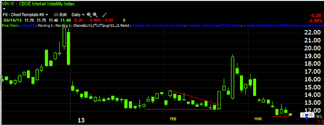
It wasn't until the market went negative and already started rolling over that the VIX was Whacked down to a new intraday low, but the close is a piece of art that I may have to frame.

Some people say, "This manipulation is just going to keep going, what's the point".

From my point of view, these are moves of absolute desperation, the money literally is not there, if you don't trust those readings, then how can you argue with breadth readings in which more stocks are moving to lower lows every day?

My view is this desperation to scratch and claw for +.04% like yesterday or +.02% the day before or even .35% (DOW-previous 3-days), which is a move so infinitesimally small, not so long ago it wasn't even worth mentioning, an average move was .75% to 1.25%, that was an average move, a move worth talking about was +2%-3%.

It seems there's an absolute desperation to make the SPX new closing high, for what reason when the rest of the market is crumbling around us (as seen in market breadth), I have no idea, perhaps some options, some kind of derivatives.

These tiny, volume-less, breadth-less gains that everyone knows are pure manipulation of anything they can get to move like the VIX today, while stock's crumble and smart money moves out, as well as insiders sell, have some point or reason, but if the money is not there, smart money is moving out to the point in which it's not just on 3C charts but physically in deteriorating breadth/ stock prices now at the point of growing worse just about EVERY DAY, I have to say my initial impression is not to be emotionally scared off by this when the money is not there, they're after something for some reason so bad that that they are willing to concede the game as volume is smaller and smaller every day (new lows for the year every day), they are willing to permanently lose that volume for something that is close enough that they are scratching for it.

This looks like a perfect black swan, I think now more than ever it's important to make decisions based on fact and logic and not emotion.

If we were moving 1+% a day, breadth was improving, money was coming in to the market, insiders were buying, smart money was moving in, volume was rising, that's a totally different scenario, this is the exact opposite in every sense except for price.

The VIX...
 This looked bad enough, but the last minute of the day...

 And there it is, the VIX moved 42 cents from the intraday high to the low at the 2nd to last minute of trade and then lost 30 cents in the last minute alone.

 The Dow vs the VIX, I didn't see Dow futures last night, but in last night's post, the SPX and especially the NASDAQ positive divergence were very clear, this overnight ramp in to the lowest possible volume of the continuous trading period is obviously the easiest way to ramp the market and we see that on opening gains, after that though the market barely moves, some of the averages are slipping and the VIX is slaughtered to save the day. It won't take some 26 year old algo programmer long  to figure out how to take the other side of the trade, I'm surprised they haven't yet and start using this predictable pattern against them.


 SPX vs the VIX, like the other averages around 1 pm the SPX starts to look like it's going to lose the opening gains, cue the VIX.

The NASDAQ 100 futures had the strongest divergence by far as of 2 a.m. last night and it just got stronger from there (1 min chart), giving the NDX a nice gap up, yet they couldn't hold the gains and apparently only the VIX held the NDX off from letting those gains slip away.

I have a couple of ideas for some indicators to show some breadth figures I'm interested in, I'm going to update, check the normal breadth and see if I can get these up and running.

ES. NQ and especially R2K futures are very negative

Looking for thing of interest

Most are after market, when closing stats are available, but there's a big move down in HY credit, yesterday it moved up at the close, this is a big move.


Intraday charts like 1 min seem to follow, few go positive, everything longer stays negative

Whack-a-VIX Send VIX to NEW Intraday Low

Today as the markets were just rolling over, bang-Whack the VIX and send it down to a new intraday low of 7 or so years.

 SPX green / VIX red

New intraday low going back to 2007

The goes GOOG on some volume

All of the intraday charts have gone positive (1, 2 ,3 and 5 ), this should be the start to the move.

GOOG Update

GOOG still looks good, it has actually improved all around for the call position.

 The 1 min chart is no longer in line with price, but started with a relative positive divergence and is now starting a leading intraday divergence.

 The 3 min chart went straight from in line to a leading positive divergence.

The 5 min chart's leading positive looked impressive yesterday, today it has just added more to that leading positive divergence, nearly doubled the size of the leading positive.

IWM Updated Charts

The fill on the IWM April 20 $94 puts was $1.98

I wanted to add to the March Weekly position as it looks like the IWM will move enough to influence price there, but looking at it objectively, it's just dollar cost averaging. If there were no position in place, I'd opt for the longer expiration as I have been doing with the most recent options positions; this is based on the observation last Monday that from the looks of the charts, Volatility/amplitude and duration look set to pick up. As I explained in a follow up post, this is not something that I feel will be noticeable on a daily chart, but more on a continuous basis and one way to get more of a continuos feel to the charts is by using multi-day charts.

 IWM intraday 1 min-Earlier I posted what looked like initial weakness at 12:27, but it wasn't showing up on the intraday futures yet; at the time of that post the IWM was at $94.47, it added 3 cents from there and is now at $94.42 so the initial charts were showing deterioration, it just hadn't gained enough momentum.


 The 2 min

 The longer 2 min trend

 3 min

 5 min

 Jumping to the longer term trend, there's already been significant weakness in the IWM (and market) which has been visible in volume, 3C, and especially market breadth as more stocks continue to fall below their moving averages or even 2 standard deviation below their moving averages as shown last week, this week and last night.

 This is the 1 min intraday  R2K Futures, they have been in line since my post last night, they are just going negative here, in fact since this screen capture, the chart has deteriorated more.

 5 min futures are leading negative in to a parabolic price move, I never trust parabolic moves as they tend to end the same way they started, except with a parabolic completion to the downside.

 15 min futures, the dashed line is the June contract, however I have found the 3C signals to work from one contract to another.

60 min Russell 2000 futures and a leading negative divergence, most of it since the June contract started trading.

Adding IWM April 20th 95 Puts

I'd almost add to the weekly, but decided to go longer, the charts are falling apart intraday, charts coming next.

GOOG Update

Here are the GOOG charts...
 The 1 min is in line with price, not any more negative or positive. The 2 and 3 min charts are exactly the same.

It's the 5 min chart that's moving (this is also the earliest timeframe where we see institutional money flows on an intraday basis), the leading positive divergence from yesterday has added quite a bit more today in to prices pulling back. I'm still inclined to stick with the data and not emotion, this looks like buy low has occurred and we are waiting for the snap to sell high.

ICI's Flow of Funds

Again, addressing the "Great Rotation" from bonds to stocks, it is more appropriately named, "The Great Myth of Rotation: Stocks are losing money.

From ICI's Flow of Funds...
 Supposedly money has been flowing in since the start of 2013, I have the start of 2013 highlighted above, the first one showing a big decline is the week ending 1/2/2013 so it's not indicative of "New Year" funds, however ever since the start of money coming in to domestic equity funds, it's been steadily fading, the last 2 weeks have been negative. A lot of the money that came in was not from bonds, in fact bond funds have seen larger inflows for the year than equity funds, a good portion of money rotating in to stocks was from Money Market Funds.

As for the Dow...
 The last 2 weeks of outflows certainly show up in the Dow during the month of March.

This isn't comprehensive analysis of Bond funds, but just take a look at the volume trend in TLT, the flight to safety trade vs the Dow.
TLT is seeing large volume and since February it has been in a range, a range I showed you in last night's post that has been characterized by accumulation through March.

 30 min TLT positive divergence keeps migrating to longer charts.

The rate of change (white) in TLT (green) vs the Dow-30 (red) has gone from declining to tapering off, if the Dow's move is so strong and there's a rotation out of bonds, why hasn't TLT's rate of change remained negative?

Market Update charts

The averages are starting to go negative, they don't look really horrible yet,but the futures aren't looking that bad yet.

Basically I'm on alert for things to change quick.


 DIA 2 min

 DIA 5 min

 IWM 1 min

 IWM 3 min

 IWM 5 min

 QQQ 1 min

 QQQ 2 min

 QQQ 5 min

 SPY 1 min

SPY 3 min

Quick Market Update

I'm going to post charts, but the SPY, DIA and IWM all look ready to come down intraday.

UNG Update

This is a larger Primary Update of UNG from March 5th in which I said, "If you think it's too late to get involved in UNG, you'd be mistaken", however I added that UNG is not the typical trade, this is a longer term trade, more like an investment and risk management must reflect that, it needs room as it is about to come out of a large base, but for now it's still in the base and bases like tops are volatile. It has still been worth playing though as many of us got involved at the lows and have a 30-40% gain and this one hasn't even moved to mark-up yet.

This morning UNG is up on a gap and up more on the 10:30 EIA Natural Gas Report in which there was a slightly larger draw than consensus.

"Natural gas in storage fell 145 billion cubic feet in the March 8 week to 1,938 bcf. A withdrawal of 135 bcf was expected."

 Here's the longer term perspective, change of character and base, we started following UNG in anticipation of a base while it was still heading down.

 This level crossed on 3/8 doesn't look that important on a daily chart, but on an intraday chart you can see there were a lot of resistance areas so it actually was an important move, I'm pretty sure I posted about it, but can't find the post right now.

 This shows the right side of the base with a head fake/false breakout right at the apex of the large ascending triangle, 3C shows that it was a false breakout and we suspected back then that UNG would be taken down to lower levels to be accumulated on the cheap one last time before it made a serious run to breakout to stage 2 mark-up. The most recent resistance level broken yesterday, but decisively today was a serious level as can be seen on the daily chart with at least 8 serious points of resistance and a break away gap to the downside, maybe one to the upside if today doesn't get filled.

We have talked a lot about the lack of breakaway and exhaustion gaps in the market, two really exceptional signals that HFTs have just annihilated with relentless gap filling, however as you can see in orange, a not so important gap was filled, but in white, an exceptionally important break-away gap was not filled, this is a VERY bullish gap at the area it formed and the fact it wasn't filled (which makes it a breakaway gap) shows how important that day was.

 The 5 min UNG chart (which is typically the earliest timeframe we see institutional money move, has been nearly perfectly in line with price - that's what we call, "Price trend confirmation".


 The 60 min chart is important as a long timeframe showing larger sums of money moving, you can see the head fake / false breakout in yellow and 3C confirming that with a negative divergence meant to send UNG lower where it was accumulated at the white positive divergences.

 More important is the 4-hour chart showing base accumulation.

As a form of confirmation, I like to check other indicators I trust like MoneyStream, note the almost perfect confirmation of the downtrend, this gives me high confidence in the indicator's readings, then a large leading positive divergence on a very important daily chart as this shows huge accumulation.

 On my X-Over Screen which is a 10 and 22 bar m.a., a custom indicator with a 22 bar ma and 14 bar RSI, all 3 must agree to give a buy/sell signal, red is a sell signal, white is a buy or confirmation signal and in yellow we have a whiplash or false price crossover that the other 2 indicators would keep you from taking.

 Here's my recommended stop, an 8 day that holds the downtrend, note price is breaking above the channel today.

If you are looking for a shorter trading stop to trade around the position, this daily will work, it will keep moving up locking in gains, but allow some room for consolidations. Right now, a 22-day exponential moving average will give you a close approximation of the daily trend channel stop.

GOOG Update

Yesterday's call position lost about 1% of portfolio, even though it was over a 50+% position loss, by keeping your losers small, you can take multiple stabs at a position until you get the correct positioning, this is one of the biggest differences I've seen between professional traders who make a living and not flame out and retail traders, pros keep their losses small and if there's something they like about a position they aren't afraid to take multiple stabs at the trade, they can afford to because they keep losses small and let winners run. Retail traders tend to take 1 stab at a position, take WAY too big of a loss because risk management is the last thing on their mind rather than the first and they walk away from a good trade after 1 loss. That's like accepting a strike out in baseball after only 1 strike, you have at least 2 more at bats, why would you walk away after the first strike and accept an out?

I don't advocate taking multiple stabs at a position if you don't have a reason, but if you do, then it's a different story. Risk management is what allows you to stay in the game until you hit that home run.

Any way, here's the GOOG update, yesterday I got out of GOOG and the more I thought about it and looked at the charts, the less I liked my decision, but options have a different set of rules than a long equity position, there's time decay, expiration, the premium, etc.

 The 1 min chart, this is 1 reason I lo back at the exit and regret it, the decision was more emotional based than fact based.

 The 2 min chart makes looking back at that decision even worse.

 And the 5 min chart looks like GOOG can still make that pop higher, but remember the real trade here is looking for higher prices in GOOG to fill out a April Put position. Here's the reasoning behind that trade idea.

 10 min chart is leading negative

60 min chart is leading negative. This is the bigger picture, the charts taken together suggest a short term bounce which should be used to sell/short in to price strength, the call is a short term position to try to ride that bounce, the longer term put is to try to ride the move down that the larger distribution on the charts suggests, but we'll definitely look at the charts again on any strength and make sure they look worse, meaning there was stronger distribution in to any price strength.