Monday, December 17, 2012

RIMM Chart Request

RIMM, I am proud to say is a chart we have watched transition from a negative price trend, but we expected that because of the underlying 3C signals we were getting. Many members are long RIMM, many more would like the opportunity.

There were several positive divergences that we called correctly, but for the wrong reasons which is fine because we'll never know the real reason until it's too late to make any money. There's a way to be sure, there's just no money in it. At first we saw a positive divergence just before earnings, I thought it was a leak, but RIMM didn't react well to earnings, we stuck with the trade even though it lost 9%, we did that because the 3C signals stayed strong. Eventually there was a huge management shakeup and RIMM went from a losing trade to a winning trade in days, the point is, you never know why- we thought earnings, but someone knew ahead of time there was going to be a management shakeup.

RIMM also benefits from the QE3 effect, I call it that because ever since then (and I believe this is because of the uncertainty the F_E_D is creating with their new policy yardstick rather than timetables) stocks with high P/E multiples or the high flyers have been getting crushed like AAPL, whereas the stocks that were already beaten up pretty good look a lot more reasonable in valuation and that might actually matter if the F_E_D suddenly changes their QE policy because of unforeseen economic developments, funds for once in the last 3-4 years may actually be a little more concerned about value rather than momentum if they have a sudden shift in F_E_D policy that sends the market down lower, at least they are holding stocks that are closer to fair value.

The other thing RIMM may be benefitting from is the notion of AAPL's invincibility was stripped away with the IP-5, as I said at the time, for the first time I can remember, an AAPL product was evolutionary rather than revolutionary. RIMM might just find a bigger share of the market.

Here are the numerous charts because if you look at each, there's something to be seen, something to be learned.

If you are already long, this may be of some help, if you want to get long, be patient, RIMM is worth the wait.

 I always start with a 5 day chart, I want to see what has happened and here I can see a change in character in volume, first it's very heavy on the move down as RIMM longs clear out, then it is very heavy on the upside as a new class of RIMM longs come in. Any way you want to look at it, compared to the market's declining and horribly low volume, something stands out about RIMM, it's worth investigating.

 Then RIMM makes a nearly perfect rounding bottom, it even has higher volume on the right side, it's actually nearly technically perfect for a rounding bottom, but if you think it didn't get head faked and shaken out, think again.

 Here's the clear range/base and you may not think it looks like much, but that's a 1-day -6.6% move with another 2+% for almost a 9% 2 day shakeout below support, you know how hard that would be to sit through?

Right after the head fake move what happens? RIMM's move in to Stage 2 Mark-Up starts, the head fake move is a sign post on the map telling us the move is about to start.

 I'm using my Trend Channel here set to 4 days, you set the TC depending on the trend you are trading, there was one volatile stop in the downtrend before a new downtrend and then a stop out and a long signal that is still long with a longer term trending stop around the $10 area, but never put stops at whole numbers like $10 or even close ($9.87 or $10.31 would be my choice and I wouldn't place it with my broker-just mental and on a closing basis only).

 RIMM tracks the 100-day moving average pretty well, it acts as resistance and a breakout area that is very close to the Trend Channel's signals.

 My X-Over Screen is also set to a longer trend of 2 days, note the first price crossover, this is why I added the middle custom indicator and m.a. as well as RSI, when all 3 give a buy or sell signal, they rarely get whiplashed like most moving average crossover systems.

Typically in a new trend the first pullback is to the yellow price moving average, the second is typically between the yellow and blue and subsequent pullbacks usually hold at the 22 bar blue moving average, so remember these will keep moving up on momentum, but those are the rough areas you might want to set some alert for if you are interested in RIMM.


 Something big happened in 3C too, this is a daily chart, these rarely see leading positive divergences, almost never this big and almost never this fast, this is a HUGE change in character and CHANGES IN CHARACTER PRECEDE CHANGES IN TRENDS.

 The 4 hour 3C chart leading positive

 Look at the 60 min, almost all of the leading is during the base, this should give you the confidence needed to stay in the trade on a bad head fake move like it saw.

 The 30 min trend is in line, the two yellow areas are head fake moves within the base before the breakout, this tells us that the longer term trend is not in any real danger.

 The 15 min chart shows the start of a leading negative divergence so we also know that it's likely RIMM will pullback, but only pullback because the 30 min chart has no problems. This means we may be able to get a great entry on a new position or an add to long position in RIMM.

 The very near term 5 min shows recent damage, but this is nothing compared to the positive longer charts, it may be enough though to get our pullback.

 The 3 min is also negative, but it's still lingering, the exact set up for a sell or short (I prefer not to short RIMM) is not clear yet, I think it will be within the next few days.


The 1 min chart is also negative here so we know that we are close to a pullback and we know probabilities are very high that this is a pullback worth buying. We just need the set up for any who want to take some profit of the table and as it pulls back we'll watch 3C for signs the pullback is being accumulated, maybe a head fake move and we'll be in pretty good position.

I would set alerts along the moving averages described and the Trend Channel.

I suspect that RIMM will see a pullback when the market itself sees the next trend to the downside so it may be a pretty decent pullback.

There's resistance around the $14.80-$15 level, I know that' pretty far from here, but it would make for a great had fake move and we'd know where to take profits and maximum profits so that's one thing I'll be watching for.

If you are interested in RIMM, feel free to keep in touch via email for regular updates.


Futures look set to see downside

This probably doesn't have anything to do with tomorrow, but it looks like both NASDAQ and S&P Futures are seeing distribution short term tonight in to highs, their slightly longer 5 min charts are still in line which means the move tomorrow on the upside can still continue, there's no negative divergence on the more important 5 min scale that would be problematic.

 ES 1 min negative divergence

 ES 5 min positive and in line.

 NQ/NASDAQ 1 min negative divergence

5 min positive and still in line

Market Wrap

I'm getting started a little later than normal tonight, I'm just a bit concerned about my wife with her thousands of miles away and me here, it's just not ideal, especially when some scary results come in.  I needed to take some time to get a clear head. By the way, thanks AGAIN for all the kind messages, I think I'll print them all up and give them to her when she returns. As always, you all prove to me there's just something special about the WOWS membership that I'm so blessed to be a part of.

So I was browsing another site as I get a kick out of their perspective and way of expressing it from time to time, they started their analysis of today's trade saying,

"For anyone watching the last hour or two of today's market, there was plenty to entertain. VXX (the implied vol ETF) collapsed in a haze of glory dragging stocks to the highs of the day with financials seeing their best day in three months. "


 Which was ironic that they lead off with that as one of our late day market updates or confirmation updates was, "Volatility as Confirmation" in which I showed you the exact opposite of VXX, XIV and how the positive divergences there were not only confirming the market's end of day ramp from the earlier pullback, but also hinting at direction in After Hour and tomorrow. Out of all of the assets that one could look at, to both be looking in the same direction (the only difference is they can only see price whereas we can see underlying trade) struck me as ironic.

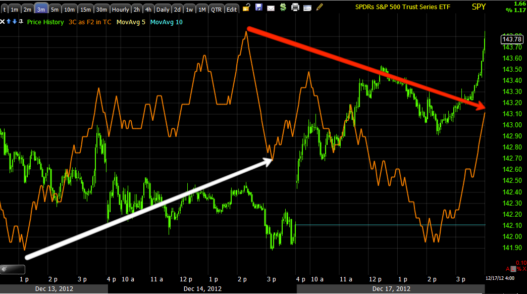
After hours trade hasn't been so bad either, another fraction of a percent or so; this is what ES (The S&P E-mini Futures) look like...

*I just wanted to add, so you had a feel for ES, there's an old saying on Wall St., "Are you man enough to trade the S&P e-minis", they are not the typical retail trader's asset.

Point "A" is a "relative negative divergence", the reason being is 3C is at the same level between the two 3C peak highs, but ES is higher at the second peak high "relative" to the first, there's a little less underlying money flow and that tells us we are losing momentum and likely to see an intraday pullback or consolidation soon. At point "B" I posted there weren't many, but there were a few negative divergences and an intraday consolidation or pullback was likely, but likely wouldn't hold or make much trouble on the downside. At point "C" I posted that the DIA and ES where both seeing some positive divergences  and point "D" we have a  move to new intraday highs in ES (also new highs for the new trading week started last night).

As of now, the negative divergence I'm seeing and leading negative divergence suggest ES will pullback soon and with it the After Hours market, but this is a short term move that means virtually nothing overnight and in to tomorrow's open.

Early today around 10 a.m. I commented how strong financials were out of the gate, in that post I showed you the Financial Sector and FAS 3C readings which were really amazingly strong, go back and look at the post linked just above. The end result, Financials saw their best day in 3 months with the Financial sector represented by XLF gaining +2.13% and adding another +0.43% in after hours with individual names seeing much larger gains such as BAC at nearly 4%.

I noticed today that the IWM was lagging in 3C signals compared to the other averages, at first I didn't think anything of it and then it came to me, the IWM was last week's short term flavor of the moment, remember? The IWM already hit the area where limit orders would be piled up so there's not so much profit left in IWM as far as Wall St. is concerned (hitting stops/limit orders, making the bid ask spread, making money on volume rebates, etc), even though the IWM was marginally the best performer today by 1/10th of a percent, the underlying flow wasn't as strong by far.

This is what I mean...
Last week I was predicting the IWM would take out resistance at the red trendline which it did, but the first hit of that level took out the majority of orders that accumulated there, like cleaning out the gutters, the first time there's a lot there, a few days later, not so much which explains in my view, the IWM's weaker underlying trade in 3C.

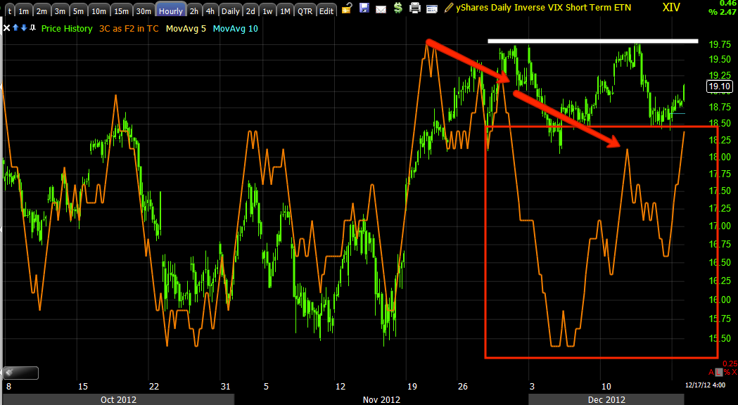
As for Financials, they had a strong positive divergence in place late last week hinting at the move to come...
Friday's leading positive divergence on a 5 min chart in to a very flat trading range (where we often see divergences). Remember on Friday I compared "dull' markets to, "The kids being a little too quiet in the other room, you just know something is going on" and Friday's dull market in Financials was unleashed today, but the divergence telling us something was up was there.

By contrast, today's Financial 3C signals aren't anything like Friday's, while they are still in line, I suspect we may see some rotation to another sector like perhaps Tech.
 Last week Tech saw distribution early to mid-week that sent it lower, Thursday and Friday it put together a solid divergence, but it wasn't until today...

That the 1 min divergence came alive, remember even on small additions to accumulation, any new move starts on the earliest timeframe and this 1 min chart flying in the Technology sector hints to me that we will see some relative performance rotation from Financials and in to Tech, I suspect that will be helpful not only to AAPL, but the QQQ as well. If we dubbed last week's short term trade, "The IWM head fake", this week might be called the "QQQ head fake", but don't forget there are more important charts that show much heavier underlying trade and money flow that are horrible looking so don't let short term strength fool you in to believing this market isn't going to see a vicious move down.

 QQQ 3 min chart took off late day today.

 Compare that to the Financial heavy SPY which was actually slightly negative in to the close as I'm sure profits were being booked in Financials.

The IWM as mentioned also didn't impress.

 However if Tech may be 1 rotational theme tomorrow, the other may be from Small Caps (IWM) to large caps as seen on the DIA5 min chart above which is leading positive


And DIA 1 min which also saw late day high intensity 3C momentum on a leading positive divergence.


Since I've laid out the trend table expectations so many times-from short term trend and how that dovetails in to the next longer trend to the downside and how that dovetails in to what looks like a longer term base for a stronger rally after that, I won't go over all of that again, I will let you know when I think we are coming to transitional points so you can use things like this to your advantage....
The QQQ daily chart-other than all of the posts late last week expecting the Q's to move up, the Market Update posts from Friday showed everything, all of the reasons I thought the Q's would be higher today, it may be worth a quick browse just so you can see the concepts used to determine the path of highest probabilities as well as a classic head fake move on the bearish QQQ triangle, it broke down just as traders were expecting, drew in shorts and today took them to the cleaners.

When I release part 2 of the article from this weekend on "Understanding Head-fakes", Friday's trade will make a lot of sense, but for now you can go back and probably piece together why that head fake move was so obvious and why it was such a high probability reversal to the upside today.

In any case, the move (if we can get it which I think we can) above the red trend line n the QQQ does the same thing as last week's identical move in the IWM, it generates a bundle of profits for Wall Street from the bid-ask spread on increased volume, triggering orders, volume rebates and lets not forget creating a lot of demand that Wall Street can sell in to or short in to to help send the market's lower (a head fake move) just a Friday's small head fake move contributed to today's upside momentum as shorts who entered on the break below the market triangles late Friday had to buy to cover at a loss today sending demand and prices higher on a mini squeeze.

The point is, I'll let you know when/if we cross the Q's resistance level when 3C goes negative and it is time to close any associated longs and start getting short or adding to existing shorts.

As for Leading Indicators on the close today, I found them to be very encouraging in falling in line with our trend table, short term up and the next longer term down, but in a much bigger way. This is the earlier Leading Indicators post from today so you can compare if you like...

I'll explain as we go along... *As always, the comparison symbol is the S&P-500 in green unless otherwise noted.


The $AUD, a great leading indicator among the currencies, but one that also goes in to divergences before most others is already in a negative divergence, this points to the longer term downtrend expected after a QQQ head fake move, I did expect this move earlier, then Tuesday came up with accumulation and I didn't understand why, but it was short term and ended up being support to take out the IWM resistance, while that happened an obvious zone formed in the Q's so that needs to be hit if possible as it's money on the table for Wall St., but the important chart to remember are the longer term market averages like this...

QQQ 15 min and there are longer and more negative charts than this. The point being is the Q's were negative and seeing distribution at the head fake in yellow, the recent leading negative divergence at lower lows with price where it is or higher, is like skating on VERY thin ice, while we have a pretty good clue, you really never know when it's just going to totally give way and that's why i keep some 3x leveraged shorts open.

 Don't forget the negative divergence in the $UD, it will let the market move up short term, but as it continues to build negative, we have a stronger and stronger sign post to tell us when the shift to the downside is coming.

Above is the Euro, it did not follow the market higher today. Friday when the Euro was higher and the market lower, I said I suspected the market was being manipulated short term with a downside head fake move that would lead to the reversal today to the upside. In similar manner, except the opposite, today the Euro is the one that is weaker and it is the market that looks like it is being manipulated higher in the short term to take out the QQQ resistance zone.

Remember this chart...
 This is why I want you to remember, commodities on Friday were all risk on as the market was risk off, commodities knew there was going to be a move higher and they were running in front of it with the Euro, today they did virtually nothing as the market ran higher, both are risk assets, in a risk on mood, both should mov together, this is just another signal to me that the market's move to the upside is short term, short lived and sets up a nice short trade.

 FCT is another one that will go negative for days, sometimes even weeks before the market follows it so it going negative on today's strength is yet another sign that this move up is worth trading, but won't last. Those traders who see a breakout in the QQQ and go all in buying that breakout are going to be the ones left holding the bag when the market reverses to the down side, this is why head fake moves exist and there are many important components to that as you will see soon in the next installment of our Head fake article. Once you understand why they are there, what to look for, how to confirm them, you'll have a great asset that lets you enter trades at the best prices while the sheep go off the cliff.


 Yields today closed an hour earlier than the market so we couldn't see the end of day move, but they appear to have been strong up until then, there's more influencing these right now such as the record low indirect bidder take down on today's US 2 year Treasury Auction, telling us that what we saw last week with foreign governments like China and Japan stepping away from the table and not willing to hold US debt was not  one-off event, it's becoming a trend. Wonder why the F_E_D is willing to add treasuries to their buy list at the last F_O_M_C meeting? Apparently there isn't much interest from the rest of the world and someone needs to keep buying our debt so Congress can spend it.

 High Yield Corporate Credit ran late today with the SPX, this tells me the chances are very good for another move higher tomorrow, this is a very liquid/large market so traders can get out of large positions fairly quick, but keep watching...

 Junk Credit also ran at the end of the day, again a risk on attitude among the huge credit markets suggesting they think there's some more near term upside, but...

The less liquid High Yield Credit is seeing selling as it WILL NOT follow the SPX higher, no one wants to be trapped with a large position in a less liquid market when the music stops playing.

I'm going to try to update a stock or two tonight before I wrap it up, I'll also let you know if I see anything strange in futures. Within the next day or so I need to check breadth indicators again, I like to keep up with them at least a few times a month comprehensively, I think I know what we'll see, but it's important to be sure and I think it can be useful for you.


AAPL Continues to look Good

Volatility as Confirmation

Before the F_O_M_C announced their Treasury buying, there were no signals any where suggesting which way the market was going to head, how it would initially take it; then as I went to the volatility ETFs like XIV, VXX and UVXY, I saw them move big time right before my eyes, I posted that they were showing the initial reaction to be favorable which it was and then they reversed suggesting a move down intraday which happened and a 3rd post about the continuation which happened so I've learned a little about how and when to use these.

Here's XIV alone, the findings here are nearly identical to the QQQ findings, although they do have some differences as they should because a move down in the Q's is not the same as a change in volatility, the amplitude of the change in volatility can be much different than just a price move up or down, but for now we have pretty good confirmation.

 XIV moves with the market for the most part, that is it's correlation whereas VXX and UVXY tend to move opposite the market like the VIX so positive divergences in XIV should be taken as similar to positives in the SPY or another market average.

On the intraday 1 min we have a positive divergence that fits with the DIA one I mentioned, it has moved to leading positive position which is stronger...

 That divergence has migrated to the 2 min chart so it looks good.

 The 5 min chart already had a significant divergence in place so most of the new move in on the intraday charts, but like the Q's 5 min being positive, so is XIV.

 And the Q's 10 min is positive, so is XIV in a leading positive divergence

Looking at the 60 min you can see the overall longer term tone is much different out here, there's a leading negative divergence of some size, so this again fits with the QQ/Market trend expectations. Think of the white trendline as being similar to the QQQ's obvious resistance area where a lot of orders will be triggered and almost certainly create a bull-trap, kind of like a short squeeze for a move down.

Market Update

I think in the last post I made the trend expectations pretty clear, feel free to email me if you didn't understand something and don't worry, it's a complicated subject.

As to today's intraday pullback, as you know the 10 min positive in the QQQ makes me believe that whatever intraday pullbacks we get, they will not last too long as the Q's still look set to try to make that move higher above resistance before they snap lower.

As for market averages for intraday signals, the DIA is giving an intraday positive and ES is as well, most of the others are in line or lagging a bit, but that DIA signal may be enough.

I think the trend table explained in the last post is the most important information though.


Leading Indicators, Market Update, Trend Perspective

First we're going to look at Leading Indicators because they were predictive for today's trade and they are probably somewhat predictive for either this afternoon and maybe in to tomorrow or part of tomorrow's trade. I'm not looking too much beyond that.

Then I'm going to show you about 5 different QQQ charts that should, if you are still having a hard time visualizing multiple trends at the same time and how to rate their probabilities (which is understandable as this is a particularly complex set of signals currently) help you understand the different trends, what their respective strength and probabilities are and how that ties in to Leading Indicators, at least in the near term.


Leading Indicators (*With Leading Indicator Charts, the Leading Indicator will have its own color, it will always be compared to the S&P-500 which will always be green unless the comparison symbol is noted to be something other than the S&P-500*)

Commodities
 Looking slightly longer term at commodities we see where they are roughly trading with the SPX as they generally should as they are both reflections of investors/traders sentiment toward risk, either buying or selling. However recently with the SPX making that triangle Friday the market seemed to be short term manipulated and Commodities outperformed the SPX by a wide margin, this was a hint that there was a risk on sentiment in the market and that the SPX was likely being artificially held back for a short time (as they can't manipulate the market too long without really setting that trade up in advance).

Our view that we'd see a near term attempt at least for the market and especially the QQQ to try to take out that clear resistance level was confirmed by strength in Commodities while the SPX was weak at the moment; this also tells us (with enough confirmation) that the trade in the PX is likely being manipulated. You can see why now after that triangle from Friday fell and the shorts who were trapped covered and help send the market higher earlier today.

 Commodities 1 min chart intraday show a positive divergence between them and the SPX, they are headed higher as the SPX breaks below the triangle late Friday afternoon. Today commodities and the SPX are pretty much in what I call 'reversion to the mean", meaning the bullish divergence in commodities short term has now vanished as the SPX has caught up with commodities and commodities have failed to make a strong move higher, instead they have just met up with the SPX, this is short term negative for the market or at least tells us a consolidation is likely.


FCT
 FCT was brought to me by a member and I'm eternally grateful because for whatever reason, I have found that it tends to lead the market in a number of timeframes. Here on about a week's worth of trade FCT held up much better than the SPX at the white area and suggested a positive divergence that the SPX would have to catch up to by moving up as we suspected any way.

 Again, like commodities today, intraday trade shows FCT making lower highs as the SPX was making higher highs, FCT is in a short term negative divergence which should send the SPX lower or in to some sort of consolidation any time now.

Yields

 Yields are like a magnet and they attract stocks/SPX to them, the positive divergence in yields in white suggested we'd see some near term upside in the SPX and we have.

 Intraday yields are still holding up pretty well, we'll have to see how they close.

Currencies

 The $AUD is a great leading indicator among the currencies because it reflects to some degree whether the FX carry trade is on or off which effects the market. The $AUD was leading the market on the 14th (Friday) and suggesting the SPX moves higher today, that happened, the $AUD lost strength today and the two met at reversion to the mean, that means as of now there's no divergence, but it also takes the wind out of the bullish sails short term.

 The Euro is a better confirmation indicator than leading indicator, but it has been leading the SPX, these two usually move together so the SPX had some catching up to do on the upside as of Friday, it looks like it still does so it's possible that we get a short term pullback/consolidation and then a continuation of the short term market move to the upside.

 Intraday you can see the Euro has lost some steam and this is certainly having an effect on the SPX, as I said, they tend to move together even on an intraday basis with the Euro leading longer term, this is because of arbitrage traders/HFTs.

Credit

 As they say, "Credit leads, stocks follow" or "confirm". This is High Yield Credit, it is a risk asset rather than a flight to safety like Investment Grade Credit, HY credit is used when credit traders expect a bullish environment, but because Credit is so big, they tend to unwind trades before the market does and thus give us a leading divergence. Here in white Credit is leading the SPX and the SPX moves higher, but then Credit turns to a negative divergence and the SPX moves lower, it looks like we still have some near term downside.

 A closer look reveals a positive divergence in HY credit late Friday at the white arrow and a negative divergence intraday today at the red arrow.

 High Yield Corporate Credit works much the same way as HY above, in green the SPX and credit are in line and moving together, no real signals there, today however HYG Credit is not as enthusiastic to move higher with the SPX at the red box.

 Junk Credit is high yield because of its risk as being junk, so this is used to express a risk on sentiment. Last week we see Junk Credit outperforming the SPX at the white box as Junk refuses to move lower with the SPX, Junk still is leading the SPX over the bigger picture (meaning several days-maybe a week).


QQQ-trends
 This is the 1 min intraday trend, it is the fastest chart to react to new information such as an intraday divergence as we see to the right at the red arrow and the QQQ has lost ground since then. We can also see a preceding positive divergence at the white arrow suggesting the QQQ moves higher short term as it did today.

The red trendline above is the resistance zone I think the NASDA 100 will try to break to trigger orders and make $$$, but for now this is signaling a pullback intraday until it turns positive again.


 The 10 min QQQ 3C chart shows a positive divergence a couple of days long, also a leading positive divergence so all in all, being this is a stronger, more important and higher probability trend, even though the short term 1 min chart shows a QQQ pullback, this 10 min chart is still in effect and still suggests the QQQ will head higher, which tells us even though there's a pullback now, it's very likely it ends at some point soon to finish what this chart is depicting until this 10 min chart turns negative.

 The 15 min chart is even more important than the 10-min chart and we have  longer trend here. On 11/16 we have a strong positive divergence in the QQQ, this tells us a significant move up should come, it did, then we see a leading negative divergence telling us that even though the QQQ are still holding in this area and still might see short term upside volatility, the strongest trend and highest probabilities are the QQQ follow this leading negative divergence and likely make a new low below the 11/16 low. This doesn't mean in the short term the Q' can't move higher, it just means they are not likely to move too high and they definitely are not likely to hold that move, so it makes any upside move in the QQQ worth looking at as a short as this trend finally executes to the downside.

 The 60 min chart is even more impressive and stronger in trend and probabilities, it also says QQQ goes down so while other trades may see the QQQ breakout and chase it thinking it is going higher, we have strong information saying , "NO IT DOESN'T-YOU WERE JUST SUCKERED IN TO A BULL TRAP!!!"

THIS IS A MCH LONGER 30 MIN TREND AND WE ARE NOT THERE YET, BUT IT IS POSITIVE, IT'S BEEN BUILDING SUPPORT SINCE LATE SEPTEMBER, BUT JUST LIKE BASES WE HAVE SEEN, THEY CAN MOVE UP AND DOWN, EVEN THOUGH THEIR EVENTUAL PATH IS TO THE UPSIDE. 

When more data comes in and the trends we expect play out, we will cross this bridge when we get there, it's too early.