Thursday, August 18, 2011


Looking at the SPY options chain, there was a lot of open interest in Calls between $120 and $135, it looks like, as put forth in my theory on the market and Op-Ex, these will all expire worthless.

The SPY Puts were more spread out, mostly between $110 and $130. I talked a lot yesterday about the market dropping today and that it did.  As you probably know, my original theory was that a sharp sell-off would not only pull in more put buyers, but it would cause them to act emotionally and let greed come in to the equation in which they would see this as the start of the next leg down, so why take the profits on Friday by selling their contracts when this "apparent" new trend is just getting started? Why not exercise those PUT options and hold the position and ride it lower?

This is where the second phase of the rally would come in and send the market higher creating a short squeeze on many of the recently exercised PUTS. I believe this would be the last rally, but it could be just as spectacular as the downside ride.

Of course the other option mentioned was to drop the market today, selling more Puts at a lower strike and perhaps moving the market up tomorrow.

Internals today were interesting, there was a Dominant Price/Volume relationship, it was in all of the major averages and it was price down/volume up. To show how dominant it was, the Dow had 29 stocks in this category, the NASDAQ 100 had 92 stocks so you get a feeling of just how dominant it really was.

There are two interpretations of this relationship, one is that there is panic selling and the second is capitulation and a short term bottom. Neither relationship fits exactly because if it were panic selling, then the volume was about 40% lower then similar declines last week and about 60% lower then the average ES volume for the week of the decline.

It doesn't really fit as capitulation either, rarely is there a 1-day price move that is capitulation and the volume should be higher overall.

I think it's a reflection of the lower volume environment we have been in and perhaps a controlled burn of the market (manipulating the market lower as suggested yesterday).

As for today's trade lower, for whatever reason (one of my theories or something else) the market gapped lower and 3C had been warning of this. At 10 a.m. the Philly Fed Survey came out, this was a whopper of a disappointment. The Survey came in at -30.7 with consensus at +2!  There wasn't much in the way of "Silver Lining" in the survey either, however ironically the market found a bottom 10 minutes later that held until about 3 p.m. I have some ideas about that, but I'm not going to engage in useless speculation.

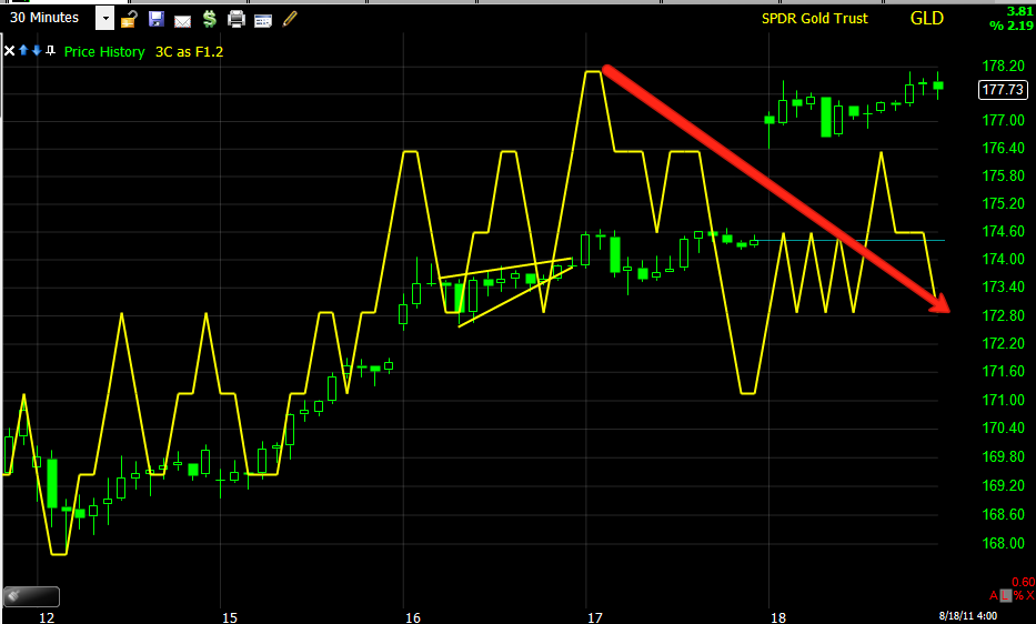
Charts that stood out today....
 DIA 5 min- New accumulation has to start somewhere, so it usually starts on 1-5 min charts and makes its way through the longer timeframes. 3C here acted as if price didn't even fall.

 The IWM was interesting, this is a 15 min chart that didn't budge at all, it also acted as if the market never moved, thus it is in a leading positive status.

 The 5 mn IWM chart showed a top yesterday and went in to a leading positive divergence today.

 And the 1 min chart was spectacular, it is a leading positive divergence, even in the face of a 5.69% drop, it's hitting new leading highs!

 The QQQ 2 min chart nearly did the same thing as the IWM above.

The SPY 10 min chart was leading price today, especially toward the close.

Currencies
 FXE/Euro Daily chart-this is more of the big picture (Second shoe to drop), the daily hart refused to confirm the move higher in the Euro over the last week. This is inline with the long term accumulation of the dollar we are seeing.

 This FXE 15 min chart s leading negative, suggesting the dollar wants to rise a bit more in the intermediate term.

 The shorter term looks like some dollar weakness for a short period, perhaps tomorrow or Monday.

 The 1 min chart confirms the above chart.

 The 10 min UUP/Dollar chart is also suggesting some near term weakness

 As is the 5 min chart. I know it's a bit confusing, but it looks like dollar weakness within a few days, which is positive for stocks, when looking at the bigger picture, the Euro is falling apart and the dollar gaining in accumulation, I would associate this with the "second shoe dropping". My opinion is that there is a rally before the second shoe drops, that would explain the near term weakness in the dollar.


 GLD 30 mn refused to confirm, it's almost as if the Big players are saying, "not at this level" and perhaps are distributing GLD in to strength.

 The 15 min hart says the same and should have easily been able to confirm GLD price action if the underlying will was there with the locals.

 SLV, (see my update today on SLV-we are looking for a possible false breakout to the upside before some downside) 15 min is n a negative leading position, again, if the underlying commitment to SLV at these price levels were there, 3C should have no problem confirming the new regional highs.

 The 30 min chart is worse.

Treasuries-The Safe Haven Play
 TLT

Volatility-VXX
 The VXX has an inverse relationship with the market, VXX goes up, the market goes down. On the 5 min chart, there's accumulation and confirmation of VXX's move up.

 On the hourly, no one is biting.

Same with the 30 min

DJ-20 Transports
Here we see some accumulation before the DJ-20 rises, today we see similar accumulation on the hourly chart.

XLF Financials
 XLF showed a pretty amazing burst of apparent accumulation on this short term chart today.

 XLF 10 min also put in quite an impressive performance, as if XLF not only didn't drop, but as if it were still up there and accumulating.

Even the 15 min hart ran up to new leading highs over the last several days in afternoon trade.

Something is definitely going on behind the scenes in the underlying action. My call for the market to fall was not based on gut, instinct or CNBC, it was based on the charts.

I browsed a few bellwether stocks and found some interesting 3C charts among them, I'll just name the stocks and the timeframe, you should be able to make sense of the divergence and its importance.

Some other interesting charts....
 AAPL 1 min

 AXP 60 min

 AXP 10 min.

 C 30 min


 C 10 min

 C 5 min.

 C 15 min.

 DD 5 min.

 DD 1 mn.

 GOOG 15 min.

 GOOG 1 min.

 IBM 60 min

 IBM 30 min.

 IBM 10 min,

 IBM 5 min.

 JPM 15 min.

JPM 5 min.

Some others too that I didn't capture: CAT, MSFT, GE, CSCO, MMM, XOM, HPQ, T, UTX, DIS, HD and  KFT

Pretty amazing

IWM 1 min

HOV-I hope you got out

Yesterday I posted this strongly urging you to take your profits on HOV, I actually warned several times before as well. If you took profits yesterday around the time of my post, you made 23% in 2 days, if not, you lost a lot of that today as HOV is down over 13%.

Keep HOV on your buy list though, I think we'll have another opportunity for another 20%+ run in a few short days.


RIMM Update Request...

Here was the last update for RIMM

 RIMM 60 min chart, climbed back int the trading range.

 Here's  a closer look. Yesterday I sad I thought support of the trading range would hold, thus far it has.

 The 1 min chart showing the probability of some afternoon selling, a test of support again could form some new signals.

 The 5 min chart showing the early positive divergence on the open that sent RIMM higher today.

 The 10 min chart, shows the break from the trading range and the positive divergence to move RIMM up back into the range, again there are some signs that there will be late afternoon selling pressure.

 The 15 min chart, shows some history, but otherwise is trading in line or confirmation of the trend.

The 30 min chart shows a leading negative divergence, but this is very new and could go on for some time, RIMM could even move much higher as the divergence continues to form. Ultimately my idea was RIMM moves above the range and fails from there, this chart would be in line with that thought.