Although I have marked divergences to make them easier to see and I've tried to show today's action as well, try to look at the price trend vs. the 3C trend, try to block out my annotations and just visualize the trend of each. Remember when prices are down and 3C is up, it's a positive for the market, when prices are up and 3C is trending down, it's a negative and when price and 3C travel together, it is confirmation of the trend (marked with green arrows).
DIA long term 1 min trend, the yellow arrow marks a bullish triangle head fake. While many individual divergences are marked, the most important is the recent leading negative in the red box.
This is the recent action on the 1 min chart in the DIA, there's a nice head fake, today's overall trend has been negative, not following prices.
The 5 min chart also reveals the bigger trend, the red box is the worst divergence, a leading negative.
This long term 30 min chart is a good one to try to visualize just the price and 3 trend.

IWM 1 min shows distribution in to today's move.
The longer 2 min trend, 3C fails to make higher highs.
An even longer 2 min perspective, another good one to try to ignore the annotations. This is also showing the IWM in the most dangerous spot on this chart.
IWM 5 min, I have marked divergences with arrows and the effected price region with boxes around price, white positive/ red negative. Note how small the positive divergences are vs the negative divergences in length.
IWM 5 min for today, hitting apparent resistance or a sell/short zone.
There are many interesting divergences on the 30 min chart, but again, the trend is what is most telling and the recent leading negative divergence also makes this a dangerous area for the IWM
The IWM 60 min reduces the noise and the trend is apparent.
QQQ 1 min action for today, note it is going negative in to a price spike, note past price spikes w/ negative divergences like the one to the left.
long term QQQ 1 min trend
Long term QQQ 2 min trend, also in a dangerous spot right now.
QQQ 2 min close up of yesterday and today
QQQ 10 min trend
Another area I have marked divergences and the effected price area, but the overall trend is most telling.
Although this is a good chart to study to see how divergences effect price.
The QQQ hourly is very clear as far as the trend goes and it's one of the most important timeframes.
SPY 1 min for recent action
The longer term 1 min trend.
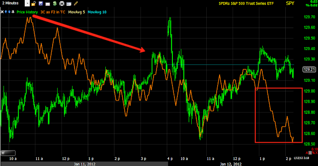
Recent SPY 2 min action
Longer term 5 min SPY trend.
The 30 min sPY trend is very dangerous here.
Here's the long term daily XLE trend.
Some interesting action in the XLF 2 min chart, remember the rotation I showed earlier.
XLF 15 min is in trouble too.
The long term 30 min XLF trend.
XLK recent action is quite troublesome
The 15 min chart looks very bad here.
The hourly really tells the story though.
Take a look at this when you have more time to study it closer. There's good short/long term confirmation, good confirmation between averages and industry groups and the trends are quite clearly negative


